Technicals:
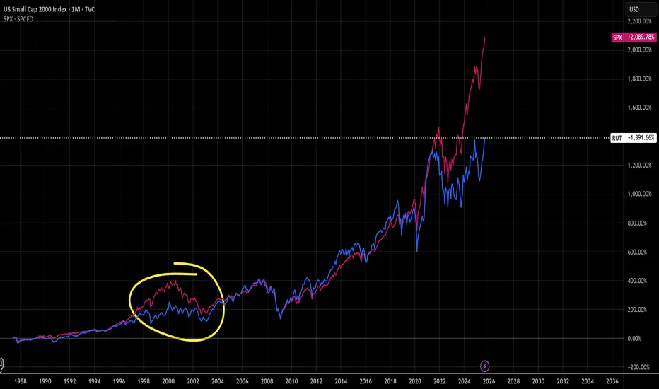
Here we compare the SPX in pink to the RUT in blue. You can see the last time the SPX overtook the RUT was in 1998-2002, if history repeats this puts us squarely in the late 1998. Unlike 1998, we see the RUT has made a higher high after it's V-shaped recovery which looks more promising for it this time around. We could have an everything bubble forming here as money supply inflation and speculation trickle down into smaller companies and people look to diversify outside of the already booming precious metals, crypto, and SPX markets. So far the market has not had a lot of breadth, but it's starting to diversify
Fundamentals:
Looking at the companies that form the RUT, I was surprised to learn that larger ones like AMD are in there. Other notables include utility and the health care which were hit hard earlier this year. Now that there is rotation out of some tech into these 2 sectors I think we may see the RUT really start to perform, but... is it worth buying?
Well the fact is, in this 38 year chart history the RUT has outperformed the SPX for 26 years. The RUT's longest run outperforming the SPX was following the 2000 crash, bottoming in 2002 before surpassing the SPX in 2003-2020. Personally, I'll be looking into this index in 2028/2029
כתב ויתור
המידע והפרסומים אינם מיועדים להיות, ואינם מהווים, ייעוץ או המלצה פיננסית, השקעתית, מסחרית או מכל סוג אחר המסופקת או מאושרת על ידי TradingView. קרא עוד ב־תנאי השימוש.
כתב ויתור
המידע והפרסומים אינם מיועדים להיות, ואינם מהווים, ייעוץ או המלצה פיננסית, השקעתית, מסחרית או מכל סוג אחר המסופקת או מאושרת על ידי TradingView. קרא עוד ב־תנאי השימוש.