הסבר על גרף שטח
בסופר גרפים, ניתן לגשת לגרפי שטח, המשתמשים במילוי מתחת לקו המחירים כדי להדגיש את שינויי המחירים. במסחר, גרפי שטח משמשים לעתים קרובות כדי להדגיש את גודל תנודות המחירים ולעזור לסוחרים לזהות במהירות את הכיוון והעוצמה של מגמה.
תוכן עניינים
מהו גרף שטח
גרפי שטח הם וריאציה של גרפי קו סטנדרטיים. הם משתמשים בקלט דומה כדי לשרטט את קו המחיר ויש להם הגדרות דומות.

מקרי השימוש העיקריים של גרפי שטח משתנים מאוד, החל מזיהוי מגמות ועד להכנת מצגות ודוחות עם נתונים כמותיים.
הדרך הטובה ביותר להבין אותם היא על ידי השוואת גרפי שטח לקווים סטנדרטיים. בואו נמשיך ונראה כיצד הם שונים ומה יכול לעזור לכם.
גרפי לעומת גרפי קו
גרפי שטח הם וריאציה של גרפי קו סטנדרטיים, רק שהרווח מתחת לקו המחיר עד לציר X (האופקי) מוצלל כדי לעזור לכם לקרוא טוב יותר את השינויים.
גרפי שטח
- פרשנות חזותית אינטואיטיבית יותר
- מדגיש את גודל השינוי בערכים
- עשוי להתאים יותר לכמויות ולנתונים מצטברים
- מתאים יותר לדוחות מגמה או כאשר שינוי משמעותי בערך חשוב, מאשר קווים
גרפי קווים
- מתמקדים יותר במגמה מאשר בשינויי ערך
- דורשים יותר זמן לצורך פירוש שינויים משמעותיים
- מתאים יותר להשוואת נכסים או ערכים מרובים
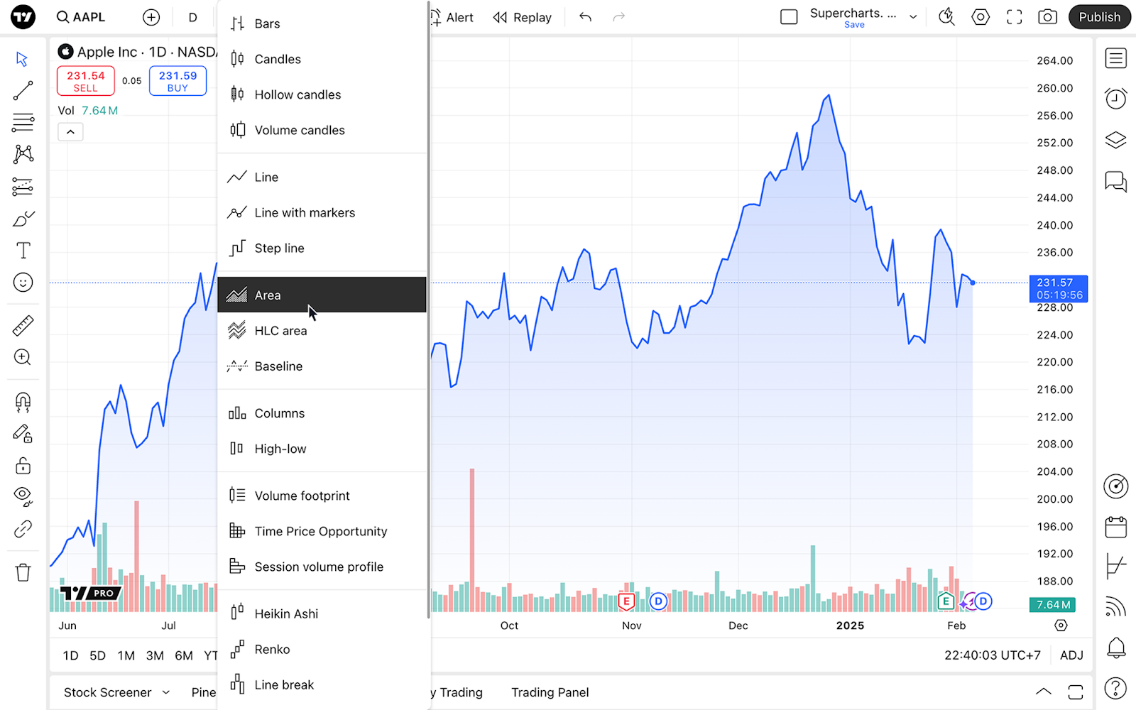
הפעלת סוג הגרף
לאחר שנכנסת לסופר גרפים פתח את התפריט הנפתח של סוג הגרף בסרגל הכלים העליון ובחר "שטח".
 הגדרות גרף שטח
כדי להפיק את המרב מגרפי הקווים, תוכל להתאים אותם אישית בהתאם להעדפותיך ולצרכים שלך.
לשם כך, מצא את כפתור "הגדרות" עם גלגל השיניים בסרגל הכלים העליון ובחר בכרטיסייה "סימול".

החלק הראשון, "שטח", מפרט הגדרות ספציפיות לסוג גרף זה:
1. מקור מחיר: בחר את המחיר שאתה רוצה שהגרף יציג. כברירת מחדל, הוא מוגדר למחיר סגירה, כלומר הגרף ייווצר עם מחירי הסגירה של נכס. בהתאם לסגנון המסחר שלך, בחר את המחיר הרצוי:
- פתיחה: הגרף יציג את מחירי הפתיחה
- גבוה: מציג רק את המחירים הגבוהים ביותר
- נמוך: מציג רק את המחירים הנמוכים ביותר
- סגירה: מציג רק את מחירי הסגירה
- (H + L)/2 - מציג את הממוצע של המחירים הגבוהים והנמוכים ביותר
- (H + L + C)/3 - מציג את הממוצע של המחירים הגבוהים, הנמוכים ביותר ומחיר הסגירה
- (O + H + L + C)/4 - מציג את הממוצע של מחירי הפתיחה, הגבוהים ביותר, הנמוכים ביותר ומחיר הסגירה
2. קו: כאשר הגדרה זו מופעלת, ניתן לשנות את צבע הקו, את העובי שלו ואת האטימות שלו בהתאם להעדפות שלך.
3. מילוי: שנה את צבעי האזור הממולא מתחת לקו ואת האטימות שלהם
גרפי שטח בקצרה
גרפי שטח יכולים לסייע לך לקרוא בקלות שינויי מחירים משמעותיים ולראות תנועות ערך חדות. הם נמצאים בשימוש נרחב עבור דוחות, כאשר תמונה ברורה היא כל מה שאתה צריך כדי לקבל החלטות נוספות.
ההגדרות שלהם עוזרות לך לעצב את הגרפים שלך ולבצע ניתוח ייחודי המבוסס על העדפות הניתוח שלך.
ייתכן שתשקלו ללמוד סוגי גרפים אחרים כדי לראות את השווקים מנקודות מבט שונות ב- TradingView
קרא גם: