OPEN-SOURCE SCRIPT
מעודכן Gap Symbolized on Chart
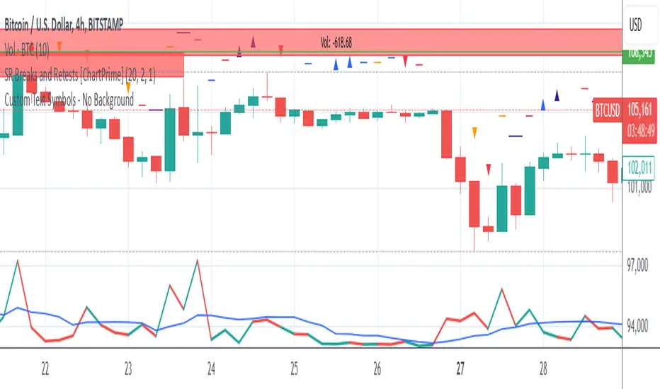
Indicator Description: Gap Analysis with Text Symbols
This indicator analyzes the relationship between the current candle's open price, the previous candle's close price, and the current candle's close price to provide visual insights into price gaps and momentum. It displays text symbols (▼, ▲, ━) above each candle, color-coded to reflect the strength and direction of the gap.
Key Features:
Gap Analysis:
Compares the current candle's open price with the previous candle's close price.
Evaluates the current candle's close price relative to its open price.
Text Symbols:
▼ (Down Arrow): Indicates a bearish movement.
▲ (Up Arrow): Indicates a bullish movement.
━ (Dash): Indicates a neutral or sideways movement.
Color Coding:
Red: Bearish conditions (e.g., price opening lower than the previous close and closing lower than the open).
Orange: Mild bearish or bullish conditions.
Blue: Bullish conditions (e.g., price opening higher than the previous close and closing higher than the open).
Navy: Strong bullish conditions.
Transparent Background:
The text symbols are displayed without any background shape, ensuring they do not obstruct the chart.
Use Cases:
Identify Gaps: Quickly spot gaps between the previous close and the current open.
Momentum Analysis: Assess the strength and direction of price movements.
Visual Clarity: The minimalist design (text symbols only) keeps the chart clean and easy to interpret.
How to Use:
Add the indicator to your chart.
Observe the text symbols above each candle:
Red ▼: Strong bearish momentum.
Blue ▲: Strong bullish momentum.
━: Neutral or consolidation phase.
Use the insights to confirm trends, spot reversals, or identify potential entry/exit points.
הערות שחרור
Indicator Description: Gap Analysis with Text SymbolsThis indicator analyzes the relationship between the current candle's open price, the previous candle's close price, and the current candle's close price to provide visual insights into price gaps and momentum. It displays text symbols (▼, ▲, ━) above each candle, color-coded to reflect the strength and direction of the gap.
Key Features:
Gap Analysis:
Compares the current candle's open price with the previous candle's close price.
Evaluates the current candle's close price relative to its open price.
Text Symbols:
▼ (Down Arrow): Indicates a bearish movement.
▲ (Up Arrow): Indicates a bullish movement.
━ (Dash): Indicates a neutral or sideways movement.
Color Coding:
Red: Bearish conditions (e.g., price opening lower than the previous close and closing lower than the open).
Orange: Mild bearish or bullish conditions.
Blue: Bullish conditions (e.g., price opening higher than the previous close and closing higher than the open).
Navy: Strong bullish conditions.
Transparent Background:
The text symbols are displayed without any background shape, ensuring they do not obstruct the chart.
Use Cases:
Identify Gaps: Quickly spot gaps between the previous close and the current open.
Momentum Analysis: Assess the strength and direction of price movements.
Visual Clarity: The minimalist design (text symbols only) keeps the chart clean and easy to interpret.
How to Use:
Add the indicator to your chart.
Observe the text symbols above each candle:
Red ▼: Strong bearish momentum.
Blue ▲: Strong bullish momentum.
━: Neutral or consolidation phase.
Use the insights to confirm trends, spot reversals, or identify potential entry/exit points.
הערות שחרור
Legend for the symbols:
G-: Red Gap ( The main Gap between two red candles)
O2: Green Red Overlay ( Overlapping between new green candle and old red candle)
O-: Red Overlay ( Overlay between two red candles)
G4: Green Red Gap ( Gap between new green candle and old red candle)
G5: Red Green Gap ( Gap between new red candle and old green candle)
O+: Green Overlay ( Overlay between two green candles)
O7: Red Green Overlay ( Overlapping between new red candle and old green candle)
G+: Green Gap ( The main Gap between two green candles)
Understanding Candlestick Open and Close Relationships
Candlestick charts are a fundamental tool in technical analysis, providing a visual representation of price movements over a specific period. A candlestick is composed of the "body" (representing the range between the opening and closing prices) and the "wicks" or "shadows" (representing the highest and lowest prices).
The relationship between the opening and closing prices reveals important information about market sentiment. Here are eight distinct conditions:
Conditions Where Open is Greater Than Close (Bearish):
* Red Gap Down:
* Open is significantly higher than the previous candle's close.
* Close is lower than the open.
* Indicates: Strong bearish sentiment, a gap down suggests a sudden drop in price.
* Red Overlap:
* Open is higher than the previous candle's close.
* Close is lower than the previous candle's close.
* Indicates: Bearish sentiment, but less extreme than a gap down. Sellers managed to push the price lower.
* Red Gap Up:
* Open is lower than the previous candle's close.
* Close is lower than the open.
* Indicates: A temporary gap up that couldn't be sustained. Sellers took over, driving the price down.
* Red and Green Gap:
* Open is lower than the previous candle's close.
* Close is higher than the open (making it a green candle).
* However, the range of the current candle is entirely below the high of the previous candle.
* Indicates: Confusing signals. The gap down suggests bearishness, but the green body suggests some buying pressure. However, the fact that it's contained within the previous candle's range indicates overall weakness.
Conditions Where Open is Less Than Close (Bullish):
* Green Gap Up:
* Open is significantly lower than the previous candle's close.
* Close is higher than the open.
* Indicates: Strong bullish sentiment, a gap up suggests a sudden surge in price.
* Green Overlap:
* Open is lower than the previous candle's close.
* Close is higher than the previous candle's close.
* Indicates: Bullish sentiment, buyers were able to push the price higher.
* Green Gap Down:
* Open is higher than the previous candle's close.
* Close is higher than the open.
* Indicates: A temporary gap down that couldn't be sustained. Buyers took over, driving the price up.
* Green and Red Gap:
* Open is higher than the previous candle's close.
* Close is lower than the open (making it a red candle).
* However, the range of the current candle is entirely above the low of the previous candle.
* Indicates: Confusing signals. The gap up suggests bullishness, but the red body suggests some selling pressure. However, the fact that it's contained within the previous candle's range indicates overall strength.
Important Considerations:
* Context is Crucial: These patterns should be analyzed in conjunction with other technical indicators and the overall market trend.
* Confirmation: Look for confirmation of the signals in subsequent candles or indicators.
* Timeframe Matters: The interpretation of these patterns can vary depending on the timeframe of the chart (e.g., daily, weekly, hourly).
By understanding these eight conditions, you can gain valuable insights into the forces driving price action and improve your ability to make informed trading decisions. Remember that consistent practice and learning are key to mastering candlestick chart analysis.
סקריפט קוד פתוח
ברוח האמיתית של TradingView, יוצר הסקריפט הזה הפך אותו לקוד פתוח, כך שסוחרים יוכלו לעיין בו ולאמת את פעולתו. כל הכבוד למחבר! אמנם ניתן להשתמש בו בחינם, אך זכור כי פרסום חוזר של הקוד כפוף ל־כללי הבית שלנו.
כתב ויתור
המידע והפרסומים אינם מיועדים להיות, ואינם מהווים, ייעוץ או המלצה פיננסית, השקעתית, מסחרית או מכל סוג אחר המסופקת או מאושרת על ידי TradingView. קרא עוד ב־תנאי השימוש.