ES-VIX Expected Move LTF LevelsES-VIX LTF Price Bands
This indicator plots dynamic intraday price bands for ES futures based on real-time volatility levels measured by the VIX (CBOE Volatility Index). The bands evolve throughout the trading day, providing volatility-adjusted price targets.
Formulas:
Upper Band = (Input TF Open) + (ES Price × VIX x √(Input TF ÷ (23h in min) ) ÷ 100
Lower Band = Daily Open - (ES Price × VIX x √(Input TF ÷ (23h in min) ) ÷ 100
The calculation uses the square root of Input TF ÷ (23h in min) to convert annualized VIX volatility into an expected TF move, then scales it as a percentage adjustment from the current TF input's open.
Features:
Real-time band calculation that updates throughout the trading session
Upper band (green) extends from the current TF's open
Lower band (red) contracts from the current TF's open
Inner upper band (green) at 50% of expected move
Inner lower band (red) at 50% of expected move
Middle Inner upper band (green) at 80% of expected move
Middle Inner lower band (red) at 80% of expected move
Information table displaying:
Current input TF
Current ES price and VIX level
Current input TF Open
Expected move
רצועות וערוצים

Bitcoin Power Law Zones (Dunk)Introduction When viewed on a standard linear chart, Bitcoin’s long-term price action can appear chaotic and exponential. However, when analyzed through the lens of physics and network growth models, a distinct structure emerges.
This indicator implements the Bitcoin Power Law , a mathematical model that suggests Bitcoin’s price evolves in a straight line when plotted against time on a "log-log" scale. By calculating parallel bands around this regression line, we create a "Rainbow" of valuation zones that help investors visualize whether the asset is historically overheated, undervalued, or sitting at fair value.
The Math Behind the Model The Power Law dictates that price scales with time according to the formula: Price = A * (days since genesis)^b
This script uses the specific parameters popularized by recent physics-based analyses of the network: Slope (b): 5.78 (Representing the scaling law of the network adoption). Amplitude (A): 1.45 x 10^-17 (The intercept coefficient).
While simple moving averages react to price, this model is predictive based on time and network growth physics, providing a long-term "gravity" center for the asset.
Guide to the Valuation Zones
Upper Bands (Red/Orange): Extr. Overvalued, High Premium, Overvalued. Historically, these zones have marked cycle peaks where price moved too far, too fast ahead of the network's steady growth. The Baseline (Black Line): Fair Value. The mathematical mean of the Power Law. Price has historically oscillated around this line, treating it as a center of gravity. Lower Bands (Green/Blue): Undervalued, Discount, Deep Discount. These zones represent periods where the market price has historically lagged behind the network's intrinsic value, often marking accumulation phases.
Note: The lowest theoretical tiers ("Bitcoin Dead") have been trimmed from this chart to focus on relevant historical support levels.
How to Use Logarithmic Scale: You MUST set your chart to "Log" scale (bottom right of the TradingView window) for this indicator to function correctly. On a linear chart, the bands will appear to curve upwards aggressively; on a Log chart, they will appear as smooth, parallel channels. Timeframe: This is a macro-economic indicator. It is best viewed on Daily or Weekly timeframes. Overlay Labels: The indicator includes dynamic labels on the right-side axis, allowing you to instantly see the current price requirements for each valuation zone without manually tracing lines.
Credits This script is based on the Power Law theory popularized by Giovanni Santostasi and the original Corridor concepts by Harold Christopher Burger .
Disclaimer This tool is for educational and informational purposes only. It visualizes historical mathematical trends and does not constitute financial advice. Past performance of a model is not indicative of future results.
Further Reading
www.hcburger.com
giovannisantostasi.medium.com

Zig Zag & Trendlines with Dynamic Threshold ATRPercentage Zig Zag with Dynamic Threshold
This Pine Script indicator is an advanced Zig Zag tool that identifies and tracks price pivots based on a percentage move required for reversal, offering a clear visual representation of volatility-adjusted trends.
Core Functionality (The Reversal Threshold):
Unlike standard Zig Zag indicators that use a fixed price difference, this indicator calculates the required reversal size (%X) dynamically using the Average True Range (ATR).
It calculates the ATR as a percentage of the current price (ATR%).
The final threshold is this ATR% multiplied by a user-defined factor (default 3x).
This means the reversal threshold is wider during volatile periods and narrower during quiet periods, adapting automatically to market conditions. Users can optionally revert to a fixed percentage if desired.
Trend Extension Lines:
The indicator draws two unique, dynamic trend lines connecting the last two significant Highs and the last two significant Lows. Crucially, these lines do not wait for the entire Zig Zag leg to confirm:
If the price is actively forming a new up-leg, the High Extension Line connects the last confirmed High to the current extreme high of the active move.
The Low Extension Line functions similarly for the downtrend.
This feature allows the user to visualize dynamic support and resistance levels based on the current, active trend structure defined by the percentage threshold.

Forex Trend Master FollowerThis indicator is based on slow and fast EMA, like regular EMA cross, but updated. It works the best on trendy pairs like EU, and works the best on 4h time frame. It shows where to entry and where to close the position based on slow EMA. It can be used like additional confluence with FTB entry model, and whole strategy.

Snip Price Action [@17.daavid indicator]All in one
SMC Indicator Snip.
CONTACT: @17.daavid
Instagram

ES-VIX Expected Move - Open basedES-VIX Daily Price Bands
This indicator plots dynamic intraday price bands for ES futures based on real-time volatility levels measured by the VIX (CBOE Volatility Index). The bands evolve throughout the trading day, providing volatility-adjusted price targets.
Formulas:
Upper Band = Daily Open + (ES Price × VIX ÷ √252 ÷ 100)
Lower Band = Daily Open - (ES Price × VIX ÷ √252 ÷ 100)
The calculation uses the square root of 252 (trading days per year) to convert annualized VIX volatility into an expected daily move, then scales it as a percentage adjustment from the current day's open.
Features:
Real-time band calculation that updates throughout the trading session
Upper band (green) extends from the current day's open
Lower band (red) contracts from the current day's open
Inner upper band (green) at 50% of expected move
Inner lower band (red) at 50% of expected move
Middle Inner upper band (green) at 80% of expected move
Middle Inner lower band (red) at 80% of expected move
Information table displaying:
Current ES price and VIX level
Daily Open
Expected move

Ben D"s IndicatorIt Auto Draws and Detects, Channels draws buy and sell signals based on over bought, oversold and a few other indicators. It works on all time frames! Enjoy! Leave a comment if you like it.

Smart Money ProSmart Money Pro V 8.1 is an advanced trading indicator that tracks institutional "smart money" movements using multiple Smart Money Concepts (SMC) techniques:
Market Structure: Identifies Change of Character (CHoCH), Break of Structure (BOS), and Internal/External Market Structure (IDM)
Order Blocks: Detects demand/supply zones including EXT OB, IDM OB, SCOB, and mitigation/breaker blocks
Order Flow: Tracks major and minor order flows with mitigation levels
Fair Value Gaps (FVG): Highlights price inefficiencies and imbalance zones
Liquidity Levels: Maps liquidity sweeps and key pivot levels
Price Structure: Shows OTE (Optimal Trade Entry) zones, PDH/PDL (Previous Day High/Low), equilibrium levels, and swing sweeps
Candle Patterns: Detects Inside and Outside bars
The indicator helps traders identify institutional entry/exit points, liquidity grabs, and high-probability trading zones.
Smart Money Pro V 8.1 هو مؤشر متقدم لتتبع تحركات المؤسسات المالية "الأموال الذكية" باستخدام مفاهيم Smart Money Concepts (SMC):
هيكل السوق: يحدد تغيير الاتجاه (CHoCH)، كسر الهيكل (BOS)، والهيكل الداخلي/الخارجي (IDM)
مناطق الطلب والعرض: يكتشف Order Blocks بأنواعها (EXT OB, IDM OB, SCOB) ومناطق الاختراق والتخفيف
تدفق الأوامر: يتتبع التدفقات الرئيسية والثانوية مع مستويات التخفيف
فجوات القيمة العادلة (FVG): يبرز مناطق عدم الكفاءة السعرية وعدم التوازن
مستويات السيولة: يرسم مصائد السيولة والنقاط المحورية الرئيسية
هيكل السعر: يعرض مناطق OTE (نقاط الدخول المثلى)، أعلى/أدنى سعر سابق (PDH/PDL)، مستويات التوازن، وكسر القمم/القيعان
أنماط الشموع: يكتشف شموع Inside و Outside Bar

EMA Crossover + Angle + Candle Pattern + Breakout (Clean) finalmayank raj 9 15 ema strategy which will give me 1 crore

FVG + Bollinger + Toggles + Swing H&L (Taken/Close modes)This indicator combines multiple advanced market-structure tools into one unified system.
It detects A–C Fair Value Gaps (FVG) and plots them as dynamic boxes projected a fixed number of bars forward.
Each bullish or bearish FVG updates in real time and “closes” once price breaks through the opposite boundary.
The indicator also includes Bollinger Bands based on EMA-50 with adjustable deviation settings for volatility context.
Swing Highs and Swing Lows are identified using pivot logic and are drawn as dynamic lines that change color once taken out.
You can choose whether swings end on a close break or on any touch/violation of the level.
All visual elements—FVGs, Bollinger Bands, and Swing Lines—can be individually toggled on or off from the settings panel.
A time-window session box is included, allowing you to highlight a custom intraday window based on your selected timezone.
The session box automatically tracks the high and low of the window and locks the final range once the window closes.
Overall, the tool is designed for traders who want a structured, multi-layered view of liquidity, volatility, and intraday timing.

KVS-Ultimate FVG & iFVG System [MTF + Distance Filter]Description: This indicator identifies Fair Value Gaps (FVG) and Inversion FVGs (iFVG) across multiple timeframes (MTF) with an advanced visualization system. Unlike standard FVG indicators, this script solves the "chart clutter" problem with a unique Distance Filter and offers a customizable Split Label System.
Key Features:
1. Unique Distance Filter (Clean Screen Mode):
When enabled, the script only shows the closest FVGs to the current price within a user-defined limit.
Keeps your chart clean while focusing on relevant price action levels.
2. Split Label System (Tabular Design):
Completely customizable label positioning, sizing, and coloring.
Separate controls for Normal FVGs and iFVGs.
Smart Label Logic: If you hide the FVG box, its label automatically hides. If an FVG breaks and becomes an iFVG (or fades), the label logic switches automatically to the iFVG settings.
3. Strict Mode Filtering:
Enabled: Checks if the candle closing price effectively breaks the previous structure (High/Low of the 1st candle), ensuring high-quality gaps.
Disabled: Detects all gaps between wicks (Standard calculation).
4. Multi-Timeframe (MTF) Support:
Monitor FVGs from up to 5 different timeframes simultaneously on a single chart.
5. Dynamic Interaction:
Choose how the script reacts when an FVG is broken: Turn it into an iFVG (Inversion) or simply fade the color (Ghost/Fade mode).
How to Use:
Use the "Distance Filter" checkbox in settings to clean up old/far blocks.
Adjust "TF1" to "TF5" to set up your multi-timeframe analysis.
Customize the Label Panel to align text perfectly with your chart style.
Disclaimer: This tool is for educational purposes and support for technical analysis.

Gold Fair Value [Alpha Extract]Gold-anchored Bitcoin fair value model is a macro-fundamental valuation indicator that anchors Bitcoin price assessment to gold market dynamics, establishing fair value zones through percentage change influence modelling and adaptive band multipliers. This overlay system provides institutional-grade context for identifying accumulation zones, distribution zones, and fair value equilibrium across all market cycles with minimal chart clutter through sophisticated gradient fill visualization.
🔶 Gold-Anchored Valuation Framework
Establishes Bitcoin's theoretical fair value by integrating daily gold price movements into a smoothed asset baseline, applying percentage change calculations over configurable periods to measure gold's momentum influence. The system translates gold's relative strength or weakness into Bitcoin price expectations through adjustable influence multipliers, creating a dynamic fair value line that adapts to shifting macro-fundamental relationships between digital and traditional store-of-value assets.
🔶 Multi-Layer Statistical Band System
Implements asymmetric upper and lower band multipliers applied to the fair value baseline, creating five distinct valuation zones: extreme overvaluation, moderate overvaluation, fair value equilibrium, moderate undervaluation, and extreme undervaluation. The asymmetric configuration (default 1.46x upper, 0.74x lower) reflects Bitcoin's historical tendency toward asymmetric volatility patterns with more violent upside moves and grinding downside action, optimizing zone accuracy for actionable trading decisions.
🔶 Gradient Fill Visualization
Employs sophisticated transparency-based gradient fills between bands to create visually intuitive valuation heat maps, with darker orange shading indicating proximity to fair value and lighter shading showing extreme deviation zones. The system maintains chart readability by hiding individual band lines while preserving the filled zones, eliminating visual clutter while delivering maximum information density for rapid market assessment without overwhelming the trader with excessive line plots.
🔶 Historical Context & Position Management
The lower band zones have historically preceded periods of constructive price behavior including consolidation phases and early-stage recovery rallies, while upper band interactions have preceded distribution and correction events. This historical pattern recognition enables traders to position proactively based on valuation extremes rather than reactively chasing momentum, supporting systematic accumulation during undervaluation periods and graduated profit-taking during overvaluation extremes.
All analysis provided by Alpha Extract is for educational and informational purposes only. The information and publications are not meant to be, and do not constitute, financial, investment, trading, or other types of advice or recommendations.

All-in-One (PHT)All-in-One (PHT) — Modular Multi-Tool Market Analyzer (Pine Script v6)
All-in-One (PHT) is a complete, modular market-analysis toolkit designed for traders who want clean, reliable, and professional-grade charting - in a single indicator.
Built using Pine Script® v6 and structured with reusable PHT-Libraries (EMA Band, Bollinger Band, Fractal, Session), this indicator delivers clarity, precision, and consistent performance across all markets and timeframes.
Unlike traditional indicators that mix logic and visuals, AIO (PHT) uses a fully modular architecture. All calculations come from dedicated libraries, and this main script focuses purely on visual output and clean plotting.
This ensures:
Stable plot references
Zero repainting in all included modules
High performance even with complex overlays
Easy extensibility for future upgrades
🔥 Included Modules
1. EMA Band (PHT Library)
A triple-EMA band designed for trend clarity and structure.
Provides:
EMA of High
EMA of Close
EMA of Low
Band fill visualization
Ideal for identifying trend strength, momentum pockets, and mean-reversion zones.
2. Bollinger Band Suite
A complete Bollinger framework with:
SMA / EMA / WMA midline options
Dual standard-deviation envelopes
Multi-zone band fills (upper, middle, lower)
User-controlled visibility for each layer
Perfect for volatility detection, squeeze identification, and precision envelope trading.
3. Fractal Engine (High/Low Pivots)
Fast, reliable fractal detection using user-defined left/right periods.
Features:
Pivot Highs & Pivot Lows
Multiple marker sizes (Tiny → Large)
Zero-lag plotting with proper offset handling
Useful for swing structure, breakout confirmation, and automated level marking.
4. Market Session Tracker
A powerful session-mapping module that visually highlights market sessions with:
Dynamic session boxes
High & Low markers
Persistent historical sessions
Auto-managed labels, lines, and live updates
Timezone-aware session boundaries (supports IANA zones)
Designed for identifying daily ranges, session liquidity, volatility pockets, and market timing.
🧠 Why This Indicator Is Different
Most “all-in-one” tools mix plotting, logic, and calculations in a single heavy script, causing lag, reference instability, and repainting issues.
All-in-One (PHT) solves this by using a Pine v6 library architecture:
Each component is computed in its own library
The main script handles only visuals
No hidden code, no repainting tricks
Maximum clarity and maintainability
This design mirrors professional software architecture:
clear separation of logic, visuals, and user interface.
🎯 Ideal For
Trend traders
Scalpers & intraday traders
Swing and positional traders
Volatility analysts
Structure-based price action traders
Anyone who wants multiple high-quality tools in one clean indicator
Whether you analyze markets manually or build algorithmic systems, AIO (PHT) provides a solid foundation.
⚙️ Features at a Glance
Fully modular Pine v6 design
Complete EMA band engine
Advanced Bollinger band system (multi-deviation, multi-fill)
Configurable fractal high/low markers
Smart session boxing with history
Clean visuals and transparent settings
No repainting
Fully customizable colors & visibility
Optimized for performance
💡 How to Use
Choose the modules you want to display (EMA, BB, Fractals, Sessions).
Adjust lengths, deviations, or fractal periods as per your trading style.
Use session boxes to understand volatility timing.
Combine bands + fractals for advanced structure-based decisions.
The indicator is designed to overlay on price for maximum clarity.
🚀 Future Upgrades
The PHT framework supports smooth future expansion. Planned modules include:
ATR/volatility engines
Trend switches
Supertrend/Donchian plugins
Volume profile extensions
Updates will remain backward compatible across all modules.
⭐ Summary
All-in-One (PHT) is not just another overlay — it’s a complete multi-tool trading framework built using professional engineering practices in Pine Script v6.
If you want cleaner charts, smarter signals, and a high-performance modular system, this indicator gives you everything in one reliable package.


BB & MTF EMAs + DPOC/WPOCDescription:
This indicator combines multiple trend and support/resistance tools into a single overlay with specific customization for the Indian Standard Time (IST) session.
Features Included:
Bollinger Bands: 20-period SMA Basis, 1.5 StdDev.
4 Multi-Timeframe EMAs:
EMA 1: 9 Length (1m timeframe)
EMA 2: 20 Length (3m timeframe)
EMA 3: 50 Length (15m timeframe)
EMA 4: 200 Length (15m timeframe)
Session POCs (IST):
Daily POC (DPOC): Calculated 05:30-05:29 IST. Extends for full 24h session.
Weekly POC: Calculated from Monday 05:30 IST Open. Extends for full 7-day week.
Controls:
Toggle visibility for all individual components.
"Show Historical" toggle for pivots to see past levels or keep charts clean.

LPC Rebate HunterLPC Rebate Hunter Version 1.3.5
From Static to Dynamic Momentum: Replaced the rigid RSI filter with a Multi-Engine Oscillator (WaveTrend, MFI, or RSI), allowing for smoother cycle detection.
From "Pivots" to "Smart Structure": The liquidity engine now detects Swing Failure Patterns (SFP)—identifying when price "pokes" a level to trap traders before reversing—and automatically cleans up mitigated zones.
Choppy Market Protection: Added an ADX (Average Directional Index) integration to strictly filter out signals during flat/sideways markets.
Risk Management Layer: Introduced a Smart Trailing Stop (ATR-based Chandelier Exit) to help traders manage active positions objectively.
Visual Overhaul: Features a modern gradient trend cloud and a fully adaptive "Heads-Up Display" (HUD) that provides real-time market stats.

Arden SMC OTEThis indicator represents a comprehensive trading system based on Smart Money Concepts (SMC) and Optimal Trade Entry (OTE). The script's key feature is the built-in "Liquidity Trap" filter, which protects the trader from entering positions where the price is highly likely to hunt for stop losses before making the true move.
Key Features:
1. Automatic OTE Search: The indicator identifies market structure (Swing Highs/Lows) on the selected timeframe and draws a Fibonacci grid. Entry is based on the 0.62 level, and the target is the -0.27 extension (or a fixed Risk:Reward ratio).
2. "Liquidity Trap" Filter (Smart Logic):
The algorithm scans the chart for Equal Highs (EQH) and Equal Lows (EQL), based on precise candle body touches.
Protection Logic: If a liquidity zone (EQH/EQL) is located between your entry point and your Stop Loss, the indicator cancels the signal. This saves you from situations where the market maker first "sweeps" liquidity (hits your stop) and only then moves in the desired direction.
3. Flexible Risk Management:
3 Stop Loss modes (Conservative behind the swing, Aggressive behind 0.88 Fib, or ATR-based).
Take Profit selection (Structure-based or fixed RR).
4. SMC Filters:
Equilibrium: Checks if the price is in the Discount zone (for buys) or Premium zone (for sells).
Structure Size: Filters out structures that are too small (noise) using ATR.
How to read the chart:
Grey zones/lines: Your potential trade (Entry, Stop, Take Profit).
Orange boxes: Liquidity Zones (EQH/EQL). If they appear, it means orders have accumulated there.
Labels: "ENTRY 🚀" — entry triggered, "TP HIT" — target reached.
Disclaimer:
This indicator is an assistive tool. Always check the higher timeframe context yourself.
Liquidity Filter Settings
❌ Block on Liquidity (EQH/EQL): The main checkbox. If enabled, the script checks: "Is there an orange liquidity box right before my stop loss?". If yes — no signal is generated.
Show Liquidity Zones: Toggle the visibility of the orange boxes.
Touch Count (cNum): How many times the price must hit the exact same level (body-to-body) for it to count as liquidity. Usually 2 (Double Top/Bottom).
Gap Count (bars): Minimum distance (in bars) between touches.
Confirmation Bars: How many candles must pass after the touch for the zone to be confirmed and drawn.

SEE + RSI Signal with Dual Invalidationrsi mcd and see close signal. when a candle closes below rsi, see and macd the script prints a tiny circle


MaruMaroo's Multi-MA & BB & Ichimoku매매할 때 가장 기본적으로 세팅하는 이동평균선, 볼린저 밴드, 일목균형표를 스크립트 하나로 합쳤습니다.
무료 계정이라 지표 개수 제한(3개) 때문에 불편하셨거나, 이것저것 추가해서 차트 지저분해지는 거 싫으신 분들 쓰시면 됩니다. 복잡한 거 싹 빼고 딱 필요한 기능만 넣어서 최적화했습니다.
7줄 이동평균선 (Rainbow MA): 단기부터 장기까지 7개 라인을 한 번에 보여줍니다. 설정에서 단순(SMA), 지수(EMA)뿐만 아니라 가중(WMA), 거래량가중(VWMA) 등으로 바꿀 수 있습니다.
헷갈림 방지 라벨: 이평선이 많으면 뭐가 60일선이고 120일선인지 헷갈리는데, 선 끝자락에 숫자(기간)가 뜨도록 해서 보기 편하게 만들었습니다. (글자 크기도 키워둠)
볼린저 밴드 & 일목균형표: 표준편차 1, 2배수 밴드랑 일목 구름대까지 다 포함되어 있습니다.
커스텀: 안 쓰는 기능은 설정에서 체크 해제하면 깔끔하게 사라집니다. 입맛대로 세팅해서 쓰세요.
I combined the most essential trading indicators into a single script to keep the chart clean and bypass the indicator limit.
If you are tired of switching between indicators or have a cluttered screen, this "All-in-One" setup is for you. It includes everything you need for trend and volatility analysis.
7 Moving Averages: Covers short to long-term trends (Rainbow setup). You can switch types between SMA, EMA, SMMA, WMA, and VWMA in the settings.
Smart Labels: Added labels at the end of each MA line so you can instantly see which line corresponds to which period (e.g., 20, 60, 120).
Bollinger Bands & Ichimoku: Includes Double Bollinger Bands (StdDev 1 & 2) and the full Ichimoku Cloud system.
Fully Customizable: You can toggle each component ON or OFF in the settings.

RSI + EMA Dynamic Zones + Volume + Divergence (with RSI 50 line)RSI + EMA Dynamic Zones + Volume + Divergence (with RSI 50 line)


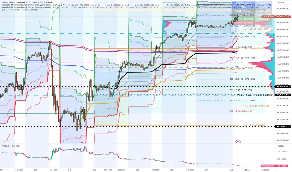
ES-VIX Daily Price Bands - Inner and OuterES-VIX Daily Price Bands
This indicator plots dynamic intraday price bands for ES futures based on real-time volatility levels measured by the VIX (CBOE Volatility Index). The bands evolve throughout the trading day, providing volatility-adjusted price targets.
Formulas:
Upper Band = Daily Low + (ES Price × VIX ÷ √252 ÷ 100)
Lower Band = Daily High - (ES Price × VIX ÷ √252 ÷ 100)
The calculation uses the square root of 252 (trading days per year) to convert annualized VIX volatility into an expected daily move, then scales it as a percentage adjustment from the current day's extremes.
Features:
Real-time band calculation that updates throughout the trading session
Upper band (green) extends from the current day's low
Lower band (red) contracts from the current day's high
Inner upper band (green) at 50% of expected move
Inner lower band (red) at 50% of expected move
Middle Inner upper band (green) at 80% of expected move
Middle Inner lower band (red) at 80% of expected move
Outer upper band (green) at 150% of expected move
Outer lower band (red) at 150% of expected move
Shaded zone between bands for visual clarity
Information table displaying:
Current ES price and VIX level
Running daily high and low
Current upper and lower band values