Key levels + Session Range (Sweep-Aware Levels)Overview
This indicator provides a single, clean view of two core intraday contexts that day traders rely on:
Daily Liquidity Levels: prior day high/low (PDH/PDL), prior day open/close, weekly highs/lows, and other commonly referenced reference points.
Session Ranges: clearly plotted high/low for each active session (e.g., Asia, London, New York), tracked live as the session evolves.
By unifying these two information layers, traders can immediately see when price is sweeping a session’s extremes into known daily liquidity—a frequent precursor to reversals or continuation moves. This saves chart space, reduces cognitive overload, and turns two separate checks into one coherent read.
What it does
Plots daily liquidity references: previous day high/low, previous day open/close, and optional higher-timeframe levels (open, high, mid and low 4H ,Day, Week, month, year and quarterly).
Tracks session high/low live: as each session unfolds, the indicator updates that session’s running High and Low, then locks them at session end.
Maps interaction between the two layers: you can instantly spot session sweeps that tag PDH/PDL (or weekly extremes), highlight potential liquidity grabs, and frame risk with objective boundaries.
Keeps the chart clean: just essential lines/zones and concise labels—no extra clutter.
Why it’s useful & original
Single-purpose integration: Rather than a generic mashup, this is a purpose-built fusion where session dynamics are read in the context of daily liquidity. That relationship is the core edge—seeing when a session sweep aligns with known liquidity pools.
Workflow efficiency: One overlay replaces two indicators, simplifying visibility and reducing conflicting visuals.
Decision clarity: The combination highlights setups many intraday traders already watch manually (e.g., NY session high sweep into PDH), but makes them obvious in real time.
How it works (plain-English logic)
Daily Liquidity Engine
At the start of each day, the indicator records PDH, PDL, prior open/close and (optionally) prior week high/low.
These levels are plotted and extended across the session as static references.
Session Range Tracker
For each defined session (e.g., Asia/London/New York), the script initializes session High/Low at session open.
Throughout the session, it updates those extremes in real time and locks them on session close.
Interaction Layer
When price reaches or sweeps a session High/Low near a daily level (e.g., within your chosen tolerance), the confluence becomes visually obvious.
Traders can then decide whether it’s a likely liquidity grab (fade/reversal idea) or a continuation through the pool (breakout idea), per their plan.
How to use it
Identify session context: Start by noting where price is trading relative to the current session’s High/Low.
Locate nearby daily liquidity: Check distance to PDH/PDL, prior open/close, and weekly extremes.
Look for confluence:
Sweep-and-fade idea: Session High swept into PDH (or Session Low into PDL) with failure to hold → potential reversal context.
Break-and-go idea: Strong close through PDH/PDL following a session extreme break → potential continuation context.
Risk framing: Session High/Low and PDH/PDL provide objective anchors for stops and targets. Adapt to your own risk model (e.g., use ATR or structure-based stops).
Keep it clean: Use this as your primary overlay to avoid clutter; add confirmations (volume, structure) only if they genuinely help your process.
Settings (typical options)
Sessions: Choose which sessions to display (e.g., Asia/London/NY) and their time zones/hours.
Daily Levels: Toggle PDH/PDL, prior open/close, prior week High/Low, and other references you rely on.
Visuals: Colors, line styles, label visibility, and optional band shading for quick recognition.
Confluence Tolerance (optional): Define how near a session extreme must be to a daily level to consider it a “liquidity touch/sweep” in your visuals.
Alerts (optional): First touch/sweep of session High/Low, break/close beyond PDH/PDL, or custom distance conditions.
Chart & Publishing Notes (for reviewers and users)
Clean chart by design: Only essential lines/labels for session extremes and daily references.
Plain-English description: Explains what, why, and how so non-coders can use it confidently.
Original integration: The value here is the purposeful interaction—seeing session sweeps in context of daily liquidity in one place—rather than a cosmetic mashup.
Limitations & good practice
This tool is contextual, not predictive. It highlights structure and liquidity landmarks; trade decisions are yours.
Session definitions vary by asset/exchange; ensure your session times match your market.
Past behavior at these levels does not guarantee future outcomes; always use proper risk management.
Disclaimer
This indicator is for educational and informational purposes only and is not financial advice. Trading involves risk; always test and evaluate with your own methods and risk parameters.
מתנדי רוחב
Sessions Highs/LowsThis indicator plots the High and Low of the three main trading sessions:
Asia (20:00–03:00) – green lines
London (03:00–08:00) – blue lines
New York (08:00–13:00) – red lines
Features:
Levels update in real time during each session.
When a new session starts, the previous lines are deleted – only the latest active sessions remain visible.
Default session times are set to Asia (20:00–03:00), London (03:00–08:00), and New York (08:00–13:00), but you can adjust them to your own custom hours in the settings.
Colors can also be customized.
Use cases:
Quickly visualize session ranges.
Track session highs/lows for breakouts, fakeouts, and reactions around liquidity zones.

Fixed Asset TurnoverFixed Asset Turnover (FAT) measures how efficiently a company uses its fixed assets (Property, Plant & Equipment – PPE) to generate revenue. It shows how many times the company “turns over” its fixed assets in a period relative to revenue.
High FAT: Assets are used efficiently; the company generates more revenue per unit of fixed assets.
Low FAT: Fixed assets are underutilized; the company may have invested too much in assets that don’t produce sufficient revenue.
Formula:
Fixed Asset Turnover=Total Revenue/Average Net Fixed Assets
What it tells you:
Indicates asset efficiency in generating sales.
Useful to compare companies within the same industry (because asset intensity varies by sector).
Helps identify whether a company is over-invested in fixed assets or underutilizing them.
How to use it:
Trend Analysis:
Track FAT over time for the same company to see if asset utilization is improving.
Benchmarking:
Compare FAT against competitors or industry averages.
Investment Decisions:
Higher FAT usually suggests more efficient operations, but context matters (e.g., heavy-capital industries naturally have lower FAT).

EMA+RSI Buy/Sell with Fibonacci GuideSingle-Instance EUR/USD & GBP/USD Trend+MACD ATR EA
Purpose:
This EA is designed for automated Forex trading on EUR/USD and GBP/USD. It identifies trend-based trading opportunities, dynamically calculates position sizes based on your available capital and risk percentage, and manages trades with ATR-based stop-loss and take-profit levels, including optional trailing stops.
Key Features:
Auto Pair Selection:
Compares the trend strength of EUR/USD vs GBP/USD using a combination of EMA slopes and MACD direction.
Automatically trades the stronger trending pair.
Trend & Signal Detection:
Uses Fast EMA / Slow EMA crossover for trend direction.
Confirms trend with MACD line vs signal line.
Generates long and short signals only when trend and MACD align.
Dynamic SL/TP:
Stop-loss and take-profit are calculated based on ATR (Average True Range).
Supports optional trailing stops to lock in profits.
Position Sizing:
Automatically calculates micro-lot sizes based on your capital and risk percentage.
Ensures risk per trade does not exceed the defined % of your account equity.
Chart Visualization:
Plots Fast EMA / Slow EMA.
Displays SL and TP levels on the chart.
Shows a label indicating the active pair currently being traded.
Alerts:
Generates alerts for long and short signals.
Can be used with TradingView alerts to notify or trigger webhooks.
Single Strategy Instance:
Fully compatible with Pine Script v6.
Only one strategy instance runs on the chart to prevent “too many strategies” errors.

Weighted Sector ADD (sign-weighted)What it is
A true, cap-weighted advances/declines (ADD) proxy for the S&P 500 using sector ETFs. Each sector contributes +1 if it’s up on the bar, −1 if it’s down, 0 if flat. Those signals are then weighted by your sector weights (auto-normalized to 100%) and summed into a single breadth line. The result is a fast, low-noise read of how much of the S&P (by sector weight) is advancing vs. declining right now.
- Tracks participation, not price magnitude—perfect for spotting “broad vs. narrow” moves
- Heavily weighted sectors (e.g., Tech) matter proportionally more, reflecting real index impact
- Simple scale: ~−1 to +1 (all weight down → all weight up)
Chart Elements
- Green/Red Columns – “Weighted ADD”: Current bar’s weighted breadth (sign-based by default)
- Blue Line – “Weighted MA”: SMA of the weighted ADD (regime filter)
- Zero/Guide Lines (optional): 0.0, ±0.2 (mild), ±0.6 (strong)
- Labels (optional): Text markers at those guide levels
- Advancing Weight % (optional): Label showing ((ADD+1)/2)*100 → share of total sector weight advancing
How to Read (Quick Guide)
- +0.60 to +1.00 → Broad, one-sided risk-on (most sector weight advancing)
- +0.20 to +0.60 → Moderate, supportive breadth
- −0.20 to +0.20 → Mixed/choppy; rotation
- −0.60 to −1.00 → Broad, one-sided risk-off
- MA above/below zero → Simple regime indicator; zero-crosses could be potential alert triggers
- Divergence: Strong price move with a weak/flat ADD could potentially warn of narrow participation
Inputs & settings
Calculation
- Use returns instead of up/down sign?
OFF (default): true weighted participation (+1/−1/0)
ON: weighted sector returns (winsor-capped). Use if you want magnitude, not just direction
- Winsor cap (returns mode): Caps per-sector contribution in returns mode (e.g., 0.02 = ±2%)
- Smoothing MA length: SMA period for the blue “Weighted MA” line
- Source timeframe: Compute signals on another TF (e.g., “60”) but plot on your chart TF
Visibility
- Show Weighted ADD (bars): Toggle the green/red columns
- Show Weighted ADD MA: Toggle the blue SMA line
- Show Zero Line (0): Toggle the 0.0 reference line
- Show ±0.2 / ±0.6 guide lines: Toggle the helper levels
- Show guide labels: Draw small text labels at 0, ±0.2, ±0.6
- Guide label offset (bars left): Move labels left if they overlap the right edge values
- Show Advancing Weight % label: Toggle the % of sector weight currently advancing
Sector Symbols (ETF proxies)
- XLK, XLY, XLF, XLV, XLC, XLI, XLP, XLE, XLB, XLU, XLRE: Defaults to the SPDR sector ETFs. You can swap for alternative proxies if desired.
Sector Weights (auto-normalize)
- Weight inputs for each sector (e.g., Tech 0.30, Financials 0.13…). These auto-normalize to 1.0 so you can paste rough numbers; the script scales them.
- Keep weights fresh. GICS sector weights drift; update periodically (e.g., quarterly).
Alerts included
- “Weighted ADD crossed above 0”
- “Weighted ADD crossed below 0”
Version
v1.0 – Initial release (weighted sign-based ADD + SMA, zero/guide lines & labels, Adv % label, alerts).

CCI Stochastic - YOSI
CCI Stochastic (Pro v6) – MTF, Adaptive Bands & Live Label
What it does
This indicator applies a Stochastic calculation on the CCI (K/D lines) to highlight momentum shifts, overbought/oversold zones, and adaptive market regimes. It comes with optional higher-timeframe confirmation, adaptive volatility bands, a live value label, and built-in alerts.
Key Features
Core Signal: Choose between D or K line of the Stoch-CCI.
Extreme Zones: Customizable OB/OS thresholds (default 80/20) and a midline (50), with dynamic background shading.
Adaptive Bands (optional): Mean ± k·standard deviation of the signal, to capture cyclic extremes.
MTF Confirmation (optional): Fetches the same signal from a higher timeframe via request.security.
Arrows/Signals:
Enter – Cross above OS (Buy) / below OB (Sell).
Center – Cross of the 50 midline (momentum shift).
Exit – Exit from extreme zones.
Alerts: All arrow signals + adaptive band crosses.
Live Value Label: Shows the latest signal value near the last bar, customizable decimals/offset/background colors.
Visuals: Red line above OB, green below OS, gray neutral; adaptive band fills.
Use Cases
Momentum / Reversals: Enter with OS/OB crosses confirmed by MTF.
Trend validation: Combine with moving averages (e.g., EMA200) or support/resistance.
Mean Reversion: Fade extreme zones, especially with adaptive band or OB/OS exit alerts.
Inputs
CCI Period, Stoch Period, Smooth K/D – core calculation.
Overbought / Oversold – thresholds (default 80/20).
Line to plot – K or D.
Show Arrows (Enter, Center, Exit) – visual control.
Adaptive Bands – length and k multiplier.
Higher TF – optional confirmation timeframe.
Live Label – decimals, offset, colors.
Quick Tips
For scalping/short-term setups: tighten OB/OS (e.g., 85/15) to filter noise.
In high volatility: increase adaptLen or decrease k to smooth bands.
Reduce false signals: require local + MTF alignment (e.g., only long if MTF > 50).
Disclaimer
This is a technical analysis tool – not a standalone buy/sell signal. Always use with proper risk management, key levels, and confluence from multiple factors.
מה זה עושה?
האינדיקטור מחשב Stochastic על CCI (קו K/D) ומציג אזורי קיצון, חציות ומשטרי שוק. הוא כולל אופציה לאישור מטיימפריים גבוה, בנדים אדפטיביים, תווית ערך חיה והתרעות מוכנות.
יכולות עיקריות
סיגנל מרכזי: בחירה בין קו D או K של Stoch-CCI.
אזורי קיצון: קווים ניתנים להגדרה (ברירת מחדל 80/20) וקו אמצע 50, עם צביעת רקע דינמית כשנכנסים לקיצון.
Adaptive Bands (אופציונלי): ממוצע ± k·סטיית תקן של הסיגנל—מסייע לזהות overheat ומחזוריות.
אישור MTF (אופציונלי): אותו סיגנל מטיימפריים גבוה באמצעות request.security.
חיצים/סיגנלים:
Enter – חציה מלמטה מעל OS (קנייה) / מלמעלה מתחת OB (מכירה).
Center – חציה של 50 (שינוי מומנטום).
Exit – יציאה מאזורים קיצוניים (OS/OB).
Alerts: לכל הסיגנלים לעיל + כניסה/יציאה לבנדים האדפטיביים.
תווית ערך חיה: מציגה את ערך הסיגנל האחרון ליד הנקודה (ספרות ו־offset ניתנים להגדרה).
עיצוב קריא: צבע קו אדום מעל OB, ירוק מתחת OS, אפור ניטרלי; מילוי אזורים.
שימוש מומלץ
מומנטום/היפוכים: כניסה עם חציה מה-OS/OB ואישור מה-MTF.
ממוצע נע/רמות מחיר: חברו לאימות מגמה (למשל EMA200 או תמיכה/התנגדות).
Mean Reversion: חיפוש חזרה מאזורי קיצון, במיוחד כשיש התרעת יציאה מ-OB/OS או נגיעה בבנד אדפטיבי.
קלטים מרכזיים
CCI Period, Stoch Period, Smooth K/D – פרמטרי חישוב.
Overbought / Oversold – ספי קיצון (ברירת מחדל 80/20).
Line to plot – בחירה בין K או D.
Show Arrows/Center/Exit/Enter – שליטה בתצוגת החיצים.
Adaptive Bands (len, k) – חלון ורגישות לבנדים.
Higher TF – טיימפריים לאישור (אופציונלי).
Live Label – ספרות, היסט ברים, צבעי רקע.
טיפים מהירים
בסקלפים/טווחים קצרים: הקשיחו ספי קיצון (למשל 85/15) להפחתת רעש.
בשוק תנודתי: העלו את adaptLen או הורידו את k כדי לקבל בנדים רגישים פחות.
להקטנת אותות שווא: דרשו התאמה בין הסיגנל המקומי ל-MTF (לדוגמה, לונג רק כשה-MTF מעל 50).
הערה חשובה
זהו כלי ניתוח טכני—לא אות קנייה/מכירה בפני עצמו. שלבו אותו עם ניהול סיכונים (SL/TP), בדיקת רמות מפתח ואימות ממספר אינדיקטורים או טיימפריימים.

EchoSignalsمؤشّر بسيط يعطي إشارات شراء وبيع مباشرة على الشارت باستخدام الهيكل السعري والشموع، مع تنبيهات جاهزة وبدون تعقيد.
لمن يرغب في دعم العمل (التبرع اختياري): معرّفي في باينانس 451681666
A simple indicator that shows clear Buy/Sell signals on the chart based on market structure and candles, with ready-to-use alerts and no extra complexity.
If you’d like to support this work (optional donation): My Binance ID 451681666

buy and sell v1.2
**Buy & Sell v1.2**
مؤشّر يعطي إشارات شراء وبيع مباشرة على الشارت اعتمادًا على هيكل الحركة والشموع، مع ظهور العلامات على الرسم وتنبيهات جاهزة—بدون تعقيد أو إعدادات كثيرة. *(هذا ليس نصيحة استثمارية)*
**Buy & Sell v1.2**
Simple indicator that prints clear Buy/Sell signals on the chart using market structure and candle behavior, with on-chart markers and ready-to-use alerts—no extra complexity. *(Not financial advice)*

Multi-Exchange VWAP Aggregator (Crypto)Description:
This advanced VWAP indicator aggregates volume data from up to 9 cryptocurrency exchanges simultaneously, providing a more accurate volume-weighted average price than single-exchange VWAP calculations.
Key Features:
Multi-Exchange Aggregation - Combines volume from Binance, Coinbase, Bybit, Bitfinex, Bitstamp, Deribit, OKEx, Phemex, and FTX
Flexible Currency Pairs - Supports both spot (USD, USDT, EUR, USDC, BUSD, DAI) and perpetual futures contracts
Standard Deviation Bands - Includes customizable 1σ, 2σ, and 3σ bands for identifying overbought/oversold levels
Multiple Reset Periods - Daily, Weekly, Monthly, or Session-based VWAP calculations
Volume Calculation Options - Choose between SUM, AVG, MEDIAN, or VARIANCE for volume aggregation
Why Use This?
Traditional VWAP indicators only use volume from a single exchange, which can be misleading in fragmented crypto markets. This indicator provides a comprehensive market-wide VWAP by aggregating volume across major exchanges, giving you a more reliable benchmark for entries, exits, and institutional price levels.
Perfect for traders who want to see where the real volume-weighted price sits across the entire crypto market, not just one exchange.

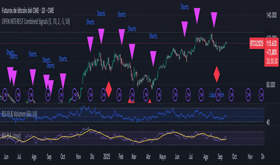
Liquidation Detector, Short and Long with Open InterestThe script analyzes three main pieces of data from each candle (or time bar): price, Open Interest (OI), and volume. It then uses that data to look for two distinct types of patterns and marks them on the chart for easy viewing.
CAN ONLY BE USED WITH STICKER BTC1! CME
Liquidation Detection:
What are you looking for? A sharp drop in Open Interest accompanied by a spike in volume.
What does it mean? This pattern indicates that a large number of positions (usually long) are being closed quickly, which can cause a sharp price drop. It's a signal of market capitulation that many traders use as a potential entry point.
Shorts Entry Detection:
What are you looking for? A price drop accompanied by an increase in Open Interest and a spike in volume.
What does it mean? This pattern shows that "new money" is entering the market to open short positions. It confirms a downtrend and suggests that the price drop has real strength behind it.
Marker: A purple triangle labeled "Shorts."
KA IntradiaKA Intradia plots the current session’s Daily Open and symmetric micro-percent bands above and below it. It shows price only (no percent labels) and anchors values on the left price scale for a clean, unobtrusive read. Levels refresh automatically at the first bar of each new day and work on any symbol or timeframe. Use them to gauge intraday bias, likely reaction zones, and momentum stretches at a glance. Optional alerts fire when price crosses any active band.

KA_anualKA_anual — Annual Open % Levels
KA_anual plots the current year’s opening price and fixed percentage bands every 10% up to ±130%. The levels update automatically at the first bar of each new year. Lines are tied to the price scale and shown only for the current year, so they move with your chart without cluttering past history. Use them to gauge momentum, potential support/resistance, and stretch zones at a glance. Works on any symbol and timeframe; no inputs required.

KA Pivot Estricto (5L/5R)Indicator Name: KA Pivot Estricto (5L/5R)
Description:
This indicator identifies strict pivot highs and pivot lows on any timeframe. A pivot high is plotted when the current candle is strictly higher than the previous N candles on the left and the next N candles on the right. A pivot low is plotted when the current candle is strictly lower than the previous N candles on the left and the next N candles on the right.
The script draws a red triangle above bars for pivot highs and a green triangle below bars for pivot lows. Both markers stay attached to the price candles (they move with the chart).
Features:
Customizable lookback period (left and right bars).
Option to require strict pivots (no equal highs/lows allowed).
Clean visual markers (triangles only, no text).
Works across all timeframes.
Use case:
This tool is useful for traders who want to spot swing highs and lows, confirm potential reversal points, or build strategies that depend on confirmed pivot structures.

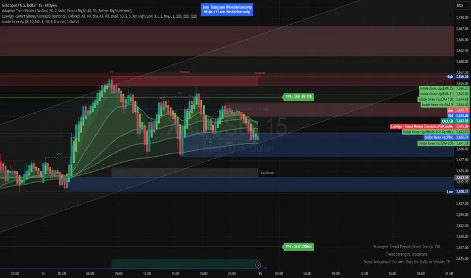
XAUUSD Combined Levels / The_lurkerXAUUSD Combined Levels to trade as support. XAUUSD Combined Levels to trade as support

inside forex vip📌 SuperTrend
Based on:
ATR Period (default 10).
Multiplier ATR (default 3).
Calculates the trend direction (upward/downward).
Generates buy/sell signals:
Buy: Positive crossover with EMA color matching (bullish).
Sell: Negative crossover with EMA color matching (bearish).