Candlestick analysis

HS:- HA+BIAS📝 Daily Bias + Heikin Ashi Step Line (Notes)
1️⃣ Indicator Purpose
Combines Daily Market Bias with Heikin Ashi Average
Displays HA average as a STEP LINE WITH BREAKS
HA line changes color based on bias
Works on any timeframe
Bias logic is always calculated from Daily data
2️⃣ Heikin Ashi Calculation
Uses Heikin Ashi candles internally
Does not change chart candles
Formula used:
HA Average = (HA Open + HA Close) / 2
Provides a smoother price reference than normal candles
3️⃣ Daily Reference Levels
Uses previous day:
High
Low
These levels define market structure
Fetched using Daily timeframe regardless of chart timeframe
4️⃣ Positive Bias Condition (Bullish)
Bias becomes POSITIVE only when both conditions are true:
Today Close > Previous Day High
Today Low > Previous Day Low
📌 Indicates strong bullish control
5️⃣ Negative Bias Condition (Bearish)
Bias becomes NEGATIVE only when both conditions are true:
Today Close < Previous Day Low
Today High < Previous Day High
📌 Indicates strong bearish control
6️⃣ Bias Hold Rule (Most Important)
Bias does NOT flip frequently
Bias remains unchanged until:
Both opposite conditions are satisfied
Prevents false signals during sideways markets
Bias Values:
+1 → Positive
-1 → Negative
0 → Neutral
7️⃣ Bias Memory Concept
Bias is stored using a state variable
Previous bias is carried forward when no condition is met
Ensures stable trend direction

ChoCh Pattern with Trading Levels + Candlestick PatternsBuilt for smart money traders and market structure enthusiasts, the ChoCh Pattern indicator identifies powerful Change of Character reversals with precision. Features intelligent swing point detection, automated risk-reward level plotting, and comprehensive performance tracking to optimize your trading edge in any market condition.
Smart Money Structure Detection - Identifies bullish and bearish Change of Character patterns based market structure analysis and Candlestick patterns Detection,Eliot Waves with T levels
Automated Entry & Exit Levels - Generates entry points with 4 customizable take-profit targets (TP1-TP4) and stop-loss placement based
Real-Time Performance Dashboard - Tracks hit rates for all TP levels, stop-loss statistics, and cumulative P&L across all signals
Visual Trade Management - Clear buy/sell arrows, color-coded level lines, and dynamic price labels for effortless trade execution
Traders seeking systematic risk management with multiple profit targets

RBR / DBR / RBD / DBD Pattern IdentifierThis strategy identifies price-action based continuation and reversal structures using the Rally–Base–Rally (RBR), Drop–Base–Rally (DBR), Rally–Base–Drop (RBD), and Drop–Base–Drop (DBD) patterns.
The logic is based on institutional price behavior, where strong impulsive moves are followed by a low-volatility base (consolidation) and then a confirmation move in the direction of continuation or reversal.
Strong candles represent aggressive participation (demand or supply).
Base candles represent absorption, order balancing, and accumulation/distribution.
Breakout candle confirms intent and directional bias.
Pattern Interpretation
RBR: Bullish continuation after consolidation
DBR: Bullish reversal after selling pressure
RBD: Bearish reversal after buying pressure
DBD: Bearish continuation after consolidation
Usage Guidelines
Best used in alignment with higher-timeframe trend and key supply/demand zones.
Suitable for intraday, swing, and positional trading, with timeframe-specific tuning.
Intended as a structure identification tool, not a standalone trading system.
Risk management, trend context, and confluence with other tools are essential before taking trades.

MATRIX AI Trading SystemMATRIX AI Trading System - Complete Trading Guidelines
Core Trading Strategy
Primary Entry Signals (Must Have)
BUY/SELL Arrow Signals - Your main entry trigger
Wait for the green "BUY" arrow (upward triangle) below the candle
Wait for the red "SELL" arrow (downward triangle) above the candle
These are generated by the MATRIX indicator when momentum shifts
AI Score Confirmation
Check the dashboard on the right side
LONG SCORE should be 55+ (preferably 70+) for buy entries
SHORT SCORE should be 55+ (preferably 70+) for sell entries
Green = Strong signal, Yellow/Orange = Moderate, Red = Weak
3-4 Key Confirmations (Use At Least 3)
Confirmation 1: Bollinger Bands (BB) Smooth Area
Best Entry Zones:
For BUY: Price touches or bounces from the lower BB band (blue line at bottom)
For SELL: Price touches or bounces from the upper BB band (blue line at top)
BB Status on Dashboard: Look for "Squeeze" followed by "Expansion" - this indicates volatility breakout
Avoid trading when: Price is in the middle of BB bands with "Normal" status
What to Look For:
Price rejection wicks at BB bands
Candle closes back inside the bands after touching outer band
BB width increasing (expansion phase)
Confirmation 2: RSI Divergence
Check Dashboard Row 9 (RSI):
Bullish Divergence: Look for "Bull Div" label on chart (green label near lows)
Price makes lower low, but RSI makes higher low
Strong reversal signal for BUY trades
Bearish Divergence: Look for "Bear Div" label on chart (red label near highs)
Price makes higher high, but RSI makes lower high
Strong reversal signal for SELL trades
Dashboard Signals:
RSI value shows in green when bullish (<30 zone)
RSI value shows in red when bearish (>70 zone)
"Bull Div" or "Bear Div" text appears in rightmost column
Confirmation 3: Fibonacci Golden Pocket
The Sweet Spot (0.618 - 0.786 retracement):
Yellow shaded zone between two orange lines
Dashboard Row 15 shows: "Inside" or "Outside"
Trading Rules:
BUY Setup: Price pulls back INTO golden pocket, then BUY arrow appears
SELL Setup: Price rallies INTO golden pocket from below, then SELL arrow appears
Best Entries: When price is "Inside" golden pocket + BUY/SELL arrow appears
Trend Continuation: Golden pocket acts as support in uptrends, resistance in downtrends
Confirmation 4: Support & Resistance
Check Dashboard Rows 16-17:
Support Level: Green horizontal line below price
Resistance Level: Red horizontal line above price
Dashboard shows "Near" or "Away"
Trading Rules:
BUY Priority: When dashboard shows "Near" support + BUY arrow
SELL Priority: When dashboard shows "Near" resistance + SELL arrow
Strongest Signals: Multiple touches of S/R level + rejection candles
Wait for confirmation: Don't trade until price clearly respects the level
Additional Power Confirmations
Confirmation 5: Fair Value Gap (FVG)
Visual Identification:
Green semi-transparent boxes = Bullish FVG (price gap up)
Red semi-transparent boxes = Bearish FVG (price gap down)
Small dotted line in the middle of each FVG zone
"FVG" label marks each gap
Trading Strategy:
BUY Setup: Price returns to fill bullish FVG (green box) + BUY arrow
SELL Setup: Price returns to fill bearish FVG (red box) + SELL arrow
Dashboard Row 14: Shows "FVG Up" or "FVG Dn"
FVG zones act as magnets - price often returns to fill them
Confirmation 6: CHoCH (Change of Character)
Structure Break Signals:
Green "CHoCH" label below candle = Bullish structure change
Red "CHoCH" label above candle = Bearish structure change
What It Means:
Market structure has shifted direction
Previous trend is weakening
Potential reversal or new trend beginning
Trading Application:
CHoCH + BUY arrow = Strong bullish reversal setup
CHoCH + SELL arrow = Strong bearish reversal setup
Look for CHoCH near support/resistance for highest probability
Complete Trade Setup Examples
PERFECT BUY SETUP (Use 3-4 Confirmations)
✅ BUY Arrow appears below candle (primary signal)
✅ LONG SCORE 70+ on dashboard (AI confirmation)
✅ Price at lower BB band or bouncing from it (BB confirmation)
✅ "Bull Div" label appears or RSI bullish (divergence confirmation)
✅ "Inside" golden pocket or near 0.618 Fib (Fibonacci confirmation)
✅ "Near" support on dashboard (S/R confirmation)
✅ Bullish FVG zone below or CHoCH green label (SMC confirmation)
Minimum Required: BUY Arrow + 3 of the above confirmations
PERFECT SELL SETUP (Use 3-4 Confirmations)
✅ SELL Arrow appears above candle (primary signal)
✅ SHORT SCORE 70+ on dashboard (AI confirmation)
✅ Price at upper BB band or rejecting from it (BB confirmation)
✅ "Bear Div" label appears or RSI bearish (divergence confirmation)
✅ "Inside" golden pocket or near 0.786 Fib (Fibonacci confirmation)
✅ "Near" resistance on dashboard (S/R confirmation)
✅ Bearish FVG zone above or CHoCH red label (SMC confirmation)
Minimum Required: SELL Arrow + 3 of the above confirmations
Trade Management
Entry Rules:
Wait for confirmation: Arrow + AI Score + minimum 3 confirmations
Best entries: 4+ confirmations aligned = highest probability
Avoid: Trading with only 1-2 confirmations (low probability)
Stop Loss (Automatic on Chart):
Red horizontal line shows your SL level
Based on recent swing high/low (20 periods)
Dashboard shows risk in pips
Take Profit Levels (Automatic on Chart):
TP1 (1:1 R:R): Green dashed line - First profit target
TP2 (2:1 R:R): Green dashed line - Second profit target
TP3 (4:1 R:R): Green solid line - Final profit target
Labels show exact prices, pips, and percentage gains
Position Sizing Strategy:
Close 50% at TP1 (secure profits)
Close 30% at TP2 (let winners run)
Close 20% at TP3 or trail stop (maximum gains)
Dashboard Quick Reference
Top Priority Rows to Check:
Row 1: LONG SCORE (need 55+, prefer 70+)
Row 2: SHORT SCORE (need 55+, prefer 70+)
Row 3-6: TP Hit Rate statistics
Row 8: Trend direction
Row 9: RSI + Divergence status
Row 12: BB status (Squeeze/Expansion/Normal)
Row 14: SMC status (OB/FVG indicators)
Row 15: Fib golden pocket (Inside/Outside)
Row 16-17: S/R proximity (Near/Away)
Row 20: Active trade status
Trading Psychology & Rules
High Probability Setups (Take These):
BUY/SELL arrow + AI Score 70+ + 4 confirmations = STRONG ENTRY
Multiple confluences at same price level = HIGH PROBABILITY
Trend direction + all indicators aligned = BEST TRADES
Low Probability Setups (Skip These):
Arrow appears but AI Score below 45 = WEAK SIGNAL
Only 1-2 confirmations = LOW PROBABILITY
Conflicting signals (bullish and bearish indicators mixed) = STAY OUT
"Sideways" trend + mixed signals = NO TRADE
Golden Rules:
Never trade without the BUY/SELL arrow
Always check AI Score first (must be 55+)
Wait for minimum 3 confirmations
Respect the automatic TP/SL levels
Check TP Hit Rate on dashboard (Row 3-6)
Trade with the trend (Row 8 on dashboard)
Quick Decision Flowchart
STEP 1: Did BUY/SELL arrow appear? → NO = Don't trade / YES = Continue
STEP 2: Is AI Score 55+? → NO = Skip trade / YES = Continue
STEP 3: Count your confirmations:
BB position (at bands?)
RSI Divergence (Bull/Bear Div label?)
Golden Pocket (Inside/Outside?)
S/R Proximity (Near support/resistance?)
FVG zone (price near gap?)
CHoCH label (structure break?)
STEP 4: Do you have 3+ confirmations? → NO = Wait / YES = ENTER TRADE
STEP 5: Set position size and follow automatic TP/SL levels
Success Tips
✅ Patience is key - Wait for all confirmations to align
✅ Quality over quantity - 2-3 high-probability trades better than 10 weak ones
✅ Trust the system - The AI calculates 11 different indicators
✅ Follow TP/SL strictly - They're calculated for optimal risk:reward
✅ Review dashboard - Check TP Hit Rate to see system performance
✅ Trade sessions - Best results during high volume trading hours
✅ Avoid news events - Major economic releases create unpredictable volatility

[EWT] HTF Candle Panel: Advanced Multi-Timeframe ProjectionOverview
The HTF Candle Panel is a high-performance utility designed for serious technical analysts who require real-time higher timeframe (HTF) context without the need to constantly switch tabs. This indicator renders a customizable panel of HTF candlesticks directly in the right margin of your current chart, allowing you to monitor the developing price action of a Daily, Weekly, or Hourly candle while navigating the lower timeframe (LTF) noise.
Key Features
Real-Time HTF Projection: Unlike standard static overlays, this script uses request.security with lookahead logic to ensure the most recent HTF candle updates tick-by-tick in sync with the live market.
Fully Customizable Interface:
Adjustable Timeframes: Switch between any interval (e.g., watching 1D candles on a 5m chart).
Dynamic Positioning: Use the Extra Right Margin Offset and Spacing inputs to perfectly position the panel in your chart's empty space.
Two Visual Styles: Choose between Standard (Wicks + Bodies) for a classic look or Box style for a cleaner, modern interface.
Smart Background Panel: An optional shaded "container" automatically scales to the High/Low of the projected period, providing a clear visual boundary for your HTF analysis.
Price Action Labels: Toggleable labels for the most recent HTF close prices with configurable positioning and colors.
Strategic Use Cases
1. ICT & CRT Trading (The "Internal vs. External" Perspective)
For traders following Inner Circle Trader (ICT) concepts or Core Range Theory (CRT), understanding where the "HTF Objective" lies is critical.
Identify HTF PD Arrays: Easily visualize HTF Order Blocks or Fair Value Gaps (FVGs) as they form on the Daily or 4H level while you look for entries on the 1m or 5m.
Bias Confirmation: Keep the Daily candle bias in your peripheral vision to ensure your LTF trend alignments are high-probability.
2. Multi-Timeframe (MTF) Analysis
MTF analysis is the backbone of professional trading. This indicator solves the "tunnel vision" problem by providing:
The "Micro-to-Macro" Bridge: See if a 15m bullish breakout is actually just a wick-rejection on a 4H candle.
Candle Close Anticipation: Monitor the "Fullness" of an HTF candle to predict potential reversals or continuations before they happen on the lower timeframe.
How to Set Up
Right Margin: For the best experience, go to your Chart Settings > Canvas > Margin > Right and set it to 100 or higher. This provides the "future space" for the panel to reside.
Configuration: Use the Extra Right Margin Offset input to push the candles further right if they overlap with your current price action.
Developer Best Practices
Built on Pine Script v6, this script follows the KISS (Keep It Simple, Stupid) and DRY (Don't Repeat Yourself) principles. It is optimized for performance by executing drawing logic only on the most recent bar (barstate.islast), ensuring your chart remains lag-free even with multiple candles projected.

Stage Analysis & MinerviniScript with Stage Analysis and Minervini set data set ups
Candle stick colors:
Lime - Green candle with volume > 50day moving avg vol - Bullish
Yellow - Red or green candle with wick with volume > 50day moving avg vol - Bearish
Black - indecisive candle with volume
Table has the moving averages, ATR, ADR, minervini set ups.
Swing highs and swing lows are printed to identify the latest stop loss markers for swing traders who follow Stan Weinstein stage analysis method of stop loss management
Volume labels and markers are present in the candle if applicable.

SMC Market Structure Analysis Indicator v1.0SMC Market Structure Analysis Indicator v1.0
OVERVIEW
A Pine Script v6 indicator implementing Smart Money Concepts (SMC) for automated market structure analysis. Designed to identify institutional trading patterns through systematic detection of structure breaks, inducement sweeps, and price imbalances.
CORE FEATURES
Market Structure Detection
- BOS (Break of Structure): Trend continuation signal triggered when close price breaks confirmed structure points
- CHoCH (Change of Character): Trend reversal signal triggered when close price breaks protection levels
- Swing Point Labels: Automatic labeling of HH, HL, LL, LH
Inducement (IDM)
- Detects liquidity sweeps to confirm valid structure points
SMC Structure Lines
- Connects confirmed swing points to visualize market waves
Fair Value Gap (FVG)
- Detects price imbalances with Inside Bar filtering
- Tracks fill status with automatic extension stop
Potential Levels
- Displays pending BOS/CHoCH trigger levels as dashed lines
TECHNICAL SPECIFICATIONS
Pine Script Version: v6
Confirmation Method: Close-based (No Repainting)
Inside Bar Filtering: Global
ADVANTAGES
- No Repainting: All confirmations based on close prices
- Noise Filtering: Inside Bars globally ignored
- Fully Configurable: Every visual element can be customized

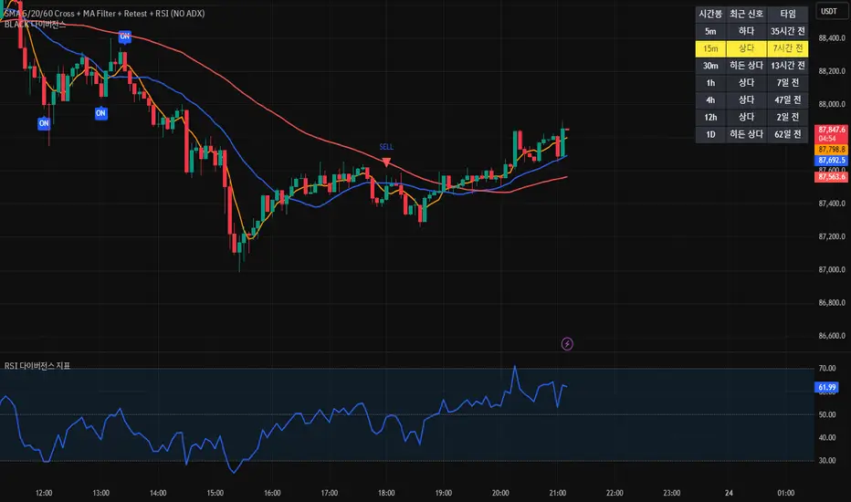
[BLACK] DivergenceDivergence
RSI Filter
EMA Filter
Unconfirmed Divergence Display
Confirmed Unconfirmed Alerts
Boards by Timeframe
다이버전스
RSI필터 EMA필터
미확정 다이버전스 표시
확정 미확정 얼러트
각 시간봉 다이버전스 보드
Squeeze + ADX + TTM [V6]Execution speed: The TradingView engine processes v6 scripts much faster.
Stability: By using standard functions like ta.sma or ta.linreg, the indicator is less prone to calculation errors on lower timeframes.
Clarity: I've reorganized the ADX calculation within a function to make it more readable if you decide to modify it later.
Volume Flow Bubbles [SunnyAlgo]# Volume Flow Bubbles
## What This Indicator Shows
This indicator visualizes **order flow** by displaying buy and sell volume as colored bubbles directly on your chart. It uses Lower Timeframe (LTF) data to show granular volume activity within each candle.
Perfect for **scalping** and **intraday trading** on any timeframe including Range bars.
---
## How to Read the Bubbles
### Colors
- **Green bubbles** = Buying pressure (bulls absorbing at lows)
- **Red bubbles** = Selling pressure (bears distributing at highs)
### Size
Bubble size reflects volume magnitude:
| Size | Volume Level |
|------|--------------|
| Huge | ≥70% of bar's max volume |
| Large | 40-70% |
| Normal | 20-40% |
| Small | 10-20% |
| Tiny | <10% |
### Position
- Buy bubbles appear **near the low** of each LTF candle (where buyers stepped in)
- Sell bubbles appear **near the high** (where sellers distributed)
---
## Entry Signals
### LONG Signal (▲)
Appears when ALL conditions align:
1. **Imbalance** - Price breaking out of consolidation
2. **Bullish trend** - EMA 9 > EMA 21
3. **Big buy print** - Large green bubble (volume > 3x average)
4. **CVD rising** - Cumulative Volume Delta confirms buying
### SHORT Signal (▼)
Appears when ALL conditions align:
1. **Imbalance** - Price breaking down
2. **Bearish trend** - EMA 9 < EMA 21
3. **Big sell print** - Large red bubble
4. **CVD falling** - Cumulative Volume Delta confirms selling
---
## Order Flow Patterns
| Pattern | What You See | Meaning |
|---------|-------------|---------|
| Absorption | Large green bubbles at lows, price holds | Buyers defending level - look for longs |
| Distribution | Large red bubbles at highs, price stalls | Sellers offloading - look for shorts |
| Breakout | Mostly green bubbles, increasing size | Strong buying momentum |
| Breakdown | Mostly red bubbles, increasing size | Strong selling momentum |
| Balance | Mixed small bubbles, no dominant color | Consolidation - wait for breakout |
---
## Settings Guide
### Lower Timeframe Settings
| Your Chart | Recommended LTF |
|------------|-----------------|
| 5 min | 1 min |
| 15 min | 1-3 min |
| 1 hour | 5-15 min |
| Range bars | 1 min |
### Key Parameters
- **Max Bubbles Per Bar** - Increase for more detail, decrease for cleaner charts
- **History Bars** - How many bars back to display bubbles
- **Big Print Threshold** - Sensitivity for detecting large volume (default 3x)
- **Balance Threshold** - ATR multiplier for detecting consolidation
- **Imbalance Multiplier** - ATR multiplier for detecting breakouts
---
## Alerts
6 built-in alerts available:
- Long Entry Signal
- Short Entry Signal
- Bullish Imbalance
- Bearish Imbalance
- Big Buy Print
- Big Sell Print
---
## Tips for Best Results
1. **Look for size clusters** - Multiple large bubbles at same price = institutional interest
2. **Watch color dominance** - More green = buyers winning, more red = sellers winning
3. **Combine with support/resistance** - Bubbles at key levels are more significant
4. **Use on liquid markets** - Works best on high-volume instruments
5. **Enable "Bring to Front"** - In TradingView visual settings for best bubble visibility
---
## How It Works
The indicator fetches lower timeframe candle data and splits each candle's volume into:
- **Buy Volume** = (Close - Low) / (High - Low) x Volume
- **Sell Volume** = (High - Close) / (High - Low) x Volume
This approximates order flow based on where price closed within the candle range.
---
*Created by SunnyAlgo*

Option ScalperUpdate: A good indicator must be able to detect what type of current market is: trending, range bound, or whipsawing. Based upon market type, signals should be either short living, long lasting or avoided at all. This is what this current updated version does best.

MNQ Reversal Signals (HP/MP) + Traffic Light Regime FilterWhat we’re building
A 1-minute MNQ overlay indicator that does two things:
Generates trade signals (Long/Short) using a structured “reversal + confirmation” logic, plus optional filters.
Decides if we’re allowed to trade at all using a simple Traffic Light regime gate (GREEN / ORANGE / RED).
The goal is to only participate when conditions are favorable, avoid forcing trades, and keep decision-making consistent.
What we want to achieve
A rules-based system that:
Waits for high-quality setups (reversal-style signals, not random chop).
Uses a market regime filter to avoid trading during impulse / chaos.
Produces clear, repeatable entries: HP / MP Long or Short.
Enforces strict discipline: no “coerced” trades, no “I think it’ll work” entries.
Signal logic (V36-style structure)
1) Standard trend signal (EMA crossover)
Fast EMA (9) vs Slow EMA (21):
Long signal = fast crosses above slow
Short signal = fast crosses below slow
Optional RSI filter:
Longs require RSI above threshold
Shorts require RSI below threshold
2) Reversal signals (the ones we actually care about)
These are pattern + location + confirmation signals:
Mid-Probability (MP) Reversal
Long MP: deep pullback below slow EMA + hammer-type candle + EMAs bearish (fast < slow)
Short MP: deep extension above slow EMA + shooting-star-type candle + EMAs bullish (fast > slow)
High-Probability (HP) Reversal
HP is MP plus confirmation:
Long HP: after an MP long, the next 3 candles hold the low
Short HP: after an MP short, the next 3 candles hold the high
So HP = “reversal happened” + “market proved it didn’t immediately fail.”
Traffic Light gate (the trade permission system)
This block measures volatility regime + impulse behavior using:
ATR vs ATR baseline (volatility regime)
True Range vs TR baseline (impulse / expansion)
Count of recent TR expansion events over a rolling window (default 50 bars)
Colors mean:
GREEN (LFG): conditions stable enough to trade
ORANGE (OKISH): tradeable, but not perfect
RED (BAD): impulse / unstable → we do nothing
Our trading rule with the traffic light:
✅ We only take trades when Traffic Light is GREEN or ORANGE.
❌ We do not trade on RED.
❌ We don’t trade the “L” ever. (No “always-on”/baseline entries—only the defined MP/HP signals)
The execution rule-set (how we behave)
We do not chase.
We do not force entries (“coerced trades” are banned).
We wait for the system to print a valid setup:
MP Long / HP Long OR MP Short / HP Short
AND Traffic Light = GREEN or ORANGE
If it’s RED: no trade, even if a signal appears.
That’s it: signal + permission. No improvisation.
Educational Use Only — Not Financial Advice
This script/indicator is provided for educational and informational purposes only. It is not financial, investment, trading, tax, or legal advice, and nothing here should be interpreted as a recommendation to buy, sell, or hold any security, futures contract (including MNQ), options, crypto, or any other instrument.
Risk Warning: Trading involves substantial risk and you may lose some or all of your capital. Past performance is not indicative of future results. Any examples or “signals” are hypothetical and may not reflect real-world execution, slippage, commissions, liquidity, outages, or data-feed differences.
No Guarantees: This script may produce false, delayed, missing, or inaccurate signals due to market conditions, chart settings, timeframe differences, data quality, broker feeds, platform limitations, or coding constraints. It is provided “AS IS” without warranties of any kind.
Your Responsibility: You are solely responsible for all trading decisions, risk management, order placement, and compliance with applicable laws/rules.
Limitation of Liability: To the maximum extent permitted by law, the author/creator disclaims any liability for any losses or damages (including trading losses, lost profits, indirect or consequential damages) arising from the use of or reliance on this script.
By using this script, you acknowledge and accept this disclaimer.

Price Range CHoCH Alert🎯 Smart Money Concept (SMC) indicator that monitors a specific price level and alerts only when price touches that level AND
subsequently creates a Change of Character (CHoCH).
Key Features:
• Set a custom price level to monitor
• Detects CHoCH/BOS based on pivot highs/lows
• Alerts ONLY when: Price touches level → CHoCH occurs
• Visual confirmation with level line and status table
• Configurable tolerance for precise level targeting
• Works for both bullish and bearish scenarios
Perfect for:
✓ Institutional level trading
✓ Key support/resistance breakouts
✓ Liquidity grab confirmations
✓ Structure break validation
Simply set your target price level and let the indicator watch for the perfect SMC setup!

The Strat Candle Labels & Color Inc F2D F2UThis script uses TheStrat candle numbers 1, 2D, 2U, 3 and places the text below or above. I have also now added the Failed 2D/2U labels. You can also change the text size. This also allows you to change the colors of the candles with two options for the 1 & 3 so you can color them in the direction they are going. For example a 1 that is green can be green and a 1 that is red can be red.

Manipulation Candle 15mManipulation Candle
The Manipulation Candle 15m indicator is designed to highlight potential market manipulation or exhaustion moves on the 15-minute chart by identifying large impulsive candles relative to the Daily ATR and fading them contrarian-style.
This tool is especially useful for index futures, SPX options, and high-liquidity instruments where sharp moves often precede mean reversion.
How It Works -
The script monitors completed 15-minute candles
It measures the candle body size (open → close)
That body is compared to a user-defined percentage of the Daily ATR (set to 20%)
When a candle exceeds the threshold, it is considered an impulse / manipulation candle
Signal Logic (Contrarian Bias) -
Bearish impulse candle → LONG signal
Indicates aggressive selling that may be exhausted
Bullish impulse candle → SHORT signal
Indicates aggressive buying that may be overextended
Signals are only generated once per completed 15-minute candle to avoid repainting.
Inputs -
Daily ATR Length
Controls how volatility is measured
Impulse Threshold (% of ATR)
Defines how large a candle must be (relative to Daily ATR) to trigger a signal
Best Use Cases
Mean-reversion and fade strategies
SPX / ES / NQ / YM indices
Important Notes
This is not a standalone system
Works best with context, confirmation, and risk management
Designed to identify potential turning points, not trend continuation
Created by: @aaronrileycheer
Timeframe: 15-Minute
Style: Contrarian / Mean Reversion
Turtle MTF Donchian plus ATR What you’re looking at
This indicator is a Turtle-style breakout system:
Donchian Channels = breakout levels (entry signals)
ATR = how far to place your Stop Loss and Take Profit (or Donchian exit if you turn that on)
And it can do it on a different timeframe than your chart (MTF).
Step-by-step: how it works
1) You choose your “Signal Timeframe”
In settings:
Signal Timeframe = 1 → signals are based on 1 minute
5 → based on 5 minute
60 → 1 hour
D → daily
✅ You can be on a 1m chart but set signals to D if you want only swing signals.
2) It builds the Donchian breakout levels
It calculates:
Donchian High = the highest high of the last entryLen candles (default 20), excluding the current candle
Donchian Low = the lowest low of the last entryLen candles, excluding current candle
Those two lines are your breakout “walls”.
3) It waits for a REAL breakout (fresh cross)
A long setup triggers only when:
price crosses ABOVE the Donchian High (not just stays above)
A short setup triggers only when:
price crosses BELOW the Donchian Low
✅ This reduces spam signals.
4) It calculates ATR on the same signal timeframe
ATR is volatility. Bigger ATR = bigger stop/target.
Defaults:
ATR length = 20
5) It creates your Entry / SL / TP levels automatically
When a LONG triggers:
Entry = Donchian High
Stop Loss = Entry − (SL mult × ATR)
(default SL mult is 2 → so 2×ATR stop)
Take Profit (if you’re using TP mode) = Entry + (TP mult × ATR)
When a SHORT triggers:
Entry = Donchian Low
Stop Loss = Entry + (SL mult × ATR)
Take Profit = Entry − (TP mult × ATR)
6) It prints it on the chart (easy mode)
When a signal happens it will:
Drop a label that says LONG or SHORT
Show the numbers:
Entry
SL
TP (or Donchian exit level)
Draw horizontal lines for Entry / SL / TP (latest signal only)
7) It can use “true Turtle exit” if you want
If you turn ON:
Use Turtle Exit Rule
Then it does NOT use a fixed TP.
Instead it says:
Long: exit when price breaks below the Donchian exit low (default exitLen = 10)
Short: exit when price breaks above the Donchian exit high
That’s the classic “let winners run” vibe.
8) Alerts (Option A)
You can set alerts for:
Turtle Long
Turtle Short
Those alerts are simple and reliable (no dynamic text).
How YOU would use it (quick examples)
If you trade 1m intraday
Chart: 1m
Signal Timeframe: 1
Try entryLen: 40–60 (less choppy than 20)
ATR: 14–20
SL: 2×ATR
If you want daily swings too
Chart: 1m (for execution)
Signal Timeframe: D (for direction/entries)
That gives you swing breakouts while you watch intraday.

Gaps IdentifierThis indicator identifies up and down Gaps using previous period's close price to the next period's open price. Potentially useful for Gap rebound strategies.
(Will identify gaps 4%–11% by default; can change in settings)

MACD Classic MT5 Style (2 Lines + Histogram)MACD Classic MT5 Style (แบบ MetaTrader 5) มีความแตกต่างจาก MACD ทั่วไปที่ใช้กันใน TradingView พอสมควรครับ นี่คือคำอธิบายว่ามันทำงานอย่างไรและอ่านค่าอย่างไรครับ:
1. ความแตกต่างสำคัญ (Key Difference)
MACD ทั่วไป (Standard):
มี 2 เส้น (เส้น MACD และ เส้น Signal)
ฮิสโตแกรม (แท่งกราฟ) คือ ส่วนต่าง (Gap) ระหว่าง 2 เส้นนั้น
MACD แบบ MT5 (Classic MT5):
เส้น MACD จะถูกวาดออกมาเป็น แท่งกราฟ (Histogram) แทนที่จะเป็นเส้น
เส้น Signal จะเป็น เส้น (Line) สีแดงพาดผ่านแท่งกราฟ
สรุปคือ: ในแบบ MT5 แท่งกราฟคือตัวพระเอก (MACD) ส่วนเส้นคือตัวช่วยกรอง (Signal)
Here is the English translation of the explanation:
MACD Classic MT5 Style vs. Standard MACD
The "Classic MT5 Style" MACD differs significantly from the standard MACD typically found on TradingView. Below is an explanation of its mechanics and how to interpret it.
1. Key Differences
Standard MACD (TradingView Default):
Displays 2 Lines (MACD Line and Signal Line).
The Histogram represents the difference (gap) between those two lines.
MT5 Style MACD (Classic):
The MACD value is plotted as a Histogram (bars) instead of a line.
The Signal Line appears as a standard Line (usually red) overlaying the histogram.
In summary: In the MT5 style, the Histogram represents the actual MACD Line, while the separate line acts as the Signal filter.

new Relative Strength Index by weidalunThis indicator is a technical analysis tool designed for testing and internal research purposes.
It primarily utilizes price action and momentum shifts to assist in assessing market structure.
This script is intended solely for personal and small-scale internal testing.


The Strat: 3-2D Setup Label + Entry, Target & AlertsThis is an indicator that identifies the 3-2D setup based on TheStrat & will alert you if you have this on the chart. Once the 3-2D setup happens this will give you the entry, target and price labels. You can change the font size, label colors and add optional alerts.

3 EMA IndicatorThis indicator is a combination og three EMA's
This indicator is a combination og three EMA's
This indicator is a combination og three EMA's
This indicator is a combination og three EMA's
This indicator is a combination og three EMA's
