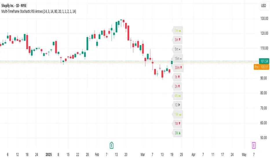
Multi-Timeframe Stochastic RSI ArrowsMulti-Timeframe Stochastic RSI Arrows Indicator by The Venetian
Dear Moderators before you torch me alive theres nothing groundbreaking just very handy indicator for some users.
This indicator provides traders with a jet fighter-style heads-up display for market momentum across multiple timeframes. By displaying Stochastic RSI directional arrows for 12 different timeframes simultaneously, it offers a comprehensive view of market conditions without requiring multiple chart windows.
How It Works
The indicator calculates the Stochastic RSI for each of 12 common timeframes (1m to 3M) and represents directional movements with intuitive arrows:
- ▲ Green up arrow = Rising momentum
- ▼ Red down arrow = Falling momentum
- ◄► Yellow horizontal arrows = Flat/sideways momentum
- ► Gray right arrow = Just peaked (crossed above overbought)
- ◄ Gray left arrow = Just bottomed (crossed below oversold)
Each timeframe's status appears with its label (e.g., "1m ▲") in a clean, vertically-stacked display using ATR-based spacing to maintain consistent visual appearance regardless of price scale.
Key Features
- ATR-Based Spacing : Uses Average True Range to maintain consistent distances between labels even as chart scale changes
- Multi-Timeframe Analysis: Easily spot divergences and confluences across timeframes (1m, 3m, 5m, 15m, 30m, 1h, 2h, 4h, 1D, 1W, 1M, 3M)
- Sensitivity Control: Adjust flat detection sensitivity to filter out noise
- Customisable Appearance: Modify arrow size, vertical spacing, and show/hide timeframe labels
- Overbought/Oversold Detection: Highlights when momentum has peaked or bottomed at extreme levels
- Trading Applications
- Trend Alignment: Quickly identify when multiple timeframes align in the same direction
- Divergence Detection: Spot when shorter timeframes begin to shift against longer ones
- Entry/Exit Timing: Use crossovers of significant timeframes as potential signals
- Market Context: Maintain awareness of the bigger picture while trading shorter timeframes
This indicator doesn't break new ground technically but excels in presenting complex multi-timeframe information in a clean, actionable format — much like a pilot's heads-up display provides critical information at a glance. The ATR-based positioning ensures consistent visibility across different instruments and market conditions.
Great effort has been made for this script to adhere to TradingView's Pine Script house rules and focuses on trader usability rather than introducing novel technical concepts.
HUD
Price AltimeterThis indicator should help visualize the price, inspired by a Digital Altimeter in a Pilots HUD.
It's by default calibrated to Bitcoin, with the small levels showing every $100 and the larger levels setup to display on every $1000. But you can change this to whatever you want by changing the settings for: Small and Large Level Increments.
The default colors are grey, but can be changed to whatever you want, and there are two cause if you want they work as a gradient.
There are options to fade as the values go away from the current price action.
There are options for Forward and Backward Offsets, 0 is the current price and each value represents a candle on whatever time frame your currently on.
Other Options include the Fade Ratio, the Line Width and Style, which are all self explanatory.
Hope you Enjoy!
Backtest it in fast mode to see it in action a little better...
Known Issues:
For some reason it bug's out when either or are displaying more than 19 lines, unsure why so its limited to that for now.
Extra Note on what this may be useful for: I always wanted to make this, but didn't realize how to put things in front of the price action... Offset! Duh! Anyways, I thought of this one because I often it's hard on these charts to really get an idea for absolute price amounts across different time frames, this in an intuitive, at a glance way to see it because the regular price thing on the right always adds values between values when you zoom in and you can sometimes get lost figuring out the proportions of things.
Could also be useful for Scalping?
[HuD] Yearly High Low1. Indicator will display highest and lowest price level within yearly period.
- Highest Yearly Price = green line
- Lowest Yearly Price = red line
2. User also has an option to display Monthly high and low level.
- Monthly Highest Price = Blue Line
- Monthly Lowest Price = Orange Line

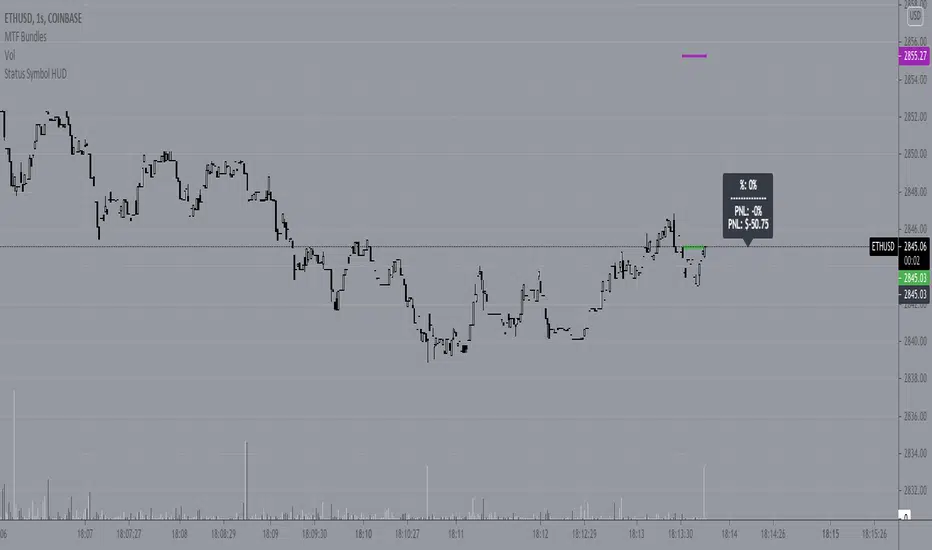
Status Symbol HUD***THIS IS NOT A TECHNICAL INDICATOR*****
***THIS IS A HUD (HEADS UP DISPLAY)*******
***TV MADE ME CHOOSE AN INDICATOR CATEGORY****
This is a Status HUD designed to be overlaid your live chart to help you keep track of important information regarding your current position as well as provide 'quick-glimpse' tools and information to help you make quicker, more informed decisions in the moment.
The HUD consist of a small label plotted to the right side of price action keeping your viewing area clean and clear.
The following inputs allow you to customize the information to suit your needs;
AE
This is the Average Entry of your trade. It is assumed that you have calculated this out on your own using external methods. If this is for a single buy-in/buy-out trade, this will just be your entry price
R
This is the percentage of your balance that you currently have in the open trade. This number also needs to be computed using external sources. If you are only interested in keeping track of the status of a single position as an isolated trade apart from your entire balance, you would enter 1 here.
AX
If you are scaling or laddering in and out of a position, this is how you would keep track of your average exit price, This also needs to be calculated externally.
BAL
Input your total balance here if this trade is used against your larger portfolio, this allows for live %PNL calculations on your balance as a whole.
SL
This the real price % you are comfortable allowing price to drop before exiting the position. Currently, the HUD does not calculate SL for you so you will need to calculate your own SL based on your portfolio risk and enter that number here. Future versions will have this baked in, however.
Fees
This is assumed to be a 'one-way' fee. For my personal use I am normally the taker, and my fees are relatively constant. Put in the one-way fee here and the HUD will double that number when necessary to account for 'round-trip' break even points and more accurate SL and target plots.
SPEC
The HUD also has a small selection of 'speculative' tools that can assist in quick information gathering and decision making. By selecting the first check box, this will show or hide the spec dialogue. This spec information appears in the same label as the main info.
Adjusted Average Entry Projection
One powerful feature of the HUD is that by inputting the amount of your next buy-in, you can see a live indicator showing the approximate location that your new average entry will be. This can be very helpful when trying to decide if it is worth employing DCA strategies or if you should simply cut and run.
STEP is a variable that plots the small grey lines above your entry. These are 5 targets, evenly spaced according to this variable. The default is 50, which means the grey target lines show you the price points equivalent to $50, $100, $150, $200, and $250 profit. These targets are fairly accurate when accounting for fees as well, meaning that the $50 target painted here is a REAL $50 with all fees covered!
By selecting the Spec SL box you will show/hide the speculative stop loss projection. This is a small black cross that prints under the current price. This represents your described SL as a function of current price. In other words, if you were to take a new trade at the current price, it shows you where your desired stop will be. This projection is an estimate and does NOT account for fees. It also will NOT work with DCA strategies. It is currently ONLY for new trades. Once you have entered a trade, it is better to turn this off. Future updates will include dynamic projections that account for fees. ;)
HUD Offset is the number of candles forward you wish to displace the HUD interface. If set to 0, the info box will be directly over the current candle.
The info that is on the HUD is as follows;
% = total %the trade has moved since your entry
PNL = Your personal PNL on balance
PNL (line 2) = Your personal PNL as real dollars
---------
MU = the makeup required for a negative trade. This calculates how far UP price must travel to make up the current lost percent. Because the makeup % is not always intuitively related to the loss percent, this can sometimes be handy. For instance, if price is down 20% from entry, you will need almost 26% increase from current price to reach your break even point.
Visual Tools that are plotted are as follows;
Green line = Trade Entry
Red line = SL
Purple Line = Break-even point for fees
Grey lines = profit targets based on 'STEP' increment
HuD AQV BursaPersonal Experiment
Indicator based on Donchian Channel and ATR
Blue Dot = Entry Point
Red Dot = Stop Loss
Green Dot = Breakout Candle
Orange Triangle = Uptrend Confirmation
Entry
- only entry if it suit your risk
- Entry at the beginning of uptrend is a good entry
Stop Loss
- Stop Loss calculation are based on 100 lot shares
- Risk calculation at Info panel
Take Profit (TP)
- TP calculation as followed :
Range = Close Price - Stop Loss
TP1 = Close Price + ( 1 x Range )
TP2 = Close Price + ( 2 x Range )
TP3 = Close Price + ( 3 x Range )
Note :
EP = Entry price / Trigger price
CP = Close Price
SL = Stop Loss
Risiko = ( CP - SL ) x 100 lot

Target Painter [BVCC]Another addition to the "HUD series'. This is not an indicator in the sense that it is attempting to provide OHLCV data in some new way. Instead, this is a tool designed to help you quickly place visual references on your chart of a current position. It is easy enough to paint an entry, Target, and SL with the long position tool on TV, but if you have multiple targets it can be a pain to work with 2 or 3 of these and especially if you are trying to work quickly or just want a minimalistic way to see your references of entry, targets, and SL, this can help.
simply input your entry and up to 3 targets along with a stop loss and it will plot them for you and then you can set alarms on the indicator itself to alert you to price changes.
entry and all targets can be input in sats and if you enable 'auto sat calculation' then you can just enter in a whole number and it will do the math for you. so, .000374 sats can be entered as 374 - Yes, it can differentiate between .000374 and .00000374. no matter what the actual decimal place needed, you only need to enter the whole number.
Enter Stop Loss as a whole number percent. So, if you want a 10% SL on the order, just put '10' in the Stop Loss input box. As with the other recent indicators in this series, this is a quick and dirty prototype allowing me to deploy it in the real world to see how it works and what improvements could be made.
please comment here or come talk to me in my telegram channel for more ideas, suggestions and improvement ideas or indicator ideas of your own you would like to see!

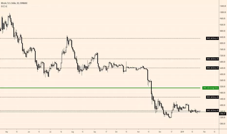
Average Entry [BVCC]Allow for input of up to 5 different entry prices and will calculate and print your average entry.
Choose 'auto calculate sat value' to input whole numbers for btc entries (e.g. input 292 instead of .00000292)
Simply deselect this option if working with a different base pair (ETH, USD, BNB and so on)
You will also need to manually select the number of entries that you are tracking from the selection box at the top of the dialogue.
It will show your entries as dotted black lines and will plot your average entry as a large green line.
If you partially exit a position, I believe you can manually subtract the number of coins sold from the lowest entry, once it is at 0, you can then move to the next lowest to continue subtracting coins. I am not 100% sure on this, so please let me know in the comments or otherwise contact me for suggestions or improvements you would like to see. This is just a proof of concept so that I can get something working in the real world and tweak it from there.