stelaraX - MFIstelaraX – MFI
stelaraX – MFI is a volume-weighted momentum oscillator that combines price movement and trading volume to measure buying and selling pressure. Unlike pure price-based oscillators, the Money Flow Index incorporates volume, making it especially useful for identifying strength behind price moves.
This indicator is part of the stelaraX ecosystem, focused on clean technical analysis and AI-supported chart evaluation
stelarax.com
Core logic
The Money Flow Index is calculated using the typical price (HLC3) and volume over a user-defined lookback period.
The calculation distinguishes between positive and negative money flow and converts the result into an oscillator ranging from 0 to 100.
Key components include:
* MFI value between 0 and 100
* overbought threshold to identify excessive buying pressure
* oversold threshold to identify excessive selling pressure
High MFI values indicate strong inflows of capital, while low values indicate capital outflows.
Visualization
The script plots:
* the MFI line in a separate indicator pane
* a configurable overbought level
* a configurable oversold level
The area between overbought and oversold levels is visually highlighted, allowing quick recognition of extreme money flow conditions.
Use case
This indicator is intended for:
* identifying overbought and oversold conditions with volume confirmation
* spotting potential reversals driven by volume imbalance
* confirming price trends with underlying money flow
* divergence analysis between price and volume-based momentum
* filtering trades based on participation strength
For traders who want to combine price action with volume-aware, AI-driven chart analysis, additional tools and insights are available at stelarax.com
Disclaimer
This indicator is provided for educational and technical analysis purposes only and does not constitute financial advice or trading recommendations. All trading decisions and risk management remain the responsibility of the user.
מדד זרימת כסף (MFI)

Money Flow Index - MFI🎯 Overview
This is an advanced Money Flow Index - MFI indicator that combines volume-weighted momentum analysis with dynamic moving average filtering. Unlike basic MFI implementations, this version features gradient overbought/oversold zones, multiple color themes, and a clear signal dashboard for precise money flow identification.
🧩 Core Components
1. ⚙️ Technical Foundation
📊 Primary Calculation: Uses TradingView's built-in ta.mfi() function which incorporates both price and volume data
📈 Dual Analysis Components:
MFI Line: Volume-weighted momentum oscillator
MA Filter: Customizable moving average acting as dynamic signal line
Threshold Zones: Gradient fills for overbought and oversold conditions
⚡ Volume Integration: Unique ability to combine price action with trading volume for more reliable signals
2. 🎛️ Configuration Parameters
📏 MFI Length: Default 14 periods (standard setting)
🔄 MA Filter Settings:
Length: Customizable (default 365 periods)
Type: 6 options available (EMA, SMA, RMA, WMA, VWMA, HMA)
🎨 Color Themes: 5 visual schemes consistent with your indicator suite:
Classic, Modern, Robust, Accented, Monochrome
📊 Signal Interpretation:
🟢 BULLISH: MFI > MA Filter (money flow above trend)
🔴 BEARISH: MFI < MA Filter (money flow below trend)
⚠️ OVERBOUGHT: MFI > 80 (potential reversal zone)
⚠️ OVERSOLD: MFI < 20 (potential reversal zone)
3. 🎨 Visual Elements
🚨 Gradient Zones:
Overbought zone : Red gradient intensifying toward 100
Oversold zone : Green gradient intensifying toward 0
📋 Dashboard Display: Top-right status indicator showing "⬆️ Bullish" or "⬇️ Bearish"
📊 Dynamic Coloring: MFI line changes color based on position relative to MA
⚡ Trading Applications
📈 Primary Uses:
🎯 Money Flow Direction:
MFI > MA = Bullish money flow regime
MFI < MA = Bearish money flow regime
💪 Trend Strength with Volume Confirmation:
MFI considers both price movement AND volume
Higher volume moves have more significance
Validates price trends with volume support
🚨 Extreme Zone Signals:
Overbought: MFI > 80 (potential sell opportunity)
Oversold: MFI < 20 (potential buy opportunity)
📊 Zone Analysis:
🔴 Overbought Zone :
Red gradient fills
Indicates excessive buying pressure
Watch for bearish reversals
🟢 Oversold Zone :
Green gradient fills
Indicates excessive selling pressure
Watch for bullish reversals
🟡 Equilibrium: Yellow MA line acts as volume-weighted trend filter
🎨 Customization Options
👁️ Display Features:
📊 Dual Components: Always shows both MFI line and MA filter
🎨 Gradient Visualization: Automatic fill for overbought/oversold conditions
📋 Status Dashboard: Clear bullish/bearish money flow indication
📈 Customizable MA: Choose from 6 different moving average types
🎨 Visual Themes: (Consistent suite)
🎨 Classic: Green/Red (traditional volume-weighted colors)
🚀 Modern: Cyan/Purple (contemporary)
💪 Robust: Amber/Deep Purple (high contrast)
🌈 Accented: Purple/Magenta (vibrant)
⚫⚪ Monochrome: Light Gray/Dark Gray (minimalist)
🔔 Alert System
🟢 LONG Alert: Triggers when MFI crosses above MA
🔴 SHORT Alert: Triggers when MFI crosses below MA
📧 Format: Includes ticker symbol for tracking
⚡ Key Advantages
✅ Strengths:
🎯 Volume-Weighted Accuracy: Combines price and volume for more reliable signals
💪 Overbought/Oversold Filter: Built-in 80/20 thresholds with gradient visualization
👁️ Clear Trend Identification: MA filter separates noise from meaningful money flow
🔄 Flexible Configuration: Multiple MA types for different trading styles
📊 Professional Dashboard: Immediate money flow status recognition
📊 Optimal Settings:
⚡ Short-term Trading: MFI Length 10-14, MA Length 20-50
📊 Medium-term Trading: MFI Length 14-20, MA Length 50-100
📈 Long-term Trading: MFI Length 20-30, MA Length 100-365
🏆 Unique Features:
🎯 Volume Integration: The only oscillator in your suite that includes volume data
📊 Gradient Thresholds: Visual intensity shows proximity to extremes
🎨 Consistent Design: Matches your indicator family aesthetics
📋 Money Flow Dashboard: Quick visual confirmation of volume trends
🔧 Dual Analysis: Combines oscillator with dynamic trend filter
🔄 Trading Strategies
1. Basic Money Flow Strategy:
Go LONG when MFI crosses above MA from oversold
Go SHORT when MFI crosses below MA from overbought
Exit when opposite extreme is reached
2. Divergence Detection:
Price makes higher high, MFI makes lower high → Bearish divergence (selling pressure weakening)
Price makes lower low, MFI makes higher low → Bullish divergence (buying pressure increasing)
3. Volume Confirmation:
Strong trend + rising MFI = High conviction move
Weak trend + declining MFI = Potential reversal
📈 Performance Tips
Volume Matters: MFI is most effective in markets with consistent volume
Extreme Zones: levels often act as support/resistance for the indicator
Divergence Signals: More reliable than simple overbought/oversold readings
Trend Alignment: MFI above MA in uptrend, below MA in downtrend
Confirmation: Combine with price action at key support/resistance levels
This enhanced MFI indicator provides professional-grade volume-weighted analysis with intuitive visualization, allowing traders to identify money flow trends, spot potential reversals at extremes, and filter signals through the customizable moving average for higher accuracy trading decisions! 📊💰

Blockcircle Global Central Bank Balance Sheet and Money SupplyOVERVIEW
This indicator aggregates money supply (M2) and central bank balance sheet data from the world's largest economies into a single, unified view of global liquidity conditions. Rather than manually tracking dozens of separate data feeds or building your own aggregation logic, you get a ready-to-use tool that pulls from FRED, TradingView Economics, and real-time FX rates to convert everything into USD terms automatically.
Global liquidity has historically served as a leading indicator for risk assets. When central banks expand their balance sheets and the money supply grows, capital tends to flow into equities, crypto, and other risk-on assets. When liquidity contracts, markets often follow. This indicator gives you that macro context directly on your chart.
The global liquidity movement (expansionary or contractionary) often leads to asset price appreciation/depreciation in CRYPTOCAP:BTC , SP:SPX , etc
WHAT MAKES IT ORIGINAL AND DIFFERENT
Combines both M2 money supply AND central bank balance sheet data in one place, whereas most existing tools focus on only one metric
Aggregates 11 economies for M2 (USA, EU, China, Japan, UK, Canada, India, Russia, Brazil, Australia, Switzerland) and 10 central banks for balance sheet data
Automatically handles currency conversion using live FX rates so all values display in USD
Includes a dedicated US Net Liquidity calculation (Fed Balance Sheet minus Reverse Repo minus TGA) which filters out temporary distortions that other aggregate tools ignore
Provides granular country by country breakdown in the information table so you can identify which central banks are driving the aggregate trend
Offers four moving average types (SMA, EMA, WMA, RMA) for trend smoothing with configurable length
HOW IT WORKS
The indicator requests monthly M2 data from TradingView's Economics feeds for each included country. Central bank balance sheet data is pulled the same way. All non-USD values are converted using daily FX rates from major currency pairs. The script then sums these converted values to produce the Global M2 and Global CBBS lines.
For US liquidity specifically, the script pulls weekly data for the Reverse Repo Program (RRP) and Treasury General Account (TGA) from FRED. Net Liquidity is calculated as: Fed Balance Sheet minus RRP minus TGA. This formula removes funds parked in reverse repos and Treasury cash balances, showing what is actually circulating in the financial system.
KEY FEATURES
Global M2 Money Supply line tracking 11 major economies with individual toggles for each country
Global Central Bank Balance Sheet line tracking 10 central banks with individual toggles
US-specific components, including Reverse Repo, TGA, and Net Liquidity as separate plot lines
Moving average overlays with selectable type and length for identifying trend direction
Fill the option between M2 and CBBS lines to visualize the gap between money supply and central bank assets
Value labels at line endpoints showing current readings and period-over-period percentage change
Comprehensive information table with optional country breakdown view
Full color customization for all lines, configurable line width, and style options
Alert conditions for significant M2 and CBBS changes plus MA crossover signals
HOW TO USE
Add to any chart and observe the overall direction of global liquidity. Rising lines generally support risk on positioning, while declining lines suggest caution
Watch for divergences between the M2 and CBBS lines. If money supply grows faster than central bank assets, private credit may be expanding. If CBBS rises faster, central banks are actively injecting liquidity
Use the US Net Liquidity line to understand short term dollar liquidity conditions separate from longer term global trends
Enable moving averages to filter noise and identify when liquidity trends are changing direction
Toggle individual countries on or off in the settings to see how specific regions contribute to the total
Reference the information table for exact values and percentage changes without leaving your chart
SETTINGS BREAKDOWN
Table Settings: position, text size, and whether to show the country breakdown
Display Settings: toggle visibility for each line, fill area, value labels, percent labels, and the info table
Line Styling: customize colors for each metric, adjust line width, and select solid, dashed, or dotted style
Moving Average: enable or disable MA overlays for M2 and CBBS, select MA type, and set length
Global M2 Countries: individually enable or disable each of the 11 economies
US Liquidity Components: toggle RRP and TGA data
Global CBBS Countries: individually enable or disable each of the 10 central banks
Alerts: set percentage threshold for change based alerts
IMPORTANT CONSIDERATIONS
Data updates depend on the publication schedule of each source. M2 and CBBS data are typically monthly with some delay. US Fed Balance Sheet, US RRP and US TGA update weekly
FX conversion uses daily close rates which may introduce minor discrepancies during volatile currency periods
Some emerging market data may have longer reporting lags than developed market data
Hope you find it useful and impactful to your trading and investment decisions! If you have any questions at all, please just ask, happy to help

Smart Money Flow Signals [QuantAlgo]🟢 Overview
The Smart Money Flow Signals indicator synthesizes significant volume-price dynamics through multi-component analysis to identify potential accumulation and distribution phases driven by substantial market participants. It combines Money Flow Index momentum, Chaikin Money Flow accumulation patterns, volume-weighted price momentum, and buying/selling pressure metrics into a unified composite oscillator that quantifies periods of concentrated capital movement, helping traders and investors identify conditions where significant volume participants may be actively positioning across multiple market conditions and timeframes.
🟢 How It Works
The indicator's core methodology lies in its weighted composite approach, where multiple volume-price components are calculated sequentially and then integrated to create a comprehensive significant flow activity signal.
First, the Money Flow Index (MFI) is calculated to measure buying and selling pressure by incorporating volume into price momentum analysis:
raw_money_flow = source * volume
positive_flow = source >= source ? raw_money_flow : 0
negative_flow = source < source ? raw_money_flow : 0
positive_money_flow = math.sum(positive_flow, mfi_period)
negative_money_flow = math.sum(negative_flow, mfi_period)
money_flow_index = 100 - 100 / (1 + positive_money_flow / negative_money_flow)
This creates an RSI-style momentum indicator that tracks whether money (price × volume) is flowing into or out of the asset, with values ranging from 0 to 100 where readings above 50 suggest buying pressure dominance.
Then, Chaikin Money Flow (CMF) is computed to evaluate accumulation and distribution by analyzing where prices close within each bar's range, weighted by volume:
money_flow_multiplier = high != low ? (close - low - (high - close)) / (high - low) : 0
money_flow_volume = money_flow_multiplier * volume
volume_sma = ta.sma(volume, trend_period)
chaikin_money_flow = volume_sma != 0 ? ta.sma(money_flow_volume, trend_period) / volume_sma : 0
Positive CMF values indicate accumulation (closes near the high of the range), while negative values indicate distribution (closes near the low of the range), with volume weighting emphasizing periods of significant participation.
Next, Volume Analysis is performed to quantify current volume intensity relative to historical averages:
volume_average = ta.sma(volume, trend_period)
volume_strength = volume_average != 0 ? volume / volume_average : 1
volume_weight = math.log(volume_strength + 1)
The logarithmic transformation creates a volume weight that amplifies signals during high-volume periods while preventing extreme volume spikes from overwhelming the composite calculation.
Following this, Buy/Sell Pressure is quantified by comparing cumulative volume during bullish versus bearish candles:
buying_pressure = math.sum(volume * (close >= open ? 1 : 0), trend_period)
selling_pressure = math.sum(volume * (close < open ? 1 : 0), trend_period)
pressure_ratio = (buying_pressure - selling_pressure) / (buying_pressure + selling_pressure) * 100
This creates a directional pressure ratio that reveals whether significant participants are predominantly buying or selling, expressed as a percentage between -100 (all selling) and +100 (all buying).
Then, Volume-Weighted Momentum is calculated through an exponential smoothing channel that adjusts price deviation based on volume intensity:
exponential_smooth_average = ta.ema(source, momentum_channel_period)
deviation = ta.ema(math.abs(source - exponential_smooth_average), momentum_channel_period)
channel_index = deviation != 0 ? (source - exponential_smooth_average) / (0.015 * deviation) * (1 + volume_weight * 0.5) : 0
This channel index measures how far price has deviated from its exponential average relative to typical deviation, with the volume weight multiplier (1 + volume_weight * 0.5) amplifying the signal when significant volume accompanies the price movement.
Finally, the Composite Wave is constructed by combining all components with specific weighting to create the final oscillator:
momentum_wave = ta.ema(channel_index, trend_period)
money_flow_wave = (money_flow_index - 50) * 1.2
chaikin_flow_wave = chaikin_money_flow * 100
composite_wave = momentum_wave * 0.5 + chaikin_flow_wave * 0.3 + money_flow_wave * 0.2
smoothed_wave = ta.sma(composite_wave, signal_smoothing)
This creates a multi-dimensional volume flow oscillator that combines price-volume momentum, accumulation-distribution patterns, and buying-selling pressure into a single signal, providing traders with probabilistic insights into periods of concentrated market activity and directional bias based on weighted component convergence.
🟢 Signal Interpretation
▶ Positive Values (Above Zero, Green): Composite money flow above equilibrium indicating net accumulation pressure, positive buying volume dominance, and bullish volume-price alignment = Favorable conditions for long positions, significant capital flowing into the asset = Buy/hold opportunities
▶ Negative Values (Below Zero, Red): Composite money flow below equilibrium indicating net distribution pressure, negative selling volume dominance, and bearish volume-price alignment = Unfavorable conditions for long positions, significant capital flowing out of the asset = Sell/short opportunities
▶ Extreme Overbought Zone: Excessive bullish money flow indicating potential accumulation exhaustion, where buying pressure may have reached unsustainable levels with elevated reversal risk = Caution on new longs, potential distribution phase beginning, profit-taking zone for existing positions
▶ Extreme Oversold Zone: Excessive bearish money flow indicating potential distribution exhaustion, where selling pressure may have reached unsustainable levels with elevated reversal risk = Caution on new shorts, potential accumulation phase beginning, buying opportunity zone for contrarian entries
▶ Smoothed Trend Line (White) Alignment: When the smoothed trend line confirms the composite wave direction, it validates the underlying volume-price trend and filters false signals caused by short-term noise
▶ Volume Intensity Correlation: Gradient intensity (color saturation) reflects combined wave strength, volume participation, and directional alignment, where darker/more saturated colors indicate stronger concentrated activity and higher-probability directional moves
🟢 Features
▶ Preconfigured Presets: Three optimized parameter configurations accommodate different trading styles, timeframes, and market analysis approaches.
1. "Default" provides balanced volume flow measurement suitable for swing trading on 4-hour and daily charts, offering moderate responsiveness to money flow shifts with standard RSI-equivalent MFI period and moderate smoothing for most market conditions.
2. "Fast Response" delivers heightened sensitivity optimized for active intraday trading and scalping on 1-minute to 1-hour charts, using compressed calculation periods across all components and minimal smoothing to capture rapid volume flow changes and quick trend shifts as they develop, ideal for early entry/exit opportunities with acceptance of increased signal frequency during consolidation.
3. "Smooth Trend" offers conservative extreme identification ideal for position trading and long-term analysis on daily to weekly charts, employing extended periods across all money flow components with substantial smoothing to filter short-term noise and isolate only strong, sustained accumulation and distribution phases driven by significant volume participants.
▶ Built-in Alerts: Seven alert conditions enable comprehensive automated monitoring of significant money flow transitions and extreme market states.
1. "Bullish Flow" triggers when the composite wave crosses above zero, signaling the shift from distribution to accumulation and concentrated buying activity beginning.
2. "Bearish Flow" activates when the composite wave crosses below zero, signaling the shift from accumulation to distribution and concentrated selling activity starting.
3. "Any Flow Direction Change" provides a combined notification for either bullish or bearish crossover regardless of direction, useful for general money flow momentum shifts.
4. "Extreme Overbought" alerts when the composite wave reaches or exceeds the overbought threshold (default +60), indicating excessive buying pressure and potential exhaustion.
5. "Extreme Oversold" notifies when the composite wave reaches or falls below the oversold threshold (default -60), indicating excessive selling pressure and potential capitulation.
6. "Overbought Reversal" triggers specifically when the wave crosses back down through the overbought level after being extended, signaling the beginning of distribution from extreme levels.
7. "Oversold Reversal" activates when the wave crosses back up through the oversold level after being extended, signaling the beginning of accumulation from extreme levels.
▶ Color Customization: Six visual themes (Classic, Aqua, Cosmic, Ember, Neon, plus Custom) accommodate different chart backgrounds and visual preferences, ensuring optimal contrast and immediate identification of bullish versus bearish volume flow conditions across various devices and screen sizes. Optional bar coloring provides instant visual context of current significant volume activity intensity and direction without switching between the price pane and indicator pane, enabling traders and investors to immediately assess volume-price positioning dynamics while analyzing price action.

MB-MACD## Description
**MB-MACD** is a custom Pine Script indicator designed to enhance momentum analysis by combining a volume-based "Main Buy Ratio" (MB) calculation with a traditional MACD oscillator. The MB Ratio estimates institutional buying pressure by apportioning volume based on the candle's range and close position, providing a unique proxy for "smart money" flow. This smoothed MB value is then used as the source for MACD computation, allowing for divergence detection between price action, the MB line, and the MACD Histogram.
Key features include:
- **MB Line**: A histogram-style plot showing smoothed buy/sell ratio, colored bullishly (teal) or bearishly (pink) based on direction.
- **MACD Histogram**: Standard MACD applied to the MB source, with optional smoothing.
- **Divergence Detection**: Identifies bullish and bearish divergences on both the MB line and MACD Histogram, with configurable filters for momentum decay and zero-line alignment.
- **Visualization Options**: Display divergence lines and labels in the indicator pane or synced as an overlay on the main chart for better context.
- **Alerts**: Triggers for bullish or bearish divergences to notify users of potential reversal setups.
This indicator is particularly useful for swing traders and momentum followers looking to spot hidden divergences that may signal trend reversals or continuations. It emphasizes risk management by highlighting where price and momentum decouple, but remember: divergences are probabilistic signals and should be confirmed with other tools.
As this is a community-shared script, I encourage users to test it thoroughly and provide feedback. If you spot any bugs, calculation errors, or improvements (e.g., edge cases with low-volume symbols or performance issues on certain timeframes), please comment below or reach out—your input helps refine it for everyone!
## User Manual
### Introduction
The **MB-MACD** indicator integrates volume analysis with MACD to detect divergences in price and momentum. The core innovation is the "Main Buy Ratio" (MB), which approximates buying vs. selling volume within each bar based on its range and close position. This MB value is smoothed and fed into a MACD calculation, enabling divergence scans on both the MB line and the resulting MACD Histogram.
Divergences occur when price makes higher highs/lower lows, but the oscillator (MB or Histogram) fails to confirm—often signaling potential reversals. The script offers flexible display options, filters to reduce false positives, and alerts for real-time notifications.
**Important Notes:**
- This is not financial advice; use it for educational purposes and backtest on your symbols/timeframes.
- Works best on liquid stocks or indices with reliable volume data (e.g., daily or higher timeframes).
- Performance may vary on low-volume assets or during after-hours trading.
- If you encounter issues (e.g., no divergences detected or rendering errors), check your chart settings and report them in the comments for community debugging.
### Inputs Explanation
The inputs are grouped for ease of configuration. Adjust them via the indicator's settings panel in TradingView.
#### Core Parameters
- **Show MB Line** (Default: True): Enables/disables the MB Ratio histogram plot.
- **Show MACD Histogram** (Default: True): Enables/disables the MACD line and histogram plots.
- **MB Smoothing (SMA)** (Default: 10, Min: 1): Length for smoothing the raw MB Ratio using a Simple Moving Average (SMA). Higher values reduce noise but may lag.
- **Pivot Lookback Length** (Default: 5, Min: 2): Bars to look back/forward for detecting price pivots (highs/lows) used in divergence logic.
- **Max Lines Kept** (Default: 100, Min: 10): Limits the number of divergence lines/labels to prevent chart clutter.
#### Display Settings
- **Show Lines (Indicator Pane)** (Default: True): Draws divergence lines on the MB line in the indicator pane.
- **Show Labels (Indicator Pane)** (Default: True): Adds labels (e.g., "L" for line divergence) at divergence points in the pane.
- **Show Hist Divergence Lines** (Default: True): Draws dashed lines for MACD Histogram divergences in the pane.
- **Show Hist Divergence Labels** (Default: True): Adds labels (e.g., "H" for histogram divergence) in the pane.
- **Sync Lines to Main Chart (Overlay)** (Default: True): Mirrors divergence lines and labels onto the main price chart for context (slightly offset for visibility).
#### Filters & Tolerance
- **Peak Alignment Tolerance (Bars)** (Default: 5, Min: 0): Allows flexibility in matching oscillator peaks/valleys to price pivots (e.g., within ±5 bars).
- **Max Divergence Distance (Bars)** (Default: 20, Min: 5): Maximum bars between two pivots for a valid divergence; prevents detecting overly distant signals.
- **Enable Momentum Decay Filter** (Default: True): For Histogram divergences, requires the current peak/valley to have a smaller absolute value than the previous (indicating convergence/decay).
- **Enable Zero-Side Filter** (Default: False): Ensures both peaks/valleys in a divergence are on the same side of the zero line (e.g., both positive or both negative).
#### MACD Settings
- **MACD Fast Length** (Default: 12): Fast EMA length for MACD.
- **MACD Slow Length** (Default: 26): Slow EMA length for MACD.
- **MACD Signal Length** (Default: 9): Smoothing length for the MACD signal line.
- **MACD Source Smoothing** (Default: 3, Min: 1): Additional SMA smoothing applied to the MB Ratio before MACD calculation.
### How It Works
1. **MB Ratio Calculation**: For each bar, the script computes the position of the close within the high-low range (0-1). This scales the volume into "buy" and "sell" portions, then derives a net ratio (-100% to +100%). It's smoothed via SMA for the final MB line.
2. **MACD Application**: The (optionally smoothed) raw MB is used as the MACD source, producing a MACD line, signal line, and histogram.
3. **Pivot Detection**: Uses Pine's `ta.pivothigh`/`ta.pivotlow` to find price highs/lows over the lookback period.
4. **Divergence Scanning**:
- **Bearish (on Highs)**: Price makes a higher high, but MB/Hist makes a lower high.
- **Bullish (on Lows)**: Price makes a lower low, but MB/Hist makes a higher low (closer to zero).
- Scans nearby bars for oscillator matches and applies filters.
5. **Rendering**: Lines/labels are drawn in the indicator pane or overlaid on the chart. Colors: Teal for bullish, Pink/Maroon for bearish.
6. **Cleanup**: Automatically removes old lines/labels to stay under the max limit.
### Interpreting the Outputs
- **MB Line (Columns)**: Positive (teal) indicates net buying pressure; negative (pink) shows selling. Watch for crossovers above/below zero as momentum shifts.
- **MACD Histogram (Area)**: Green/teal for positive momentum; red/maroon for negative. Widening bars suggest strengthening trends; narrowing indicates weakening.
- **Divergence Lines/Labels**:
- Solid lines: MB line divergences (thicker, labeled "L").
- Dashed lines: Histogram divergences (thinner, labeled "H").
- Bullish: Teal lines sloping up (potential bottom reversal).
- Bearish: Pink lines sloping down (potential top reversal).
- **Overlay on Chart**: Lines connect price pivots (or offset slightly for Histogram). Use this to visualize how divergences align with candlesticks.
- **Zero Line**: Gray horizontal line; divergences filtered by side if enabled.
**Example Usage**:
- On a daily stock chart, enable overlays and watch for a bullish "L" or "H" label near a price low—could signal a buy if confirmed by volume breakout.
- In a downtrend, bearish divergences on highs might warn of further downside.
### Alerts
- **Bullish Divergence (L or H)**: Triggers on any detected bullish divergence (MB or Histogram).
- **Bearish Divergence (L or H)**: Triggers on bearish divergences.
- Set up via TradingView's alert menu: Select the indicator, choose the condition, and customize the message (e.g., includes ticker).
### Troubleshooting / Known Issues
- **No Divergences Shown**: Increase "Peak Alignment Tolerance" or reduce filters. Ensure pivot length suits your timeframe (shorter for intraday).
- **Too Many Lines/Labels**: Lower "Max Lines Kept" or increase "Max Divergence Distance" to filter distant signals.
- **Performance on Low-Volume Symbols**: MB Ratio may be unreliable; test on high-volume assets first.
- **Rendering Errors**: If lines don't appear, check chart zoom or ensure "force_overlay=true" isn't conflicting with other indicators.
- **NaN/Undefined Values**: Rare on live data but possible in historical backtests; report with symbol/timeframe for fixes.
### Feedback and Contributions
This script is open for community improvement! If you find bugs (e.g., false positives in divergences, calculation edge cases, or UI glitches), or have suggestions (like additional filters or visualizations), please share in the comments. Your feedback helps make it better—let's debug and enhance it together!

777 mean reversion engineA guy asked his librarian if they had any books on "paranoia." She leaned in and whispered, "They're right behind you." He hasn't been back to the library since.

3D Isometric MFI (Christmas Edition) [Kodexius]3D Isometric MFI (Christmas Edition) is a visual-first interpretation of the classic Money Flow Index, rendered as a projected 3D-style ribbon using an isometric mapping. Instead of plotting a standard oscillator line, the script reconstructs recent MFI history as a depth-aware ribbon that moves from back to front, producing a layered perspective effect that helps you read momentum shifts, regime transitions, and relative strength changes as a continuous structure.
This Christmas Edition was also built for fun and as a creative seasonal experiment. The goal is to keep the underlying indicator logic familiar, while presenting it in a playful, “3D showroom” style that looks great in a separate oscillator panel.
The indicator is designed for presentation quality and chart readability. It uses controlled object management (lines, polylines, labels) and renders only the most recent portion of the MFI history (user-defined depth). A decorative snow background effect adds atmosphere.
🔹 Features 🎄
🔸 Isometric 3D Projection Engine
The ribbon is produced by projecting 3D points (time offset, MFI value, depth) into 2D chart coordinates.
- X represents bar offset into history
- Y represents the MFI value
- Z introduces depth and perspective
Angle controls the projection direction, and Vertical Zoom scales the perceived amplitude.
🔸 Depth-Limited Ribbon Rendering (Back to Front)
Only the most recent History Depth values are drawn to keep performance and readability stable.
- Each segment connects two consecutive MFI values
- A top edge, bottom edge, and filled face are drawn to simulate thickness
- Older segments fade into the background
🔸 Dynamic Gradient Coloring + Depth Fade
Ribbon color follows a value-based gradient:
- Lower values lean red (risk-off pressure)
- Higher values lean green (risk-on pressure)
- Mid values blend naturally
Transparency increases with depth so older history is less dominant but still readable.
🔸 Tip Label (Value + Candy Marker) 🍭🍬
The most recent ribbon tip displays current MFI value.
A candy symbol that switches based on the 50 midpoint
The label is offset so it does not cover the ribbon tip.
🔸 Projected Reference Grid (80, 50, 20)
A projected grid is drawn at classic MFI reference levels to improve orientation:
- 80 Overbought reference
- 50 Midpoint reference
- 20 Oversold reference
These grid lines use the same projection math, so they stay aligned at any angle or zoom.
🔸 Seasonal Snow Background Effect ❄️
Randomized snow is rendered behind the ribbon using lightweight labels. This is purely decorative and does not alter MFI values or logic.
🔸 Object Lifecycle Management
Because 3D-style drawing uses many objects, the script manages them explicitly by storing references in arrays, deleting old objects, and redrawing on the last bar. This helps prevent visual stacking artifacts and keeps the panel clean.
🔹 Calculations
1) Money Flow Index Computation
The script separates “positive” and “negative” money flow based on the direction of change in the selected source, then converts their ratio into the standard 0 to 100 oscillator. Classic MFI Calculations.
calc_mfi(int length, float source) =>
float upper = math.sum(volume * (ta.change(source) <= 0 ? 0 : source), length)
float lower = math.sum(volume * (ta.change(source) >= 0 ? 0 : source), length)
float mfi = 100.0
if lower != 0
float r = upper / lower
mfi := 100 - (100 / (1 + r))
mfi
Interpretation:
upper accumulates volume-weighted source values on up moves
lower accumulates volume-weighted source values on down moves
if lower is zero, MFI defaults to 100 to avoid division errors
otherwise, MFI is computed from the ratio transform
2) History Buffer Management
The current MFI value is pushed into the front of an array every bar. The array is trimmed to History Depth so rendering stays bounded.
array.unshift(ctx.history_val, mfi_curr)
if ctx.history_val.size() > depth
ctx.history_val.pop()
3) 3D Point Model and Ribbon Thickness
Each segment is built from four projected points to form a filled face (a simple quad). A small thickness is applied to create the “ribbon” look, and depth is used to simulate perspective.
4) Isometric Projection to Chart Coordinates
3D points are mapped into chart coordinates with an angle rotation and scaling for zoom and depth.
method project(Point3 p, int anchor_bar, float angle_rad, float zoom, float z_scale) =>
float x_world = -float(p.x) * 2.0
float z_val = p.z * z_scale
float screen_x_offset = (x_world * math.cos(angle_rad)) - (z_val * 1.0)
float screen_y_offset = (p.y * zoom) + (x_world * math.sin(angle_rad)) * 0.5
int final_x = anchor_bar + int(math.round(screen_x_offset))
float final_y = screen_y_offset
chart.point.from_index(final_x, final_y)
5) Gradient and Depth Transparency
Color is derived from MFI value via a gradient, and transparency increases with segment depth so recent data remains dominant while older context stays visible.
6) Projected Reference Grid Construction
The 80, 50, 20 levels are drawn as dotted segments across the same historical span, using the same projection and depth fade logic for consistent alignment.
🎆 Wishing you a great year ahead 🎄✨
May your charts be clear, your risk be controlled, and your next year be filled with health, peace, and good trades. Happy Holidays and Happy New Year.

Participation-Weighted Orderflow Bubbles (HTF / LTF Context ToolThis indicator visualizes participation-weighted market pressure by aggregating lower-timeframe price and volume data into higher-timeframe context bubbles. It is designed to help identify directional dominance, balance, and absorption across timeframes. This is a context and bias tool, not a trade signal generator.
What the indicator shows
Each bubble represents a single chart bar, built from lower-timeframe candles.
Total Notional
Aggregated volume multiplied by price from lower-timeframe candles.
Buy / Sell Proxies
Lower-timeframe candles are classified based on where they close within their range:
– Close near the high → buy-side proxy
– Close near the low → sell-side proxy
– Middle of the range → neutral
Delta (USD and %)
Buy proxy notional minus sell proxy notional, expressed as both absolute USD delta and percentage of total notional.
Bubble colors
Green
Buy-side participation dominance.
Sell color (user configurable)
Sell-side participation dominance. The default is chosen for visibility on bearish candles and can be changed in settings.
Grey
Balanced participation. Indicates two-way trade, consolidation, or auction.
Yellow (Absorption)
High notional with limited price movement, suggesting potential absorption or distribution.
Coloring uses both relative dominance (delta percentage) and absolute dominance (minimum delta in USD), which improves behavior on higher timeframes.
Bubble size and visuals
Bubble size scales with total notional.
HD glow layers adapt automatically by timeframe.
Bubbles are drawn in front of candles for clarity.
Optional text displays delta and total notional.
Hovering over a bubble shows detailed information including total notional, buy/sell/neutral proxies, delta values, absorption status, and the number of lower-timeframe candles used.
Timeframe behavior
The indicator is designed to work across multiple timeframes. On higher timeframes, more grey bubbles are expected due to natural auction and balance behavior. Colored bubbles on higher timeframes represent sustained participation rather than short-term momentum. Visual density and performance are automatically adjusted on higher timeframes.
How to use it
Recommended workflow:
1. Higher timeframe (1H, 4H, Daily)
Use the bubbles to identify dominant buy or sell participation, balance zones, and absorption near highs or lows.
2. Lower timeframe (5m, 15m)
Take trades in alignment with the most recent higher-timeframe dominance. Be cautious or range-focused inside higher-timeframe balance zones. Use structure and price action for entries.
What this indicator is not
This indicator does not show true bid/ask data.
It does not display actual market versus limit orders.
It does not replace a DOM or exchange orderflow feed.
It should not be used as a standalone entry signal.
The indicator works within TradingView’s available data and provides a probabilistic, participation-weighted view of market pressure rather than true tape or orderflow data.
Best practices
Use a 1-minute lower timeframe for best results.
Avoid setting the lower timeframe too high relative to the chart timeframe.
Combine this tool with structure, levels, and session context.
Treat grey bubbles as information about balance, not as noise.
This tool is intended for traders who want better context and bias, not more signals.

MFI Volume Profile [Kodexius]The MFI Volume Profile indicator blends a classic volume profile with the Money Flow Index so you can see not only where volume traded, but also how strong the buying or selling pressure was at those prices. Instead of showing a simple horizontal histogram of volume, this tool adds a money flow dimension and turns the profile into a price volume momentum heat map.
The script scans a user controlled lookback window and builds a set of price levels between the lowest and highest price in that period. For every bar inside that window, its volume is distributed across the price levels that the bar actually touched, and that volume is combined with the bar’s MFI value. This creates a volume weighted average MFI for each price level, so every row of the profile knows both how much volume traded there and what the typical money flow condition was when that volume appeared.
On the chart, the indicator plots a stack of horizontal boxes to the right of current price. The length of each box represents the relative amount of volume at that price, while the color represents the average MFI there. Levels with stronger positive money flow will lean toward warmer shades, and levels with weaker or negative money flow will lean toward cooler or more neutral shades inside the configured MFI band. Each row is also labeled in the format Volume , so you can instantly read the exact volume and money flow value at that level instead of guessing.
This gives you a detailed map of where the market really cared about price, and whether that interest came with strong inflow or outflow. It can help you spot areas of accumulation, distribution, absorption, or exhaustion, and it does so in a compact visual that sits next to price without cluttering the candles themselves.
Features
Combined volume profile and MFI weighting
The indicator builds a volume profile over a user selected lookback and enriches each price row with a volume weighted average MFI. This lets you study both participation and money flow at the same price level.
Volume distributed across the bar price range
For every bar in the window, volume is not assigned to a single price. Instead, it is proportionally distributed across all price rows between the bar low and bar high. This creates a smoother and more realistic profile of where trading actually happened.
MFI based color gradient between 30 and 70
Each price row is colored according to its average MFI. The gradient is anchored between MFI values of 30 and 70, which covers typical oversold, neutral and overbought zones. This makes strong demand or distribution areas easier to spot visually.
Configurable structure resolution and depth
Main user inputs are the lookback length, the number of rows, the width of the profile in bars, and the label text size. You can quickly switch between coarse profiles for a big picture and higher resolution profiles for detailed structure.
Numeric labels with volume and MFI per row
Every box is labeled with the total volume at that level and the average MFI for that level, in the format Volume . This gives you exact values while still keeping the visual profile clean and compact.
Calculations
Money Flow Index calculation
currentMfi is calculated once using ta.mfi(hlc3, mfiLen) as usual,
Creation of the profileBins array
The script creates an array named profileBins that will hold one VPBin element per price row.
Each VPBin contains
volume which is the total volume accumulated at that price row
mfiProduct which is the sum of volume multiplied by MFI for that row
The loop;
for i = 0 to rowCount - 1 by 1
array.push(profileBins, VPBin.new(0.0, 0.0))
pre allocates a clean structure with zero values for all rows.
Finding highest and lowest price across the lookback
The script starts from the current bar high and low, then walks backward through the lookback window
for i = 0 to lookback - 1 by 1
highestPrice := math.max(highestPrice, high )
lowestPrice := math.min(lowestPrice, low )
After this loop, highestPrice and lowestPrice define the full price range covered by the chosen lookback.
Price range and step size for rows
The code computes
float rangePrice = highestPrice - lowestPrice
rangePrice := rangePrice == 0 ? syminfo.mintick : rangePrice
float step = rangePrice / rowCount
rangePrice is the total height of the profile in price terms. If the range is zero, the script replaces it with the minimum tick size for the symbol. Then step is the price height of each row. This step size is used to map any price into a row index.
Processing each bar in the lookback
For every bar index i inside the lookback, the script checks that currentMfi is not missing. If it is valid, it reads the bar high, low, volume and MFI
float barTop = high
float barBottom = low
float barVol = volume
float barMfi = currentMfi
Mapping bar prices to bin indices
The bar high and low are converted into row indices using the known lowestPrice and step
int indexTop = math.floor((barTop - lowestPrice) / step)
int indexBottom = math.floor((barBottom - lowestPrice) / step)
Then the indices are clamped into valid bounds so they stay between zero and rowCount - 1. This ensures that every bar contributes only inside the profile range
Splitting bar volume across all covered bins
Once the top and bottom indices are known, the script calculates how many rows the bar spans
int coveredBins = indexTop - indexBottom + 1
float volPerBin = barVol / coveredBins
float mfiPerBin = volPerBin * barMfi
Here the total bar volume is divided equally across all rows that the bar touches. For each of those rows, the same fraction of volume and volume times MFI is used.
Accumulating into each VPBin
Finally, a nested loop iterates from indexBottom to indexTop and updates the corresponding VPBin
for k = indexBottom to indexTop by 1
VPBin binData = array.get(profileBins, k)
binData.volume := binData.volume + volPerBin
binData.mfiProduct := binData.mfiProduct + mfiPerBin
Over all bars in the lookback window, each row builds up
total volume at that price range
total volume times MFI at that price range
Later, during the drawing stage, the script computes
avgMfi = bin.mfiProduct / bin.volume
for each row. This is the volume weighted average MFI used both for coloring the box and for the numeric MFI value shown in the label Volume .

Market Cipher With DivegencesAnother look into classic ;)
My take on Market Cypher with new money line and DIVERGENCES!!!
Enjoy!

Global M2 Money Supply (100+ countries, USD, Offset)Global M2 Money Supply:
-potentially 100+ countries - countries can be added in Script,
-USD, Offset
-offset in months can be manually adjusted to account for the time that i takes for liquidity to hit the market

Twiggs Go Money Flow Enhanced [KingThies]█ OVERVIEW
The Twiggs Money Flow (TMF) is a volume-weighted momentum oscillator that
measures buying and sellistng pressure by analyzing where price closes within
each bar's true range. It's an enhanced version of Chaikin Money Flow that
uses Wilder's smoothing method, providing better trend persistence and
smoother signals.
The indicator oscillates around a zero listne:
Values above zero indicate accumulation (buying pressure)
Values below zero indicate distribution (sellistng pressure)
TMF was developed by Colistn Twiggs as an improvement over traditional money
flow indicators by incorporating true range calculations and Wilder's
exponential moving average.
█ CONCEPTS
True Range Boundaries
TMF calculates a modified true range for each bar by comparing the current
bar's high and low with the previous close:
True Range High = maximum of (previous close, current high)
True Range Low = minimum of (previous close, current low)
This accounts for overnight gaps and ensures price continuity between bars.
Average Daily Value (ADV)
The ADV represents the portion of volume attributable to buying versus sellistng:
ADV = Volume × ((Close - TR Low) - (TR High - Close)) / True Range
When price closes near the high of the true range, ADV is positive and large.
When price closes near the low, ADV is negative and large.
A close in the middle produces values near zero.
Wilder's Moving Average
Unlistke simple moving averages, Wilder's smoothing method gives more weight
to recent values while maintaining memory of historical data:
WMA = (Previous WMA × (Period - 1) + Current Value) / Period
This creates smoother trends that are less prone to whipsaws than standard
moving averages.
Final Calculation
TMF = Wilder's MA(ADV, Period) / Wilder's MA(Volume, Period)
By dividing smoothed ADV by smoothed volume, TMF normalistzes the reading and
makes it comparable across different securities and timeframes.
█ HOW TO USE
Zero listne Crossovers
The most straightforward trading signals:
A cross above zero suggests buyers are gaining control.
Consider this a bullistsh signal, especially when confirmed by price action.
A cross below zero suggests sellers are gaining control.
Consider this a bearish signal.
The longer TMF remains above or below zero, the stronger the trend.
Extreme Values
Strong positive or negative readings indicate intense buying or sellistng pressure:
Sustained high positive values (above +0.4) suggest strong accumulation
but may also indicate overbought conditions.
Sustained low negative values (below -0.4) suggest strong distribution
but may also indicate oversold conditions.
These extremes work best when used in conjunction with price levels and
support/resistance zones.
Divergences
Divergences between price and TMF often signal potential reversals:
Bearish divergence: Price makes a higher high but TMF makes a
lower high — suggests buying pressure is weakening despite rising prices.
Bullistsh divergence: Price makes a lower low but TMF makes a
higher low — suggests sellistng pressure is weakening despite fallistng prices.
Trend Confirmation
Use TMF to confirm the strength of existing trends:
In an uptrend, TMF should remain mostly positive with occasional dips below zero.
In a downtrend, TMF should remain mostly negative with occasional rises above zero.
If TMF contradicts the price trend, consider the trend weak or potentially ending.
█ FEATURES
Period (default: 21)
The lookback length for Wilder's moving average calculation:
Shorter periods (10–15) make TMF more responsive to recent changes but
increase noise and false signals.
Longer periods (30–50) create smoother readings but lag price action more
significantly.
The default 21-period setting balances responsiveness with relistabilistty.
Consider adjusting the period based on your trading timeframe and the
volatilistty of the security you're analyzing.
█ LIMITATIONS
TMF is a lagging indicator due to its smoothing method. Signals may occur
after optimal entry or exit points.
In low-volume or illistquid markets, TMF can produce erratic readings that
may not reflect true buying or sellistng pressure.
Ranging or choppy markets often generate frequent zero-listne crosses that
can lead to whipsaws.
listke all volume-based indicators, TMF's relistabilistty depends on accurate
volume data.
For securities with unrelistable volume reporting, consider using
price-based momentum indicators instead.
█ NOTES
This indicator uses area-style plotting in the original version to visualistze
the magnitude of buying and sellistng pressure. The filled area makes it easy
to see at a glance whether the market is in accumulation or distribution mode.
TMF works on any timeframe but tends to be most relistable on daily charts
where volume data is most accurate and meaningful.
█ CREDITS
Original indicator developed by
LazyBear .
Based on the Twiggs Money Flow concept from Incredible Charts:
Incredible Charts – Twiggs Money Flow .

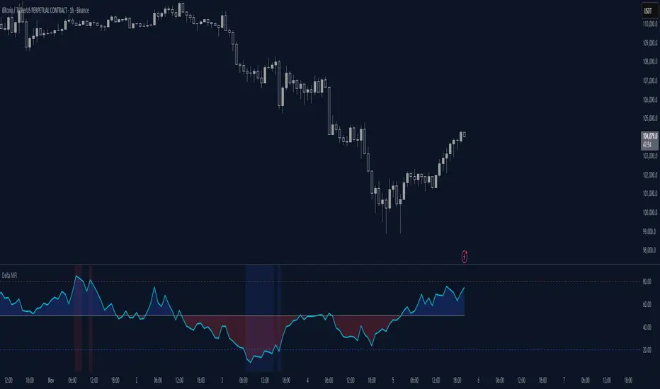
Delta Money Flow IndexThe Delta Money Flow Index is a modified version of the traditional Money Flow Index that uses directional volume instead of total volume to measure buying and selling pressure in a different way.
It helps traders identify overbought/oversold conditions based on actual buy/sell pressure rather than just total volume. It's designed for traders who want to see if price movements are backed by genuine buying or selling activity.
How to use it:
- Values above 80 indicate overbought conditions
- Values below 20 indicate oversold conditions
- The 50 level acts as a neutral zone. Above suggests buyers are in control, below suggests sellers are in control.
- Traders can check for divergences for potential reversal signals
- Works best on intraday timeframes where delta volume is most meaningful
What makes it different:
Unlike the standard MFI which uses total volume, the Delta MFI calculates an approximation of volume delta by assigning positive volume to up-closing candles and negative volume to down-closing candles.
This means:
- It focuses on directional pressure, not just activity
- Filters out low-conviction volume that doesn't move price
- Provides clearer signals when actual buying/selling dominates
The indicator includes visual aids like background colors for overbought/oversold and a fill showing whether the Delta MFI is above or below the 50 midpoint for quick interpretation.
Flow Control Oscillator (FCO)Flow Control Oscillator (FCO)
The Flow Control Oscillator (FCO) is a momentum-based indicator that combines volume analysis and money flow to determine who is in control of the market—buyers or sellers—and how strong that control is. Unlike pure price-based oscillators, FCO integrates both price action and volume distribution to provide a more complete picture of market dynamics.
How It Works
Core Components:
Money Flow Index (MFI) -
Scaled to -1 to +1 range
Measures the flow of money into and out of an asset
Identifies buying and selling pressure based on price and volume
Chaikin Money Flow (CMF) -
Already in -1 to +1 range
Measures the accumulation/distribution of volume
Shows whether volume is accumulating (buying) or distributing (selling)
Combined Flow Control Line (FCO Line) -
Equal-weighted composite of MFI and CMF
Smoothed with SMA (default: 3 periods)
Values above 0 = Buyers in control
Values below 0 = Sellers in control
Signal Line -
WMA of the FCO line (default: 6 periods)
Used for timing entries and confirming momentum shifts
Momentum Histogram-
Shows the rate of change in buyer/seller control
Weighted by ADX (Average Directional Index) when enabled
Larger bars = stronger momentum
ADX weighting filters out choppy, unreliable signals
Key Zones
Neutral Zone (-0.3 to +0.3): Balanced market, low conviction
Healthy Trend Zone (±0.3 to ±0.7): Clear control without exhaustion
Warning Zone (±0.7 to ±1.0): Extended, approaching exhaustion
Extreme Zone (beyond ±1.0): Overbought/oversold, reversal likely
What To Look For
Reversal Setups:
FCO in extreme zone (beyond ±1.0)
FCO crosses Signal line in opposite direction
Momentum histogram shrinking (weakening pressure)
Interpretation: Buyers or sellers are exhausted and losing control
Trend Strength Setups:
FCO crosses zero line (control shift)
Momentum histogram growing in the same direction
ADX confirms strong trend (no orange background)
Signal line moving in same direction as FCO
Interpretation: New control being established with building momentum
Divergences:
Price makes new high/low but FCO doesn't confirm
Indicates weakening momentum despite price movement
Early warning of potential reversal
Choppy Market Warning:
Orange background (ADX < 20)
Small momentum bars regardless of FCO position
Interpretation: Weak trend, avoid trading or use tight stops
Best Practices:
Use with context: Combine with support/resistance levels (like VWAP) for confluence
Multi-timeframe confirmation: Check higher timeframe FCO for overall bias
Wait for confirmation: Let signals develop rather than predicting turns
Respect extreme zones: Best reversal opportunities occur when FCO is beyond ±1.0
Filter with ADX: Pay attention to background coloring—avoid choppy conditions
The indicator includes comprehensive alert conditions for:
Reversal setups (extreme + cross + weakening momentum)
Trend strength signals (zero cross + growing momentum + strong ADX)
FCO/Signal crossovers
Extreme overbought/oversold conditions
Control shifts (buyers/sellers taking control)

RSI + MFIRSI and MFI combined, width gradient fields if OS or OB, shows divergences separate for wicks and bodies, shows dots when mfi and rsi oversold at the same time.

Aggregated Open Interest Multi-Exchange (USD)This indicator aggregates Open Interest (OI) data from multiple major cryptocurrency exchanges into a single unified view in USD, using data available on TradingView. It automatically adapts to the asset you're viewing on the chart.
Features:
Aggregates OI from 7 major exchanges: Binance, Bybit, OKX, Bitget, Deribit, HTX, and Coinbase
All values converted to USD - unlike native OI which shows contracts/coins
Uses only data available on TradingView platform
Automatically detects the asset from your chart (BTC, ETH, SOL, etc.)
True apples-to-apples comparison across exchanges
Displays as candlesticks showing OI open, high, low, and close
Toggle exchanges on/off individually
Handles different contract types per exchange automatically
Why USD conversion matters:
Traditional OI indicators show values in contracts or crypto units, making it difficult to compare across exchanges. This indicator converts everything to USD, giving you the real dollar value of open positions across all exchanges.
How it works:
Simply add the indicator to any crypto perpetual futures chart. It will automatically fetch and aggregate OI data from all supported exchanges for that asset using TradingView's built-in data feeds, converting everything to USD.
Supported Exchanges:
Binance, Bybit, Bitget, HTX: USDT perpetuals
Deribit: BTC/ETH use USD contracts, others use USDC
OKX: Contract-based (automatically converted)
Coinbase: USDC perpetuals
Perfect for traders who want a comprehensive view of total market Open Interest in USD across exchanges using reliable TradingView data.

- Standardized Money Flow Index with Multi-MA and BB OverlayThis custom Money Flow Index (MFI) script enhances the standard MFI by introducing multiple layers of configurability, statistical normalization, and visual clarity. It begins with the traditional MFI calculation using the average price, hlc3, and a user-defined length, then offers the option to standardize the output. Standardization transforms the MFI into a z-score by subtracting a rolling mean and dividing by a rolling standard deviation, making the indicator statistically interpretable across different assets, timeframes, and volatility regimes. When standardization is active, the overbought and oversold thresholds shift from the conventional 80 and 20 to +2 and –2, aligning them with standard deviation boundaries and improving signal clarity in volatile environments.
Beyond standardization, the script introduces a robust smoothing engine. Users can choose from several moving average types, including SMA, EMA, SMMA (RMA), WMA, and VWMA, to reduce noise and highlight trend shifts. A particularly advanced option is the “SMA + Bollinger Bands” mode, which overlays volatility envelopes around the smoothed MFI using a user-defined standard deviation multiplier. This feature helps traders identify when the MFI is unusually high or low relative to its recent behaviour, adding a volatility-adjusted layer of insight, especially useful in momentum or mean-reversion setups.
Visually, the script is designed for clarity, modularity, and flexibility. It plots the raw or standardized MFI in purple, overlays the smoothed version in yellow if enabled, and adds green Bollinger Bands when selected. It also includes horizontal reference lines for overbought, oversold, and midpoint levels, which dynamically adjust based on whether standardization is active. A shaded background between the overbought and oversold lines further enhances readability, helping traders quickly assess momentum extremes and potential inflection zones.
Compared to the standard MFI, which offers a fixed calculation, limited visual feedback, and no statistical context, this enhanced version is modular, customizable, and statistically grounded. It allows traders to tailor the indicator to their strategy, whether they prefer raw signals, smoothed trends, or volatility-adjusted extremes. These enhancements make it a powerful building block for more sophisticated signal engines, especially when combined with filter gating, persistent state logic, or multi-indicator overlays.

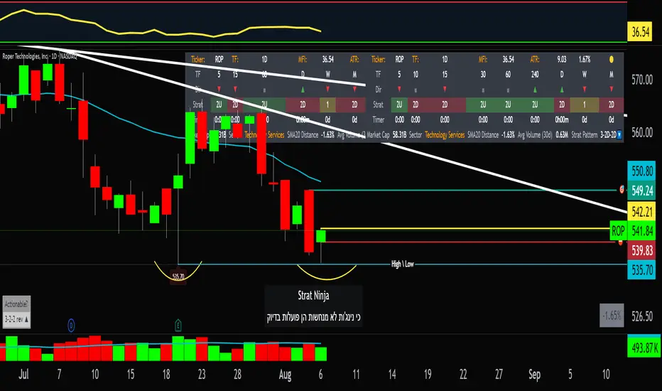
StratNinjaTable - VerticalA Pine Script v6 indicator that displays a vertical table with key The Strat data and supporting metrics.
✦ Table Structure:
Overview:
Ticker – the stock symbol.
TF – the chart’s main timeframe.
MFI – Money Flow Index with selectable timeframe.
ATR – Average True Range with color coding:
Green – below 3%.
Yellow – between 3% and 6%.
Red – above 6%.
Timeframes:
Displayed vertically (5m, 15m, 1H, D, W, M, etc.).
Each shows the current bar type according to The Strat (1, 2U, 2D, 3).
Text color reflects candle direction (green = close above open, red = close below open).
Includes a countdown timer to bar close.
Fundamentals:
Market Cap – in billions.
Sector – stock sector.
SMA20 Δ – distance from the 20-period SMA (in %).
Avg Volume (30d) – average 30-day volume (in millions).
✦ Adjustments Made:
Removed the Strat Pattern section completely.
Removed the DIR column – direction is now represented by Strat cell text color.
Reordered Overview section: Ticker → TF → MFI → ATR.
ATR now has three levels of coloring (Green/Yellow/Red) for >3% and >6%
Multi-Indicator Panel (RSI, Stoch, MACD, VIX Fix, MFI)A versatile single-pane oscillator panel combining RSI, Stochastic, MACD (scaled to 0–100), Williams VIX Fix (normalized & inverted: low value = high fear), and MFI. Each module is toggleable, with reference levels, background highlights, and ready-made alerts.
Key features
Per-indicator toggles: RSI, Stoch %K/%D, MACD (lines + optional histogram), inverted 0–100 VIX Fix, and MFI.
Standard levels & center line at 50; adjustable overbought/oversold thresholds.
Contextual background coloring (optional) for extreme conditions.
Built-in alerts: RSI/Stoch OB/OS, MACD–Signal cross, VIX Fix “High Fear/Low Fear,” and MFI OB/OS.
Unified scale: MACD mapped around 50 to align with other oscillators; VIX Fix normalized to 0–100.
How to use (quick)
Add the indicator → enable needed modules via “Indicator Toggles.”
Tune periods & levels (e.g., RSI 14, Stoch 14/3, MACD 12-26-9, VIX Fix 22/252, MFI 14).
(Optional) Turn on MACD histogram.
Create alerts from “Add alert on…” using the provided conditions.
Interpretation notes
Inverted VIX Fix: low values ⇒ high fear/volatility (potential bounces); high values ⇒ complacency.
Scaled MACD: lines around 50 ≈ MACD zero; line crosses remain valid despite scaling.
Disclaimer
Analysis tool, not financial advice. Test across timeframes/instruments and pair with risk management.

Dynamic Threshold Money Flow Indexi thought this script was a clever idea, but the more i tried to improve it, the worse it seemed to get.
the idea behind this script was to build a context around a Money Flow Index that changes based on market conditions.
the width of the channel is controlled by a combination of the choppiness index and an inverted, normalized, absolute value of the ROC. when the market begins trending, the channel narrows, making the MFI more likely to break out of the channel in the direction of the emerging trend. as the market becomes more choppy and the trend diminishes, the channel widens, recapturing the MFI.
my initial hopes for this script was that the context-based thresholds would spare the user from choppy markets, but perhaps i need to make the channel non-linear.

Trend+Volume Confluence IndicatorScalper and swing trading signals: use the 15–30 minute charts for scalps and the 4–8 hour charts for swings. Add the Money Flow Index (MFI) for extra confluence. In an uptrend, if the MFI is at or above the halfway mark and rising, take the long. In a downtrend, if the MFI is at or below the halfway mark and falling, take the short.

StratNinjaTableAuthor’s Instructions for StratNinjaTable
Purpose:
This indicator is designed to provide traders with a clear and dynamic table displaying The Strat candle patterns across multiple timeframes of your choice.
Usage:
Use the input panel to select which timeframes you want to monitor in the table.
Choose the table position on the chart (top left, center, right, or bottom).
The table will update each bar, showing the candle type, direction arrow, and remaining time until the candle closes for each selected timeframe.
Hover over or inspect the table to understand current market structure per timeframe using The Strat methodology.
Notes:
The Strat pattern is displayed as "1", "2U", "2D", or "3" based on the relationship of current and previous candle highs and lows.
The timer updates in real-time and adapts to daily, weekly, monthly, and extended timeframes.
This script requires Pine Script version 6. Please use it on supported platforms.
MFI or other indicators are not included in this base version but can be integrated separately if desired.
Credits:
Developed and inspired by shayy110 — thanks for your foundational work on The Strat in Pine Script.
Disclaimer:
This script is for educational and informational purposes only. Always verify signals and manage risk accordingly.
TFO + ADX with Histogram & SignalTrend Flow Oscillator (TFO + ADX) – Histogram + Signal
This version of the original TFO+ADX introduces a MACD-style histogram and signal line overlay for clearer momentum and trend visualization.
The Trend Flow Oscillator (TFO+ADX) blends two powerful volume-based tools — the Money Flow Index (MFI) and Chaikin Money Flow (CMF) — along with a normalized Average Directional Index (ADX). The result is a comprehensive momentum and trend strength tool that offers a more precise read on when markets are gaining or losing conviction.
⸻
How It Works
1.Money Flow Index (MFI)
• Measures volume-weighted buying/selling pressure using price and volume.
• Scaled between –1 and +1 for visual clarity.
2.Chaikin Money Flow (CMF)
• Evaluates volume distribution over time — institutional buying (accumulation) or selling (distribution).
• Also scaled between –1 and +1.
3.TFO Composite Line
• Combines MFI and CMF into a single flow reading.
• A signal line (EMA) tracks the trend of this flow.
• A histogram plots the difference between the TFO and its signal, giving clear signals on shifts in momentum.
4.Normalized ADX Overlay
• Shows trend strength on the same scale (–1 to +1).
• ADX > 0 indicates strong trending conditions.
• ADX < 0 signals weak or consolidating conditions.
⸻
Visual Interpretation
1. Histogram Bars
• Green: TFO is above the signal line → bullish momentum accelerating
• Red: TFO is below the signal line → bearish momentum building
• Bar height represents the strength of the momentum shift
2. Signal Line
• Tracks the smoothed trend of the TFO composite
• Histogram crossing above or below zero reflects momentum crossover and can act as entry or exit signals
3. TFO Raw Line (Optional)
• Still available for reference alongside the histogram
• Shows the unsmoothed blended money flow direction (MFI + CMF)
4. Extreme Zones
• Background shading appears when TFO exceeds ±1.0
• Helps highlight areas of stretched or unsustainable momentum, useful for spotting potential reversals or exhaustion
