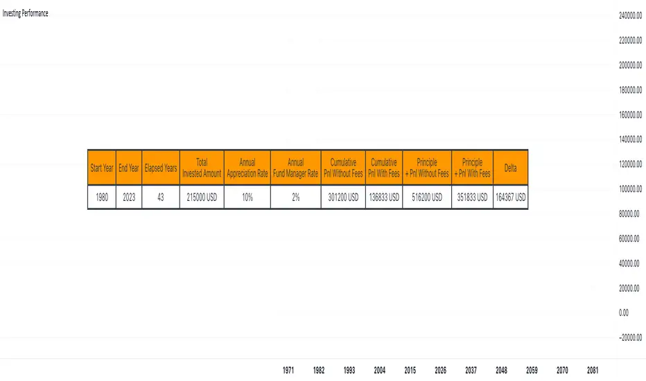
Investing Performance with vs without feesHello traders,
I had a chat with a friend recently who's using a fund manager services to invest for him in some US-based ETFs tracking the US indices.
I showed him using an online tool that those 2% annual fees he's paying to his fund manager are eating a lot of his profit overtime.
As I had some time, I decided to code this simulator in Pinescript because .... why not :)
@RicardoSantos already did that Compound Interest function ()
I added the n parameter being the number of times the interest is compounded per unit of time
Compound interest is calculated using the following formula
CI = P*(1 + R/n) (n*t) – P
Here,
P is the principal amount.
R is the annual interest rate.
t is the time the money is invested or borrowed for.
n is the number of times that interest is compounded per unit t, for example if interest is compounded monthly and t is in years then the value of n would be 12.
If interest is compounded quarterly and t is in years then the value of n would be 4.
For now, the script only works on a yearly chart - I might update it later making it compatible with other chart timeframes - assuming there is some demand for it
If there is, let me know in the comments down below
All the best
Dave
חפש סקריפטים עבור "西班牙人VS奥萨苏纳"
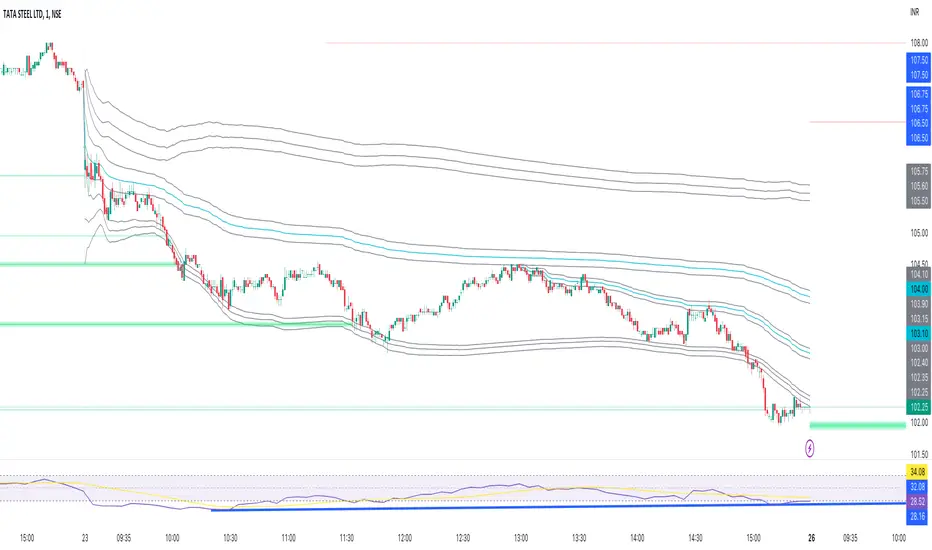
Another New Adaptive Moving Average [CC]The New Adaptive Moving Average was created by Scott Cong (Stocks and Commodities Mar 2023) and this is a companion indicator to my previous script . This indicator still works off of the same concept as before with effort vs results but this indicator takes a slightly different approach and instead defines results as the absolute difference between the closing price and a closing price x bars ago. As you can see in my chart example, this indicator works great to stay with the current trend and provides either a stop loss or take profit target depending on which direction you are going in. As always, I use darker colors to show stronger signals and lighter colors to show normal signals. Buy when the line turns green and sell when it turns red.
Let me know if there are any other indicator scripts you would like to see me publish!

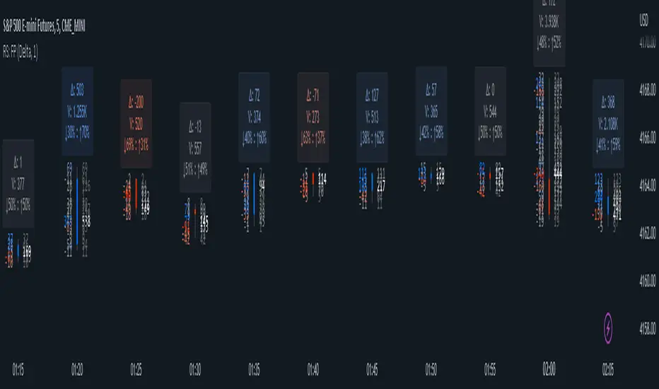
RS: FootprintThis is live only Footprint indicator.
Warning: TV does not provide tick by tick data and updates come in snapshots . Based on this, this indicator can never show precisely what is happening on the bid/ask. What it shows is only an approximation that works well enough if the tape is not too fast.
Use it at your own risk, with the warning above in mind!
Footprint can be used in two modes:
Delta - with bid/ask delta numbers on the left, at the same price level and the total volume numbers on the right
Bid vs Ask - with the bid on the left and the ask on the right; the coloring is based on the diagonal difference
Zoom in to fit the candles; optionally hide default candles.
TICK - Custom Tickers [Pt]Traditionally, the TICK index is a technical analysis indicator that shows the difference in the number of stocks that are trading on an uptick vs a downtick in a particular period of time. This indicator allows user to choose up to 40 tickers to calculate TICK.
By default, it uses the SPY Top 40 stocks, but can be changed to any tickers.
There are options to show:
- Top 7 , ie. can be used for just showing TICK for FAANGMT => $FB + $AMZN + $AAPL + $NFLX + $GOOG + $MSFT + $TSLA
- Top 10
- Top 20
- Top 30
- Top 40
Data can be displayed in candle bars, line, or both.
Enjoy~

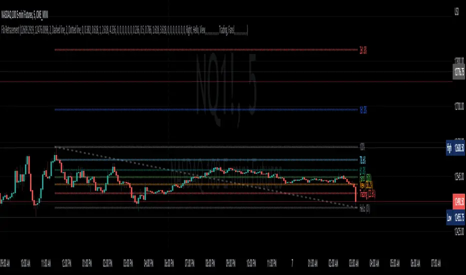
Fib RetracementI've re-created the fib retracement tool as an indicator and this is as close as I can currently get to matching the built-in fib retracement tool.
Why did I make this? For custom labels for every fib retracement level.
Caveats to this vs the built-in tool are:
the "Save as Default" doesn't appear to work (I believe this is due to the interactive/confirm based settings)
copy and paste to another chart is locked into the price of source location
when dragging the points of retracement the tool/indicator disappears
Hopefully some can find usefulness in this code or it's functionality.
Custom HTF candle overlay, ICT True Day-input your own session time for custom 'daily' or HTF candles to overlay on your lower time frame charts.
-based on ICT's notion of 'True Day'.
-customize the HTF candles to any start/end time.
-set lookback period/cutoff in days (i.e. backtesting vs only viewing recent price action).
-option to toggle on/off custom opening price line.
-works across all lower time frames.
~useful for visualizing the chunks of the day where the action tends to happen.
~useful for other session times intraday; to be visualized as a single custom HTF candle.

GRIDBOT Scalper by nnamWhat is this Indicator used for?
Made specifically for GRID Bots
note: before continuing... this indicator works on any timeframe, but it WORKS BEST ON THE 15 MINUTE TIMEFRAME
Straters and Forex Master Pattern Value Line Traders use this to help determine when the price could reverse.
This indicator is a scalping indicator that produces signals when a "potential" reversal in price is indicated. When the price moves UP and a Potential Bearish Reversal Signal occurs, traders can use this signal as a potential SHORT entry signal for their Short Grid Bot. The process is the same in reverse. After a sustained move down, a Potential Bullish Signal can be used by the trader as a potential LONG entry signal for their GridBot.
As shown in the screenshot below, lines develop on the chart (either RED or GREEN) indicating that a sustained move in one direction is currently occurring; however, there is no potential reversal signal plotted (this means that price action is currently moving in one direction only).
As shown in the screenshot below, lines can be used as a stop-loss after entering the GRIDbot. (usually, by this time, the Grid Bot is in Profit as it usually moves in the opposite direction first)
What this Indicator Does
The GRIDBOT Scalper provides information regarding potential reversals in the market after a sustained movement in one direction (either Bullish or Bearish).
The indicator is based on PRICE-ACTION ONLY and does not take into account the current state of the market (Bullish or Bearish).
Once the price moves in a particular direction for at least 14 bars , a line appears as shown in a previous screenshot. Once the price stops moving in that direction and begins moving in the opposite direction - and after a sustained run - a "signal" appears alerting the trader that a "potential" reversal could be on the horizon soon.
If price moves in one direction and plots both a line and a signal and then begins moving back in the other direction in a sustained manner, the original signal will remain even when a NEW line begins forming (the original line will disappear). (see below) This line will continue to move as the price continues to move. Not until a signal plots on the chart is the potential reversal forming. THE LINE DOES NOT SIGNAL A REVERSAL . Some traders, however, use this information to "ride the wave UP or DOWN" and exit their positions once the signal prints.
As shown below, optional input settings allow the trader to set the line at CLOSE or HIGH/LOW of the candle preceding the potential reversal.
It is suggested to use Close instead of High or Low but the setting allows one to use either.
As shown in the screenshot below, it is typical on LOWER TIME FRAMES to see the price pass the signal line. The Indicator works best on the 15 minute timeframe, as it gives the trader time to make the decisions required as the volatility is less on the 15 minute chart vs the 1 minute or 5 minute charts.
If you have any questions or suggestions for this indicator, please join our Discord. We offer free training on this Indicator on our Discord Server.

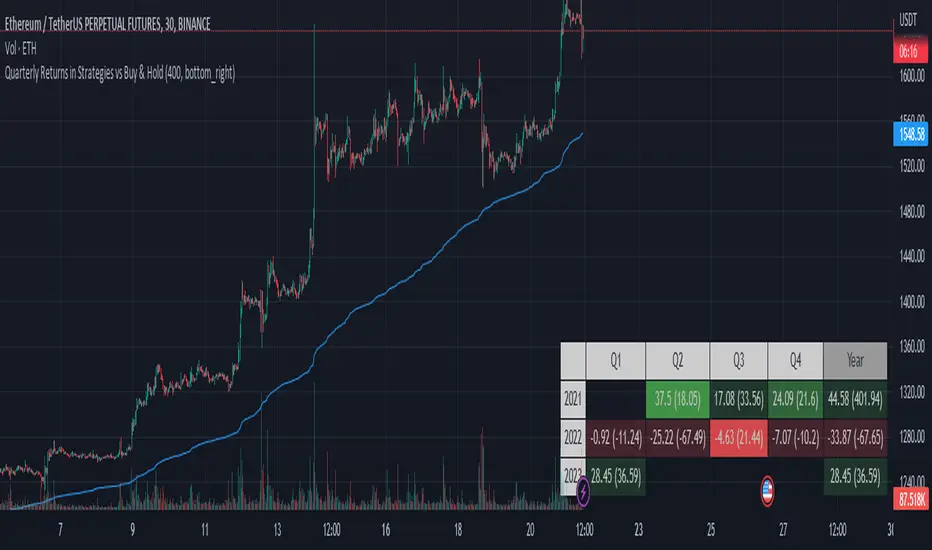
Quarterly Returns in Strategies vs Buy & HoldThis is a Quarterly Returns version of Monthly Returns in PineScript Strategies by QuantNomad
This script shows a table of Quarterly/Yearly performance of your strategy.
It also provides an option to compare with Buy & Hold.
The script can easily integrated to your strategy. All you need to do is copy the table part and paste it at the end of your script
Disclaimer
Please remember that past performance may not be indicative of future results.
This post and the script don’t provide any financial advice.
Simple STRAT Tool by nnamWhat this Indicator Does
This indicator is a very simple tool created specifically for experienced Straters. It was created for those Straters who fully understand the 1-2-3 Strat Scenarios, are in need of an easy to use tool, and do not want or need a lot of messy markings on their chart.
The indicator simply allows the user to color code the Strat 1, 2 ,3 (Inside /Outside /Up / Down) Bars as desired and by default extends lines to the right of the chart from the Highs and Lows of the previous 2 Bars giving the user a simple reference for Strat scenario structure breaks.
As shown above, the bars are color coded, but the original bar color is maintained via the border and wick.
If a bar is an Outside Bar or an Inside Bar, it is still easy to identify whether or not the bar was a Bullish or Bearish 1 or 3.
The same goes for 2UP and 2Down Bars - It is easy to identify Bullish or Bearish UP or DOWN Bars.
Optionally, as show in the screenshot below, the user can extend the lines in both directions to get an "at a glance" better understanding of where price is currently vs previous support and resistance areas.
For Straters that prefer to trade only INSIDE BAR BREAKOUTS there is an optional input setting labeled "Trade Inside Bars ONLY".
This setting turns OFF the lines that extend from the 2nd previous bar back and only displays and extend lines from the previous bar IF and ONLY IF the current bar is an INSIDE (one) bar. .
The User Input settings allow for the following customizations:
1. Custom Outside Bar Color
2. Custom Inside Bar Color
3. Custom 2 Up Bar Color
4. Custom 2 Down Bar Color
5. Turn ON or OFF color coded bars
6. Trade only INSIDE Bar Breakouts
7. Extend Lines Both Directions
8. Hide all Lines
The customizable settings above allow the user to hide all lines and turn OFF color coding without having to fully remove the indicator from the chart. This is convenient when the user has another indicator that uses color coded bars or the lines conflict with another indicator and they need to be temporarily disabled.
If you have any questions regarding this indicator please let me know. If you have any suggestions for minor tweaks to the indicator do not hesitate to ask for them.
I hope you enjoy this indicator and get some usefulness from it... HAPPY TRADING!!
Short vs Long ATRSimple pinescript that compares a long ATR against short ATR and let you define a threshold in %

Quickfingers Luc base scanner - version 2This is my second implementation of a Pine Script Quickfingers Luc (QFL) base scanner that I have published on Trading View. QFL base scanners seek to provide buy signals according to the QFL trading strategy. To profitably trade using this script you should be familiar with the QFL trading strategy, scaling in and out of positions, and money risk management.
Background
All the QFL base identification Pine Scripts that I have inspected to date use a simple candlestick pattern of two lower lows followed by two higher lows to identify a base. Some scripts may combine this with a volume indicator as well. In practice, I found the results of this approach to be somewhat unreliable. The candlestick pattern may identify some significant bases, may identify minor bases (that should not be traded), but at the same time miss other significant bases entirely!
My first QFL base scanner sought to use Pine Script’s built in ta.lowest and ta.highest functions to identify bases and peaks. This approach depended on the time period selected to find the lowest lows and highest highs. This approach can be problematic because significant bases may be formed outside the nominated time period, leading to the identification of minor bases within the time period. I have left the first version of my QFL base scanning script in the Trading View indicators because it uses a different approach to this script that other people may still find useful.
My second version of the QFL base scanner does not use the Pine Script ta.lowest and ta.highest functions, and therefore does not rely on nominating a time period to look back through data.
User inputs
This script steps through the price data to find the following patterns that are used to confirm bases and peaks.
Base – bounce of x% above previous base confirms that base
Peak – fall of y% below previous peak confirms that peak
Buy signal – fall of z% below the base signals a buy signal.
x%, y% and z% are user configurable through the script settings. Small percentages will provide more, but riskier, buy signals; larger percentages will provide fewer, but safer, buy signals.
The script identifies QFL bases and buy signals and marks them on the price chart. These are able to be turned on and off in the script settings. The settings also allow the user to turn on plots for peaks, lowest lows and highest highs. These are not useful for applying the QFL trading strategy, but are calculations used in finding bases and can be useful for the user to understand what the script is doing in the background.
Troubleshooting
If looking at the past script results, you may think that the script is perfectly timing entry points at the bottom of market dips. This is NOT the case. The script is actually showing buy signals when the price falls z% below the PREVIOUS base. The current base is only retrospectively marked some periods later once the reversal is confirmed – a solid line marks a confirmed base in real time; a dotted line retrospectively repaints the line to the actual base. New bases are not tradeable using this script, but a percentage fall from the previous base is – this is the QFL trading strategy.
Pine Script may flag that this script has a repainting issue. Pine Script defines repainting as, “script behavior causing historical vs realtime calculations or plots to behave differently.” In the case of this script, bases are confirmed once the price has bounced x% off the low. The script then repaints a dotted line from the base that has been identified in real time (with a solid line) back to the point in the price data where the base actually occurs. The dotted line only aids in visual identification of the base, and does not impact on the real time identification of bases. A similar repainting issue occurs for identifying peaks. I have identified the lines in the script that cause this repainting. These lines can be commented out without affecting the buy signals generated by the script, but you will also lose the visual pinpointing of historical bases and peaks.
The user may find price charts where they think that the script has not correctly identified a base or peak. Usually, careful measurement will reveal that the price chart has not confirmed a base or peak by moving x% or y% from the previous base or peak respectively.
And before you ask, yes, Trading View alerts work with this script.
Enjoy.

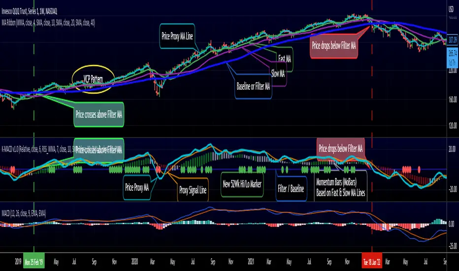
RedK K-MACD : a MACD with some more musclesMoving Averages are probably the most commonly used analysis tools, and MACD is possibly the first charting indicator a trader gets to learn about.
MACD Basic concept
----------------------------
Without repeating all the tons of documentation about what MACD does, let's quickly re-visit the MACD concept from a 10-mile altitude (note we're keen on simplifying here rather than being technically accurate - so please forgive the use of any "common lingos")
- MACD goal is to represent the distance between 2 Moving Averages (MAs) - one fast and one slow, relatively - as an unrestricted zero-based oscillator.
- The value of the main MACD line is the distance, or the displacement between the 2 MA's
- usually a signal line is used (which is another MA of that distance value) to enable better visualization of the change (and rate of change, since this is all depicted on a time axis) of that displacement - this represents price momentum (price movement in the recent period versus movements for a relatively longer period).
- the difference between the main MACD line and its signal is then represented as a histogram above and below the zero line. in this case, that histogram is really redundant, since it shows a value that is already represented visually by the main line and its signal line.
How K-MACD is different
---------------------------------
K-MACD takes that simple concept of the classic MACD and expands around it - the idea is to use the same simple approach to representing price momentum while bringing in more insight to price moves in the short, medium and long terms, ability to represent more than 2 MA's and to enable better identification of tradeable patterns (like Volatility Contraction and others) - while still keeping things simple and visually clean.
K-MACD is an indicator that allows us to view how price moves against 3 moving averages: a fast / slow pair, and a "market" Filter or Baseline (very long) that will be used as a flag for Bear/Bull market mode. Many traders and trading literature use the 200 day (40 week) SMA as that key filter
so in total, there are 4 MA lines in K-MACD (excluding the "orange" signal line):
* Price Proxy: Which is a very fast moving average that will represent the price itself - let's use a WMA(3) or something close to that here - there will be a signal line to enable better visualization of this similar to a classic MACD - that's the orange line
* Fast & Slow MA's : Use whatever represents the "medium term" momentum for your trading - Some traders use 20 and 50, others use 10 and 20 .. if on your price chart, you keep using a pair of MA's for this, use the same settings in K-MACD - these will be represented by the 3-color Momentum Bars that fluctuate above and below the baseline
* Filter/Baseline MA: Should be your long (Bullish/Bearish Mode) MA. so 100 or 200 or any other value you consider your market to be bearish below and bullish above. on K-MACD this is actually the blue zero line - everything else is "relative" to it
Review the sample chart which explains various elements and the "price chart" setup that K-MACD represents. With K-MACD you can clean up your chart from those various Moving Averages - or use a different set than the ones you already have K-MACD represent - or other indicators (like ATR channels..etc)
Other "muscles" in the K-MACD
---------------------------------------------
- Relative vs Classic Calculation Mode
A key issue with the classic MACD is that the displacement between the 2 moving averages is represented as "absolute or direct" values - as the price of the underlying increases with time, you can't really use these values to make useful comparison between the past and now (see below example) - also you can't use them to compare 2 different instruments.
- The "Relative" calculation option in K-MACD addresses that issue by relating all "distances" to the Baseline MA as percentage (above or below) - you can see this clear when you look at the above chart the far left versus the far right and compare K-MACD with the classic MACD - the Classic option is still available
- More MA "type" options for all MA lines: choose between SMA, EMA, WMA, and RSS_WMA (which i use a lot in my trading and is my default for the Price Proxy)
- More Alerts: a total or 9 alerts (in 3 groups) are available with K-MACD (Momentum above or below baseline, Price Proxy crossing signal line, and Price Proxy crossing baseline)
- New 52 week High / Low markers: These will show as Green/red circles on the zero line in K-MACD. this will only work for 1D timeframe and above, i'm just using a simple approach and would like to keep it that way.
- i know i added some more features not covered above :) -- if you have questions about any of the settings, feel free to ask below
Closing thoughts
-------------------------
K-MACD is a combination of couple of indicators i published in the past (xMACD and Mo_Bars) - so you can go back and read about them if needed - I then added improvements to accommodate ideas from swing trading literature and common practices that i plan to focus on in future. So K-MACD is really part of my own trading setup.
I assume here that most traders are familiar with what a MACD is - so kept this post short - if you thing we should expand more about the concepts covered here let me know in the comments - i can make some separate posts with examples and more details.
I hope many fellow traders find this work useful - and feel free let me know in comments below if you do.
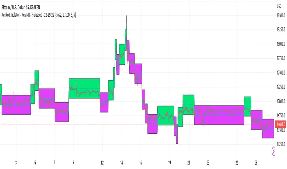
Renko Emulator - Rev NR - Released - 12-29-22Renko Emulator - Rev NR - Released 12-29-22
By Hockeydude84
Simple script to Emulate Renko Charting behavior on standard candle stick charts. Code provide capability to select between standard(ish) Renko bricks (in this code it's defined by percent vs ticks/value), or an ATR brick option. For ATR bricks, the code provides an option to inhibit emulator movement (formation of new bricks) by providing a minimum threshold that must be present. This threshold is the "Standard Brick" input (the input pulls double duty). Code also provides multiple plotting options.
Use the code to help see trends and reduce the chop/erroneous data. Also helps to identify where trend deviations are present.
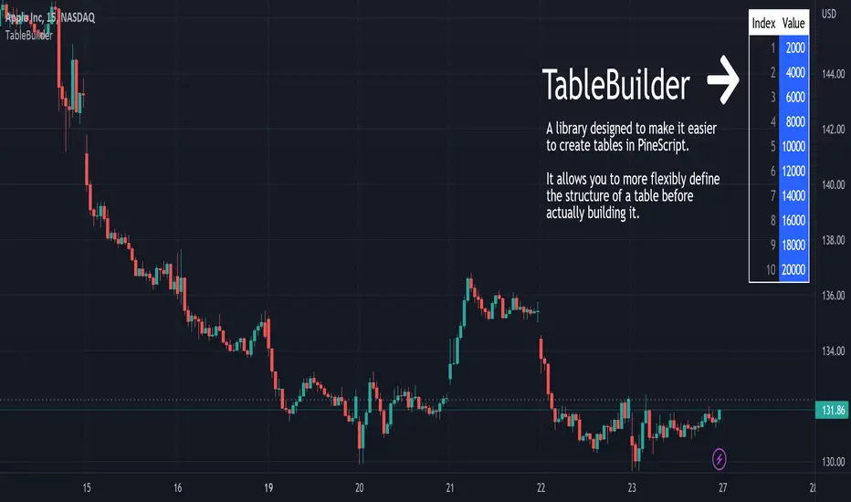
TableBuilderTableBuilder is a library designed to make it easier to create tables in PineScript.
It allows you to more flexibly define the structure of a table before actually building it.
Features:
Style inheritance: styles are inherited from Table, to Column, to Row, and then Cell.
Columns are useful for propagating/reusing style but they are not required.
Add rows with different numbers of cells. The resultant number of columns in the table will be determined by the max number of cells vs the number of defined columns.
Auto text color: Instead of having to set the font color for every cell, the color is automatically determined by the luminosity of the background color.
See the 'Demo' section of the code for an example.
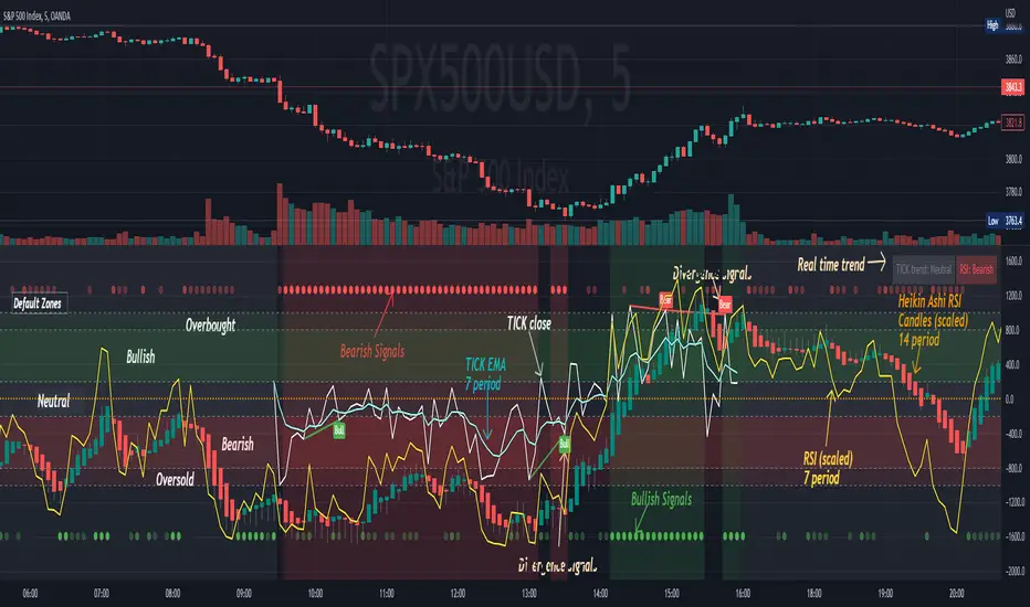
[Pt] TICK + Heikin Ashi RSI IndicatorThis indicator combines NYSE TICK and RSI to aim to provide a view of NYSE market trend strength.
What is TICK
NYSE TICK, also known as the TICK index, is a technical analysis indicator that shows the number of stocks on the New York Stock Exchange (NYSE) that are trading on an uptick or a downtick in a particular period of time. The TICK index is calculated by subtracting the number of stocks trading on a downtick from the number of stocks trading on an uptick. A reading of +1000 on the TICK index, for example, would indicate that there are 1000 more stocks trading on an uptick than on a downtick. The TICK index is often used as a measure of market sentiment, as it can provide insight into whether there is more buying or selling pressure in the market at a given time. A high TICK index reading may suggest that there is strong buying pressure, while a low TICK index reading may indicate that there is more selling pressure in the market.
By default, I am using -800 and 800 for oversold and overbought levels. These are configurable. Also, this indicator includes TICK divergence signals.
The TICK index is usually very volatile, so this indicator is best suited for lower timeframes, such as 1 to 5 min charts.
Idea of TICK neutral zone
As part of this indicator I've identified what I consider as "neutral" range for the TICK. Based on my own personal experience, the market tends to be in consolidation or choppy in this range. By default, I've defined this range to be -200 to 200. This range is configurable.
Signals
In combination with RSI and Heikin Ashi RSI (HARSI), which help smooths out the RSI values and make it easier to identify trends and potential reversal points, this indicator aims to generate Bullish vs Bearish signals based on the following conditions:
- bullish / bearish HARSI candle
- Inside bar on HARSI candle
- TICK trend (above or below Neutral zone)
- RSI trend (above or below 0, but not overbought or oversold)
- RSI / HARSI convergence and divergence
When all bullish conditions are met, the signal turns bright green. Bright red when all bearish conditions are met. These generated signals aims to provide users easy to read visual cues to help with their trades.
A table is also provided in attempt to identify the trend in real time:
TICK trend:
- Bullish, Extended
- Bullish
- Neutral w/ Bullish bias
- Neutral w/ Bearish bias
- Bearish
- Bearish, Extended
RSI:
- Bullish
- Bearish
Note on scale
This indicator is based on the scale for TICK, hence the RSI and HARSI are scaled. By default, standard overbought RSI value of 70 = 800 on this scale, whereas oversold value of 30 = -800.
Credits:
Heikin Ashi RSI code was borrowed from @JayRogers - Heikin Ashi RSI Oscillator
Anchored VWAP BandSimple script to anchor vwap to a drag and drop spot on the chart and display it as a band instead of a line.
the AVAP Band displays:
1. The AVWAP using High as the source
2. The AVWAP using OHLC4 as the source
3. The AVWAP using Low as the source
This is just a different way of visualising VWAP from an anchored point in time (Band vs Line)