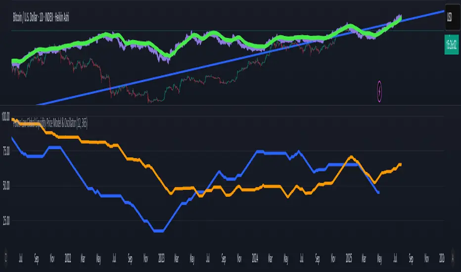
Power Law Global Liquidity Price Model & OscillatorDescription:
This Pine Script implements a predictive Bitcoin (BTC) price model derived from an observed power-law relationship between BTC price and Global Liquidity (specifically Global M2).
To clarify, the indicator doesn't show M2 directly as many indicators do, but uses an empirical observed relationship between BTC price and M2. This is an important difference from other Global Liquidity indicators and makes it very useful because it allows for making predictions on the future of Bitcoin price.
The model is based on the relationship BTC ~ GL^9.3, where GL represents Global M2, and the best correlation is achieved with an 85-period lead in GL, making it a leading indicator for BTC price movements. The observed correlation is higher than 0.92, giving high confidence in the model's validity. The 85-day lead was chosen by calculating the predictive rate of the model (how many times a positive/negative return in the model correlates with the price) with a given lead. The relationship between a chosen delay and predictive power has a maximum at 85 days.
Features:
BTC Price Model:
Calculates a BTC price model using the power-law relationship (BTC ~ GL^9.3) with an 85-period lead in Global Liquidity data.
The model is superimposed on the chart using forced overlay for clear visualization of the predicted BTC price trend relative to actual price.
Directional Oscillator:
Displayed in a lower panel, the oscillator compares the structural similarity between the actual BTC price and the GL-based price model.
Computes the win rate of the averaged BTC price (over a 1-year period) versus the price model to highlight structural alignment.
Projects future oscillator values based on the 85-period lead in the GL model, providing insight into potential price direction.
This feature is also very unique, and it is not present in most Global Liquidity indicators. The reason to choose the win rate is that this parameter doesn't depend on a precise scaling
between the BTC price and GL. This allows for better identification of changes in features between the 2 time series (for example, a downturn, a run up, peaks, bottoms, and similar).
Purpose:
This script serves as a predictive tool for traders and analysts by leveraging the leading relationship between Global Liquidity and BTC price. The overlay model and oscillator provide both a visual and quantitative framework to anticipate BTC price trends and assess structural alignment with global economic indicators.
The indicator allows for early identification of bottoms, peaks, and possible local bull or bear runs.
Usage Notes:
This indicator works best when used with the "All Time History" BTCUSD index.
The 85-period lead in GL allows for forward-looking projections, making this tool suitable for strategic planning.
The oscillator aids in confirming the structural validity of the model, enhancing confidence in its projections.
חפש סקריפטים עבור "BTC"
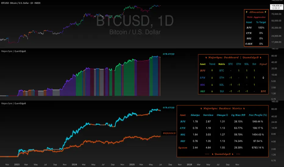
Majors Sync | QuantEdgeBIntroducing MajorsSyn c by QuantEdgeB
🔹 Overview
🚀 Dynamic Rotation System for BTC, ETH & SOL
MajorsSync is a powerful, rotation-based strategy designed to systematically identify the leading cryptocurrency among the top three majors: Bitcoin (BTC), Ethereum (ETH), and Solana (SOL).
By analyzing inter-market strength, pairwise trend dominance, and individual trend quality, MajorsSync dynamically shifts exposure toward the asset with the highest potential for outperformance, while de-risking during unfavorable conditions.
✨ Core Objective
📌 To allocate capital to the strongest-performing major—BTC, ETH, or SOL—while avoiding underperformers and unnecessary exposure during uncertain market phases.
🧠 How It Works
Majors Sync uses a multi-tiered decision structure:
🔹 1. Individual Asset Trend Evaluation
Each asset is scored using a Trend Performance Index (TPI). These are proprietary models capturing medium-term momentum and structure for:
• BTC
• ETH
• SOL
🔹 2. Pairwise Relative Strength Matrix
Compute TPI values between the asset pairs:
• ETHBTC → Is ETH stronger than BTC?
• SOLETH → Is SOL stronger than ETH?
• SOLBTC → Is SOL stronger than BTC?
These relative TPI readings help construct a score matrix to rank assets 0–2.
🔹 3. Signal Confirmation
Only when the top-ranked asset has a positive TPI, a Long signal is triggered on that asset.
Otherwise, if no asset meets the threshold, the system remains in Cash/Neutral mode to protect capital.
🧮 Capital Allocation Logic
📊 Allocation always rotates to:
• ✅ The strongest asset with a positive trend
• 🛑 Otherwise, goes neutral/cash (no trade)
This ensures capital is placed in high-probability zones only.
💼 Equity System
🧮 An internal equity engine simulates dynamic capital rotation by reallocating to the top-performing major (BTC, ETH, or SOL) at each bar. This allows for transparent tracking of historical strategy performance.
• 💡 If BTC is the top asset → System follows BTC's price change
• 💡 If ETH becomes dominant → It reallocates to ETH
• 💡 If SOL takes over → Position shifts to SOL
• 📉 No asset qualified? → Strategy holds cash
You also get a Buy & Hold BTC benchmark for direct comparison.
⚠️ This simulation reflects past behavior and is not indicative of future results.
📊 Dashboard & Visuals
The built-in dashboard table displays:
• 🧠 Asset Trends (BTC, ETH, SOL)
• 🧩 Matrix values (e.g., ETH vs BTC, SOL vs ETH)
• 🏁 Final Signal Output (which asset is selected)
• 🔁 Real-time Strategy Equity vs Buy & Hold
💪 Why It Works
Majors Sync blends:
• ✅ Inter-market structure (pairwise dominance)
• ✅ Intra-asset momentum (standalone TPI)
• ✅ Position filtering (only acts on positive signals)
• ✅ Capital efficiency (rotates rather than overtrades)
This design reduces drawdowns, avoids stagnation, and seeks to capture medium-term leadership shifts among the top crypto majors.
📊 MajorSync Backtest Metrics
🔹 Sharpe Ratio
Shows the risk-adjusted return by comparing the strategy's return to its overall volatility. Higher is better — it means you're getting more reward per unit of risk.
🔹 Sortino Ratio
Similar to Sharpe, but focuses only on downside volatility (the bad kind). This makes it a better reflection of how the system handles losses specifically.
🔹 Omega Ratio (Ω)
Measures how often the system generates profitable returns versus unprofitable ones. A value above 1 means it wins more than it loses — and the higher it goes, the better.
🔹 Equity Max Drawdown (Eq.Max DD)
This is the deepest decline from peak equity during the test. Lower drawdown means less risk of big losses.
📌 Disclaimer: Backtest results are based on historical data and past market behavior. Performance is not indicative of future results and should not be considered financial advice. Always conduct your own backtests and research before making any investment decisions. 🚀
🚀 Key Benefits
✔️ Trend-Following + Relative Strength Hybrid
✔️ Rotational Capital Efficiency
✔️ De-risking in Weak Conditions
✔️ Optimized for Swing and Medium-Term Positioning
✔️ Visual Clarity + Smart Allocation
🔧 Settings Overview
• Color Mode – Switch visual palette for the base Trend
• Trend Color – Toggle trend-based bar coloring
• Enable Backtest Table – Show historical performance metrics
• Start Date – Control backtest window
🏁 Conclusion
Majors Sync is your intelligent rotation engine for crypto majors.
Instead of guessing which coin to hold, let the system rotate for you—objectively, consistently, and visually.
📈 Be in BTC when it leads. Switch to ETH or SOL when strength shifts. Sit in cash when needed.
📌 Master the market with precision and confidence | QuantEdgeB
🔹 Disclaimer: Past performance is not indicative of future results. No trading strategy can guarantee success in financial markets.
🔹 Strategic Advice: Always backtest, optimize, and align parameters with your trading objectives and risk tolerance before live trading.
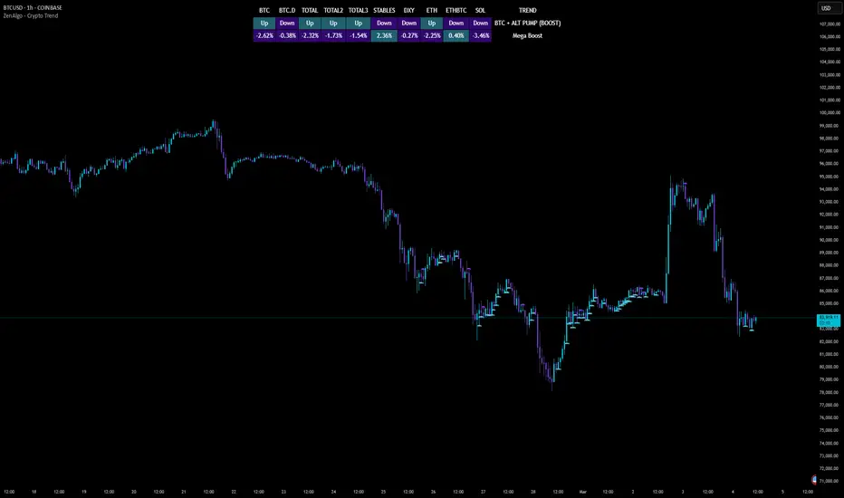
ZenAlgo - Crypto TrendThe ZenAlgo - Crypto Trend indicator is a unique tool for analyzing cryptocurrency market trends, combining data from multiple sources such as BTC , ETH , market caps, dominance metrics, and the DXY index . Unlike standalone indicators, it integrates these data points to deliver actionable insights on macro and micro market movements, helping traders better navigate complex market conditions.
Features
Multi-Asset Trend Analysis: Monitors trends across BTC , ETH , USDT dominance , DXY , SOL , ETHBTC and total market caps ( TOTAL , TOTAL2 , TOTAL3 ), providing a holistic market view.
Dynamic Labels: Real-time market conditions are summarized with labels such as "FIRE SELL," "BTC UP," or "ALT PUMP" for instant clarity.
Customizable Display: Options for dark mode, text size, and table position allow traders to personalize their experience.
Market Sentiment Table: Summarizes trends and percentage changes for multiple assets in a structured, easy-to-read table.
Composite Signals: Identifies unique states like "Mega Boost" or "Outflow" by analyzing the interplay of market trends.
Enhanced Heikin Ashi Analysis: Applies Heikin Ashi trends in a broader context, combining them with other metrics to overcome standalone limitations.
ZenAlgo Theme: A visually distinct and professional theme for enhanced usability.
Added Value: Why Is This Indicator Original/Why Shall You Pay for This Indicator?
The ZenAlgo - Crypto Trend indicator transcends the limitations of free tools in several ways:
Integrated Insights: While Heikin Ashi is freely available, this indicator applies it in tandem with market dominance, total market caps, and macroeconomic indicators like the DXY . This integration creates composite signals (e.g., "Mega Boost," "Defi Mega Boost") that standalone Heikin Ashi cannot provide.
Advanced Contextualization: Free Heikin Ashi indicators lack contextual data about dominance shifts, altcoin performance, and macroeconomic trends. Our indicator integrates these elements to give a broader market perspective.
Time-Saving: Instead of switching between multiple indicators, ZenAlgo - Crypto Trend combines them in one cohesive tool, offering a comprehensive market overview in a single glance.
Custom Features: Unlike generic Heikin Ashi indicators, this tool includes dynamic labels and a market sentiment table that summarize trends and provide immediate insights.
How It Works
1. Heikin Ashi Trend Detection
Calculates smoothed Heikin Ashi trends for BTC , ETH , USDT dominance , DXY , and total market caps ( TOTAL , TOTAL2 , TOTAL3 ).
Functionality: Heikin Ashi values are derived from the weighted average of open, high, low, and close prices. The "open" averages the previous bar's open and close, while the "close" averages the current bar's open, high, low, and close. A trend is assigned as Up (+1) or Down (-1) based on whether the close exceeds the open.
2. Market Metrics Analysis
Tracks daily percentage changes and trends for key metrics like BTC dominance and total market caps.
Outputs: Displays trends (Up/Down) and percentage changes for each asset, helping assess market strength and sentiment.
3. Composite Signal Generation
Combines individual asset trends to define broader market states such as "Mega Boost" or "Outflow."
Logic: Signals are triggered by predefined conditions, e.g., "Mega Boost" occurs when DXY trends down, market caps ( TOTAL , TOTAL2 , TOTAL3 ) trend up, and BTC dominance trends down.
4. Dynamic Labels and Sentiment Table
Displays real-time labels (e.g., "FIRE SELL," "BTC + ALT PUMP") directly on the chart for actionable insights.
A market sentiment table summarizes trends and percentage changes, with customizable display options (position, text size, theme).
Usage Examples
Spotting Bullish Momentum: Use "BTC + ALT PUMP" signals to identify synchronized bullish trends in BTC and altcoins.
Avoiding Bearish Trends: React to "CRYPTO DOWN" or "FIRE SELL" signals to minimize exposure during downturns.
Evaluating Altcoin Opportunities: Identify "ALT PUMP" or "ALTS DUMP" signals to time entries and exits in altcoin markets.
Tracking Dominance Shifts: Monitor "BTC.D UP" or "BTC.D DOWN" trends to assess shifts in market dominance between BTC and altcoins.
Macro Market Awareness: Use "Mega Boost" or "Mega Outflow" states to align with macroeconomic trends, such as dollar strength or weakness.
Seasonal Trends: Observe "ETH PUMP" or "BTC DOWN + ALT PUMP" states to understand specific altcoin or BTC-led market cycles.
Settings
ZenAlgo Theme: Enable a custom ZenAlgo visual style for improved clarity.
Table Text Size: Adjust text size (options: tiny, small, normal, large, huge) for better visibility.
Dark Mode: Toggle dark mode for improved viewing in low-light environments.
Table Position: Choose table placement (e.g., Top Left, Bottom Center) based on your preferences.
Important Notes
Synthetic and Lagging Nature of Heikin Ashi: Heikin Ashi values are synthetic and inherently lagging. They provide smoothed trends but do not represent precise entry or exit points. This indicator does not produce buy or sell signals.
Limitations in Low-Volume Markets: The indicator may underperform in low-liquidity markets or during periods of high volatility, where data discrepancies can distort trends.
Trend Reversals in Choppy Markets: In sideways or choppy markets, the composite signals may lag behind sudden reversals, potentially resulting in delayed recognition of trend changes.
False Positives During Macro News Events: Abrupt macroeconomic news or policy changes can cause the indicator to emit signals (e.g., "Mega Boost") that may not align with sustained market movements.
Dominance Metrics Sensitivity: Heavy reliance on BTC.D or TOTAL3 can sometimes result in misleading insights when these metrics are influenced by atypical events, such as large-scale liquidations or isolated token movements.
Use in Conjunction with Other Tools: While powerful, this indicator should be combined with other technical and fundamental analysis tools for a comprehensive trading strategy.
No Guaranteed Results: Trading involves risk. This tool is designed to support decision-making, not to guarantee trading success.
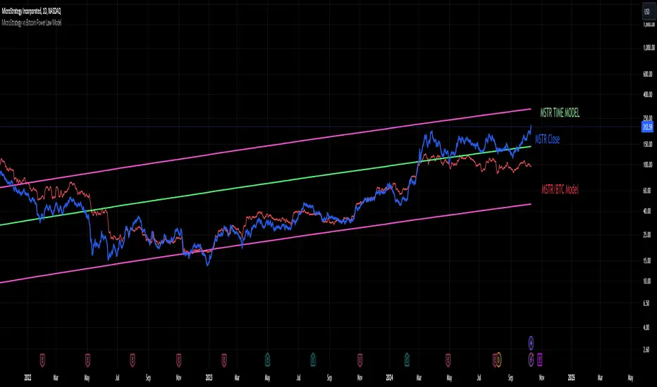
MicroStrategy vs Bitcoin Power Law Model
This indicator provides a powerful tool for investors by modeling the relationship between MicroStrategy (MSTR) and Bitcoin (BTC) based on an observed power law correlation since August 2020, when MSTR adopted Bitcoin as its core investment strategy. The primary objective of the indicator is to identify areas where MSTR is overvalued or undervalued relative to BTC, offering investors crucial insights for making informed decisions.
Step-by-Step Creation Process:
Data Collection:
The indicator begins by gathering historical price data for both MSTR and BTC starting from August 2020. This period is significant as it marks MSTR’s strategic shift toward Bitcoin acquisition.
Power Law Analysis:
A power law relationship between MSTR and BTC is computed using a power of 1.3. This relationship models the price behavior of MSTR relative to BTC, providing a framework to track where MSTR’s price deviates from its expected value based on BTC's movements.
MSTR Price Model:
The MSTR price model based on this power law is then plotted against the actual price of MSTR. This allows investors to visualize areas where MSTR is potentially overvalued or undervalued relative to BTC.
Overvaluation is highlighted when the actual MSTR price exceeds the power law-based price, while undervaluation is noted when it falls below.
Time-Based Power Law Model:
Additionally, the indicator integrates a time-based model for MSTR, which shows that MSTR follows its own power law over time with a higher slope than BTC (7.2 vs. 5.8). This comparison provides further context, showing how MSTR's growth rate differs from BTC’s over time.
Oscillator Inclusion:
To complement the price models, an oscillator is added, which tracks the difference between the MSTR power law and the BTC power law. This oscillator helps visualize and quantify the divergence between the two, offering a clearer picture of periods where MSTR is performing above or below expectations compared to BTC.
Indicator Usefulness:
Overvaluation and Undervaluation Detection: By comparing MSTR’s current price against its expected power law-based price, investors can easily identify potential entry and exit points. When MSTR is overvalued relative to BTC, it may signal an opportunity to sell or reduce exposure. Conversely, undervaluation may suggest a buying opportunity.
Time-Based Growth Comparisons: The time-based power law model shows how MSTR has been growing relative to Bitcoin over time. This helps investors understand whether MSTR is outperforming or underperforming BTC in the long run.
Divergence Oscillator: The oscillator provides an intuitive way to gauge whether MSTR is significantly diverging from BTC’s growth trajectory, offering an additional signal to guide investment decisions.
Projections to the future
Projections of the MSTR power law to 500 days ahead is also included.
Why is this Indicator Useful for Investors?
This indicator offers a comprehensive view of how MSTR’s price behavior correlates with Bitcoin. By leveraging the power law relationship, it provides insight into whether MSTR is priced appropriately relative to BTC, which is especially valuable for those with exposure to both assets. The oscillator further refines this analysis by highlighting periods of divergence, offering potential trading opportunities based on relative value.
Correlation Table by VanHelsingCorrelation Table by VanHelsing
Explanation:
So we have three asset with correlation to current asset which is a BTC, also you can use it for ETH
But why only three assets? Because this one fits the best to identify a trend of BTC.
By using let's say a GOLD this table will be far away from accuracy then this three Nasdaq, ES1!(S&P500), DXY the best one for this.
Inside a script we have kama's
(Developed by Perry Kaufman, Kaufman's Adaptive Moving Average (KAMA) is a moving average designed to account for market noise or volatility. KAMA will closely follow prices when the price swings are relatively small and the noise is low. KAMA will adjust when the price swings widen and follow prices from a greater distance. This trend-following indicator can be used to identify the overall trend, time turning points and filter price movements.)
Now you know that KAMA is good solution for fast reaction of trend change and following it.
Now we have three assets with correlation to BTC and three kama's for them to know which trend is there.
Good!
What next?
Next is a scoring for up trend and down trend for BTC
For Understanding I will use DXY and BTC correlation
Lets consider that DXY is moving down and kama detected it,
we have down trend on DXY. How we can score it for BTC buy or sell?
Down trend DXY and negaive correlation to BTC lets say -0.5
In this way it scoring it like 0.5 for buy BTC, because if DXY moving down it means BTC moving up because of negative correlation.
Lets say DXY moving up and correlation with BTC is again -0.5
then what? It scoring -0.5 for sell BTC because since DXY moves up and correlation is negative BTC should move down.
Okay again what if DXY moving up and correlation is positive 0.5?
Then BTC is 0.5 for buy
What if DXY down correlation 0.5? Then BTC score for sell is -0.5
In first look it seems litle bit complicated, but actually it is not, it just take a time for understand. Hope you Enjoy this lesson and hope you will enjoy this indicator!
How to read a table:
Describtion about minimalistic mode

LIQUIDATION [CFI]EN description
The indicator determines signs of liquidations of futures contracts. It works according to the author's algorithm based on: prices, volumes, levels and candlestick analysis.
The larger the diamond, the greater the volume of potential liquidations of longs or shorts was on a particular candle. There are 5 sizes of diamonds: small, conditionally equal to 1x, medium - 3x, large - 5x, huge - 15x, huge - 50x. That is, on the largest diamond, the volume of liquidations is 50 times greater than on the smallest one (namely, the volume, not to be confused with shoulders).
The price of the location of diamonds is equal to the maximum (for short liquidations) price for a particular pair, or the minimum (for long liquidations). Thus, you can immediately see to what marks the price reached on different pairs and exchanges
The indicator displays new liquidations only after the candle closes. It cannot redraw data. Diamonds with a green tint - liquidation of long contracts, with a red tint - liquidation of short contracts.
The indicator simultaneously monitors 7 pairs on 5 exchanges:
BINANCE BTC/ETH BTCUSDTPERP
BINANCE BTC/ETH BTCBUSDPERP
BYBIT BTC/ETH BTCUSD.P
BYBIT BTC/ETH BTCUSDT.P
KRAKEN BTC/ETH BTCUSDTPERP
HUOBI BTC/ETH BTCUSDT.P
OKEX BTC/ETH BTCUSD.P
As you know, it is impossible to get reliable data about the real liquidations of traders, so this script only displays the signs of these liquidations. As you can see, the price often reverses after large diamonds, so I think that the script turned out to be working and useful. The indicator is best used when trading sideways, when there is accumulation or distribution - in such situations, after collecting liquidations, the price almost always reverses and goes to collect liquidations from the opposite side
RU описание
Индикатор определяет признаки ликвидаций фьючерсных контрактов. Работает по авторскому алгоритму в основе которого лежат: цены, объёмы, уровни и свечной анализ.
Чем больше ромбик - тем больший объём потенциальных ликвидаций лонгов или шортов был на конкретной свече. Бывает 5 размеров ромбиков: маленький, условно равен 1х, средний - 3х, большой - 5х, огромный - 15х, огроменный - 50х. То есть на самом большом ромбе в 50 раз больше объём ликвидаций, чем на самом маленьком (именно объём, не путать с плечами).
Цена расположения ромбиков равна максимальной (для ликвидаций шортов) цене для конкретной пары, или минимальной (для ликвидаций лонгов). Таким образом сразу видно, до каких отметок доходила цена на разных парах и биржах
Индикатор отображает новые ликвидации только после закрытия свечи. Перерисовывать данные он не может. Ромбики с зелёным оттенком - ликвидации лонг контрактов, с красным оттенком - ликвидации шорт контрактов.
Индикатор одновременно отслеживает 7 пар на 5 биржах:
BINANCE BTC/ETH BTCUSDTPERP
BINANCE BTC/ETH BTCBUSDPERP
BYBIT BTC/ETH BTCUSD.P
BYBIT BTC/ETH BTCUSDT.P
KRAKEN BTC/ETH BTCUSDTPERP
HUOBI BTC/ETH BTCUSDT.P
OKEX BTC/ETH BTCUSD.P
Как вы знаете, нельзя получить достоверные данные о настоящих ликвидациях трейдеров, поэтому этот скрипт лишь отображает признаки этих ликвидаций. Как видите, часто цена разворачивается после крупных ромбиков, поэтому я считаю, что скрипт получился рабочим и полезным. Индикатор лучше всего применять при торговле в боковике, когда идёт накопление или распределение - в таких ситуациях почти всегда после сбора ликвидаций цена разворачивается и идёт собирать ликвидации с противоположной стороны

Volume General Asset/Bitcoin Bithanos 灭霸比特币指标介绍:
本指标是个多功能成交量指标,可以如同常规成交量一样显示当前图表品种的成交量;
如果选择比特币,可以勾选显示比特币专属成交量显示;
比特币专属成交量选取
VOLBITSTAMP
VOLCOINBASE
VOLGEMINI
VOLKRAKEN
VOLHUOBI
VOLBINANCE
VOLOKEX
VOLBITFINEX
八大现货交易所的成交量,做了聚合计算。
特点:
可以实时显示8大交易所总成交量 ,“vol BTC combin”;
也可以显示单一交易所均摊下来成交量 = 8大交易所总成交量 / 8 ,“vol average BTC combin”
名词解释:
" Show MA 显示常规资产成交量/8大现货交易所总成交量 均线"
" Show AVMA 显示BTC 8大现货交易所平均成交量 均线"
"AVMA length 8大现货交易所平均成交量 均线周期"
"MA length 常规资产成交量/8大现货交易所总成交量 均线周期"
"vol BTC combin 显示8大现货交易所总成交量"
"vol average BTC combin 显示8大现货交易所平均成交量"
"vol average BTC/usd 显示4大美元交易所平均成交量"
"vol average BTC/usdt 显示4大usdt交易所平均成交量"
Indicator introduction:
This indicator is a multi-functional volume indicator, which can display the volume of the current chart variety like regular volume;
If you choose Bitcoin, you can check the display of Bitcoin's exclusive trading volume;
Bitcoin exclusive volume selection
VOLBITSTAMP
VOLCOINBASE
VOLGEMINI
VOLKRAKEN
VOLHUOBI
VOLBINANCE
VOLOKCOIN
VOLBITFINEX
The trading volume of the eight major spot exchanges has been aggregated.
Features:
Can display real-time total trading volume of 8 major exchanges, "vol BTC combin";
You can also display the average trading volume of a single exchange = the total trading volume of 8 major exchanges / 8, "vol average BTC combin"
Glossary:
"Show MA shows the trading volume of conventional assets / 8 total trading volume of major spot exchanges"
"Show AVMA shows the average trading volume of 8 major BTC exchanges"
"AVMA length average trading volume of 8 major stock exchanges, moving average cycle"
"MA length regular asset volume / 8 total spot exchange volume average cycle"
"vol BTC combin shows the total trading volume of 8 major spot exchanges"
"vol average BTC combin shows the average volume of 8 major spot exchanges"
"vol average BTC / usd shows the average volume of the 4 major US dollar exchanges"
"vol average BTC / usdt shows the average volume of the 4 major usdt exchanges"

Altcoins capitalization histogram [peregringlk]This script superseeds "Other altcoins BTC capitalization histogram". The previous versions was a bit confusing in my opinion and lacked some generalization, so I'm now publishing this improved version.
It shows 6 pieces of info:
- Green columns: BTC price change for that day.
- Red bars: Altcoins capitalization change for that day, measured in bitcoins (altcoins_USD_capitalization / BTCUSD)
- Green/red background: green if that day the USD capitalization change was a gain, and red if it was a loss.
- Green line: accum BTC price change for the selected last days.
- Red line: accum altcoin capitalization change measured in BTC for the selected days.
- Dotted blue sequence: accum altcoin USD capitalization change for the selected days.
The base line of the histogram is 1 instead of 0, because I'm showing the price changes as multipliers (price change rates), so if there have been a +20% market movement, the calculated value will be 1.2, and if there have been a -20% market movement, then the value will be 0.8. 1 means no movement (preserved price/capitalization). Price and capitalization changes will be calculated using candle closes.
About the accumulated price changes, it will calculate the accumulated multiplication of the corresponding price change multipliers. For example, if you have set you want 3 days for the accumulation rates, and the last three days saw a -20%, +10% and +15% price/capitalization changes, the current value for the line will be 0.8*1.1*1.15 = 1.0120, or a +1.2% price change respect to the day before yesterday.
By default, if you are looking any ALTBTC market (for example, ETHBTC), instead of showing the USD and BTC capitalization of all alts, it will take the BTC and USD prices of the current market (the USD price will be calculated as ALTBTC * BTCUSD; and the BTCUSD price will be taken from BITSTAMP, the one with the longest BTC history I know in tradingview). If you are looking any other markets that is not paired with BTC, then it will take the USD capitalization of all altcoins, and the BTC capitalization will be calculated as altcoins_USD_capitalization / BTCUSD (from BITSTAMP as well).
Also, remember that, in both cases (alts capitalization or price), the graph will consistently respect the following rule:
- btc_usd_price_change * alt/capitalization_btc_price_change = alt_usd_price_change.
That applies for both the green/red bars respect to the background, and the green/red line respect to the blue dotted sequence.
Lastly, you may want to know if, in case btc price and altbtc price or capitalization go in opposite directions, who gain the battle? For example, if BTCUSD moved +20%, and an ALTBTC price moved -20%, the result is a loss, because 1.2*0.8 = 0.96, so the ALTUSD price or capitalization moved -4% (remember that, for preserving the USD value, if today's bitcoin change rate is x, the altbtc change rate must be 1/x; so for a -20% BTCUSD price movement, there must be at least a +25% ALTBTC price change to don't loss USD value, because 1/0.8 = 1.25). The background is what shows you that: if the background is green, it means that for that day there was a total USD gain of value, and when it's red, then it was a loss of USD value.
You can customize the following things:
- Accum change rate interval: the "selected days". By default 7.
- Take alts-capitalization?: By default unmarked. The effect when is unmarked is what I have explained in the previous paragraph. If you mark it, then it will use the USD_capitalization of all alts no matter what market you are looking right now.
- Which capitalization do you want? There are three options, that applies when "Take alts-capitalization?" is marked, or otherwise, when you are not looking a BTC-paired market.
- - - All-alts (default option): take CRYPTOCAP:TOTAL2 security as reference Alts-capitalization, which represents all altcoins.
- - - Other-alts: take CRYPTOCAP:OTHERS security as reference Alts-capitalization, which represents all altcoin except the 9 most capitalized alts.
- - - Big-alts: take CRYPTOCAP:TOTAL2 - CRYPTOCAP:OTHERS as reference Alts-capitalization, which represenst only the 9 most capitalized alts.
The idea of this script is:
A) Figuring out what is causing a USD value gain or loss, the alts market movements, or the BTC price change. So you can spot if some altcoin, or all altcoins combined, are gaining or loosing value by themselves or because of bitcoin.
B) Trying to spot or discover some patterns that allows you to identify altseasons. Once an altseason has been developed, the chart will show it in a pretty obvious way (massive red line bells and dotted blue lines with very high values during a period of various weeks). The hard problem is to spot it in advance, and maybe this graph can help.

CVD [able0.1]# CVD Overlay iOS Style - Complete User Guide
## 📖 Table of Contents
1. (#what-is-cvd)
2. (#installation-guide)
3. (#understanding-the-display)
4. (#reading-the-info-table)
5. (#settings--customization)
6. (#trading-strategies)
7. (#common-mistakes-to-avoid)
---
## 🎯 What is CVD?
**CVD (Cumulative Volume Delta)** tracks the **difference between buying and selling pressure** over time.
### Simple Explanation:
- **Positive CVD** (Orange) = More buying than selling = Bulls winning
- **Negative CVD** (Gray) = More selling than buying = Bears winning
- **Rising CVD** = Increasing buying pressure = Potential uptrend
- **Falling CVD** = Increasing selling pressure = Potential downtrend
### Why It Matters:
CVD helps you see **who's really in control** of the market - not just price movement, but actual buying/selling volume.
---
## 🚀 Installation Guide
### Step 1: Open Pine Editor
1. Go to TradingView
2. Click the **"Pine Editor"** tab at the bottom of the screen
3. Click **"New"** or open an existing script
### Step 2: Copy & Paste the Code
1. Select all existing code (Ctrl+A / Cmd+A)
2. Delete it
3. Copy the entire CVD iOS Style code
4. Paste it into Pine Editor
### Step 3: Add to Chart
1. Click **"Save"** button (or Ctrl+S / Cmd+S)
2. Click **"Add to Chart"** button
3. The indicator will appear on your chart!
### Step 4: Initial Setup
- The indicator appears as an **overlay** on your price chart
- You'll see an **orange/gray line** following price
- An **info table** appears in the top-right corner
---
## 📊 Understanding the Display
### Main Chart Elements:
#### 1. **CVD Line** (Orange/Gray)
- **Orange Line** = Positive CVD (buying pressure)
- **Gray Line** = Negative CVD (selling pressure)
- This line moves with your price chart but shows volume delta
#### 2. **CVD Zone** (Shaded Area)
- Light shaded box around the CVD line
- Shows the "range" of CVD movement
- Helps visualize CVD boundaries
#### 3. **Center Line** (Dotted)
- Gray dotted line in the middle of the zone
- Represents the "neutral" point
- CVD crossing this = shift in market control
#### 4. **Reference Asset Line** (Light Gray)
- Shows Bitcoin (BTC) price movement for comparison
- Helps you see if your asset moves with or against BTC
- Can be changed to any asset you want
#### 5. **CVD Label**
- Shows current CVD value
- Positioned above/below zone to avoid overlap
- Updates in real-time
#### 6. **Reset Background** (Very Light Gray)
- Appears when CVD resets
- Indicates a new calculation period
---
## 📋 Reading the Info Table
The info table (top-right) shows **8 key metrics**:
### Row 1: **Header**
```
╔═ CVD able ═╗ | 15m | ████████ | able
```
- **CVD able** = Indicator name + creator
- **15m** = Current timeframe
- **████████** = Visual decoration
- **able** = Creator signature
### Row 2: **CVD Value**
```
CVD▲ | 7.39K | ████████ | █
█
█
```
- **CVD▲** = CVD with trend arrow
- ▲ = CVD increasing
- ▼ = CVD decreasing
- ► = CVD unchanged
- **7.39K** = Actual CVD number
- **Progress Bar** = Visual strength (darker = stronger)
- **Vertical Bars** = Height shows intensity
### Row 3: **Delta**
```
◆DELTA | -1.274K | ████░░░░ | ░
░
```
- **Delta** = Volume change THIS BAR ONLY
- **Negative** = More selling this bar
- **Positive** = More buying this bar
- Shows **immediate** pressure (not cumulative)
### Row 4: **UP Volume**
```
UP↑ | -1.263K | ████████ | █
█
█
```
- Total **buying volume** this bar
- Higher = Stronger buying pressure
- Green/Orange vertical bars = Bullish strength
### Row 5: **DOWN Volume**
```
DN↓ | 2.643K | ████████ | ░
░
░
```
- Total **selling volume** this bar
- Higher = Stronger selling pressure
- Gray vertical bars = Bearish strength
### Row 6-7: **Reference Asset** (if enabled)
```
══ REF ══ | ══════ | ████████ | █
█
PRICE▲ | 4130.300 | ████████ | █
█
```
- **REF** = Reference asset header
- **PRICE▲** = Reference price with trend
- Shows if BTC (or chosen asset) is rising/falling
- Compare with your chart to see correlation
### Row 8: **Market Status**
```
◄STATUS► | NEUT | ████░░░░ | ▒
▒
```
- **BULL** = CVD positive + Delta positive = Strong buying
- **BEAR** = CVD negative + Delta negative = Strong selling
- **NEUT** = Mixed signals = Wait for clarity
**Status Colors:**
- **Orange background** = Bullish (good for long)
- **Gray background** = Bearish (good for short)
- **White background** = Neutral (no clear signal)
---
## ⚙️ Settings & Customization
### Main Settings (⚙️)
#### **CVD Reset**
- **None** = CVD never resets (from beginning of data)
- **On Higher Timeframe** = Resets when HTF candle closes
- 15m chart → Resets hourly
- 1h chart → Resets daily
- Recommended for most traders
- **On Session Start** = Resets at market open
- **On Visible Chart** = Resets from leftmost visible bar
#### **Precision**
- **Low (Fast)** = Uses 1m data, faster but less accurate
- **Medium** = Uses 5m data, balanced (recommended)
- **High** = Uses 15m data, most accurate but slower
#### **Cumulative**
- ✅ On = CVD accumulates over time (recommended)
- ❌ Off = Shows only current bar delta
#### **Show Labels**
- ✅ On = Shows CVD value label on chart
- ❌ Off = Cleaner chart, no label
#### **Show Info Table**
- ✅ On = Shows info table (recommended for beginners)
- ❌ Off = Hide table for minimalist view
---
### 🎨 iOS Style Colors
You can customize **every color** to match your chart theme:
#### **Primary Colors**
- **Primary (Orange)** = Main bullish color (#FF9500)
- **Secondary (Gray)** = Main bearish color (#8E8E93)
- **Background** = Table background (#FFFFFF)
- **Text** = Text color (#1C1C1E)
#### **Bullish/Bearish**
- **Bullish (Orange)** = Positive CVD color
- **Bearish (Gray)** = Negative CVD color
- **Opacity** = Zone transparency (0-100%)
- **Show Zone** = Enable/disable shaded area
#### **Table Colors** (📋)
- **Header Background** = Top row background
- **Header Text** = Top row text color
- **Cell Background** = Data cells background
- **Cell Text** = Data cells text color
- **Border** = Table border color
- **Accent Background** = Special rows background
- **Alert Background** = Warning/status background
---
### 📊 Reference Asset Settings
#### **Enable**
- ✅ On = Shows reference asset line
- ❌ Off = Hide reference asset
#### **Symbol**
- Default: `BINANCE:BTCUSDT`
- Can change to any asset:
- `BINANCE:ETHUSDT` (Ethereum)
- `SPX` (S&P 500)
- `DXY` (US Dollar Index)
- Any ticker symbol
#### **Color & Width**
- Customize line appearance
- Width: 1-4 (thickness)
---
## 💡 Trading Strategies
### Strategy 1: CVD Divergence (Beginner-Friendly)
**What to Look For:**
- Price making **higher highs** but CVD making **lower highs** = Bearish divergence
- Price making **lower lows** but CVD making **higher lows** = Bullish divergence
**How to Trade:**
1. Wait for divergence to form
2. Look for confirmation (price reversal, candlestick pattern)
3. Enter trade in divergence direction
4. Stop loss beyond recent high/low
**Example:**
```
Price: /\ /\ /\ (higher highs)
CVD: /\ / \/ (lower highs) = Bearish signal
```
### Strategy 2: CVD Trend Following (Intermediate)
**What to Look For:**
- **Strongly rising CVD** + **rising price** = Strong uptrend
- **Strongly falling CVD** + **falling price** = Strong downtrend
**How to Trade:**
1. Wait for CVD and price moving in same direction
2. Enter on pullbacks to support/resistance
3. Stay in trade while CVD trend continues
4. Exit when CVD trend breaks
**Signals:**
- CVD ▲▲▲ + Price ↑ = Go LONG
- CVD ▼▼▼ + Price ↓ = Go SHORT
### Strategy 3: CVD + Reference Asset (Advanced)
**What to Look For:**
- Your asset **rising** but BTC (reference) **falling** = Relative strength
- Your asset **falling** but BTC (reference) **rising** = Relative weakness
**How to Trade:**
1. Compare CVD movement with BTC
2. If your CVD rises faster than BTC = Buy signal
3. If your CVD falls faster than BTC = Sell signal
4. Use for **pair trading** or **asset selection**
### Strategy 4: Volume Delta Confirmation
**What to Look For:**
- **Large positive Delta** = Strong buying this bar
- **Large negative Delta** = Strong selling this bar
**How to Trade:**
1. Price breaks resistance + Large positive Delta = Confirmed breakout
2. Price breaks support + Large negative Delta = Confirmed breakdown
3. Use Delta to **confirm** price moves, not predict them
**Rules:**
- Delta > 2x average = Very strong pressure
- Delta near zero at key level = Weak move, likely false breakout
---
## 🎓 Reading Real Scenarios
### Scenario 1: Strong Buying Pressure
```
Table Shows:
CVD▲ | 12.5K | ████████ | ████ (CVD rising)
◆DELTA | +2.8K | ████████ | ▲ (Positive delta)
UP↑ | 3.1K | ████████ | ████ (High buy volume)
DN↓ | 0.3K | ██░░░░░░ | ░ (Low sell volume)
◄STATUS► | BULL | ████████ | ████ (Orange background)
```
**Interpretation:** Strong buying, good for LONG trades
### Scenario 2: Distribution (Hidden Selling)
```
Table Shows:
CVD► | 8.2K | ████░░░░ | ▒▒ (CVD flat)
◆DELTA | -1.5K | ████████ | ▼ (Negative delta)
UP↑ | 0.8K | ███░░░░░ | ░ (Low buy volume)
DN↓ | 2.3K | ████████ | ████ (High sell volume)
◄STATUS► | BEAR | ████████ | ░░░░ (Gray background)
```
**Interpretation:** Price may look stable, but selling increasing = Prepare for drop
### Scenario 3: Neutral/Choppy Market
```
Table Shows:
CVD► | 5.1K | ████░░░░ | ▒ (CVD sideways)
◆DELTA | +0.2K | ██░░░░░░ | ─ (Small delta)
UP↑ | 1.2K | ████░░░░ | ▒ (Medium buy)
DN↓ | 1.0K | ████░░░░ | ▒ (Medium sell)
◄STATUS► | NEUT | ████░░░░ | ▒▒ (White background)
```
**Interpretation:** No clear direction = Stay out or reduce position size
---
## ⚠️ Common Mistakes to Avoid
### Mistake 1: Trading on CVD Alone
- ❌ **Wrong:** "CVD is rising, I'll buy immediately"
- ✅ **Right:** "CVD is rising, let me check price structure, support/resistance, and wait for confirmation"
### Mistake 2: Ignoring Delta
- ❌ **Wrong:** Looking only at cumulative CVD
- ✅ **Right:** Watch both CVD (trend) and Delta (momentum)
- Delta shows **immediate** pressure changes
### Mistake 3: Wrong Timeframe
- ❌ **Wrong:** Using 1m chart with High Precision (too slow)
- ✅ **Right:** Match precision to timeframe:
- 1m-5m → Low Precision
- 15m-1h → Medium Precision
- 4h+ → High Precision
### Mistake 4: Not Using Reset
- ❌ **Wrong:** Using "None" reset for intraday trading
- ✅ **Right:** Use "On Higher Timeframe" to see fresh CVD each session
### Mistake 5: Overtrading Neutral Status
- ❌ **Wrong:** Forcing trades when STATUS = NEUT
- ✅ **Right:** Only trade clear BULL or BEAR status
### Mistake 6: Ignoring Reference Asset
- ❌ **Wrong:** Trading altcoin without checking BTC
- ✅ **Right:** Always check if BTC CVD agrees with your asset
---
## 🔥 Pro Tips
### Tip 1: Multi-Timeframe Analysis
- Check CVD on **3 timeframes**:
- Lower TF (15m) = Entry timing
- Current TF (1h) = Trade direction
- Higher TF (4h) = Overall trend
### Tip 2: Volume Confirmation
- Big price move + Small Delta = **Weak move** (likely reversal)
- Small price move + Big Delta = **Strong accumulation** (continuation)
### Tip 3: CVD Reset Zones
- Pay attention to **reset backgrounds** (light gray)
- Often marks **session starts** = High volatility periods
### Tip 4: Divergence + Status
- Bearish divergence + STATUS = BEAR = **Strongest short signal**
- Bullish divergence + STATUS = BULL = **Strongest long signal**
### Tip 5: Color Psychology
- **Orange** (Bullish) is **warm** = Buying energy
- **Gray** (Bearish) is **cool** = Selling pressure
- Train your eye to read colors instantly
### Tip 6: Table as Quick Scan
- Glance at table without reading numbers:
- **All orange** = Bullish
- **All gray** = Bearish
- **Mixed** = Wait
---
## 📱 Quick Reference Card
| Signal | CVD | Delta | Status | Action |
|--------|-----|-------|--------|--------|
| **Strong Buy** | ▲▲ High | ++ Positive | BULL | Long Entry |
| **Strong Sell** | ▼▼ Low | -- Negative | BEAR | Short Entry |
| **Divergence Buy** | ▲ Rising | Price ▼ | → BULL | Long Setup |
| **Divergence Sell** | ▼ Falling | Price ▲ | → BEAR | Short Setup |
| **Neutral** | → Flat | ~0 Near Zero | NEUT | Stay Out |
| **Accumulation** | → Flat | ++ Positive | NEUT→BULL | Watch for Breakout |
| **Distribution** | → Flat | -- Negative | NEUT→BEAR | Watch for Breakdown |
---
## 🆘 Troubleshooting
### Issue: "Indicator not showing"
- **Solution:** Make sure overlay=true in code, re-add to chart
### Issue: "Table overlaps with price"
- **Solution:** Change table position in code or use TradingView's "Move" feature
### Issue: "CVD line too far from price"
- **Solution:** This is normal! CVD is volume-based, not price-based. Focus on CVD direction, not position
### Issue: "Too many lines on chart"
- **Solution:** Disable "Show Zone" and "Show Labels" in settings for cleaner view
### Issue: "Calculations too slow"
- **Solution:** Change Precision to "Low (Fast)" or use higher timeframe
### Issue: "Reference asset not showing"
- **Solution:** Check if "Enable" is ON and symbol is valid (e.g., BINANCE:BTCUSDT)
---
## 🎬 Getting Started Checklist
- Install indicator on TradingView
- Set precision to "Medium"
- Set reset to "On Higher Timeframe"
- Enable info table
- Add reference asset (BTC)
- Practice reading the table on demo account
- Test on different timeframes (15m, 1h, 4h)
- Compare CVD with your current strategy
- Paper trade for 1 week before going live
- Keep a trading journal of CVD signals
---
## 📚 Summary
**CVD shows WHO is winning: Buyers or Sellers**
**Key Points:**
1. **Orange/Rising CVD** = Buying pressure = Bullish
2. **Gray/Falling CVD** = Selling pressure = Bearish
3. **Delta** = Immediate momentum THIS BAR
4. **Status** = Overall market condition
5. **Always confirm** with price action & other indicators
**Remember:**
- CVD is a **tool**, not a crystal ball
- Use with proper risk management
- Practice makes perfect
- Stay disciplined!
---
**Created by: able**
**Version:** iOS Style v1.0
**Contact:** For questions, refer to TradingView community
Happy Trading! 🚀📈

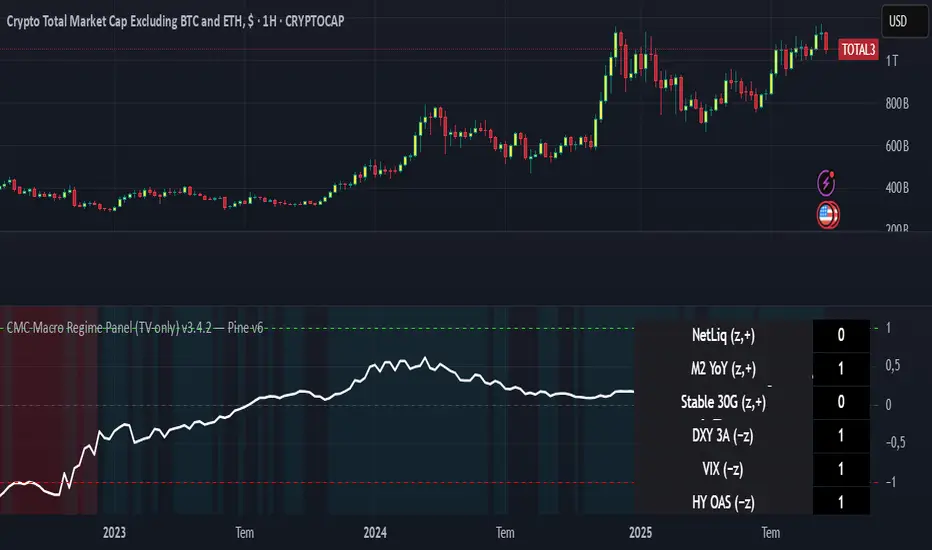
CMC Macro Regime PanelOverview (what it is):
A macro‑regime gate built entirely from TradingView-native symbols (CRYPTOCAP, FRED, DXY/VIX, HYG/LQD). It aggregates central‑bank liquidity (Fed balance sheet − RRP − Treasury General Account), USD strength, credit conditions, stablecoin flows/dominance, tech beta and BTC–NDX co‑move into one normalized score (CLRC). The panel outputs Risk‑ON/OFF regimes, an Early 3/5 pre‑signal, and an automatic BTC vs ETH vs ALTs preference. It is intentionally scoped to Daily & Weekly reads (no intraday timing). Publish with a clean chart and a clear description as per TradingView rules.
TradingView
Why we also use other TradingView screens (and why that is compliant)
This script pulls data via request.security() from official TV symbols only; users often want to open the raw series on separate charts to sanity‑check:
CRYPTOCAP indices: TOTAL, TOTAL2, TOTAL3 (market cap aggregates) and dominance tickers like BTC.D, USDT.D. Helpful for regime & rotation (ALTs vs BTC). TradingView provides definitions for crypto market cap and dominance symbols.
TradingView
+3
TradingView
+3
TradingView
+3
FRED releases: WALCL (Fed assets, weekly), RRPONTSYD (ON RRP, daily), WTREGEN (TGA, weekly), M2SL (M2, monthly). These are the official macro sources exposed on TV.
FRED
+3
FRED
+3
FRED
+3
Risk proxies: TVC:DXY (USD index), TVC:VIX (implied vol), AMEX:HYG/AMEX:LQD (credit), NASDAQ:NDX (tech beta), BINANCE:ETHBTC. VIX/NDX relationship is well-documented; VIX measures 30‑day expected S&P500 vol.
TradingView
+2
TradingView
+2
Compliance note: Using multiple screens is optional for users, but it explains/justifies how components work together (a requirement for public scripts). Keep publication chart clean; use extra screens only to illustrate in the description.
TradingView
How it works (high level)
Liquidity block (Weekly/Monthly)
Net Liquidity = WALCL − RRPONTSYD − WTREGEN (YoY z‑score). WALCL is weekly (as of Wednesday) via H.4.1; RRP is daily; TGA is a Fed liability series. M2 YoY is monthly.
FRED
+3
FRED
+3
FRED
+3
Risk conditions (Daily)
DXY 3‑month momentum (inverted), VIX level (inverted), Credit (HYG/LQD ratio or HY OAS). VIX is a 30‑day constant‑maturity implied vol index per Cboe methodology.
Cboe
+1
Crypto‑internal (Daily)
Stablecoins (USDT+USDC+DAI 30‑day log change), USDT dominance (20‑day, inverted), TOTAL3 (63‑day momentum). Dominance symbols on TV follow a documented formula.
TradingView
Beta & co‑move (Daily)
NDX 63‑day momentum, BTC↔NDX 90‑day correlation.
All components become z‑scores (optionally clipped), weighted, missing inputs drop and weights renormalize. We never use lookahead; we confirm on bar close to avoid repainting per Pine docs (barstate.isconfirmed, multi‑TF).
TradingView
+2
TradingView
+2
What you see on the chart
White line (CLRC) = macro regime score.
Background: Green = Risk‑ON, Red = Risk‑OFF, Teal = Early 3/5 (pre‑signal).
Table: shows each component’s z‑score and the Preference: BTC / ETH / ALTs / Mixed.
Signals & interpretation
Designed for Daily (1D) and Weekly (1W) only.
Regime gates (default Fast preset):
Enter ON: CLRC ≥ +0.8; Hold ON while ≥ +0.5.
Enter OFF: CLRC ≤ −1.0; Hold OFF while ≤ −0.5.
0 / ±1 reading: CLRC is a standardized composite.
~0 = neutral baseline (no macro edge).
≥ +1 = strong macro tailwind (≈ +1σ).
≤ −1 = strong headwind (≈ −1σ).
Early 3/5 (teal): a fast pre‑signal when at least 3 of 5 daily checks align: USDT.D↓, DXY↓, VIX↓, HYG/LQD↑, ETHBTC↑ or TOTAL3↑. It often precedes a full ON flip—use for pre‑positioning rather than full sizing.
BTC/ETH/ALTs selector (only when ON):
ALTs when BTC.D↓ and (ETHBTC↑ or TOTAL3↑) ⇒ rotate down the risk curve.
BTC when BTC.D↑ and ETHBTC↓ ⇒ keep it concentrated.
ETH when ETHBTC↑ while BTC.D flat/up ⇒ add ETH beta.
(Dominance mechanics are documented by TV.)
TradingView
Dissonance (incompatibility) rules — when to stand down
Use these overrides to avoid false comfort:
CLRC > +1 but USDT.D↑ and/or VIX spikes day‑over‑day → downgrade to Neutral; wait for USDT.D to stabilize and VIX to cool (VIX is a fear gauge of 30‑day expectation).
Cboe Global Markets
CLRC > +1 but DXY↑ sharply (USD squeeze) → size below normal; require DXY momentum to roll over.
CLRC < −1 but Early 3/5 = true two days in a row → start reducing underweights; look for ON flip within a few bars.
NetLiq improving (W) but credit (HYG/LQD) deteriorating (D) → treat as mixed regime; prefer BTC over ALTs.
How to use (step‑by‑step)
A. Read on Daily (1D) — main regime
Open CRYPTOCAP:TOTAL3, 1D (panel applied).
Wait for bar close (use alerts on confirmed bar). Pine docs recommend barstate.isconfirmed to avoid repainting on realtime bars.
TradingView
If ON, check Preference (BTC / ETH / ALTs).
Then drop to 4H on your trading pair for micro entries (this indicator itself is not for intraday timing).
B. Confirm weekly macro (1W) — once per week)
Review WALCL/RRP/TGA after the H.4.1 release on Thursdays ~4:30 pm ET. WALCL is “Weekly, as of Wednesday”; M2 is Monthly—so do not expect daily responsiveness from these.
Federal Reserve
+2
FRED
+2
Recommended check times (practical schedule)
Daily regime read: right after your chart’s daily close (confirmed bar). For consistent timing across crypto, many users set chart timezone to UTC and read ~00:05 UTC; you can change chart timezone in TV’s settings.
TradingView
In‑day monitoring: optional spot checks 16:00 & 20:00 UTC (DXY/VIX move during US hours), but act only after the daily bar confirms.
Weekly macro pass: Thu 21:30–22:30 UTC (after H.4.1 4:30 pm ET) or Fri after daily close, to let weekly FRED series propagate.
Federal Reserve
Limitations & data latency (be explicit)
Higher‑TF data & confirmation: FRED weekly/monthly series will not reflect intraday risk in crypto; we aggregate them for regime, not for entry timing.
Repainting 101: Realtime bars move until close. This script does not use lookahead and follows Pine guidance on multi‑TF series; still, always act on confirmed bars.
TradingView
+1
Public‑library compliance: Title EN‑only; description starts in EN; clean chart; justify component mash‑up; no lookahead; no unrealistic claims.
TradingView
Alerts you can use
“Macro Risk‑ON (entry)” — fires on ON flip (confirmed bar).
“Macro Risk‑OFF (entry)” — fires on OFF flip.
“Early 3/5” — fires when the teal pre‑signal appears (not a regime flip).
“Preference change” — BTC/ETH/ALTs toggles while ON.
Publish note: Alerts are fine; just avoid implying guaranteed accuracy/performance.
TradingView
Background research (why these inputs matter)
Liquidity → Crypto: Fed H.4.1 timing and series definitions (WALCL, RRP, TGA) formalize the “net liquidity” concept used here.
FRED
+3
Federal Reserve
+3
FRED
+3
Stablecoins ↔ Non‑stable crypto: empirical work shows bi‑directional causality between stablecoin market cap and non‑stable crypto cap; stablecoin growth co‑moves with broader crypto activity.
Global liquidity link: world liquidity positively relates to total crypto market cap; lagged effects are observed at monthly horizons.
VIX/Uncertainty effect: fear shocks impair BTC’s “safe haven” behavior; VIX is a meaningful risk‑off read.
TILT - Timed Index of Liquidity TrendsThe Timed Index of Liquidity Trends (TILT) is a tracking tool for high-market cap, high-volatility assets like Bitcoin (BTCUSD), the S&P 500 (SPY), the Nasdaq 100 (QQQ), and Gold. Liquidity drives markets; understanding when liquidity is expanding or contracting can help traders anticipate major market swings with greater confidence.
TILT’s M2 Calculation
TILT is based on a global M2 money supply proxy, which aggregates liquidity conditions from major economies. Since TradingView does not provide direct M2 data for all regions, the indicator uses market-based proxies instead:
🇺🇸 United States – S&P 500 Index (SPX)
🇨🇦 Canada – TSX Composite Index (TSX)
🇪🇺 Eurozone – EUR/USD Exchange Rate (EURUSD)
🇬🇧 United Kingdom – GBP/USD Exchange Rate (GBPUSD)
🇷🇺 Russia – Moscow Exchange Index (MOEX)
🇨🇳 China – China 50 Index (CN50USD)
🇯🇵 Japan – Nikkei 225 Index (JPN225)
🇦🇺 Australia – Gold (XAUUSD) as a liquidity proxy
🇮🇳 India – Nifty 50 Index (NIFTY)
🇰🇷 South Korea – KOSPI Index (KOSPI)
🇧🇷 Brazil – Bovespa Index (IBOV)
🇿🇦 South Africa – USD/ZAR Exchange Rate (USDZAR)
By summing these liquidity proxies, TILT provides a comprehensive view of global M2 conditions, allowing traders to see when money supply is expanding (bullish liquidity conditions) or contracting (bearish liquidity conditions).
How to Use TILT for Trading High-Volatility Assets
TILT is not a traditional price indicator. It is a macro tool designed to show whether liquidity is flowing into or out of the financial system. Assets like Bitcoin, QQQ, and Gold tend to perform well when liquidity is expanding and decline when liquidity is contracting.
₿ Bitcoin (BTCUSD) – The Ultimate Liquidity Sponge
Bitcoin thrives on excess liquidity because it is still a speculative asset with no central authority.
· Liquidity Expanding → BTC tends to rise, as speculative capital flows in.
· Liquidity Contracting → BTC struggles or enters a bear market as leverage dries up.
Example Use Case: If TILT turns green (expanding liquidity) and BTC is near a technical support zone, it may indicate a buying opportunity before the next rally.
📊 S&P 500 (SPY) & Nasdaq 100 (QQQ) – Growth & Risk Appetite
These indices are heavily influenced by liquidity conditions because they represent growth stocks and corporate credit access.
· SPY (🇺🇸) → Moves based on global liquidity, particularly Fed policy & M2 expansion.
· QQQ (🇺🇸) → Even more sensitive than SPY due to high exposure to tech stocks.
Example Use Case: If TILT shows liquidity expansion, QQQ often leads SPY higher, providing early signals for market-wide risk-on behavior.
🥇 Gold – Liquidity & Inflation Hedge
Gold is a monetary asset, meaning it benefits from liquidity expansion and inflation fears.
· Liquidity Expanding → Gold can rally as real yields decline.
· Liquidity Contracting → Gold struggles, especially if real yields rise.
Example Use Case: If TILT turns red (liquidity contracting) and bond yields are rising, gold could enter a bearish phase.
⏱️ Timing Market Swings with the Offset Function
The offset function in TILT allows traders to shift liquidity data forward or backward in time to find the best correlation with price action. However, the offset is not fixed and should be re-evaluated periodically to ensure it remains optimized as a leading indicator. Liquidity cycles and market conditions change over time, meaning an offset that worked well in one period may need adjustment in another.
🤔 Why Use an Offset?
Liquidity moves markets with a lag – The effect of M2 expansion/contraction takes time to show up in risk assets.
Finding the right lag helps confirm liquidity-driven price moves – This is crucial for Bitcoin, QQQ, and Gold, which react differently to liquidity shifts.
Since liquidity conditions evolve, the offset should be adjusted from time to time to maintain predictive accuracy.
👋 How to Fit the Offset Using Vertical Reference Lines
The best way to optimize the offset is by testing historical liquidity cycles and using vertical reference lines (and/or the Date Range tool) to align liquidity trends with major price swings.
Step 1: Plot TILT and the asset you’re analyzing (e.g., BTCUSD) on the same chart.
Step 2: Add vertical lines on significant price reversals (major tops & bottoms).
Step 3: Adjust TILT’s offset forward or backward to see if liquidity trends lead or lag those reversals.
Step 4: Periodically revisit the offset setting to ensure it still aligns well with current market conditions.
Example: If BTC topped 10 bars after TILT turned red, you might set the offset to +10 to better align liquidity changes with price action. If, over time, BTC begins reacting faster or slower to liquidity shifts, the offset should be updated accordingly.
💡 Advanced Tips for TILT Users
· Combine TILT With Sentiment Indicators Like the Fear & Greed Index
· Low Fear & Expanding Liquidity → Strong buy signal for BTC & risk assets
· High Greed & Contracting Liquidity → Caution: Market topping signal
· Use With Volume & On-Chain Metrics for BTC
· Rising TILT + Increasing BTC Volume → Confirms strong accumulation
· TILT Falling + Weak BTC Volume → Potential distribution & market risk
· Watch for Divergences
If BTC makes a new high but TILT is falling, it could indicate a liquidity-driven market top.
If BTC makes a new low but TILT is rising, it could indicate a bottom forming.
Conclusion: TILT = The Macro Liquidity Key for Volatile Assets
TILT is an effective tool for timing market swings in Bitcoin, QQQ, SPY, and Gold, as these assets are highly sensitive to liquidity cycles.
· Tracks global M2 trends using liquidity proxies from major economies
· Helps confirm major tops & bottoms in risk assets
· Offset function allows precise timing of liquidity-driven market moves
· Offset should be reviewed periodically to maintain optimal accuracy
· Pairs well with sentiment tools like the Fear & Greed Index for crypto
By using TILT correctly, traders can anticipate major market turns and position ahead of liquidity-driven moves.

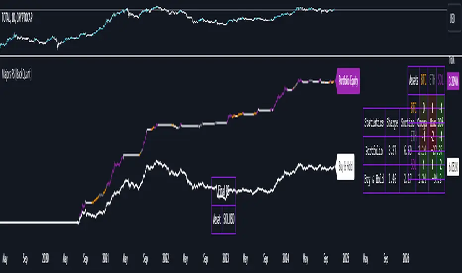
Majors Rotation System [BackQuant]Majors Rotation System
Introducing BackQuant's Majors Rotation System, a comprehensive portfolio management tool for rotating among the major cryptocurrencies—BTC, ETH, and SOL. This system is designed to optimize returns by selecting the strongest-performing asset while avoiding periods of market weakness. It employs a long and cash-only strategy, meaning the system will only hold positions when market conditions are favorable, and will stay in cash during downtrends. Additionally, it incorporates a powerful regime filter to ensure the system is inactive during market-wide downturns.
This script is ideal for crypto traders looking to improve performance by dynamically allocating capital based on real-time performance metrics, rather than relying on a simple buy-and-hold strategy.
Key Features
Dynamic Asset Rotation: The system constantly evaluates the performance of BTC, ETH, and SOL, selecting the strongest asset based on a ratio matrix. This matrix compares the relative strength of each asset to one another, ensuring that your portfolio is always positioned in the cryptocurrency with the most momentum.
Long and Cash-Only Portfolio: This system only takes long positions or remains in cash. By avoiding short positions, it reduces exposure during market downturns. The built-in regime filter ensures the system only operates when the broader market (represented by the TOTAL crypto market cap) is trending up, offering additional protection against unfavorable market conditions.
Equity Tracking: The script provides a real-time visualization of portfolio equity compared to a buy-and-hold strategy. It displays the equity curve of the portfolio while allowing you to compare it against the hypothetical equity of holding BTC, ETH, or SOL individually (Buy and Hold).
Performance Metrics: In addition to equity visualization, the system provides detailed performance metrics, including:
Sharpe Ratio: Measures risk-adjusted returns.
Sortino Ratio: Focuses on downside risk.
Omega Ratio: Evaluates returns relative to risk.
Maximum Drawdown: The maximum observed loss from a peak to a trough.
These metrics allow traders to assess the efficiency of the rotation system compared to simply holding assets.
Visual Cues:
Painted Candles: The script provides a visual trend indicator by painting candles according to the trend of the selected chart, helping traders quickly identify momentum shifts.
Support for Multiple Assets: The system allows users to toggle between BTC, ETH, and SOL or view the entire portfolio at once. It displays key metrics for each asset and offers an intuitive way to understand which asset is currently outperforming.
Regime Filter: A key aspect of this system is the regime filter, which only allows trading in favorable market conditions. It uses a Universal TPI (Trend Performance Indicator) to evaluate whether the overall crypto market (TOTAL Market Cap) and key assets (BTC, ETH) are in a bullish trend. If the market is in a downtrend, the system will exit positions and move into cash.
Customizable Parameters: Users can customize several important aspects of the system:
Starting Date: Choose when the backtest or live trading begins.
Starting Capital: Set the initial capital for backtesting purposes.
Visualization Options: Toggle between base data, ratioed data, and equity plots. Users can also customize the line width and color settings for better chart clarity.
Adaptive Momentum Scoring: The system uses advanced indicators, which are not disclosed (proprietary) to assess the trend and momentum of the selected cryptocurrencies dynamically.
How the Rotation Works
The system uses a universal algorithm to calculate trend and momentum signals for BTC, ETH, and SOL. These signals are processed through a ratio matrix, which compares the performance of each asset against the others. Based on this comparison, the system identifies the strongest asset and allocates capital accordingly.
BTC, ETH, and SOL Scores: These scores represent the relative strength of each asset based on the universal algorithm. The system dynamically selects the asset with the highest score, rotating out of underperforming assets and into the top performer.
Allocation Decisions: The system determines whether to allocate capital to BTC, ETH, SOL, or Cash based on the scores. If none of the assets show strength, the system defaults to cash to protect the portfolio from market downturns.
Equity and Buy-and-Hold Comparisons
This script provides a side-by-side comparison of the portfolio’s equity curve and a buy-and-hold strategy:
Portfolio Equity: Shows the performance of the system as it rotates between BTC, ETH, and SOL.
Buy-and-Hold Equity: Displays how the portfolio would have performed if you simply held BTC, ETH, or SOL without trading.
These comparisons allow traders to see how the dynamic rotation system performs relative to a passive holding strategy.
Alerts and Visual Feedback
The system provides real-time alerts when asset allocations change, notifying traders when the system moves capital between assets or into cash. Additionally, the system offers detailed visual feedback, including:
Equity Curve Plots: Displays the equity curve of the portfolio and the individual assets.
Score Labels: Shows the strength scores for BTC, ETH, and SOL directly on the chart for easy monitoring.
Final Thoughts
The Majors Rotation System offers a powerful way to navigate the highly volatile crypto market by rotating between the strongest performing assets and staying in cash when conditions are unfavorable. With its advanced metrics, equity tracking, and built-in regime filter, this system is designed to optimize returns while minimizing risk.
Dominance DashboardThe "Dominance Dashboard" is a TradingView indicator designed to provide traders with a clear and concise visual representation of Bitcoin Dominance (BTC.D). This script helps traders monitor BTC.D in real-time, offering insights into market dynamics and potential trading signals based on the changes in Bitcoin's market dominance.
Key Features
Real-Time BTC Dominance: Displays the current Bitcoin Dominance percentage.
Historical Comparison: Shows the previous day's Bitcoin Dominance for comparison.
Visual Indicators: Utilizes color-coded arrows to indicate changes in Bitcoin Dominance (increase or decrease).
Customizable Table Settings: Users can customize the position, size, and colors of the displayed table to suit their preferences.
How It Works
Data Retrieval: The script uses request.security to fetch the latest and previous day's BTC.D data.
Comparison Mechanism: It compares the current BTC Dominance with the previous day's value to determine whether BTC.D has increased, decreased, or remained unchanged.
Dynamic Table Display: Based on user preferences, the script dynamically adjusts the table's position, text size, and colors.
Using the Indicator
Table Settings:
Show Header: Toggle the visibility of the table header.
Position: Choose from various predefined positions (e.g., Top Right, Bottom Right) to place the dashboard on your chart.
Text Size: Select the text size (Tiny, Small, Normal, Large) for better readability.
Text and Border Colors: Customize the text and border colors to match your chart's theme.
Timeframe Settings:
Show Current BTC Dominance: Enable or disable the display of the current BTC Dominance percentage.
Underlying Concepts
BTC Dominance: Bitcoin Dominance (BTC.D) measures Bitcoin's market capitalization relative to the total market capitalization of all cryptocurrencies. Monitoring BTC.D helps traders understand the flow of capital in and out of Bitcoin compared to other cryptocurrencies.
Visual Change Indicators: The script uses simple arrow symbols (🔼 for an increase and 🔽 for a decrease) to provide quick visual cues about the direction of change in BTC Dominance. This feature helps traders quickly assess market conditions without deep analysis.
Practical Use Cases
Market Sentiment Analysis: A rising BTC Dominance could indicate a market shift towards Bitcoin, potentially signaling a bearish sentiment for altcoins. Conversely, a falling BTC Dominance might suggest increased interest in altcoins.
Trend Confirmation: Traders can use BTC Dominance trends to confirm their trading strategies. For example, if a trader is bullish on Bitcoin, an increasing BTC Dominance might reinforce their position.
Portfolio Management: By monitoring BTC Dominance, traders can make informed decisions about portfolio rebalancing between Bitcoin and other cryptocurrencies.
三维资金流向(多色版)1️⃣ Colors Correspond to Capital Flow
Based on your multi-color logic:
Green bars → BTC-only inflow
Blue bars → Major altcoins-only inflow
Yellow bars → BTC + major altcoins inflow simultaneously
Red bars → USDT inflow (risk-off / capital retreat)
On the chart, you can observe:
Red bars densely appearing → BTC and alt prices often consolidate or decline, indicating market funds are retreating to safety.
Green bars concentrated → BTC is generally in an uptrend, indicating capital is mainly flowing into BTC.
Blue bars appearing → Major altcoins may rise while BTC is flat, showing that altcoins are absorbing funds.
Yellow bars appearing → BTC and altcoins rise together, usually signaling an overall bullish market.
2️⃣ Observed Patterns
Capital flow vs price movement:
Green + Yellow bars concentrated → BTC shows clear upward movement
Blue bars concentrated → Altcoins rise noticeably
Red bars → Both BTC and altcoins may decline or consolidate
Capital rotation phenomenon:
Red → Green → Yellow → Blue → Can be seen as a rotation of USDT → BTC → BTC+Alt → Alt
This indicates that at different stages, the market rotates between risk-off, major assets, and altcoins.
Volatility:
Tall, frequently alternating bars → Market volatility is high
Short bars → Capital flow is weak, market tends to move sideways

FEDFUNDS Rate Divergence Oscillator [BackQuant]FEDFUNDS Rate Divergence Oscillator
1. Concept and Rationale
The United States Federal Funds Rate is the anchor around which global dollar liquidity and risk-free yield expectations revolve. When the Fed hikes, borrowing costs rise, liquidity tightens and most risk assets encounter head-winds. When it cuts, liquidity expands, speculative appetite often recovers. Bitcoin, a 24-hour permissionless asset sometimes described as “digital gold with venture-capital-like convexity,” is particularly sensitive to macro-liquidity swings.
The FED Divergence Oscillator quantifies the behavioural gap between short-term monetary policy (proxied by the effective Fed Funds Rate) and Bitcoin’s own percentage price change. By converting each series into identical rate-of-change units, subtracting them, then optionally smoothing the result, the script produces a single bounded-yet-dynamic line that tells you, at a glance, whether Bitcoin is outperforming or underperforming the policy backdrop—and by how much.
2. Data Pipeline
• Fed Funds Rate – Pulled directly from the FRED database via the ticker “FRED:FEDFUNDS,” sampled at daily frequency to synchronise with crypto closes.
• Bitcoin Price – By default the script forces a daily timeframe so that both series share time alignment, although you can disable that and plot the oscillator on intraday charts if you prefer.
• User Source Flexibility – The BTC series is not hard-wired; you can select any exchange-specific symbol or even swap BTC for another crypto or risk asset whose interaction with the Fed rate you wish to study.
3. Math under the Hood
(1) Rate of Change (ROC) – Both the Fed rate and BTC close are converted to percent return over a user-chosen lookback (default 30 bars). This means a cut from 5.25 percent to 5.00 percent feeds in as –4.76 percent, while a climb from 25 000 to 30 000 USD in BTC over the same window converts to +20 percent.
(2) Divergence Construction – The script subtracts the Fed ROC from the BTC ROC. Positive values show BTC appreciating faster than policy is tightening (or falling slower than the rate is cutting); negative values show the opposite.
(3) Optional Smoothing – Macro series are noisy. Toggle “Apply Smoothing” to calm the line with your preferred moving-average flavour: SMA, EMA, DEMA, TEMA, RMA, WMA or Hull. The default EMA-25 removes day-to-day whips while keeping turning points alive.
(4) Dynamic Colour Mapping – Rather than using a single hue, the oscillator line employs a gradient where deep greens represent strong bullish divergence and dark reds flag sharp bearish divergence. This heat-map approach lets you gauge intensity without squinting at numbers.
(5) Threshold Grid – Five horizontal guides create a structured regime map:
• Lower Extreme (–50 pct) and Upper Extreme (+50 pct) identify panic capitulations and euphoria blow-offs.
• Oversold (–20 pct) and Overbought (+20 pct) act as early warning alarms.
• Zero Line demarcates neutral alignment.
4. Chart Furniture and User Interface
• Oscillator fill with a secondary DEMA-30 “shader” offers depth perception: fat ribbons often precede high-volatility macro shifts.
• Optional bar-colouring paints candles green when the oscillator is above zero and red below, handy for visual correlation.
• Background tints when the line breaches extreme zones, making macro inflection weeks pop out in the replay bar.
• Everything—line width, thresholds, colours—can be customised so the indicator blends into any template.
5. Interpretation Guide
Macro Liquidity Pulse
• When the oscillator spends weeks above +20 while the Fed is still raising rates, Bitcoin is signalling liquidity tolerance or an anticipatory pivot view. That condition often marks the embryonic phase of major bull cycles (e.g., March 2020 rebound).
• Sustained prints below –20 while the Fed is already dovish indicate risk aversion or idiosyncratic crypto stress—think exchange scandals or broad flight to safety.
Regime Transition Signals
• Bullish cross through zero after a long sub-zero stint shows Bitcoin regaining upward escape velocity versus policy.
• Bearish cross under zero during a hiking cycle tells you monetary tightening has finally started to bite.
Momentum Exhaustion and Mean-Reversion
• Touches of +50 (or –50) come rarely; they are statistically stretched events. Fade strategies either taking profits or hedging have historically enjoyed positive expectancy.
• Inside-bar candlestick patterns or lower-timeframe bearish engulfings simultaneously with an extreme overbought print make high-probability short scalp setups, especially near weekly resistance. The same logic mirrors for oversold.
Pair Trading / Relative Value
• Combine the oscillator with spreads like BTC versus Nasdaq 100. When both the FED Divergence oscillator and the BTC–NDQ relative-strength line roll south together, the cross-asset confirmation amplifies conviction in a mean-reversion short.
• Swap BTC for miners, altcoins or high-beta equities to test who is the divergence leader.
Event-Driven Tactics
• FOMC days: plot the oscillator on an hourly chart (disable ‘Force Daily TF’). Watch for micro-structural spikes that resolve in the first hour after the statement; rapid flips across zero can front-run post-FOMC swings.
• CPI and NFP prints: extremes reached into the release often mean positioning is one-sided. A reversion toward neutral in the first 24 hours is common.
6. Alerts Suite
Pre-bundled conditions let you automate workflows:
• Bullish / Bearish zero crosses – queue spot or futures entries.
• Standard OB / OS – notify for first contact with actionable zones.
• Extreme OB / OS – prime time to review hedges, take profits or build contrarian swing positions.
7. Parameter Playground
• Shorten ROC Lookback to 14 for tactical traders; lengthen to 90 for macro investors.
• Raise extreme thresholds (for example ±80) when plotting on altcoins that exhibit higher volatility than BTC.
• Try HMA smoothing for responsive yet smooth curves on intraday charts.
• Colour-blind users can easily swap bull and bear palette selections for preferred contrasts.
8. Limitations and Best Practices
• The Fed Funds series is step-wise; it only changes on meeting days. Rapid BTC oscillations in between may dominate the calculation. Keep that perspective when interpreting very high-frequency signals.
• Divergence does not equal causation. Crypto-native catalysts (ETF approvals, hack headlines) can overwhelm macro links temporarily.
• Use in conjunction with classical confirmation tools—order-flow footprints, market-profile ledges, or simple price action to avoid “pure-indicator” traps.
9. Final Thoughts
The FEDFUNDS Rate Divergence Oscillator distills an entire macro narrative monetary policy versus risk sentiment into a single colourful heartbeat. It will not magically predict every pivot, yet it excels at framing market context, spotting stretches and timing regime changes. Treat it as a strategic compass rather than a tactical sniper scope, combine it with sound risk management and multi-factor confirmation, and you will possess a robust edge anchored in the world’s most influential interest-rate benchmark.
Trade consciously, stay adaptive, and let the policy-price tension guide your roadmap.

Macro Context v1 - NobruzeraaaHMacro Context v1
Advanced Multi-Asset Correlation Analysis for Professional Trading
"In institutional trading, correlation is king. This panel puts the crown on your charts."
Overview
This is a sophisticated real-time market analysis tool that monitors critical institutional correlations across traditional and cryptocurrency markets. This indicator provides traders with actionable insights based on academic research and institutional trading patterns.
Features
- **Multi-Asset Correlation Engine**
- **13 Advanced Analysis Layers** covering macro, crypto, and institutional flows
- **Real-time Correlation Detection** between BTC, equities, bonds, and commodities
- **Institutional Divergence Alerts** for early trend identification
- **Risk Sentiment Analysis** using VIX, DXY, and yield curve data
**Professional Grade Analytics**
- **NDX/SPX vs BTC Correlation** - Critical tech-crypto relationship monitoring
- **VIX Breakout Detection** - Institutional panic (>30) and dangerous complacency (<15) alerts
- **Yield Curve Inversion Monitoring** - Recession signal detection via US10Y-US2Y spread
- **Institutional Flow Tracking** - Real proxies using MSTR/COIN performance
- **DXY Critical Levels** - USD dominance (>105) and weakness (<95) thresholds
**Smart Actionable Signals**
- **Opportunity Detection** in altcoins during confirmed risk-on periods
- **Divergence Warnings** when BTC-Tech correlations break down
- **Volatility Preparation** alerts during market complacency
- **Hedge Recommendations** during institutional flight to quality
Correlation Matrix Monitored
**Traditional Markets**
| Asset | Function | Institutional Significance |
|-------|----------|---------------------------|
| **SPX** | Equity benchmark | Risk-on/off sentiment |
| **NDX** | Tech growth proxy | Innovation capital flows |
| **VIX** | Volatility index | Fear/greed institutional gauge |
| **DXY** | Dollar strength | Global liquidity flows |
| **US10Y-US2Y** | Yield curve | Recession probability |
| **Gold** | Safe haven | Inflation hedge demand |
| **Copper** | Industrial metal | Growth expectations |
**Cryptocurrency Markets**
| Asset | Function | Institutional Significance |
|-------|----------|---------------------------|
| **BTC** | Digital store of value | Institutional adoption gauge |
| **ETH** | Smart contract platform | DeFi institutional interest |
| **BTC.D** | Bitcoin dominance | Crypto capital allocation |
| **USDT.D** | Stablecoin dominance | Risk-off crypto indicator |
| **TOTAL3** | Alt market cap | Retail vs institutional flow |
**Institutional Proxies**
| Asset | Function | Why It Matters |
|-------|----------|----------------|
| **MSTR** | MicroStrategy stock | Corporate BTC holdings proxy |
| **COIN** | Coinbase stock | Crypto institutional gateway |
---
Critical Correlations Detected
**1. Tech-Led Risk-On Confirmation**
**Trigger:** NDX outperforming SPX + BTC rising + VIX declining
**Signal:** Strong institutional appetite for growth assets
**Action:** Opportunity in tech and crypto momentum
**2. BTC-Tech Divergence Warning**
**Trigger:** NDX/SPX ratio positive + BTC declining significantly
**Signal:** Potential institutional crypto exit while maintaining tech exposure
**Action:** Monitor for broader crypto weakness
**3. Institutional Panic Mode**
**Trigger:** VIX > 30 + USDT.D rising + BTC/equities declining
**Signal:** Fear-driven liquidations across all risk assets
**Action:** Wait for clarity, prepare for volatility
**4. Dangerous Complacency**
**Trigger:** VIX < 15 + low volatility across assets
**Signal:** Market complacency reaching dangerous levels
**Action:** Prepare for sudden volatility spike
**5. Yield Curve Recession Signal**
**Trigger:** US10Y-US2Y spread deeply inverted (<-0.5%)
**Signal:** Bond market pricing in economic slowdown
**Action:** Defensive positioning, reduce risk exposure
**6. USD Super-Dominance**
**Trigger:** DXY > 105 + gold declining + risk assets under pressure
**Signal:** Extreme USD strength creating global liquidity stress
**Action:** Monitor emerging market stress, dollar-denominated debt concerns
**7. Altseason Confirmation**
**Trigger:** BTC.D declining + USDT.D declining + TOTAL3 outperforming + low VIX
**Signal:** Capital rotating from BTC to altcoins in risk-on environment
**Action:** Opportunity in alternative cryptocurrencies
---
Advanced Analytics Provided
**Risk Sentiment Classification**
- 🔴 **Fear in System** - Multiple fear indicators triggered
- 🟡 **Cautious Mode** - Mixed signals, proceed carefully
- 🟢 **Risk Appetite** - Confirmed risk-on environment
- 🟢 **Strong Risk-On** - Multiple bullish confirmations
- 🟠 **Dangerous Complacency** - Excessive optimism warning
**Macro Context Analysis**
- 💪 **Dollar Dominant** - USD strength driving global flows
- 🌍 **USD Weakening** - Emerging market and commodity positive
- ⚠️ **Market Stress** - Multiple stress indicators active
- 🚀 **Solid Bull Market** - Confirmed uptrend across assets
- 🏭 **Growth Acceleration** - Copper/Gold ratio signaling expansion
- 🛡️ **Defensive Rotation** - Flight to quality assets
**Actionable Intelligence**
- ✅ **Opportunity in Alts** - Multiple confirmations for altcoin exposure
- ⚠️ **Wait for Clarity** - High uncertainty, avoid new positions
- 🏛️ **Consider Hedge** - Defensive positioning recommended
- 📈 **Ride Momentum** - Trend continuation likely
- 🔍 **Monitor Divergence** - Correlation breakdown warning
- ⚠️ **Prepare for Volatility** - Complacency extreme reached
Technical Implementation
**Data Sources**
- **Traditional Markets:** TradingView real-time feeds
- **Cryptocurrency:** Binance spot prices and market cap data
- **Macro Data:** US Treasury yields, volatility indices
- **Update Frequency:** Every minute during market hours
**Calculation Methodology**
- **24-hour percentage changes** for all assets
- **Real-time price levels** for VIX and DXY thresholds
- **Spread calculations** for yield curve analysis
- **Ratio analysis** for relative performance metrics
**Multi-Language Support**
- 🇺🇸 **English** - Full professional terminology
- 🇪🇸 **Spanish** - Complete translation for Latin American markets
- 🇧🇷 **Portuguese** - Brazilian market terminology
---
Academic Foundation
This indicator is built upon peer-reviewed research and institutional trading patterns:
**Research-Based Correlations**
- **Bitcoin-NASDAQ correlation studies** (2024 academic papers)
- **VIX threshold analysis** from institutional trading desks
- **Yield curve inversion** recession prediction models
- **Dollar index breakout** historical analysis
- **Cryptocurrency dominance** flow studies
**Institutional Insights**
- **Fear & Greed Index** methodology adaptation
- **Professional volatility** threshold implementation
- **Corporate treasury** Bitcoin adoption tracking
- **Institutional proxy** correlation validation
---
Quick Start Guide
**Configuration**
- **Language Selection:** Choose your preferred language
- **Asset Selection:** Enable/disable specific asset monitoring
- **Timezone:** Set your preferred timezone for timestamp display
**Interpretation**
- **Green indicators:** Bullish/risk-on signals
- **Red indicators:** Bearish/risk-off signals
- **Yellow indicators:** Neutral/mixed signals
- **Orange indicators:** Warning/extreme conditions
---
Use Cases
**Traders**
- **Portfolio allocation** based on institutional flows
- **Risk management** through correlation monitoring
- **Market timing** using sentiment extremes
- **Divergence trading** opportunities
**Analysts**
- **Multi-asset correlation** research
- **Macro theme** identification
- **Risk sentiment** quantification
- **Flow analysis** across asset classes
**Cryptocurrency Investors**
- **Altseason timing** through dominance analysis
- **Macro correlation** understanding
- **Institutional adoption** tracking
- **Risk-on/off** positioning
---
Important Disclaimers
- **Not Financial Advice:** This tool provides analytical insights, not investment recommendations
- **Market Risk:** All trading involves substantial risk of loss
- **Correlation Changes:** Market correlations can shift rapidly during crisis periods
- **Supplementary Tool:** Should be used alongside other analysis methods
This indicator represents cutting-edge market analysis combining traditional finance and cryptocurrency insights. Regular updates ensure continued accuracy as market structures evolve.
**Version:** 1.0
**Last Updated:** 2025
**Compatibility:** Pine Script v6
**Category:** Multi-Asset Analysis
