15 min Trailstop15m High/Low Liquidity Lines (1m) — Indicator Description
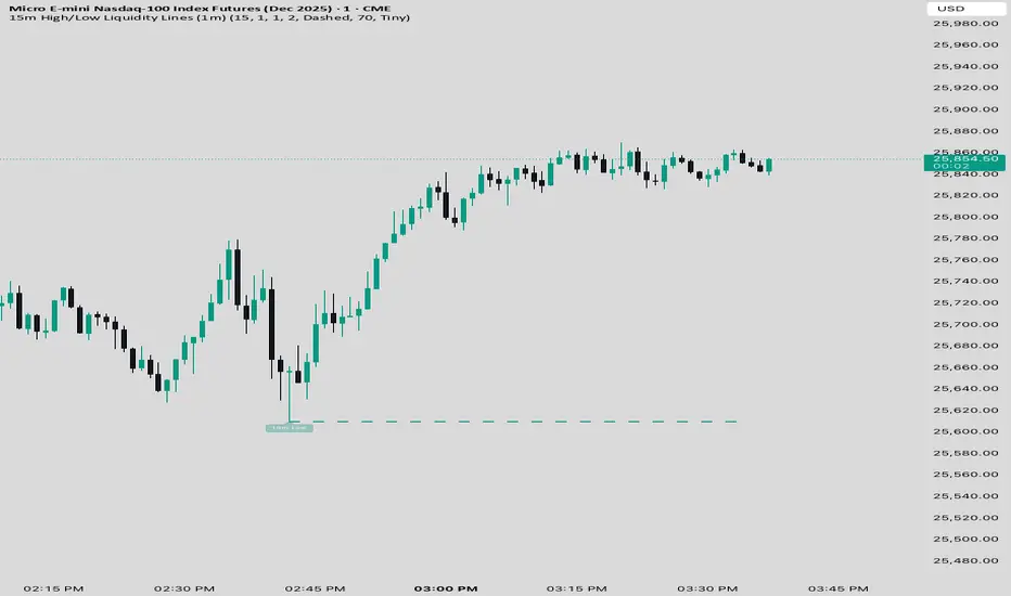
15m High/Low Liquidity Lines (1m) is a precision liquidity-mapping tool designed for intraday traders who understand the importance of higher-timeframe liquidity levels while executing on the 1-minute chart.
This indicator automatically detects confirmed 15-minute swing highs and swing lows using pivot logic. When a new 15m high or low forms:
✔ Liquidity Line Generation
A horizontal line is drawn exactly at the price level of the pivot.
The line is anchored to the exact 1-minute candle that produced the 15m high/low, ensuring perfect visual alignment.
The line extends only up to the current bar — not across the whole chart.
Optional text labels (“15m High”, “15m Low”) can be shown at the start of each line.
✔ Auto-Cleanup (Smart Liquidity Sweep Detection)
If price trades through the level, the corresponding line and label are:
Instantly deleted
Marking the level as taken/swept
Allowing the chart to stay clean and focused on active liquidity only
This mimics institutional liquidity logic: once the high or low is violated, the target is considered filled and removed.
✔ Alerts
The indicator includes built-in alerts that fire when:
A new 15m high is confirmed
A new 15m low is confirmed
This allows the trader to react immediately when fresh liquidity levels appear.
✔ Customization Options
You can fully tailor the visual representation:
Turn highs and/or lows on or off
Choose line style (solid, dashed, dotted)
Customize line color and thickness
Customize the label style, size, and transparency
Who Is This For?
This indicator is ideal for:
ICT-style traders
Liquidity-based scalpers
1-minute ES/NQ traders
Anyone who uses HTF liquidity levels to frame trades on the LTF
It provides a clean, automated method to track active 15-minute liquidity levels directly on the 1-minute chart with zero clutter and perfect alignment.
אינדיקטור Pine Script®