Volatility semaphore Support&Resistance multi timeframe [LM]Hello Traders,
I would like to introduce you volatility semaphore support&resistance levels. The idea is the same as the pivot
semaphore script of mine to spot the importance of support&resistence.
It is little bit different than previous script as it uses different line API than previous volatility support& resistance multi timeframe . You have more control over hat and how many lines are rendered(better to use odd numbers in line count setting as it always finds 2 S/R lines). Also this indicator has setup for contol whether you want wicky candles or no by setting percentage of candle body that is accepted.
I hope you will enjoy it.
חפש סקריפטים עבור "Volatility"

Relative VolatilityRelative volatility highlights large changes in price. This was designed to be used with my relative volume indicator so that traders can see the effect of volume on price action. It is also a good tool to analyse breakout patterns to identify best entry points and waves.
Above shows relative volatility and relative volume working together.

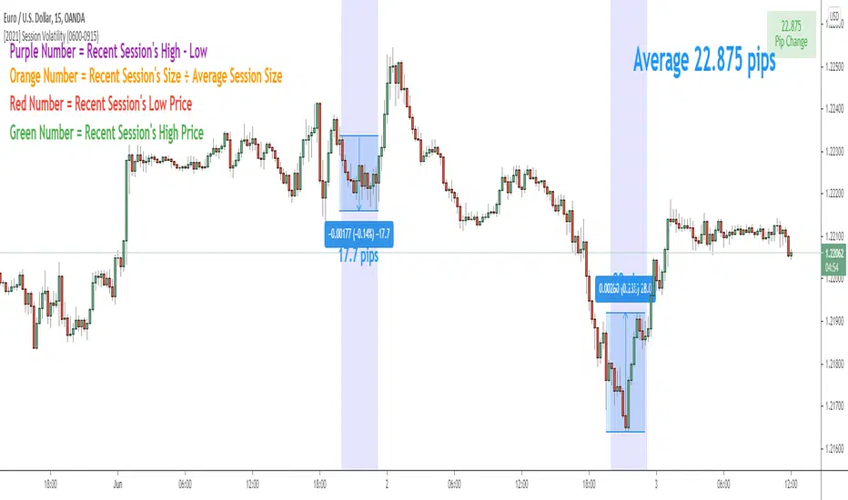
Session Volatility CalculatorHey traders!
This script calculates the average volatility of trading sessions.
You specify a start date, an end date, and a session time (eg. market open, Asian session etc)
The script then scans through all the price action on your chart and calculates the average price movement during that specified period.
What Is It For?
I created this script for my own purposes when developing certain strategies and testing certain ideas.
The purpose of this script is to give you an idea of how much price tends to move during certain times of day for certain markets.
You could think of it as a "session's average true range".
In crypto and forex this might be how much price tends to move on certain pairs during the Australian/Asian session, or the European session, or the overnight U.S. session etc.
In stocks this might be how much a symbol tends to move during the first hour of the day or the last hour of the day.
The point of calculating this information is for better understanding how markets move during certain times of day.
It's not a perfect science obviously since some days can be wilder than others depending on what fundamental events are developing, but it's useful information to have for times when there are no expected volatility-inducing events.
This info can help with optimizing targets and stop loss placement for certain day-trading strategies, and just generally getting an idea of what kinds of moves you might reasonably expect out of overnight positions or certain times of day etc - or at least that's what I use it for.
Settings
Hover your mouse over the "i" symbol to get more information on the script's settings, but here's a brief description:
Start Date: The date to begin calculating from (set to 1000 by default so it scans the entire chart).
End Date: The date to stop calculating (set to 2099 by default so it scans the entire chart)
Time Session: This is the time session during the day that you want to analyze.
Color Background: If turned on, this setting changes the background color to highlight the session.
Indicator Values
The indicator outputs a handful of values onto your chart. This is what the colors correspond to:
Top-Right Box: The average price range during the given time of day over historical price action.
Green Number: The recent session's highest price.
Red Number: The recent session's lowest price.
Purple Number: The recent session's price range (high - low).
Orange Number: The recent session's range ÷ the average (outputs a relative % of the average).
The dispersion of volatility indicesThe script is my implementation of "Forecasting a Volatility Tsunami" by Andrew Thrasher (Thrasher Analytics). You can find the paper here: www.researchgate.net
I've changed a bit the approach - instead of two volatility indices (VIX & VVIX), I used two more: VXN and VXD. Additionally, I average the percentiles, but there is an option to swtich it to the original approach.

Profit Accumulator VolatilityHi Everyone
I thought I'd share my new volatility trend indicator for anyone to use.
The indicator tracks the volatility in the market and plots this accordingly. Any plot above the zero line is a bullish signal and anything below the zero line is a bearish signal.
Long and Short Entry points are indicated at the 10 and -10 values respectively. A value of over 40 , or under -40 indicates a strong trend.
Possible entry and exit points are also highlighted on the chart.
I've added alerts onto this indicator highlighting possible entry and exit points as well as when strong trends are developing and when they are over.
This is intended to be used with your own indicators and/or analysis of the market and should be used carefully.
I personally like to use this indicator for entry on the one hour chart and then drop down to the 15 minute chart to confirm my entry and to use that timeframe for my exit.
Please feel free to forward any improvements that you'd like to make.
Cheers
Mike

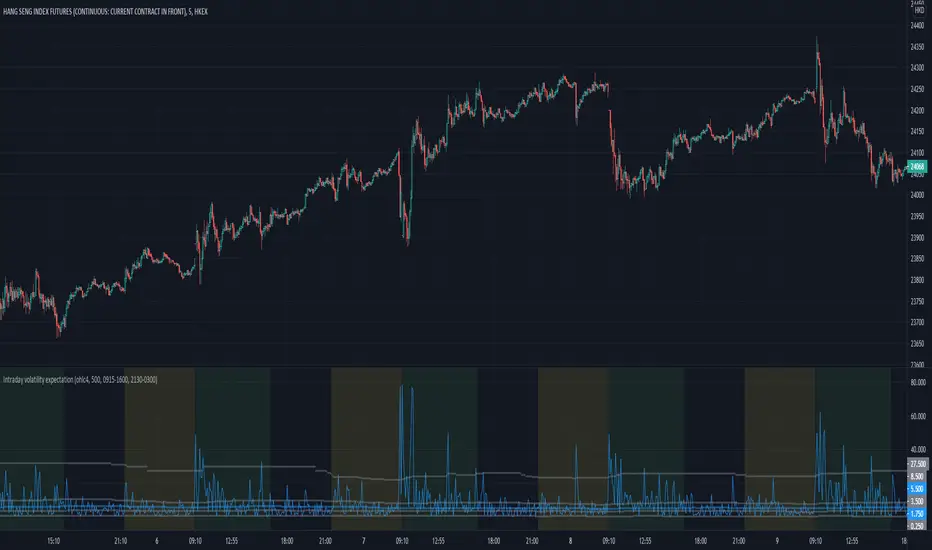
Intraday volatility expectationManaging expectation is important for price action traders.
This indicator mainly for intraday reference, and it plots the price change/ volatility statistics on a bar-to-bar basis, with the marking of +/- 1 and 2 sigma SD .
The user can refer to the historical volatility to manage their expectation of the velocity of price action by referring to these statistics.
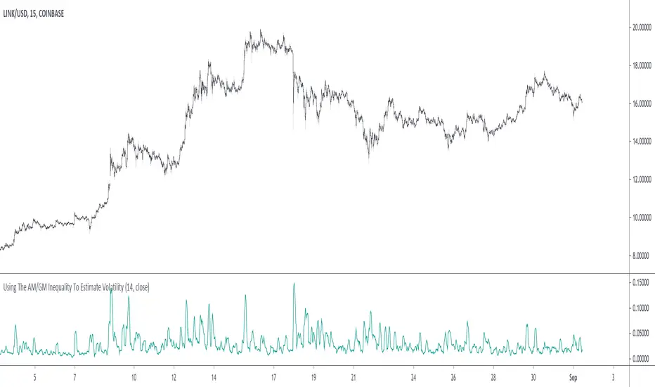
Using The AM/GM Inequality To Estimate VolatilityA volatility indicator derived from the AM/GM inequality. I don't think it will be necessary to describe the usage and interpretation of such indicator, and I don't think it is super useful, however, this is not the case of the script, which contains three ways to compute the geometric mean, with a classic, a simple, and an efficient way. The AM/GM inequality is also a really interesting concept, and I'll try to"prove" it in this post by using DSP. I also added more comments in the script in order to highlight some stuff.
The AM/GM Inequality
When we talk about the mean, we are referring to the "arithmetic" one by default, but there exist more types of means. Two other ones include the "geometric" and "harmonic" means, both are part of the Pythagorean means with the arithmetic mean.
Each one of them as several properties, but the most interesting aspect is their inequality, that is:
HM <= GM <= AM
The arithmetic mean is the one with the highest value, while the harmonic mean is the one with the lowest value. In the case each data point is equal to each other, all the means have the same value.
In our case, the inequality of interest is the inequality between the geometric and arithmetic mean, where the geometric mean is lower or equal than the arithmetic one. Many proofs/explanations exist, I'll try my version using DSP, where instead of thinking about means, we think about rolling means, which allows us to interpret them as low-pass filters. So we end up having the geometric moving average (GMA) and arithmetic moving average (SMA).
We know that GMA <= SMA , the SMA has a unity passband, this implies that the GMA has a passband lower than 1 (for non-equal input values), this explains why the GMA is smaller than the SMA. In order for a FIR filter to have a passband lower than 1, the sum of the filter coefficients must be lower than 1. In order to further proves this consider the following equation:
sqrt(a×b) = k×a + k×b
Here sqrt(a×b) is the geometric mean of a and b , the right-hand side of the equation is a weighted sum between a and b and coefficient k , we want to solve the equation with respect to k , if k×2 < 1 then we have the proof that GMA < SMA . The solution with respect to k is:
k = sqrt(a×b)/(a+b)
which always gives a number lower than 0.5, as such k×2 < 1 and thus the passband is lower than 1. If our input values are equal to each other, we end up with the following solution for k :
k = sqrt(a×a)/(a+a) = a/(2×a) = 0.5
as such the GMA has the coefficients of an SMA as long as the input values are equal to each other.
Because of this inequality, we can subtract the SMA to a GMA and take the square root of the result in order to have a volatility indicator, however, both moving averages are still pretty close to each other, which gives a very small result for the indicator.
Uwu I am a bit tired, better indicators coming up
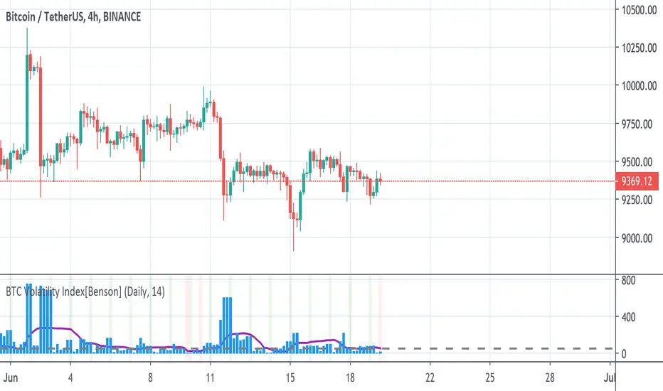
BTC Volatility Index[Benson]This indicator is for choosing the best timing to long BTC move future on FTX.
The basic idea is that when BTC's price volatility Index is relatively low(under 50 in 4hr timeframe or under 200 in D timeframe), it's more likely to have huge volatility afterwards, which it's a good time to long BTC's move future.
Green background --> Move future expected strike price
Red background --> Good timing to long BTC move future
Revolution Volatility Bands With Range Contraction Signal VIIAlso one of my favorite indicators. Very simple and easy to use. Essentially volatility bands with a technical analysis pattern, the triangle/wedge, which I have called "contraction signal". Put simply: When price is written in blue, volatility overall is falling. When the outer bands start to fatten up in blue, a contraction signal is forming. Works with any length of your choosing.

[GM PRO] VolatilityA highly customizable yet simple to use volatility indicator designed for algorithmic traders in mind.
Trend traders seek volume when entering a trade. Price action without volume is like a rocket without fuel -- it won't go very far.
In the Forex world, the actual volume is unknown, however with a good volatility indicator, we can more or less predict high/low volume periods relative to recent price action with a reasonable degree of accuracy.
This indicator uses standard deviations and moving averages to calculate when there is a strong price action, or weak/sideways price action.

Wasabi Bitcoin Volatility (BitMEX BVOL Index)This is Wasabi Bitcoin Volatility (BitMEX BVOL Index) which simulates the way the BitMEX BVOL index is described.
The good thing about this indicator as compared to the original BitMEX BVOL is that this indicator shows the volatility data on or prior to 2017.
이 지표는 와사비의 비트코인 변동성 지수 입니다. 이 것은 비트맥스의 BVOL 인덱스 계산 방식으로 범용으로 다른 거래소에 적용하기 위해 만들었습니다.
이 지표가 비트맥스의 BVOL 보다 유용한 점은 2017년 이전 데이타도 표현된다는 것입니다.
보다 자세한 제작 과정은 아래 프로파일 문구의 장소에 있는 관련 영상을 찾아보시기 바랍니다.

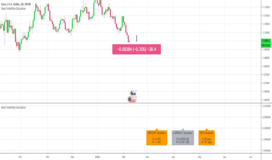
Best Volatility CalculatorHello traders,
This indicator shows the average volatility, of last N Periods, for the selected time frames.
You can select up to 2 timeframes with this version
Volatility is defined as the close of current candle - close of the previous N candle
Presented as Currency, Pip, percentage labels in a panel below.
Will calculate in real-time only for the current instrument on the chart.
The indicator is coded to not be repainting
Example
In the indicator screenshot, I used a lookback period of 1.
That compares the current candle close versus the previous one for the daily and weekly timeframe
Showing how the results are calculated for the weekly calculations
Enjoy :)
Best regards
Dave
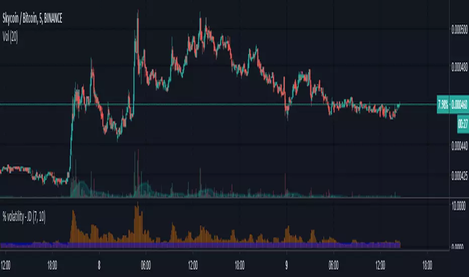
% volatility - JDA small script to quickly scan through coins based on % volatility, eg. for AB-trading.
Both lookback length of the number of bars and the minimum volatility threshold can be changed.
JD.
Volatility after Momentum/SMA crossThis indicator can be used in conjunction with alerts to detect Momentum crosses, which usually occur before volatility . ATR is included as a measurement of past volatility after crosses.
Special thanks to Washdil whom discovered this reoccurring theme in many of the major pairs.
Happy trading!

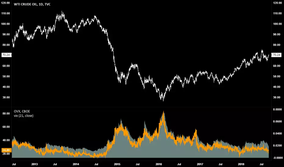
Realized VolatilityRealized Volatility, using the 21 period Average True Range formula with a log scaling of source input values.
Designed to match the CBOE's Volatility indexes across all timeframes and instruments.
XeL Volatility BANDSDISCLAIMER:
The Following indicator/code IS NOT intended to be a formal investment advice or recommendation by the author, nor should be construed as such. Users will be fully responsible by their use regarding their own trading vehicles/assets.
The following indicator was made for NON LUCRATIVE ACTIVITIES and must remain as is following TradingView's regulations. Use of indicator and their code are published by Invitation Only. All access granted over it, their use, copy or re-use should mention authorship and origin.
WARNING NOTICE!
THE INCLUDED FUNCTION MUST BE CONSIDERED AS DEBUGING CODE The models included in the function have been taken from openly sources on the web so they could have some errors as in the calculation scheme and/or in it's programatic scheme. Debugging are welcome.
WHAT'S THIS...?
Work derived by previous own research in favour of this main fields of study:
BUY TO SELL PRESSURES: Given current limitations and rise of prices for Market-Data fees, trying to count "real" market moves tick-by-tick is a real pain. I was very focused to measure this by estimation of Buyers against Sellers (or viceversa) just by playing around with the Range given of time-compression (OHLCv) data and trying to use accepted statistical methods like maximum-minimum count.
VOLATILITY ESTIMATION: From the previous point, my concern was trying to found an Historical Volatiilty Estimator that can individually count Bullish moves (Minimum from previous close to current price) and Bearish ones (Maximum from previous close to current price) and estimate them by filtering deviations selectable from Square of Returns or Absolute Returns with an Elastic Volatility-Weighted Average Method. (First Order Impulse Response Filter against PriceVolume cumulatives over time.)
BANDS: Two zones are mainly shadowed from derivations of Deviations: A BULL area and a BEAR area. This areas usually define cyclical regimes of asset price.
NOTES:
This version DO NOT INCLUDE ALERTS.
This version DO NOT INCLUDE STRATEGY: Feedback to write are welcome
CHEERS!
@XeL_Arjona 2018.

ADX Volatility Moving AverageThe ADXVMA is a volatility based moving average with the volatility being determined by the value of the ADX. The ADXVMA provides levels of support during uptrends and resistance during downtrends. Original NT indicator by Fat Tails on futures.io, just ported it to pinescript

Chaikin Volatility StrategyChaikin's Volatility indicator compares the spread between a security's
high and low prices. It quantifies volatility as a widening of the range
between the high and the low price.
You can use in the xPrice1 and xPrice2 any series: Open, High, Low, Close, HL2,
HLC3, OHLC4 and ect...

Chaikin Volatility Chaikin's Volatility indicator compares the spread between a security's
high and low prices. It quantifies volatility as a widening of the range
between the high and the low price.
You can use in the xPrice1 and xPrice2 any series: Open, High, Low, Close, HL2,
HLC3, OHLC4 and ect...

Volatility Adjusted Relative Strength (VARS) - Histogram OptionI’ve developed a new version of VARS that includes an option to toggle it into a histogram view. I recommend using a single neutral color rather than the conventional “red below 0, green above 0” scheme — because true RS analysis shouldn’t rely on color cues. The focus should be on the immediacy and persistence of RS itself to capture that initial breakout move as the most optimal RRR entry. This also provides clearer insight and visualization into how RS functions (both traditional and VARS) since RS is a static EOD metric derived from a defined timeframe.
I want to emphasize again that VARS is useful to identify low-risk entries, with relative strength calibrated to the volatility of the reference index (in this case, AMEX:SPY ). It is not used to determine my exits — those should be governed by a strict, non-discretionary framework for partial profit-taking and final exit of a position.

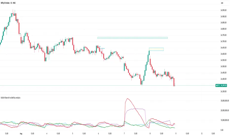
Bullish Bearish volatility analysisThis script is used to analyse Bullish/Bearish volatility direction based on volumes and moving average.
Volatility Visualizer by Oddbeaker LLCUse this to determine if a crypto pair has volatility suitable for your Oddbeaker Synthetic Miner. Draws entry/exit lines over the candles.
"Show me every place on the chart where I could have made X percent gains in Y days or less."
Inputs :
Percent Gain : Minimum percent gains to show on the chart.
Scan Bars : Maximum number of bars allowed to reach the profit target.
Notes :
Lines drawn on the chart indicate the entry and exit times and prices to reach the exact profit target.
The indicator only uses the low price of each candle to determine entry. It does not show every possible entry point.
When counting lines, count any group of lines that cross each other as one. Also, count any group of lines that do not cross but overlap in price over the same time period as one.
Tips :
For best results, set Percent Gain to double the amount of the sum of Min Profit and Min Stash on your Synth Miner. Example: If you have minProfit=5 and minStash=5, 5+5=10, so percentGain should be 20 on the chart.
Use a daily chart and set Scan Bars to 7 or less on highly volatile pairs.
Look for charts with the highest number of lines that don't overlap.
Use this indicator combined with the Synthetic Mining Channel for best results.
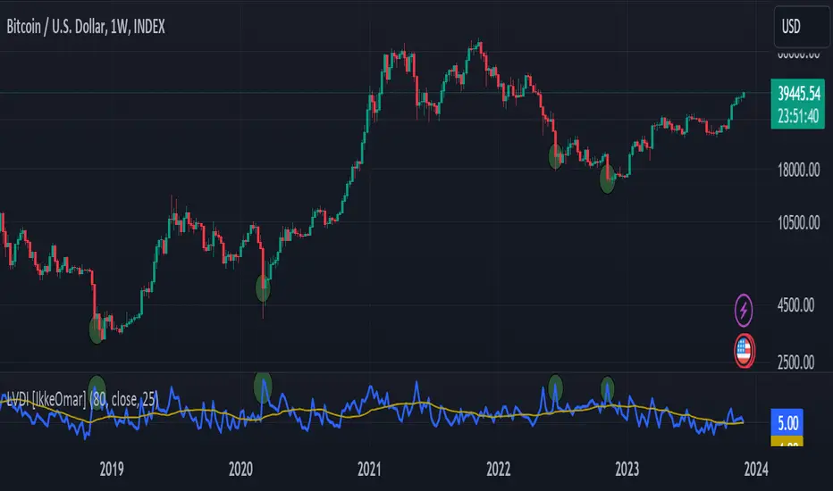
Logarithmic Volatility Direction Index [IkkeOmar]The LVDI is a Mean-Reversion Indicator. it doesn't detect trends and does not give a signal per se.
What it does is tell you if we have a flashcrash based on the price action and volume that is available. It is not always easy to see with the naked eye, so this indicator can help you DCA into an asset in a smarter way, if you couple it with other trend systems.
Think of this indicator like a form of a volatility index.
Inputs:
len and lenWMA are integers representing different lengths for calculations, and src is the data source
Keep in mind that "Length" is the lookback for the WMA, and the Length smooting is the lookback for the SMA of the "volume_weighted".
WMA Calculation
wma_basic = math.log10(ta.wma(src, len))
This calculates the logarithm (base 10) of the Weighted Moving Average (WMA) of the source data over len periods. WMA is a type of moving average giving more importance to recent data. The reason I use log10, is to make it transformative over a longer timeframe. This makes it easier to see the growth direction. I like to use this for crypto, since there is asymetric upside.
Volume Filter:
average_volume = ta.sma(volume, lenWMA)
volume_weighted = math.log10(wma_basic * (volume / math.log10(average_volume)))
Here, the script first calculates the Simple Moving Average (SMA) of the trading volume over lenWMA periods. Then, it computes a volume-weighted value of the WMA, adjusted by the logarithmic ratio of current volume to average volume.
Distance and Score Calculation:
distance = math.log10(src) - math.log10(volume_weighted)
score = math.sign(distance) * math.pow(math.abs(distance), 2)
The script calculates the logarithmic difference between the source data and the volume-weighted WMA. The score is determined by the sign of this distance multiplied by its square. This potentially amplifies the impact of larger distances.
Plotting:
plot(volume_weighted, title="Volume Weighted WMA", color=color.blue, linewidth = 2)
plot(ta.sma(volume_weighted, lenWMA), title="Volume Weighted WMA", color=color.rgb(189, 160, 0))
Mathematical concepts
Weighted Moving Average (WMA):
WMA is a moving average that assigns more weight to recent data points. The idea is that recent prices are more relevant to the current trend than older prices.
Logarithms:
The use of log10 (logarithm base 10) is interesting. Logarithms help in normalizing data and can make certain patterns more visible, especially when dealing with exponential growth or decay.
Volume Weighting:
Multiplying the WMA by the ratio of current volume to average volume (both logarithmic) integrates volume into the analysis. High trading volume can signify stronger market interest and can thus validate price movements.
Distance and Score:
The distance measures how far the current price is from the volume-weighted WMA on a logarithmic scale. The score squares this distance, potentially highlighting large divergences.
Case example
In the case above (which is a low timeframe that shouldn't be your main system) we see the blue line going up before going below the moving average line (orange). This indicates a local bottom zone. Does that mean that we wont go lower? No! What you can do is calculate a zone range.
We have an average line, you can get that from the POC with the VRVP.
Then you take the low and high of that zone and take the average:
(3.17% + 2.33%) / 2 = 2.75%
This means that we expect that the price can fall an additional 2.75%! Low and behold. When you check the same chart as above:
Hope it makes sense!
Stay safe everyone!
Don't hesitate to ask any questions if you have any!