Moving Average ADX with Alerts# Moving Average ADX (MA ADX) Indicator
## Overview
The Moving Average ADX combines a weighted moving average (WMA) with ADX (Average Directional Index) momentum to create a dynamic, trend-following indicator. The indicator's line changes color based on the ADX strength and directional movement, helping traders identify strong trends and potential reversals.
## Key Features
- Color-changing WMA line based on ADX strength and direction
- Built-in alerts for trend changes
- Customizable ADX and moving average parameters
- Overlay indicator that plots directly on the price chart
## Color Signals
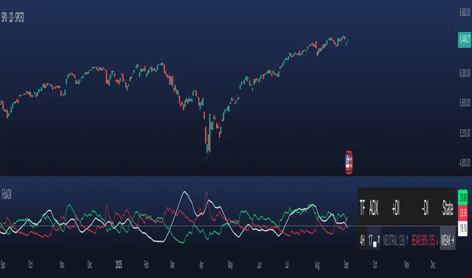
- **Green Line**: Strong bullish trend (ADX > threshold with +DI > -DI)
- **Red Line**: Strong bearish trend (ADX > threshold with -DI > +DI)
- **Black Line**: Weak or no trend (ADX < threshold)
## Parameters
- **DI Length**: Period for calculating Directional Movement (default: 14)
- **ADX Smoothing**: Smoothing period for ADX calculation (default: 14)
- **ADX MA Active**: Threshold for ADX to consider a trend strong (default: 18)
- **Length**: Period for the Weighted Moving Average (default: 34)
- **Source**: Price source for calculations (default: close)
## Trading Applications
1. **Trend Identification**
- Green line suggests riding bullish trends
- Red line suggests riding bearish trends
- Black line suggests ranging or weak trend conditions
2. **Entry Signals**
- Color changes from black to green: Potential bullish entry
- Color changes from black to red: Potential bearish entry
3. **Exit Signals**
- Color changes from green to black or red: Consider exiting longs
- Color changes from red to black or green: Consider exiting shorts
## Alert Functions
The indicator includes two built-in alerts:
1. Bullish Signal: Triggers when the indicator turns bullish (green)
2. Bearish Signal: Triggers when the indicator turns bearish (red)
## Best Practices
- Use in conjunction with other technical analysis tools
- Consider the overall market context
- Wait for confirmation of color changes before taking action
- Use appropriate position sizing and risk management
אינדיקטור Pine Script®