20W EMA – Macro Only (Perfectly Clean)Bitcoin 20 week moving average script showing buy / sell signals
חפש סקריפטים עבור "bitcoin"
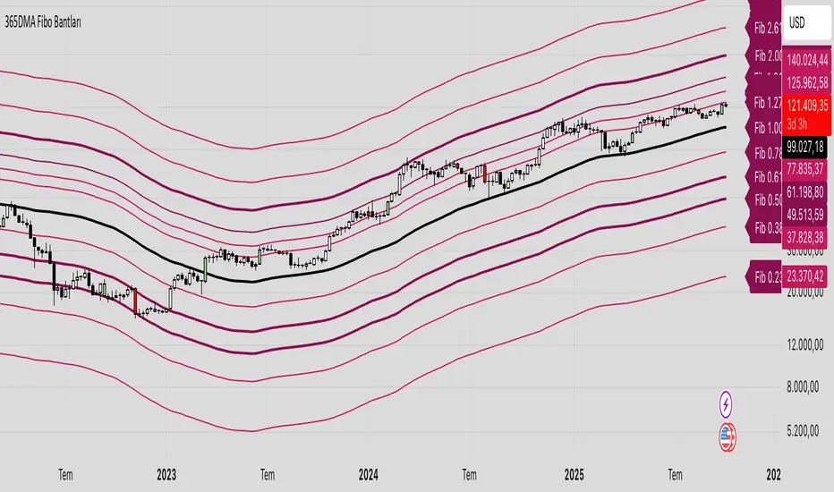
365 DMA Based Multiplier Fibonacci BandsBitcoin Chart
365 DMA Based
Fibonacci 1.0 = Long term trend
Fibonacci 0.5/0.618 = Long term support
Fibonacci 1.618 = Mid term target
Fibonacci 2.618 = Long term target
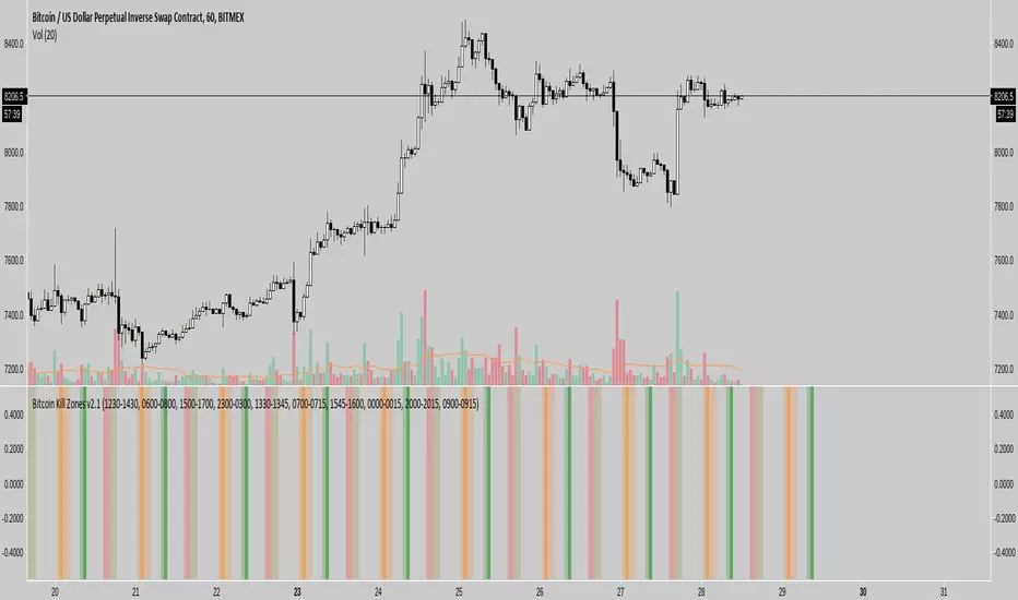
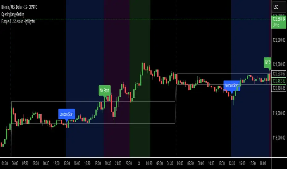
Europe & US Session Highlighter
Bitcoin trading volumes peak during the Europe-US session overlap (13:30–17:00 UTC), driven by institutional activity and market news. This indicator helps traders:
- Focus on high-liquidity periods for better trade execution.
- Avoid low-volume, high-volatility periods outside major sessions.
- Plan entries and exits during Bitcoin’s most active hours.
How to Use:
- Apply the indicator to any Bitcoin intraday chart (e.g., 1M, 5M, 15M).
- Look for blue (London), green (NY), or purple (overlap) backgrounds to identify active sessions.
Bitcoin Buy HODL Sell Indicator - MonthlyWMA16 (monthly)
EMA200 (weekly)
These are the indicators you need for BTCs bull / bear market recognition.
Green candles = bull market
Red candles = beginning of bear market
Purple candles = End of bear market
by Stockmoney Lizards

Bitcoin 1H-15M Breakout StrategyKey Features
1H and 15M Timeframes:
The script uses the 1-hour timeframe for the range and 15-minute timeframe for breakout conditions.
request.security is used to fetch the higher timeframe data.
Risk Management:
Variables entry_price, sl_price, and tp_price are declared explicitly as float with na initialization to handle dynamic assignment.
Stop-loss and take-profit levels are calculated based on the specified Risk-Reward Ratio (RRR) and buffer (in pips).
Trade Logic:
Long trade triggered when the 15-minute candle closes above the 1-hour high.
Short trade triggered when the 15-minute candle closes below the 1-hour low.
Visualization:
The range_high and range_low (previous 1-hour high and low) are plotted on the chart using dashed lines.
Debugging:
Enabling the show_debug input displays labels showing stop-loss and take-profit values for easier troubleshooting.

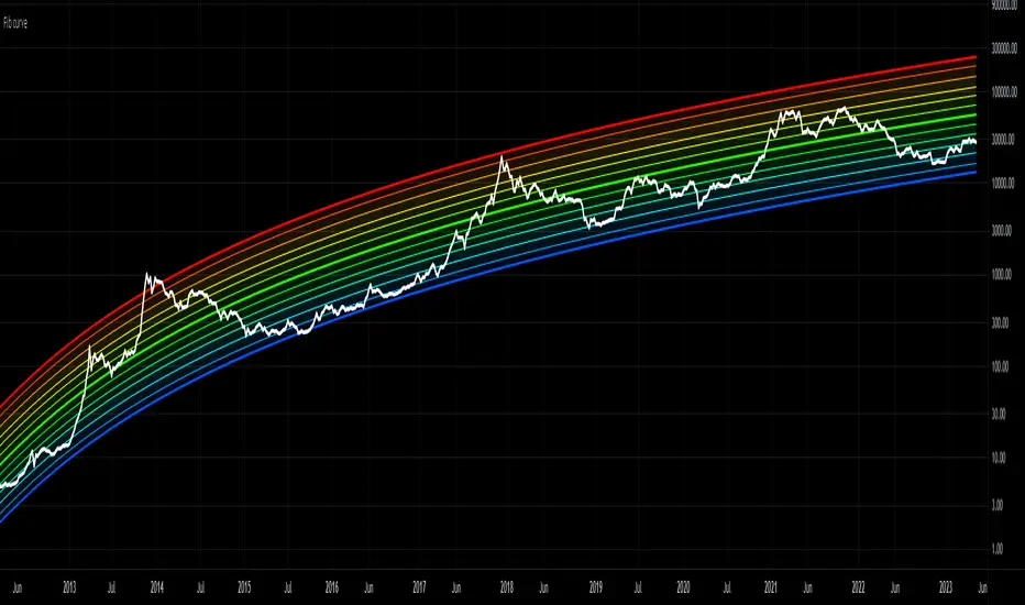
Bitcoin Rainbow Logarithmic CurvesThis indicator shows the logarithmic regression curves for BTC and color codes it based on how extended we are from the best fit line (middle).
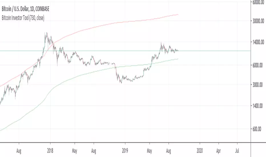
Bitcoin Investor Tool: 2-Year MA MultiplierIt is two 2 year length sma's. One sma*5 another just sma.
It is a long term investing tool with Valuation scores in a upper right corner. When price moves from a middle up scores decreas maximum to -1 in a near place to higher sma which usually a top of cycle.
When price moves near to bottom sma score indcreasing to +1 maximum
Visual reprasantation of valuation you can see on a color of sma's. When upper sma become red, means top is close, when bottom sma become green, bottom is close, the same with background.
You can send allert with values.
Example of scores

BitCoin RSI TrendWhat is it?
This indicator will plot the RSI of BTC with a red or green background based on the top and bottom values which you can set.
How to use it?
For example, you want to trade only if the RSI of BTC is between 50 and 70, so the top value is 70 and bottom is 50. If the RSI value between those values the background will be green, else it will be red.
Why to use it?
The buy and sell strength of the BTC controls the other coins, and it is noticeable when the BTC is over sold and the RSI exceeding the 70, the price will reverse its movement to down, thus it is advisable to not open long position if the RSI of BTC is above the 70-75. Also, if the RSI is under 50 there is a big possibility to move down further to the over bought areas. The best is to buy a altcoins when the BTC RSI is between 50 and 70.
For example, I could avoid a bad long trade on MATICUSDT when the RSI of BTC is going under 50
Or, get a good long trade on MATICUSDT when the RSI of BTC is between 50 and 70

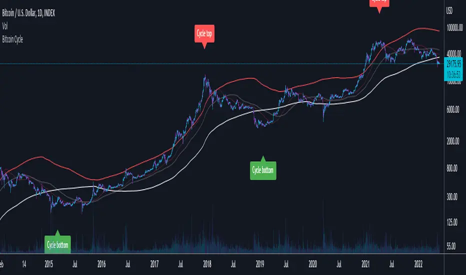
Bitcoin CycleThis script displays 4 different Moving Averages:
2 Year Moving Average (White)
1 Year Moving Average (Doubled in value, Red)
116 Day Moving Average (Transparent, Red)
232 Day Moving Average (Transparent, White)
For the last cycles: once the 2 year MA crossed the 232 Day MA, it marked the cycle bottom within a few days and once the 1 year MA (x2) crossed the 116 Day MA, it marked the cycle top within a few days.
It is interesting to note that both 365/116 and 730/232 equal 3.1465, which is very close to Pi (3.142). It is actually the closest we can get to Pi when dividing 365 by another whole number.
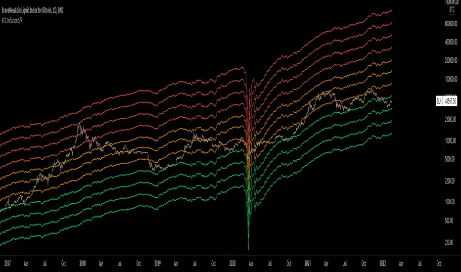
Bitcoin Inflation-Adjusted Support and Resistance5year breakeven inflation rate fitted for log BTC chart as Support and Resistance
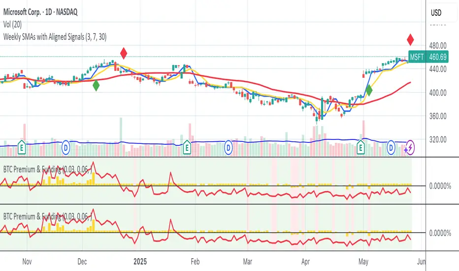
Bitmex BTC Perpetual Premium and FundingThis script tracks the premium (default red line) and the funding rate (default yellow area) of the Bitmex XBTUSD pair perpetual contract.
The calculations are based on the 8H TWAP of interest rates and premium index from Bitmex.
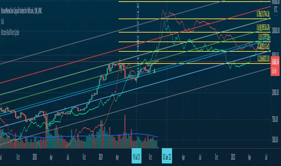
Bitcoin Bull Runs Mid Cycle Aligned This script plots 2 lines which are the 2013 and 2016 bull run. The plots are aligned on their mid cycles to the 2021 mid cycle.
Settings:
You can move the plots on the x and y axis in the settings for the Daily, Weekly and Monthly TFs.
The plot is weird on the Monthly TF, best to use the Daily and Weekly.
If it doesn't load at first you have to zoom out fully and go back to 2013 for it to load. Then it will load.
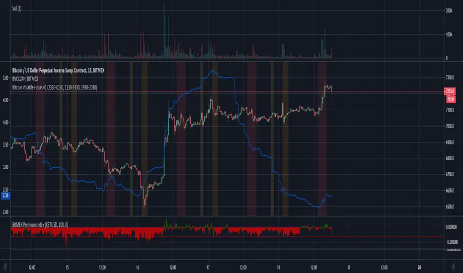
Bitcoin Volatile Hours v1This indicator shows the typical hours in which BTC is volatile hence expected to move, 3 time zones which are UTC
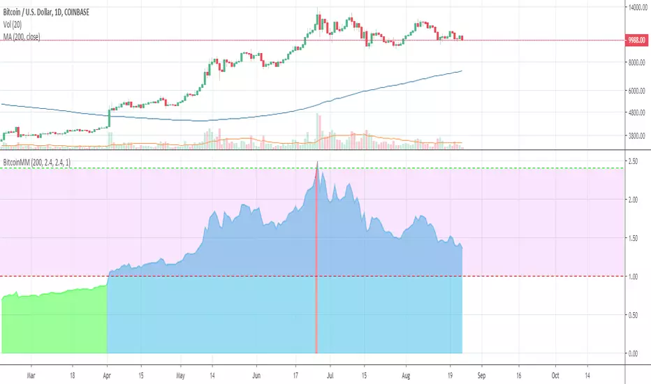
Bitcoin Mayer MultipleSimple mayer mutiple based on Bitstamp BTCUSD.
Use this in a DAILY chart
Will show green when < 1.0: it means cheaper than 200-day moving average,
red when above 2.4: this is considered bubble bursting territory.
If you like it feel free to tip bc1q4vxf6dycmrswqdj03rxd26gpnyu8hmuwnjjt7h


Bitcoin Stock to Flow Multiplethis study plots the price of btc over the Stock to Flow Model value
idea credited to: 100trillionUSD
my data is a bit off compared to the original source but overall it seems correct

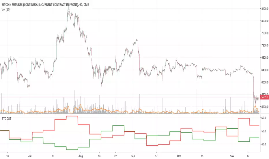
Bitcoin COT (CME)Commitment of Traders report from the CME.
HOW TO INTERPRET:
// 1. Trade in the same direction of institutional money.
// 2. Trade in the opposite direction of retail money.
// 3. Trade in the direction of professional money.
// 4. When %open interest held by largest 4 longs > %open interest held by largest 4 shorts = look to buy
// 5. When %open interest held by largest 4 shorts > %open interest held by largest 4 longs = look to sell