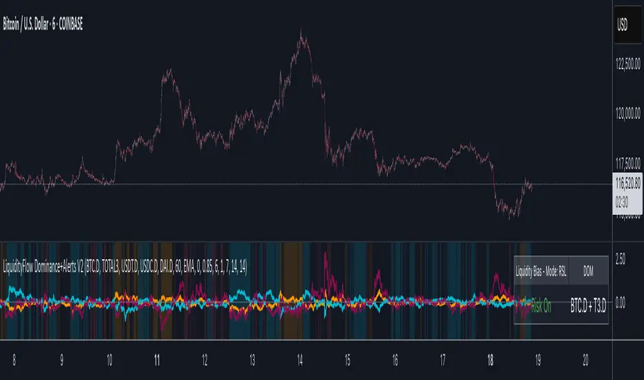
LiquidityFlow Dominance+Alerts (btc.d, T3, Stables)LiquidityFlow Dominance+Alerts: Overview & Usage Guide
Overview
The LiquidityFlow Dominance+Alerts indicator provides a dynamic view of liquidity flow across Bitcoin, Altcoins, and Stablecoins, helping track liquidity shifts and identify market sentiment. By integrating moving averages, custom alerts, and thresholds for extreme outliers, this indicator helps to anticipate bullish and bearish shifts in liquidity and alert market tops and bottoms.
Key features include:
1. Liquidity Flow Monitoring : Track liquidity flow across Bitcoin (BTC), Altcoins (TOTAL3), and Stablecoins (USDT, USDC, DAI).
2. Custom Alerts : Set alerts for key liquidity shifts and extreme conditions in Stablecoin dominance, both with static and moving average (MA)-based calculations.
3. Moving Averages : Use Simple, Exponential, or Weighted Moving Averages to smooth out market data for more reliable signals.
4. Outlier Detection : Identify potential tops and bottoms using thresholds for Stablecoin dominance, with alerts for extreme movements.
Functionality
Data Inputs and Key Metrics
- Symbols Monitored:
- Bitcoin Dominance (BTC.D)
- Altcoin Market Cap (TOTAL3)
- Stablecoins (USDT.D, USDC.D, DAI.D)
- Liquidity Flow Conditions:
- Track percentage changes in dominance across sectors to detect liquidity flow into Bitcoin, Altcoins, or Stablecoins.
- Custom Metrics:
- Liquidity Flow Index: BTC Dominance minus Stablecoin Dominance.
- Liquidity Flow Ratio: BTC Dominance divided by the combined dominance of Stablecoins and Altcoins.
Moving Average Integration
- Select from SMA, EMA, or WMA to apply moving averages to the dominance metrics. Moving averages help smooth out short-term volatility and provide more consistent signals.
- Moving averages are applied to each sector (BTC, Altcoins, and Stablecoins) and compared to their previous period values to determine shifts in liquidity.
Alerts and Thresholds
- % Change Lookback Period: Adjust the lookback period to align with the timeframe of your chart. Shorter timeframes may require a lower lookback period, while higher timeframes may benefit from longer periods.
- Stables Bull/Bear % for Alerts: Set a threshold for when Stablecoin dominance becomes a bullish or bearish signal relative to BTC and Altcoins. A higher threshold may be used in volatile markets to filter out noise.
- Extreme Outliers Detection: Use the **Stables Up/Down Extreme Threshold** to identify potential market tops or bottoms when Stablecoin dominance deviates significantly from historical trends. The **Extreme Lookback Period** controls the time window for detecting these anomalies.
How to Use the Indicator
Adjusting the % Change Lookback Period
- The `% Change Lookback Period` should be adjusted based on your chart’s timeframe. For example, a shorter period (e.g., 7) works well for intraday charts, while longer periods (e.g., 14) might be more suitable for daily or weekly charts.
Setting Thresholds for Alerts
- Stables Bull/Bear % for Alerts: Adjust this setting to define when Stablecoin dominance triggers bullish or bearish alerts. A value like 1% could be a good starting point for most market conditions but can be fine-tuned based on volatility.
- Extreme Lookback Period: Define the lookback period for detecting extreme moves in Stablecoin dominance. This will help identify major tops and bottoms in the market. For shorter-term trades, consider using a shorter extreme lookback (e.g., 7-10 periods).
Alerts for Liquidity Shifts
- The indicator supports alerts for key liquidity shifts, which are useful for staying ahead of market movements. Alerts can be set to notify you when liquidity moves into:
- Bitcoin: Indicating a potential bullish trend for Bitcoin.
- Altcoins: Signaling altcoins are bullish.
- Stablecoins: Suggesting a risk-off environment or market correction.
Extreme Alerts for Stables
- Extreme Up/Down Alerts: These are triggered when Stablecoin dominance crosses extreme thresholds. For example, if Stablecoin dominance rises more than 14% over a set period, it could signal a market top, while a significant drop could indicate a market bottom.
Moving Average Calculations
- In addition to static percentage changes, moving averages can be applied to smooth out dominance values. The type and length of the moving average can be customized:
- SMA (Simple Moving Average): Best for smoothing out volatility in a linear way.
- EMA (Exponential Moving Average): More responsive to recent data, making it useful in faster markets.
- WMA (Weighted Moving Average): Emphasizes more recent data, but less reactive than the EMA.
Additional Usage Tips:
- Background Colors: The indicator visually highlights the dominant liquidity flow:
- Orange: Liquidity is shifting toward Bitcoin.
- Aqua: Liquidity is flowing into Altcoins.
- Red: Liquidity is moving into Stablecoins.
חפש סקריפטים עבור "bitcoin"
twisted SMA strategy [4h] Hello
I would like to introduce a very simple strategy that uses a combination of 3 simple moving averages ( SMA 4 , SMA 9 , SMA 18 )
this is a classic combination showing the most probable trend directions
Crosses were marked on the basis of the color of the candles (bulish cross - blue / bearish cross - maroon)
ma 100 was used to determine the main trend, which is one of the most popular 4-hour candles
We define main trend while price crosses SMA100 ( for bullish trend I use green candle color )
The long position strategy was created in combination of 3 moving averages with Kaufman's adaptive moving average by alexgrover
The strategy is very accurate and is easy to use indicators
the strategy uses only Buy (Long) signals in a combination of crossovers of the SMA 4, SMA 9, SMA 18 and the Kaufman Adaptive Moving Average.
As a signal to close a long position, only the opposite signal of the intersection of 3 different moving averages is used
the current strategy is recommended for higher time zones (4h +) due to the strength of the closing candles, which translates into signal strength
works fascinatingly well for long-term bullish market assets (for example 4h Apple, Tesla charts)
Enjoy and trade safe ;)

HASHRATE and MINER REVENUEThis script uses daily data points from Quandl which measure Bitcoin mining hashrate, and miner revenue, and averages the two. The two data sets are fairly zigzaggy, so to smooth the data I am use a John Ehlers' filter to reduce the noise. Why did I combine the two? Both have correlation to BTC price action, and by combining hashrate and revenue, I believe it produces a stronger and more accurate signal. At times when the background is green (also displayed with a green square at the bottom), conditions are good in Bitcoinland with miner revenue/hashrate going up. No color in the background and no dot, means the combined miner revenue and hashrate indicator is dropping, but nothing to get worried about. Seeing red dots on the bottom along with a red background signals a rapidly dropping rate of hashrate/miner revenue, and with a fairly strong correlation to the Bitcoin price. Not every red zone foretells a drop in the Bitcoin price, but a significant number of them do. I wrote this script as an early warning system for when to move out of Bitcoin. Use at your own risk. Feel free to modify this code to suit your personal needs. Please only use on BTC /USD pairs with 1D bars. Since there is only one data point per day published by Quandl, it will not give accurate data for shorter timeframes. Enjoy.

GBTC holdings USD market valueThis script estimates GBTC bitcoins per share, rather than hardcoding as in other scripts. Its result is an estimate of GBTC holdings USD market value.
Per share bitcoin estimates are adjusted by 2.0% / 365 per day from 2019 year end holdings. Calendar year 2019 ending bitcoins and shares were 261,192 bitcoins and 269,445,300 shares. From the 2019 Form 10-K: 'The Trust’s only ordinary recurring expense is the Sponsor’s Fee. The Sponsor’s Fee accrues daily in U.S. dollars at an annual rate of 2.0% of the Bitcoin Holdings.. The Sponsor’s Fee is payable in Bitcoins to the Sponsor monthly in arrears.'
No attempt is made to account for leap years.
Per share bitcoin estimate is converted to USD market value by multiplying by the simple average BTCUSD price at Coinbase and Bitstamp. Grayscale uses the TradeBlock XBX index, a volume weighted average of Coinbase Pro, Kraken, LMAX Digital and Bitstamp prices.
Spot checks vs archive.org captures of daily bitcoins per share and the chart on Grayscale's site:
The estimate for market close January 22 2021 is 0.00094899 bitcoins per share, the published datum on Grayscale's web site was 0.00094898. The estimate matches at 20:30 rather than at 16:00.
The estimate for December 31 2018 is 0.000988965 vs a published 0.00098895.
The estimate for December 29 2017 market value is $14.58 vs $14.65.
The estimate for December 30 2016 market value is $0.99 vs $0.98.
The estimate for January 4 2016 market value is $0.46 vs $0.45.
No estimates before 2016.
The default style is to draw a blue line with two thirds transparency outside market hours and for first/last minutes of trading, switching to daily or greater periodicity hides this.
No warranty is expressed or implied , I am not a lawyer, etc etc etc.
This is not investing advice . Always do your own due diligence .

BTC - Satoshis Altcoin Graveyard OVERVIEW
The Satoshi's Altcoin Graveyard (SAG) is a macro-statistical engine designed to solve the problem of Survivorship Bias . It is a well-known phenomenon in the crypto markets that the "Top 10" list is in a constant state of flux. If you look at historical data from CoinMarketCap (CMC) year by year, you will see a revolving door of projects that once seemed "too big to fail" disappearing into obscurity. Meanwhile, Bitcoin has remained the undisputed #1 since inception.
While most traders have a "gut feeling" that Altcoins eventually depreciate against Bitcoin, I believe in measuring it and drawing it on a chart for better visibility. By locking in specific "Cohorts" of market leaders from the past, we can track their inevitable decay through the Satoshi Sieve .
THE 13-COIN STATISTICAL BUCKET
To ensure an objective, non-biased audit, each cohort (we look at 2018, 2020 and 2022) is constructed using a fixed market-cap methodology from the snapshot date (excluding stablecoins):
• The Core: The Top 10 non-stablecoin assets at that time by Marketcap.
• The Risk Alpha: Representative samples from the Top #25, #50, and #100 ranks. (By including lower-ranked "riskier" alts, we capture the full statistical decay of the market, not just the "Blue Chips.")
TECHNICAL ARCHITECTURE
This script is engineered to push the boundaries of the Pine Script engine. TradingView enforces a hard limit of 40 unique data requests . By tracking 3 cohorts of 13 assets plus the Bitcoin base, this indicator utilizes exactly 40/40 requests , providing the maximum possible data density in a single chart window.
THE SPS CONCEPT (Survival Probability Score)
The SPS measures the Breadth of Survival . It answers: "How many coins from this year (the year of the snapshot) are actually outperforming BTC?"
We use a binary logic system to determine if a coin is "Winning" or "Losing" against the only benchmark that matters: Bitcoin.
• The Status Formula: Status = Current_Alt_BTC_Ratio >= Entry_Alt_BTC_Ratio ? 1 : 0 . This means: Every single day, at the Daily Close , the script compares the current Alt/BTC ratio to the fixed ratio from the snapshot date. If the coin is worth more in Bitcoin today than it was back then, it is assigned a "1" (a Win). If it has lost value against Bitcoin, it gets a "0" (a Loss).
• The SPS Line: SPS Line = (Sum of 'Wins' / 13) * 100 This means: We add up all the "Winners" for that specific day and turn it into a percentage. For example, if the Aqua line is at 7.69% on your chart, it confirms that on that day , exactly 1 out of the 13 coins was successfully beating Bitcoin, while the other 12 were underperforming.
THE PERFORMANCE MATRIX
In the top-right corner, we provide a Weighted Portfolio Simulation . This answers the financial question: "If I swapped 1 BTC into an equal-weight basket of these 13 coins on the snapshot day, what is my BTC value today?".
• Value < 1.0 BTC: You lost purchasing power compared to holding Bitcoin.
• Value > 1.0 BTC: You successfully achieved "Alpha" over the benchmark.
HOW TO READ THE CHART
• The Waterfall: Lines generally trend downward as the "Satoshi Sieve" filters out assets that cannot maintain their BTC-relative value.
• Dynamic Winners: We dynamically print the names of the current survivors at the tip of each line. If a cohort shows "None," the graveyard is full.
HOW TO READ THE MATRIX
• The BTC Target: Any portfolio value in the matrix below 1.0 BTC represents a failed altcoin rotation.
• Class of 2018: A portfolio value near 0.15 BTC at the current date, means a 85% loss rate.
• Class of 2020: A portfolio value near 0.77 BTC at the current date, means an approx 20 % loss rate.
• Class of 2022: A portfolio value near 0.31 BTC at the current date, means an approx 70% loss rate.
DIFFERENCE FROM AN ALTCOIN INDEX
Standard Altcoin Indexes (like my ALSI Index ) "rebalance" by removing losers and adding new winners. This is deceptive. The Altcoin Graveyard never rebalances . It forces you to watch the "losers" decay, providing a realistic look at the long-term opportunity cost of "Buy and Hold" for anything other than Bitcoin.
CONCLUSION
The data revealed by the Satoshi Sieve leads to a singular, sobering "Lesson Learned": Picking the right coin to outperform Bitcoin is not just difficult—it is statistically improbable over a long-term horizon.
While the "Risk-Reward" of altcoins is often marketed as having higher upside, the Altcoin Graveyard proves that for the vast majority of assets, the reward does not justify the risk of total portfolio erosion in BTC terms.
• The Mathematical Odds: If you picked a Top 10 coin in 2018, your chance of outperforming BTC today is effectively 0%.
• The Rotation Trap: Most investors "HODL" these assets into the graveyard, hoping for a return to previous ATHs that never comes because the liquidity has already moved on to the next "Class" of winners.
The final conclusion is clear: Diversification into altcoins is often just a slow-motion transfer of wealth back to Bitcoin. If you cannot identify the 1-out-of-13 that survives the Sieve, your best risk-adjusted move has historically been to simply hold the benchmark.
DISCLAIMER
This script is for educational purposes only. It does not constitute financial advice. It is a mathematical study of historical opportunity cost and survivorship bias.
Tags
bitcoin, btc, satoshis graveyard, altseason, dominance, total3, rotation, cycle, index, alsi, Rob Maths, robmaths

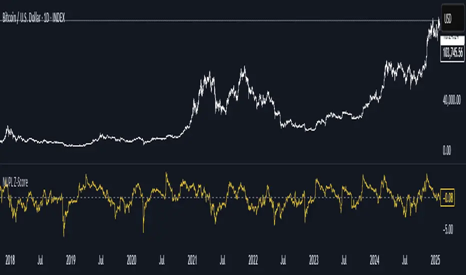
Active Addresses Z-ScoreActive Addresses Z-Score Indicator
The Active Addresses Z-Score Indicator is a fundamental analysis tool designed to evaluate the relationship between Bitcoin network activity and its price movements over a specified period. This indicator aims to provide insights into whether the market is showing signs of increasing or decreasing interest in Bitcoin, based on its network usage and activity.
How to Read the Indicator
Orange Line (Price Z-Score):
This line represents the Z-Score of the price change over a defined period (e.g., 28 days). The Z-Score normalizes the price change by comparing it to the historical mean and standard deviation, essentially measuring how far the current price change is from the average.
A positive Z-Score indicates that the price change is above the historical average (a bullish signal), while a negative Z-Score means the price change is below the historical average (a bearish signal).
Gray Line (Active Addresses Z-Score):
This line represents the Z-Score of the change in active addresses over the same period. The Z-Score here normalizes the change in the number of active Bitcoin addresses by comparing it to historical data.
A positive Z-Score suggests that the number of active addresses is increasing more than usual, which can be a sign of increased market activity and potential interest in Bitcoin.
A negative Z-Score suggests that active addresses are decreasing more than usual, which may indicate reduced interest or usage of Bitcoin.
Upper and Lower Threshold Lines:
The upper and lower threshold lines (set by the user) act as Z-Score boundaries. If either the price Z-Score or the active address Z-Score exceeds the upper threshold, it can signal an overbought or overactive condition. Similarly, if the Z-Score falls below the lower threshold, it could indicate an oversold or underactive condition.
These thresholds are customizable by the user, allowing for flexible interpretation based on market conditions.
Indicator Calculation
Price Change Calculation:
The percentage change in the Bitcoin price over a specified lookback period (e.g., 28 days) is calculated as:
Price Change
=
Close
−
Close
Close
Price Change=
Close
Close−Close
This shows the relative price movement during the specified period.
Active Address Change Calculation:
Similarly, the percentage change in active addresses is calculated as:
Active Address Change
=
Active Addresses
−
Active Addresses
Active Addresses
Active Address Change=
Active Addresses
Active Addresses−Active Addresses
This shows the relative change in the number of active Bitcoin addresses over the same period.
Z-Score Calculation:
The Z-Score for both the price and active address changes is calculated as:
𝑍
=
X
−
𝜇
𝜎
Z=
σ
X−μ
Where:
X is the current change (price or active addresses),
μ (mu) is the mean (average) of the historical data over the lookback period,
σ (sigma) is the standard deviation of the historical data.
This Z-Score tells you how far the current value deviates from its historical average, normalized by the volatility (standard deviation).
Smoothing (Optional):
A simple moving average (SMA) is applied to smooth out the Z-Score values to reduce noise and provide a clearer trend.
What the Indicator Does
Signals of Bullish or Bearish Market Behavior:
The Z-Score of Price tells you how strong or weak the price movement is relative to its past performance.
The Z-Score of Active Addresses reveals whether more users are interacting with the Bitcoin network, which can be an indication of growing interest or market activity.
When both the price and active address Z-Scores are high, it may indicate a strong bull market, while low Z-Scores may point to a bear market or decreasing interest.
Overbought/Oversold Conditions:
The upper and lower threshold lines help you visualize when the Z-Scores for either price or active addresses have reached extreme values, signaling potential overbought or oversold conditions.
For example, if the Price Z-Score exceeds the upper threshold (e.g., +2), it might indicate that the price has risen too quickly, and a correction may be due. Conversely, if it falls below the lower threshold (e.g., -2), it may indicate a potential buying opportunity.
Important Note on Activity and Price Movements:
After Rapid Price Increases:
A sharp increase in Bitcoin’s price followed by a spike in active addresses can be interpreted as a bearish signal. High network activity after a rapid price surge might indicate that investors are taking profits or that speculative interest is peaking, potentially signaling an upcoming correction or reversal.
After Extreme Price Declines:
Conversely, high network activity after a significant price drop may indicate a bottoming signal. A surge in active addresses during a price decline could suggest increased buying interest and potential accumulation, signaling that the market may be finding support and a reversal may be imminent.
Customization and Flexibility
The lookback period (default: 28 days) can be adjusted to suit different trading strategies or time horizons.
The smoothing length (default: 7 periods) allows for smoothing the Z-Score, making it easier to detect longer-term trends and reduce noise.
The upper and lower threshold values are fully customizable to adjust the indicator’s sensitivity to market conditions.
Conclusion
The Active Addresses Z-Score Indicator combines network activity with price data to give you a deeper understanding of the Bitcoin market. By analyzing the relationship between price changes and active address changes, this indicator helps you assess whether the market is experiencing unusual activity or if Bitcoin is trending in an extreme overbought or oversold condition.
It is a powerful tool for fundamental analysis and can complement traditional technical indicators for a more comprehensive trading strategy.
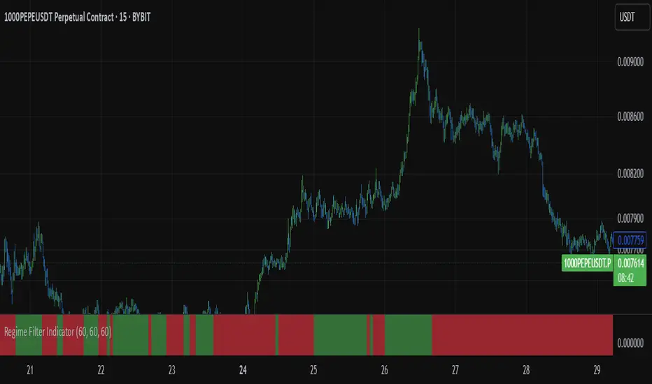
Regime Filter IndicatorRegime Filter – Crypto Market Trend Indicator
📊 Overview
The Regime Filter is a powerful market analysis indicator designed specifically for crypto trading. It helps traders identify whether the market is in a bullish or bearish phase by analyzing key assets in the cryptocurrency market, including Bitcoin (BTC), Bitcoin Dominance (BTC.D), and the Altcoin Market (TOTAL3). The indicator compares these assets against their respective Simple Moving Averages (SMA) to determine the overall market regime, allowing traders to make more informed decisions.
🔍 How It Works
The Regime Filter evaluates three main components to determine the market's sentiment:
1. BTC Dominance (BTC.D) vs. 40 SMA (Medium Timeframe)
The Bitcoin Dominance (BTC.D) is compared to its 40-period SMA on a mid-timeframe (e.g.,
1-hour). If BTC.D is below the 40 SMA, it indicates that altcoins are performing well relative
to Bitcoin, suggesting a bullish altcoin market. If BTC.D is above the 40 SMA, Bitcoin is
gaining dominance, indicating a potential bearish phase for altcoins.
2. TOTAL3 Market Cap vs. 100 SMA (Medium Timeframe)
The TOTAL3 index, which tracks the total market capitalization of all cryptocurrencies except
Bitcoin and Ethereum, is compared to its 100-period SMA. A bullish signal occurs when TOTAL3
is above the 100 SMA, indicating strength in altcoins, while a bearish signal occurs when
TOTAL3 is below the 100 SMA, signaling a potential weakness in the altcoin market.
3. BTC Price vs. 200 SMA (Higher Timeframe)
The current Bitcoin price is compared to its 200-period Simple Moving Average (SMA) on a
higher timeframe (e.g., 4-hour). A bullish signal is given when the BTC price is above the 200
SMA, and a bearish signal when it's below.
🟢 Bullish Market Conditions
The market is considered bullish when:
- BTC Dominance (BTC.D) is below the 40 SMA, suggesting altcoins are gaining momentum.
- TOTAL3 Market Cap is above the 100 SMA, signaling strength in the altcoin market.
- BTC price is above the 200 SMA, indicating an uptrend in Bitcoin.
In these conditions, the background turns green 🟢, and a "Bullish" label is displayed on the chart.
🔴 Bearish Market Conditions
The market is considered bearish when:
- BTC Dominance (BTC.D) is above the 40 SMA, indicating Bitcoin is outperforming altcoins.
- TOTAL3 Market Cap is below the 100 SMA, signaling weakness in altcoins.
- BTC price is below the 200 SMA, indicating a downtrend in Bitcoin.
In these conditions, the background turns red 🔴, and a "Bearish" label appears on the chart.
⚙ Customization Options
- The Regime Filter offers flexibility for traders:
- Enable or Disable Specific SMAs: Customize the indicator by enabling or disabling the 200 SMA for Bitcoin, the 40 SMA for BTC Dominance, and the 100 SMA for TOTAL3.
- Adjust Timeframes: Choose the timeframes for each of the moving averages to suit your preferred trading strategy.
- Real-Time Data Adjustments: The indicator updates in real-time to reflect current market conditions, ensuring timely analysis.
📈 Best Use Cases
- Trend Confirmation: The Regime Filter is ideal for confirming the market's overall trend,
helping traders to align their positions with the dominant market sentiment.
- Trade Entry/Exit Signals: Use the indicator to identify favorable entry or exit points based on
whether the market is in a bullish or bearish phase.
- Market Overview: Gain a quick understanding of the broader crypto market, with a focus on
Bitcoin and altcoins, to make more strategic decisions.
⚠️ Important Notes
Trend-Following Indicator: The Regime Filter is a trend-following tool, meaning it works best in strong trending markets. It may not perform well in choppy, sideways markets.
Risk Management: This indicator is designed to assist in identifying market trends, but it does not guarantee profits. Always apply sound risk management strategies and use additional indicators when making trading decisions.
Not a Profit Guarantee: While this indicator can help identify potential market trends, no trading tool or strategy guarantees profits. Please trade responsibly and ensure that your decisions are based on comprehensive analysis and risk tolerance.
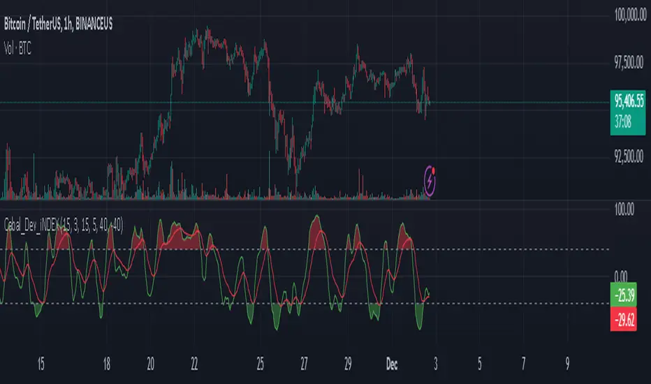
Cabal Dev IndicatorThis is a TradingView Pine Script (version 6) that creates a technical analysis indicator called the "Cabal Dev Indicator." Here's what it does:
1. Core Functionality:
- It calculates a modified version of the Stochastic Momentum Index (SMI), which is a momentum indicator that shows where the current close is relative to the high/low range over a period
- The indicator combines elements of stochastic oscillator calculations with exponential moving averages (EMA)
2. Key Components:
- Uses configurable input parameters for:
- Percent K Length (default 15)
- Percent D Length (default 3)
- EMA Signal Length (default 15)
- Smoothing Period (default 5)
- Overbought level (default 40)
- Oversold level (default -40)
3. Calculation Method:
- Calculates the highest high and lowest low over the specified period
- Finds the difference between current close and the midpoint of the high-low range
- Applies EMA smoothing to both the range and relative differences
- Generates an SMI value and further smooths it using a simple moving average (SMA)
- Creates an EMA signal line based on the smoothed SMI
4. Visual Output:
- Plots the smoothed SMI line in green
- Plots an EMA signal line in red
- Shows overbought and oversold levels as gray horizontal lines
- Fills the areas above the overbought level with light red
- Fills the areas below the oversold level with light green
This indicator appears designed to help traders identify potential overbought and oversold conditions in the market, as well as momentum shifts, which could be used for trading decisions.
Would you like me to explain any specific part of the indicator in more detail?
BTC Seasonality Strategy (Weekly)This strategy identifies potential weekend opportunities in Bitcoin (BTC) markets by leveraging the concept of seasonality, entering a position at a predefined time and day, and exiting at a specified time and day.
Key Features
Customizable Time and Day Selection:
Users can select the entry and exit days and corresponding times (in EST).
Directional Flexibility:
The strategy allows traders to choose between long or short positions.
TradingView Compliance:
The script adheres to TradingView's house rules, avoids overly complex conditions, and provides clear user-configurable inputs.
How It Works
The script determines the current weekday and hour in EST, converting TradingView's UTC time for accurate comparisons.
If the current day and hour match the selected entry conditions, a trade (long or short) is opened.
The position is closed when the current day and hour match the specified exit conditions.
Theoretical Basis
Market Seasonality:
The concept of seasonality in financial markets refers to predictable patterns based on time, such as weekends or specific days of the week. Studies have shown that cryptocurrency markets exhibit unique trading behaviors during weekends due to reduced institutional activity and higher retail participation behavioral Biases**:
Retail traders often dominate weekend markets, potentially causing predictable inefficiencies .
Reverences**
Baur, D. G., Hong, K., & Lee, A. D. (2018). Bitcoin: Medium of exchange or speculative assets? Journal of International Financial Markets, Institutions and Money, 54, 177–189.
Urquhart, A. (2016). The inefficiency of Bitcoin. Economics Letters, 148, 80–82.

Altcoin Total Average Divergence (YavuzAkbay)The "Average Price and Divergence" indicator is a strong tool built exclusively for cryptocurrency traders who understand the significance of comparing altcoins to Bitcoin (BTC). While traditional research frequently focusses on the value of cryptocurrencies against fiat currencies such as the US dollar, this indicator switches the focus to the value of altcoins against Bitcoin itself, allowing you to detect potential market opportunities and divergences.
The indicator allows you to compare the price of an altcoin to Bitcoin (e.g., ETHBTC, SOLBTC), which is critical for determining how well an altcoin performs against the main cryptocurrency. This is especially important for investors who expect Bitcoin's price will continue to rise logarithmically and want to ensure that their altcoin holdings retain or expand in market capitalisation compared to Bitcoin.
The indicator computes the average price of the chosen cryptocurrency relative to Bitcoin over the viewable portion of the chart. This average acts as a benchmark, indicating the normal value around which the altcoin's price moves.
The primary objective of this indicator is to calculate and plot the divergence, which is the difference between the altcoin's current price relative to Bitcoin and its average value. This divergence can reveal probable overbought or oversold conditions, allowing traders to make better decisions about entry and exit points.
The divergence is represented as a histogram, with bars representing the magnitude of the difference between the current and average prices. Positive values indicate that the altcoin is trading above its average value in comparison to Bitcoin, whereas negative values indicate that it is trading below its average.
The indicator automatically adjusts to the chart's visible range, ensuring that the average price and divergence are always calculated using the most relevant data. This makes the indicator extremely sensitive to changes in the chart view and market conditions.
How to Use:
A significant positive divergence may imply that the cryptocurrency is overbought in comparison to Bitcoin and is headed for a correction. A significant negative divergence, on the other hand, may indicate that the cryptocurrency has been oversold and is cheap in comparison to Bitcoin.
Tracking how an altcoin's price deviates from its average relative to Bitcoin can provide insights about the market's opinion towards that altcoin. Persistent positive divergence may suggest high market confidence, whilst constant negative divergence may imply a lack of interest or eroding fundamentals.
Use divergence data to better time your trades, either by entering when a cryptocurrency is discounted in comparison to its average (negative divergence) or departing when it is overpriced (positive divergence). This allows you to capture value as the price returns to its mean.
Ideal For:
Cryptocurrency Traders who want to understand how altcoins are performing relative to Bitcoin rather than just against fiat currencies.
Long-term Investors looking to ensure their altcoin investments are maintaining or growing their value relative to Bitcoin.
Market Analysts interested in identifying potential reversals or continuations in altcoin prices based on divergence from their average value relative to Bitcoin.

Altcoins capitalization histogram [peregringlk]This script superseeds "Other altcoins BTC capitalization histogram". The previous versions was a bit confusing in my opinion and lacked some generalization, so I'm now publishing this improved version.
It shows 6 pieces of info:
- Green columns: BTC price change for that day.
- Red bars: Altcoins capitalization change for that day, measured in bitcoins (altcoins_USD_capitalization / BTCUSD)
- Green/red background: green if that day the USD capitalization change was a gain, and red if it was a loss.
- Green line: accum BTC price change for the selected last days.
- Red line: accum altcoin capitalization change measured in BTC for the selected days.
- Dotted blue sequence: accum altcoin USD capitalization change for the selected days.
The base line of the histogram is 1 instead of 0, because I'm showing the price changes as multipliers (price change rates), so if there have been a +20% market movement, the calculated value will be 1.2, and if there have been a -20% market movement, then the value will be 0.8. 1 means no movement (preserved price/capitalization). Price and capitalization changes will be calculated using candle closes.
About the accumulated price changes, it will calculate the accumulated multiplication of the corresponding price change multipliers. For example, if you have set you want 3 days for the accumulation rates, and the last three days saw a -20%, +10% and +15% price/capitalization changes, the current value for the line will be 0.8*1.1*1.15 = 1.0120, or a +1.2% price change respect to the day before yesterday.
By default, if you are looking any ALTBTC market (for example, ETHBTC), instead of showing the USD and BTC capitalization of all alts, it will take the BTC and USD prices of the current market (the USD price will be calculated as ALTBTC * BTCUSD; and the BTCUSD price will be taken from BITSTAMP, the one with the longest BTC history I know in tradingview). If you are looking any other markets that is not paired with BTC, then it will take the USD capitalization of all altcoins, and the BTC capitalization will be calculated as altcoins_USD_capitalization / BTCUSD (from BITSTAMP as well).
Also, remember that, in both cases (alts capitalization or price), the graph will consistently respect the following rule:
- btc_usd_price_change * alt/capitalization_btc_price_change = alt_usd_price_change.
That applies for both the green/red bars respect to the background, and the green/red line respect to the blue dotted sequence.
Lastly, you may want to know if, in case btc price and altbtc price or capitalization go in opposite directions, who gain the battle? For example, if BTCUSD moved +20%, and an ALTBTC price moved -20%, the result is a loss, because 1.2*0.8 = 0.96, so the ALTUSD price or capitalization moved -4% (remember that, for preserving the USD value, if today's bitcoin change rate is x, the altbtc change rate must be 1/x; so for a -20% BTCUSD price movement, there must be at least a +25% ALTBTC price change to don't loss USD value, because 1/0.8 = 1.25). The background is what shows you that: if the background is green, it means that for that day there was a total USD gain of value, and when it's red, then it was a loss of USD value.
You can customize the following things:
- Accum change rate interval: the "selected days". By default 7.
- Take alts-capitalization?: By default unmarked. The effect when is unmarked is what I have explained in the previous paragraph. If you mark it, then it will use the USD_capitalization of all alts no matter what market you are looking right now.
- Which capitalization do you want? There are three options, that applies when "Take alts-capitalization?" is marked, or otherwise, when you are not looking a BTC-paired market.
- - - All-alts (default option): take CRYPTOCAP:TOTAL2 security as reference Alts-capitalization, which represents all altcoins.
- - - Other-alts: take CRYPTOCAP:OTHERS security as reference Alts-capitalization, which represents all altcoin except the 9 most capitalized alts.
- - - Big-alts: take CRYPTOCAP:TOTAL2 - CRYPTOCAP:OTHERS as reference Alts-capitalization, which represenst only the 9 most capitalized alts.
The idea of this script is:
A) Figuring out what is causing a USD value gain or loss, the alts market movements, or the BTC price change. So you can spot if some altcoin, or all altcoins combined, are gaining or loosing value by themselves or because of bitcoin.
B) Trying to spot or discover some patterns that allows you to identify altseasons. Once an altseason has been developed, the chart will show it in a pretty obvious way (massive red line bells and dotted blue lines with very high values during a period of various weeks). The hard problem is to spot it in advance, and maybe this graph can help.

BTC vs US500: Normalized Trend DivergenceOverview:
In the financial landscape of 2026, the correlation between Bitcoin and traditional equity markets has reached institutional maturity. This indicator provides a sophisticated way to visualize this relationship by normalizing the US500 index directly onto the Bitcoin price scale.
This script is designed specifically for trading Bitcoin. We focus on anomalies where BTC either aligns with or diverges from the global market trend.
Key Features:
Target Asset: BTCUSD
Recommended Timeframe: 1D for reliable macro trend analysis.
Normalized US500 MA (Neon Blue): The primary signal line showing the 50-period trend of the S&P 500 adapted to BTC’s price.
Live Correlation Dashboard: Real-time data showing Market Status (Strong Risk-On, BTC Strength, etc.).
Crossover Signals: Visual alerts (triangles) when Bitcoin’s price breaks above or below the normalized US500 trend.
How to use:
Strong Risk-On: Price is above both MAs. Global markets and BTC are in sync.
BTC Strength (Divergence): BTC is above the US500 MA but US500 itself is lagging. This often signals institutional accumulation of BTC.

Bulkowski Breakout vPRO (5m) - Runtime FixedHere is the English translation of your strategy guide, tailored for international traders while maintaining your encouraging tone.Strategy Guide: Bulkowski Breakout vPROFor Aspiring "Golden Traders"This strategy is designed for beginners to trade with the "flow of power." In short, it is a momentum-following strategy that enters a trade when a strong price move (Long Body Candle + High Volume) breaks through a key psychological level (200 EMA).1. Core Concept: "The High-Energy Breakout"Based on the principles of Thomas Bulkowski, a legendary master of chart patterns, this strategy prioritizes high-energy moves over simple price touches. A signal (LONG or SHORT) is only generated when these three conditions align:200 EMA Break (The Baseline): The 200-period Exponential Moving Average is the "life-line" of the market. Price breaking above this line indicates a powerful shift from a bearish to a bullish trend.Long Body Candle (Volatility): The candle body must be at least 2x larger than the recent average. This serves as evidence of institutional or "whale" buying/selling.Volume Surge (Reliability): Trading volume at the moment of breakout must be 1.5x higher than the recent average. This confirms the move is genuine and not a "fake-out."2. Session Filter (Optimized for Peak Volatility)To avoid "choppy" sideways markets, this strategy only operates during the first two hours of the major global market opens, when liquidity is at its highest.MarketTime (KST / UTC+9)Market CharacteristicsAsia Session09:00 ~ 11:00Opening of Korean, Japanese, and Chinese markets.Europe Session16:00 ~ 18:00Volatility spikes as the London market opens.US Session22:00 ~ 24:00Peak global liquidity as New York opens.Signals only appear when the chart background is shaded blue. All other times are "resting periods" to protect your capital.3. Execution GuideEntryLONG (Buy): Enter when a large green candle breaks above the yellow 200 EMA with high volume. (Green triangle label appears).SHORT (Sell): Enter when a large red candle breaks below the yellow 200 EMA with high volume. (Red triangle label appears).Take Profit (TP) & Stop Loss (SL)Lines are automatically drawn on your chart once you enter:Orange Line (Stop Loss): Automatically set at the low (or high) of the last 3 candles. If the price touches this, the trade closes to prevent further loss.Green Line (Take Profit): Automatically set at 1.5x your risk. This ensures a healthy 1:1.5 Risk-to-Reward ratio.4. Pro-Tips for BeginnersOptimized for 5m: This strategy works best on the 5-minute (5m) timeframe. 1m is often too noisy, and 15m can be too slow for scalping.Watch Bitcoin: Even if an altcoin gives a LONG signal, be cautious if Bitcoin is currently crashing. BTC dictates the overall market direction.Adjusting Sensitivity: If signals are too rare, go to "Settings" and lower the Long Body Multiplier from 2.0 to 1.5.This indicator is built to help you trade based on statistical advantages, not emotions. We strongly recommend practicing with Paper Trading first to get a feel for the signals.To everyone dreaming of becoming a Golden Trader—Success is a marathon, not a sprint!

BTC - Standard of Living BenchmarkerOVERVIEW
Most traders track their wealth in USD or EUR — currencies that are structurally designed to lose value. This is a "Money Illusion." To understand if you are truly becoming wealthier, you must measure your Bitcoin not against fiat, but against the Standard of Living assets you eventually want to buy.
The Standard of Living Benchmarker is a macro-ratio engine that swaps the denominator of your chart. It answers the only question that matters for long-term wealth: "Is my Bitcoin stack gaining ground against the real world?"
THE "Stuff" BENCHMARKS
I have pre-selected four critical pillars of a high standard of living (that can be switched/cycled in the settings window):
• Gold: The historical baseline for "Hard Money" (TVC:GOLD).
• Equities: The primary engine of global productivity (S&P 500).
• Real Estate: Measured via the Vanguard Real Estate ETF (VNQ).
• Energy: The fundamental cost of human progress (Crude Oil).
THE CORE CALCULATION
The calculation is a simple, non-manipulated ratio:
• The Formula: Ratio = BTC_Price / Asset_Price
• This means: We are looking at the direct barter-rate between Bitcoin and the asset. For example, when the "Energy" mode is selected, the chart doesn't show dollars; it shows exactly how many Barrels of Oil one single Bitcoin can buy at today's close.
THE LIFESTYLE BASKET (The 5th Denominator)
Individual ratios tell you how Bitcoin is doing against one asset, but life isn't lived in a single asset. To solve this, I introduced the Lifestyle Basket .
What is a "Lifestyle Share"? A synthetic "Life Token" that represents a diversified slice of human prosperity. It is an equal-weighted basket consisting of:
• 25% Gold (Inflation Hedge)
• 25% S&P 500 (Global Growth)
• 25% Real Estate (Shelter)
• 25% Crude Oil (Energy/Consumption)
HOW TO READ THE CHART
• How to interpret the ratio: If the dashboard shows that 1 BTC buys 50 Lifestyle Shares , it means your Bitcoin stack has the purchasing power to acquire 50 equal units of the world's most critical assets.
• The Purchasing Power Line (Orange): When this line moves UP, Bitcoin is outperforming the real world. You are getting "wealthier" in a tangible sense. When it moves DOWN, your Bitcoin is losing purchasing power against that specific asset class.
• The Opportunity Zones: We plot a 200-day Mean with Standard Deviation bands.
• Upper Band (Red): Bitcoin is historically "Expensive" compared to the asset. This has historically been a high-probability zone to swap BTC for "Stuff" (Real Estate, Gold, etc.).
• Lower Band (Green): Bitcoin is "Cheap" compared to the asset. This is the zone where "Stuff" should be sold to acquire more Bitcoin.
WHY THIS IS "FRESH"
Unlike standard indicators that use RSI or MACD to find price momentum, this is a Macro-Audit . It ignores the noise of the US Dollar and focuses on the Ratio of Reality . It allows the "Infinite Hodler" to know when they are overextended in Bitcoin and when it is mathematically time to diversify into hard real-world assets.
DISCLAIMER
This script is for educational and macro-analytical purposes only. It does not constitute financial advice. Benchmarks are proxies for asset classes and may not reflect individual local prices (e.g., local real estate).
Tags: bitcoin, macro, gold, realestate, oil, benchmark, purchasing power, wealth, satoshi, Rob Maths, robmaths, Rob_Maths

BTC - Cycle Integrity Index (CII) BTC - Cycle Integrity Index (CII) | RM
Are we following a calendar or a capital flow? Is the Halving still the heartbeat of Bitcoin, or has the institutional "Engine" taken over?
The most polarized debate in the digital asset space today centers on a single question: Is the 4-year Halving Cycle dead? While some market participants wait for a pre-ordained calendar countdown, the reality of 2026 suggests that visual guesswork is no longer sufficient. As institutional gravity takes hold, we cannot rely on the simple "Clock" of the past. Instead, we must audit the Integrity of the present.
The Cycle Integrity Index (CII) was engineered to move beyond simple price action and provide a clinical answer to the market's biggest mystery: "Is this trend supported by structural substance, or is it merely speculative foam?" By aggregating eight diverse Pillars into a single 0-100% score, this model uses Gaussian Distributions and Sigmoid Normalization to distinguish between professional accumulation and retail-driven chaos. We aren't guessing where we are in a cycle; we are measuring the internal health of the asset's engine in real-time.
Why these 8 Pillars?
The CII does not rely on a single indicator because the "New Era" of Bitcoin is multi-dimensional. To capture the full picture, I selected eight specific pillars that cover the three layers of market truth:
• The Capital Layer: Global Liquidity (M2) and ETF Flows (Wall Street Absorption).
• The Network Layer: Mining Difficulty and Security Backbone expansion.
• The Sentiment Layer: Long-Term Holder conviction, Valuation Heat (MVRV), and Corporate Adoption (MSTR). While alternatives like the Pi Cycle or RSI exist, they are often "one-dimensional." The CII is a synthesis—a modular engine where every part validates the others.
How the Calculation Works
The CII is a sophisticated model for Bitcoin. It aggregates 8 diverse pillars into a single 0-100% score in the following way:
• Mathematical Normalization: We don't just use raw prices. We use Gaussian Distributions to find "Institutional DNA" in drawdowns and Sigmoid (S-Curve) functions to score volatility and valuation.
• Dynamic Weighting: The index is modular. If a data source (like a specific on-chain metric) is toggled off, the engine automatically redistributes the weight among the active sensors so the final integrity score is always balanced to 100%.
• Multi-Source Integration: The script pulls from Global Liquidity (M2), ETF flows, Corporate Treasury premiums (MSTR), and Network Difficulty to create a truly "Full-Stack" view of the asset.
The 8 Pillars of Integrity
Pillar 1: Drawdown DNA The "Identity Crisis" Filter
• Concept: Audits the depth of corrections to distinguish between "Institutional Floors" and "Retail Panics."
• Logic: Historically, retail crashes reached -80%, while institutions view -20% to -25% as primary value entries.
• Implementation: Uses a Gaussian (Normal) Distribution centered at -25%. Scores of 10/10 are awarded for holding institutional targets; scores decay as drawdowns accelerate toward legacy "crash" levels.
Basis: DNA Drawdown
Pillar 2: Volatility Regime The "Smoothness" Audit
• Concept: Measures the "vibration" of the trend. High-integrity moves are characterized by "smooth" price action.
• Logic: Erratic volatility signals speculative bubbles; consistent "volatility clusters" indicate professional trend-following.
• Implementation: Calculates a Z-Score of the 14-day ATR against a 100-day benchmark. This is passed through a Sigmoid function to penalize "chaotic" price shocks while rewarding stability.
Basis: RVPM
Pillar 3: Liquidity Sync (Global M2) The Macro Heartbeat
• Concept: Audits whether price growth is fueled by monetary expansion or internal speculative leverage.
• Logic: True cycle integrity requires a positive correlation between Central Bank balance sheets and price action.
• Implementation: Aggregates a custom Global Liquidity Proxy (Fed, RRP, TGA, PBoC, ECB, BoJ). It measures the Pearson Correlation between BTC and M2 with a standardized 80-day transmission lag.
Basis: Liquisync
Pillar 4: ETF Absorption (Wall Street Entry) The "Cost Basis" Defense
• Concept: Tracks the aggregate institutional cost-basis since the January 2024 Spot ETF launch.
• Logic: Integrity is high when the "Wall Street Floor" is defended; it fails when the aggregate position is underwater.
• Implementation: A Cumulative VWAP engine tracking the "Big 3" (IBIT, FBTC, BITB). Scoring decays based on the percentage distance the price drifts below this institutional average entry.
Basis: Institutional Cost Corridor
Note: Turning this to OFF will significantly expand the timeframe of the indicator on the chart (otherwise it will just start in 2024)
Pillar 5: LTH Dormancy (Conviction) The HODL Floor Audit
• Concept: Monitors the conviction of Long-Term Holders (LTH) to identify supply-side constraints.
• Logic: Sustainable cycles require stable or increasing 1Y+ dormant supply; rapid "thawing" signals distribution.
• Implementation: Uses Min-Max Normalization on the Active 1Y Supply over a 252-day window. A score of 10/10 indicates peak annual holding conviction.
Basis: RHODL Proxy & VDD Multiple
Pillar 6: Valuation Intensity The MVRV Heat Map
• Concept: Measures market "overheat" by comparing Market Value to Realized Value.
• Logic: High integrity trends rise steadily; vertical spikes in MVRV indicate "speculative foam" and bubble risk.
• Implementation: Performs a Relative Rank Analysis of the MVRV Ratio over a 730-day window, passed through a high-steepness Sigmoid curve to identify extreme valuation anomalies.
Pillar 7: Miner Stress The Security Backbone
• Concept: Tracks Mining Difficulty to ensure network infrastructure is expanding alongside price.
• Logic: Difficulty expansion signals health; drops in difficulty (Miner Stress) signal capitulation and sell-side pressure.
• Implementation: Monitors the 30-day Rate of Change (ROC) of Global Mining Difficulty. Maintains a 10/10 score during expansion; decays rapidly during network contraction.
Pillar 8: Corporate Adoption The MSTR NAV Proxy
• Concept: Audits the MicroStrategy (MSTR) premium as a barometer for institutional demand.
• Logic: A high premium indicates a willingness to pay a "convenience fee" for BTC exposure; a collapsing premium signals waning appetite.
• Implementation: Calculates the Adjusted Enterprise Value (Market Cap + Debt - Cash) relative to the Net Asset Value (NAV) of its BTC holdings.
Note1: Debt and share parameters are user-adjustable to maintain accuracy as corporate balance sheets evolve.
Note2: I just included this because I was curious about the mNAV calculation I saw in other scripts, where the printed value often does not match exactly the propagated value from the MSTR page itself. Hence, for my live calculation, we calculate the Adjusted Enterprise Value to find the "Market NAV" (mNAV). Unlike simpler scripts that only look at Market Cap vs. Bitcoin holdings, our engine accounts for the Capital Structure . We explicitly factor in the corporate debt (approx. $8.24B long-term + $7.95B convertible notes) and subtract the cash reserves (approx. $2.18B) to find the true cost Wall Street is paying for the underlying Bitcoin. Since this will ran "old" very quickly, I recommend to update in the code by yourself from time to time, or just de-select this parameter.
Interpretation Guide
• Score 100% (The Perfect Storm): This represents a state of "Maximum Integrity." All 8 pillars are in perfect institutional alignment—liquidity is surging, conviction is at yearly highs, and price action is perfectly smooth. This is the hallmark of a healthy, structural parabolic run.
• 75% - 100% (High Integrity): Robust trend. Price is supported by structural demand and macro tailwinds.
• 35% - 75% (Equilibrium): Transition zone. The market is digesting gains or waiting for a new liquidity pulse.
• 0% - 35% (Fragile): Speculative foam. Structural support has failed.
• Score 0% (The Ghost Trend): Absolute structural failure. All pillars (liquidity, miners, LTH, ETFs) have broken down. Note: Due to the robust nature of the Bitcoin network, the index naturally floors around 20-30% during deep bear markets, as specific pillars (like Miner Security) rarely drop to zero.
To provide a complete experience, I have included the Cycle Triad —a visualization layer consisting of the Halving, Ideal Peak, and Ideal Low. It is important to understand the role of this feature:
• Benchmark Only (Not Calculated): The Triad is based purely on historical evidence from previous Bitcoin epochs. While the Halving is fixed anyway, the "Ideal Peak" or "Ideal Low" are not calculated or computed by the 8 pillars. These are user-adjustable temporal anchors drawn on the chart to provide a static map of the "Legacy 4-Year Cycle."
• The Temporal Audit: The power of the CII lies in comparing the Engine (the 8 Pillars) against the Clock (the Triad) . By overlaying historical time-windows on top of our integrity math, we can see if the "New Era" is currently ahead of, behind, or perfectly in sync with the past.
• The "Peak Divergence" Logic: Based on the specific models selected for this ECU—specifically Volatility Decay and Valuation Heat —traders will notice that a cycle peak often coincides with a low integrity score (Red Zone) . While the index measures structural health, a low score is a byproduct of a market that has become "too hot to handle."
• Regime Detection: Although the primary goal is to audit the "New Era," the CII is highly effective at detecting overheated regimes. When the score drops toward the 25–35% range, the structural floor is giving way to speculative foam—making it a dual-purpose tool for both cycle analysis and risk management.
Dashboard Calibration & Settings
Cycle Triad Calibration
• Ideal Peak/Trough Window: Defines the historical "Average Days" from a Halving to the cycle top and bottom. This sets the vertical anchors for the Halving, Peak, and Low labels.
• Show Cycle Triad: A master toggle to enable or disable the temporal lines and labels on your dashboard.
The CII Master ECU is fully modular. You can toggle individual pillars ON/OFF to focus on specific market dimensions, and calibrate the sensitivity of each sensor to match your strategic bias.
• P1: Drawdown DNA Lookback (Weeks): Defines the window for the "Rolling High." Inst. Target (%): The specific percentage drawdown you define as "Institutional Support" (e.g., -25%).
• P2: Volatility Regime Benchmark (Days): The historical window used to define "Normal" vs. "Abnormal" volatility.
• P3: Liquidity Sync Corr. Window (Bars): The lookback for the Pearson Correlation calculation. Transmission Lag (Bars): The delay (standard 80 days) for Central Bank M2 to hit price.
• P4: ETF Absorption FBTC Ticker: The data source for the ETF volume audit (Default: CBOE:FBTC).
• P5: LTH Dormancy LTH Source: The ticker for 1Y+ Active Supply (Default: GLASSNODE:BTC_ACTIVE1Y). Norm. Window: The lookback (252 days) used to rank current conviction.
• P6: Valuation Intensity MVRV Source: The ticker for the MVRV Ratio (Default: INTOTHEBLOCK:BTC_MVRV). Relative Window: The lookback (730 days) to calculate the valuation rank.
• P7: Miner Stress Mining Diff: The data source for Global Mining Difficulty (Default: QUANDL:BCHAIN/DIFF).
• P8: Corporate Adoption Shares (M) & BTC (K): The balance sheet parameters for MicroStrategy (MSTR). Update these as the company executes new purchases to maintain mNAV accuracy.
Operational Usage This index is best used on the Daily (D) (recommended - description for inputs optimized for this time-window) or Weekly (W) timeframes. While the code is optimized to fetch daily data regardless of your chart setting, the structural "Integrity" of a cycle is a macro phenomenon and should be viewed with a medium-to-long-term lens.
The Verdict: Is the 4-Year Cycle Still Alive?
Based on the data provided by the CII Master ECU, the answer remains a nuanced "Work in Progress." The evidence presents a fascinating conflict between legacy patterns and the new institutional regime:
• The Case for the Cycle: Historically, a local "Peak" in price corresponds with a "Local Low" in our integrity indicator (Red Zone). We observed this exact phenomenon in October 2025. When viewed through the lens of the "Ideal Peak" anchor, this alignment suggests that the 4-year temporal rhythm is still exerts a massive influence on market behavior.
• The Case for the New Era: While the timing of the October 2025 peak followed the legacy script, the intensity did not. Previous cycle tops produced far more aggressive and persistent "Red Zone" clusters. The relative brevity of the integrity breakdown suggests that the "Institutional Era" provides a much higher floor than the retail-driven bubbles of 2017 and 2021.
• The Institutional Floor: Our data shows that while "Tops" still resemble the 4-year cycle, the "Lows" now reflect a regime of constant institutional absorption. This suggests that the brutal 80% drawdowns of the past may be replaced by the "Institutional DNA" of Pillar 1.
Final Outlook: As we move through 2026, the ultimate test lies in the Q3/Q4 window. While classical theory demands a "Cycle Low" during this period, the CII will be our primary auditor. We cannot definitively say the cycle is dead, but we can say it has evolved. We will not know if the 4-year low will manifest until the model either flags a total structural breakdown or confirms that the institutional "Floor" has permanently shifted the rhythm of the asset.
Tags: Bitcoin, Institutional, Macro, On-chain, Liquidity, MSTR, ETF, Cycle
Note to Moderators: This script is a "Master Index" that aggregates several quantitative models I have previously published on this platform (including DNA Drawdown, RVPM, and Liquisync). I am the original author of the logic and source code referenced in the "Basis" sections of the description.

deKoder | Structural Flow [SF]deKoder | SF | Structural Flow - Swing/Pivot Structure Charting
Strips away the noise of standard candlestick charts and reveals the true underlying swing structure through clean, connected pivot lines.
Beneath the storm of wicks / Silent structure whispers truth
Extreme Noise Reduction
Replaces cluttered price action with a minimalist pivot based line chart. The user-defined Window length lets you control sensitivity: shorter for more detail on lower timeframes, longer for cleaner structure on higher timeframes.
Accurate Swing Detection
Only stronger pivots are accepted. Weaker same side pivots are ignored, preserving the true extreme highs and lows without distortion.
Real Time Extension
The final incomplete leg dynamically follows the current close until the next confirmed pivot forms.
Optional Directional Colouring
Enable Directional Colouring to automatically colour confirmed legs with the user defined bull and bear colours on upward and downward swings.
Adjustable Background Candles
Candles with adjustable transparency may be displayed on the chart. Adjust the visibility setting to find the perfect balance between full raw candle data and clean structure
Practical Uses
Instantly reveals classic chart patterns — head & shoulders, double tops/bottoms, triangles, flags with unmistakable clarity
Becomes simple to spot Wyckoff springs, upthrusts, and phase transitions inside trading ranges
Provides a clean foundation for manual Elliott Wave counting . Clear swing structure makes labeling impulses and corrections much easier
Makes trend changes and potential reversals stand out without second-guessing every wick
Excellent for higher-timeframe structural analysis — the longer window setting produces exceptionally clean swing views
Ideal for creating clean educational screenshots and annotated posts - the chart speaks for itself
Reduces emotional noise by shifting focus from every candle to meaningful swing structure
Well suited for swing and price action traders, Wyckoff and Elliott Wave analysis, and anyone who prefers calm, uncluttered charts over constant visual chaos.
Clean charts. Clear sight.
☠ FR33FA11 | deKoder ☠
Released January 2025 | Open Source
If this open-source script (or any of its free companions) has saved you time or helped you read the market better, a coffee or a few sats helps to keep the Pine coming ❤️
Solana: 2N8HWPAHSC7Z8SLyneMrZp234UAP9HCtQX7wNXw7LKQC
Ethereum: 0xE770D254DC579d1db7bA2fe74376b7009527356B
Bitcoin: bc1qd8j3awht5yrjtnvt5dagxldzhaesc83sftype3
Polygon: 0xE770D254DC579d1db7bA2fe74376b7009527356B
Hype: 0xE770D254DC579d1db7bA2fe74376b7009527356B

VaRz BTC/Gold Risk MeterVaRz Risk Meter (BTC vs Risk-On & Gold Safe-Haven Proxy)
The VaRz Risk Meter is a macro sentiment oscillator designed to measure Bitcoin’s relative strength and directional bias using key risk-appetite and safe-haven flows.
Indicator Components
VIX → Market fear & volatility benchmark
NASDAQ 100 (NDX) → Primary risk-on proxy (growth/tech capital flow)
Gold (XAUUSD) → Safe-haven strength alternative to USD index
Bitcoin (BTCUSDT) → Used only for normalization reference, not bias calculation
Core Logic
All assets are normalized on a 0–100 scale using a 100-period rolling window to create a balanced comparison across markets.
The Bitcoin Macro Bias Histogram is calculated as:
NASDAQ strength − VIX fear − Gold safe-haven strength
This produces a macro directional regime for Bitcoin:
Market Regimes Interpretation
Indicator State Meaning for BTC
NASDAQ high + VIX low + Gold weak Risk-On environment → Bullish for Bitcoin
Gold strong + VIX rising + NASDAQ weak Risk-Off / flight to safety → Bearish pressure on BTC
All assets near 50 with no trend Neutral / Sideways → Macro indecision
How to Use
This is not a direct entry signal, but a macro bias filter
Best combined with:
Market Structure, Liquidity zones, Orderflow, Volume analysis, and Elliott Wave context
Bias becomes more reliable on higher timeframes (1W, 1M) but works on any chart
Key Insight
Bitcoin behaves as a hybrid risk asset. This indicator helps track when capital is:
Rotating into risk markets (favorable for BTC)
or
Seeking protection in gold and volatility hedges (unfavorable for BTC)
The histogram visually maps these shifts to give traders a clear macro regime awareness in one window.

BTC - ALSI: Altcoin Season Index (Dynamic Eras)Title: BTC - ALSI: Altcoin Season Index (Dynamic Eras)
Overview & Philosophy
The Altcoin Season Index (ALSI) is a quantitative tool designed to answer the most critical question in crypto capital rotation: "Is it time to hold Bitcoin, or is it time to take risks on Altcoins?"
Most "Altseason" indicators suffer from Survivor Bias or Obsolescence. They either track a static list of coins that includes "dead" assets from previous cycles (ghosts of 2017), or they break completely when major tokens collapse (like LUNA or FTT).
This indicator solves this by using a Time-Varying Basket. The indicator automatically adjusts its reference list of Top 20 coins based on historical eras. This ensures the index tracks the winners of the moment—capturing the DeFi summer of 2020, the NFT craze of 2021, and the AI/Meme narratives of 2024/2025.
Methodology
The indicator calculates the percentage of the Top 20 Altcoins that are outperforming Bitcoin over a rolling window (Default: 90 Days).
The "Win" Count: For every major Altcoin performing better than BTC, the index adds a point.
Dynamic Eras: The basket of coins changes depending on the date:
2020 Era (DeFi Summer): Tracks the "Blue Chips" of the DeFi revolution like UNI, LINK, DOT, and early movers like VET and FIL.
2021 Era (Layer 1 Wars): Tracks the explosion of alternative smart contract platforms, adding winners like SOL, AVAX, MATIC, and ALGO.
2022 Era (The Survivors): Filters for resilience during the Bear Market, solidifying the status of established assets like SHIB and ATOM.
2023 Era (Infrastructure & Scale): Captures the rise of "Next-Gen" tech leading into the pre-halving year, introducing TON, APT (Aptos), and ARB (Arbitrum).
2024/25 Era (AI & Speed): Tracks the current Super-Cycle leaders, focusing on the AI narrative (TAO, RNDR), High-Performance L1s (SUI), and modern Memes (PEPE).
Chart Analysis & Strategy ( The "Alpha" )
As seen in the chart above, there is a strong correlation between ALSI Peaks and local tops in TOTAL3 (The Crypto Market Cap excluding BTC & ETH).
The Entry (Rotation): When the indicator rises above the neutral 50 line, it signals that capital is beginning to rotate out of Bitcoin and into Altcoins. This has historically been a strong confirmation signal to increase exposure to high-beta assets.
The Exit (Saturation): When the indicator hits 100 (or sustains in the Red Zone > 75), it means every single Altcoin is beating Bitcoin. Historically, this extreme exuberance often marks a local top in the TOTAL3 chart. This is the zone where smart money typically sells into strength, rather than opening new positions.
How to Read the Visuals
🚀 Altcoin Season (Red Zone > 75): Strong Altcoin dominance. The market is "Risk On."
🛡️ Bitcoin Season (Blue Zone < 25): Bitcoin dominance. Alts are bleeding against BTC. Historically, this is a defensive zone to hold BTC or Stablecoins.
Data Dashboard: A status table in the bottom-right corner displays the live Index Value, current Regime, and a System Check to ensure all 20 data feeds are active.
Settings
Lookback Period: Default 90 Days. Lowering this (e.g., to 30) makes the index faster but noisier.
Thresholds: Adjustable zones for Altcoin Season (Default: 75) and Bitcoin Season (Default: 25).
Credits & Attribution
This open-source indicator is built on the shoulders of giants. I acknowledge the original creators of the concept and the pioneers of its implementation on TradingView:
Original Concept: BlockchainCenter.net. - They established the industry standard definition: 75% of the Top 50 coins outperforming Bitcoin over 90 days = Altseason..
TradingView Implementation: Adam_Nguyen - He implemented the "Dynamic Era" logic (updating the coin list annually) on TradingView. Our code structure for the time-based switching is inspired by his methodology. See also his implementation in the chart. ( Altcoin Season Index - Adam) .
Comparison: Why use ALSI | RM?
While inspired by the above, ALSI introduces three key improvements:
Open Source: Unlike other popular TradingView versions (which are closed-source), this script is fully transparent. You can see exactly which coins are triggering the signal.
Sanitized History (Anti-Fragile): Historical Top 20 snapshots are not blindly used. "Dead" coins (like LUNA and FTT) from previous eras are manually filtered out. A raw index would crash during the Terra/FTX collapses, giving a false "Bitcoin Season" signal purely due to bad actors. The curated list preserves the integrity of the market structure signal.
Narrative Relevance: The 2024/25 basket was updated to include TAO (Bittensor) and RNDR, ensuring the index captures the dominant AI narrative, rather than tracking fading assets from the previous cycle.
You can compare the ALSI indicator with other available tradingview indicators in the chart: Different indicators for the same idea are shown in the 3 Pane window below the BTC and Total3 chart, whereas ALSI is the top pane indicator.
Important Note on Coin Selection Baskets are highly curated: Dead/irrelevant coins (FTT, LUNA, BSV) are excluded for clean signals. This prevents historical breaks and ensures Era T5 captures current narratives (AI, Memes) via TAO/RNDR. See above. Users are free to adjust the source code to test their own baskets.
Disclaimer
This script is for research and educational purposes only. Past correlations between ALSI and TOTAL3 do not guarantee future results. Market regimes can change, and "Altseasons" can be cut short by macro events.
Tags
bitcoin, btc, altseason, dominance, total3, rotation, cycle, index, alsi, Rob Maths

Altseason IndexDescription of the "Altseason Index" Indicator
The Altseason Index is a powerful and visually minimalist tool designed to objectively identify the onset and conclusion of an "altseason" in the cryptocurrency market. Moving beyond subjective speculation, this indicator employs a clear, mathematical methodology by comparing the performance of a broad basket of altcoins against Bitcoin.
🎯 Core Concept and Utility
An "Altseason" is a market period where altcoins (cryptocurrencies other than Bitcoin) consistently yield higher returns than BTC. This indicator empowers traders and investors to:
Objectively Identify Market Cycles: Precisely pinpoint when capital is actively rotating from Bitcoin into altcoins and vice versa.
Make Data-Driven Decisions: Adjust their strategy in a timely manner: increasing exposure to altcoins during an altseason or rotating back into BTC upon its conclusion.
Avoid Emotional Pitfalls: Steer clear of FOMO (Fear Of Missing Out) and base decisions on hard data rather than market noise.
⚙️ How the Calculation Works
1. Asset Selection: The indicator tracks the performance of 15 leading altcoins across various market segments (Layer 1s, DeFi, Meme, Payments), ensuring a representative sample.
2. Performance Comparison: For each altcoin, the percentage price change over the user-defined lookback period (default: 90 days) is calculated. This performance is then compared to BTC's performance over the same period.
3. Counting the "Outperformers": The index counts the number of altcoins that have "outperformed" BTC.
4. Calculating the Index: The Altseason Index value is the percentage of altcoins in the basket that are outperforming BTC. For example, a value of 60% means that 9 out of the 15 coins performed better than Bitcoin.
🛠️ Indicator Settings
The settings are kept simple and intuitive, allowing you to customize the indicator to your strategy:
Lookback Period (days) (Default: 90):
- Defines the time horizon for the performance calculation.
- Shorter Periods (30-60 days) react faster to new trends but may produce more false signals.
- Longer Periods (90-180 days) provide smoother and more reliable signals, capturing sustained macro-trends.
Altseason Threshold (%) (Default: 75%):
- This is the key parameter that defines what index value constitutes an official "altseason."
- A threshold of 75% means an altseason is declared when at least 11 out of the 15 altcoins (75%) are outperforming BTC.
- You can increase the threshold (e.g., to 85%) for more conservative and stronger signals, or decrease it (e.g., to 65%) for earlier entries.
📊 Interpreting the Readings and Signals
The indicator uses a clear color-coding system and levels for easy interpretation:
🔴 < 30%: "BTC SEASON"
Bitcoin is dominating. The market is in risk-off mode or a state of anticipation. Growth is concentrated in BTC.
⚪ 30% - 49%: "NEUTRAL"
A transitional phase. The market is uncertain. Some alts show strength, but there is no unified trend.
🔵 50% - 74%: "BULLISH"
Growing strength in altcoins. Capital is beginning to rotate actively. This can be an early stage of an altseason.
🟢 ≥ 75% (or your custom threshold): "ALTSEASON"
The active altseason phase. The vast majority of altcoins are rising faster than BTC. This is the period of maximum potential returns for alts.
Signal Markers:
Green Dot: Signals the potential start of an altseason (the index crosses above the threshold).
Red Dot: Signals the potential end of an altseason (the index crosses below the threshold).
ℹ️ Information Panel
The chart displays two clean information panels:
1. Main Info Label:
Current index value (e.g., ⟠ 80%).
Market status (ALTSEASON, BULLISH, etc.).
The ratio of outperforming altcoins (11/15 alts).
2. Dominance & Market Cap Panel:
Alts: Altcoin Dominance (the market cap share of all coins except BTC).
BTC: Bitcoin Dominance.
Market: Total cryptocurrency market capitalization in billions of USD. This helps assess the overall market context (bullish/bearish).
💎 Conclusion
The Altseason Index is your strategic companion for navigating the crypto markets. It transforms the complex task of identifying market cycles into a simple and visual process. Use it to confirm broad market trends, identify potential entry and exit points, and, most importantly, to maintain discipline in your trading strategy by filtering out noise and emotion.
Disclaimer: This indicator is a tool for analysis and does not constitute investment advice. All trading decisions are taken at your own risk.

[c3s] CWS - M2 Global Liquidity Index & BTC Correlation CWS - M2 Global Liquidity Index with Offset BTC Correlation
This custom indicator visualizes and analyzes the relationship between the global M2 money supply and Bitcoin (BTC) price movements. It calculates the correlation between these two variables to provide insights into how changes in global liquidity may impact Bitcoin’s price over time.
Key Features:
Global M2 Liquidity Index Calculation:
Fetches M2 money supply data from multiple economies (China, US, EU, Japan, UK) and normalizes using currency exchange rates (e.g., CNY/USD, EUR/USD).
Combines all M2 data points and normalizes by dividing by 1 trillion (1e12) for easier visualization.
Offset for M2 Data:
The offset parameter allows users to shift the M2 data by a specified number of days, helping track the influence of past global liquidity on Bitcoin.
BTC Price Correlation:
Computes the correlation between shifted global M2 liquidity and Bitcoin (BTC) price, using a 52-day lookback period by default.
Correlation Quality Display:
Categorizes correlation quality as:
Excellent : Correlation >= 0.8
Good : Correlation >= 0.6 and < 0.8
Weak : Correlation >= 0.4 and < 0.6
Very Weak : Correlation < 0.4
Displays correlation quality as a label on the chart for easy assessment.
Visual Enhancements:
Labels : Displays dynamic labels on the chart with metrics like M2 value and correlation.
Plot Shapes : Uses shapes to indicate data availability for global M2 and correlation.
Data Table : Optionally shows a data table in the top-right corner summarizing:
Global M2 value (in trillions)
The correlation between global M2 and BTC
The correlation quality
Optional Debugging:
Debug plots help identify when data is missing for M2 or correlation, ensuring transparency and accurate functionality.
Inputs:
Offset: Shift the M2 data (in days) to see past liquidity effects on Bitcoin.
Lookback Period: Number of periods (default 52) used to calculate the correlation.
Show Labels: Toggle to show or hide labels for M2 and correlation values.
Show Table: Toggle to show or hide the data table in the top-right corner.
Usage:
Ideal for traders and analysts seeking to understand the relationship between global liquidity and Bitcoin price. The offset and lookback period can be adjusted to explore different timeframes and correlation strengths, aiding more informed trading decisions.

NightWatch 24/5 [theUltimator5]NightWatch 24/5 is a comprehensive indicator designed to seamlessly display both regular and overnight trading (BOATS exchange) into a single chart. Current TV limitations don't allow both overnight trading and regular exchanges to appear on the same chart due to timeframe visibility settings. We can either select between RTH (Regular Trading Hours) or ETH (Extended Trading Hours). There is no option to show 24 hour charts when looking at a stock. This indicator attempts to solve this issue.
Please read the entire description thoroughly because this indicator takes a little bit of setup to work properly!
---IMPORTANT-- -
This indicator MUST be used over a liquid cryptocurrency chart, like Bitcoin. It requires access to something that trades 24/7 and has volume data for all periods. Bitcoin on Coinbase is the best option. Please select Bitcoin as your main ticker before adding this indicator to the chart.
-------------------
This indicator combines the price of both the regular trading hours and the overnight trading to create a single price line and volume candles. You can select view settings to either overlay the price on the chart, or have it below the chart. Volume can be toggled on or off as well.
Default settings:
Ticker = GME
Overlay Candles on Main Chart = true
Display Data = Both Price and Volume
Show Status Table = true
Here is an explanation for each of these settings:
Ticker - Type in the ticker you want to track overnight and intraday data for
Overlay Candles on Main chart - This will push the price candles onto the main chart area instead of below it. Volume candles will remain in their own separate pane below. This is useful if you want to track both price and volume without adding the indicator twice.
Display Data - This determines what data to show. Volume, price, or both volume and price.
Show Status Table - This toggles on or off the table that shows the ticker name, current session, and the price (change) of the ticker since the most recent daily close.
If you overlay the price onto the chart, the price of the stock you are looking at will likely be a VERY different price than the crypto it is overlaying against. There are a couple workarounds. You can either zoom into the chart around the price of the stock you are looking at (time consuming), or you can go into your object tree and drag the indicator up into the main chart area. This will overlay the price onto the crypto while maintaining it's own unique y-axis.
After you move the indicator up, you can add the indicator back a second time, then change the settings to only show the volume candles. You can then toggle off the table on one of the two so you don't see duplicate tables. This is the setting I am showing in my chart above. The indicator is added twice with the price being pulled up into the same window as Bitcoin, then a second instance below showing just volume.
--LIMITATIONS--
Since the indicator requires the use of a 24 hour market ticker like Bitcoin, it DOES NOT display extended hours data. The price and volume data STOPS at 16:00 EST then resumes back up at 20:00 EST when BOATS opens. At 04:00, the price and volume then stops until 09:30, when the regular trading hours begin. This causes a flat line in the price during those periods. Unfortunately, there is no current workaround to this issue.
If Bitcoin becomes illiquid (or whatever crypto you choose), it will only populate data for the ticker you want if there is data available for that crypto at the same time period. A gap in Bitcoin volume will show a gap in trade activity for your ticker.

Crypto Risk-Weighted Allocation SuiteCrypto Risk-Weighted Allocation Suite
This indicator is designed to help users explore dynamic portfolio allocation frameworks for the crypto market. It calculates risk-adjusted allocation weights across major crypto sectors and cash based on multi-factor momentum and volatility signals. Best viewed on INDEX:BTCUSD 1D chart. Other charts and timeframes may give mixed signals and incoherent allocations.
🎯 How It Works
This model systematically evaluates the relative strength of:
BTC Dominance (CRYPTOCAP:BTC.D)
Represents Bitcoin’s share of the total crypto market. Rising dominance typically indicates defensive market phases or BTC-led trends.
ETH/BTC Ratio (BINANCE:ETHBTC)
Gauges Ethereum’s relative performance versus Bitcoin. This provides insight into whether ETH is leading risk appetite.
SOL/BTC Ratio (BINANCE:SOLBTC)
Measures Solana’s performance relative to Bitcoin, capturing mid-cap layer-1 strength.
Total Market Cap excluding BTC and ETH (CRYPTOCAP:TOTAL3ES)
Represents Altcoins as a broad category, reflecting appetite for higher-risk assets.
Each of these series is:
✅ Converted to a momentum slope over a configurable lookback period.
✅ Standardized into Z-scores to normalize changes relative to recent behavior.
✅ Smoothed optionally using a Hull Moving Average for cleaner signals.
✅ Divided by ATR-based volatility to create a risk-weighted score.
✅ Scaled to proportionally allocate exposure, applying user-configured minimum and maximum constraints.
🪙 Dynamic Allocation Logic
All signals are normalized to sum to 100% if fully confident.
An overall confidence factor (based on total signal strength) scales the allocation up or down.
Any residual is allocated to cash (unallocated capital) for conservative exposure.
The script automatically avoids “all-in” bias and prevents negative allocations.
📊 Outputs
The indicator displays:
Market Phase Detection (which asset class is currently leading)
Risk Mode (Risk On, Neutral, Risk Off)
Dynamic Allocations for BTC, ETH, SOL, Alts, and Cash
Optional momentum plots for transparency
🧠 Why This Is Unique
Unlike simple dominance indicators or crossovers, this model:
Integrates multiple cross-asset signals (BTC, ETH, SOL, Alts)
Adjusts exposure proportionally to signal strength
Normalizes by volatility, dynamically scaling risk
Includes configurable constraints to reflect your own risk tolerance
Provides a cash fallback allocation when conviction is low
Is entirely non-repainting and based on daily closing data
⚠️ Disclaimer
This script is provided for educational and informational purposes only.
It is not financial advice and should not be relied upon to make investment decisions.
Past performance does not guarantee future results.
Always consult a qualified financial advisor before acting on any information derived from this tool.
🛠 Recommended Use
As a framework to visualize relative momentum and risk-adjusted allocations
For research and backtesting ideas on portfolio allocation across crypto sectors
To help build your own risk management process
This script is not a turnkey strategy and should be customized to fit your goals.
✅ Enjoy exploring dynamic crypto allocations responsibly!
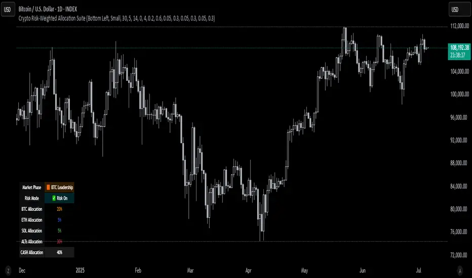
NUPL Z-ScoreThis indicator is derived from Market Value and Realized Value, which can be defined as:
Market Value: The current price of Bitcoin multiplied by the number of coins in circulation. This is like market cap in traditional markets i.e. share price multiplied by number of shares.
Realized Value: Rather than taking the current price of Bitcoin, Realized Value takes the price of each Bitcoin when it was last moved i.e. the last time it was sent from one wallet to another wallet. It then adds up all those individual prices and takes an average of them. It then multiplies that average price by the total number of coins in circulation.
By subtracting Realized Value from Market Value we calculate Unrealized Profit/Loss.
Unrealized Profit/Loss estimates the total paper profits/losses in Bitcoin held by investors. This is interesting to know but of greater value is identifying how this changes relatively over time.
To do this we can divide Unrealized Profit/Loss by Market Cap. This creates Net Unrealized Profit/Loss, sometimes referred to as NUPL, which is very useful to track investor sentiment over time for Bitcoin.
Relative Unrealised Profit/Loss is another name used for this analysis.