Bitcoin: Price projection from previous cycles onto 2024 cycleAn indicator for displaying the BITFINEX:BTCUSD price movement pattern from previous cycles onto the 2024–2025 cycle.
Best checked on Bitfinex or the “Brave New Coin – Bitcoin Liquid Index” (though that one has gone offline).
Next time it should be done with embedded constants rather than by copying candles from previous cycles.
Publishing to share the idea.
חפש סקריפטים עבור "bitcoin"

Bitcoin cme gap indicators, BINANCE vs CME exchanges premium gap
# CME BTC Premium Indicator Documentation CME:BTC1!
## 1. Overview
Indicator Name: CME BTC Premium
Platform: TradingView (Pine Script v6)
Type: Premium / Gap Analysis
Purpose:
* Visualize the CME BTC futures premium/discount relative to Binance BTCUSDT spot price.
* Detect gap-up or gap-down events on the daily chart.
* Assess short-term market sentiment and potential volatility through price discrepancies.
## 2. Key Features
1. CME Premium Calculation
* Formula:
CME Premium(%) = ((CME Price - Binance Price) / Binance Price) X 100
* Positive premium: CME futures are higher than spot → Color: Blue
* Negative premium: CME futures are lower than spot → Color: Purple
2. Premium Visualization Options
* `Column` (default)
* `Line`
3. Daily Gap Detection (Daily Chart Only)
* Gap Up: CME open > previous high × 1.0001 (≥ 0.01%)
* Gap Down: CME open < previous low × 0.9999 (≤ 0.01%)
* Visualization:
* Bar Color:
* Gap Up → Yellow (semi-transparent)
* Gap Down → Blue (semi-transparent)
* Background Color:
* Gap Up → Yellow (semi-transparent)
* Gap Down → Blue (semi-transparent)
4. Label Display
* If `Show CME Label` is enabled, the last bar displays a premium percentage label.
* Label color matches premium color; text color: Black.
* Style: `style_label_upper_left`, Size: `small`.
## 3. User Inputs
| Option Name | Description | Type / Default |
| -------------- | ------------------------- | --------------------------------------- |
| Show CME Label | Display CME premium label | Boolean / true |
| CME Plot Type | CME premium chart style | String / Column (Options: Column, Line) |
## 4. Data Sources
| Data Item | Symbol | Description |
| ------------- | ---------------- | ----------------------------- |
| Binance Price | BINANCE\:BTCUSDT | Spot BTC price |
| CME Price | CME\:BTC1! | CME BTC futures closing price |
| CME Open | CME\:BTC1! | CME BTC futures open price |
| CME Low | CME\:BTC1! | CME BTC futures low price |
| CME High | CME\:BTC1! | CME BTC futures high price |
## 5. Chart Display
1. Premium Column/Line
* Displays the CME premium percentage in real-time.
* Color: Premium ≥ 0 → Blue, Premium < 0 → Purple
2. Zero Line
* Indicates CME futures are at parity with spot for quick visual reference.
3. Gap Highlight
* Applied only on daily charts.
* Gap-up or gap-down is highlighted using bar and background colors.
4. Label
* Shows the latest CME premium percentage for quick monitoring.
## 6. Use Cases
* Analyze spot-futures premium to gauge CME market sentiment.
* Identify short-term volatility and potential trend reversals through daily gaps.
* Combine premium and gap analysis to support altcoin trend analysis and position strategy.
## 7. Limitations
* This indicator does not provide investment advice or trading recommendations; it is for informational purposes only.
* Data delays, API restrictions, or exchange differences may result in calculation discrepancies.
* Gap detection is meaningful only on daily charts; other timeframes may not provide valid signals.

Bitcoin: Pi Cycle Top & Bottom Indicator Z ScoreIndicator Overview
The Pi Cycle Top Indicator has historically been effective in picking out the timing of market cycle highs within 3 days.
It uses the 111 day moving average (111DMA) and a newly created multiple of the 350 day moving average, the 350DMA x 2.
Note: The multiple is of the price values of the 350DMA, not the number of days.
For the past three market cycles, when the 111DMA moves up and crosses the 350DMA x 2 we see that it coincides with the price of Bitcoin peaking.
It is also interesting to note that 350 / 111 is 3.153, which is very close to Pi = 3.142. In fact, it is the closest we can get to Pi when dividing 350 by another whole number.
It once again demonstrates the cyclical nature of Bitcoin price action over long time frames. However, in this instance, it does so with a high degree of accuracy over Bitcoin's adoption phase of growth.
Bitcoin Price Prediction Using This Tool
The Pi Cycle Top Indicator forecasts the cycle top of Bitcoin’s market cycles. It attempts to predict the point where Bitcoin price will peak before pulling back. It does this on major high time frames and has picked the absolute tops of Bitcoin’s major price moves throughout most of its history.
How It Can Be Used
Pi Cycle Top is useful to indicate when the market is very overheated. So overheated that the shorter-term moving average, which is the 111-day moving average, has reached an x2 multiple of the 350-day moving average. Historically, it has proved advantageous to sell Bitcoin around this time in Bitcoin's price cycles.
It is also worth noting that this indicator has worked during Bitcoin's adoption growth phase, the first 15 years or so of Bitcoin's life. With the launch of Bitcoin ETF's and Bitcoin's increased integration into the global financial system, this indicator may cease to be relevant at some point in this new market structure.
Added the Z-Score metric for easy classification of the value of Bitcoin according to this indicator.
Created for TRW
Bitcoin Total VolumeThis Pine Script indicator, titled "Bitcoin Top 16 Volume," is designed to provide traders with an aggregate view of Bitcoin (BTC) spot trading volume across leading cryptocurrency exchanges. Unlike traditional volume indicators that focus on a single exchange, this tool compiles data from a selection of the top exchanges as ranked by CoinMarketCap, offering a broader perspective on overall market activity.
The indicator works by fetching real-time volume data for specific BTC trading pairs on various exchanges. It currently incorporates data from prominent platforms such as Binance (BTCUSDT), Coinbase (BTCUSD), OKX (BTCUSDT), Bybit (BTCUSDT), Kraken (BTCUSD), Bitfinex (BTCUSD), Bitstamp (BTCUSD), Gemini (BTCUSD), Upbit (BTCKRW), Bithumb (BTCKRW), KuCoin (BTCUSDT), Gate.io (BTCUSDT), MEXC (BTCUSDT), Crypto.com (BTCUSD), Poloniex (BTCUSDT), and BitMart (BTCUSDT). It's important to note that while the indicator aims to represent the "Top 16" exchanges, the actual number included may vary due to data availability within TradingView and the dynamic nature of exchange rankings.
The script then calculates the total volume by summing up the volume data retrieved from each of these exchanges. This aggregated volume is visually represented as a histogram directly on your TradingView chart, displayed in white by default. By observing the height of the histogram bars, traders can quickly assess the total trading volume for Bitcoin spot markets over different time periods, corresponding to the chart's timeframe.
This indicator is valuable for traders seeking to understand the overall market depth and liquidity of Bitcoin. Increased total volume can often signal heightened market interest and potential trend strength or reversals. Conversely, low volume might suggest consolidation or reduced market participation. Traders can use this indicator to confirm trends, identify potential breakouts, and gauge the general level of activity in the Bitcoin spot market across major exchanges. Keep in mind that the list of exchanges included may need periodic updates to accurately reflect the top exchanges as rankings on CoinMarketCap evolve.
Bitcoin Logarithmic Regression BandsOverview
This indicator displays logarithmic regression bands for Bitcoin. Logarithmic regression is a statistical method used to model data where growth slows down over time. I initially created these bands in 2019 using a spreadsheet, and later coded them in TradingView in 2021. Over time, the bands proved effective at capturing Bitcoin's bull market peaks and bear market lows. In 2024, I decided to share this indicator because I believe these logarithmic regression bands offer the best fit for the Bitcoin chart.
How It Works
The logarithmic regression lines are fitted to the Bitcoin (BTCUSD) chart using two key factors: the 'a' factor (slope) and the 'b' factor (intercept). The two lines in the upper and lower bands share the same 'a' factor, but I adjust the 'b' factor by 0.2 to more accurately capture the bull market peaks and bear market lows. The formula for logaritmic regression is 10^((a * ln) - b).
How to Use the Logarithmic Regression Bands
1. Lower Band (Support Band):
The two lines in the lower band create a potential support area for Bitcoin’s price. Historically, Bitcoin’s price has always found its lows within this band during past market cycles. When the price is within the lower band, it suggests that Bitcoin is undervalued and could be set for a rebound.
2. Upper Band (Resistance Band):
The two lines in the upper band create a potential resistance area for Bitcoin’s price. Bitcoin has consistently reached its highs in this band during previous market cycles. If the price is within the upper band, it indicates that Bitcoin is overvalued, and a potential price correction may be imminent.
Use Cases
- Price Bottoming:
Bitcoin tends to bottom out at the lower band before entering a prolonged bull market or a period of sideways movement.
- Price Topping:
In reverse, Bitcoin tends to top out at the upper band before entering a bear market phase.
- Profitable Strategy:
Buying at the lower band and selling at the upper band can be a profitable trading strategy, as these bands often indicate key price levels for Bitcoin’s market cycles.

Bitcoin Exponential Profit Strategy### Strategy Description:
The **Bitcoin Trading Strategy** is an **Exponential Moving Average (EMA) crossover strategy** designed to identify bullish trends for Bitcoin.
1. **Indicators**:
- **Fast EMA (default 9 periods)**: Represents the short-term trend.
- **Slow EMA (default 21 periods)**: Represents the longer-term trend.
2. **Entry Condition**:
- A **bullish crossover** occurs when the Fast EMA crosses above the Slow EMA.
- The strategy enters a **long position** with a user-defined order size (default 0.01 BTC).
3. **Exit Conditions**:
- **Take Profit**: Closes the position when the profit target is reached (default $100).
- **Stop Loss**: Closes the position when the price drops below the stop loss level (default $50).
- **Bearish Crossunder**: Closes the position when the Fast EMA crosses below the Slow EMA.
4. **Visual Signals**:
- **BUY signals**: Displayed when a bullish crossover occurs.
- **SELL signals**: Displayed when a bearish crossunder occurs.
This strategy is optimized for trend-following behavior, ensuring positions are aligned with upward-moving trends while managing risk through clear stop-loss and take-profit levels.

Bitcoin Macro Trend Map [Ox_kali]
## Introduction
__________________________________________________________________________________
The “Bitcoin Macro Trend Map” script is designed to provide a comprehensive analysis of Bitcoin’s macroeconomic trends. By leveraging a unique combination of Bitcoin-specific macroeconomic indicators, this script helps traders identify potential market peaks and troughs with greater accuracy. It synthesizes data from multiple sources to offer a probabilistic view of market excesses, whether overbought or oversold conditions.
This script offers significant value for the following reasons:
1. Holistic Market Analysis : It integrates a diverse set of indicators that cover various aspects of the Bitcoin market, from investor sentiment and market liquidity to mining profitability and network health. This multi-faceted approach provides a more complete picture of the market than relying on a single indicator.
2. Customization and Flexibility : Users can customize the script to suit their specific trading strategies and preferences. The script offers configurable parameters for each indicator, allowing traders to adjust settings based on their analysis needs.
3. Visual Clarity : The script plots all indicators on a single chart with clear visual cues. This includes color-coded indicators and background changes based on market conditions, making it easy for traders to quickly interpret complex data.
4. Proven Indicators : The script utilizes well-established indicators like the EMA, NUPL, PUELL Multiple, and Hash Ribbons, which are widely recognized in the trading community for their effectiveness in predicting market movements.
5. A New Comprehensive Indicator : By integrating background color changes based on the aggregate signals of various indicators, this script essentially creates a new, comprehensive indicator tailored specifically for Bitcoin. This visual representation provides an immediate overview of market conditions, enhancing the ability to spot potential market reversals.
Optimal for use on timeframes ranging from 1 day to 1 week , the “Bitcoin Macro Trend Map” provides traders with actionable insights, enhancing their ability to make informed decisions in the highly volatile Bitcoin market. By combining these indicators, the script delivers a robust tool for identifying market extremes and potential reversal points.
## Key Indicators
__________________________________________________________________________________
Macroeconomic Data: The script combines several relevant macroeconomic indicators for Bitcoin, such as the 10-month EMA, M2 money supply, CVDD, Pi Cycle, NUPL, PUELL, MRVR Z-Scores, and Hash Ribbons (Full description bellow).
Open Source Sources: Most of the scripts used are sourced from open-source projects that I have modified to meet the specific needs of this script.
Recommended Timeframes: For optimal performance, it is recommended to use this script on timeframes ranging from 1 day to 1 week.
Objective: The primary goal is to provide a probabilistic solution to identify market excesses, whether overbought or oversold points.
## Originality and Purpose
__________________________________________________________________________________
This script stands out by integrating multiple macroeconomic indicators into a single comprehensive tool. Each indicator is carefully selected and customized to provide insights into different aspects of the Bitcoin market. By combining these indicators, the script offers a holistic view of market conditions, helping traders identify potential tops and bottoms with greater accuracy. This is the first version of the script, and additional macroeconomic indicators will be added in the future based on user feedback and other inputs.
## How It Works
__________________________________________________________________________________
The script works by plotting each macroeconomic indicator on a single chart, allowing users to visualize and interpret the data easily. Here’s a detailed look at how each indicator contributes to the analysis:
EMA 10 Monthly: Uses an exponential moving average over 10 monthly periods to signal bullish and bearish trends. This indicator helps identify long-term trends in the Bitcoin market by smoothing out price fluctuations to reveal the underlying trend direction.Moving Averages w/ 18 day/week/month.
Credit to @ryanman0
M2 Money Supply: Analyzes the evolution of global money supply, indicating market liquidity conditions. This indicator tracks the changes in the total amount of money available in the economy, which can impact Bitcoin’s value as a hedge against inflation or economic instability.
Credit to @dylanleclair
CVDD (Cumulative Value Days Destroyed): An indicator based on the cumulative value of days destroyed, useful for identifying market turning points. This metric helps assess the Bitcoin market’s health by evaluating the age and value of coins that are moved, indicating potential shifts in market sentiment.
Credit to @Da_Prof
Pi Cycle: Uses simple and exponential moving averages to detect potential sell points. This indicator aims to identify cyclical peaks in Bitcoin’s price, providing signals for potential market tops.
Credit to @NoCreditsLeft
NUPL (Net Unrealized Profit/Loss): Measures investors’ unrealized profit or loss to signal extreme market levels. This indicator shows the net profit or loss of Bitcoin holders as a percentage of the market cap, helping to identify periods of significant market optimism or pessimism.
Credit to @Da_Prof
PUELL Multiple: Assesses mining profitability relative to historical averages to indicate buying or selling opportunities. This indicator compares the daily issuance value of Bitcoin to its yearly average, providing insights into when the market is overbought or oversold based on miner behavior.
Credit to @Da_Prof
MRVR Z-Scores: Compares market value to realized value to identify overbought or oversold conditions. This metric helps gauge the overall market sentiment by comparing Bitcoin’s market value to its realized value, identifying potential reversal points.
Credit to @Pinnacle_Investor
Hash Ribbons: Uses hash rate variations to signal buying opportunities based on miner capitulation and recovery. This indicator tracks the health of the Bitcoin network by analyzing hash rate trends, helping to identify periods of miner capitulation and subsequent recoveries as potential buying opportunities.
Credit to @ROBO_Trading
## Indicator Visualization and Interpretation
__________________________________________________________________________________
For each horizontal line representing an indicator, a legend is displayed on the right side of the chart. If the conditions are positive for an indicator, it will turn green, indicating the end of a bearish trend. Conversely, if the conditions are negative, the indicator will turn red, signaling the end of a bullish trend.
The background color of the chart changes based on the average of green or red indicators. This parameter is configurable, allowing adjustment of the threshold at which the background color changes, providing a clear visual indication of overall market conditions.
## Script Parameters
__________________________________________________________________________________
The script includes several configurable parameters to customize the display and behavior of the indicators:
Color Style:
Normal: Default colors.
Modern: Modern color style.
Monochrome: Monochrome style.
User: User-customized colors.
Custom color settings for up trends (Up Trend Color), down trends (Down Trend Color), and NaN (NaN Color)
Background Color Thresholds:
Thresholds: Settings to define the thresholds for background color change.
Low/High Red Threshold: Low and high thresholds for bearish trends.
Low/High Green Threshold: Low and high thresholds for bullish trends.
Indicator Display:
Options to show or hide specific indicators such as EMA 10 Monthly, CVDD, Pi Cycle, M2 Money, NUPL, PUELL, MRVR Z-Scores, and Hash Ribbons.
Specific Indicator Settings:
EMA 10 Monthly: Options to customize the period for the exponential moving average calculation.
M2 Money: Aggregation of global money supply data.
CVDD: Adjustments for value normalization.
Pi Cycle: Settings for simple and exponential moving averages.
NUPL: Thresholds for unrealized profit/loss values.
PUELL: Adjustments for mining profitability multiples.
MRVR Z-Scores: Settings for overbought/oversold values.
Hash Ribbons: Options for hash rate moving averages and capitulation/recovery signals.
## Conclusion
__________________________________________________________________________________
The “Bitcoin Macro Trend Map” by Ox_kali is a tool designed to analyze the Bitcoin market. By combining several macroeconomic indicators, this script helps identify market peaks and troughs. It is recommended to use it on timeframes from 1 day to 1 week for optimal trend analysis. The scripts used are sourced from open-source projects, modified to suit the specific needs of this analysis.
## Notes
__________________________________________________________________________________
This is the first version of the script and it is still in development. More indicators will likely be added in the future. Feedback and comments are welcome to improve this tool.
## Disclaimer:
__________________________________________________________________________________
Please note that the Open Interest liquidation map is not a guarantee of future market performance and should be used in conjunction with proper risk management. Always ensure that you have a thorough understanding of the indicator’s methodology and its limitations before making any investment decisions. Additionally, past performance is not indicative of future results.

Bitcoin Logarithmic Regression
This indicator displays logarithmic regression channels for Bitcoin. A logarithmic regression is a function that increases or decreases rapidly at first, but then steadily slows as time moves. The original version of this indicator/model was created as an open source script by a user called Owain but is not available on TradingView anymore. So I decided to update the code to the latest version of pinescript and fine tune some of the parameters.
How to read and use the logarithmic regression:
There are 3 different regression lines or channels visible:
Green Channel: These lines represent different levels of support derived from the logarithmic regression model.
Purpose: The green channel is used to identify potential support levels where the price might find a bottom or bounce back upwards.
Interpretation:
If the price is approaching or touching the lower green lines, it might indicate a buying opportunity or an area where the price is considered undervalued.
------------------------------------------------
Red Channel: These lines represent different levels of resistance derived from the logarithmic regression model.
Purpose: The red channel is used to identify potential resistance levels where the price might encounter selling pressure or face difficulty moving higher.
Interpretation:
If the price is approaching or touching the upper red lines, it might indicate a selling opportunity or an area where the price is considered overvalued.
-------------------------------------------------
Purple Line This line represents to so-called "fair price" of Bitcoin according to the regression model.
Purpose: The purple line can be used to identify if the current price of Bitcoin is under- or overvalued.
Interpretation: A simple interpretation here would be that over time the price will have the tendency to always return to its "fair price", so starting to DCA more when price is under the line and less when it is over the line could be a suitable investment strategy.
----------------------------------------------------
Practical Application:
You can use this regression channel to build your own, long term, trading strategies. Notice how Bitcoin seems to always act in kind of the same 4 year cycle:
- Price likes to trade around the purple line at the time of the halvings
- After the halvings we see an extended sideways range for up to 300 days
- After the sideways range Bitcoin goes into a bull market frenzy (the area between the green and red channel)
- The price tops out at the upper red channel and then enters a prolonged bear market.
Buying around the purple line or lower line of the green channel and selling once the price reaches the red channel can be a suitable and very profitable strategy.
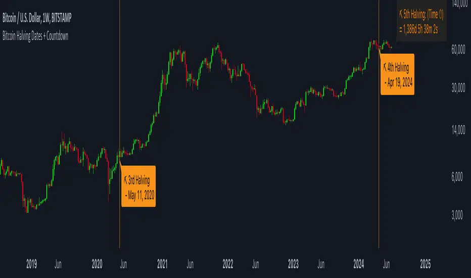
Bitcoin Halving Dates + CountdownBitcoin Halving Dates + Countdown Indicator
This unique TradingView Indicator is designed to provide traders and cryptocurrency enthusiasts with critical information about the Bitcoin halving events directly on their charts. Bitcoin halving is a significant event that reduces the reward for mining Bitcoin transactions by half, an occurrence that happens approximately every four years and is known to impact Bitcoin's price significantly.
Features:
▪ Halving Date Lines: The indicator plots vertical lines on the chart at the dates of past and the upcoming Bitcoin halving events.
Customizable Appearance: Users can personalize the look of the indicator with options to change the color of the halving lines, label background, and text for better visibility against their chart theme.
▪ Halving Event Labels: Each halving event is marked with a label indicating its sequence (e.g., 1st Halving) and the exact date it occurred or is expected to occur.
Countdown to Next Halving: For the upcoming halving event, the indicator displays a countdown in days, hours, minutes, and seconds, helping users anticipate the event with precise timing.
▪ User-friendly Options: Toggle the visibility of labels for a cleaner chart appearance and customize color schemes to match personal preferences or chart themes.
Usage:
This indicator is invaluable for those looking to understand Bitcoin's historical halving events and their timing in relation to price movements. It's also perfect for preparing for the next halving event, as the countdown feature provides a clear and timely reminder.
Customization Options:
▪ Show Labels: Toggle on/off the visibility of halving event labels.
Line Color: Choose the color of the vertical lines marking each halving event.
Label Background Color & Text Color: Customize the background and text color of the labels for better readability.
▪ Countdown Label Colors: Separate customization options for the countdown label's background and text colors, allowing for clear visibility and distinction from other chart elements.
Enhance your chart with this indicator and trade with more context and anticipation towards the future of Bitcoin.
Bitcoin's Logarithmic ChannelLogarithmic growth is a reasonable way to describe the long term growth of bitcoin's market value: for a network that is experiencing growing adoption and is powered by an asset with a finite and disinflationary supply, it’s natural to expect a more explosive growth of its market capitalization early on, followed by diminishing returns as the network and the asset mature.
I used publicly available data to model the market capitalization of bitcoin, deriving thereform a set of three curves forming a logarithmic growth channel for the market capitalization of bitcoin. Using the time series for the circulating supply, we derive a logarithmic growth channel for the bitcoin price.
Model uses publicly available data from July 17, 2010 to December 31, 2022. Everything since the beginning of 2023 is a prediction.
Past performance is not a guarantee of future results.
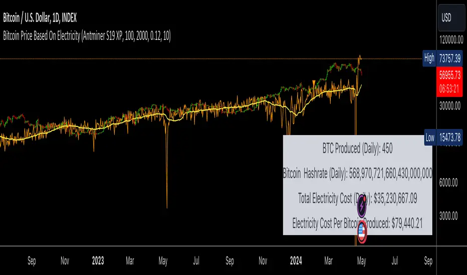
Bitcoin Price Based On ElectricityThis script Calculates the price of Bitcoin solely on the hashrate and the cost of electricity.
The calculation is quite conservative considering its based on the average cost of electricity globally and we are assuming that everyone is running the latest mining hardware, which is the most efficient and cost effective.
Under both of these assumptions the calculation for bitcoins price is almost identical to the price we are seeing now.
If we change the reward rate to 3.125 (Aprils reward amount) then the price of one bitcoin per cost of work will be around 100k.
I am sure I am missing some important numbers in this calculation, fees, start up costs etc. However, it is very interesting to see that the price of Bitcoin can be calculated almost perfectly based on the hashrate and cost of electricity.
PROOF OF WORK
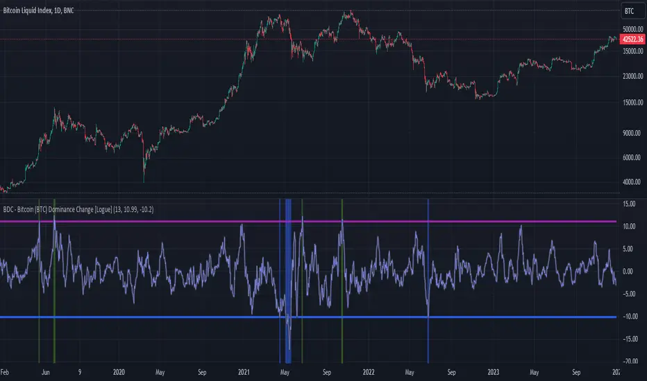
BDC - Bitcoin (BTC) Dominance Change [Logue]Bitcoin Dominance Change. Interesting things tend to happen when the Bitcoin dominance increases or decreases rapidly. Perhaps because there is overexuberance in the market in either BTC or the alts. In back testing, I found a rapid 13-day change in dominance indicates interesting switches in the BTC trends. Prior to 2019, the indicator doesn't work as well to signal trend shifts (i.e., local tops and bottoms) likely based on very few coins making up the crypto market.
The BTC dominance change is calculated as a percentage change of the daily dominance. You are able to change the upper bound, lower bound, and the period (daily) of the indicator to your own preferences. The indicator going above the upper bound or below the lower bound will trigger a different background color.
Use this indicator at your own risk. I make no claims as to its accuracy in forecasting future trend changes of Bitcoin.
Bitcoin Cycles IndicatorBitcoin Cycles Indicator
The "Bitcoin Cycles Indicator" is designed to provide insights into the current market cycle of Bitcoin. It utilizes a combination of market cap real and total volume transfer to generate a visual representation of the market cycle.
Indicator Phases:
Cycle Lows (Green): Indicates potential low points in the cycle.
Under Valued (Aqua): Represents phases where Bitcoin might be undervalued.
Fair Market Value (Purple): Reflects periods considered to be at fair market value.
Aggressively Valued (Orange): Marks phases where Bitcoin might be aggressively valued.
Over Valued (Red): Suggests potential overvaluation of Bitcoin in the cycle.
Bitcoin Cycles can identify periods of increased risk when transaction behavior on-chain is indicative of major cycle highs. It also identifies areas of value opportunity where on-chain transaction behavior signals major cycle lows.
Historically, Bitcoin has exhibited cyclical behavior roughly every four years, coinciding with significant events known as "halvings."
While the historical correlation between Bitcoin's cycles and halving events is compelling, market dynamics are subject to change. Traders and investors should approach the market with a comprehensive strategy, incorporating multiple indicators and risk management techniques to navigate Bitcoin's evolving landscape.

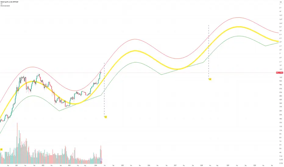
Bitcoin Market Cap wave model weeklyThis Bitcoin Market Cap wave model indicator is rooted in the foundation of my previously developed tool, the : Bitcoin wave model
To derive the Total Market Cap from the Bitcoin wave price model, I employed a straightforward estimation for the Total Market Supply (TMS). This estimation relies on the formula:
TMS <= (1 - 2^(-h)) for any h.This equation holds true for any value of h, which will be elaborated upon shortly. It is important to note that this inequality becomes the equality at the dates of halvings, diverging only slightly during other periods.
Bitcoin wave model is based on the logarithmic regression model and the sinusoidal waves, induced by the halving events.
This chart presents the outcome of an in-depth analysis of the complete set of Bitcoin price data available from October 2009 to August 2023.
The central concept is that the logarithm of the Bitcoin price closely adheres to the logarithmic regression model. If we plot the logarithm of the price against the logarithm of time, it forms a nearly straight line.
The parameters of this model are provided in the script as follows: log(BTCUSD) = 1.48 + 5.44log(h).
The secondary concept involves employing the inherent time unit of Bitcoin instead of days:
'h' denotes a slightly adjusted time measurement intrinsic to the Bitcoin blockchain. It can be approximated as (days since the genesis block) * 0.0007. Precisely, 'h' is defined as follows: h = 0 at the genesis block, h = 1 at the first halving block, and so forth. In general, h = block height / 210,000.
Adjustments are made to account for variations in block creation time.
The third concept revolves around investigating halving waves triggered by supply shock events resulting from the halvings. These halvings occur at regular intervals in Bitcoin's native time 'h'. All halvings transpire when 'h' is an integer. These events induce waves with intervals denoted as h = 1.
Consequently, we can model these waves using a sin(2pih - a) function. The parameter determining the time shift is assessed as 'a = 0.4', aligning with earlier expectations for halving events and their subsequent outcomes.
The fourth concept introduces the notion that the waves gradually diminish in amplitude over the progression of "time h," diminishing at a rate of 0.7^h.
Lastly, we can create bands around the modeled sinusoidal waves. The upper band is derived by multiplying the sine wave by a factor of 3.1*(1-0.16)^h, while the lower band is obtained by dividing the sine wave by the same factor, 3.1*(1-0.16)^h.
The current bandwidth is 2.5x. That means that the upper band is 2.5 times the lower band. These bands are forming an exceptionally narrow predictive channel for Bitcoin. Consequently, a highly accurate estimation of the peak of the next cycle can be derived.
The prediction indicates that the zenith past the fourth halving, expected around the summer of 2025, could result in Total Bitcoin Market Cap ranging between 4B and 5B USD.
The projections to the future works well only for weekly timeframe.
Enjoy the mathematical insights!
BITCOIN Miners Revenue VS Price Correlation OscillatorUse 3D(3-day candle) as timeframe for best reading.
------
original template for Correlation indicator was created by obaranova. credit goes to her.

Bitcoin Power Law Zones (Dunk)Introduction When viewed on a standard linear chart, Bitcoin’s long-term price action can appear chaotic and exponential. However, when analyzed through the lens of physics and network growth models, a distinct structure emerges.
This indicator implements the Bitcoin Power Law , a mathematical model that suggests Bitcoin’s price evolves in a straight line when plotted against time on a "log-log" scale. By calculating parallel bands around this regression line, we create a "Rainbow" of valuation zones that help investors visualize whether the asset is historically overheated, undervalued, or sitting at fair value.
The Math Behind the Model The Power Law dictates that price scales with time according to the formula: Price = A * (days since genesis)^b
This script uses the specific parameters popularized by recent physics-based analyses of the network: Slope (b): 5.78 (Representing the scaling law of the network adoption). Amplitude (A): 1.45 x 10^-17 (The intercept coefficient).
While simple moving averages react to price, this model is predictive based on time and network growth physics, providing a long-term "gravity" center for the asset.
Guide to the Valuation Zones
Upper Bands (Red/Orange): Extr. Overvalued, High Premium, Overvalued. Historically, these zones have marked cycle peaks where price moved too far, too fast ahead of the network's steady growth. The Baseline (Black Line): Fair Value. The mathematical mean of the Power Law. Price has historically oscillated around this line, treating it as a center of gravity. Lower Bands (Green/Blue): Undervalued, Discount, Deep Discount. These zones represent periods where the market price has historically lagged behind the network's intrinsic value, often marking accumulation phases.
Note: The lowest theoretical tiers ("Bitcoin Dead") have been trimmed from this chart to focus on relevant historical support levels.
How to Use Logarithmic Scale: You MUST set your chart to "Log" scale (bottom right of the TradingView window) for this indicator to function correctly. On a linear chart, the bands will appear to curve upwards aggressively; on a Log chart, they will appear as smooth, parallel channels. Timeframe: This is a macro-economic indicator. It is best viewed on Daily or Weekly timeframes. Overlay Labels: The indicator includes dynamic labels on the right-side axis, allowing you to instantly see the current price requirements for each valuation zone without manually tracing lines.
Credits This script is based on the Power Law theory popularized by Giovanni Santostasi and the original Corridor concepts by Harold Christopher Burger .
Disclaimer This tool is for educational and informational purposes only. It visualizes historical mathematical trends and does not constitute financial advice. Past performance of a model is not indicative of future results.
Further Reading
www.hcburger.com
giovannisantostasi.medium.com

Bitcoin vs. S&P 500 Performance Comparison**Full Description:**
**Overview**
This indicator provides an intuitive visual comparison of Bitcoin's performance versus the S&P 500 by shading the chart background based on relative strength over a rolling lookback period.
**How It Works**
- Calculates percentage returns for both Bitcoin and the S&P 500 (ES1! futures) over a specified lookback period (default: 75 bars)
- Compares the returns and shades the background accordingly:
- **Green/Teal Background**: Bitcoin is outperforming the S&P 500
- **Red/Maroon Background**: S&P 500 is outperforming Bitcoin
- Displays a real-time performance difference label showing the exact percentage spread
**Key Features**
✓ Rolling performance comparison using customizable lookback period (default 75 bars)
✓ Clean visual representation with adjustable transparency
✓ Works on any timeframe (optimized for daily charts)
✓ Real-time performance differential display
✓ Uses ES1! (E-mini S&P 500 continuous futures) for accurate comparison
✓ Fine-tuning adjustment factor for precise calibration
**Use Cases**
- Identify market regimes where Bitcoin outperforms or underperforms traditional equities
- Spot trend changes in relative performance
- Assess risk-on vs risk-off periods
- Compare Bitcoin's momentum against broader market conditions
- Time entries/exits based on relative strength shifts
**Settings**
- **S&P 500 Symbol**: Default ES1! (can be changed to SPX or other indices)
- **Lookback Period**: Number of bars for performance calculation (default: 75)
- **Adjustment Factor**: Fine-tune calibration to match specific data feeds
- **Transparency Controls**: Customize background shading intensity
- **Show/Hide Label**: Toggle performance difference display
**Best Practices**
- Use on daily timeframe for swing trading and position analysis
- Combine with other momentum indicators for confirmation
- Watch for color transitions as potential regime change signals
- Consider using multiple timeframes for comprehensive analysis
**Technical Details**
The indicator calculates rolling percentage returns using the formula: ((Current Price / Price ) - 1) × 100, then compares Bitcoin's return to the S&P 500's return over the same period. The background color dynamically updates based on which asset is showing stronger performance.

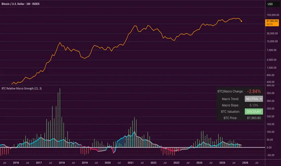
Bitcoin Relative Macro StrengthBTC Relative Macro Strength
Overview
The BTC Relative Macro Strength indicator measures Bitcoin's price strength relative to the global macro environment. By tracking deviations from the macro trend, it identifies potentially overvalued and undervalued market phases.
The global macro trend is derived by multiplying the ISM PMI (a widely-used proxy for the business cycle) by a simplified measure of global liquidity.
Calculations
Global Liquidity = Fed Balance Sheet − Reverse Repo − Treasury General Account + U.S. M2 + China M2
Global Macro Trend = ISM PMI × Global Liquidity
Understanding the Global Macro Trend
The global macro trend plot combines the ebb and flow of global liquidity with the cyclical patterns of the business cycle. The resulting composite exhibits strong directional correlation with Bitcoin—or more precisely, Bitcoin appears to move in lockstep with liquidity conditions and business cycle phases.
This relationship has strengthened notably since COVID, likely because Bitcoin's growing market capitalization has increased its exposure to macro forces.
The takeaway is that Bitcoin is acutely sensitive to growth in the money supply (it trends with liquidity expansion) and oscillates with the phases of the business cycle.
Indicator Components
📊 Histogram: BTC/Macro Change
Displays the rolling percentage change of Bitcoin's price relative to the global macro trend.
High values: Bitcoin is outpacing macro conditions (potentially overvalued)
Low values: Bitcoin is underperforming macro conditions (potentially undervalued)
Color scheme:
🟢 Green = Positive deviation
🔴 Red = Negative deviation
📈 Macro Slope Line
Plots the scaled percentage change of the global macro trend itself.
Color scheme:
🔵 Teal = BULLISH (slope positive and rising)
⚪ Gray = NEUTRAL (slope and trend disagree)
🟣 Pink = BEARISH (slope negative and falling)
FieldDescription
BTC/Macro Change : Percentage change of Bitcoin's price vs. the Global Macro Trend (default: 21-bar average)
Macro Trend : Composite assessment combining slope direction and trend momentum. Reads BULLISH when both align upward, BEARISH when both align downward, NEUTRAL when they disagree
Macro Slope : The global macro trend's average slope expressed as a percentage
BTC Valuation : Relative valuation category based on BTC/Macro deviation (Extreme Premium → Extreme Discount)
BTC Price : Current Bitcoin price
How to Use
This indicator is primarily useful for identifying market phases where Bitcoin's price has diverged from the global macro trend.
Identify extremes : Look for periods when the histogram reaches elevated positive or negative levels
Assess valuation : Use the BTC Valuation reading to gauge relative over/undervaluation
Confirm with trend : Check whether macro conditions support or contradict the current price level
Mean reversion : Consider that significant deviations from trend historically tend to revert
Note: This indicator identifies relative valuation based on macro conditions—it does not predict price direction or timing.
Settings
Lookback Period - 21 bars - Number of bars for calculating rolling averages
Macro Slope Scale - 3.0 - Multiplier for macro slope line visibility
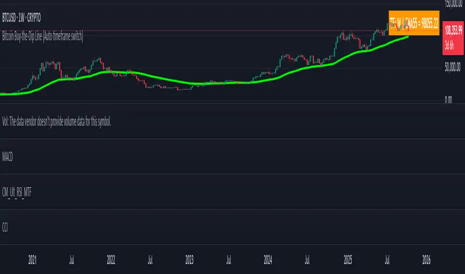
Bitcoin Buy-the-Dip Line (Auto timeframe switch)Many people ask me when is the right time to buy Bitcoin. However, most of them have little trading experience and no time to study technical strategies or tools.
That’s why I created a simple and intuitive indicator — easy enough for anyone to use.
Usage 1 – Buy the Dip
This indicator works only on 4H, 1D, 1W, and 1M timeframes.
On each timeframe, you will see a single EMA line.
During a bull market, whenever the price dips below this EMA, it usually represents a good opportunity to buy the dip .
Usage 2 – Bull to Bear Transition
On the daily timeframe, if the price stays below the EMA and continues to make lower lows , it often signals that the market is transitioning into a bearish phase .
Bitcoin Logarithmic Growth Curve 2025 Z-Score"The Bitcoin logarithmic growth curve is a concept used to analyze Bitcoin's price movements over time. The idea is based on the observation that Bitcoin's price tends to grow exponentially, particularly during bull markets. It attempts to give a long-term perspective on the Bitcoin price movements.
The curve includes an upper and lower band. These bands often represent zones where Bitcoin's price is overextended (upper band) or undervalued (lower band) relative to its historical growth trajectory. When the price touches or exceeds the upper band, it may indicate a speculative bubble, while prices near the lower band may suggest a buying opportunity.
Unlike most Bitcoin growth curve indicators, this one includes a logarithmic growth curve optimized using the latest 2024 price data, making it, in our view, superior to previous models. Additionally, it features statistical confidence intervals derived from linear regression, compatible across all timeframes, and extrapolates the data far into the future. Finally, this model allows users the flexibility to manually adjust the function parameters to suit their preferences.
The Bitcoin logarithmic growth curve has the following function:
y = 10^(a * log10(x) - b)
In the context of this formula, the y value represents the Bitcoin price, while the x value corresponds to the time, specifically indicated by the weekly bar number on the chart.
How is it made (You can skip this section if you’re not a fan of math):
To optimize the fit of this function and determine the optimal values of a and b, the previous weekly cycle peak values were analyzed. The corresponding x and y values were recorded as follows:
113, 18.55
240, 1004.42
451, 19128.27
655, 65502.47
The same process was applied to the bear market low values:
103, 2.48
267, 211.03
471, 3192.87
676, 16255.15
Next, these values were converted to their linear form by applying the base-10 logarithm. This transformation allows the function to be expressed in a linear state: y = a * x − b. This step is essential for enabling linear regression on these values.
For the cycle peak (x,y) values:
2.053, 1.268
2.380, 3.002
2.654, 4.282
2.816, 4.816
And for the bear market low (x,y) values:
2.013, 0.394
2.427, 2.324
2.673, 3.504
2.830, 4.211
Next, linear regression was performed on both these datasets. (Numerous tools are available online for linear regression calculations, making manual computations unnecessary).
Linear regression is a method used to find a straight line that best represents the relationship between two variables. It looks at how changes in one variable affect another and tries to predict values based on that relationship.
The goal is to minimize the differences between the actual data points and the points predicted by the line. Essentially, it aims to optimize for the highest R-Square value.
Below are the results:
snapshot
snapshot
It is important to note that both the slope (a-value) and the y-intercept (b-value) have associated standard errors. These standard errors can be used to calculate confidence intervals by multiplying them by the t-values (two degrees of freedom) from the linear regression.
These t-values can be found in a t-distribution table. For the top cycle confidence intervals, we used t10% (0.133), t25% (0.323), and t33% (0.414). For the bottom cycle confidence intervals, the t-values used were t10% (0.133), t25% (0.323), t33% (0.414), t50% (0.765), and t67% (1.063).
The final bull cycle function is:
y = 10^(4.058 ± 0.133 * log10(x) – 6.44 ± 0.324)
The final bear cycle function is:
y = 10^(4.684 ± 0.025 * log10(x) – -9.034 ± 0.063)
The main Criticisms of growth curve models:
The Bitcoin logarithmic growth curve model faces several general criticisms that we’d like to highlight briefly. The most significant, in our view, is its heavy reliance on past price data, which may not accurately forecast future trends. For instance, previous growth curve models from 2020 on TradingView were overly optimistic in predicting the last cycle’s peak.
This is why we aimed to present our process for deriving the final functions in a transparent, step-by-step scientific manner, including statistical confidence intervals. It's important to note that the bull cycle function is less reliable than the bear cycle function, as the top band is significantly wider than the bottom band.
Even so, we still believe that the Bitcoin logarithmic growth curve presented in this script is overly optimistic since it goes parly against the concept of diminishing returns which we discussed in this post:
This is why we also propose alternative parameter settings that align more closely with the theory of diminishing returns."
Now with Z-Score calculation for easy and constant valuation classification of Bitcoin according to this metric.
Created for TRW

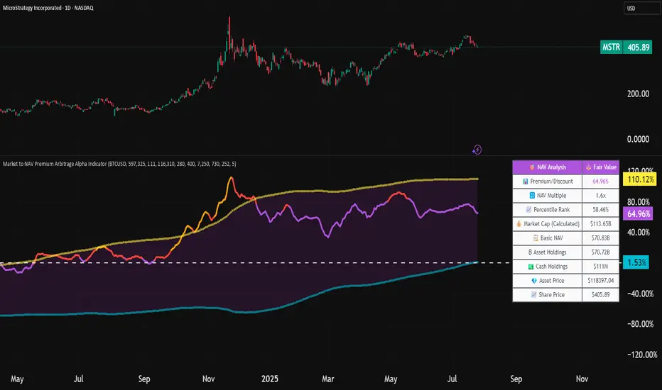
Market to NAV Premium Arbitrage Alpha IndicatorBitcoin treasury companies such as Microstrategy are known for trading at significant premiums. but how big exactly is the premium? And how can we measure it in real time?
I developed this quantitative tool to identify statistical mispricings between market capitalization and net asset value (NAV), specifically designed for arbitrage strategies and alpha generation in Bitcoin-holding companies, such as MicroStrategy or Sharplink Gaming, or SPACs used primarily to hold cryptocurrencies, Bitcoin ETFs, and other NAV-based instruments. It can probably also be used in certain spin-offs.
KEY FEATURES:
✅ Real-time Premium/Discount Calculation
• Automatically retrieves market cap data from TradingView
• Calculates precise NAV based on underlying asset holdings (for example Bitcoin)
• Formula: (Market Cap - NAV) / NAV × 100
✅ Statistical Analysis
• Historical percentile rankings (customizable lookback period)
• Standard deviation bands (2σ) for extreme value detection (close to these values might be seen as interesting points to short or go long)
• Smoothing period to reduce noise
✅ Multi-Source Market Cap Detection
• You can add the ticker of the NAV asset, but if necessary, you can also put it manually. Priority system: TradingView data → Calculated → Manual override
✅ Advanced NAV Modeling
• Basic NAV: Asset holdings + cash.
• Adjusted NAV: Includes software business value, debt, preferred shares. If the company has a lot of this kind of intrinsic value, put it in the "cash" field
• Support for any underlying asset (BTC, ETH, etc.)
TRADING APPLICATIONS:
🎯 Pairs Trading Signals
• Long/Short opportunities when premium reaches statistical extremes
• Mean reversion strategies based on historical ranges
• Risk-adjusted position sizing using percentile ranks
🎯 Arbitrage Detection
• Identifies when market pricing significantly deviates from fair value
• Quantifies the magnitude of mispricing for profit potential
• Historical context for timing entry/exit points
CONFIGURATION OPTIONS:
• Underlying Asset: Any symbol (default: COINBASE:BTCUSD) NEEDS MANUAL INPUT
• Asset Quantity: Precise holdings amount (for example, how much BTC does the company currently hold). NEEDS MANUAL INPUT
• Cash Holdings: Additional liquid assets. NEEDS MANUAL INPUT
• Market Cap Mode: Auto-detect, calculated, or manual
• Advanced Adjustments: Business value, debt, preferred shares
• Display Settings: Lookback period, smoothing, custom colors
IT CAN BE USED BY:
• Quantitative traders focused on statistical arbitrage
• Institutional investors monitoring NAV-based instruments
• Bitcoin ETF and MSTR traders seeking alpha generation
• Risk managers tracking premium/discount exposures
• Academic researchers studying market efficiency (as you can see, markets are not efficient 😉)
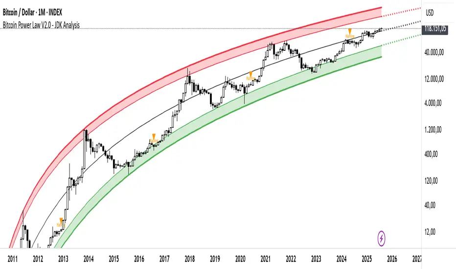
Bitcoin Cycle Log-Curve (JDK-Analysis)Important: The standard parameters provided in the script are specifically tuned for the TradingView Bitcoin Index chart on a monthly timeframe on logarithmic scale, and will yield the most accurate visual alignment when applied to that dataset. (more below)
This very simple script visualizes Bitcoin’s long-term price behavior using a logarithmic regression model designed to reflect the cyclical nature of Bitcoin’s historical market trends. Unlike typical technical indicators that react to recent price movements, this tool is built on the assumption that Bitcoin follows an exponential growth path over time, shaped by its fixed supply structure and four-year halving cycles.
The calculation behind the curved bands:
An upper boundary, a lower boundary, and a central midline, are calculated based on logarithmic functions applied to the bar index (which serves as a proxy for time). The upper and lower bounds are defined using exponential formulas of the type y = exp(constant + coefficient * log(bar_index)), allowing the curves to evolve dynamically over time. These bands serve as a macro-level guide for identifying periods of historical overvaluation (upper red curve) and undervaluation (lower green curve), with a central black curve representing the geometric average of the two.
How to customize the parameters:
The lower1_const and upper1_const values vertically shift the respective lower and upper curves—more negative values push the curve downward, while higher values lift it.
The lower1_coef and upper1_coef control the steepness of the curves over time, with higher values resulting in faster growth relative to time.
The shift_factor allows for uniform vertical adjustment of all curves simultaneously.
Additionally, the channel_width setting determines how far the mirrored bands extend from the original curves, creating a visual “channel” that can highlight more conservative or aggressive valuation zones depending on preference.
How to use this indicator:
This indicator is not intended for short-term trading or intraday signals. Rather, it serves as a contextual framework for long-term investors to identify high-risk zones near the upper curve and potential long-term value opportunities near the lower curve. These areas historically align with cycle tops and bottoms, and the model helps to place current price action within that broader cyclical narrative. While the concept draws inspiration from Bitcoin’s halving-driven market cycles and exponential adoption curve, the implementation is original in its use of time-based logarithmic regression to define dynamic trend boundaries.
It is best used as a strategic tool for cycle analysis, macro positioning, and trend anchoring—rather than as a short-term signal provider.
Bitcoin NUPL IndicatorThe Bitcoin NUPL (Net Unrealized Profit/Loss) Indicator is a powerful metric that shows the difference between Bitcoin's market cap and realized cap as a percentage of market cap. This indicator helps identify different market cycle phases, from capitulation to euphoria.
// How It Works
NUPL measures the aggregate profit or loss held by Bitcoin investors, calculated as:
```
NUPL = ((Market Cap - Realized Cap) / Market Cap) * 100
```
// Market Cycle Phases
The indicator automatically color-codes different market phases:
• **Deep Red (< 0%)**: Capitulation Phase - Most coins held at a loss, historically excellent buying opportunities
• **Orange (0-25%)**: Hope & Fear Phase - Early accumulation, price uncertainty and consolidation
• **Yellow (25-50%)**: Optimism & Anxiety Phase - Emerging bull market, increasing confidence
• **Light Green (50-75%)**: Belief & Denial Phase - Strong bull market, high conviction
• **Bright Green (> 75%)**: Euphoria & Greed Phase - Potential market top, historically good profit-taking zone
// Features
• Real-time NUPL calculation with customizable smoothing
• RSI indicator for additional momentum confirmation
• Color-coded background reflecting current market phase
• Reference lines marking key transition zones
• Detailed metrics table showing NUPL value, market sentiment, market cap, realized cap, and RSI
// Strategy Applications
• **Long-term investors**: Use extreme negative NUPL values (deep red) to identify potential bottoms for accumulation
• **Swing traders**: Look for transitions between phases for potential trend changes
• **Risk management**: Consider taking profits when entering the "Euphoria & Greed" phase (bright green)
• **Mean reversion**: Watch for overbought/oversold conditions when NUPL reaches historical extremes
// Settings
• **RSI Length**: Adjusts the period for RSI calculation
• **NUPL Smoothing Length**: Applies moving average smoothing to reduce noise
// Notes
• Premium TradingView subscription required for Glassnode and Coin Metrics data
• Best viewed on daily timeframes for macro analysis
• Historical NUPL extremes have often marked cycle bottoms and tops
• Use in conjunction with other indicators for confirmation