Standardized Leveraged ETF Fund of FlowsThis indicator tracks and standardizes the 3-month fund flows of major leveraged ETFs across different asset classes, including equities, gold, and bonds.
The fund flows are summed over a 3-month period (63 trading days) and then standardized using a 500-day rolling mean and standard deviation.
The resulting normalized fund flow values are plotted in three distinct colors:
Blue for Equities Fund Flows
Yellow for Gold Fund Flows
Green for Bond Fund Flows
חפש סקריפטים עבור "etf开盘时间"

CE - 42MACRO Fixed Income and Macro This is Part 2 of 2 from the 42MACRO Recreation Series
However, there will be a bonus Indicator coming soon!
The CE - 42MACRO Fixed Income and Macro Table is a next level Macroeconomic and market analysis indicator.
It aims to provide a probabilistic insight into the market realized GRID Macro regimes,
track a multiplex of important Assets, Indices, Bonds and ETF's to derive extra market insights by showing the most important aggregates and their performance over multiple timeframes... and what that might mean for the whole market direction.
For traders and especially investors, the unique functionalities will be of high value.
Quick guide on how to use it:
docs.google.com
WARNING
By the nature of the macro regimes, the outcomes are more accurate over longer Chart Timeframes (Week to Months).
However, it is also a valuable tool to form an advanced,
market realized, short to medium term bias.
NOTE
This Indicator is intended to be used alongside the 1nd part "CE - 42MACRO Equity Factor"
for a more wholistic approach and higher accuracy.
Methodology:
The Equity Factor Table tracks specifically chosen Assets to identify their performance and add the combined performances together to visualize 42MACRO's GRID Equity Model.
For this it uses the below Assets:
Convertibles ( AMEX:CWB )
Leveraged Loans ( AMEX:BKLN )
High Yield Credit ( AMEX:HYG )
Preferreds ( NASDAQ:PFF )
Emerging Market US$ Bonds ( NASDAQ:EMB )
Long Bond ( NASDAQ:TLT )
5-10yr Treasurys ( NASDAQ:IEF )
5-10yr TIPS ( AMEX:TIP )
0-5yr TIPS ( AMEX:STIP )
EM Local Currency Bonds ( AMEX:EMLC )
BDCs ( AMEX:BIZD )
Barclays Agg ( AMEX:AGG )
Investment Grade Credit ( AMEX:LQD )
MBS ( NASDAQ:MBB )
1-3yr Treasurys ( NASDAQ:SHY )
Bitcoin ( AMEX:BITO )
Industrial Metals ( AMEX:DBB )
Commodities ( AMEX:DBC )
Gold ( AMEX:GLD )
Equity Volatility ( AMEX:VIXM )
Interest Rate Volatility ( AMEX:PFIX )
Energy ( AMEX:USO )
Precious Metals ( AMEX:DBP )
Agriculture ( AMEX:DBA )
US Dollar ( AMEX:UUP )
Inverse US Dollar ( AMEX:UDN )
Functionalities:
Fixed Income and Macro Table
Shows relative market Asset performance
Comes with different Calculation options like RoC,
Sharpe ratio, Sortino ratio, Omega ratio and Normalization
Allows for advanced market (health) performance
Provides the calculated, realized GRID market regimes
Informs about "Risk ON" and "Risk OFF" market states
Visuals - for your best experience only use one (+ BarColoring) at a time:
You can visualize all important metrics:
- GRID regimes of the currently chosen calculation type
- Risk On/Risk Off with background colouring and additional +1/-1 values
- a smoother GRID model
- a smoother Risk On/ Risk Off metric
- Barcoloring for enabled metric of the above
If you have more suggestions, please write me
Fixed Income and Macro:
The visualisation of the relative performance of the different assets provides valuable information about the current market environment and the actual market performance.
It furthermore makes it possible to obtain a deeper understanding of how the interconnected market works and makes it simple to identify the actual market direction,
thus also providing all the information to derive overall market health, market strength or weakness.
Utility:
The Fixed Income and Macro Table is divided in 4 Columns which are the GRID regimes:
Economic Growth:
Goldilocks
Reflation
Economic Contraction:
Inflation
Deflation
Top 5 Fixed Income/ Macro Factors:
Are the values green for a specific Column?
If so then the market reflects the corresponding GRID behavior.
Bottom 5 Fixed Income/ Macro Factors:
Are the values red for a specific Column?
If so then the market reflects the corresponding GRID behavior.
So if we have Goldilocks as current regime we would see green values in the Top 5 Goldilocks Cells and red values in the Bottom 5 Goldilocks Cells.
You will find that Reflation will look similar, as it is also a sign of Economic Growth.
Same is the case for the two Contraction regimes.
******
This Indicator again is based to a majority on 42MACRO's models.
I only brought them into TV and added things on top of it.
If you have questions or need a more in-depth guide DM me.
GM

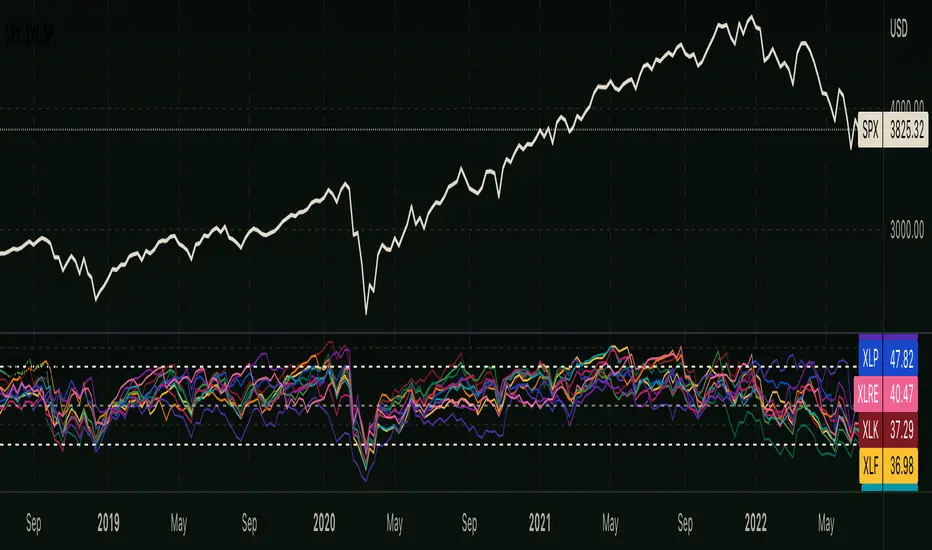
RSI - S&P Sector ETFsThe script displays RSI of each S&P SPDR Sector ETF
XLB - Materials
XLC - Communications
XLE - Energy
XLF - Financials
XLI - Industrials
XLK - Technology
XLP - Consumer Staples
XLRE - Real Estate
XLU - Utilities
XLV - Healthcare
XLY - Consumer Discretionary
It is meant to identify changes in sector rotation, compare oversold/overbought signals of each sector, and/or any price momentum trading strategy applicable to a trader.
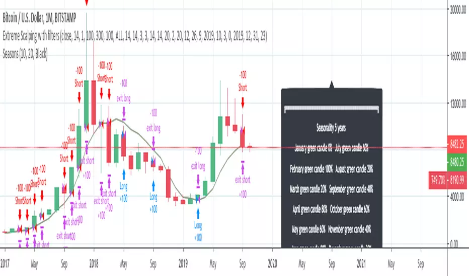
InfoPanel - SeasonalityThis panel will show which is the best month to buy a stock, index or ETF or even a cryptocurrency in the past 5 years.
Script to use only with MONTHLY timeframe.
Thanks to: RicardoSantos for his hard work.
Please use comment section for any feedback.
Confluence Retournement Haussier - Ultimate V1This indicator was originally designed to visualize the right moment to enter a position. I buy stocks when they are falling, at the bottom before they rebound.
The 30‑minute chart with its 100 EMA was used as the baseline, but it can be applied to multiple timeframes. I even used it on a 1‑second chart for a ticker, and when there is volume it works wonderfully.
It’s up to you to check whether it fits the ticker you’re analyzing by testing it on historical data.
Drawback: it takes up screen space. Feel free to improve it.
See a ticker in freefall and wonder whether it’s a good time to buy or if it will keep falling? Switch your chart to 30 minutes and watch for triangles and green circles to start appearing.
You could call it momentum. Your background begins to show color when there is confluence. If it stays black, don’t buy.
Already in the trade and the screen turns black? Sell, and wait for the colors to return before buying back in

3rd Candle Coach – VWAP/ORB Tool3rd Candle Coach, VWAP and ORB Logic Script
This script helps you spot clean setups by checking your key conditions at the same time. It shows a simple pass or fail for each piece and prints a signal only when everything agrees.
What this script checks:
1. **3 Candle Breakouts from VWAP, Volume Weighted Average Price, or ORB, Opening Range Breakout**
* Needs two full candles above or below VWAP or ORB
* Third candle must follow in the same direction
* Marks the setup once all three confirm
2. **Trend Using EMAs, Exponential Moving Averages (9 and 21)**
* Shows if the fast EMA is above or below the slow EMA
* Can confirm if the EMAs support the trade direction
3. **Momentum Using RSI, Relative Strength Index, and MACD, Moving Average Convergence Divergence**
* RSI must clear your level for longs or shorts
* MACD must agree with the direction
4. **Volume Check, Simple and Relative Volume Comparison**
* Compares current volume to a volume moving average
* Can check relative volume for strength
5. **Higher Timeframe Trend Using HTF EMA, Higher Timeframe Exponential Moving Average**
* Shows larger trend direction for bias
6. **Session Timing Filter, Session Based Signal Control**
* Lets signals fire only inside your chosen session window
7. **ATR Extension Check, Average True Range Distance from VWAP or ORB**
* Measures how far price has stretched from VWAP or ORB using ATR units
* Blocks signals when the move is too extended
8. **Long and Short Signal Markers, Directional Trade Alerts**
* Prints a long marker when all enabled conditions pass
* Prints a short marker when all enabled conditions pass
9. **Condition Breakdown Panel, Real Time Pass or Fail Table**
* Shows pass or fail for trend, RSI, MACD, volume, relative volume, higher timeframe bias, session, and extension
10. **Explanation Labels, Signal Reasoning Summary**
* When a signal fires, a label shows which conditions triggered it
---
This script gives you a clean checklist and one clear signal only when everything lines up. It helps you see the setup form step by step and keeps your chart easy to read.
---
note:
I built this to help you spot when indicators actually agree. It is mainly a training script. Alerts on the one minute fire a lot, so turn them off or use a five minute chart. You can turn almost everything off to keep it as simple or strict as you want.

Monthly DCA & Last 10 YearsThis Pine Script indicator simulates a Monthly Dollar Cost Averaging (DCA) strategy to help long-term investors visualize historical performance. Instead of complex timing, the script automatically executes a hypothetical fixed-dollar purchase (e.g., $100) on the first trading day of every month. It visually marks entry points with green "B" labels and plots a dynamic yellow line representing your Global Break-Even Price, allowing you to instantly see if the current price is above or below your average cost basis. To provide deep insight, it generates a detailed performance table in the bottom-right corner that breaks down metrics year-by-year—including total capital invested, shares/coins accumulated, and Profit/Loss percentage—along with a grand total summary of the entire investment period.

Custom ORB (Adjust Time, Color, + Alerts)Set Opening Range Break Out for whatever time range you choose for current day only. 15 min, 30 min etc. You can add alerts on ORB High Low and change color of Lines.

SPX EMAs - Bala//@version=5
indicator("SPX EMAs", overlay = true)
// Inputs
ema8 = ta.ema(close, 8)
ema21 = ta.ema(close, 21)
ema50 = ta.ema(close, 50)
ema200 = ta.ema(close, 200)
// Plot EMAs
plot(ema8, "EMA 8", color=color.new(color.green, 0), linewidth=2)
plot(ema21, "EMA 21", color=color.new(color.orange, 0), linewidth=2)
plot(ema50, "EMA 50", color=color.new(color.blue, 0), linewidth=2)
plot(ema200,"EMA 200",color=color.new(color.red, 0), linewidth=2)

CIS Swing Trade Zones (All-in-One)It help you to expalin all the high and low and it will also give y0ou the fibo level tat is useful

RS Rating Multi-Timeframe MAsRS Rating Multi-Timeframe MAs
A relative strength rating indicator that measures how a stock performs against a benchmark index (default: S&P 500), displayed as a 1-99 rating with five customizable multi-timeframe moving averages for trend analysis and crossover signals.
What is RS Rating?
The RS (Relative Strength) Rating compares a stock's price performance to a benchmark index over four weighted time periods:
63 days (1 quarter) — 40% weight
126 days (2 quarters) — 20% weight
189 days (3 quarters) — 20% weight
252 days (1 year) — 20% weight
The raw relative strength score is then converted to a 1-99 rating scale, where higher values indicate stronger outperformance versus the benchmark.
Rating Zones
90-99 (Elite): Exceptional relative strength, top performers
80-89 (Strong): Solid outperformance, institutional quality
50-79 (Neutral): Average performance relative to benchmark
30-49 (Weak): Underperforming the market
1-29 (Laggard): Significant underperformance
Multi-Timeframe Moving Averages
This indicator includes five fully customizable moving averages, each operating on its own timeframe:
MADefault TimeframeDefault LengthPurposeMA11 Hour5Fastest, short-term momentumMA24 Hour5Intraday trendMA3Daily10Swing trade referenceMA4Weekly4Intermediate trendMA5Monthly3Long-term trend, slowest
Each MA can be configured with:
Custom timeframe
Custom length
SMA or EMA calculation
Individual color
Crossover Signals
Select two MA pairs to monitor for crossover signals:
Cross Pair 1: Triangles (lime up / red down)
Cross Pair 2: Circles (aqua up / orange down)
Common configurations:
MA1/MA2 for fast scalp signals
MA2/MA3 for swing entries
MA3/MA4 for trend confirmation
MA4/MA5 for major trend changes
Stack Alignment
When all five MAs align in order (fastest to slowest), the background highlights the trend:
Green background: Bullish stack (MA1 > MA2 > MA3 > MA4 > MA5)
Red background: Bearish stack (MA1 < MA2 < MA3 < MA4 < MA5)
This identifies strong trending conditions where momentum aligns across all timeframes.
Information Table
The top-right table displays:
Current RS Rating with color coding
Trend status (Bullish / Bearish / Mixed)
All five MA values
Whether RS Rating is above (▲) or below (▼) each MA
Raw RS score for reference
Alerts
Cross Pair 1 Bullish/Bearish
Cross Pair 2 Bullish/Bearish
Bullish Stack Alignment
Bearish Stack Alignment
RS Above 80
RS Below 30
How to Use
Trend Following: Look for stocks with RS Rating above 80 and bullish MA stack alignment
Pullback Entries: When RS Rating pulls back to a rising MA3 (daily) in an uptrend
Trend Reversals: Watch for MA crossovers combined with RS Rating crossing key thresholds (80/30)
Avoid Laggards: Stocks with RS below 30 and bearish stack alignment are underperforming
Settings
Benchmark Index: Change the comparison index (default: SP:SPX)
MA 1-5: Configure timeframe, length, type, and color for each moving average
Signal Pairs: Select which MA pairs trigger crossover signals
Display Options: Toggle table and individual MAs on/off
Credits
Based on the IBD Relative Strength Rating methodology with multi-timeframe MA enhancements for active traders.

Smart Money Concepts by Rakesh Sharma🎯 SMART MONEY CONCEPTS - TRADE WITH INSTITUTIONS
Reveal where banks, hedge funds, and institutional traders enter the market. Trade alongside smart money, not against them!
✨ FEATURES:
- Order Blocks (OB) - Institutional buying/selling zones
- Fair Value Gaps (FVG) - Market inefficiencies to exploit
- Break of Structure (BOS) - Trend continuation signals
- Change of Character (ChoCh) - Early reversal detection
- Liquidity Sweeps - Stop hunt identification
- Premium/Discount Zones - Buy cheap, sell expensive
- Live Dashboard - Real-time market structure
🎯 HOW TO USE:
✓ BUY in Discount Zone at Bullish Order Blocks
✓ SELL in Premium Zone at Bearish Order Blocks
✓ Wait for ChoCh or BOS confirmation
✓ Follow institutional footprints for high-probability setups
📊 PERFECT FOR:
All markets - Nifty, Bank Nifty, Stocks, Forex, Crypto
All timeframes - 5m (scalping), 15m (intraday), Daily (swing)
⚡ TRADING EDGE:
Stop trading like retail. Start trading like institutions. See where smart money accumulates and distributes. Catch reversals early with ChoCh signals.
Created by: Rakesh Sharma | Version 1.0

Ratio with Lag• Ratio = X(T) / Y(T-lag)
• Auto-detects “X/Y” typed in chart search bar
• Plots ratio directly on main chart
• Adds 30-week MA (weekly SMA of the ratio)
• Adds 150-day SMA (daily SMA of the ratio)

Market Trend & Breadth Checklist [Kulturdesken]Description
Concept & Inspiration This indicator serves as a disciplined "Pre-Flight Checklist" for swing traders, combining two powerful methodologies into one objective dashboard.
The Foundation (@kulturdesken): The core checklist structure is inspired by the workflow of @kulturdesken, utilizing the QQQE (Nasdaq 100 Equal Weighted Index). By focusing on the equal-weighted index rather than the market-cap weighted QQQ, we avoid distortions caused by mega-cap stocks and gauge the true price trend of the average stock.
The Enhancement (StockBee): To further filter out "hollow rallies," we integrated Pradeep Bonde’s (StockBee) "Market Monitor" logic. This adds a layer of analysis based on the Total US Universe (Wilshire 5000) to ensure market breadth is expanding, not just price.
Why StockBee Logic Was Added While QQQE tells us if the average price is trending, the StockBee logic tells us if the market structure is healthy. We added the "Universe" checks (Total US Market Breadth) because price trends can sometimes be deceptive during low-volume corrections.
By incorporating the Market Monitor concept (specifically checking if the % of stocks above their 50-day Moving Average is rising), this tool acts as a "Traffic Light." It prevents the trader from entering aggressive long positions even if QQQE is green, provided the underlying participation (Market Breadth) is weak.
How It Works (The 7 Checks)
1. Price Momentum (Kulturdesken): QQQE > Rising 5 SMA
Verifies short-term momentum is aggressive (Price > 5SMA) and the 5SMA itself is curling up.
2. Daily Trend Structure: Daily Buy Signal
Verifies a "stacked" bullish alignment where Price > 10 SMA > 20 SMA.
3. Macro Trend: Weekly Buy Signal
Verifies the Weekly Price > 10 WMA > 20 WMA (Weighted Moving Averages).
4. Universe Breadth (StockBee/McClellan): Summation Uptrend
We aggregate Nasdaq + NYSE data to create a "Total Universe" McClellan Summation Index.
Check: Is the Summation Index rising? (Indicates long-term money flow entering the system).
5. Short-Term Thrust: Oscillator Positive
Uses the "Total Universe" McClellan Oscillator.
Check: Is the Oscillator > 0? (Indicates immediate buying pressure is dominant).
6. Leadership: Net Highs/Lows
Check: Are Net New Highs (Highs minus Lows) trending positive?
7. Performance Filter (Manual): Traction Check
A psychological guardrail. If you toggle this off in settings (indicating you are losing money/getting stopped out), the checklist forces a "WAIT" signal, protecting you from overtrading during choppy conditions.
Settings & Customization
Data Feeds: The script is pre-configured with USI (United States Indices) and INDEX tickers to ensure accurate breadth data, but these can be customized in the settings.
Main Ticker: Defaults to QQQE.
Disclaimer: This tool is for educational purposes and market analysis only. It does not constitute financial advice. Past performance is not indicative of future results.

Ichimoku Traffic Lights Go--no go flags for Ichimoku Cloud. For quick scanning thru your watchlist, and good for scanning through timeframes.

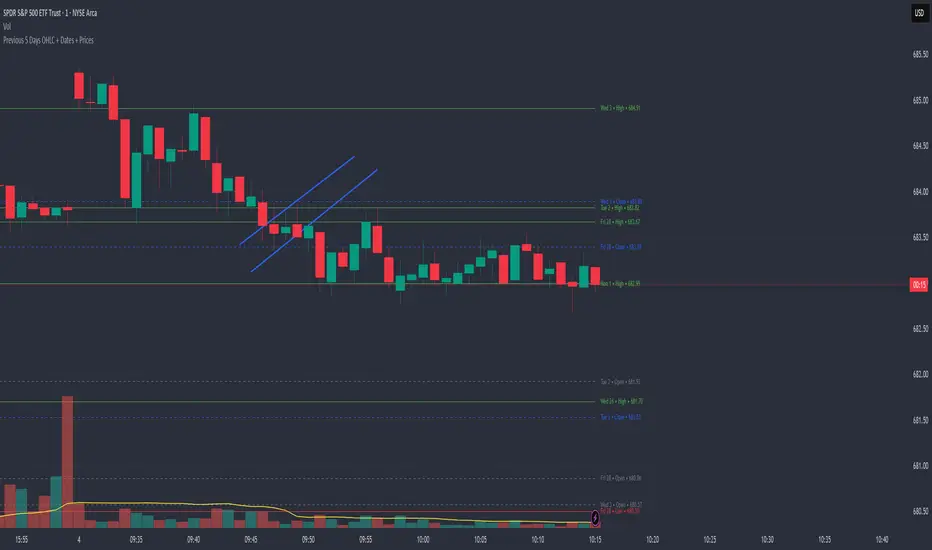
Previous 5 Days OHLC + Dates + PricesTitle: Previous 5 Days OHLC Levels (Extended Lines + Labels)
Description:
This indicator automatically plots the Open, High, Low, and Close (OHLC) levels for the previous 5 trading days. Unlike standard daily separators, this tool extends the lines from their historical origin all the way to the current price bar, allowing traders to instantly see how current price action interacts with recent support and resistance levels.
Key Features:
5-Day Lookback: Automatically fetches and plots OHLC data for the last 5 trading sessions.
Extended Lines: Lines extend to the current bar (Right) to visualize immediate Support/Resistance zones.
Smart Labels: Each line is marked with the Day Name, Date, Type (O/H/L/C), and the Exact Price.
Customizable Positioning: Choose to display labels on the Left (start of the day) or the Right (next to current price) to keep your chart clean.
Toggle Visibility: Individually turn on/off Opens, Closes, Highs, or Lows to focus on the data that matters to your strategy.
How to Use:
Trend Analysis: Use previous Highs and Lows to identify potential breakout or breakdown levels.
Range Trading: Identify where price previously opened or closed to find intraday pivots.
Clean Charting: Use the settings to hide labels or specific lines (e.g., hide Opens/Closes to see only the Daily Range).
Settings:
Label Position: Switch between "Left" (historical origin) and "Right" (current price).
Visibility: Checkboxes to show/hide Open, High, Low, Close, and Text Labels.
Style: Fully customizable colors for each level type.
Technical Note: This script is optimized for performance (Pine Script v6). It uses array management and executes drawing logic only on the last bar to minimize resource usage while maintaining real-time accuracy.
Apex Trend & Liquidity Master with TP/SLThe Apex Trend & Liquidity Master is a systematic trading framework that identifies trend direction and key structural price levels for entry and exit decisions. The system uses a volatility-adaptive trend detection mechanism built on Hull Moving Averages with ATR-based bands to filter consolidation periods and isolate directional moves.
The liquidity detection engine identifies potential reversal zones by marking swing highs and lows that meet statistical significance thresholds. These zones represent areas where institutional order flow previously caused price rejection. Zones remain active until price closes through them, indicating mitigation of the level.
This implementation is an enhanced derivative of the original system with fully automated risk management. Stop losses are calculated using ATR multiples with entry candle wick protection as a minimum threshold, while take profits maintain a fixed 3:1 risk-reward ratio. An additional exit mechanism closes profitable positions when price reaches opposing supply or demand zones, providing early profit-taking at probable reversal points before full target completion.
Entry signals generate only on trend changes when volume exceeds average levels, reducing false breakouts in ranging conditions. The system includes complete position tracking with three distinct exit types: take profit hits, stop loss hits, and profitable zone contact exits. All calculations use confirmed historical data with no forward-looking bias, though supply/demand zone identification operates with a confirmation lag inherent to pivot point detection.

Momentum Structural AnalysisMomentum Structural Analysis (MSA‑style Oscillator)
This indicator implements a simple, MSA‑style momentum oscillator that measures how far price has moved above or below its own long‑term trend on the active timeframe, expressed in percentage terms. Instead of looking at raw price, it "oscillates" price around a timeframe‑appropriate simple moving average (SMA) and plots the percentage distance from that SMA as an orange line around a zero baseline. Zero means price is exactly at its structural trend; positive values mean price is extended above trend; negative values mean it is trading below trend.
The script automatically selects the SMA length based on the chart timeframe:
On daily charts it uses the configurable Daily SMA Length (default 252 trading days, roughly 1 year).
On weekly charts it uses Weekly SMA Length (default 208 weeks).
On monthly charts it uses Monthly SMA Length (default 120 months).
This approach is inspired by the ideas behind Momentum Structural Analysis (MSA), which studies where a market trades relative to long‑term moving averages and then treats the momentum line (the oscillator) as the primary object of analysis. The goal is to highlight structural overbought/oversold conditions and regime changes that are often clearer on momentum than on the raw price chart.
--------------------------------------------------
What the script computes and how it works
For each bar, the indicator:
Chooses an SMA length based on the current timeframe (daily/weekly/monthly).
Calculates the SMA of the close.
Computes the percentage distance:
\text{Diff %} = \frac{\text{Close} - \text{SMA}}{\text{SMA}} \times 100
Plots this Diff % as an orange line, with a dashed horizontal zero line as the base.
This produces a momentum oscillator that oscillates around zero and reflects the "structural" position of price versus its own long‑term mean.
--------------------------------------------------
How to use it on index charts (e.g., NIFTY50)
On indices like NIFTY50, use the indicator to see how stretched the index is versus its structural trend.
Typical uses:
Identify extremes: a). Historically high positive readings can signal euphoric, late‑stage conditions where risk is elevated. b). Deep negative readings can highlight panic/capitulation zones where downside may be exhausted.
Draw structural levels: a). Mark horizontal bands on the oscillator where past turns have occurred (e.g., +15%, −10%, etc. specific to NIFTY50). b). Watch how price behaves when the oscillator revisits these zones: repeated rejections can validate them as structural bounds; clean breaks can indicate a change of regime.
This is not a buy/sell signal generator by itself; it is a framework to understand where the index sits within its long‑term momentum structure and to support risk‑management decisions.
--------------------------------------------------
How to use it on ratio charts
Apply the same indicator to ratio symbols such as NIFTY50/GOLD, BANKNIFTY/NIFTY50, sector vs index, or any spread you plot as a ratio.
On a ratio chart:
The oscillator now measures relative momentum: how far that ratio is above or below its own long‑term mean.
High positive readings = strong outperformance of the numerator vs the denominator (e.g., equities strongly outperforming gold).
Deep negative readings = strong underperformance (e.g., equities structurally lagging gold).
This is very much in the spirit of MSA’s work on spreads between asset classes: it helps visualize major rotations (equities → gold, financials → commodities, etc.) and whether a relative‑performance trend is stretched, reverting, or breaking into a new phase.
--------------------------------------------------
Using multiple timeframes for better decisions
You can stack information across timeframes to get a more robust view:
Monthly : a). Use monthly charts to see secular/structural phases. b). Long multi‑year stretches above or below zero, and large bases or trendline breaks on the monthly oscillator, can mark major bull or bear cycles and big rotations between asset classes.
Weekly : a). Use weekly charts for the primary trend. b). Weekly structures (multi‑month highs/lows, channels, or trendlines on the oscillator) are useful for medium‑term positioning and for confirming or rejecting signals seen on the monthly view.
Daily : a). Use daily charts mainly for timing entries/exits once the higher‑timeframe direction is clear. b). Short‑term extremes on the daily oscillator that align with the larger weekly/monthly structure can offer better‑timed opportunities, while signals that contradict higher‑timeframe momentum are more likely to be noise.
--------------------------------------------------

RVol based Support & Resistance ZonesDescription:
This indicator is designed to help traders identify significant price levels based on institutional volume. It monitors two higher timeframes (defined by the user) simultaneously. When a candle on these higher timeframes exhibits unusually high volume—known as high Relative Volume (RVol)—the indicator automatically draws a "Zone of Interest" box on your current chart.
These zones are defined by:
Up candle : from candle open to low of candle
Down candle : from candle open to high of candle
Key Features:
Multi-Timeframe Monitoring: You can trade on a lower timeframe (e.g., 5-minute) while the indicator monitors the 30-minute and 1-hour charts for volume spikes.
RVol Boxes: Automatically draws boxes extending from high-volume candles.
Up Candles: Box covers Low to Open.
Down Candles: Box covers High to Open.
Live Dashboard: A neat, color-coded table displays the current Volume, Average Volume, and RVol percentage for your watched timeframes.
Real-Time vs. Confirmed: Choose whether to see boxes appear immediately as volume spikes (Live) or only after the candle has closed and confirmed the volume (Candle Close).
Settings Guide:
1. General Settings
Relative Volume Length: The number of past candles used to calculate the "Average Volume." (Default is 20).
Max Days Back to Draw: To keep your chart clean, this limits how far back in history the script looks for high-volume zones. (e.g., set to 5 to only see zones created in the last 5 days).
Draw Mode:
- Live (Real-time): Draws the box immediately if the current developing candle hits the volume threshold. (Note: The box may disappear if the volume average shifts before the candle closes).
- Candle Close: The box only appears once the candle has finished and permanently confirmed the volume spike.
2. Table Settings
Show Info Table: Toggles the dashboard on or off.
Text Size & Position: Customise where the table appears on your screen and how large the text is.
Colours: Fully customisable colours for the Table Header (Top row) and Data Rows (Bottom rows).
3. Timeframe 1 & 2 Settings
You have two identical sections to configure two different timeframes (e.g., 30m and 1H).
Timeframe: The chart interval to monitor (e.g., "30" for 30 minutes, "60" for 1 Hour, "240" for 4 Hours).
Threshold %: The "Trigger" for drawing a box based on relative candle volume in that timeframe.
Example:
100% = Candle Volume is equal to the average volume for the specified timeframe.
200% = Candle Volume is 2x the average volume for the specified timeframe.
300% = Candle Volume is 3x the average volume for the specified timeframe.
Box & Edge Colour: Distinct colours for each timeframe so you can easily tell which timeframe created the zone.

RS Rating Multi-TimeframeRS Rating Multi-Timeframe (IBD-Style Relative Strength)
Short Description:
IBD-style Relative Strength Rating (1-99) comparing any stock's performance vs the S&P 500 across multiple timeframes.
Full Description:
Overview
This indicator calculates an IBD-style Relative Strength (RS) Rating that measures a stock's price performance relative to the S&P 500 over the past 12 months. The rating scale ranges from 1 (weakest) to 99 (strongest), telling you how a stock ranks against all other stocks in terms of relative performance.
How It Works
The RS Rating uses a weighted formula based on quarterly performance:
Last 63 days (1 quarter): 40% weight
Last 126 days (2 quarters): 20% weight
Last 189 days (3 quarters): 20% weight
Last 252 days (4 quarters): 20% weight
This weighting emphasizes recent performance while still accounting for longer-term strength.
Rating Interpretation
90-99 (Elite): Top 10% of all stocks - exceptional relative strength
80-89 (Excellent): Top 20% - strong leadership candidates
50-79 (Average): Middle of the pack
30-49 (Below Average): Underperforming the market
1-29 (Weak): Bottom 30% - avoid or consider shorting
Features
Multi-Timeframe: Works on any timeframe from 1-hour to weekly (always uses daily data for calculation)
Moving Average: Optional EMA or SMA of the RS Rating to smooth signals
Visual Zones: Color-coded zones for quick identification of strength/weakness
Signal Markers: Triangles appear when RS crosses key levels (80 and 30)
Info Table: Displays current RS Rating, change, MA value, and raw score
Alerts: Built-in alerts for key crossover events
Settings
Show Moving Average: Toggle MA line on/off
MA Length: Period for the moving average (default: 10)
MA Type: Choose between EMA or SMA
Benchmark Index: Change the comparison index (default: SP:SPX)
Show Rating Table: Toggle the info table on/off
How To Use
Buy candidates: Look for stocks with RS Rating above 80, ideally rising
Avoid: Stocks with RS Rating below 30 or falling rapidly
Confirmation: Use RS above its moving average as additional confirmation
Divergence: Watch for RS making new highs before price (bullish) or new lows before price (bearish)
Credits
RS Rating calculation methodology inspired by Investor's Business Daily (IBD) and adapted from Fred6724's RS Rating script. Percentile calibration based on analysis of ~6,600 US stocks.
Tags: relative strength, RS rating, IBD, momentum, CAN SLIM, benchmark, SPX, market leaders, stock ranking
Category: Relative Strength

RS Rating Trailing StrategyHow It Works:
StageActionEntryBuy when RS Rating crosses above 80TrackingTrack the highest RS Rating while in positionExitSell when RS Rating drops 5 points below the high
Example:
RS Rating crosses from 79 to 81 → BUY
RS Rating climbs to 85 → High RS = 85, Stop = 80
RS Rating climbs to 95 → High RS = 95, Stop = 90
RS Rating drops to 92 → Still holding (above 90 stop)
RS Rating drops to 90 → SELL (hit trailing stop)
Settings:
SettingDefaultDescriptionRS Entry Level80Buy when RS crosses above thisRS Trailing Drop5.0Sell when RS drops this many points from highBenchmark IndexSP:SPXIndex for RS calculation
Table Shows:
Current RS Rating
Position status (LONG/FLAT)
Entry RS (what RS was when you bought)
High RS (highest RS since entry)
Stop RS (current trailing stop level)
Cushion (how far above stop you are)
The cushion turns orange when close to stop, red when very close.

MACD Cross Long/Short Alert📌 MACD Cross Long/Short Alert — Indicator Description
📌 MACD 上/下穿信号线提醒指标说明
🇺🇸 English Description
This indicator provides clean and actionable MACD cross alerts, designed for traders who need quick “long/short” signals based on MACD line and Signal line interactions.
Key Features
Standard MACD Calculation
Uses customizable Fast EMA, Slow EMA, and Signal EMA.
Cross-Based Trading Signals
Bullish Cross (MACD crossover Signal) → Long setup
Bearish Cross (MACD crossunder Signal) → Short setup
Chart Markers
Triangles plotted directly on the chart for fast visual recognition.
Built-in Alerts
Automatically triggers alerts when MACD crosses above/below the signal line.
Works with any timeframe and any asset.
Use Cases
Intraday trend reversal detection
Momentum confirmation
Breakout retest validation
Simple auto-trading signal for strategies/robots
Quick scalp entries on 5m/10m/30m
This MACD tool is ideal for traders who need a fast, reliable long/short trigger without unnecessary complexity.
🇨🇳 中文说明
本指标提供 MACD 上穿/下穿信号线的即时做多/做空提醒,适用于所有周期与品种,是一个简洁、实用的趋势转折信号工具。
主要功能
标准 MACD 计算
快线 EMA、慢线 EMA、Signal EMA 均可自定义。
交叉交易信号
上穿 Signal → 多头信号(做多)
下穿 Signal → 空头信号(做空)
图表标记
图中自动绘制上/下三角形,方便肉眼快速发现信号。
内置警报提醒
自动推送 MACD 上下穿事件,可用于:
APP 推送
邮件提醒
自动化策略触发
日内做单提醒
适用场景
日内反转捕捉(5m / 10m / 30m)
动量确认
趋势切换点识别
回踩/突破后的方向确认
自动交易机器人信号源

SMC IndicatorTitle: Smart Money Concepts Structure & ZigZag
Description: Master market structure with this precision Smart Money Concepts (SMC) tool. Unlike standard ZigZag indicators that repaint (change the past) as price moves, this indicator utilizes a robust, non-repainting detection engine to objectively map Swing Highs, Swing Lows, and structural breaks.
It is designed to help traders identify the true trend direction and spot critical reversal points without the confusion of disappearing signals.
How It Works:
1. Non-Repainting Pivots: The core of this indicator is a custom ZigZag algorithm that "locks in" Swing Highs (H) and Swing Lows (L) only after they are statistically confirmed by a user-defined deviation. Once a label appears, it stays there.
2. Break of Structure (BoS):
Signal: Trend Continuation.
Logic: Triggers when price breaks and closes past a confirmed pivot in the direction of the current trend.
Use Case: confirms the trend is healthy and identifies opportunities to join the move.
3. Change of Character (CHoCH):
Signal: Trend Reversal.
Logic: Triggers when price breaks a key pivot in the opposite direction of the current trend.
Use Case: Serves as an early warning signal that the trend may be ending or reversing.
4. The Ghost Line: A dotted line connects the last confirmed pivot to the current live price. This helps you visualize the developing leg of the structure before it is confirmed.
Visual Guide:
🔵 Blue Label: Bullish Break of Structure (BoS).
🔴 Maroon Label: Bearish Break of Structure (BoS).
🟢 Aqua Label: Bullish Change of Character (CHoCH).
🟠 Orange Label: Bearish Change of Character (CHoCH).
H / L: Confirmed Swing Highs and Lows.
Features:
Precision Tuning: "Deviation %" input supports values as low as 0.01 for scalping on 1-minute charts.
Smart Tooltips: Hover over settings to see recommended values for Daily, Hourly, and Minute timeframes.
Clean Visuals: Uses text-only labels to keep the chart clutter-free.
Alerts: Fully alert-enabled for Bullish/Bearish BoS and CHoCH signals.
Credits: This script is built upon classic Market Structure theory and Smart Money Concepts (SMC), optimized for real-time reliability.
