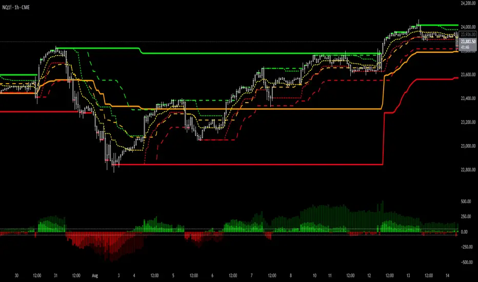
Supertrend Channel Histogram OscillatorThis histogram is based on the script "Supertrend Channels "
The idea of the indicator is to visually represent the interaction of price with several different supertrend channels of various lengths in an oscillator in order to make it much more clear to the trader how the longer trends are interacting with shorter trends of the price movement of an asset. I got this idea from the "Kurutoga Cloud" and "Kurutoga Histogram" by D7R which is based on the centerlines of 3 Donchian Channels, however after I started using the Supertrend Channel by LuxAlgo I found that it was a more reliable price range channel than a standard Donchian Channel and I made this indicator to accompany it.
This indicator plots a positive value above 0 when the price is above the centerline of the supertrend channel and a negative value below 0 when the price is below the centerline.
The first supertrend's length and multiple can be adjusted in the settings.
The given supertrend input is then doubled and quadrupled in both length and multiplication so that a supertrend histogram with the values of 3, 3 will be accompanied by 2 additional supertrend histograms with the values of 6, 6 and 12, 12.
The larger price trend histograms are clearly visible behind the short term supertrend channel's histogram, giving traders a balanced view of short and long term trends interacting. The less visible columns of the larger trend remain above or below the 0 line behind the more visible short term channel trend, helping to spot pullbacks within a larger trend.
Additionally, when the 3 separate histograms are all positive or all negative but the histogram columns are separating from each other this can indicate a potential trend exhaustion leading to reversal or pullback about to happen.
The overbought and oversold lines at 50 and -50 are representative primarily of the short term trend with above 50 or below -50 indicating that the price is pushing the boundary and potentially beginning a new short term supertrend in the opposite direction. If values do not noticably exceed these levels, then the current short term trend movement can be viewed as a pullback within a larger trend, with continuation potentially to follow.
I have had troubles converting the original code to v6 so this will be published here in v5 of pinescript to be used in conjunction with the original. I was intending to create a companion indicator for this oscillator that represents 3 supertrends with corresponding 2x and 4x calculations based on LuxAlgo's script, but I can't seem to get it to work correctly in v5.
For best visualization of the trends 3 LuxAlgo Supertrend channels with 2x and 4x values should be used in conjunction with each other to fully visualize the histogram.
Used in conjunction with other indicators this can be a very effective strategy to capture larger trend moves and pullbacks within trends, as well as warn of potential price trend exhaustion.
חפש סקריפטים עבור "histogram"
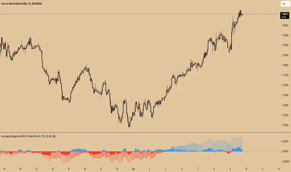
Kurutoga Histogram with HTF and LTF
Kurutoga Histogram:
The Kurutoga Histogram is a technical analysis indicator designed to measure price divergence from the 50% level of a recent price range. By calculating how far the current price is from the midpoint of a selected base length of candles, the histogram provides insight into the momentum, strength, and potential reversals in the market. Additionally, it can be applied across multiple timeframes to provide a comprehensive view of both short- and long-term market dynamics.
Key Components:
Base Length:
The base length is the number of candles (bars) over which the high and low prices are observed. The default base length is typically 14 periods, but it can be adjusted according to the trader's preference.
This base length defines the range from which the 50% level, or midpoint, is calculated.
50% Level (Midpoint):
The midpoint is the average of the highest high and the lowest low over the selected base length. This 50% level acts as an equilibrium point around which the price fluctuates.
Formula:
Midpoint = (Highest High + Lowest Low) / 2
The price’s distance from this midpoint is an indicator of how strong the current trend or divergence is.
Price Divergence:
The main calculation of the histogram is the difference between the current closing price and the midpoint of the price range.
Formula:
Divergence = Close Price − Midpoint
A positive divergence (price above the midpoint) indicates bullish strength, while a negative divergence (price below the midpoint) indicates bearish strength.
Multi-Timeframe Analysis:
The Kurutoga Histogram can be applied to both the current timeframe and a higher timeframe (HTF), allowing traders to gauge price movement in both short-term and long-term contexts.
By comparing the histograms of multiple timeframes, traders can determine if there is alignment (confluence) between trends, which can strengthen trade signals or provide additional confirmation.
Color-Coded Histogram:
Blue Bars (Positive Divergence): Represent that the price is above the 50% level, indicating bullish momentum. Taller blue bars suggest stronger upward momentum, while shrinking bars suggest weakening strength.
Red Bars (Negative Divergence): Represent that the price is below the 50% level, indicating bearish momentum. Taller red bars suggest stronger downward momentum, while shrinking bars suggest a potential reversal or consolidation.
The histogram’s color intensity and transparency can be adjusted to enhance the visual effect, distinguishing between current timeframe (LTF) and higher timeframe (HTF) divergence.
Interpretation:
Bullish Signals: When the histogram bars are blue and growing, the price is gaining momentum above the midpoint of its recent range. This could signal an ongoing uptrend.
Bearish Signals: When the histogram bars are red and growing, the price is gaining momentum below the midpoint, signaling an ongoing downtrend.
Momentum Shifts: When the histogram bars shrink in size (whether blue or red), it could indicate that the current trend is losing strength and may reverse or enter consolidation.
Neutral or Sideways Movement: When the histogram bars hover around zero, it means the price is trading near the midpoint of its recent range, often signaling a lack of strong momentum in either direction.
Multi-Timeframe Confluence:
When the current timeframe (LTF) histogram aligns with the higher timeframe (HTF) histogram (e.g., both are showing strong bullish or bearish divergence), it may provide stronger confirmation of the trend's strength.
Divergence between timeframes (e.g., bullish on LTF but bearish on HTF) may suggest that price movements on lower timeframes are not yet reflected in the broader trend, signaling caution.
Applications:
Trend Identification: The Kurutoga Histogram is highly useful for detecting when the price is trending away from its equilibrium point, providing insight into the strength of ongoing trends.
Momentum Analysis: By measuring the divergence from the 50% level, the histogram helps traders identify when momentum is increasing or decreasing.
Reversal Detection: Shrinking histogram bars can signal weakening momentum, which often precedes trend reversals.
Consolidation and Breakouts: When the histogram remains near zero for an extended period, it suggests consolidation, which often precedes a breakout in either direction.
Advantages:
Clear Visuals: The use of a color-coded histogram makes it easy to visually assess whether the market is gaining bullish or bearish momentum.
Multi-Timeframe Utility: The ability to compare current timeframe signals with higher timeframe signals adds an extra layer of confirmation, reducing false signals.
Dynamic Adjustment: By adjusting the base length, traders can fine-tune the sensitivity of the indicator to match different markets or trading styles.
Limitations:
Lagging Indicator: Like most divergence indicators, the Kurutoga Histogram may lag slightly behind actual price movements, especially during fast, volatile markets.
Requires Confirmation: This indicator works best when used in conjunction with other technical tools like moving averages, support/resistance levels, or volume indicators, to avoid relying on divergence alone.
Conclusion:
The Kurutoga Histogram is a versatile and visually intuitive tool for measuring price divergence from a key equilibrium point, helping traders to assess the strength of trends and identify potential reversal points. Its use across multiple timeframes provides deeper insights, making it a valuable addition to any trading strategy that emphasizes momentum and trend following.
[CT] Kurutoga MTF HistogramWhat is Kurutoga MTF Histogram?
The Kurutoga MTF Histogram is a multi-time-frame momentum and mean-deviation tool.
It measures how far the current close is trading away from a rolling midpoint of price and then displays that deviation as a color-coded histogram.
Instead of looking only at one lookback, this version plots three Kurutoga “leads” at the same time:
Kurutoga Lead (x1) – base length
Kurutoga Lead 2x – slower, 2 × base length
Kurutoga Lead 4x – slowest, 4 × base length
Each lead is calculated both on the chart’s timeframe (LTF) and on a Higher Time Frame (HTF) of your choice, so you can see short-term deviation inside a higher-time-frame structure.
4-color Kurutoga scheme
Each Kurutoga lead uses a 4-color MACD-style scheme:
For a given lead:
Up Light – divergence ≥ 0 and rising compared to the previous bar
Up Dark – divergence ≥ 0 and falling (positive but losing momentum)
Down Light – divergence < 0 and falling (bearish momentum increasing)
Down Dark – divergence < 0 and rising (negative but contracting)
By default the same four teal / red hues are shared across x1, x2, and x4. The only difference between the leads is transparency:
x1 = strongest (least transparent)
x2 = medium opacity
x4 = faintest
This lets you see all three layers at once without the chart becoming a solid block of color.
The HTF areas use the same palette but with an extra transparency offset applied, so they appear as soft background bands rather than competing with the histograms.
Inputs and how to use them
1. Base Length
Defines the lookback for the main Kurutoga Lead.
The script automatically creates:
len1 = baseLength
len2 = baseLength × 2
len3 = baseLength × 4
Smaller base lengths → faster, more reactive histograms.
Larger base lengths → smoother, trend-focused behavior.
2. Higher Time Frame
This is the HTF used for the area plots and HTF midpoints.
Examples:
5-minute chart with HTF = 30 or 60 minutes
15-minute chart with HTF = 4H or 1D
The idea is to trade on the lower timeframe while seeing how far price is stretched relative to a higher-time-frame range midpoint.
3. Show / Hide toggles
Under “Show / Hide” you can independently turn on/off:
Kurutoga Lead (x1)
Kurutoga Lead 2x
Kurutoga Lead 4x
HTF Lead, HTF Lead 2x, HTF Lead 4x
This lets you:
Run only a single Kurutoga if you want a clean panel, or
Stack multiple leads for a “multi-speed” view of extension and mean reversion.
4. Color Scheme (4-color Kurutoga)
Up Light / Up Dark / Down Light / Down Dark – base hues used for every lead.
Lead opacity (x1, 2x, 4x) – sets how strong or faint each lead appears.
x1 is usually your primary “trading speed.”
x2 and x4 can be faded so they act as context.
Extra transparency for HTF areas – additional opacity applied on top of each lead’s opacity when drawing HTF areas. This keeps the HTF layer subtle.
You can fine-tune the exact teal/red values here to match your personal palette.
Practical reading & trade ideas
Trend alignment
When all three Kurutoga leads (x1, 2x, 4x) are above zero, price is trading above its rolling mid-range on multiple speeds → bullish environment.
When all three are below zero, you have a multi-speed bearish environment.
Mixed readings (e.g., x1 above zero, x4 below zero) can signal transition or mean-reversion areas.
Momentum vs exhaustion
Up Light / Down Light (light colors) show momentum expanding in that direction.
Up Dark / Down Dark (dark colors) show momentum contracting – price still on that side of zero, but the push is weakening.
After a run of Up Light bars, a shift to Up Dark may hint at a stall or pullback.
After a run of Down Light bars, a shift to Down Dark may hint at short covering / bounce potential.
Multi-time-frame confluence
Use the HTF areas as a backdrop:
If LTF Kurutoga leads are above zero while the HTF area is also positive (and ideally expanding), that’s strong bullish alignment.
If LTF leads are trying to flip up while HTF divergence is still deeply negative, you may be looking at a counter-trend bounce rather than a true trend change.
Example setups
Trend-following entries:
Look for x2 & x4 leads on the same side of zero as the HTF area, then use x1 color shifts (from Down Dark → Up Light or vice versa) to fine-tune entries in the direction of that higher-time-frame bias.
Mean-reversion fades:
Watch for extreme Kurutoga values where x1/x2 are strongly extended beyond zero while color flips from Light to Dark (momentum stalling) against an opposing HTF backdrop .
Notes
The indicator is non-directional by itself – it measures distance from a rolling midpoint rather than trend structure or order flow. It works best when combined with your existing price action/trend tools (moving averages, HLBO, structure zones, etc.).
Because HTF values are brought down via request.security, choose HTF settings that make sense for your product and session (for example, don’t use very high HTFs on thin intraday markets).
Use the Kurutoga MTF Histogram as a visual scanner for extension, momentum regime, and multi-speed alignment, then layer your own entry/exit rules on top.

OA - RS HistogramOA - RS Histogram Indicator
This indicator displays a histogram representation of Relative Strength (RS) analysis, helping traders visualize the momentum relationship between a security and a reference index.
Key Features:
RS Histogram: Shows the difference between the current RS ratio and its EMA smoothed line
Customizable Reference Index: Default set to XU100, but can be changed to any index
EMA Smoothing: Adjustable EMA period (default 21) for trend analysis
Visual Clarity: Histogram bars are colored aqua for positive values and purple for negative values
Zero Line Reference: Dotted gray line for easy identification of positive/negative zones
How It Works:
The indicator calculates the relative strength by comparing the normalized percentage changes of the current security against the selected reference index. A 5-period EMA is applied to the RS ratio, and then the difference between this smoothed RS line and a longer EMA (default 21 periods) is displayed as a histogram.
Technical Calculation:
Fetches reference index data with proper gap handling
Calculates normalized percentage changes for both security and index
Computes relative strength ratio
Applies EMA smoothing to reduce noise
Displays the difference as a histogram for clear momentum visualization
Customization Options:
Reference index selection (default: XU100)
EMA length adjustment (default: 21 periods)
Color customization for positive and negative histogram bars
Alert Conditions:
Histogram crossing above zero (potential bullish momentum shift)
Histogram crossing below zero (potential bearish momentum shift)
Usage:
This tool helps traders understand relative strength concepts through visual histogram representation. The zero-line crossovers can indicate momentum shifts in the security relative to the chosen benchmark index.

Average of CBO and CBO divergence histogramShort Description:
This indicator combines a Custom Bias Oscillator (CBO) with its Divergence Histogram and computes their average for use to assess the market's bias based on candlestick analysis, from the aforementioned CBO indicator.
Full Description:
Overview:
This indicator integrates two powerful analytical tools into a single script: a Custom Bias Oscillator (CBO) and its Divergence Histogram. This indicator provides traders with a comprehensive view of market bias and divergence between price movements and volume, enhanced by an optional signal line derived from the combined average of these metrics.
Key Features:
Custom Bias Oscillator (CBO):
The CBO is calculated based on the body and wick biases of candlesticks, normalized by the Average True Range (ATR) to account for market volatility.
The CBO is scaled by the divergence between the Rate of Change (ROC) of volume and the ROC of the adjusted bias, ensuring it reflects potential reversals or continuations in the market.
Divergence Histogram:
The Divergence Histogram is derived from the difference between the CBO and its signal line.
This difference is normalized and plotted to provide visual cues for potential divergences, which may indicate trend exhaustion or the beginning of a new trend.
Combined Average with Signal Line:
The indicator calculates the average of the CBO and the normalized divergence, creating a combined signal that offers a more rounded perspective on market conditions.
A signal line, generated by smoothing the combined average, is plotted to help traders identify potential buy or sell signals based on crossovers.
Customization:
The indicator includes customizable parameters for the periods of the oscillator, signal line, ATR, ROC, and the combined signal line, allowing traders to tailor the indicator to different market conditions and timeframes.
How to Use:
Buy Signal: Consider a long position when the combined average crosses above the signal line, indicating potential bullish momentum.
Sell Signal: Consider a short position when the combined average crosses below the signal line, indicating potential bearish momentum.
Divergence Analysis: Use the Divergence Histogram to identify areas where price movements may be diverging from volume, signaling potential reversals or corrections.
Disclaimer:
This indicator is designed for educational and informational purposes only. It is not financial advice. Always perform your own analysis before making any investment decisions. Past performance is not indicative of future results.

Uber Stochastic Index v2 + HistogramRealized how useful a histogram could be for a Stochastic, so I added it to my Uber Stochastic. It actually has two histograms - one on the primary stochastic, and one on a stochastic of the stochastic. So you can histogram while you histogram and stoch while you stoch.
The second stoch is actually really useful sometimes as a early warning but can get ugly on some settings. The histograms are also quite fast on fast settings.
What separates the Uber from the standard stoch? Well, you get 7 K stochastics, technically, to weigh together into one. Looks like one, but I assure you its 7 complete stochastics. You can have a long term stochastic with short term influence or a short term with long term influence, or have one thats all-encompassing.
Why histograms? Stochastic is already read similar to MACD, with crossover signals derived from two lines reflected in one another, one slower then the other. It just makes sense. This way, with a slower running histogram, you can more readily "see" it close in. After all, the best trades are rarely made when the stochastic crosses, but rather as it approaches crossing.
I included a lot of settings for max tweaking. The histograms seem to shift in size considerably depending how you have it set, hence the resolution settings for each. I actually recommend setting the 2nd histogram to inverted resolution, that way you can see them more clearly, but you will also see them on both sides of 0.
And yes, I offset the stochastic so the histogram would look right.
"Wealth beyond measure, Outlander" -Unknown Dunmer
Multi-Timeframe MACD, Signal & Histogram TableThis Pine Script is designed for the TradingView platform to create a multi-timeframe MACD (Moving Average Convergence Divergence), Signal, and Histogram table that displays values for different timeframes. The script uses the MACD indicator to assess market trends across various timeframes and display the results in a table format on the chart. Here's a breakdown of its components and functionality:
1. User Inputs for Timeframes:
The script allows the user to input five different timeframes for the analysis. These are configured using input.string, which enables the user to select from a list of timeframes (from seconds to months).
tf1 to tf5 represent the different timeframes (for example, 5 minutes, 15 minutes, 60 minutes, 240 minutes, and daily).
2. MACD Settings:
The script provides adjustable settings for the MACD calculation:
macdShortLength (default 12): The length of the short-term moving average for the MACD.
macdLongLength (default 26): The length of the long-term moving average for the MACD.
macdSignalLength (default 9): The length of the signal line, which is an EMA (Exponential Moving Average) of the MACD line.
3. MACD Calculation Function (calc_macd):
This function calculates the MACD, Signal, and Histogram values:
MACD Line: Difference between the fast and slow exponential moving averages.
Signal Line: EMA of the MACD line.
Histogram: Difference between the MACD line and Signal line.
4. Requesting Multi-Timeframe Data:
The script calculates the MACD, Signal, and Histogram for the selected timeframes (tf1 to tf5) using request.security, which retrieves data for those timeframes:
macd_tf1, signal_tf1, hist_tf1 for Timeframe 1 (and similar variables for the other timeframes).
5. Rounding Values:
A helper function roundDecimal is used to round MACD, Signal, and Histogram values to two decimal places for readability.
6. Color Assignment Based on Value:
The colors of the values in the table cells are dynamically set based on whether the value is positive or negative:
MACD, Signal, and Histogram: The script uses conditional color assignments (green for positive values, red for negative values).
For example, if the MACD value is greater than or equal to 0, it is colored green, otherwise red. The same logic applies to the Signal and Histogram values.
7. Populating the Table:
For each timeframe (tf1 to tf5), the script populates the table with the following data:
Timeframe (e.g., "5 min")
Rounded MACD value
Rounded Signal value
Rounded Histogram value
The respective color is applied to each value based on whether it is positive or negative.
8. Table Update:
The table is updated dynamically with new data on each new bar. Each timeframe’s values are populated into the table starting from row 1 through row 5.

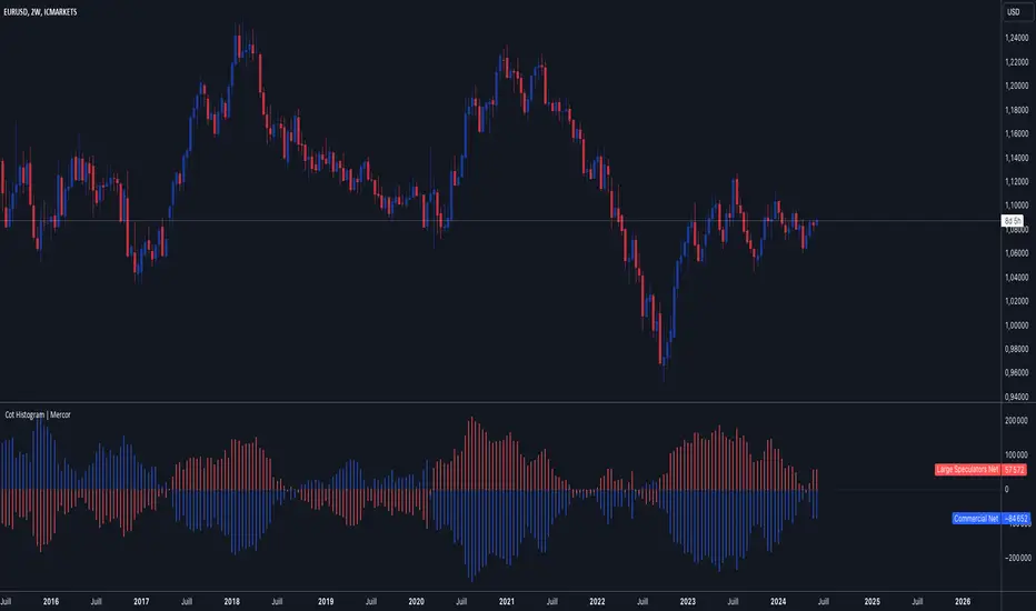
Cot Histogram | MercorCot Histogram | Mercor
Overview:
The Cot Histogram | Mercor indicator provides a comprehensive visualization of the Commitment of Traders (COT) report data using bar charts. This indicator is designed to help traders analyze the positions held by commercial traders and large speculators in various markets. By representing the data as histograms, traders can easily interpret the long and short positions, as well as the net positions of these market participants.
Originality:
What sets the Cot Histogram | Mercor indicator apart is its unique approach to visualizing COT data using bar charts instead of traditional line charts. This method offers a clearer representation of the data, making it easier for traders to spot trends and changes in market sentiment. Additionally, the indicator allows for customization of colors and bar widths, providing a tailored experience for each user.
Features:
Show Shorts as Negative Numbers: This option allows users to display short positions as negative values, providing a more intuitive visualization.
Invert Colors: Users can invert the default colors for long and short positions, enabling better contrast and visual preference.
Bar Width: Adjust the width of the histogram bars to suit personal preferences and chart aesthetics.
Concepts Underlying the Calculations:
The Commitment of Traders (COT) report is a weekly publication by the Commodity Futures Trading Commission (CFTC) that provides a breakdown of the open interest positions of market participants in futures markets. This indicator focuses on two main categories of traders:
Commercial Traders: These are entities involved in the production, processing, or merchandising of a commodity. Their positions are typically hedging-oriented.
Large Speculators: These include institutional investors, hedge funds, and other entities that take positions based on market trends and expectations, often for speculative purposes.
The indicator calculates and plots the following metrics:
Commercial Long: The number of long positions held by commercial traders.
Commercial Short: The number of short positions held by commercial traders.
Commercial Net: The difference between commercial long and short positions.
Large Speculators Long: The number of long positions held by large speculators.
Large Speculators Short: The number of short positions held by large speculators.
Large Speculators Net: The difference between long and short positions of large speculators.
How to Use:
Load the Indicator: Add the Cot Histogram | Mercor indicator to your TradingView chart.
Customize Settings: Adjust the settings according to your preferences:
Enable or disable the "Show Shorts as Negative Numbers" option.
Invert the colors if needed.
Adjust the bar width for better visual representation.
Interpret the Data: Use the histograms to analyze the market positions:
Commercial Long and Short: Observe the positions held by commercial traders. Increasing long positions may indicate hedging against potential price increases, while increasing short positions may suggest hedging against potential price decreases.
Large Speculators Long and Short: Monitor the positions of large speculators to gauge market sentiment. A rise in long positions by large speculators often indicates bullish sentiment, while a rise in short positions suggests bearish sentiment.
Net Positions: The net positions provide a clearer picture of the overall stance of commercial traders and large speculators.
Example:
If you notice that commercial traders are increasing their long positions while large speculators are increasing their short positions, it may indicate a divergence in market expectations between hedgers and speculators. This could be a signal to further investigate potential market reversals or confirm existing trends.
By leveraging the Cot Histogram | Mercor indicator, traders can gain valuable insights into market dynamics, improve their trading strategies, and make more informed decisions. Whether you are a long-term investor or a short-term trader, understanding the positions of different market participants can provide a significant edge in the markets.
Sri_Momentum Burst Histogram📝 Description :
🌀 Sri_Momentum Burst Histogram — A Custom Momentum and Volatility Fusion Tool
The Sri_Momentum Burst Histogram is a unique technical analysis tool designed to visualize sudden changes in price momentum in the form of a dynamic, color-coded histogram. This indicator helps traders identify trend accelerations, early momentum shifts, and potential exhaustion in real time.
By combining a MACD-like momentum engine with a volatility-sensitive Bollinger Band range, this script offers an enhanced view of market bursts — moments where momentum "pops" beyond typical ranges. The result is a refined perspective on market sentiment, helping traders to anticipate reversals, follow breakouts, and assess the relative strength of ongoing trends.
🧠 Core Methodology
The indicator calculates the difference between a fast and slow EMA (Exponential Moving Average), similar to a MACD histogram.
This difference is then compared across candles to gauge the rate of change in momentum — referred to here as a “momentum burst.”
A sensitivity multiplier allows you to scale the response based on your preferred timeframe and trading style.
A volatility band, derived from Bollinger Band logic, is used to frame the relative intensity of the momentum change.
The histogram is divided into two parts:
Green/Lime Bars represent increasing and decreasing bullish momentum.
Red/Orange Bars represent increasing and decreasing bearish momentum.
⚙️ Customizable Inputs
Momentum Sensitivity: Adjust the responsiveness of the burst detection mechanism.
Short EMA Period: Sets the lookback period for the fast EMA.
Long EMA Period: Sets the lookback period for the slow EMA.
Volatility Band Length: Controls the length used for Bollinger Band calculations.
Band Std Dev Multiplier: Adjusts how wide the volatility range should be, based on price dispersion.
📈 How to Use It
Use the green/red histogram bars to visually gauge momentum strength and direction.
Watch for transitions in color intensity (e.g., green to lime, red to orange) as early warning signs of trend exhaustion or reversal.
Combine with other indicators like RSI, MACD, ADX, or volume profiles to confirm entry/exit points.
Useful in both trending and ranging markets, especially on lower timeframes for scalping or intraday setups.
✅ Key Features
Easy-to-read histogram with intuitive color coding.
Fully customizable settings for fine-tuned signal control.
Can be used on any asset class — stocks, forex, crypto, commodities.
Optimized for real-time use with minimal lag.
🔐 This script is an original creation, developed independently by adapting publicly known mathematical concepts into a unique visualization tool. All function and variable names have been customized for originality and compliance with TradingView’s publishing and community standards.
💡 Developed by: @venkat_27
🧩 For educational purposes only — not financial advice.

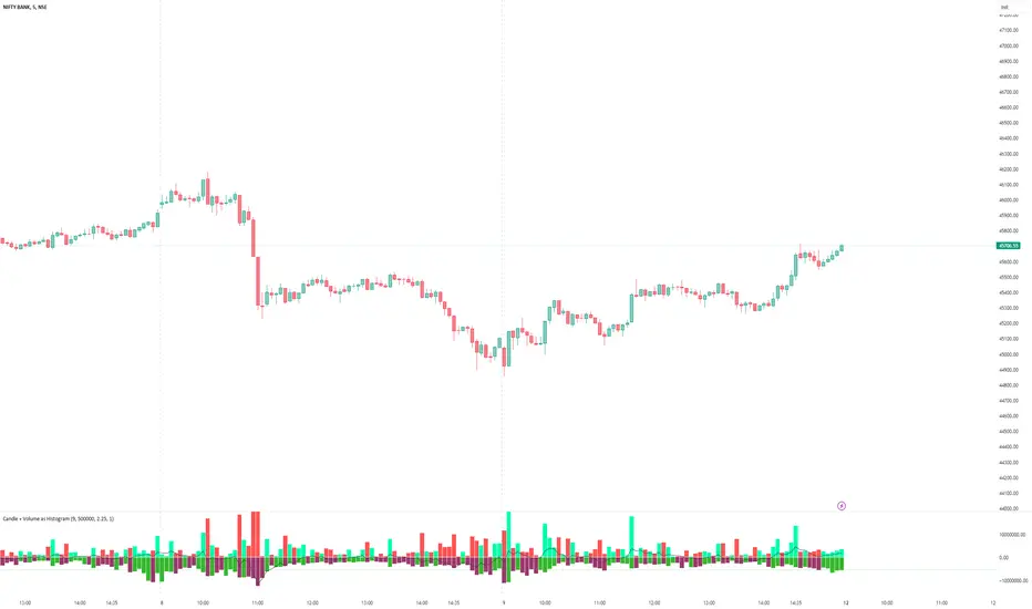
Candle + Volume as HistogramNow plot Candle and Volume as Histogram Oscillator. It is a very simple but very effective indicator to see what is happening at Volume and Candle levels. It clearly plots whether the market is trending, volatile, what is going to happen in next candles etc. Above Zero is price candle and below Zero is Volume histogram.
SETTINGS:
EMA : 9 period EMA on price is default, which I find the best, but you can change as you likes. Below zero line shows market is in negative phase and above zero market is positive.
PRICE CANDLE : As price and volume have different numeric value, so you have to use multiplier to set the proper price candle, which is plotted above zero
VOLUME : As price and volume have different numeric value, so you have to use multiplier to set the Volume candle, which is plotted below zero.
ZERO LINE : use ‘Gap between Candle and Volume plotting’. Increase the value until you see a thin line between price and volume histogram.
NOTE: (i) When you will plot the indicator for the first time, either price candle may not be appearing properly or volume. It means that non-appearing histogram side needs multiplication, so keep on increasing value on proper side until both side histogram appears properly.
(ii) In other case. Price or volume histogram may appear as full Candle. In this case too, you need to increase multiplier value on opposite side till value becomes equal on both sides.
These settings are important because a share price can be 10 only whereas volume may be in millions. Indicator has been tested on many shares and indexes, so never feels that indicator is improper. Just try to change the setting.
Enjoy.
Spread/Range Oscillator + Signal + HistogramThe Spread/Range Oscillator is a technical analysis tool designed to assess market momentum by evaluating the relationship between price movement and volatility.
Calculation
Spread: The difference between the closing and opening prices of a candle (close - open).
Range: The difference between the high and low prices of a candle (high - low).
Oscillator: The spread divided by the range (spread / range). This ratio provides a normalized measure of price movement within each candle.
Smoothed Oscillator: An Exponential Moving Average (EMA) applied to the oscillator over a user-defined period (Smoothing Length) to reduce noise.
Signal Line: An EMA of the Smoothed Oscillator over another user-defined period (Signal Line Length) to identify potential trend changes.
Histogram: The difference between the Smoothed Oscillator and the Signal Line (Smoothed Oscillator - Signal Line). Positive values suggest bullish momentum, while negative values indicate bearish momentum.
Inputs
Smoothing Length (EMA): Determines the period for smoothing the oscillator.
Signal Line Length (EMA): Sets the period for the EMA applied to the Smoothed Oscillator to generate the Signal Line.
Visual Representation
Smoothed Oscillator: Plotted as a line representing the smoothed momentum of price movements.
Signal Line: Displayed as a line serving as a reference to identify potential crossovers and trend changes.
Histogram: Rendered as bars, with positive values indicating bullish momentum and negative values indicating bearish momentum.
Zero Line: A horizontal line at zero to distinguish between bullish and bearish territories.
Applications
Momentum Analysis: Identify periods of strong buying or selling pressure based on the oscillator's position relative to the zero line.
Trend Confirmation: Use crossovers between the Smoothed Oscillator and Signal Line to confirm potential trend reversals or continuations.
Divergence Detection: Spot divergences between price action and the oscillator to anticipate possible market turning points.
This indicator is open-source and intended for educational purposes. It is recommended to use it in conjunction with other forms of analysis and risk management practices before making trading decisions.

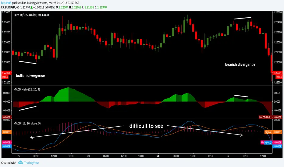
MACD Histogram/AreaIt´s just the histogram of the MACD. (Actually it´s not a histogram, I like the Area visualisation more. But you can switch.)
When I´m using the MACD, I´m just searching for a divergence between Price and the MACD-histogram. I´m not interested in the MACD-signalline or the MACD-line in any way. As you can see, The omission of them leads to better visualisation. It´s much easier to spot a divergence. On the one hand because that way the histogram scales bigger, on the other hand becauce the lines can´t overdraw the histogram.
Rules bullish Divergence: Price makes a lower low, oscillator makes higher low.
Rules bearish Divergence: Price makes a higher high, oscillator makes lower high.
Advanced MACD Pro (WhiteStone_Ibrahim) - T3 Themed✨ Advanced MACD Pro (WhiteStone_Ibrahim) - T3 Themed ✨
Take your MACD analysis to the next level with the Advanced MACD Pro - T3 Themed indicator by WhiteStone_Ibrahim! This isn't just another MACD; it's a comprehensive toolkit packed with advanced features, unique T3 integration, and extensive customization options to provide deeper market insights.
Whether you're a seasoned trader or just starting, this indicator offers a versatile and powerful way to analyze momentum, identify trends, and spot potential reversals.
Key Features:
Core MACD Functionality:
Classic MACD Line: Calculated from customizable Fast and Slow EMAs using your chosen source (Close, Open, HLC3, etc.).
Standard Signal Line: EMA of the MACD line, with adjustable length.
Dynamic MACD Line Coloring: Automatically changes color based on whether it's above or below the zero line (positive/negative).
Zero Line: Clearly plotted for reference.
Enhanced MACD Histogram:
Sophisticated Color Coding: The histogram isn't just positive or negative. It intelligently colors based on momentum strength and direction:
Strong Bullish: MACD above signal, histogram increasing.
Weakening Bullish: MACD above signal, histogram decreasing.
Strong Bearish: MACD below signal, histogram decreasing.
Weakening Bearish: MACD below signal, histogram increasing.
Neutral: Default color for other conditions.
Optional Histogram Smoothing: Smooth out the histogram noise using one of five different moving average types: SMA, EMA, WMA, RMA, or the advanced T3 (Tilson T3). Customize smoothing length and T3 vFactor.
🌟 Unique T3 Integration (T3 Themed):
Extra T3 Signal Line (on MACD): An additional, fast-reacting T3 moving average calculated directly from the MACD line. This provides an alternative and often quicker signal.
Customizable T3 length and vFactor.
Dynamic Coloring: The T3 Signal Line changes color (bullish/bearish) based on its crossover with the MACD line, offering clear visual cues.
T3 is also available as a smoothing option for the main histogram (see above).
🔍 Disagreement & Divergence Detection:
Bar/Price Disagreement Markers:
Highlights instances where the price bar's direction (e.g., a bullish candle) contradicts the current MACD momentum (e.g., MACD below its signal line).
Visual markers (circles) appear above/below bars to draw attention to these potential early warnings or confirmations.
Histogram Color Change on Disagreement: Optionally, the histogram can adopt distinct alternative colors during these bar/price disagreements for even clearer visual alerts.
Classic Bullish & Bearish Divergence Detection:
Automatically identifies regular divergences between price action (Higher Highs/Lower Lows) and the MACD line (Lower Highs/Higher Lows).
Customizable pivot lookback periods (left and right bars) for divergence sensitivity.
Plots clear "Bull" and "Bear" labels on the price chart where divergences occur.
🎨 Extensive Customization & Visuals:
Multiple Color Themes: Choose from pre-set themes like 'Dark Mode', 'Light Mode', 'Neon Night', or use 'Default (Current Settings)' to fine-tune every color yourself.
Granular Control (Default Theme): Individually customize colors and thickness for:
MACD Line (positive/negative)
Standard Signal Line
Extra T3 Signal Line (bullish/bearish)
Histogram (all four momentum states + neutral)
Disagreement Markers & Histogram Alt Colors
Divergence Lines/Labels
Zero Line
Toggle Visibility: Easily show or hide the Standard Signal Line and the Extra T3 Signal Line as needed.
🔔 Comprehensive Alert System:
Stay informed of key market events with a wide array of configurable alerts:
MACD Line / Standard Signal Line Crossover
Histogram / Zero Line Crossover
MACD Line / Zero Line Crossover
Bullish Divergence Detected
Bearish Divergence Detected
Bar/Price Disagreement (Bullish & Bearish)
MACD Line / Extra T3 Signal Line Crossover
Each alert can be individually enabled or disabled.
The Advanced MACD Pro - T3 Themed indicator is designed to be your go-to tool for momentum analysis. Its rich feature set empowers you to tailor it to your specific trading style and gain a more nuanced understanding of market dynamics.
Add it to your charts today and experience the difference!
(Developed by WhiteStone_Ibrahim)

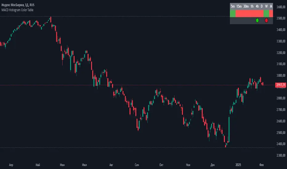
MACD Histogram Color Tabledisplaying the MACD Histogram color and divergences across multiple timeframes. Here's how it works step by step:
1. Setting the Table Position
The script allows the user to choose where the table will be placed using the positionOption input. The three options are:
Top Right
Top Left
Top Center
Depending on the selected option, the table is created at the corresponding position.
2. Creating the Table
A table (macdTable) is created with 8 columns (for different timeframes) and 3 rows (for different data points).
3. MACD Histogram Color Function (f_get_macd_color)
This function calculates the MACD line, signal line, and histogram for a given timeframe.
The histogram (histLine) is used to determine the cell background color:
Green if the histogram is positive.
Red if the histogram is negative.
4. Divergence Detection Function (f_detect_divergence)
This function looks for bullish and bearish divergences using the MACD histogram:
Bullish Divergence (🟢)
The price makes a lower low.
The MACD histogram makes a higher low.
Bearish Divergence (🔴)
The price makes a higher high.
The MACD histogram makes a lower high.
The function returns:
🟢 (green circle) for bullish divergence.
🔴 (red circle) for bearish divergence.
"" (empty string) if no divergence is detected.
5. Populating the Table
The table has three rows for each timeframe:
First row: Displays the timeframe labels (5m, 15m, 30m, etc.).
Second row: Shows MACD Histogram color (red/green).
Third row: Displays divergences (🟢/🔴).
This is done using table.cell() for each timeframe.
6. Final Result
A table is displayed on the chart.
Each column represents a different timeframe.
The color-coded row shows the MACD histogram status.
The bottom row shows detected divergences.
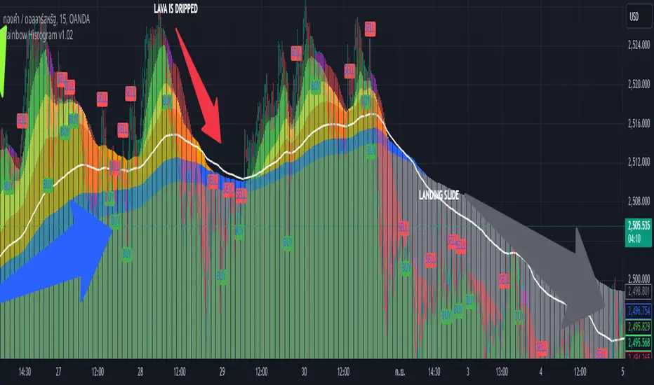
Rainbow Histogram v1.01Sure! Here’s a compelling English version of the article for your TradingView post:
---
### 🌈 **Introducing Rainbow Histogram: A Fusion of EMA and MA for Enhanced Trading Analysis**
**Hello Traders,**
I’m excited to introduce a fresh concept that combines technical analysis techniques into a new indicator called **Rainbow Histogram**. This innovative tool blends Exponential Moving Averages (EMA) and Moving Averages (MA) to provide you with a powerful and accurate tool for making trading decisions.
#### **🎨 What is Rainbow Histogram?**
The Rainbow Histogram is designed to help you identify market trends and signal precise entry and exit points by blending EMA and MA into a colorful "Rainbow" display. This visual approach enhances your ability to spot trend strength and direction with clarity.
#### **📈 How Does Rainbow Histogram Work?**
1. **Exponential Moving Average (EMA):** Captures short-term trends and reacts quickly to price changes.
2. **Moving Average (MA):** Tracks long-term trends and provides a broader view of the market direction.
**Rainbow Histogram** uses the combination of EMA and MA to create a histogram that shows the difference between these two averages in distinct colors. This makes it easy to visualize trend changes and market momentum.
#### **🔧 Setting It Up**
1. **EMA:** Adjust the EMA settings based on your trading timeframe and strategy (e.g., EMA 9, EMA 21).
2. **MA:** Set the MA parameters to capture long-term trends (e.g., MA 50, MA 200).
#### **🌟 Why Use Rainbow Histogram?**
- **Simplified Analysis:** Quickly identify trends and their strength with a clear visual representation.
- **Distinct Colors:** Differentiate between EMA and MA with vibrant colors for easy interpretation.
- **Precise Signals:** Get clear buy and sell signals based on histogram changes.
#### **📥 Get Started**
Add **Rainbow Histogram** to your TradingView charts by searching for the script in TradingView’s library or set it up manually using the recommended settings.
#### **📝 In Summary**
**Rainbow Histogram** is a unique tool that simplifies trend analysis and enhances accuracy by merging EMA and MA into a single, colorful indicator. Use this tool to refine your trading strategy and make more informed financial decisions.
If you have any questions or feedback about **Rainbow Histogram**, feel free to comment below or send me a message!
**Happy Trading!** 🌟
---
I hope this version effectively captures attention and engages your audience!
SAR MACDSAR MACD is an idea of implementing Directional MACD with Parabolic SAR to exactly detect and confirm Trend. This p-SAR MACD consist of a HYBRID MACD which acts as MACD TREND oscillator, MACD Oscillator, PSAR Indicator combined with MA line. thus Fake MACD Signals can be eliminated using this SAR MACD. Sideways can be detected using Threshold Levels must be adjusted based on timeframe.
Indicators Hybrid model contains:
1.MACD (12,26,9) Standard with MA Crossovers
2.MACD Trend
3.Parabolic SAR with 0.02
4.Threshold level - indicates Sideways
How to use.
Histogram:
-> HIST MODE: normal MACD indicator
MA Line Color is based on PSAR Direction Blue-Up/ Pink -Down
A crossover upside with a Blue MA line denotes Up confirmation
A Crossover downwards with a red MA line denotes Down Confirmation
Additionally Histogram above zero line and below zero line are to be confirmed
-> MACD MODE: MACD Trend indicator
MA Line Color is based on PSAR Direction Blue-Up/ Pink -Down
A crossover upside with a Blue MA line denotes Up confirmation
A Crossover downwards with a red MA line denotes Down Confirmation
Additionally Histogram above zero line and below zero denotes long term Trend
-> Histogram Color: Indicates candles direction
Yellow indicates Unconfirmed Direction
Green Indicates up direction
Red Indicates Down Direction
Buy Condition:
MA Color - Blue
Histogram- Above Zero
Histogram/Candle -Green
MA Crossover is must
Sell Condition:
MA Color - Red
Histogram- Below Zero
Histogram/Candle -Red
MA Cross under is must
Warning: Must not be used as a standalone indicator. Use for confirmation of your Buy Sell Signals and Entry only.

Liquidity Levels [LuxAlgo]The Peak Activity Levels indicator displays support and resistance levels from prices accompanied by significant volume. The indicator includes a histogram returning the frequency of closing prices falling between two parallel levels, each bin shows the number of bullish candles within the levels.
1. Settings
Length: Lookback for the detection of volume peaks.
Number Of Levels: Determines the number of levels to display.
Levels Color Mode: Determines how the levels should be colored. "Relative" will color the levels based on their location relative to the current price. "Random" will apply a random color to each level. "Fixed" will use a single color for each level.
Levels Style: Style of the displayed levels. Styles include solid, dashed, and dotted.
1.1 Histogram
Show Histogram: Determines whether to display the histogram or not.
Histogram Window: Lookback period of the histogram calculation.
Bins Colors: Control the color of the histogram bins.
2. Usage
The indicator can be used to display ready-to-use support and resistance. These are constructed from peaks in volume. When a peak occurs, we take the price where this peak occurred and use it as the value for our level.
If one of the levels was previously tested, we can hypothesize that the level might be used as support/resistance in the future. Additional analysis using volume can be done in order to confirm a potential bounce.
The histogram can return various information to the user. It can show if the price stayed within two levels for a long time and if the price within two levels was mostly made of bullish or bearish candles.
In the chart above, we can see that over the most recent 200 bars (determined by Histogram Window) 68 closing prices fall between levels A and B, with 27 bars being bullish.
Additionally, the width of a bin and its length can sometimes give information about the volatility of a specific price variation. If a bin is very wide but short (a low number of closing prices fallen within the levels) then we can conclude a most of the movement was done on a short amount of time.

Futures Confluence Delta (FCD) - Histogram
The Futures Confluence Delta (FCD) Histogram is a powerful trend-following indicator tailored for scalping futures on 1-minute charts. Displayed in a bottom panel like RSI or volume, it visualizes cumulative volume delta to identify bullish or bearish market momentum. The histogram turns green for positive delta (buying pressure, suggesting a long trend) and red for negative delta (selling pressure, indicating a short trend), providing quick insight into market direction.
This indicator is ideal for futures traders seeking confluence with other tools, such as VWMA or order block strategies. It uses a simple yet effective delta calculation (buy volume for up candles, sell volume for down candles, smoothed with EMA) to highlight trend strength, making it perfect for fast-paced scalping environments.
Key Features:
Cumulative Delta Histogram: Tracks buying vs. selling pressure, smoothed with an EMA for clarity.
Color-Coded Trend Signals: Green for bullish (long) trends, red for bearish (short) trends.
Customizable Settings: Adjust the delta lookback period and enable/disable daily reset for flexibility.
Optimized for 1-minute charts on futures.
Alert Support: Set alerts for trend changes to stay ahead of market shifts.
How to Use:
Add the indicator to your 1-minute chart. Observe the histogram in the bottom panel:
Green bars (positive delta) suggest a bullish trend, favoring long entries.
Red bars (negative delta) indicate a bearish trend, favoring short entries.
Combine with other indicators (e.g., VWMA, order blocks, or FVGs) for confluence.
Set alerts for trend changes via the FCD Long Trend or FCD Short Trend conditions.
Adjust settings (delta lookback, daily reset) to match your trading style.
Settings:
Delta Lookback Period (default: 14): Controls the EMA smoothing of the delta. Lower values increase sensitivity; higher values smooth trends.
Reset Delta Daily (default: true): Resets cumulative delta at the start of each trading day for futures session alignment.
Long Color (default: green): Color for bullish delta.
Short Color (default: red): Color for bearish delta.
Notes:
Ensure sufficient historical data (500+ bars) for accurate delta calculations.
Test on NQ for higher volatility, as it may show stronger delta signals compared to GC or ES.
Check the Pine Logs pane (“More” > “Pine Logs”) for any NA data issues if the histogram doesn’t display.
Share your feedback or suggestions in the comments!

VIX Percentile Rank HistogramVIX Percentile Rank Histogram
The VIX Percentile Rank Histogram provides a visual representation of the CBOE Volatility Index (VIX) percentile rank over a customizable lookback period, helping traders gauge market sentiment and make informed trading decisions.
Overview:
This indicator calculates the percentile rank of the VIX over a specified lookback period and displays it as a histogram. The histogram helps traders understand whether the current VIX level is relatively high or low compared to its recent history. This information is particularly useful for timing entries and exits in the S&P 500 or related ETFs and Mega Caps.
How It Works:
VIX Data Integration: The script fetches daily VIX close prices, regardless of the chart you are viewing, to analyze market volatility.
Percentile Rank Calculation: The indicator calculates the rank percentile of the VIX over the chosen lookback period.
Histogram Visualization: The histogram plots the difference between the flipped VIX percentile rank and 50, showing green bars for ranks below 50 (indicating lower market volatility) and red bars for ranks above 50 (indicating higher market volatility).
Usage:
This indicator is most effective when trading the S&P 500 (SPX, SPY, ES1!) or ETFs and Mega Caps that closely follow the S&P 500. It provides insight into market sentiment, helping traders make more informed decisions.
Timing Entries and Exits: Green histogram readings suggest it's a good time to enter or hold long positions, while red readings suggest considering exits or short positions.
Market Sentiment: A high VIX percentile rank (red bars) indicates market fear and uncertainty, while a low percentile rank (green bars) suggests investor confidence and reduced volatility.
Key Features:
Customizable Lookback Period: The default lookback period is set to 20 days, but can be adjusted based on the trader's average trade duration. For example, if your trades typically last 20 days, a 20-day lookback period helps contextualize the VIX level relative to its recent history.
Histogram Visualization: The histogram provides a clear visual representation of market volatility.
Green Bars: Indicate a lower-than-median VIX percentile rank, suggesting reduced market volatility.
Red Bars: Indicate a higher-than-median VIX percentile rank, suggesting increased market volatility.
Threshold Line: A dashed gray line at the 0 level serves as a visual reference for the median VIX rank.
Important Note:
This indicator always shows readings from the VIX, regardless of the chart you are viewing. For example, if you are looking at Natural Gas futures, this indicator will provide no relevant data. It works best when trading the S&P 500 or related ETFs and Mega Caps.

Emibap's Uniswap V3 HEX/WETH 0.3% Liquidity PoolThis script will display a histogram of the Uniswap V3 HEX / WETH 3% liquidity pool.
Similar to what you can see in the liquidity section of the Uniswap pool page but conveniently rendered alongside your chart.
It's meant to be used on a HEX / WETH chart only. The price should be expressed in WETH for it to work.
One of the main motivations for using this in your chart is to get an idea of the current sentiment: If most of the volume is below the price it might be an indication of an upcoming move up, for instance.
I'll try to update the liquidity regularly.
Using the 4h, daily, or weekly time frames is highly recommended.
The options are straightforward:
Histogram bars color. Default is blue
Histogram background color. Default is black at 20% opacity
Upper price limit of the diagram: Visible upper bound price limit for the histogram, based on the current price. I.E: 200%: If the price is 1, the histogram will show 3 as the upper bound
Lower price limit of the diagram. Visible lower bound price limit for the histogram, based on the current price. I.E: 99%: If the price is 1, the histogram will show 0. 01 as the upper bound
Width of the widest bar: Width (in bars) for the widest bar of the histogram. The more the higher resolution you'll get

Smart RSI Composite [DotGain]Summary
Do you want to know the "True Direction" of the market without getting distracted by noise on a single timeframe?
The Smart RSI Composite simplifies market analysis by aggregating momentum data from 10 different timeframes (5m to 12M) into a single, easy-to-read Histogram.
Instead of looking at 10 separate charts or dots, this indicator calculates the Average RSI of the entire market structure. It answers one simple question: "Is the market predominantly Bullish or Bearish right now?"
⚙️ Core Components and Logic
This indicator works like a consensus mechanism for momentum:
Data Aggregation: It pulls RSI values from 10 customizable slots (Default: 5m, 15m, 1h, 4h, 1D, 1W, 1M, 3M, 6M, 12M). All slots are enabled by default.
Smart Averaging: It calculates the arithmetic mean of all active timeframes. If the 5m chart is bearish but the Monthly chart is bullish, this indicator balances them out to show you the net result.
Histogram Visualization: The result is plotted as a histogram centered around the 50-line (Neutral).
🚦 How to Read the Histogram
The histogram bars indicate the aggregate strength of the trend based on the Average RSI:
🟩 DARK GREEN (Strong Bullish)
Condition: Average RSI > 60.
Meaning: The market is in a strong uptrend across most timeframes. Momentum is firmly on the buyers' side.
🟢 LIGHT GREEN (Weak Bullish)
Condition: Average RSI between 50 and 60.
Meaning: Slight bullish bias. The bulls are in control, but momentum is not yet extreme.
🔴 LIGHT RED (Weak Bearish)
Condition: Average RSI between 40 and 50.
Meaning: Slight bearish bias. The bears are taking control.
🟥 DARK RED (Strong Bearish)
Condition: Average RSI < 40.
Meaning: The market is in a strong downtrend across most timeframes. Momentum is firmly on the sellers' side.
Visual Elements
Center Line (50): This acts as the Zero-Line. Above 50 is bullish, below 50 is bearish.
Zone Lines (30/70): Dashed lines indicate the traditional Overbought/Oversold levels applied to the aggregate average.
Key Benefit
The Smart RSI Composite acts as a powerful Macro Trend Filter .
Pro Tip: Never go long if the Histogram is Dark Red, and avoid shorting when it is Dark Green. Use this tool to align your trades with the overall market momentum.
Have fun :)
Disclaimer
This "Smart RSI Composite" indicator is provided for informational and educational purposes only. It does not, and should not be construed as, financial, investment, or trading advice.
The signals generated by this tool (both "Buy" and "Sell" indications) are the result of a specific set of algorithmic conditions. They are not a direct recommendation to buy or sell any asset. All trading and investing in financial markets involves substantial risk of loss. You can lose all of your invested capital.
Past performance is not indicative of future results. The signals generated may produce false or losing trades. The creator (© DotGain) assumes no liability for any financial losses or damages you may incur as a result of using this indicator.
You are solely responsible for your own trading and investment decisions. Always conduct your own research (DYOR) and consider your personal risk tolerance before making any trades.

NASDAQ VWAP Distance Histogram (Multi-Symbol)📊 VWAP Distance Histogram (Multi-Symbol)
This custom indicator plots a histogram of price strength relative to the VWAP (Volume-Weighted Average Price).
The zero line is VWAP.
Histogram bars above zero = price trading above VWAP (strength).
Histogram bars below zero = price trading below VWAP (weakness).
Unlike a standard VWAP overlay, this tool lets you monitor multiple symbols at once and aggregates them into a single, easy-to-read histogram.
🔑 Features
Multi-Symbol Support → Track up to 10 different tickers plus the chart symbol.
Aggregation Options → Choose between average or median deviation across enabled symbols.
Percent or Raw Values → Display distance from VWAP as % of price or raw price points.
Smoothing → Apply EMA smoothing to calm intraday noise.
Color-Coded Histogram → Green above VWAP, red below.
Alerts → Trigger when the aggregate crosses above/below VWAP.
Heads-Up Table → Shows number of symbols tracked and current aggregate reading.
⚡ Use Cases
Market Breadth via VWAP → Monitor whether your basket of stocks is trading above or below VWAP.
Index Substitution → Create your own “mini index” by tracking a hand-picked set of tickers.
Intraday Confirmation → Use aggregate VWAP strength/weakness to confirm entries and exits.
Relative Strength Spotting → Switch on/off specific tickers to see who’s holding above VWAP vs. breaking down.
🛠️ Settings
Include Chart Symbol → Toggle to include the current chart’s ticker.
Smoothing → EMA length (set to 0 to disable).
Percent Mode → Show results as % of price vs. raw difference.
Aggregate Mode → Average or median across all active symbols.
Symbol Slots (S1–S10) → Enter tickers to track alongside the chart.
⚠️ Notes
Works best on intraday charts since VWAP is session-based.
Designed for confirmation, not as a standalone entry/exit signal.
Ensure correct symbol format (e.g., NASDAQ:AAPL if needed).
✅ Tip: Combine this with your regular price action strategy. For example, if your setup triggers long and the histogram is well above zero, that’s added confirmation. If it’s below zero, caution — the basket shows weakness.

TDI 7 MA and HISTOGRAMTDI %K Histogram with 7 MA
Overview
This indicator enhances trend and momentum analysis using the %K line from the Traders Dynamic Index (TDI), combined with a 7-period moving average (MA) and a histogram.
How It Works
The script calculates %K (similar to Stochastic RSI), representing the relative price position within a given range.
A 7-period Simple Moving Average (SMA) is applied to smooth the %K line, reducing noise and improving trend clarity.
A histogram is plotted based on the difference between %K and the 7-period MA:
Green bars indicate that %K is above the 7-period MA, suggesting bullish momentum.
Red bars indicate that %K is below the 7-period MA, suggesting bearish momentum.
Key Features
-%K Line (Blue) – Reflects short-term momentum shifts.
-7-period MA (Purple) – Helps smooth out fluctuations in %K for better trend identification.
-Histogram (Green/Red Columns) – Highlights momentum shifts visually.
Overbought (68), Midpoint (50), and Oversold (32) Levels – Provides reference points for potential reversals or trend continuation.
How to Use
Bullish Confirmation: When the histogram turns green and %K is above the 7 MA, it suggests upward momentum.
Bearish Confirmation: When the histogram turns red and %K is below the 7 MA, it suggests downward momentum.
Overbought/Oversold Conditions: Use the 68 and 32 levels as potential reversal zones, but always confirm with price action.
Midpoint (50 Level): Acts as a dynamic support/resistance area for momentum shifts.
This indicator is suitable for trend-following and momentum-based trading strategies, whether on lower timeframes for scalping or higher timeframes for swing trading.
Try it out and integrate it with your trading system to refine your entries and exits!
