IKH Cloud V1.0 (nextSignals)The IKH Cloud V1.0 (nextSignals) is an Ichomoku-type indicator that can be used for various trading strategies. It's based on a ThinkScript study from @stephenharlinmd (aka nextSignals) that uses an instantaneous moving average as the base MA, and a custom trailing stop. Both of these components form the cloud.
Indicator Components and Calculation
The indicator comprises two key components:
Instantaneous Moving Average (IMA) : This is a type of moving average that places a greater weight on the most recent data points, and is based on Ehler's book "Rocket Science for Traders". This is slightly different from the Doc's original, but is very approximate.
Trailing Stop : This component helps determine the stop loss level that moves along with the price. The trailing stop is based on the highest high and the lowest low of the last 5 bars, as well as the simple moving averages of the low and high of the previous bar. The trailing stop is calculated separately for each condition: when the bar index is greater than 1 and when the previous 'a' variable is either 1 or 0.
These two components are used to create a filled area on the chart, also known as the 'cloud'. The color of the cloud and the candlesticks change based on the relative positions of the IMA and the trailing stop.
How to Use the Indicator
The following are just ideas on how to use this indicator, and is not financial advice in any form:
Trend Identification: When the IMA is above the trailing stop (cloud), it indicates an uptrend, and when it's below, it indicates a downtrend.
Entry/Exit Signals: Traders can consider going long when the candlesticks move above the cloud and short when they move below the cloud.
Stop Loss Level: The trailing stop line (the cloud's edge) can serve as a dynamic stop loss level.
Please don't use just this indicator on its own. Please use this in conjunction with other analysis tools, indicators, and systems you already have in place. Always consider the overall market context and use appropriate risk management strategies.
חפש סקריפטים עבור "ichimoku"
Chuff by Monty V2This is the second version of the indicator ‘Chuff by Monty’ we made a while back.
This indicator uses multiple previously available indicators as well as some newly calculated scripts to provide information on chart that uses one indicator slot but is telling you more than what one indicator could’ve.
The indicator also includes alerts which can be used to find potential signals generated by the indicator, So be sure to check those out as well.
Features of the indicator:
Ichimoku Cloud
TK Crosses: Label on chart when the Conversion Line (Tenken Sen) and Base line (Kijun Sen) is crossing each other. There are five types of crosses that are marked in the indicator. Each will have Bullish or Bearish aspect but, you have to look at the image below to really understand which is worth considering signal.
TK Lines: This checkbox will enable the Conversion and Base line, the crosses of which are labeled through the TK Crosses Checkbox above.
Bullish TK: Now when the orange line crosses the red line to the up side which should be flat at that time, this generates a bullish signal showing that this can lead price to the upwards direction. And a label print as Bullish TK in red color.
Bearish TK: Now when the orange line crosses the red line to the down side which should be flat at that time, this generates a bearish signal showing that this can lead price to the downwards direction. And a label print as Bearish TK in Golden color.
Kumo Cloud: There are two types of clouds in the indicator as well, This is calculated with a bit different approach then conventional Ichimoku Cloud indicator. Both red and green Kumo cloud acts as resistance and support respectively.
Trading Edge to Edge: This phenomenon in ichimoku suggests that when there’s a close in the cloud as 1. For longs, Green candles should close in the red cloud and at that time, The other side of the cloud should be flat and 2. For shorts, Red candles should close in the green cloud and at that time, the other side of the cloud should be flat. This opens up the window for the price to go to the other flat side of the cloud after retesting the cloud through the inside. An example is shared in the snapshot.
Divergences:
This part of the indicator uses 10 different types of oscillators including MACD, Histogram, RSI, Stochastic, CCI, Momentum, On-Balance Volume, Volume Weighted MACD, CMF, Money Flow Index and EXT to calculate divergences. By default, the indicator will show hidden and regular divergences at once, but you can choose to have just hidden or just regular divergences as per your liking. I specifically hard coded the indicator to calculate divergences from candle closes rather than from wicks, so that’s what it’s doing.
Harmonic Patterns:
I personally trade three and only three harmonics, these are bat, butterfly and Gartley. This part of indicator will analyze each swing and check if these swings are falling in any of those three harmonic pattern ranges. As we all know that these patterns don’t complete their retracement to the last digit exactly each time, so there’s a liberty range that has 10% error flexibility. Which means that if a retracement is supposed to be at 0.618, the error flexibility will check it in a range of +10% and -10% of 0.618 which comes out to be 0.556-0.678. Three of the harmonics, bullish (Green) and bearish (Red) is posted in the snapshot.
You can trade these harmonics by either waiting for the indicator to print them, either by putting an alert for each type of a harmonic pattern or by pre-predicting a harmonic which is taught in our community’s premium discord discord.gg .
Golden/Death cross:
Just like TK Crosses, this will print you Goldencross and Deathcross labels each time 55sma and 200sma cross each other. If the 55sma is crossing the 200sma to the upside, A Goldencross label will appear and if 55sma is crossing the 200sma to the downside, A Deathcross label will appear. Golden cross means the coin is turning bullish and can go high. Death cross shows that the coin is turning bearish and the price can fall.
Moving Averages:
Default lengths are 13EMA, 21EMA, 55SMA, 200SMA and 355SMA. You can change it as you like but I use these lengths for my analysis. One feature that this set of moving average has is that each MA is labeled as it’s length and the calculation method (SMA or EMA). So, when you are analyzing with multiple Moving Averages enabled, you can easily know which MA is which.
SR Band:
It has three mods. Fast/Weak which is going to be quick and sensitive to the price but will a weak support and resistance area. Slow/Strong which is going to be slow and less sensitive to the price but will be a very strong support and resistance area. The normal settings which is set as default is kind of in-between these two. You can use this SR band as a way of getting in and out of the trades as it represents Supports and resistances. The colors of the band changes when the price is above, below and is in the band.
Here’s an example trade using the confluences provided by the indicator.
This is how that trade would’ve looked like with indicator:
And this is how that trade would’ve looked like without the indicator:
Do ask questions in the comment section about the indicator or the trading strategy here if you feel like this is too complex. I’ll be glad to help.
All the settings and features which were worth customizing are customizable in this version of the indicator. Feel free to change those settings as per your liking.
Thank you.

Gamification IndicatorDo you want your charts to look like a video game? Look no further! Would you rather be an alien racing through a lava tube, a surfer with great white sharks, an airplane flying through the clouds, or some other custom emoji setup of your choice? Traders can choose their own custom player emoji, trend indicator, obstacle emoji, and celestial emoji. This indicator is just for fun and is not intended to be used when making trading decisions. Enjoy!
This indicator also contains a live sun/moon emoji that should accurately reflect day/night and can give information about the current moon phases.
Shoutout to @citlacom for the public Moon Ephemeris and calculations. Building this indicator was a useful & fun introduction to financial astrology in Pinescript.

supersignal oscilatorThis indicator shows you a special divergence which you can use them for getting the trend of chart and the base code of indicator is on ichimoku
these divergences are based on ichimoku
In LongTerm divergence, we calculate the difference between lead 1 and lead 2, and a graph is formed from their difference, by comparing the obtained graph and the candles, we find the divergence between them
In ShortTerm divergence, we calculate the difference between Conversion and Base, and a graph is formed from their difference, by comparing the obtained graph and the candles, we find the divergence between them
-The Accuracy Section has two options:
Default means that numbers are based on default numbers
when you choose golden,The indicator find a number automatic based on 3000 candle ago and put them on ichimoku numbers
in Line option you can choose the LongTerm Divergence or ShortTerm Divergence
in Ichi smooth we specify the number that we want to smooth LongTerm line or turn it to sma (Simple Moving Average)
in Ichi smooth we specify the number that we want to smooth ShortTerm line or turn it to sma (Simple Moving Average)
Signal Line is based on the same Signal Line on Macd
I hope you enjoy it :)

RSI + MA, LinReg, ZZ (HH HL LH LL), Div, Ichi, MACD and TSI HistRelative Strength Index with Moving Average, Linear Regression, Zig Zag (Highs and Lows), Divergence, Ichimoku Cloud, Moving Average Convergence Divergence and True Strength Index Histogram
This script is based on zdmre's RSI script, I revamped a lot of things and added a few indicators from ParkF's RSI script.
Disable Labels in the Style tab and the histogram if you don't enlarge the indicator and it seems too small.
Look to buy in the oversold area and bounce of the support of the linear regression.
Look to sell in the overbought area and bounce of the resistance of the linear regression.
Look for retracement to the moving average or horizontal lines, and divergences for potential reversal.
RSI
The Relative Strength Index (RSI) is a well versed momentum based oscillator which is used to measure the speed (velocity) as well as the change (magnitude) of directional price movements.
Moving Average
Moving Average (MA) is a good way to gauge momentum as well as to confirm trends, and define areas of support and resistance.
Linear Regression
The Linear Regression indicator visualizes the general price trend of a specific part of the chart based on the Linear Regression calculation.
Zig Zag (Highs and Lows)
The Zig Zag indicator is used to identify price trends, and in doing so plots points on the chart to mark whenever prices reverse by a larger percentage point than a predetermined variable or marker.
Divergence
The divergence indicator warns traders and technical analysts of changes in a price trend, oftentimes that it is weakening or changing direction.
Ichimoku Cloud
The Ichimoku Cloud is a package of multiple technical indicators that signal support, resistance, market trend, and market momentum.
MACD and TSI Histogram
MACD can be used to identify aspects of a security's overall trend.
The True Strength Index indicator is a momentum oscillator designed to detect, confirm or visualize the strength of a trend.

pickle financialversion 1.0
A multi-use indicator
FEATURES:
1) Robust VWAP with up to 3 deviations that can be adjusted for Session, Week, Month, Quarter, Year, Decade, Century, Earnings , Dividend, & Split intervals
2) 20 customizable Moving Averages that can be changed to EMAs, SMAs , WMAs, SMMAs, and VWMAs; can also be adjusted to Candle Closes, Highs, Lows, Opens, HLC3, HL2 , OHLC4, & HLCC4
-Praise be lady VWAP
Jupiter MAyou can use this srtategy multitime but the best time is your chart should be on5 min and multitime 1 should be on15 then when the the red an green line cross blue line get long position and get short position when upside down
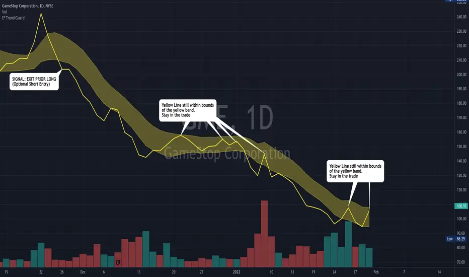
E³ Trend GuardWe all need help staying in trades as long as possible, buckling down through those pesky pullback and consolidation periods, and this script really helps you gain some better insight!
The TREND GUARD indicator is great for keeping you in trending trades through pullbacks and short consolidations. It is a STOP INDICATOR and helps you with your exits. It can work for Swing Trading on strongly trending stocks ( bullish and bearish ) as well as help you on intraday trades of the same. It can also be used to gain insight for entries (see below).
HOW TO USE:
FOR EXITS:
Once you've entered a trending stock that may be providing Alpha (excess returns or depreciation vs the market), you can use the strong Yellow line that is behind the candlesticks (see TIP #1 below) to keep you in your trade or inform you of when you should think about exiting. What you are looking for, is for the yellow line to not cross over to the other side of the yellow band from the "trending side" of your trade. In other words, when price is running up the band, similar to trading Bollinger Bands , or above the band, and the band is curving up or running upward as well, that can be considered "in trend" and LONG ( bullish ) in direction. The converse is true for "in trend" SHORT ( bearish ) direction.
FOR ENTRIES:
It wasn't built for entries, but users are reporting good results for using it for entries. The best technique for entry appears to be to allow the band to run sideways during a consolidation, then enter on the side where a strong breakout/down candle or price occurs through to outside the yellow band. This is very similar and indeed somewhat corresponds to entering breakouts of bases (sideways consolidation areas).
TIP
In order to see the strong yellow line (looks like a thread behind the candlesticks ), you have at least three choices:
Change your charts to LINE type on the CLOSE pricing;
Point at the indicator on the chart and it will highlight it and the line that is behind the Candlesticks will come forward
On the Data Information pane you can toggle HIDE candlesticks to see it more clearly
THE MECHANICS:
So what's going on behind the scenes here?
Instead of the traditional statistical band approach like Bollinger, or Keltner, or ATR bands, which all spread out from a "center line" (calculated as OHLC4, etc) ... I have instead created the upper band with a Moving Average of the Highs of each period (candle) and a lower band with a Moving Average of the Lows of each period (candle). I used the weighted moving average in order to make current pricing more relevant. And through backtesting I have found the ideal period to be 10.
CREDIT TO: The original Moving Average Ribbon by TradingView™
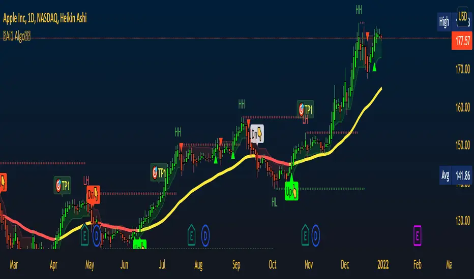
MarketReader_StrategyMarketReader_Strategy is a very useful and advanced indicator:
- It draws buying (green) and selling (orange) zone .
-Once the buying or selling zone is tapped, the color is automatically changed to grey
-It shows liquidity pool ($$$) engineered by market behaviour
Buying or selling area are determined by an algorithm that combines volume profile, Elliott Wave principles and order flow delivery .
On the above example:
At “1” , you can see that the first buying zone is drawn since January 12
At “2” , the buying zone is tapped on January 18 with a strong bullish reaction.
At “3” and “3’” , you can see that liquidity pool has been created by market maker on both buying and selling side. It is typical of market behavior.
Market maker will take the downside liquidity by targeting the buying zone and then reverse (to the upside) targeting the upside liquidity pool that fuel the pump to the selling zone “4” . This selling zone is reached at “5” with a strong bearish reaction.
“6” represent active buying zone, waiting to be tapped.
To buy or take profit on these areas will depend on market behavior on the way down. Does the market engineer liquidity before? We use 2 complementary indicators helping us to take position on these areas but feel free to experiment with your own.
Usually, I wait price comes to selling or buying zone, then I go on lower timeframe (15 to 30 times lower) searching for divergences and convergences on Momemtum reader (also available on tradingview)
This indicator does not repaint and works on Forex, Crypto, Indices, Commodities and stock.

Heikin Ashi Trailing Stoploss ActivationThe Basics
This indicator should be used on regular candle sticks. It is possible to trigger an alert, when the block flips from red to green bar. Or vice versa.
Red block represents a red Heikin Ashi candle.
Green block for green Heikin Ashi candle.
It can be used as a trailing stoploss for (DCA/ TV) bots, when riding trends.
What Makes It Different
The user can preset the price (of the asset e.g. BTC), where it will start looking for Heikin Ashi flips. Every Heikin Ashi flip before this preset price will be ignored. Preset prices could be chosen tactically at resistance levels.
Different time frames of Heikin Ashi flips can be used together. E.g. 10 min, 3 hour or 2 Day time frames. If this is possible within your Tradingview subscription.
Example
The user has a long position (bought at the green arrow.) The user wants to start trailing at price 88 USDT (blue line).
The indicator will only trigger when the following conditions are met:
Cross of red block on the indicator (representing red Heikin Ashi candle)
Price has crossed 88 USDT
If the candlestick turns from a green to a red block, before crossing 88 USDT. It will NOT trigger the alert. Visible as the orange down arrows. In the indicator below it is displayed as a red block.The alert will go off at the red down arrow on 10th Nov (if chosen for Once per bar close). The price condition of 88 USDT was already met at 7th Nov.
Final Words
Disclaimer: Please use it with care and at own risk. The owner of this indicator is not liable for any financial losses.
Past performance is no guarantee of future returns.

Trailing Stoploss Bottom ActivationThe Basics
The indicator is visible on the chart as circles above and below the bar.
It will trigger an alert when the current price goes below, the low of the previous candle.
Or an alert when current price goes above, the high of the previous candle.
The indicator can be used as a trailing stoploss for (DCA/ TV) bots.
The distance between the circles and candlesticks can be adjusted. If the user prefers to set an alert e.g. a few ticks lower than the candle bottom.
What Makes It Different
The user can preset the price (of the asset e.g. BTC), where it will start looking for the condition: current price is below previous candle low (when in long position). Current price is above previous candle high (when short).
Example
In the chart above MATIC/BUSD the user has drawn a blue line at 1.70. Since there is where he expects resistance.
The user has a long position (bought at the green arrow.) The user wants to start trailing at price 1.70.
The alert will only trigger when the following conditions are met:
Condition 1 - Crossed 1.70
Condition 2 - Current candle price is below previous candle low.
In the chart above price crossed above 1.70 on 26th Oct. Current candle price (at that moment) went below previous candle low on 27th Oct, indicated with a red arrow. Here the alert will go off at 1.659 BUSD (indicated in pink).
It ignores the other two lows, indicated with orange arrows. Because condition 1 is not met.
It is possible to use multiple time frames at the same time. Some time frames might not be available depending on your Tradingview subscription.
Final Words
Disclaimer: Please use it with care and at own risk. The owner of this indicator is not liable for any financial losses.
Past performance is no guarantee of future returns.

Supertrend NinjaSupertrend Ninja
The Basics
The Supertrend Ninja is a trend-following indicator. The indicator is optimised for daily, 2 days and 3 days candlesticks and can be used on varying trending markets.
Supertrend Ninja using 2 days candlesticks only gave 7 bullish signals in 2020 and 2 in 2021 for Bitcoin/USDT (based on Binance charts). Greatly reducing false signals. It can be used on lower time frames as well, although you will encounter more noise.
This indicator could be used as a compass for DCA or TV bots as well.
What To Look For
When the background of the candlestick closes green with an upwards pointing pink arrow. It indicates a possible bullish (up)trend. To enter a trade its best to place an order a few ticks above the candle high. This way we only enter a position, when there is trend continuation.
When the background of the candlestick closes red with a downwards pointing black arrow. It indicates a possible bearish (down)trend. To enter a trade its best to place an order a few ticks below the candle low.
Exits can be determined by Fibonacci extensions, orderblocks or other resistances to name a few. Or exit the trade when the opposite background color appears.
Final words
Disclaimer: Please use it with care and at own risk. The owner of this indicator is not liable for any financial losses.
Past performance is no guarantee of future returns.

Martyv Technical Analysis KitThis indicator is being developed as a tool hopefully suited to both the beginner/amateur/hobbyist and possibly also the professional analyst/trader. The idea is that it would be a tool that can give you an instant ‘overview’ of a few different schools of measurement on any measurable asset. Makes for great training wheels or a primer for further analysis.
Out of the box settings will give you an AutoFib for the most recent low and high (with extension targets), a pair of commonly-used moving averages (50 SMA and 200 SMA), RSI (and/or many other) divergences on the chart, and candles colored according to current trend (Blue = Bullish Control, Purple = Neutral/Coasting, Red = Bearish Control) and intensity according to volume (Darker = High Volume/Increasing, Lighter = Low Volume/Decreasing). For more advanced traders/analysts, almost all settings can be customized, with multiple options and additional features.
*There are a lot of settings. Shrug. Wink. I tried to bundle them together, however there are a few that I use quite often and placed them at the top for easy access. If you have any suggestions as to what's super useful in the top area, lmk. Happy trading! -E
AutoFib
-Places an AutoFib for the most recent low and high (with extension targets)
-You can choose to "contain price action" inside a 0-1 fib retrace, or allow extension targets to automatically be used (potentially useful within Harmonic Trading among other things)
-Uses the Fast/Medium/Slow (Default) global inputs for fib lookback period (Defaults to 8/21/34 at the time of this writing, can be changed in settings)
-Customizable fib levels, colors, and styles
-Can choose between AutoFib with manually defined levels or SmartFib with levels automatically calculated, including extensions as needed
--Choose between only using the most recent confirmed fib retrace, or the currently developing (non-confirmed) fib retrace - this will also contain price action within a 0-1 fib
--Adds fib extensions as needed, you can define extension levels
-Can change the lookback period and turn the visible Zig Zag and/or AutoFib on/off
-Can turn Logarithmic on/off in settings
Divergence
-Can identify and mark divergences (regular and hidden) for MACD, MACD Histogram, RSI (Default), Stochastic (Default), CCI, Momentum, OBV, Diosc, VWmacd, and Chaikin Money Flow
-Can turn divergences on/off individually
-Can choose to show hidden divergence
-Uses the Fast/Medium/Slow global inputs (Defaults to 8/21/34 at the time of this writing, can be changed in settings)
Trend Channels
-Uses a Zig-Zag with a specified lookback period (can be changed in settings)
-Setting AutoFIb to a different lookback than Trend Channels yields interesting results imo
-Can turn channels on/off
-Can change the lookback period and turn the Zig Zag and/or Channels on/off
Trend Ribbon
-Uses the John F. Ehlers Supersmooth method on a specified lookback period (Default 14)
-Checks the current price action against the lookback period trend and if the Supersmooth signal aligns with the trend direction, it gives a strong signal (Bull/Bear). A continuation signal (Neutral) is given if these two don’t match, and often indicates trend continuation or trend reversal.
-Can turn supersmooth and/or matching bar repaint on/off
-Can choose between Bull/Bear/Neutral signals and only Bull/Bear signals
-Alerts available for Bullish or Bearish change
-Can choose current timeframe or any timeframe
Bar Repaint
-Candles colored according to current trend (Blue = Bullish Control, Purple = Neutral/Coasting, Red = Bearish Control) and intensity according to volume (Darker = High Volume/Increasing, Lighter = Low Volume/Decreasing). You can set candle color to reflect: Open/Close, Trend (Default), or an RSI Gradient. You can set candle intensity to reflect: Volume (Default), Momentum, RSI, or ADX.
Price Tag
-Price tag that sits neatly between the candles and the fib labels. You can turn this on or off.

Confluence TradingThis indicator makes use of the Kumo Cloud, 3EMA and ADX/DI+/DI- indicators. While these can be used separately (green bars show where to long and red bars show where to short), this indicator also shows how their use together can create a more precise estimate on when to enter and exit the market. It is interesting to note that while each of the three indicators individually can predict movements and trend reversals early, having their signals converge into one makes a slower prediction but also a more accurate one. It is a great visual representation of why combining multiple trading techniques or analysis increases odds of winning trades (confluence trading). Do feel free to message me if you wish for me to add any other indicator to the mix or to fix any bugs. The ADX indicator makes use of robertkowalski's code.

[ADOL_]ARVIS 3R
ENG) ARVIS 3R
ARVIS 3R is a tool for ARVIS 3 users.
ARVIS 3 manual (manual) contains more information to help with trading.
It can be used as a replacement for the traditional RSI to see more information readable.
principle)
Utilizes the default RSI. RSI is an indicator of the relative strength between upward and downward pressure on prices.
Candle view form and line view form are supported. A little easier through the shape of the candle
Divergence can be read. When figuring out the relative position of the RSI by grafting the Ichimoku Equilibrium to the RSI,
It is made to be readable by focusing on the cloud of Ichimoku balance.
option)
- Includes Volatility Alert notifications.
This is a function that notifies you before volatility increases, which is indicated on the chart with ■ and background.
- Ichimoku Balance has been applied as a double.
- You can utilize the RSI of the upper time.
- The moving average is used as the standard for trend reading, and the RSI is applied in the form of sensitivity to refine the standard.
I made it adjustable.
- ADX & DMI can be used as additional indicators.
- A probability indicator has been added. The odds indicator is a visible indicator of the strength of the long. This is the default disabled state.
The % value that appears is a numerical value that is synthesized by judging the arrangement of multiple moving averages and whether or not they converge.
For convergence judgment, the formula of triangular convergence was used.
50% is used as a conversion criterion for breaking through long/shorts, 0-20% is oversold and 80-100% is overbought and used for reverse trading.
- Various information is implemented in the form of a table so it can be changed in real time
- Made the RSI's rising/falling divergence to be output in the background.
example)
Examples of down divergence
Status display of signals by time
Reference)
For more information, please refer to the in-index guide.
You are solely responsible for any trading decisions you make.
When used with ARVIS 3, efficiency is maximized.
How to use)
It is set to be available only to invited users. When invited,
Tap Add Indicator to Favorites at the bottom of the indicator.
If you click the indicator at the top of the chart screen and look at the left tab, there is a Favorites tab.
Add an indicator by clicking the indicator name in the Favorites tab.
KOR) ARVIS 3R
ARVIS 3R 은 ARVIS 3의 보조도구로 ARVIS 사용자를 위한 도구 입니다.
ARVIS 3의 매뉴얼(수동) 거래에 도움이 되는 더 많은 정보를 담고 있습니다.
기존의 RSI를 대체하여 더 많은 정보를 가독성 있게 볼 때 사용할 수 있습니다.
원리)
기본 RSI를 활용합니다. RSI란, 가격의 상승압력과 하락압력 간의 상대적인 강도를 나타내는 지표입니다.
캔들보기 형태와 라인보기 형태를 지원합니다. 캔들의 형태를 통해 조금 더 쉽게
다이버전스를 판독 할 수 있습니다. RSI에 일목균형을 접목하여 RSI의 상대적 위치를 파악할 때,
일목균형의 구름을 중심으로 읽을 수 있게 만들어 졌습니다.
옵션)
- 변동성 경고 알림이 포함되어 있습니다.
변동성이 커지기 전에 미리 알려주는 기능으로 차트에 ■ 와 배경으로 표기됩니다.
- 일목균형이 더블로 적용되었습니다.
- 상위 시간의 RSI 를 활용할 수 있습니다.
- 추세판독의 기준으로 이평선을 활용하며, RSI를 민감도의 형태로 적용하여 기준을 세밀하게
조정할 수 있도록 하였습니다.
- 추가지표로 ADX & DMI를 활용할 수 있습니다.
- 확률표시기가 추가 되었습니다. 확률표시기는 롱의 강도에 대한 가시적인 표시기입니다. 기본 비활성화 상태입니다.
출현되는 %값은 다중이평선 배열과 수렴여부를 판단하여 종합한 수치입니다.
수렴판단은 삼각수렴의 공식이 사용되었습니다.
50%는 롱/숏의 돌파 전환기준으로 활용하며, 0~20%는 과매도구간, 80~100%는 과매수구간으로 판단하여 역매매에 사용합니다.
- 다양한 정보를 table의 형태로 구현하여 실시간으로 바뀔 수 있도록 하였습니다.
- RSI의 상승/하락 다이버전스를 배경으로 출력하도록 만들었습니다.
예시)
하락다이버전스의 예시
시간별 시그널의 상태 표시
참고)
더 많은 내용은 지표내 가이드를 참고하시기 바랍니다.
귀하가 내리는 모든 거래 결정은 전적으로 귀하의 책임입니다.
ARVIS 3 과 함께 활용할때, 효율이 극대화 됩니다.
사용방법)
초대된 사용자만 사용할 수 있도록 설정이 되어있습니다. 초대를 받을 경우,
지표 하단의 즐겨찾기에 인디케이터 넣기를 누릅니다.
차트화면 상단에 지표를 눌러서 왼쪽탭에 보면 즐겨찾기 탭이 있습니다.
즐겨찾기 탭에서 지표이름을 눌러서 지표를 추가합니다.

MA DerivativesMA Derivatives basicly using Ichimoku Cloud and some additional moving averages for traders.
A. ICHIMOKU
Tenkan-sen (Conversion Line): (9-period high + 9-period low)/2
On a daily chart , this line is the midpoint of the 9-day high-low range, which is almost two weeks.
Kijun-sen (Base Line): (26-period high + 26-period low)/2
On a daily chart , this line is the midpoint of the 26-day high-low range, which is almost one month.
Senkou Span A (Leading Span A): (Conversion Line + Base Line)/2
This is the midpoint between the Conversion Line and the Base Line. The Leading Span A forms one of the two Cloud boundaries. It is referred to as “Leading” because it is plotted 26 periods in the future and forms the faster Cloud boundary.
Senkou Span B (Leading Span B): (52-period high + 52-period low)/2
On the daily chart , this line is the midpoint of the 52-day high-low range, which is a little less than 3 months. The default calculation setting is 52 periods, but it can be adjusted. This value is plotted 26 periods in the future and forms the slower Cloud boundary.
Chikou Span: Represents the closing price and is plotted 26 days back.
Kumo Cloud: Kumo cloud between Senkuo Span A and Senkou Span B lines. It can be green or red. Color can be change with the trend.
You can use Ichimoku for buy&sell strategy
For Buying Strategy
- Tenkansen (Conversion Line) should crossover Kijunsen (Base line) above the highest line of cloud
- Price should be above the highest line of cloud
- Chikouspan should be above the cloud
For Selling Strategy
- Kijunsen (Base Line) should crossover Tenkansen (Conversion Line) below the lowest line of cloud
- Price should be below the lowest line of cloud
- Chikouspan should be below the cloud
B. SIMPLE MOVING AVERAGES
The indicator has some of Simple Moving Averages
It includes:
-Simple Moving Average 50
-Simple Moving Average 100
-Simple Moving Average 200
C. EXPONENTIAL MOVING AVERAGES
The indicator has some of Simple Moving Averages
It includes:
-Exponential Moving Average 9
-Exponential Moving Average 21
-Exponential Moving Average 50
D. BOLLINGER BAND
Bollinger Bands are a type of price envelope developed by John BollingerOpens in a new window. (Price envelopes define upper and lower price range levels.) Bollinger Bands are envelopes plotted at a standard deviation level above and below a simple moving average of the price. Because the distance of the bands is based on standard deviation, they adjust to volatility swings in the underlying price.
Bollinger Bands use 2 parameters, Period and Standard Deviations, StdDev. The default values are 20 for period, and 2 for standard deviations, although you may customize the combinations.
Bollinger bands help determine whether prices are high or low on a relative basis. They are used in pairs, both upper and lower bands and in conjunction with a moving average. Further, the pair of bands is not intended to be used on its own. Use the pair to confirm signals given with other indicators.
How this indicator works
When the bands tighten during a period of low volatility, it raises the likelihood of a sharp price move in either direction. This may begin a trending move. Watch out for a false move in opposite direction which reverses before the proper trend begins.
When the bands separate by an unusual large amount, volatility increases and any existing trend may be ending.
Prices have a tendency to bounce within the bands' envelope, touching one band then moving to the other band. You can use these swings to help identify potential profit targets. For example, if a price bounces off the lower band and then crosses above the moving average, the upper band then becomes the profit target.
Price can exceed or hug a band envelope for prolonged periods during strong trends. On divergence with a momentum oscillator, you may want to do additional research to determine if taking additional profits is appropriate for you.
A strong trend continuation can be expected when the price moves out of the bands. However, if prices move immediately back inside the band, then the suggested strength is negated.
Calculation
First, calculate a simple moving average. Next, calculate the standard deviation over the same number of periods as the simple moving average. For the upper band, add the standard deviation to the moving average. For the lower band, subtract the standard deviation from the moving average.
Typical values used:
Short term: 10 day moving average, bands at 1.5 standard deviations. (1.5 times the standard dev. +/- the SMA)
Medium term: 20 day moving average, bands at 2 standard deviations.
Long term: 50 day moving average, bands at 2.5 standard deviations.
E. ADJUSTABLE MOVING AVERAGES
And this script has also 2 adjustable moving average
- 1 Adjustable Simple Moving Average
- 1 Adjustable Exponential Moving Average
You can just change the length for using this tool.

Rosebud Trend [DepthHouse]Rosebud Trend Indicator uses complex range calculations to easily detect trend changes, critical support and resistance levels, and even aid in spotting reversals. The Critical Support & Resistance Zones are plotted via the red and green cloud. This cloud not only visually displays the expected trend direction but often acts as major support and resistance zones. The outer band measures the expected range in which the assets trades within over longer periods of time.
Users can switch the ‘Trend Sensitivity’ between ‘Low’ and ‘High’ to increase or decrease the rate at which the cloud changes.
By altering the S/R Band Thickness users can furthermore increase or decrease the rate at which a trend changes by altering the thickness of the cloud. I prefer to keep these settings at 0.55 , 0.382, or 0.236.
The bar colors are generated by a combination of Rosebuds primary function and our ATR AUTO Oscillator base functions. Users have 3 bar color options to select from: Simple, Complex, and Off .
Simple: Bars colors alternate between shades of red and green based on the trend direction and the ATR Auto strength. Stronger the shade, the stronger the trend.
Complex: This adds a few extra variables to the script which generates a more complex bar color display. Using this option, Rosebud will generate light red bars in a bull trend if downward movement is strong and vice versa in a bear trend. It also will generate a purple bar if the candle successfully closes above or below the Top & Bottom Range Bands; We call this a range break , and it could be an early sign of strong upward or downward movement.
Off: In case you like to keep things even simpler, this option hides all overlay bar colors.
Sample of Complex Bar Colors:
Bull, Bear signals along with Up and Down arrows are too based on a combination of our trend direction and ATR Auto Oscillator calculations.
Users have the option to adjust both bar color, and shape generation settings via:
Smoothed Signal Option: Turns advance smoothing on or off. On will reduce signal noise, while Off could land you that perfect bottom signal with a lower success rate.
Candlestick Length: Default factor for bar color and shape generation, higher the number the fewer signals that will generate.
Candlestick Smoothing: Default smoothing for the Candlestick Length
Signal Lookback: Adjust the factor at which Bull, Bear, Up, and Down. Lower this to 2 for more signals.
Cross Thresholds: The lower this number the easier it is for ‘Bull’, ‘Bear’, and over extended signals to generate; see image below:
*Users also have the option to hide all signal visuals via the 'Shapes' On/Off option.
Users have multiple built in Alerts to choose from:
Bullish Trend Change: When the critical cloud switches to Bullish
Bearish Trend Change: When the critical cloud switches to Bearish
Upper Range Break: When the price action closes above the Range Top
Lower Range Break: When the price action closes below the Range Bottom
Light Bullish Cross: Early bullish signal; also displayed by up arrows by default
Light Bearish Cross: Early bear signal: also displayed by down arrows by default
Verified Bullish Cross: Occurs when a Bull signal is generated.
Verified Bearish Cross: Occurs when a Bear signal is generated.
*Past performance is no guarantee of future results*

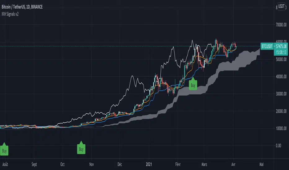
IKH Signals v2Hi,
I'm happy to release this new update after few weeks working.
Fixes
Fix kumo break-out of Chiku span and close price
Fix buy trigger and strong buy trigger
Improvement
Signals take now the kumo thickness and kumo angle
Signals does not trigger on doji candles
Multi time frame validation is now available
I hope this fixes and new features will improve the signals for you too.
Let me know if you find strange behavior or possible improvments.
cheesywedges MTF MACD+Stoch+Ichi+PSARThis is a heatmap created to show 4 key indicators MACD, Stochastic, Ichimoku and PSAR. Adjust TF accordingly. Default is incremental by 45 minutes.
One advantage is you can see as the indicator current candles change from green to red or the other way round as the current trend changes. Eg. MACD attempting to cross Signal and the candle will flicker red to green and you can see it happen on multiple TF.
Standard Settings
PSAR - Start, Increment and Max Value
Stochastic - K,D,Smooth, Upper and Lower
MACD - Fast, Slow and Smooth
Ichimoku - Conversion Line, Base Line Periods, Lagging Span and Displacement
Advanced Settings (MACD)
MACD/Signal Crossover , eg. Long = MACD > Signal
MACD/Signal + Histogram Crossover , eg. Long = MACD > Signal and Hist > 0 and Signal > 0
MACD/Signal Crossing, eg. Long = MACD > Signal and previous MACD < previous Signal
MACD/Signal + Histogram Crossing, eg. Long = MACD > Signal and previous MACD < previous Signal and Hist > 0 and Signal > 0 and previous Hist > previous Signal
For normal usage, just use MACD/Signal Crossover
Recommended Settings
Ichimoku 20, 60, 120, 30
If customized enhancement required drop a message and I'll see what I can do.

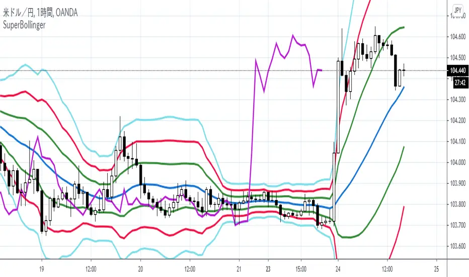
【Super Bollinger】The market consists of three phases: an uptrend phase, a downtrend phase, and a range-bound phase.Furthermore, if we include a trend phase and a correction phase, the market has five phases. In other words, the market is classified into the “five phases” as below:
1) Uptrend market (trend phase, upward bias)
2) Downtrend market (trend phase, downward bias)
3) Upward correction phase (correction phase, upward bias)
4) Downward correction phase (correction phase, downward bias)
5) Range-bound phase, sideways (correction phase, basically not biased)
For your judgment of the above market trends, Super Bollinger is extremely useful and effective. And Super Bollinger has advantage in judging market price level.
そもそも、相場は、5つの局面に分けることができます。
すなわち、
1)上昇トレンド局面(上昇バイアス)
2)下降トレンド局面(下降バイアス)
3)調整の反騰局面(上昇バイアス)
4)調整の反落局面(下降バイアス)
5)レンジ局面(バイアスなし)
そして、スーパーボリンジャー、これら5つの局面の判断を下す際にきわめて有効なツールです。また、とりわけ、価格分析に優れたチャートです。
With regard to Chikou Span,this span gives very useful information about (1) the direction of the market (being in an upward bias by buying pressure or in a downward bias by selling pressure) , (2) the timing of buying on the dip or selling on the rally, (3) the market’s temporal rhythm etc..
遅行スパンに関しては、基本的に、
(1)相場の方向性(買い優勢か売り優勢か)
(2)押し目買いや戻り売りのタイミング
(3)相場の時間的リズム
等々に関して実に有効な情報を与えてくれます。
【SpanModel】The Span Model is a very unique chart which shows us especially when to buy and when to sell. And the Span Model has advantage in judging the trade timing.
スパンモデルとは、いつ買うか、いつ売るかを教えてくれるとてもユニークなチャートです。とりわけ、トレードのタイミングを判断する上で優れています。
The Span Model is composed of only three lines (spans).
They are the Blue Span, the Red Span and the Chikou Span.
And a major characteristic of the Span Model is the signals (Span Model Signals) of the two types explained below:
1) Buy signal
The buy signal is lit when the Blue Span sits above, and the Red Span sits below.
2) Sell signal
The sell signal is lit when the Red Span sits above, and the Blue Span sits below.
スパンモデルには、構成要素(3つのスパン)として、青色スパン、赤色スパン、そして、遅行スパンがあります。
スパンモデルの大きな特長として、シグナル(スパンモデルシグナル)があります。そして、2種類のシグナルがあります。
1)買いシグナル
青色スパンが上方、赤色スパンが下方に位置するときに点灯します。
2)売りシグナル
赤色スパンが上方、青色スパンが下方に位置するときに点灯します。

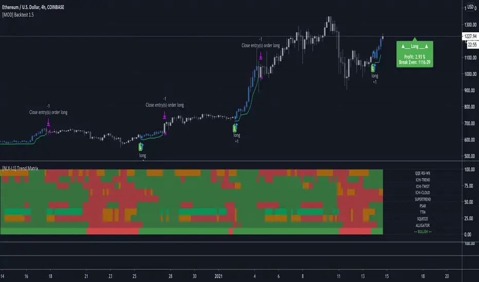
[NLX-L1] Trend Matrix (+Alerts)- Trend Matrix with Alerts -
This is pretty much the only Trend Indicator you will ever need. Alerts are included :)
It includes all the common indicators and creates a positive or negative score (which can be used with my Modular Trading Framework)
QQE-RSI-W%
ICHIMOKU-TREND
ICHIMOKU-TWIST
ICHIMOKU-CLOUD
SUPERTREND
PSAR
TTM
BB/ KELTNER SQUEEZE
ALLIGATOR
- Use with the Modular Trading Framework -
1. Add Trend Matrix to your chart. All the parameters are adjusted dynamically.
2. Add any L2 Indicator to your Chart and select Trend Matrix as a Signal Source, select L1 as Type
TB Momentum/Volume Indicator, MTFThis Indicator Merges The Best Parts Of The Macd, Vortex, Volume, Ichimoku Cloud, Bollinger Bands, Atr, And Rsi Indicators.
The Idea Is To Signal Important Sectors Of The Chart Were All Or Some Of These Indicators Are Giving The Same Signals.
This Indicator Consist Of 3 Parts The Signaling Indicator Which Goes On As A Layout On Top On The Price Action (Candles), An Indicator Called (TB Macd /Momentum Squeeze) That Shows The Actual Macd With A 0 Line Merging With The Momentum Squeeze. The Third Part Is The (TB Rsi Indicator) Which Signals Overbought And Oversold Areas. These 3 Indicators Are Given For Free But Are Only For Premium Members For The Trading Bullies Premium Service.
To Get Access Please Send A Private Message
After You Have Been Given Access You Can Find The Indicators On The Invite Only Scripts
Instructions:
After Applying To Your Chart You Should See On The Left Part Of Your Screen Where Your Indicator Labels Are “TD-Mom/Vol” Click On The Settings To Start The Setup
-The Macd Settings
- The First 5 Checkmarks Go Untouched
- The Settings Can Be Left Standard Or They Can Be Changed To 8-17-9 For Faster Signals. 8-17-9 Are My Settings
-Vortex Settings
- The Vortex Periods Can Be Set To 12 For Faster Signals Or To 14. 12 Is My Go-To Setting
-The Ichimoku Filter
- When This Is Activated It Decreases Significantly The Signals And Should Only Be Turn On If You Only Wish To Receive Signals When The Macd, Vortex, And Ichimoku Conversion Line And Baseline Crosses Around The Same Areas. I Generally Leave It Off
-Volume Filter
- When The Volume Filter Is Activated The Alerts Will Only Come Up If The Volume Is Above The 20 Ma. This Can Be Changed As Well But In General 20 Ma Is The Best For All Markets. I Leave This At 20 Ma The Macd 0 Line Filter
-Macd 0 Line Filter
- This Filter When Activated Will Only Give Signals When The Macd Crosses Up Below The 0 Line For Longs And Above The 0 Line For Shorts. I Generally Leave This Off
-Rsi Filter
- This Filter Will Create A Grey Signal When The Signal Is Given On Overbought Or Oversold Areas. Settings Should Be Left At 12 Or 14 And Then 70-30. I Leave This On
-The Cloud Squeeze
- The Cloud Squeeze Is A Visual Indicator That Marks The Trend Green Cloud Is Trend Up And Red Cloud Is Trend Down. The Wider The Cloud The More Resistance Its Got Below Or Above. Settings For This Should Be 10-40 Resolution Depending On The Timeframe You Are Working On
-The Momentum Squeeze
- Momentum Squeeze Will Signal A Triangle Above Or Below The Candles To Signal The Strength Of the Trend. This Is Very Helpful On Lower Timeframes 1m - 5m To Signal When The Trend Is Losing Steam. You Can Set The Bollinger Band Ratio On And Use The Henkin Ashi Optimization When Using Those Kinds Of Candles.
- Style******
- The Style Tab Is Very Personal But I Like The Below Settings
- First Shape Label Up Below Bar, First Color 9598a1 - Second Color 00e676
- Second Shape Label Down Above Bar First Color 9598a1 And Second Color Ff5252
- Short And Long Leading Ema Are Already Set
- Momentum Positive & Up With Triangle Up Above Bar Color 4caf50
- Momentum Positive & Down With Triangle Down Above Bar Color 1b5e20
- Momentum Negative & Up With Triangle Up Below Bar Color Ffeb3b
- Momentum Negative & Down Triangle Down Below Bar Color Ff5252
- Ma Cloud Left As-Is.
Functionality:
Labels
These Labels Are Best Used Un Longer Timeframes 1hr+++
-Cross+Up Green - Momentum And Volume Are High, Possibilities For A Long/Call In The Market
-Cross+Up Grey - Momentum And Volume Are High. Possibilities For A Long/Call In The Market But Signal Is Presented In Overbought Area Of The Rsi
-Cross-Down Red - Momentum And Volume Are High Possibilities For Short/Put In The Market
-Cross-Down Grey - Momentum And Volume Are High Possibilities For Short/Put In The Market But Signal Is Presented On Oversold Area Of The Rsi
Cloud
Very Important To Not******* Take Any Trades From The Above Labels When The Cloud Is Thin, This Indicator Measures Trending Markets And When There Is No Trend Or A Range Market The Signals Are To Be Disregarded*******
-When Cloud Is Green The Trend Is Upwards And You Should Look To Long/Call The Market. Try Not To Take Any Puts/Shorts As You Will Be Going Against The Trend
-When Cloud Is Red The Trend Is Down And You Should Look To Short/Put The Market. Try Not To Take Any Call/Longs As You Will Be Going Against The Trend
Momentum Triangles On Top Of The Candles
-There Are Made To Be Used In Lower Timeframes 1m -5m -15m
-These Are Good Once You Are In A Position And You Want To Get A Closer Look At The Trend.
-Green Arrow Up Signals High Momentum Up Buyers In Control
-Blue Arrow On Top Downwards Signals Uptrend Is Losing Steam
-Orange Arrow Below Upwards Signals Down Momentum Is Losing Steam
-Red Arrow Below Signals Momentum Is Down Sellers In Control