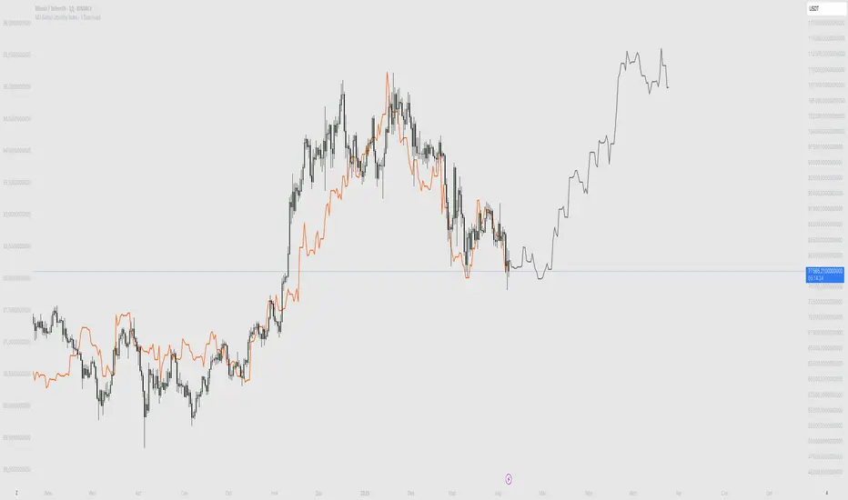
M2 Global Liquidity Index - X Days LeadThis custom indicator overlays the Bitcoin price chart with the Global Liquidity M2 chart, providing a unique perspective on how monetary supply might influence Bitcoin's price movements. The indicator distinguishes between past and future segments of the liquidity data using two distinct colors.
- Past Segment: The portion of the Global Liquidity M2 chart that has already passed is displayed in one color, allowing users to assess historical correlations with Bitcoin's price.
- Future Segment: The upcoming part of the liquidity chart is shown in a different color, offering insights into potential future impacts on Bitcoin's price trajectory.
by walkin
חפש סקריפטים עבור "liquidity"
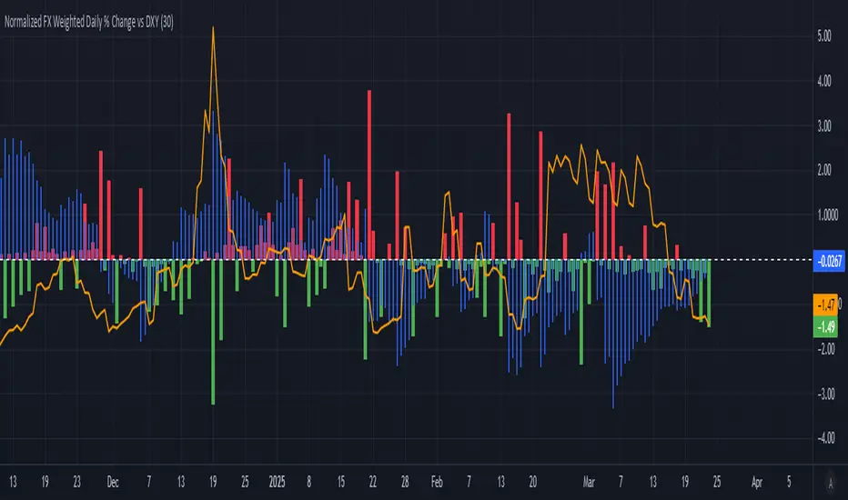
Normalized FX Weighted Daily % Change vs DXYThis indicator tracks international liquidity flows by measuring the USD’s relative strength against major currencies—EUR, CNY, JPY, GBP, and CAD. It calculates the weighted percentage change of each pair over a specified interval. A positive reading means the USD is weakening (liquidity flowing out of the US), while a negative reading indicates the USD is strengthening (liquidity flowing in). Additionally, the indicator incorporates the DXY index and VIX, with all components normalized using Z-scores for clear, comparable insights into market dynamics.
BTC-USDT Liquidity Trend [Ajit Pandit]his script helps traders visualize trend direction and identify liquidity zones where price might react due to past pivot levels. The color-coded candles and extended pivot lines make it easier to spot support/resistance levels and potential breakout points.
Key Features:
1. Trend Detection Using EMA
Uses two EMA calculations to determine the trend:
emaValue: Standard EMA based on length1
correction: Adjusted price movement relative to EMA
Trend: Another EMA of the corrected value
Determines bullish (signalUp) and bearish (signalDn) signals when Trend crosses emaValue.
2. Candlestick Coloring Based on Trend
Candlesticks are colored:
Uptrend → Blue (up color)
Downtrend → Pink (dn color)
Neutral → No color
3. Liquidity Zones (Pivot Highs & Lows)
Identifies pivot highs and lows using a customizable pivot length.
Draws liquidity lines:
High pivot lines (Blue, adjustable width)
Low pivot lines (Pink, adjustable width)
Extends lines indefinitely until price breaks above/below the level.
Removes broken pivot levels dynamically.

2:30 [LuciTech]this is a technical analysis tool designed to highlight key price levels and patterns during a specific trading window, based on UK time (Europe/London). It overlays visual elements on the chart, including a 12 PM reference line, Buy Side Liquidity (BSL) and Sell Side Liquidity (SSL) levels, a highlighted 2:30 PM candle, and Engulfing Fair Value Gaps (FVGs). This indicator is intended for traders who focus on intraday price action and liquidity zones.
Features
The 12 PM Line displays a vertical line at 12:00 PM (UK time) to mark the start of the session. It’s customizable, allowing you to enable or disable it and adjust its color.
BSL/SSL Lines track the highest high (BSL) and lowest low (SSL) from 12:00 PM to 2:00 PM (UK time). These lines extend horizontally until 3:30 PM, after which they remain static at their last recorded levels. You can customize them by enabling or disabling visibility, adjusting colors, choosing a line style (solid, dashed, or dotted), and setting the width.
The 2:30 PM Candle highlights the candle at 2:30 PM (UK time) with a distinct color. It’s customizable, with options to enable or disable it and change its color.
Engulfing FVG (Fair Value Gap) identifies bullish and bearish engulfing patterns with a gap from the prior candle’s range. It draws a shaded box over the FVG area, and you can customize it by enabling or disabling it and adjusting the box color.
How It Works
The indicator operates within a session starting at 12:00 PM (UK time). BSL/SSL levels update between 12:00 PM and 2:00 PM, with lines extending until 3:30 PM. After 3:30 PM, these lines freeze.
BSL/SSL lines show the highest price (BSL) and lowest price (SSL) reached during the 12:00 PM to 2:00 PM window. After 3:30 PM, they remain static, marking the final range boundaries.
The 2:30 PM candle emphasizes a key timestamp, often of interest to intraday traders.
Engulfing FVGs detect significant price gaps created by engulfing candles, which may indicate potential reversal or continuation zones.
Settings
12 PM Line Settings let you toggle visibility and set the line color.
BSL/SSL Line Settings allow you to toggle visibility, set BSL and SSL colors, choose a line style (Solid, Dashed, Dotted), and adjust width (1-4).
2:30 Candle Settings let you toggle visibility and set the candle color.
Engulfing FVG Settings allow you to toggle visibility and set the box color.
Interpretation
The 12 PM Line serves as a reference for the session start.
BSL/SSL Lines may act as potential support or resistance zones or highlight liquidity areas. After 3:30 PM, they remain static, showing the session’s final range.
The 2:30 PM Candle can be monitored for price action signals, such as reversals or breakouts.
Engulfing FVGs shaded areas may indicate imbalances in supply and demand, useful for identifying trade opportunities or stop-loss placement.
Notes
The timezone is set to Europe/London (UK time). Ensure your chart’s timezone aligns for accurate results.
This indicator is best used on intraday timeframes, such as 1-minute or 5-minute charts.
It provides visual aids for analysis and does not generate buy or sell signals on its own.

Advanced Liquidity Trap & Squeeze Detector [MazzaropiYoussef]DESCRIPTION:
The "Advanced Liquidity Trap & Squeeze Detector" is designed to identify potential liquidity traps, short and long squeezes, and market manipulation based on open interest, funding rates, and aggressive order flow.
KEY FEATURES:
- **Relative Open Interest Normalization**: Avoids scale discrepancies across different timeframes.
- **Liquidity Trap Detection**: Identifies potential bull and bear traps based on open interest and funding imbalances.
- **Squeeze Identification**: Highlights conditions where aggressive buyers or sellers are trapped before a reversal.
- **Volume Surge Confirmation**: Alerts when abnormal volume activity supports liquidity events.
- **Customizable Parameters**: Adjust thresholds to fine-tune detection sensitivity.
HOW IT WORKS:
- **Long Squeeze**: Triggered when relative open interest is high, funding is negative, and aggressive selling occurs.
- **Short Squeeze**: Triggered when relative open interest is high, funding is positive, and aggressive buying occurs.
- **Bull Trap**: Triggered when relative open interest is high, funding is positive, and price crosses above the trend line but fails.
- **Bear Trap**: Triggered when relative open interest is high, funding is negative, and price crosses below the trend line but fails.
USAGE:
- This indicator is useful for traders looking to anticipate reversals and avoid being caught in market manipulation events.
- Works best in combination with order book analysis and volume profile tools.
- Can be applied to crypto, forex, and other leveraged markets.
**/

BIAS PRO - Zones + Liquidity + SP&RS [AlgoRich]This multifunction indicator is used to identify key areas on the chart, liquidity levels, and support/resistance zones (SP&RS). Its design is aimed at highlighting price pivots (swings) by drawing zones (boxes and lines) based on these pivots, while also displaying information about trading sessions and levels of analysis across different timeframes.
1. Configuration and Input Parameters
Swing Parameters (Bars Right-Left):
Two inputs are defined to adjust the number of bars on the right and left used to detect pivots (swings). This allows the determination of high and low pivot points.
Display Options:
You can choose to show or hide boxes, lines, and labels (bubbles). There is also an option to extend the zones until they are “filled” (confirmed), and you can opt to hide those zones once filled.
Appearance:
Visual parameters are defined, such as the option to display high and low pivots, colors for lines, labels, and boxes (for both bullish and bearish conditions), line styles (solid, dotted, dashed), and other aesthetic details (box width, label size, text alignment).
Lookback and Time Range:
The “lookback” and “daysBack” variables determine whether the analysis is limited to data from a certain number of days, helping to filter out older historical information.
2. Calculation of Pivots (Swings) and Zone Detection
Price Pivots:
Using the pivot functions (ta.pivothigh and ta.pivotlow), the script identifies swing high and low points based on the configured swing size (bars left and right).
If a swing high is detected, its bar index is stored and the corresponding signal is activated.
Similarly, a swing low is detected and marked.
Drawing Zones:
When a swing (high or low) is detected and the time range condition is met (inRange), the script draws:
Boxes: These visually represent the area around the pivot level. The configuration (type and width) is adjustable.
Lines: A horizontal line is drawn from the pivot point to the current bar, using the defined style and color.
Boxes and lines are drawn for both high pivots (showhighs) and low pivots (showlows).
Additionally, these zones are updated and extended dynamically as new bars appear, and zones that are “filled” (when the price exceeds the zone level) are removed.
Labels and Markers:
If enabled, the script displays circle markers (using plotshape) at the swing points.
3. Operational Zone (Sessions)
Customizable Sessions:
The script allows defining up to three operational sessions with distinct time ranges and colors.
For example, Session 1, Session 2, and Session 3 have configurable time ranges and colors (with adjustable opacity).
It checks if the current time falls within any of these sessions and, if so, applies a background color (bgcolor) to the chart with the configured session color.
Timezone Adjustment:
You can configure a UTC offset or use the exchange’s timezone to correctly adjust the session times.
4. Additional Levels and Analysis Groups
Groups of Levels (Levels 1, 2, 3, and 4):
Several groups are defined that allow data requests from different timeframes (e.g., 60 minutes, 240 minutes, daily, or weekly) and configure their parameters (length, line style, color).
For each group, the script uses a function that requests non-repainting data and calculates pivot levels based on ta.pivothigh/ta.pivotlow.
These levels are drawn on the chart with lines and “shadow” lines to reinforce the visualization of key pivot points. Labels are added with a slight offset to indicate the pivot value in the corresponding timeframe.
5. Maintenance and Management of Drawn Elements
Dynamic Update and Deletion:
The script maintains arrays to store the drawn boxes and lines. As new elements are added and the array reaches a maximum size (e.g., 500 elements), the oldest elements are deleted to avoid overloading the chart.
Extension and Hiding Conditions:
Conditions are checked to extend or delete zones based on whether the price has “filled” the area (i.e., if the current price has surpassed the zone level). There is also an option to hide zones once they are filled.
6. Session (Operational Zone) and Levels for Multiple Timeframes
Session Settings:
In addition to the pivot zones, the indicator also defines operational sessions with adjustable time ranges and colors, shading the background of the chart during those sessions.
Additional Level Groups:
The indicator allows grouping of analysis levels by timeframe, which can be useful for multi-timeframe analysis. Parameters such as length, style, and color are configurable for each group.
Summary:
The "BIAS PRO - Zones + Liquidity + SP&RS " is an all-in-one indicator that combines the detection of price pivots (swings) with the visual representation of key zones on the chart. With options to customize appearance, manage operational sessions, and group levels across different timeframes, this script is designed to help traders identify areas of high liquidity, potential breakouts, or reversals, thus optimizing decision-making based on market structure.
This explanation covers the main functionalities and workflow of the script, making it easier to understand without needing to examine the code in detail.

ILD inverse liquidity Divergence StrategyDetermine Bias (Bullish):
H4 chart shows an uptrend with higher highs and higher lows.
Identify a swing high where resting liquidity (buy-side) is likely above.
Look for SMT Divergence (Lower Timeframes):
On M15, EUR/USD makes a higher high while GBP/USD fails to, signaling potential manipulation.
Spot an Inverse Fair Value Gap (IFVG):
Price has impulsively moved up, leaving a fair value gap below.
Wait for a Retracement (Entry):
Price retraces into the IFVG near a Fibonacci 61.8% retracement level.
Enter long here with a SL below the gap.
Set Risk-to-Reward:
SL = 10 pips below the entry.
TP = 20 pips above (1:2 R:R), targeting a resting liquidity zone above a recent swing high.
Monitor and Exit:
Price moves into the liquidity zone, hits TP, and completes the trade.

M2 Global Liquidity Index - Time-Shift - KHM2 Global Liquidity Index - Enhanced Time-Shift Indicator
Based on original work by @Mik3Christ3ns3n
Enhanced with advanced time-shift functionality and overlay capabilities.
Description:
This indicator tracks and visualizes the global M2 money supply from five major economies, allowing precise time-shift analysis for correlation studies. All values are converted to USD in real-time and aggregated to provide a comprehensive view of global liquidity conditions.
Key Features:
- Advanced time-shift capability (-1000 to +1000 days) with shape preservation
- Real-time currency conversion to USD
- Overlay functionality with main chart
- Right-scale display for better comparison
- Full historical data preservation during time shifts
Components Tracked:
- US M2 Money Supply (USM2)
- China M2 Money Supply (CNM2)
- Eurozone M2 Money Supply (EUM2)
- Japan M2 Money Supply (JPM2)
- UK M2 Money Supply (GBM2)
Primary Use Cases:
1. Correlation Analysis:
- Compare global liquidity trends with asset prices
- Identify leading/lagging relationships through time-shift
- Study monetary policy impacts across different time periods
2. Market Analysis:
- Track global liquidity conditions
- Monitor central bank policy effects
- Identify potential macro trend changes
Settings:
- Time Offset: Shift the M2 data backwards or forwards (-1000 to +1000 days)
- Positive values: Move M2 data into the future
- Negative values: Move M2 data into the past
- Zero: Current alignment
Technical Notes:
- Data updates follow central banks' M2 publication schedules
- All currency conversions performed in real-time
- Historical shape preservation during time-shifts
- Enhanced data consistency through lookahead mechanism
Credits:
Original concept and base code by @Mik3Christ3ns3n
Enhanced version includes advanced time-shift capabilities and shape preservation
License:
Pine Script™ code is subject to the terms of the Mozilla Public License 2.0
#M2 #GlobalLiquidity #MoneySupply #Macro #CentralBanks #MonetaryPolicy #TimeShift #Correlation #TradingIndicator #MacroAnalysis #LiquidityAnalysis #MarketIndicator

Immediate Rebalance ICT [TradingFinder] No Imbalances - MTF Gaps🔵 Introduction
The concept of "Immediate Rebalance" in technical analysis is a powerful and advanced strategy within the ICT (Inner Circle Trader) framework, widely used to identify key market levels.
Unlike the "Fair Value Gap," which leaves a price gap requiring a retracement for a fill, an Immediate Rebalance fills the gap immediately, representing an instant balance that strengthens the prevailing market trend. This structure allows traders to quickly spot critical price zones, capitalizing on strong trend continuations without the need for price retracement.
The "Immediate Rebalance ICT" indicator leverages this concept, providing traders with automated identification of critical supply and demand zones, order blocks, liquidity voids, and key buy-side and sell-side liquidity levels.
Through features like crucial liquidity points and immediate rebalancing areas, this tool enables traders to perform precise real-time market analysis and seize profitable opportunities.
🔵 How to Use
The Immediate Rebalance indicator assists traders in identifying reliable trading signals by detecting and analyzing Immediate Rebalance zones. By focusing on supply and demand areas, the indicator pinpoints optimal entry and exit positions.
Here’s how to use the indicator in both bearish (Supply Immediate Rebalance) and bullish (Demand Immediate Rebalance) structures :
🟣 Bullish Structure (Demand Immediate Rebalance)
In a bullish scenario, the indicator detects a Demand Immediate Rebalance formed by two consecutive bullish candles with overlapping wicks. This structure signifies an immediate demand zone, where price instantly balances within the zone, reducing the likelihood of a revisit and indicating potential upside momentum.
Zone Identification : Look for two consecutive bullish candles with overlapping wicks, forming a demand zone. This structure, due to its rapid balance, usually does not require a revisit and supports further upward movement.
Entry and Exit Levels : If price revisits this zone, percentage markers, particularly 50% and 75%, act as supportive levels, creating ideal entry points for long positions.
Example : In the second image, an example of a Demand Immediate Rebalance is shown, where overlapping bullish candle shadows indicate immediate balance, supporting the continuation of the bullish trend.
🟣 Bearish Structure (Supply Immediate Rebalance)
In a bearish setup, the indicator identifies a Supply Immediate Rebalance when two consecutive bearish candles with overlapping wicks appear. This formation signals an immediate supply zone, suggesting a high probability of trend continuation to the downside, with minimal expectation for price to retrace back to this area.
Zone Identificatio n: Look for two consecutive bearish candles with overlapping shadows. This structure forms a supply area where price is expected to continue its downtrend without revisiting the zone.
Entry and Exit Level s: Should price revisit this zone, percentage-based levels (e.g., 50% and 75%) serve as potential resistance points, optimizing entry for short positions, especially if the downtrend is expected to persist.
Example : The attached chart illustrates a Supply Immediate Rebalance, where overlapping candle shadows define this area, reassuring traders of a continued downward trend with a low likelihood of price returning to this zone.
🔵 Settings
ImmR Filter : This filter allows users to adjust the detection of Immediate Rebalance zones in four modes, from "Very Aggressive" to "Very Defensive," based on zone width. The chosen mode controls the sensitivity of Immediate Rebalance detection, allowing users to fine-tune the indicator to their trading style.
Multi Time Frame : Enabling this option allows users to set the indicator to a specific timeframe (1 minute, 5 minutes, 15 minutes, 30 minutes, 1 hour, 4 hours, daily, weekly, or monthly), broadening the perspective for identifying Immediate Rebalance zones across multiple timeframes.
🔵 Conclusion
The Immediate Rebalance indicator, based on rapid balancing zones within supply and demand areas, serves as a powerful tool for market analysis and improving trade decision-making.
By accurately identifying zones where price achieves instant balance without gaps, the indicator highlights areas likely to support strong trend continuations, exempt from common retracements.
The indicator’s use of percentage levels enables traders to pinpoint optimal entry and exit points more effectively, with levels like 50% and 75% acting as support within demand zones and resistance within supply zones. This empowers traders to ride strong trends without the worry of abrupt reversals.
Overall, the Immediate Rebalance is a reliable tool for both professional and beginner traders seeking precise methods to recognize supply and demand zones, capitalizing on consistent trends.
By choosing appropriate settings and focusing on the zones highlighted by this indicator, traders can enter trades with greater confidence and improve their risk management.

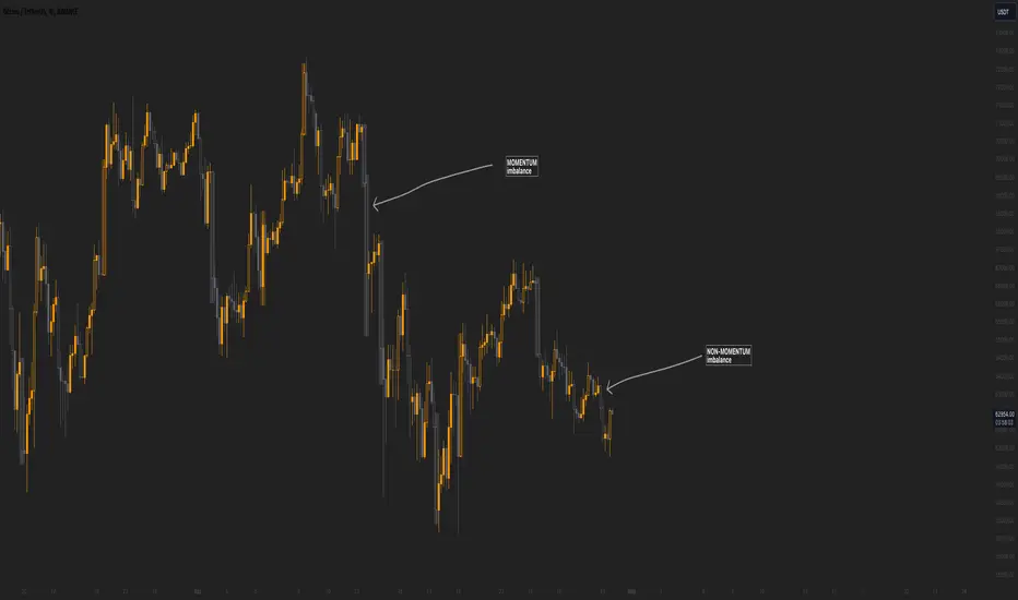
Momentum imbalance (internal liquidity) by CUWe have developed a sophisticated indicator to detect momentum, imbalance, and internal liquidity within financial markets. Designed to leverage real-time data analysis, this tool aims to assist traders in making more informed decisions.
The momentum component of the indicator calculates the rate at which prices move. By measuring price changes over a specific period, the indicator can show whether an asset is likely to continue rising or falling. This helps traders identify when a trend is gaining strength or beginning to wane.
Market imbalance is analyzed by observing the disparity in buy and sell orders. Our indicator identifies significant deviations between supply and demand, which can indicate potential turning points or accelerations in market movement. This aspect is crucial for understanding the underlying forces that influence price changes.
Regarding internal liquidity, our indicator measures the market depth and the availability of liquid assets. This component is essential for assessing how easily assets can be bought or sold without significantly impacting the price. High internal liquidity indicates a healthy market where transactions are executed quickly and efficiently, while low liquidity can lead to increased volatility and potential price manipulation.
By integrating these three components, our indicator provides a holistic view of market dynamics, enabling traders to operate more strategically and with greater confidence.
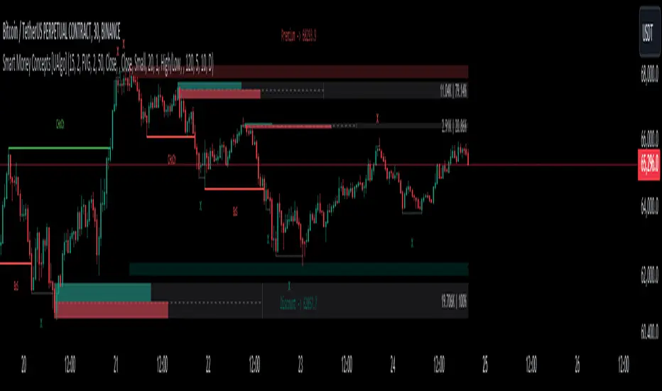
Smart Money Concepts [UAlgo]🔶 Description:
Smart Money Concepts (SMC) refer to a trading strategy that revolves around understanding and following the actions of institutional investors, such as banks and hedge funds, who are considered the “smart money” in the market. The concept is based on the idea that these institutions have more information and resources, and thus their market activities can indicate future market movements.
This script designed to be a tool that will automatically provide many features related to SMC concept for investors, offering a market structure analysis that includes the identification of order blocks, breaker blocks, and liquidity points. It also delineates premium and discount zones, highlights Fair Value Gaps (FVG), Volume Imbalance (VI) and Order Gap (OG) areas, providing users with a multifaceted view of market dynamics.
🔶 Key Features:
Market Structure Analysis : Simplifies the overview of market behavior, identifies market breakouts or trend continuation.
It detects the market structure as shown in the image below :
Order Blocks : Detects Order Blocks based on market structure analysis and volume characteristics. It draws these blocks and provides information such as volume.
Order Block Identification:
Breaker Blocks : Detects Breaker Blocks based on market structure analysis.
Breaker Block Identification:
When Order Block above is broken,
As you can see, it has now turned into a Bearish Breaker Block,
And it seems that the price is getting a reaction from this breaker block above.
Liquidity Sweeps : Tracks liquidity sweeps on both the buy and sell sides, offering traders a perspective on market momentum and potential shifts.
Multi-Timeframe Fair Value Gap (FVG), Volume Imbalance (VI), Order Gaps (OG) Detection : Detects Fair Value Gap (FVG), Volume Imbalance (VI) and Order Gaps (OG) based on different criteria such as price movements and volume characteristics. It marks these gaps/voids and provides visual cues for analysis.
Examle for FVG:
Premium & Discount Zone Analysis : Analyzes premium and discount zones, showing prices within these zones and highlighting equilibrium (0.5) levels.
Customizable Options : Provides various input parameters for customization, such as market structure length, sensitivity settings, display preferences, and mitigation methods.
Previous Key Levels : Identifies previous key levels include previous highs, lows, equilibrium points, and open prices across different timeframes such as daily, weekly, and monthly.
🔶 Disclaimer:
Use with Caution: This indicator is provided for educational and informational purposes only and should not be considered as financial advice. Users should exercise caution and perform their own analysis before making trading decisions based on the indicator's signals.
Not Financial Advice: The information provided by this indicator does not constitute financial advice, and the creator (UAlgo) shall not be held responsible for any trading losses incurred as a result of using this indicator.
Backtesting Recommended: Traders are encouraged to backtest the indicator thoroughly on historical data before using it in live trading to assess its performance and suitability for their trading strategies.
Risk Management: Trading involves inherent risks, and users should implement proper risk management strategies, including but not limited to stop-loss orders and position sizing, to mitigate potential losses.
No Guarantees: The accuracy and reliability of the indicator's signals cannot be guaranteed, as they are based on historical price data and past performance may not be indicative of future results.
Liquidation Estimates (Real-Time) [LuxAlgo]The Liquidation Estimates (Real-Time) experimental indicator attempts to highlight real-time long and short liquidations on all timeframes. Here with liquidations, we refer to the process of forcibly closing a trader's position in the market.
By analyzing liquidation data, traders can gauge market sentiment, identify potential support and resistance levels, identify potential trend reversals, and make informed decisions about entry and exit points.
🔶 USAGE
Liquidation refers to the process of forcibly closing a trader's position. It occurs when a trader's margin account can no longer support their open positions due to significant losses or a lack of sufficient margin to meet the maintenance requirements.
Liquidations can be categorized as either a long liquidation or a short liquidation. A long liquidation is a situation where long positions are being liquidated, while short liquidation is a situation where short positions are being liquidated.
The green bars indicate long liquidations – meaning the number of long positions liquidated in the market. Typically, long liquidations occur when there is a sudden drop in the asset price that is being traded. This is because traders who were bullish on the asset and had opened long positions on the same will now face losses since the market has moved against them.
Similarly, the red bars indicate short liquidations – meaning the number of short positions liquidated in the futures market. Short liquidations occur when there is a sudden spike in the price of the asset that is being traded. This is because traders who were bearish on the asset and had opened short positions will now face losses since the market has moved against them.
Liquidation patterns or clusters of liquidations could indicate potential trend reversals.
🔹 Dominance
Liquidation dominance (Difference) displays the difference between long and short liquidations, aiming to help identify the dominant side.
🔹 Total Liquidations
Total liquidations display the sum of long and short liquidations.
🔹 Cumulative Liquidations
Cumulative liquidations are essentially the cumulative sum of the difference between short and long liquidations aiming to confirm the trend and the strength of the trend.
🔶 DETAILS
It's important to note that liquidation data is not provided on the Trading View's platform or can not be fetched from anywhere else.
Yet we know that the liquidation data is closely tied in with trading volumes in the market and the movement in the underlying asset’s price. As a result, this script analyzes available data sources extracts the required information, and presents an educated estimate of the liquidation data.
The data presented does not reflect the actual individual quantitative value of the liquidation data, traders and analysts shall look to the changes over time and the correlation between liquidation data and price movements.
The script's output with the default option values has been visually checked/compared with the liquidation chart presented on coinglass.com.
🔶 SETTINGS
🔹Liquidations Input
Mode: defines the presentation of the liquidations chart. Details are given in the tooltip of the option.
Longs Reference Price: defines the base price in calculating long liquidations.
Shorts Reference Price: defines the base price in calculating short liquidations.
🔶 RELATED SCRIPTS
Liquidation-Levels
Liquidity-Sentiment-Profile
Buyside-Sellside-Liquidity
Opposite Side Liquidity Dominance NJROpposite Side Liquidity Dominance Indicator Explanation :
Imagine you're trading in the financial markets, and you want to understand who's in control - the buyers or the sellers. The "Opposite Side Liquidity Dominance" indicator is here to help you do just that in a simple and visual way.
1. **Lookback Period**: This indicator looks at historical data to make its assessments. You can choose how far back it should look by adjusting the "lookback period." For example, setting it to 50 means it'll consider the last 50 days.
2. **Opposite Side Volume**: It calculates the total trading volume on the side opposite to the current market price. This helps us understand how strong the trading activity is from traders who have a different view than the current market price.
3. **Dominance Calculation**: We determine the "Opposite Side Liquidity Dominance" by comparing the current trading volume to the historical average. If the current volume is larger than what's typical, it suggests dominance, and we color the background of the chart green. If it's smaller, we color it red to indicate a lack of dominance.
4. **Visual Representation**: In addition to the background color, we also provide a line on the chart. This line shows the Opposite Side Liquidity Dominance over time. When it goes up, it means that traders who disagree with the market are in control; when it goes down, it means the market price is dominating.
So, in a nutshell, this indicator helps you see at a glance whether the buyers or sellers who disagree with the current market price are taking control. When the background is green, it suggests they are, and when it's red, it suggests the market price is holding sway. The line on the chart provides a more detailed view of how this dominance changes over time.
You can easily customize this indicator to fit your specific trading needs by adjusting the lookback period and colors to match your preferences.
For better trading compare 30 minutes time frame in forex

Net USD Liquidity w/ overlays [tedtalksmacro]This script aggregates and analyses total USD market liquidity in trillions of dollars - albeit with lagged, weekly data (live data is not available in TradingView!)
There's a positive correlation with the total liquidity available in the world's largest economy and risk assets like BITSTAMP:BTCUSD
The formula for net liquidity is as follows and uses account balances at the Fed and of the Treasury's General Account:
Fed Balance Sheet ECONOMICS:USCBBS — Accepted Reverse Repo Bids FRED:RRPONTTLD — Treasury General Account Balance FRED:WTREGEN
This script shows positive prints when liquidity is above it's 7 day EMA and negative when below... don't use this on timeframes lower than the 1D chart!

USD Market Liquidity [tedtalksmacro]This script aggregates and analyses total USD market liquidity in trillions of dollars - albeit with lagged, weekly data (live data is not available in TradingView!)
There's a positive correlation with the total liquidity available in the world's largest economy and risk assets like BITSTAMP:BTCUSD
The formula for net liquidity is as follows and uses account balances at the Fed and of the Treasury's General Account:
Fed Balance Sheet ECONOMICS:USBBS — Accepted Reverse Repo Bids FRED:RRPONTTLD — Treasury General Account Balance FRED:WTREGEN
This script shows positive prints when liquidity is above it's 7 day EMA and negative when below... don't use this on timeframes lower than the 1D chart!
Volume CVD and Open Interest HeatmapTaking Volume and Open Interest data to the next level of visualization I created a 'heatmap'. The indicator uses a colour gradient and plots boxes from the source candle to the current candle with one of the following data sources:
- Volume - the total volume of transactions, buys and sells
- Up Volume - the total volume from buys only
- Down Volume - the total volume from sells only
- Up/Down Volume (Net) - the difference in the Buy Volume and Sell Volume
- Cumulative Delta - the sum of the up/down volume for the previous 14 bars
- Cumulative Delta EMA - a smoothed average of the sum of the up/down volume for the previous 14 bars, over a 14 period EMA
- Open Interest - a user defined ticker, whose value is added to the plot, while this is designed to be used with Open Interest tickers, you can actually choose any ticker you want, perhaps you want to see DXY while charting Bitcoin!
You can define the lookback period, though you should make sure your timeframe for volume source data, is high enough to accommodate the lookback. TradingView will only fetch 5000 candles worth of data, so at 1 min volume data, you can only lookback 83 hours.
While similar, Volume and Open Interest are not the same. To me the simplest explanation is Volume shows the trades that have been executed and the buy/sell direction, while Open Interest shows the value of open trades that are yet to be completed.
Volume shows strength, sentiment and volatility .
Open Interest does not show direction, but does indicate momentum and liquidity in the market.
With this novel way of visualizing these, you can also now determine where all that liquidity and positions came from and therefore might have resting liquidity below.

Newzage - Fed Net LiquidityThe Fed Net Liquidity indicator is a concept discovered by Max Anderson to calculate the fair value of SPX (S&P 500 Index).
The formula he shared on Twitter uses the Fed Balance Sheet, TGA (Treasury General Account), and Reverse Repo.
Net Liquidity = Fed Balance Sheet - (TGA + Reverse Repo)
The data for each component above is accessible on the FRED website.
Fed Balance Sheet fred.stlouisfed.org
Treasury General Account (TGA) fred.stlouisfed.org
Reverse Repo fred.stlouisfed.org
This script uses net liquidity (NL) fair value calculation for SPX, then estimates entry and next target exit target for both long and short trades on SPY.
The script added RSI oversold/overbought signal to the original NL signal from Max... improving the "precision" of the buy/sell signals.
The script also uses RSI to estimate targets based on how overbought or oversold the index/SPY is.

USD Liquidity Conditions IndexUSD Liquidity Conditions Index = — —
"Bitcoin vs. USD Liquidity Conditions Index
In this current phase of the crypto currency capital markets, Bitcoin represents a high-powered coincident (and sometimes leading indicator) of global USD liquidity conditions."
cryptohayes.medium.com

Institutional Trend & Liquidity Nexus [Pro]Concept & Methodology
The core philosophy of this script is "Confluence Filtering." It does not simply overlay indicators; it forces them to work together. A signal is only valid if it aligns with the macro trend and liquidity structure.
Key Components:
Trend Engine: Uses a combination of EMA (7/21) for fast entries and SMA (200) for macro trend direction. The script includes a logical filter that invalidates Buy signals below the SMA 200 to prevent counter-trend trading.
Liquidity Imbalance (FVG): Automatically detects Fair Value Gaps to identify areas where price is likely to react. Unlike standalone FVG scripts, this module is visually optimized to show support/resistance zones without obscuring price action.
Smart Confluence Zones (Originality):
The script calculates a background "State" based on multiple factors.
Bullish Zone (Green Background): Triggers ONLY when Price > SMA 200 AND RSI > 50 AND Price > Baseline EMA.
Bearish Zone (Red Background): Triggers ONLY when Price < SMA 200 AND RSI < 50 AND Price < Baseline EMA.
This visual aid helps traders stay out of choppy markets and only focus when momentum and trend are aligned.
█ How to Use
Entry: Wait for a "Triangle" signal (Buy/Sell).
Validation: Check the Background Color. Is it highlighting a Confluence Zone?
Example: A Buy Signal inside a Green Confluence Zone is a high-probability setup.
Example: A Buy Signal with no background color suggests weak momentum and should be taken with caution.
Targets: Use the plotted FVG boxes as potential take-profit targets or re-entry zones.

Imbalance Heatmap (Free) – pc75A clean, efficient visualisation of liquidity voids, 3-bar imbalances, and price inefficiency zones.
This indicator highlights where the market left gaps in the order flow — areas price often revisits to rebalance.
Imbalances are displayed as stacked horizontal “heatmap strips,” making it easy to see:
Where aggressive buying/selling left a void
Whether multiple voids overlap (stronger zones)
Whether price is likely to return to fill the imbalance
How old a void is (older zones are marked differently)
This is a refined v6 rewrite based on a script I liked, completely modernised with cleaner logic, better performance, and optional labels.
🔍 Features
3-bar liquidity void detection (ICT-style logic)
Bullish imbalance when price displaces upward with no wick overlap
Bearish imbalance for downward displacement
✔ Heatmap-style visualisation
Each imbalance is sliced into multiple thin horizontal bands to create a visual density effect.
✔ Stacking intelligence
If a new void overlaps previous ones, the heatmap is drawn brighter, showing areas where the market left multiple inefficiencies.
✔ “Void xN” labels
Optional labels show how many overlapping voids existed at the moment the imbalance formed.
✔ Automatic deletion when filled
As soon as price trades back through a slice, that slice is removed.
This keeps the chart clean and focuses only on active inefficiencies.
✔ Smart ageing
Older voids are marked with a subtle border so you can distinguish freshly formed inefficiencies from historical ones.
✔ Alerts
Set alerts for when price taps a stacked imbalance zone (“Void x2” and above).
⚙ Inputs & Customisation
ATR threshold (optional)
Minimum tick size gap
Number of heatmap slices
Bullish / bearish toggles
Label toggles
Colour and transparency configuration
Max slice memory for performance
💡 How to Use
Imbalance zones often behave as:
Magnets → price gravitates toward them
Support/resistance → structure respects inefficiencies
Continuity points → used with market structure shifts
Targets → for both scalpers and swing traders
Strong (stacked) voids typically represent areas of institutional displacement, where the market is more likely to return for rebalancing.
📢 Notes
This is the free version.
Educational only — not financial advice.

ICT Quant-Core: Liquidity Intelligence [Dual-Engine]🔥 THE ULTIMATE LIQUIDITY FILTERING ENGINE
Most SMC traders lose money because they "catch falling knives" on every local wick. This algorithm solves this problem by using DUAL-CORE logic and a signal quality scoring system.
This is no ordinary pivot indicator.
⚙️ HOW DOES IT WORK? (DUAL-CORE LOGIC)
The algorithm analyzes the market on two levels simultaneously:
1️⃣ MACRO CORE (Lookback 50 - "WHALE 🐋")
Tracks key levels from recent weeks/months.
This is where institutions build their positions.
Signals from this core have the highest priority (Score 10/10).
2️⃣ LOCAL CORE (Lookback 20 - "ROACH 🐟")
Tracks internal market structure and noise.
Signals are filtered by the Main Trend. If the trend is down, Local Longs are marked as "TRAP."
🧠 SMART FILTERS (QUANT LAYERS)
Instead of entering on every line touch, the script requires confirmation:
✅ RECLAIM LOGIC: Price must close back above/below the liquidity level (Swing Failure Pattern).
✅ RVOL FILTER: Requires relative volume > 1.2x the average (institutional track).
✅ SCORING SYSTEM (0-10): Each signal receives a score.
- 10/10: Macro Grab in line with the trend + high volume.
- 3/10: Local Grab against the trend (risky).
📊 ANALYTICAL DASHBOARD
In the lower right corner, you'll find the "Command Center":
- Trend Status (Distribution/Accumulation)
- Whale's Last Move (Price and Direction)
- Current Tactics (e.g., "Ignore Longs, Search for Shorts")
- Filter Status (RSI, Volume, Reclaim)
🚀 HOW TO USE IT?
1. Set the H4 timeframe.
2. Wait for a signal with a rating > 7/10.
3. Ignore "Fish/Local" signals (small icons) if they contradict the Dashboard color.
4. Entry occurs only after the candle closes (Reclaim).

Bayesian Liquidity Pain & Gain [Instit. Vol Weighted]Bayesian Liquidity Pain & Gain Indicator
Stop guessing where support and resistance are.
The Bayesian Liquidity Pain & Gain indicator moves beyond arbitrary lines and raw price action. It quantifies Institutional Intent by calculating the exact price levels where large volume has been accumulated and visualizes the "Pain" (stress) those participants feel when the market moves against them.
The Logic: Quantified Institutional Stress
Institutions don't trade single candles; they accumulate positions over time. This indicator tracks their Volume-Weighted Average Cost Basis to answer two critical questions:
Where did they enter? (The Cost Basis Lines)
Are they underwater? (The Pain Clouds)
By normalizing price distance using volatility (ATR) and statistical deviation (Z-Score), we filter out noise and only highlight zones where "Smart Money" is statistically forced to defend their positions or capitulate.
How to Read the Chart
1. The Cost Basis Lines (Anchors)
• 🟢 Green Line (Buyer Cost Basis): The average price where institutions accumulated long positions. This acts as dynamic Support.
• 🔴 Red Line (Seller Cost Basis): The average price where institutions accumulated short positions. This acts as dynamic Resistance.
2. The Pain Clouds (Signals)
When price moves significantly away from the cost basis (Z-Score > 2.0), "Clouds" appear to visualize the PnL status of the participants:
• 🔴 Red Cloud (Buyer Pain): Price is below the buyer's entry. Buyers are losing money (in the red). This creates a "Discount" zone where they may defend support.
• 🟢 Green Cloud (Seller Pain): Price is above the seller's entry. Sellers are losing money (shorts are squeezed). This indicates strong bullish momentum.
3. The Multi-Timeframe Dashboard
A real-time HUD showing the Z-Score status across 4 timeframes (1m, 5m, 15m, 1h):
• 🟢 Green: Profitable/Neutral (Trend Continuation)
• 🟠 Orange: Warning (Pressure Building)
• 🔴 Red: Critical Pain (High Probability Reversal)
Trading Strategies
Setup 1: The Defensive Bounce (Long)
• Context: Price drops into a 🔴 Red Cloud (Buyer Pain).
• Trigger: Price touches the 🟢 Green Line (Buyer Cost Basis) and shows a rejection wick.
• Logic: Institutional buyers defend their cost basis to avoid realizing losses.
Setup 2: The Short Squeeze (Momentum)
• Context: Price rallies into a 🟢 Green Cloud (Seller Pain).
• Trigger: Price holds above the 🔴 Red Line (Seller Cost Basis).
• Logic: Short sellers are trapped and forced to buy back (cover), fueling the rally.
Fractal Alignment:
For high-conviction trades, wait for the Dashboard to show "Pain" signals on both the 1h (Anchor) and 5m (Trigger) timeframes simultaneously.
Settings
• Memory Length (Default 144): The lookback period for the institutional cost basis. Increase for swing trading, decrease for scalping.
• Sigma Threshold (Default 2.0): The statistical confidence level for "Pain". Higher values = fewer, stronger signals.
• Volume Amp: When enabled, high volume amplifies the pain signal, giving more weight to institutional footprints.

Multi-Timeframe Liquidity ZonesXUAUSD 流动性清扫图 关闭自动调整参数,要求收盘回另一侧,重生流动性检测。高点回溯周期5
阈值0.03 数量50
XAUUSD Liquidity Sweep Chart: Disable automatic parameter adjustment, require closing on the opposite side, and regenerate liquidity detection. High point lookback period: 5. Threshold: 0.03. Quantity: 50.
