Buyside/Sellside Liquidity [Real-Time] (Expo)█ Overview
Buyside/Sellside Liquidity (Expo) is an indicator that identifies buy-side and sell-side liquidity in real time. Buy-side liquidity represents a level on the chart where short sellers will have their stops positioned. Sell-side liquidity represents a level on the chart where long-buyers will place their stops. These levels are found in areas where traders are "proven wrong" and, therefore, want to get out of their trades. Smart money will accumulate or distribute positions near these levels where many stops are placed and absorb all provided liquidity.
█ What is Buy-side and Sell-side liquidity?
Liquidity is the ability of a market to absorb large orders without significantly affecting the asset's price. Buy-side liquidity refers to the ability of buyers to buy large amounts of contracts without significantly affecting the price. Sell-side liquidity refers to the ability of sellers to sell large amounts of contracts without significantly affecting the price. This type of liquidity is important for large institutional investors, such as hedge funds and investment banks, who need to buy/sell large amounts of contracts without significantly affecting the price.
█ How to use
The price will always seek liquidity to either reverse or continue in the current move.
Reversals
Reversals are common around these levels since many traders are forced to close their positions, pushing the price in the other direction. Look for price actions that confirm a reversal around those levels.
Continuations
Liquidity is also a must for a trend to continue. If the price pushes through the liquidity levels and the current order flow structure is intact, traders should look for a continuation setup.
Inducement
Inducement is the act where smart money manipulates the price to access liquidity. Buy-side and Sell-side liquidity levels can be used to identify potential areas of inducement.
-----------------
Disclaimer
The information contained in my Scripts/Indicators/Ideas/Algos/Systems does not constitute financial advice or a solicitation to buy or sell any securities of any type. I will not accept liability for any loss or damage, including without limitation any loss of profit, which may arise directly or indirectly from the use of or reliance on such information.
All investments involve risk, and the past performance of a security, industry, sector, market, financial product, trading strategy, backtest, or individual's trading does not guarantee future results or returns. Investors are fully responsible for any investment decisions they make. Such decisions should be based solely on an evaluation of their financial circumstances, investment objectives, risk tolerance, and liquidity needs.
My Scripts/Indicators/Ideas/Algos/Systems are only for educational purposes!
חפש סקריפטים עבור "liquidity"

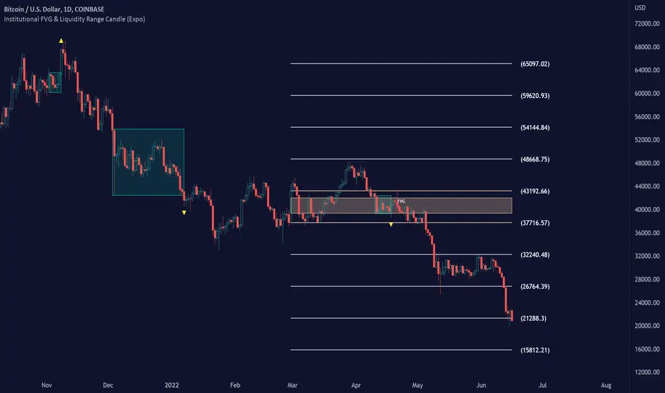
Institutional FVG & Liquidity Range Candle (Expo)█ Institutional FVG with predicted SR levels & Liquidity Range Candle is an indicator that uses Smart Money Concepts to give you the insights needed to make informed decisions based on the theory in SMC. This premium toolkit work in any market and timeframe.
█ Institutional Fair Value Gap , also known as imbalance, inefficiencies, and Liquidity void, identifies the most significant FVG within the lookback period. This is often referred to as Institutional Fair Value Gap since only big players can cause these liquidity voids.
Fair Value Gap, Liquidity voids are sudden price changes without enough liquidity at a stable price, and the price jumps from the originating price level to the final price level, creating an imbalance in price.
The price tends to fill or retest the FVG area, and traders understand at which price level institutional players have been active. FVG is a valuable concept in trading, as they provide insights about where many orders were injected, creating this inefficiency in the market. The price tends to restore the balance.
This indicator highlights the most significant Fair Value Gap on the chart and plots predicted future support and resistance levels based on the price action created at the FVG. A super simple and yet effective way to get solid market levels that acts as a magnet for the price.
█ Liquidity Range Candle is another trading concept used by large market players where they manipulate the price to stay inside a specific market area, creating a tight consolidation zone. Once the price breaks the liquidity range, liquidity flows into the market. It's an easy way to grab liquidity from retail traders. Stop losses are triggers, breakout traders jump into the market, and institutional traders absorb the liquidity.
If you don't see the liquidity, you become the liquidity!
A break of a liquidity range is a sign of a breakout, potential continuation, retracement, or reversal. Use it together with an overall market analysis. It's common that traders also mark the previous 1-3 liquidity ranges and plot them into the future. These zones can act as a future magnet for the price, and we can get a retest of the zones, or if we break above/below a previous range can be a sign of a trend change. We also know that these liquidity ranges have been important levels for institutional players, who may be willing to accumulate or distribute more orders at these levels.
█ HOW TO USE
Use the indicator to identify several important and commonly used trading concepts taught within the SMC.
Find Significant FVG
Find Significant liquidity ranges
-----------------
Disclaimer
Copyright by Zeiierman.
The information contained in my Scripts/Indicators/Ideas/Algos/Systems does not constitute financial advice or a solicitation to buy or sell any securities of any type. I will not accept liability for any loss or damage, including without limitation any loss of profit, which may arise directly or indirectly from the use of or reliance on such information.
All investments involve risk, and the past performance of a security, industry, sector, market, financial product, trading strategy, backtest, or individual’s trading does not guarantee future results or returns. Investors are fully responsible for any investment decisions they make. Such decisions should be based solely on an evaluation of their financial circumstances, investment objectives, risk tolerance, and liquidity needs.
My Scripts/Indicators/Ideas/Algos/Systems are only for educational purposes!
Dynamic Liquidity HeatMap Profile [BigBeluga]🔵 OVERVIEW
The Dynamic Liquidity HeatMap Profile is a smart-flow liquidity tracker that maps where stop-loss clusters and resting limit orders are likely positioned.
Instead of traditional volume profiles based only on executed transactions, this tool projects probable liquidity pools — areas where traders are trapped or positioned and where smart money may hunt stops or fill orders.
It dynamically scans recent price swings, builds liquidity zones above and below price, and visualizes them as a heat map + histogram — highlighting areas with the greatest liquidity attraction.
Orange highlights the highest-concentration liquidity (POC), making potential sweep targets obvious.
🔵 CONCEPTS
Liquidity pools form above swing highs (buy stops) and below swing lows (sell stops).
Market makers & large players often push price into these zones to trigger stops and capture liquidity.
The indicator uses recent volatility + volume expansion to estimate where these pools exist.
Horizontal heat bars show depth and intensity of probable liquidity.
Profile side histogram displays buy-side vs sell-side liquidity distribution.
🔵 FEATURES
Dynamic Liquidity Detection — finds potential stop-loss clusters from recent swing behavior.
Dual-Side Heatmap — split liquidity view above (short stops) and below (long stops) current price.
Volume-Weighted Levels — higher volatility & volume = deeper liquidity expectation.
Real-Time Heat Coloring
• Lime = liquidity below price (potential buy-side fuel)
• Blue = liquidity above price (potential sell-side fuel)
• Orange = peak liquidity (POC)
Liquidity Profile Histogram — plotted at right side, layered by strength.
Auto-Cleaning Engine — removes invalidated liquidity after breaks.
Adjustable lookback window and bin resolution .
🔵 HOW TO USE
Look for price moving toward dense liquidity zones — high probability of wick raids or sweeps.
Orange POC often acts as magnet — strong target zone for smart money.
Combine with SFP / BOS logic to time reversals after liquidity hunts.
In trend, price repeatedly sweeps opposite-side liquidity before continuation.
Use liquidity walls as bias filters — heavy liquidity above often precedes downward move, and vice-versa.
Great for scalping sessions, indices, FX, BTC, ETH.
🔵 CONCLUSION
The Dynamic Liquidity HeatMap Profile gives traders a tactical edge by revealing where the market’s hidden liquidity resides.
It highlights where shorts and longs are positioned, identifies likely sweep zones, and marks the most attractive liquidity magnet (POC).
Use it to anticipate stop hunts, avoid getting trapped, and align with smart-money flow instead of fighting it.

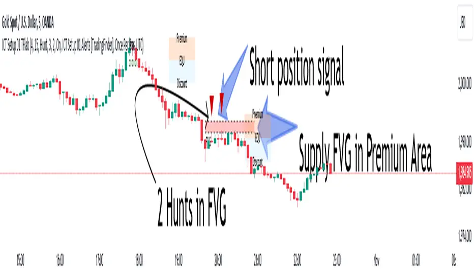
ICT Setup 01 [TradingFinder] FVG + Liquidity Sweeps/Hunt Alerts🔵 Introduction
The ICT (Inner Circle Trader) style of trading involves analyzing the behavior of market participants and market makers to identify areas where fake buy and sell activities occur. This trading style helps retail traders align with market maker behavior and avoid falling into market traps.
A key aspect of the ICT strategy is focusing on liquidity hunts. This involves searching for trading opportunities in areas of the market with low liquidity or where other traders have little activity. The ICT method leverages market inefficiencies and weaknesses, allowing traders to profit from small price movements that might go unnoticed by others.
In "ICT Setup 01," our focus is on these liquidity areas and stop hunts that form in Fair Value Gaps (FVGs). Trading within FVGs, combined with confirmations from "Hunts" and "Sweeps," can enhance trader performance.
🔵 How to Use
The presence of Fair Value Gaps (FVGs) in the market indicates rapid, powerful movements likely caused by the influx of smart money. When the price returns to these levels, a market reaction is expected.
Combining this with the complex and deceptive behavior of smart money—such as "Liquidity Sweeps" and "Stop Hunts"—forms an ICT-based price action setup that we expect to perform well.
Components of "ICT Setup 01" :
● Fair Value Gap (FVG)
● Premium and Discount
● Hunts / Sweeps
Whenever the price returns to an FVG area and reacts in such a way that only the wicks of the candles remain in the area and the candle bodies are outside the FVG, the first condition for creating the setup is met.
If subsequent candles hunt the wick that has penetrated the deepest into the FVG, a buy or sell signal is issued. In the format where hunting is based on Sweeps, penetrations that extend even outside the area are considered signals, provided they do not form a body within the area.
Additionally, a refining system exists for cases where a candle body forms in the area, optimizing the proximal levels of the FVG.
Bullish Setup :
Bearish Setup :
🔵 Features and Settings of "ICT Setup 01"
You can Find out more in Setting :
● FVG Detector Multiplier Factor
● FVG Validity Period
● Level in Low-Risk Zone
● Issuing Signals Method
● Number of Signals Allowed from a Zone
● Signal after Hunts/Sweeps
● How Many Hunts/Sweeps
● Show or Hide
● Alert Sender
FVG Detector Multiplier Factor :
This feature allows you to determine the size of the moves forming the FVGs based on the ATR (Average True Range). The default value is 1 to identify the majority of setups. You can increase this value according to the symbol and market you are trading in to achieve better results.
FVG Validity Period :
This shows the validity period of an FVG based on the number of candles. By default, an FVG area is valid for up to 15 candles. However, you can increase or decrease this period.
Level in Low-Risk Zone :
This feature helps reduce your risk. The method works by identifying the entire length of the three candles forming the FVG and dividing it into two equal areas. The upper area is "Premium," and the lower area is "Discount." To reduce risk, it is better for "Demand FVG" to be in the "Discount" and "Supply FVG" in the "Premium." This feature is off by default.
Issuing Signals Method :
This feature allows you to specify whether the hunt should occur only within the FVG area or if the wicks can extend outside the area.
If set to "Hunts," only signals where the wicks are within the area are issued, and the area loses its validity if the wicks extend outside.
In "Sweeps" mode, wicks can extend outside the area as long as they do not form a body within the area.
Number of Signals Allowed from a Zone :
This feature allows you to specify how many valid signals can be issued from one area.
Signal after Hunts/Sweeps :
In markets or symbols with a tendency for frequent stop hunts, this feature allows you to specify how many hunts should occur before you receive a signal to avoid receiving potentially failed signals.
How Many Hunts/Sweeps :
Enter the number of hunts you want to set for the "Signal after Hunts/Sweeps" feature here.
Show or Hide :
The number of setups formed may be very large, and displaying all of them on the chart can be distracting and messy. By default, only the last setup is displayed, but if you want to see all setups, you can turn on the relevant options.
Alert Sender :
You cannot constantly monitor multiple charts to identify trading opportunities. Using the alert sending feature can save time and improve performance.
Alerts Name : Customize the alert name to your preference.
Message Frequency : Determines the frequency of alert messages. Options include 'All' (triggers every time the function is called), 'Once Per Bar' (triggers only on the first call within the bar), and 'Once Per Bar Close' (triggers only on the final script execution of the real-time bar upon closure). The default is 'Once per Bar.'
Show Alert Time by Time Zone : Configure the alert messages to reflect any chosen time zone. For instance, input 'UTC+1' for London time. The default is 'UTC.'
By configuring these settings, traders can effectively utilize ICT setups to improve their trading strategies and outcomes.
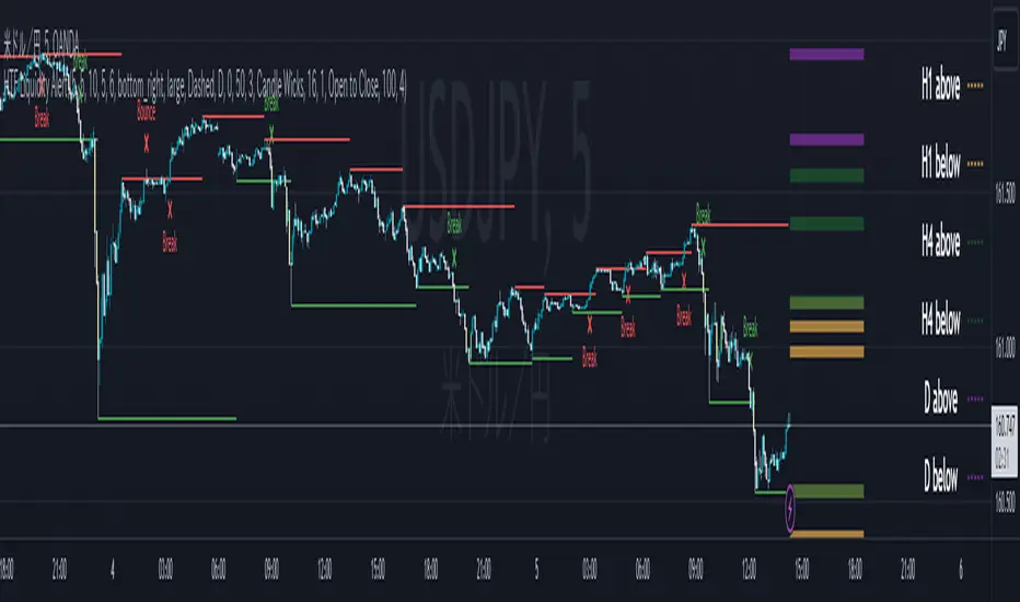
ICT HTF Liquidity Levels /w Alert [MsF]Japanese below / 日本語説明は英文の後にあります。
-------------------------
*This indicator is based on sbtnc's "HTF Liquidity Levels". It's a very cool indicator. thank you.
It has 3 functions: visualization of HTF liquidity (with alert), candle color change when displacement occurs, and MSB (market structure break) line display.
=== Function description ===
1. HTF liquidity (with alert)
Lines visualize the liquidity pools on the HTF bars. Alerts can be set for each TF's line.
Once the price reaches the line, the line is repaint.
To put it plainly, the old line disappears and a new line appears. The line that disappeared remains as a purged line. (It is also possible to hide the purged line with a parameter)
The alert will be triggered at the moment the line disappears. An alert will be issued when you touch the HTF's liquid pools where the loss is accumulated, so you can notice the stop hunting with the alert.
This alert is an original feature of this indicator.
The timeframe of the HTF can't modify. You can get Monthly, weekly, daily and H1 and H4.
Each timeframe displays the 3 most recent lines. By narrowing it down to 3, it is devised to make it easier to see visually. (This indicator original)
2. Displacement
Change the color display of the candlesticks when a bullish candle stick or bearish candle stick is attached. Furthermore, by enabling the "Require FVG" option, you can easily discover the FVG (Fair Value Gap). It is a very useful function for ICT trading.
3. MSB (market structure break)
Displays High/Low lines for the period specified by the parameter. It is useful for discovering BoS & CHoCH/MSS, which are important in ICT trading.
=== Parameter description ===
- HTF LIQUIDITY
- Daily … Daily line display settings (color, line width)
- Weekly … Weekly line display settings (color, line width)
- Monthly … Monthly line display settings (color, line width)
- INTRADAY LIQUIDITY
- 1H … 1H line display settings (color, line width)
- 4H … 4H line display settings (color, line width)
- PURGED LIQUIDITY … Display setting of the line once the candle reaches
- Show Purge Daily … Daily purged line display/non-display setting
- Show Purge Weekly … Weekly purged line display/non-display setting
- Show Purge Monthly … Monthly purged line display/non-display setting
- Show Purge 1H … 1H purged line display/non-display setting
- Show Purge 4H … 4H purged line display/non-display setting
- MARKET STRUCTURE BREAK - MBS
- Loopback … Period for searching High/Low
- DISPLACEMENT FOR FVG
- Require FVG … Draw only when FVG occurs
- Displacement Type … Displacement from open to close? or from high to low?
- Displacement Length … Period over which to calculate the standard deviation
- Displacement Strength … The larger the number, the stronger the displacement detected
-------------------------
このインジケータはsbtncさんの"HTF Liquidity Levels"をベースに作成しています。
上位足流動性の可視化(アラート付き)、変位発生時のローソク色変更、MSB(market structure break)ライン表示の3つの機能を有します。
<機能説明>
■上位足流動性の可視化
上位足の流動性の吹き溜まり(ストップが溜まっているところ)をラインで可視化します。ラインにはアラートを設定することが可能です。
一度価格がラインに到達するとそのラインは再描画されます。
平たく言うと、今までのラインが消えて新しいラインが出現する。という事です。
消えたラインはpurgeラインとして残ります。(パラメータでpurgeラインを非表示にすることも可能です)
アラートはラインが消える瞬間に発報します。上位足の損切り溜まってるところにタッチするとアラートを発報するので、アラートにてストップ狩りに気づくことができます。
このアラート発報については本インジケータオリジナルの機能となります。
表示可能な上位足のタイムフレームは固定です。月足、週足、日足およびH1とH4を表示することができます。
各タイムフレーム、直近から3つのラインを表示します。3つに絞ることで視覚的に見やすく工夫しています。(本インジケータオリジナル)
■変位発生時のローソク色変更
大きな陽線、陰線を付けた場合に、そのローソク足をカラー表示を変更します。
さらに"Require FVG"オプションを有効にすることで、FVG(Fair Value Gap)を容易に発見することができます。ICTトレードにを行うにあたり大変有用な機能となっています。
■MSB(market structure break)ライン表示
パラメータで指定した期間のHigh/Lowをライン表示します。ICTトレードで重要視しているBoS & CHoCH/MSSの発見に役立ちます。
<パラメータ説明>
- HTF LIQUIDITY
- Daily … 日足ライン表示設定(色、線幅)
- Weekly … 週足ライン表示設定(色、線幅)
- Monthly … 月足ライン表示設定(色、線幅)
- INTRADAY LIQUIDITY
- 1H … 1時間足ライン表示設定(色、線幅)
- 4H … 4時間足ライン表示設定(色、線幅)
- PURGED LIQUIDITY … 一度到達したラインの表示設定
- Show Purge Daily … 日足ライン表示/非表示設定
- Show Purge Weekly … 週足ライン表示/非表示設定
- Show Purge Monthly … 月足ライン表示/非表示設定
- Show Purge 1H … 1時間足ライン表示/非表示設定
- Show Purge 4H … 4時間足ライン表示/非表示設定
- MARKET STRUCTURE BREAK - MBS
- Loopback … High/Lowを探索する期間
- DISPLACEMENT FOR FVG
- Require FVG … FVG発生時のみ描画する
- Displacement Type … openからcloseまでの変位か?highからlowまでの変位か?
- Displacement Length … 標準偏差を計算する期間
- Displacement Strength … 変位の強さ(数字が大きいほど強い変位を検出)
ICT Daily Levels & Liquidity Zones [HatefBW]ICT Daily Levels & Liquidity Zones
This indicator automatically detects and plots the daily high and low levels for the current day and the two previous days.
Each level dynamically tracks the exact candle that created it, allowing traders to identify where short-term liquidity pools form across multiple timeframes.
What makes this tool unique:
• Three-day structure: Displays current, previous, and 2-day-old highs/lows for contextual price action.
• Dynamic mapping: On lower timeframes, each level aligns precisely with the candle that created the daily high or low.
• Full customization: Traders can toggle each day’s levels, colors, label size, and extension behavior independently.
• Adaptive logic: Lines automatically extend or stay fixed depending on the chosen setting, avoiding chart clutter.
This tool helps ICT traders and smart money practitioners visualize daily liquidity zones — potential areas of stop hunts or institutional targeting.
The script is originally coded by @HatefBW from scratch, with no reused or modified open-source code

Market Structure (Range) & Internal Liquidity
This indicator will simplify the price-action reading of any trader/investor by decluttering his/her charts from un-important & confusing candles to highlight the true momentum candles which are usually formed by institutional buying/selling .
The indicator will be a good tool in the arsenal of the following styles of Trading/Investing
Smart Money / Liquidity Concepts
Price Action Concepts
Demand & Supply Concepts
Support & Resistance Concepts
UNIQUE FEATURES:
1. Market Structure - Range & Internal Liquidity:
Unlike other liquidity indicators, this indicator only highlights liquidity levels of significant importance. Not every intermediate high & low in a chart are worthy of noticing, hence by enabling the 'Swings' & 'Range (BoS)' feature in the indicator settings, the structure highs and lows (external liquidity) in a chart can be identified.
Any other liquidity levels within a market range (Range between structural High & Low) is known as internal liquidity which price targets to collect enough orders before heading towards the external liquidity levels.
2. Gaps (Fair Value Gaps / Imbalance):
Not every imbalance / gap between candles are important & trade-worthy. This feature of the indicator is different from the other widely available imbalance indicators & only highlights gaps formed by true momentum candles. Gaps between unimportant inside bars are not highlighted, as these bars occur in the absence of momentum.
3. True Price Action:
Looking at the two charts below, we can clearly observe the difference between price action of a confusing normal chart & the simplified price action highlighted by the indicator. This feature declutters the charts by only highlighting the candles a trader / investor should notice in a chart.
This feature when used in confluence with the liquidity levels feature & gap feature of the indicator, helps identify the true demand & supply zones (order blocks) in a chart.
Before
After
4. Zig Zag Lines:
This unique feature which is useful to Identify & Backtest different entry types taught by Smart Money Traders . This feature helps the trader understand the True Fractal Nature of price. This can also be seen as an alternate to the default line chart feature.
Examples of Entry Types taken by Smart Money Traders
ADDITIONAL FEATURES:
(These features are essential addons to trade liquidity. However, these are derived from publicly available indicators from the Tradingview library, but with a different interpretation for a better visualization of charts & or to time better trade entries without cluttering the charts)
a. Inside Bar & Outside Bars:
Identify not just a single Inside Bar as highlighted by other indicators, but to highlight a series of candles which are within a master candle range and are exhibiting unimportant sideways price action.
Outside Bars only relevant to momentum candles are highlighted, ignoring candles that occur within a master candle range. Highs & Lows of such Outside Bars are used by aggressive traders to identify liquidity levels in the charts.
b. Highs & Lows of previous Monthly / Weekly / Daily & Hourly Candles:
This feature draws Highs & Lows of previous Monthly / Weekly / Daily & Hourly Candles on the extreme right hand side of the chart to keep the charts clean.
Additionally for Hourly time frame, the indicator includes a setting to select the hourly candle time frame (60 min / 75 min / 240 min), which are personal and different for each trader.
UNDERLYING CONCEPT:
In the image below we see how a large majority of Traders / Investors incorrectly mark Structure markings, mistaking a raid of internal liquidity as a Break of Structure, thereby taking trades opposite to the broader trend of the markets
However, this indicator has a higher accuracy of identifying the correct price structure by only marking a structure high or low, when a subsequently opposite side liquidity is taken/raided. Further the broader trend of the markets can be easily identified by looking as to which side the Break of Structure has happened. (This is visible in the indicator in the form of 'Range' feature, so if a Range High is broken then it is understood to be in an uptrend & vice versa)
The underlying core functionality of the indicator is best displayed by the image below
USECASE OF THE INDICATOR:
Before taking any Buying/Selling position in the markets, a Trader / Investor must analyze the price action on the following parameters
HTF & LTF Trend Identification (To judge if trade is Pro-Trend or Counter-Trend)
Is Price at a High Probability Area of Interest?
Is Price satisfying the trade entry conditions?
Let us see how this indicator can be used as a complete trading system in itself and addresses each of the above parameters
Disclaimer: Illustrations shown below are just for understanding the features of the indicator & does not guarantee profitability. Every trader must back test their setups to arrive at a setup with an edge (positive expectancy) before they start actively trading the setup.
1. HTF & LTF Trend Identification (Pro-Trend / Counter-Trend) using 'Range (BoS)' feature of the indicator
Let's assume a Day Trader, uses hourly chart (75 min) to frame his Higher Time Frame (HTF) ideas & 15min charts (LTF) for trade entries
Looking at the chart below the Trader concludes that the HTF has most recently broken the structure to the downside and is considered Bearish till price action is below the range high of 48600 levels. It can also be concluded that the price is currently in a Bullish retracement.
The Trader can choose to take both Pro-Trend or Counter-Trend Trades, timing the trade entries using the LTF charts.
Looking at the LTF chart below, it is evident that price on LTF has also broken structure to the downside and is now aligned with the HTF Bearish Trend. The Trader will now look to get into short trades, to take trades both in line with HTF & LTF trend.
2. Let's identify if Price is at a High Probability Area of Interest, using either single or combination of the 'Swings' / 'Gaps' / 'Outside Bars' / 'HL of previous M,W,D, H candles' features of the indicator
Definition of High Probability Level / Area differs from each Traders perspective depending upon which of the Trading Styles (mentioned in the beginning) does one use.
Smart Money Traders
SMC Traders are known to get into trades early and their high R:R trades are taken mostly at a High Probability Area of Interest which are identified by them on HTF, by looking for candles with imbalance (gaps) & or candles which have taken out a previous liquidity and then having creating imbalance (gaps).
Also Turtle Soups is one of the favorite setups for SMC traders, where a trader enters a trade on LTF (typically 1 min/3min & 5min) after grabbing HTF liquidity lying at H/L of outside bar / previous monthly, weekly, daily or hourly candles.
Demand & Supply Traders
Some of the Best Demand & Supply Traders have the patience to wait for trades and take trades at the extreme Demand & Supply Zones within a market Range.
As illustrated below, the extreme hourly supply zone just below the structure high, which has the confluence of imbalance and Bearish HTF confirmation resulted in a good R:R trade.
Price Action Traders & Support & Resistance Traders
From the illustration below we can see how the 15 min Range breakdown confirms the breakdown of the Inverted Cup Pattern for Price Action Traders & Support & Resistance Traders using the same area of breakdown as the new Resistance to enter Short trades
3. Let's identify if Price is satisfying the Trade Entry Conditions using the 'Zig-Zag Lines' feature
Statistics say that majority (> 80%) of Traders blow up their accounts multiple times or completely give up and never achieve profitability.
One of the primary reasons for this is Traders punching trades randomly and without having proper Setup or rules for entering Trades.
Also in order to arrive at rules or execute the different entry models (couple of examples highlighted earlier) taught by different Trainers, a Trader needs to learn to visualize charts in a similar format to what the trainers are teaching.
The Zig-Zag lines feature is a form of line chart that joins the swing high points to the swing low points on the chart to represent the True Price action & a proper fractal nature of the markets, unlike the line chart which is formed by only by joining the closing value of each candle.
From the image below we can see that the Zig-Zag lines feature eliminates the randomness visible in the line chart and is a more smoother chart. Using this feature one can back test the various entry models widely available on the internet or arrive at a user specific model which he/she is comfortable with.
CONCLUSION:
Trading with a deeper understanding of Price Action allows a Trader/Investor to enter or exit trades with ease. Price Action trading allows individuals to keep their charts clean and stay away from the other lagging technical indicators and enter trades much earlier than other technical indicators.
This indicator attempts in simplifying the understanding of price action for every one and identify potential high probability areas / levels where one should enter / exit trades.
This indicator will be an important tool in the arsenal of any Trader / Investor to take better informed trades, however it does not guarantee profitability of a Trader, due to the randomness of the markets & external factors that influence each trader.
GET ACCESS:
Refer Author's instructions below to get access to the indicator

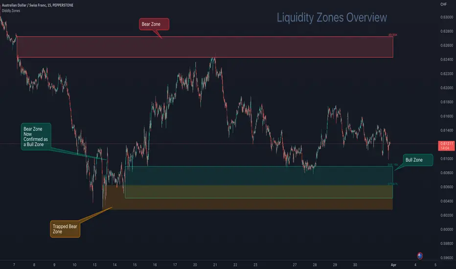
Diddly - Liquidity ZonesDiddly Liquidity Zones is an indicator to highlight where the liquidity exists in a market place.
What is Liquidity
Liquidity refers to the ability of an asset to be turned into cash. Cash is the more liquid form of any asset, whereas selling a house would take a little longer to liquidate and convert to cash.
Liquidity in financial markets is in essence based on the same principle and refers to how easily an asset can be bought and sold.
Liquidity in simple terms is the volume of participants who are willing to be involved in the market at any given time. Markets are based on auction theory, the more participants who want to buy at a certain price than sell, will dictate that the price goes up. As a result it is important to understand the role that volume has in financial markets, as volume will directly correlate to liquidity and supply and demand.
What does it mean?
Areas of abnormal liquidity and volume can lead to a price range where there is high supply and demand, which in turn can become a zone that forms a support and resistance level in the future. As we all know what happens in the past does not mean it will happen in the future, but what liquidity zones will tell us is that in the past a higher number of people were interested in doing business at those prices, which is critical information when making trading decisions.
Although markets are based on auction theory, sadly we don't have the advantage of a traditional auction, where we are all sitting in a room putting our hands in the air when we are interested in paying x price for a particular item. In this environment it is very clear to see how popular the item for sale is and whether it is possible to pick up a bargain.
Being able to identify liquidity areas on a chart, provides an insight into market sentiment at a given price range. Also we have to consider that typically most retail traders participate in very liquid markets, where you can get in and out of a position with relative ease.
There are obviously exceptions, extremely low float stocks, but on the whole with liquid assets it takes some big orders to move price, especially with currencies and high float stocks. Understanding these principles helps us as retail traders identify where the big money is seeing a bargain, if buying or overpriced if selling.
However you identify liquidity, I hope you agree that it is an extremely important element to be considering before taking a trade. The last thing any trader wants to be doing if they can help it, is selling where the market perceives price to be a bargain and buying when overpriced.
Just as a side note, high and low "Float Stocks" refers to the number of shares in general circulation for buying and selling.
What is Diddly Liquidity Zones
This liquidity zones indicator in simple terms will plot zones on the chart and make an assessment of whether this is predominately buying or selling liquidity. Price will frequently come back to test areas of liquidity before making any further continuation in a specific direction. This is why liquidity zones are often described as areas of support and resistance.
How does it Work
To identify these zones the indicator is looking at a number of pieces of information predominantly based on volume.
Volume
Rate of Change
Relative Strength
From these calculations the algorithm is then looking for the standard deviation away from the normal, to identify exceptions that then become the liquidity zones. These can be classified up to 4 levels, the first being the weakest exception to four being the strongest. By default 3 levels are displayed.
What is the Indicator Showing me?
The Liquidity Zones indicator comprises two basic elements: Bull Zones and Bear Zones.
Zones that are not broken in the past are projected forward and can act as strong support and resistance levels that can also be used for targets or ignoring a trade due to lack of room above or below.
Here on AUDCHF 15 minute chart, during March 2023, it provides an example of the three indicator zone types. Details have been annotated on the chart.
The third type of zone is a “Trap Zone” which can be extremely powerful for identifying potential reversals. A Trap Zone can be either Trapped Buyers or Trapper Sellers. In essence it is a Zone that is identified, but price can never trade above or below in the direction of the zone.
As an example if a bear zone is identified and price fails to trade below the lower edge and bounces immediately out of the top. The trap is set and the indicator changes the zone from the default green (bull) or red (bear) zone to a different colour, which is orange by default.
As price moves higher away from the zone, those in their short positions start to feel the pain. The higher the move away before a retracement the higher the pain. When the retracement finally comes and price returns to the zone, you will often see price bounce off the zone for the move back to retest the highs, following the same principles of support and resistance.
In this example above a resistance level is broken, which has been identified by a volume exception identified by the indicator, when price returns to that area it now becomes support as those traders in short positions look to cover at breakeven.
Here on EURUSD 15 minute chart, during the last week in March 2023, it provides a great example of a "trap zone" setup. Details have been annotated on the chart.
Usage
This indicator will compliment any existing strategy or could be traded as part of a support and resistance trading strategy. One of the great advantages of support and resistance is that levels and zones are identified ahead of time, so trades can be planned and considered well in advance.
There is also the advantage of where to stop out, once a support or resistance level is broken then we no longer want to be in that trade. We have to accept the facts that the market sentiment has changed and no longer sees price here as good value for bull zones or overpriced at bear zones.
You will sometimes see spikes of price through a zone, where the market has grabbed the liquidity in the form of stops on the other-side, which can be extremely frustrating as a trader, but important to understand that it does happen and why it is happening.
You will find liquidity zones on all charts, from the daily to the 1 second chart. The higher the timeframe, the wider the zones are. As a result we would not recommend planning an entry purely on a daily zone, but it is extremely useful information when drilling into the lower time frame charts. So using multiple timeframe analysis is a really useful technique when looking to understand a market.
There are a number of elements to consider before taking entries around support and resistance levels. The most important thing to remember is these levels have to break at some point, otherwise price would never go anywhere. Understanding that these levels can fail is important and is the reason we should always have clearly defined stops and manage risk.
You may also want to consider higher timeframe trend analysis to try and ensure you are trading with the trend. First and second retests work better as these zones will weaken over multiple retests as traders give up on that area, as it no longer is giving the reactions of price that it used to.
The easiest entry method when working with support and resistance levels, is to place limit orders in the market. This is not a recommended approach, although it can be useful for traders who can't sit in front of charts all day. By taking this approach you would want to ensure that you are trading with the predominant trend on a higher timeframe and are in effect using these levels on a lower timeframe as pullback entries. You would also want to ensure that you have a wide enough stop to ensure that any spikes through don't stop out the trade, so using an Average True Range multiplier can be very helpful. The key point is don't oversize and manage risk.
A better approach to identifying entries would be to look at price action on a lower time frame chart, once price has arrived at the level.
A more conservative approach would be to wait for price to close outside the zone in the direction you want to trade on the signal chart and look for an entry on the retest of the top of the zone for buys or the bottom of the zone for the sells, with the stop the other-side of the zone.
For the purpose of examples we will focus on the last two methods, although there are many sources of information on how to trade support and resistance levels, so please don't take the above as the only way to plan or take entries.
Multiple Timeframe Alignment
Here on a stock asset MSFT (Microsoft), we have a zoomed out 15 minute chart. The top left is August 2022 and the bottom right is November 2022, which is quite a sell-off and there were many opportunities to the short side, although many traders would have been looking to see when this stock was at a bargain price.
Here on the 7th November 2022, there were the first signs of a potential change in market sentiment, as the indicator identified a Bull Zone on the 15 minute chart. At this stage the stock has been beaten up for a long time and there is a Bear Zone, above price - so not much distance to get a decent risk reward trade as yet.
Then on the Thursday of the same week, price came back to test the high of this previously created Bull Zone, after being rejected from the Bear Zone above.
So drilling into the 1 minute chart to find good risk : reward entries, price at the opening bell explodes through Bear Zones in the above chart and prints a big 1 minute Bull Zone. This on its own would be hard to trade, is it a fake out? price must surely retrace before a move higher, also there is a trapped buyers zone above price, so there will be a lot of liquidity and sell orders at that level.
Here again on the 1 minute chart, we see the breakout of the orange zone with a new Bull Zone (which is coloured blue, being a 2nd level zone) . Now we just want to see this zone being confirmed by breaking the top and then we would look for entries on the retest.
Price action is now ready for taking a buy entry for a short-term swing trade as illustrated on the next chart.
About a month later the price hit the target, as shown on the 4 hour chart.
The target was set on the 15 min chart, being the next substantial level of a bear zone. Also on the 1 hour chart above, a big green bull zone of liquidity was identified, so there's a fair chance that price will come back to retest liquidity before a greater move away. The trade planner has been removed from this chart, so it is easier to see the printed zones, but the entry was at the 238.00
You will see since January 2023 there have been many opportunities on this stock using the 15 minute chart to find zones to trades and manage risk. The one thing that is clear in this chart is where the market sentiment was on this stock as it made the run-up to current price.
Alerting
Utilising the power of TradingView Alerts enables you to monitor many pairs, when you are away from your charts. You can set up alert for the indicator, by right-clicking on a zone that you see on a chart and choose the first option that appears on the menu "Add Alert to Diddly Zones". You can also perform the same operation from the indicator tile that appears in the top left corner of the chart.
Within setting you can choose to be alerted under the following conditions:
When New Bull Zone has been Identified
When New Bear Zone has been Identified
When Price approaches a Bear Zone from below. Notifying traders that we are approaching a resistance level
When Price approaches a Bull Zone from above. Notifying traders that we are approaching a support level
When Price is Trading inside a Zone at a certain configurable time.
On the last point above: This is useful on a slightly higher timeframe, where large zones exist and you may want to be notified if this asset is trading in a zone at say the London open. You would have already been sent an alert telling you price was arriving at the zone, but that could have been a couple of days ago.
Key Settings
Within the indicator settings there are a number of options that are available to users. From changing the colours and their transparency of different zone types, to the number of exception levels that you want to see on the chart.
The most important ones that are in need of explanation are outline below:
To simplify the settings, the indicator is configured by using a similar analogy to driving style. The reason this is needed is because different assets and asset classes have different levels of liquidity, as a result the indicator requires some basic information to provide the best results. The principle being the faster you drive the more zones you will encounter.
To continue with the analogy, it is important not to drive too fast on a particular asset otherwise all you will see is zones and nowhere for price to go. If this is the case, slow the setting down or go to a higher time frame for a broader perspective.
Settings
"Determine Algo Driving Style" : Available options = "Slow", "Steady", "Sports", "Racing", "Rocket" (Default Setting = Sports)
So this is setting the speed of the indicator
"Turn on Turbo Mode" : True or False (Default Settings = True)
This setting will give the indicator a boost
"What type of asset is the Algo looking at" : Available Options = "Small Caps", "Large Caps", "Futures", "Currencies" (Default Setting = Currencies)
The only difference in these settings currently is a magnification element that is applied to the calculations, which is particularly relevant for highly liquid assets like currencies, futures and large cap stock. The only option that by default does not use the magnification element is Small Cap low float stocks, where liquidity is lower this setting is not required. This magnification can be change later in the settings under "Zone Identification Calculation Models"
Finally
We greatly appreciate the support and feedback from the Trading View community, and we are dedicated to continuing to improve our indicators with your support.
We want to help you manage risk, and that's why we emphasise that trading is risky and any technology used to support our trading decisions is based on information from the past. We encourage traders to take responsibility for their trading businesses and always prioritise risk management.
Liquidity sweep zone [Liquidation heatmap]Liquidity Sweep Zone : Capturing Liquidity Hotspots with Multi-OI Data and Volume
Overview:
The "Liquidity Sweep Zone " indicator comprehensively analyzes changes in Open Interest (OI) and volume data from major cryptocurrency exchanges to visualize potential liquidity sweep areas in real-time. This script identifies price levels where long or short positions are heavily liquidated or new liquidity enters the market, marking these as 'liquidity hotspots'. It assists traders in identifying these critical price levels to predict potential market reversals or trend accelerations. As its name suggests, it effectively illustrates market liquidity flows in a manner similar to a liquidation heatmap.
Features and Originality:
Multi-OI Data Source Integration and OI Delta Analysis:
Multi-Exchange Data: Utilizes integrated real-time Open Interest (OI) data from five major exchanges: Binance, Bybit, OKX, Bitget, and HTX. This approach reduces market bias that might arise from relying on single-exchange data, providing a more comprehensive understanding of overall market position changes.
Accurate Data Requests: Employs the request.security() function to fetch OI data for the current timeframe. Crucially, it uses lookahead=barmerge.lookahead_off and gaps=barmerge.gaps_on settings to entirely eliminate potential lookahead bias during data requests, ensuring the integrity and accuracy of historical data.
OI Delta Calculation: Accurately calculates the change in OI (delta) for each exchange and sums them to derive the total OI delta. This total OI delta represents the net change in market participants' positions, strongly indicating significant liquidity inflow or outflow at specific price levels, especially when coinciding with price movements.
Smart Volume-Based Liquidity Zone Identification:
Filtered Volume: Considers a trade as 'filtered significant trade' when the current bar's volume (volume) is higher than its 14-period Simple Moving Average volume (ta.sma(volume, 14)). This identifies significant large-scale trading activities that genuinely impact market movements, rather than just any volume spike.
Price-Specific Liquidity Marking: When such filtered volume spikes occur, potential buy or sell liquidity lines are drawn on the chart based on the bar's close and open prices. If the close is higher than the open, a line is drawn near the low, indicating long liquidation liquidity. If the close is lower than the open, a line is drawn near the high, indicating short liquidation liquidity.
Dynamic Visualization and Strength-Based Coloring/Thickness:
Gradient Coloring: Utilizes a custom color.from_gradient() method to apply a gradient effect to liquidity lines. This gradient visually represents the 'strength' (volume or OI delta value) of the liquidity zone, with stronger liquidity areas displayed in deeper colors, enabling intuitive perception of strength.
Strength-Based Line Thickness and Color:
Liquidity lines with maximum strength are displayed as the thickest and most prominent using highLevelColor (default yellow), emphasizing them as the most crucial liquidity areas.
Second maximum strength lines are also highlighted with additional thickness and secondHighLevelColor (default yellow).
Lines with above-average strength are shown with medium thickness and lowLevelColor or midLevelColor, while below-average lines are thinner, creating a visual hierarchy based on liquidity strength.
Line Persistence and Updates: Liquidity lines extend horizontally until the current bar closes via the updateVolumeLiquidityLine and updateOILiquidityLine methods, suggesting that these price levels remain valid liquidity areas for a certain period.
Customizable Multi-Timeframe Support:
Timeframe Filtering: Allows individual selection of whether to display liquidity lines on various timeframes, ranging from 1 minute to 2 hours. This enables users to focus liquidity information on their timeframes of interest.
Timeframe-Specific Line Thickness: The thickness of liquidity lines can be individually set for each timeframe. This allows for customization based on user preference, such as thinner lines for longer timeframes and thicker lines for shorter ones.
Liquidity Position Type Filtering:
The "Liquidity positions" option allows filtering to display liquidity for 'All' positions, 'Long' positions, or 'Short' positions only. This is useful when wanting to focus solely on liquidity hotspots for a specific direction.
Alert Functionality:
Provides a feature to alert users when new high-strength volume-based liquidity zones (isNewHighVolumeLongZone, isNewHighVolumeShortZone) and OI-based liquidity zones (isNewHighOILongZone, isNewHighOIShortZone) are formed. This enables traders to react instantly to significant market changes and seize opportunities.
How to Use:
Add Indicator: Add the "Liquidity Sweep Zone " indicator to your TradingView chart.
Select OI Data Sources: In the "OI Data Sources" group, select the exchanges whose Open Interest (OI) data you wish to include in the analysis.
Display and Visualization Settings:
In the "Display" group, you can customize the visual representation by adjusting the Liquidity multiplier, Liquidity positions type, and the colors for low, mid, and high-level liquidity lines (Low level, Mid level, High level, 2nd High level).
In the "Display Liquidity on Timeframes" group, select whether to display liquidity lines on the currently used timeframe.
In the "Line Thickness by Timeframe" group, set the thickness of liquidity lines for each timeframe to adjust visual density.
In the "OI Line Display" group, you can set the visibility of OI liquidity lines, colors for OI Long and Short positions, and the OI line width.
Alert Settings (Optional): In the "Alerts" group, enable the alert function and customize the alert messages for each type of liquidity.
Chart Analysis:
Pay close attention to the liquidity lines displayed on the chart. Especially, the thickest and brightest lines indicate major liquidity hotspots where large amounts of long or short positions are concentrated.
When the price approaches or reaches these liquidity zones, anticipate potential buy/sell pressure, stop-loss triggers, position liquidations, leading to price reversals or trend accelerations in that area. This indicator effectively serves as a heatmap visually representing potential liquidation levels in the market.
Analyze OI liquidity lines and volume liquidity lines together to understand the overall market liquidity flow and the strength of specific positions.
Conceptual Background:
This script is based on the market structure principle that "smart money" or "large traders" tend to drive prices towards areas where significant liquidity (liquidations and unfulfilled orders) is concentrated. These liquidity sweeps often serve as triggers for price reversals or accelerators for existing trends.
Volume Liquidity: Abnormally high volume at specific price levels indicates that many participants previously traded at those prices. This suggests that liquidity pools, which can act as critical support or resistance levels in the future, still exist.
Open Interest (OI) Liquidity: A sharp increase in OI signifies a large build-up of new positions, while a decrease indicates the liquidation of existing positions. Particularly, when OI delta changes significantly along with price movements, it strongly suggests a large influx or liquidation of long/short positions at specific price levels. This can trigger potential liquidation cascades and effectively acts as a 'liquidation heatmap'.
By integrating these liquidity metrics, this indicator helps traders visually identify the 'hidden' order flow and potential liquidation levels in the market. It empowers them to proactively understand critical price areas that could influence market direction. This is particularly useful for enhancing short-term trading and scalping strategies in futures and margin trading.

US Net LiquidityAnalysis of US Net Liquidity: A Comprehensive Overview
Introduction:
The "US Net Liquidity" indicator offers a detailed analysis of liquidity conditions within the United States, drawing insights from critical financial metrics related to the Federal Reserve (FED) and other government accounts. This tool enables economists to assess liquidity dynamics, identify trends, and inform economic decision-making.
Key Metrics and Interpretation:
1. Smoothing Period: This parameter adjusts the level of detail in the analysis by applying a moving average to the liquidity data. A longer smoothing period results in a smoother trend line, useful for identifying broader liquidity patterns over time.
2. Data Source (Timeframe): Specifies the timeframe of the data used for analysis, typically daily (D). Different timeframes can provide varying perspectives on liquidity trends.
3. Data Categories:
- FED Balance Sheet: Represents the assets and liabilities of the Federal Reserve, offering insights into monetary policy and market interventions.
- US Treasury General Account (TGA): Tracks the balance of the US Treasury's general account, reflecting government cash management and financial stability.
- Overnight Reverse Repurchase Agreements (RRP): Highlights short-term borrowing and lending operations between financial institutions and the Federal Reserve, influencing liquidity conditions.
- Earnings Remittances to the Treasury: Indicates revenues transferred to the US Treasury from various sources, impacting government cash flow and liquidity.
4. Moving Average Length: Determines the duration of the moving average applied to the data. A longer moving average length smoothens out short-term fluctuations, emphasizing longer-term liquidity trends.
Variation Lookback Length: Specifies the historical period used to assess changes and variations in liquidity. A longer lookback length captures more extended trends and fluctuations.
Interpretation:
1. Data Retrieval: Real-time data from specified financial instruments (assets) is retrieved to calculate balances for each category (FED, TGA, RRP, Earnings Remittances).
2. Global Balance Calculation: The global liquidity balance is computed by aggregating the balances of individual categories (FED Balance - TGA Balance - RRP Balance - Earnings Remittances Balance). This metric provides a comprehensive view of net liquidity.
3. Smoothed Global Balance (SMA): The Simple Moving Average (SMA) is applied to the global liquidity balance to enhance clarity and identify underlying trends. A rising SMA suggests improving liquidity conditions, while a declining SMA may indicate tightening liquidity.
Insight Generation and Decision-Making:
1. Trend Analysis: By analyzing smoothed liquidity trends over time, economists can identify periods of liquidity surplus or deficit, which can inform monetary policy decisions and market interventions.
2. Forecasting: Understanding liquidity dynamics aids in economic forecasting, particularly in predicting market liquidity, interest rate movements, and financial stability.
3. Policy Implications: Insights derived from this analysis tool can guide policymakers in formulating effective monetary policies, managing government cash flow, and ensuring financial stability.
Conclusion:
The "US Net Liquidity" analysis tool serves as a valuable resource for economists, offering a data-driven approach to understanding liquidity dynamics within the US economy. By interpreting key metrics and trends, economists can make informed decisions and contribute to macroeconomic stability and growth.
Disclaimer: This analysis is based on real-time financial data and should be used for informational purposes only. It is not intended as financial advice or a substitute for professional expertise.

NF Liquidity Sweep TrackerNF Liquidity Sweep Tracker
A tool for detecting stop hunts, reversals, and liquidity grabs
Built for Smart Money Concepts (SMC) and ICT-style trading
🔧 Full Features Usage -
🔹 1. Lookback Period
How it works: Automatically finds recent swing highs and lows using a configurable Swing High/Low Detection.
Forms the foundation for detecting liquidity levels. These are potential areas where price may reverse or sweep.
🔹 2. Liquidity Sweep Detection
Detects price movements that break through swing points, often used by institutions to trigger stops.
Modes Available:
Wick-Based Sweeps: Price wicks above/below a swing but closes back inside.
Indicates a possible stop hunt or false breakout. Shown as Label: LS
Break- Retest Based Sweeps: Price breaks the swing level and continues or retests the zone.
Helps confirm continuation or retest setups. Shown as Labels: BO (Breakout), R (Retest)
All Types of Sweeps:
Enables both wick-based and breakout/retest sweeps.
🔹 3. Liquidity Zones (Boxes)
Draws boxes around swept areas to highlight liquidity zones.
Color-coded:
🟩 Green for bullish sweeps (below swing lows)
🟥 Red for bearish sweeps (above swing highs)
Usage: These zones act as temporary support/resistance and help traders spot: Reversals, Breakout continuations, Entries after retests.
🔹 5. Visual Labels
Helps quickly identify the type of liquidity event.
LS – Liquidity Sweep
Triggered when price wicks above/below a level and closes back inside.
BO – Breakout
Triggered when price cleanly breaks above/below a zone.
R – Retest
Triggered when price revisits a broken level.
Note: In a strong trending market, using a wick-based liquidity sweep (LS) strategy is often ineffective because the liquidity sweeps triggered by breakouts (BO) and breakdowns tend to dominate price action, making wick-based setups less reliable. However, liquidity sweeps ( LS ) tend to work very well when they occur near strong liquidity zones—areas where a significant concentration of buy or sell orders exist—because these zones act as natural support or resistance levels, increasing the likelihood of price reacting strongly and providing better trading opportunities.
📌 Usage Tip: These labels help with entry zone, trend confirmation, and trap detection.
🔹 6. Liquidity Lines
What it does: Draws horizontal lines from each swing high/low.
Usage: Acts as a visual reference for where liquidity lies. Great for planning take-profits, stop placements, or sniper entries.
🔹 8. Customization Options
Turn on/off:
Labels (LS, BO, R)
Liquidity lines
Breakout/retest zones
Set your own:
Line and box colors
Detection mode (Wick/Breakout/All)
Lookback period for swing points
🧠 Many Trader's use this concept to -
Identify high-probability reversal points (after sweeps)
Trade stop hunts and traps like institutions
Use zones for breakout and retest entries
Avoid false signals by waiting for sweeps and mitigations.

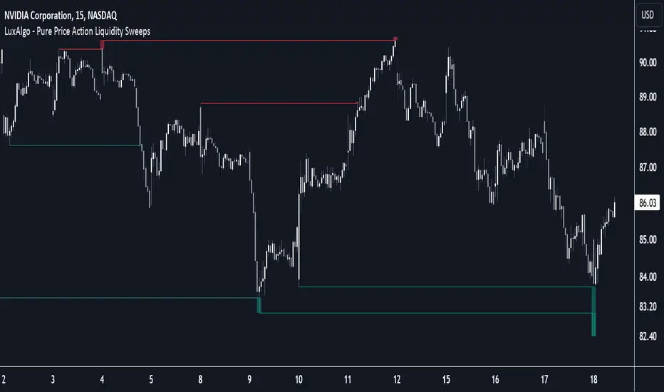
Pure Price Action Liquidity Sweeps [LuxAlgo]The Pure Price Action Liquidity Sweeps indicator is a pure price action adaptation of our previously published and highly popular Liquidity-Sweeps script.
Similar to its earlier version, this indicator detects the presence of liquidity sweeps on the user's chart, while also identifying potential areas of support/resistance or entry when liquidity levels are taken. The key difference, however, is that this price action version relies solely on price patterns, eliminating the need for numerical swing length settings.
🔶 USAGE
A Liquidity Sweep occurs when the price breaks through a liquidity level , after which the price returns below/above the liquidity level , forming a wick.
The examples below show a bullish and bearish scenario of "a wick passing through a liquidity level where the price quickly comes back".
Short-term liquidity sweep detection is based on short-term swing levels. Some of these short-term levels, depending on further market developments, may evolve into intermediate-term levels and, in the long run, become long-term levels. Therefore, enabling short-term detection with the script means showing all levels, including minor and temporal ones. Depending on the trader's style, some of these levels may be considered noise. Enabling intermediate and long-term levels can help filter out this noise and provide more significant levels for trading decisions. For further details on how swing levels are identified please refer to the details section.
The Intermediate-term option selection for the same chart as above, filters out minor or noisy levels, providing clearer and more significant levels for traders to observe.
🔶 DETAILS
The swing points detection feature relies exclusively on price action, eliminating the need for numerical user-defined settings.
The first step involves detecting short-term swing points, where a short-term swing high (STH) is identified as a price peak surrounded by lower highs on both sides. Similarly, a short-term swing low is recognized as a price trough surrounded by higher lows on both sides.
Intermediate-term swing and long-term swing points are detected using the same approach but with a slight modification. Instead of directly analyzing price candles, we now utilize the previously detected short-term swing points. For intermediate-term swing points, we rely on short-term swing points, while for long-term swing points, we use the intermediate-term ones.
🔶 SETTINGS
Detection: Period options of the detected swing points.
🔶 RELATED SCRIPTS
Pure-Price-Action-Structures.
Liquidity-Sweeps.
[TehThomas] - ICT Liquidity sweepsThe ICT Liquidity Sweeps Indicator is designed to track liquidity zones in the market areas where stop-losses and pending orders are typically clustered. This indicator marks buyside liquidity (resistance) and sellside liquidity (support), helping traders identify areas where price is likely to manipulate liquidity before making a significant move.
This tool is based on Inner Circle Trader (ICT) Smart Money Concepts, which emphasize how institutional traders, or “Smart Money,” manipulate liquidity to fuel price movements. By identifying these zones, traders can anticipate liquidity sweeps and position themselves accordingly.
⚙️ How It Works
1️⃣ Detects Key Liquidity Zones
The script automatically identifies significant swing highs and swing lows in price action using a pivot-based method.
A swing high (buyside liquidity) is a peak where price struggles to break higher, forming a resistance level.
A swing low (sellside liquidity) is a valley where price struggles to go lower, creating a support level.
These liquidity points are prime targets for liquidity sweeps before a true trend direction is confirmed.
2️⃣ Draws Liquidity Lines
Once a swing high or low is identified, a horizontal line is drawn at that level.
The lines extend to the right, serving as future liquidity targets until they are broken.
The indicator allows customization in terms of color, line width, and maximum number of liquidity lines displayed at once.
3️⃣ Handles Liquidity Sweeps
When price breaks a liquidity level, the indicator reacts based on the chosen action setting:
Dotted/Dashed: The line remains visible but changes style to indicate a sweep.
Delete: The line is completely removed once price has interacted with it.
This feature ensures that traders can easily spot where liquidity has been taken and determine whether a reversal or continuation is likely.
4️⃣ Prevents Chart Clutter
To maintain a clean chart, the script limits the number of liquidity lines displayed at any given time.
When new liquidity zones are formed, the oldest lines are automatically removed, keeping the focus on the most relevant liquidity zones.
🎯 How to Use the ICT Liquidity Sweeps Indicator
🔍 Identifying Liquidity Grabs
This indicator helps you identify areas where Smart Money is targeting liquidity before making a move.
Buyside Liquidity (BSL) Sweeps:
Occur when price spikes above a resistance level before reversing downward.
Indicate that Smart Money has hunted stop-losses and buy stops before driving price lower.
Sellside Liquidity (SSL) Sweeps:
Occur when price drops below a support level before reversing upward.
Indicate that Smart Money has collected liquidity from stop-losses and sell stops before pushing price higher.
📈 Combining with Market Structure Shifts (MSS)
One of the best ways to use this indicator is in conjunction with our Market Structure Shifts Indicator.
Liquidity sweeps + MSS Confirmation give strong high-probability trade setups:
Wait for a liquidity sweep (price takes out a liquidity level).
Look for an MSS in the opposite direction (e.g., price sweeps a high, then breaks a recent low).
Enter the trade in the new direction with stop-loss above/below the liquidity sweep.
📊 Entry & Exit Strategies
Long Trade Example:
Price sweeps a key sellside liquidity level (SSL) → creates a false breakdown.
MSS confirms a reversal (price breaks structure upwards).
Enter long position after confirmation.
Stop-loss below the liquidity grab to minimize risk.
Short Trade Example:
Price sweeps a key buyside liquidity level (BSL) → takes liquidity above resistance.
MSS confirms a bearish move (price breaks a key support level).
Enter short position after confirmation.
Stop-loss above the liquidity grab.
🚀 Why This Indicator is a Game-Changer
✅ Helps Identify Smart Money Manipulation – Understand where institutions are likely to grab liquidity before the real move happens.
✅ Enhances Market Structure Analysis – When paired with MSS, liquidity sweeps become powerful signals for trend reversals.
✅ Filters Out False Breakouts – Many traders get caught in liquidity grabs. This indicator helps avoid bad entries.
✅ Keeps Your Chart Clean – The auto-limiting feature ensures that only the most relevant liquidity levels remain visible.
✅ Works on Any Timeframe – Whether you’re a scalper, day trader, or swing trader, liquidity concepts apply universally.
📌 Final Thoughts
The ICT Liquidity Sweeps Indicator is a must-have tool for traders who follow Smart Money Concepts. By tracking liquidity levels and highlighting sweeps, it allows traders to enter trades with precision while avoiding false breakouts.
When combined with Market Structure Shifts (MSS), this strategy becomes even more powerful, offering traders an edge in spotting reversals and timing entries effectively.
__________________________________________
Thanks for your support!
If you found this idea helpful or learned something new, drop a like 👍 and leave a comment—I’d love to hear your thoughts! 🚀
Make sure to follow me for more price action insights, free indicators, and trading strategies. Let’s grow and trade smarter together! 📈✨

Draw on Liquidity [PhenLabs]📊 Draw on Liquidity (DOL) Indicator
Version: PineScript™ v6
Description
The Draw on Liquidity (DOL) indicator is an advanced technical analysis tool designed to identify and visualize significant liquidity zones in the market. It combines volume analysis, pivot point detection, and real-time proximity alerts to help traders identify potential support and resistance levels where significant trading activity occurs. The indicator features dual display modes, adaptive volume thresholds, and a comprehensive real-time dashboard.
🔧 Components
• Liquidity Detection: Advanced pivot point analysis with volume validation
• Volume Analysis: Adaptive volume threshold system
• Display Modes: Historical and Current visualization options
• Proximity Detection: Real-time price-to-level distance monitoring
• Visual Dashboard: Dynamic status display with alert system
🚨 Important Dashboard Features 🚨
The dashboard provides real-time information about:
• High Draw Zones: Resistance levels with significant liquidity
• Low Draw Zones: Support levels with high trading activity
• Current Price: Real-time price monitoring
• Active Alerts: Proximity warnings when price approaches liquidity zones
📈 Visualization
• Historical Mode: Displays all past and present liquidity zones
• Current Mode: Shows only active, unhit liquidity levels
• Color-coded lines: Blue for high liquidity, Red for low liquidity
• Dynamic line extension: Updates with price movement
• Alert indicators: Visual signals when price approaches zones
Historical Visualization
Current Visualization
📌 Usage Guidelines
The indicator is highly customizable with several key parameters:
Pivot Settings:
• Shorter lengths (3-7): More frequent zones, suitable for scalping
• Longer lengths (7-15): Major zones, better for swing trading
Volume Analysis:
• Lower multiplier (1.5-2.0): More zones, higher sensitivity
• Higher multiplier (2.0-3.0): Major zones only, reduced noise
✅ Best Practices:
• Start with default settings and adjust based on timeframe
• Use Historical mode for analysis, Current mode for active trading
• Monitor dashboard alerts for potential trade setups
• Combine with trend analysis for better entry/exit points
⚠️ Limitations
• Requires sufficient volume data for accurate analysis
• Performance varies with market volatility
• Historical mode may become visually cluttered on longer timeframes
• Best performance during regular market hours
What Makes This Unique
• Dual Display System: Choose between historical analysis and current trading modes
• Volume-Validated Zones: Only marks levels with significant trading activity
• Real-time Proximity Alerts: Dynamic warnings when approaching liquidity zones
• Adaptive Threshold System: Automatically adjusts to market conditions
• Comprehensive Dashboard: All-in-one view of current market status
🔧 How It Works
The indicator processes market data through three main components:
1. Liquidity Detection (40% weight):
• Identifies pivot points using customizable lookback periods
• Validates levels with volume analysis
• Marks significant zones based on combined criteria
2. Volume Analysis (40% weight):
• Calculates dynamic volume thresholds
• Compares current volume to moving average
• Filters out low-volume noise
3. Proximity Analysis (20% weight):
• Monitors price distance to active zones
• Triggers alerts based on customizable thresholds
• Updates dashboard status in real-time
💡 Note: For optimal results, combine with price action analysis and consider using multiple timeframes for confirmation. The indicator performs best in markets with consistent volume and clear trend structure.

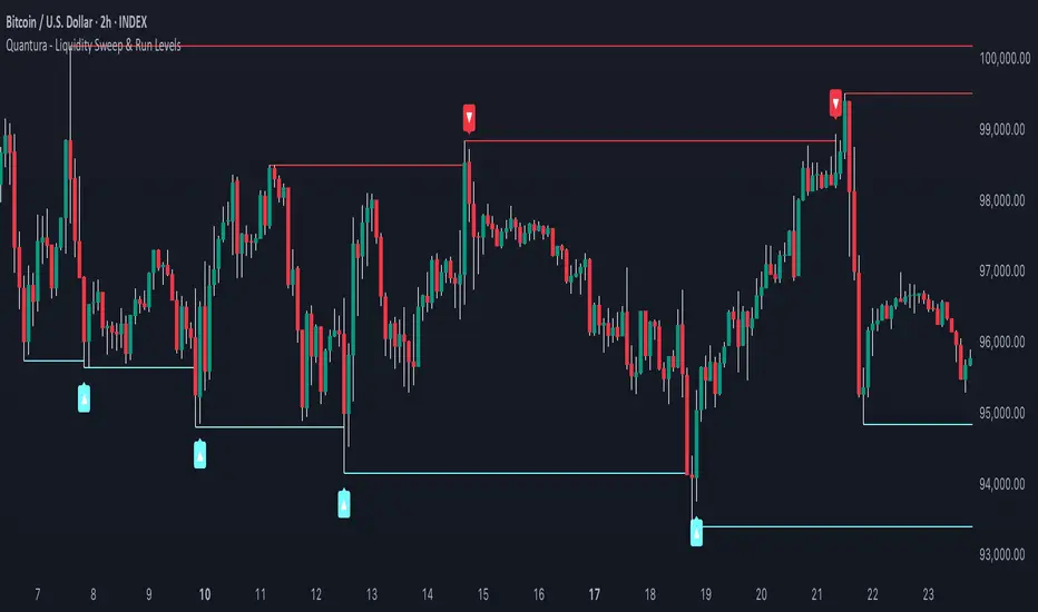
Quantura - Liquidity Sweep & Run LevelsIntroduction
“Quantura – Liquidity Sweep & Run Levels” is a structural price-action indicator designed to automatically detect swing-based liquidity zones and visualize potential sweep and run events. It helps traders identify areas where liquidity has likely been taken (sweep) or released (run), improving precision in market structure analysis and timing of entries or exits.
Originality & Value
This tool translates institutional liquidity concepts into an automated visual framework. Instead of simply marking highs and lows, it dynamically monitors swing points, tracks their breaches, and identifies subsequent reactions. The indicator is built to highlight the liquidity dynamics that often precede reversals or continuations.
Its originality lies in:
Automatic identification and tracking of swing highs and lows.
Real-time detection of broken levels and liquidity sweeps.
Distinction between “Run” and “Sweep” modes for different market behaviors.
Persistent historical visualization of liquidity levels using clean line structures.
Configurable signal markers for bullish and bearish sweep confirmations.
Functionality & Core Logic
Detects swing highs and lows using a user-defined Swing Length parameter.
Stores and updates all swing levels dynamically with arrays for efficient memory handling.
Draws horizontal lines from each detected swing point to visualize potential liquidity zones.
Monitors when price breaks a swing level and marks that event as “broken.”
Generates signals when the market either sweeps above/below or runs away from those levels, depending on the chosen mode.
Provides optional visual signal markers (“▲” for bullish sweeps, “▼” for bearish sweeps).
Parameters & Customization
Mode: Choose between “Sweep” (detects liquidity grabs) or “Run” (detects breakout continuations).
Swing Length: Sets the sensitivity for detecting swing highs/lows. A higher value focuses on larger structures, while smaller values detect micro liquidity points.
Bullish Color / Bearish Color: Customize color themes for sweep/run lines and signal markers.
Signals: Enables or disables visual up/down markers for confirmed events.
Visualization & Display
Horizontal lines represent potential liquidity levels (unbroken swing highs/lows).
Once broken, lines automatically stop extending, marking the moment liquidity is taken.
Depending on the selected mode:
“Sweep” mode identifies false breaks or stop-hunt behavior.
“Run” mode highlights breakouts that continue the trend.
Colored arrows indicate the direction and type of liquidity reaction.
Clean, non-intrusive visualization suitable for overlaying on price charts.
Use Cases
Detect liquidity sweeps before major reversals.
Identify breakout continuations after liquidity runs.
Combine with Supply/Demand or FVG indicators for multi-layered confirmation.
Validate liquidity bias in algorithmic or discretionary strategies.
Analyze market manipulation patterns and institutional stop-hunting behavior.
Limitations & Recommendations
This indicator identifies structural behavior but does not guarantee trade direction or profitability.
Works best on liquid markets with clear swing structures (e.g., crypto, forex, indices).
Signal interpretation should be combined with confluence tools such as volume, order flow, or structure-based filters.
Excessively small swing settings may cause over-signaling in volatile markets.
Markets & Timeframes
Optimized for all major asset classes — including crypto, Forex, indices, and equities — and for intraday to higher-timeframe structural analysis (5-minute up to daily charts).
Author & Access
Developed 100% by Quantura. Published as a Open-source script indicator. Access is free.
Compliance Note
This description fully complies with TradingView’s Script Publishing Rules and House Rules . It avoids performance claims, provides transparency on methodology, and clearly describes indicator behavior and limitations.
ICT Liquidity Pools SSL BSLParent Swings - ICT Liquidity Pools (BSL & SSL)
This indicator is designed to cut through the noise of the market and identify truly significant swing points. Instead of marking every minor high and low, it uses the powerful logic of ICT (Inner Circle Trader) breaker patterns to validate and draw only the "Parent Swings" that matter. These are the key liquidity pools that often act as the market's next target.
The Concept: Price Moves from Pool to Pool
A core concept taught by ICT is that price doesn't move randomly; it moves with purpose. The market is engineered to move from one pool of liquidity to the next.
Buy Side Liquidity (BSL): This is a pool of stop-loss orders resting just above a significant swing high. The market is often drawn upwards to "sweep" this liquidity.
Sell Side Liquidity (SSL): This is a pool of stop-loss orders resting just below a significant swing low. The market is often drawn downwards to sweep this liquidity.
This indicator identifies these key BSL and SSL levels after they have been confirmed by a shift in market structure, giving you a clear map of potential targets.
How It Works
The indicator doesn't just look for any swing high or low. It waits for a specific sequence of events to confirm that a swing is a "Parent Swing" and a valid liquidity pool:
Liquidity Sweep: First, it looks for a classic liquidity raid. For a significant high (BSL), it needs to see a swing high get taken out by a higher high. For a significant low (SSL), it needs to see a swing low get taken out by a lower low.
Market Structure Shift (MSS): After the liquidity sweep, the indicator waits for confirmation that the market's intention has changed. This happens when price breaks aggressively in the opposite direction, creating a breaker block pattern.
Confirmation: Only when both the liquidity sweep and the market structure shift are confirmed does the indicator draw the line, marking the swing as a valid BSL or SSL level.
How to Use This Indicator
The primary use for this indicator is to identify targets. Once a BSL (red line) or SSL (green line) is established, you can anticipate that the market will eventually make a run for that level.
If you are in a long position, the next BSL line above you can serve as a logical take-profit target.
If you are in a short position, the next SSL line below you can serve as a logical take-profit target.
The labels (BSL/SSL) will always stay with the current price action for active levels, making it easy to see your targets at a glance.
Settings
Pivot Lookback: Controls the sensitivity of the swing detection. A higher number will find larger, more significant liquidity pools.
Invalidation Threshold (Crossings): This is a key feature. It sets how many times the price must cross through a liquidity level before it's considered "used up" or invalidated. Once invalidated, the line will dim and the label will disappear, keeping your chart clean.
Disclaimer: This is a tool for technical analysis and should not be considered financial advice. Always use proper risk management and integrate this indicator with your own trading strategy.
Thin Liquidity Zones [PhenLabs]Thin Liquidity Zones with Volume Delta
Our advanced volume analysis tool identifies and visualizes significant liquidity zones using real-time volume delta analysis. This indicator helps traders pinpoint and monitor critical price levels where substantial trading activity occurs, providing precise volume flow measurement through lower timeframe analysis.
The tool works by leveraging the fact that hedge funds, institutions, and other large market participants strategically fill their orders in areas of thin liquidity to minimize slippage and market impact. By detecting these zones, traders gain valuable insights into potential areas of accumulation, distribution, and liquidity traps, allowing for more informed trading decisions.
🔍 Key Features
Real-time volume delta calculation using lower timeframe data
Dynamic zone creation based on volume spikes
Automatic timeframe optimization
Size-filtered zones to avoid noise
Custom delta timeframe scanning
Flexible analysis period selection
📊 Visual Demonstration
💡 How It Works
The indicator continuously scans for high-volume areas where trading activity exceeds the specified threshold (default 6.0x average volume). When detected, it creates zones that display the net volume delta, showing whether buying or selling pressure dominated that price level.
Key zone characteristics:
Size filtering prevents noise from large price swings
Volume delta shows actual buying/selling pressure
Zones automatically expire based on lookback period
Real-time updates as new volume data arrives
⚙️ Settings
Time Settings
Analysis Timeframe: 15M to 1W options
Custom Period: User-defined bar count
Delta Timeframe: Automatic or manual selection
Volume Analysis
Volume Threshold: Minimum spike multiple
Volume MA Length: Averaging period
Maximum Zone Size: Size filter percentage
Display Options
Zone Color: Customizable with transparency
Delta Display: On/Off toggle
Text Position: Left/Center/Right alignment
📌 Tips for Best Results
Adjust volume threshold based on instrument volatility
Monitor zone clusters for potential support/resistance
Consider reducing max zone size in volatile markets
Use in conjunction with price action and other indicators
⚠️ Important Notes
Requires volume data from your data provider
Lower timeframe scanning may impact performance
Maximum 500 zones maintained for optimization
Zone creation is filtered by both volume and size
🔧 Volume Delta Calculation
The indicator uses TradingView’s advanced volume delta calculation, which:
Scans lower timeframe data for precision
Measures actual buying vs selling pressure
Updates in real-time with new data
Provides clear positive/negative flow indication
This tool is ideal for traders focusing on volume analysis and order flow. It helps identify key levels where significant trading activity has occurred and provides insight into the nature of that activity through volume delta analysis.
Note: Performance may vary based on your chart’s timeframe. Adjust settings according to your trading style and the instrument’s characteristics. Past performance is not indicative of future results, DYOR.

Simple Liquidity Sweep [rare_gold_steak]- Shows when the liquidity was swept.
- Shows BSL and SSL.
- Simple options to change styling.
I use it personally and some people liked it so I thought i'll share it with the public.
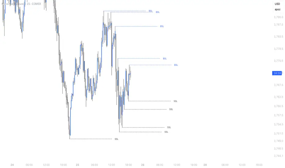
HTF Liquidity Levels█ OVERVIEW
The indicator introduces a new representation of the previous days, weeks, and months highs & lows ( DWM HL ) with a focus on untapped levels.
█ CONCEPTS
Untapped Levels
It is popularly known that the liquidity is located behind swing points or beyond higher time frames highs/lows (in a sense, an intraday swing point is a day high/low). These key areas are said "liquid" because of the accumulation of resting orders, mainly in the form of stop-loss orders. And this more significantly on higher time frames which have more time for stacking orders. As the result, the indicator aims to keep track of untapped levels that have their liquidity states intact.
Liquidity Pools
Once a liquidity level identified, or better, a cluster of liquidity levels work as magnets for the market. The price is more likely to make its way towards heavier pockets of liquidity, by proximity (the closest liquidity pool), and by difficulty (path with less obstacles). This phenomenon is referred as liquidity run, raid, purge, grab, hunt, sweep, you name it. Consequently, the indicator can help you frame a directional bias during your trading session.
█ NOTES
Drawings
Once a level is tapped, it is highlighted. At the end of each day, all tapped levels are cleared.

SMC Statistical Liquidity Walls [PhenLabs]📊 SMC Statistical Liquidity Walls
Version: PineScript™ v6
📌 Description
The SMC Statistical Liquidity Walls indicator is designed to visualize market volatility and potential reversal zones using advanced statistical modeling. Unlike traditional Bollinger Bands that use simple lines, this script utilizes an “Inverted Sigmoid” opacity function to create a “fog of war” effect. This visualizes the density of liquidity: the further price moves from the equilibrium (mean), the “harder” the liquidity wall becomes.
This tool solves the problem of over-trading in low-probability areas. By automatically mapping “Premium” (Resistance) and “Discount” (Support) zones based on Standard Deviation (SD), traders can instantly see when price is overextended. The result is a clean, intuitive overlay that helps you identify high-probability mean reversion setups without cluttering your chart with manual drawings.
🚀 Points of Innovation
Inverted Sigmoid Logic: A custom mathematical function maps Standard Deviation to opacity, creating a realistic “wall” density effect rather than linear gradients.
Dynamic “Solidity”: The indicator is transparent at the center (Equilibrium) and becomes visually solid at the edges, mimicking physical resistance.
Separated Directional Bias: distinct Red (Premium) and Green (Discount) coding helps SMC traders instantly recognize expensive vs. cheap pricing.
Smart “Safe” Deviation: Includes fallback logic to handle calculation errors if deviation hits zero, ensuring the indicator never crashes during data gaps.
🔧 Core Components
Basis Calculation: Uses a Simple Moving Average (SMA) to determine the market’s equilibrium point.
Standard Deviation Zones: Calculates 1SD, 2SD, and 3SD levels to define the statistical extremes of price action.
Sigmoid Alpha Calculation: Converts the SD distance into a transparency value (0-100) to drive the visual gradient.
🔥 Key Features
Automated Premium/Discount Zones: Red zones indicate overbought (Premium) areas; Green zones indicate oversold (Discount) areas.
Customizable Density: Users can adjust the “Steepness” and “Midpoint” of the sigmoid curve to control how fast the walls become solid.
Integrated Alerts: Built-in alert conditions trigger when price hits the “Solid” wall (2SD or higher), perfect for automated trading or notifications.
Visual Clarity: The center of the chart remains clear (high transparency) to keep focus on price action where it matters most.
🎨 Visualization
Equilibrium Line: A gray line representing the mean price.
Gradient Fills: The space between bands fills with color that increases in opacity as it moves outward.
Premium Wall: Upper zones fade from transparent red to solid red.
Discount Wall: Lower zones fade from transparent green to solid green.
📖 Usage Guidelines
Range Period: Default 20. Controls the lookback period for the SMA and Standard Deviation calculation.
Source: Default Close. The price data used for calculations.
Center Transparency: Default 100 (Clear). Controls how transparent the middle of the chart is.
Edge Transparency: Default 45 (Solid). Controls the opacity of the outermost liquidity wall.
Wall Steepness: Default 2.5. Adjusts how aggressively the gradient transitions from clear to solid.
Wall Start Point: Default 1.5 SD. The deviation level where the gradient shift begins to accelerate.
✅ Best Use Cases
Mean Reversion Trading: Enter trades when price hits the solid 2SD or 3SD wall and shows rejection wicks.
Take Profit Targets: Use the Equilibrium (Gray Line) as a logical first target for reversal trades.
Trend Filtering: Do not initiate new long positions when price is deep inside the Red (Premium) wall.
⚠️ Limitations
Lagging Nature: As a statistical tool based on Moving Averages, the walls react to past price data and may lag during sudden volatility spikes.
Trending Markets: In strong parabolic trends, price can “ride” the bands for extended periods; mean reversion should be used with caution in these conditions.
💡 What Makes This Unique
Physics-Based Visualization: We treat liquidity as a physical barrier that gets denser the deeper you push, rather than just a static line on a chart.
🔬 How It Works
Step 1: The script calculates the mean (SMA) and the Standard Deviation (SD) of the source price.
Step 2: It defines three zones above and below the mean (1SD, 2SD, 3SD).
Step 3: The custom `get_inverted_sigmoid` function calculates an Alpha (transparency) value based on the SD distance.
Step 4: Plot fills are colored dynamically, creating a seamless gradient that hardens at the extremes to visualize the “Liquidity Wall.”
💡 Note
For best results, combine this indicator with Price Action confirmation (such as pin bars or engulfing candles) when price touches the solid walls.

Sonarlab - Trendline Liquidity Indicator**This is not a normal Trend Line Indicator**
Most of the concepts we get thought online are to good to be true. Buy and sell off the touch of the trend line and you will be winning! You probably find out already that this ain't the way to trade. Trend lines mostly gets broken and you will be taken out.
he reason behind this is that the trend lines sparks the interests of Institutions. They use those area's to stop people out and use them as fuel for their positions: Liquidity.
TLL: Trend Line Liquidity
Lets show you an example on how to use these TLL markings 👇
In this example above we can see a beautiful example of the TLL indicator mapping out the TLL. The Imbalance Indicator shows us with the BPR (balanced price range) there is a sign of going short. The other confluence we can add is the TLL, which price likes to clear in these situations.
In this other example we also see two TLL resting on top. We see that price tried to break the SL (swing low), but the fake out detection showed us this was a grab on liquidity. After that we can see that on the LTF we get a displacement and we can assume that price is going to target the TLL.
Another example where price cleared the TLL and used is a targets.
This indicator will map the Trend Line Liquidity for you, so you are more aware of the liquidity that is resting around you. The Indicator has the following inputs:
Sensitivity A lower sensitivity create smaller trend lines, where a higher sensitivity creates bigger trend lines.
Display limit : The amount of lines you want the indicator to display
Line type/ text size (styling options)
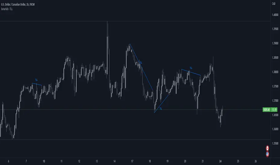
Makuchaku's trading tools - Liquidity visualizerThis indicator plots those pivots/fractals which have not been taken out by price, whereby showing where are the clusters of highs/lows where stop orders (or liquidity) could be hiding.
This is a fantastic tool for taking reversal trades.
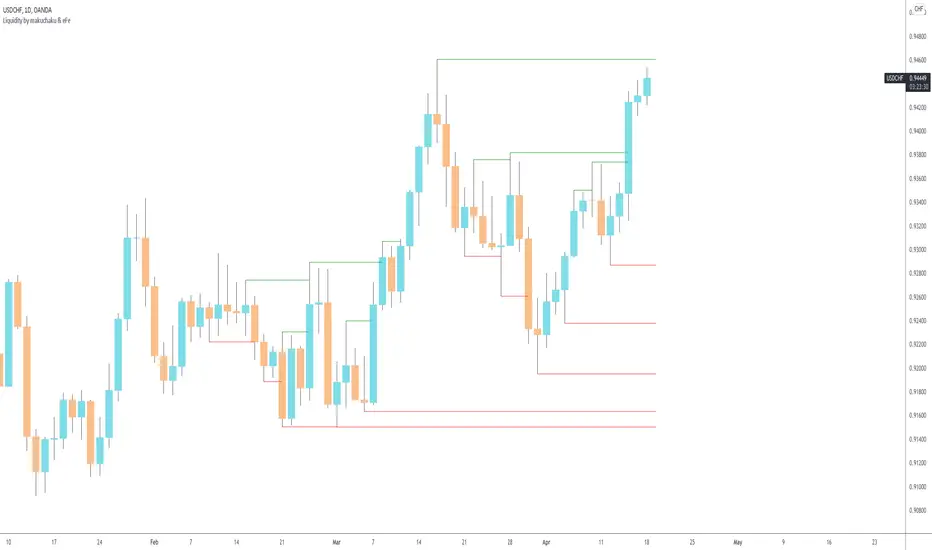
Timeframe LiquidityTimeframe Liquidity – Multi-Timeframe Highs & Lows by
Timeframe Liquidity automatically plots previous day, week, month, and year highs and lows, key liquidity zones used by smart money and price-action traders. These levels extend into the future and can automatically stop once price wicks through, showing clear liquidity sweeps and tested zones.
Perfect for traders using ICT / SMC concepts, liquidity theory, or market structure analysis. Instantly see where liquidity rests, where it’s been taken, and how price reacts at major support and resistance.
Features:
Auto-plots PDH/PDL, PWH/PWL, PMH/PML, PYH/PYL
Custom line styles, colors, and label sizes
Option to stop line on wick (liquidity sweep)
Smart timeframe visibility (hides same-TF levels)
Accurate UTC offset handling
Identify liquidity pools fast, trade cleaner charts, and track where smart money hunts liquidity.
Built for precision, clarity, and confluence.
