RSI Candles with EMA byAuncleJoeThe Relative Strength Index (RSI) is one of the most widely used momentum indicators in trading. It helps traders assess whether an asset is overbought or oversold by measuring the speed and magnitude of recent price changes. Traditionally, RSI is displayed as a single line oscillating between 0 and 100, but this representation can sometimes make it difficult to spot trends, reversals, and momentum shifts effectively.
To enhance RSI visualization and usability, the RSI Candles with EMA indicator transforms the RSI values into candlestick charts, providing a more intuitive and dynamic way to analyze momentum. Unlike the traditional RSI line, this approach allows traders to observe RSI trends just as they would analyze price charts, making it easier to detect changes in momentum and trend strength.
Each RSI candle represents a specific period’s momentum activity. Green candles indicate that the RSI closed higher than it opened, signaling bullish momentum, while red candles suggest that the RSI closed lower than it opened, indicating bearish sentiment. This candlestick-style visualization helps traders spot RSI trends, breakouts, and reversals more effectively than a simple line chart.
To further refine momentum analysis, this indicator also includes an Exponential Moving Average (EMA) of RSI. The EMA smooths RSI fluctuations and provides a clearer trend direction. When RSI candles remain above the EMA, it suggests strong buying momentum, whereas RSI candles falling below the EMA indicate increasing selling pressure. This combination of RSI candlesticks and an EMA line allows traders to better identify shifts in market sentiment and potential trend reversals.
Additionally, the indicator includes customizable overbought and oversold levels (defaulted at 70 and 30, respectively). These levels help traders recognize when an asset might be overextended in either direction, potentially signaling an upcoming reversal. When RSI candles approach or cross these thresholds, traders can anticipate possible changes in market direction.
This indicator is particularly useful for a wide range of traders. Scalpers and day traders can leverage it to quickly identify short-term momentum shifts, while swing traders can use it to detect potential reversals in multi-day trends. Trend-following traders can confirm bullish or bearish trends based on RSI’s position relative to its EMA, and mean reversion traders can use it to spot extreme conditions where price action might snap back.
By combining RSI candlesticks with an EMA filter, this indicator provides a more dynamic and visually intuitive approach to momentum trading. It offers clearer trend signals, better reversal detection, and enhanced decision-making, making it an essential tool for traders who rely on RSI-based strategies.
חפש סקריפטים עבור "sentiment"

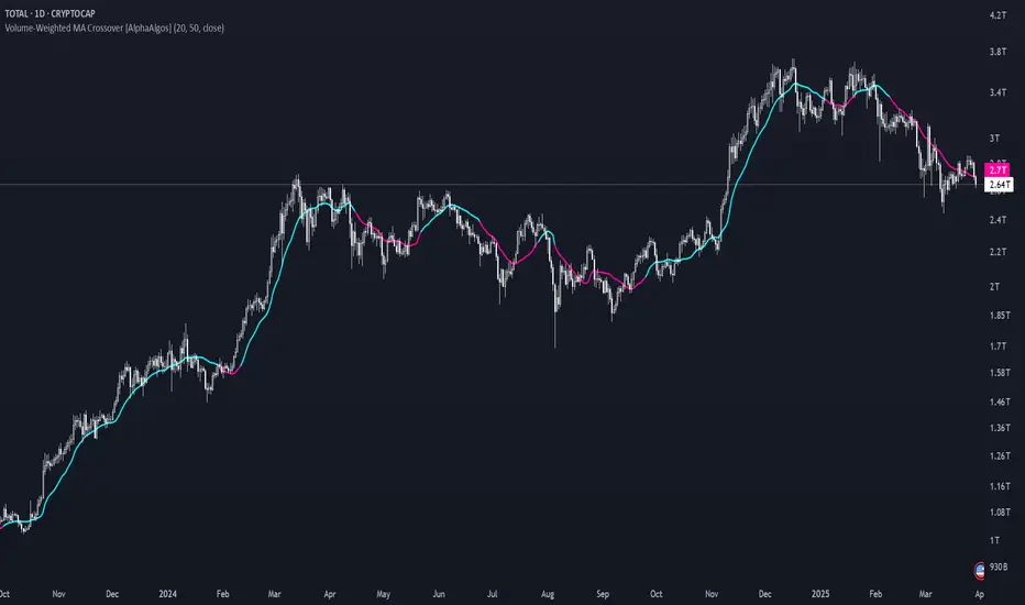
Volume-Weighted MA Crossover [AlphaAlgos]Volume-Weighted MA Crossover
Overview:
The Volume-Weighted MA Crossover is a sophisticated trend-following indicator designed to capture reliable trend reversals and trend continuation signals using volume and price action. By combining the power of Volume-Weighted Moving Averages (VWMA) and the simplicity of Simple Moving Averages (SMA) , this indicator provides a more robust and reliable trend filter. It ensures that trend signals are supported by strong market volume, offering a deeper insight into market strength and potential price movements.
How It Works:
The Volume-Weighted MA Crossover indicator calculates a Volume-Weighted Moving Average (VWMA) of the chosen price source (typically close ), which takes into account both the price and volume of each bar. This ensures that price movements with higher volume are weighted more heavily, providing a better reflection of actual market sentiment.
In conjunction with the VWMA, a traditional Simple Moving Average (SMA) is used to filter out noise and smooth price data, providing a more stable trend direction. The crossover between the VWMA and SMA serves as the primary trading signal:
Long Signal (Bullish Crossover) : The VWMA crosses above the SMA, indicating that a strong bullish trend is likely underway, supported by increased volume and price action.
Short Signal (Bearish Crossover) : The VWMA crosses below the SMA, signaling that a bearish trend is emerging, backed by decreasing volume and price reversal.
The Volume-Weighted MA Crossover can be used as a standalone indicator or in conjunction with other tools to enhance your trading strategy, offering both trend-following and volume confirmation.
Key Features:
Volume Sensitivity : The VWMA adjusts the moving average based on volume, providing a more accurate representation of price action during high-volume periods. This makes the indicator more sensitive to market dynamics, ensuring that price movements during significant volume spikes are prioritized.
Trend Confirmation : The crossover of the VWMA and SMA offers clear and actionable signals, helping traders identify trend reversals early and with more confidence.
Clean Signal Presentation : With color-coded signal markers , this indicator makes it easy to spot actionable entry points.
Customizable Settings : Tailor the VWMA and SMA periods, volume multiplier, and source price according to your preferred market conditions and timeframes, allowing the indicator to fit your trading style.
How to Use It:
Trend Direction : Look for crossovers between the VWMA and SMA to identify potential trend changes:
Volume Confirmation : The volume-weighted aspect of this indicator ensures that trends are confirmed by volume. A bullish trend with a VWMA crossing above the SMA suggests that the upward movement is supported by strong market sentiment (high volume). Conversely, a bearish trend with a VWMA crossing below the SMA indicates a reversal is supported by volume reduction.
Trend Continuation & Reversal : This indicator works particularly well during strong trending markets. However, it can also identify potential reversals, particularly during periods of high volume and rapid price changes.
Best Timeframe to Use:
This indicator is adaptable to multiple timeframes and can be used across various market types. However, it tends to work most effectively on medium to long-term charts (such as 1-hour, 4-hour, and daily charts) where trends have the potential to develop more clearly and with more volume participation.
Ideal for:
Trend-following traders looking for reliable signals that are confirmed by both price action and volume.
Swing traders who want to enter trades at the beginning of a new trend or after a confirmed trend reversal.
Day traders seeking clear and easy-to-read signals on intra-day charts, helping to pinpoint optimal entry and exit points during volatile market conditions.
Conclusion:
The Volume-Weighted MA Crossover is an essential tool for any trader looking to improve their trend-following strategy. By incorporating both volume and price action into a VWMA and SMA crossover , it offers a more refined approach to identifying and confirming trends. Whether you're a trend follower , swing trader , or day trader , this indicator provides clear, actionable signals backed by volume confirmation, giving you the confidence to execute your trades with precision.
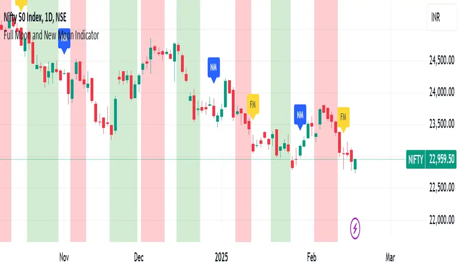
Full Moon and New Moon IndicatorThe Full Moon & New Moon Indicator is a custom Pine Script indicator which marks Full Moon (Pournami) and New Moon (Amavasya) events on the price chart. This indicator helps traders who incorporate lunar cycles into their market analysis, as certain traders believe these cycles influence market sentiment and price action. The current script is added for the year 2024 and 2025 and the dates are considered as per the Telugu calendar.
Features
✅ Identifies and labels Full Moon & New Moon days on the chart for the year 2024 and 2025
How it Works!
On a Full Moon day, it places a yellow label ("Pournami") above the corresponding candle.
On a New Moon day, it places a blue label ("Amavasya") above the corresponding candle.
Example Usage
When a Full Moon label appears, check for potential trend reversals or high volatility.
When a New Moon label appears, watch for market consolidation or a shift in sentiment.
Combine with candlestick patterns, support/resistance, or momentum indicators for a stronger trading setup.
🚀 Add this indicator to your TradingView chart and explore the market’s reaction to lunar cycles! 🌕
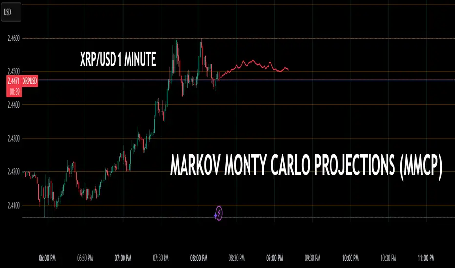
Markov + Monte Carlo Simulation with EVMarkov Monte Carlo Projection (MMCP) – A Probabilistic Approach to Price Forecasting
Introduction: A New Approach to Price Projection
The Markov Monte Carlo Projection (MMCP) is an advanced stochastic forecasting tool that models potential future price paths using a combination of Markov Chain transition probabilities and Monte Carlo simulations. Unlike traditional technical indicators that rely on fixed formulas, MMCP employs probability distributions and simulated price movement paths to estimate future price behavior dynamically.
This indicator is designed to adapt to changing market conditions and provides traders with a probabilistic framework rather than a fixed forecast. By incorporating volatility modeling, MMCP enables traders to size projections proportionally to recent price action, making it an adaptive and flexible forecasting tool.
Mathematical Foundations
Markov Chains: Modeling Probability of Price Movements
A Markov Chain is a stochastic process where the probability of transitioning to the next state depends only on the current state and not on past states (i.e., it is memoryless).
For price movement, MMCP analyzes the past N bars (set by the lookback window) to determine the transition probabilities of price moving up, down, or remaining the same based on past behavior:
Pup=Number of Up MovesTotal Moves
Pup=Total MovesNumber of Up Moves
Pdown=Number of Down MovesTotal Moves
Pdown=Total MovesNumber of Down Moves
Psame=1−(Pup+Pdown)
Psame=1−(Pup+Pdown)
These probabilities guide how future price movements are simulated, ensuring that projections reflect historical price behavior tendencies.
Monte Carlo Simulations: Generating Possible Futures
Monte Carlo simulations involve running many random trials to estimate possible outcomes. Each trial simulates a future price path by:
Randomly selecting a direction based on the Markov probabilities Pup,Pdown,PsamePup,Pdown,Psame.
Determining the magnitude of the price movement using a normally distributed volatility model.
Iterating this process across multiple forecast bars to simulate a range of potential price paths.
This process does not predict a single outcome, but rather generates a probability-weighted range of future price possibilities.
Volatility Modeling: Scaling Movements Proportionally
Why We Use Standard Deviation (σσ)
Price movement is inherently volatile, and the magnitude of price shifts must be scaled relative to recent volatility. MMCP calculates rolling price returns and then derives the standard deviation of those returns:
σ=stdev(price returns,lookback)
σ=stdev(price returns,lookback)
The Volatility Multiplier allows users to adjust the impact of this volatility on projected movements. This makes the indicator adaptive to different asset price ranges.
Key User Adjustments
1. Volatility Multiplier – Tuning Projections for Different Assets
The scale of the Volatility Multiplier must be tuned for each asset because it is relative to the magnitude of price action. For example:
Low-priced assets (e.g., $2.50 stocks) → A multiplier of 0.1 works best.
Mid-priced assets (e.g., $250 stocks) → A multiplier of 3 works best.
High-priced assets (e.g., Bitcoin) → A multiplier of 1000 works best.
🔹 If projections seem too extreme, decrease the multiplier.
🔹 If projections seem too flat, increase the multiplier.
The Volatility Multiplier can also be fine-tuned to make the projected signal proportionate to the immediately preceding price action.
2. Expected Value (EV) Path – Analyzing Aggregate Future Probabilities
The EV Line is a computed average of all simulated paths, giving traders an expected mean trajectory.
If you find that the EV Line is not visible, try increasing the volatility multiplier to make it more pronounced.
3. Projection Inversion – Enhancing Analysis with Paired Indicators
A unique feature of MMCP is the projection inversion toggle, designed to allow traders to run multiple instances of the indicator in tandem.
When one instance is set to normal projection and another to inverted projection, traders can pair them together using identical settings (except inversion). This setup allows for a mirrored probability perspective and enhances visualizing volatility dynamics.
Additionally, traders can use multiple sets of paired indicators, each with a different lookback window, to build a multi-layered, probability-driven market visualization. This dynamic approach provides an evolving structure of probable price movement in different time frames, offering deeper insights into potential market conditions.
How MMCP Works in Real-Time
Each new bar triggers a fresh Monte Carlo simulation, meaning that projections organically evolve with the market. This ensures that MMCP is always responding to current conditions, rather than applying static assumptions.
How to Use MMCP in Trading
✔ Identifying Potential Reversal & Continuation Zones
If most Monte Carlo paths project upward, bullish momentum is likely.
If most Monte Carlo paths project downward, bearish momentum is likely.
The Expected Value (EV) Line can help confirm the most probable trajectory.
✔ Analyzing Market Sentiment in Real Time
Use multiple instances of MMCP with different lookback windows to capture short-term vs. long-term sentiment.
Enable projection inversion to analyze potential mirrored moves.
✔ Fine-Tuning MMCP for Your Strategy
Adjust the Volatility Multiplier to match the price scale of your asset.
Increase the number of simulations to improve statistical robustness.
Use shorter lookback windows for more responsive predictions, or longer windows for more stable forecasts.
Why MMCP is a Game-Changer
✅ Dynamic & Probabilistic – Unlike fixed indicators, MMCP adapts in real-time.
✅ Fully Stochastic – MMCP embraces uncertainty using Markov models & Monte Carlo simulations.
✅ Customizable for Any Asset – Adjust the Volatility Multiplier for small or large price movements.
✅ Live Updates – The projection organically evolves with every new price bar.
✅ Multi-Perspective Analysis – Traders can run paired normal and inverted projections for deeper insights.
By tuning Volatility Multiplier, Lookback Window, and Projection Inversion, traders can customize MMCP to fit their strategy.
Final Thoughts
The Markov Monte Carlo Projection (MMCP) is not about making absolute predictions—it is about understanding probability distributions in price action.
By leveraging Monte Carlo simulations, Markov transition probabilities, and dynamic volatility modeling, MMCP gives traders a powerful probability-based edge in forecasting potential price movement.
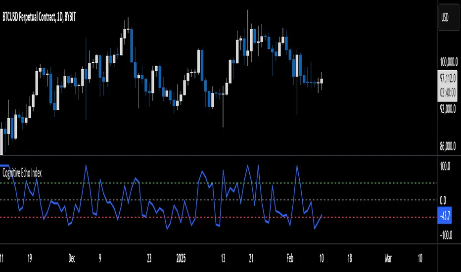
Cognitive Echo IndexCognitive Echo Index – User Guide
Overview
The Cognitive Echo Index is a composite indicator that combines several technical aspects—including price deviation from a moving average, normalized volatility (via ATR), and volume variations—to create a single numeric value. The output is scaled between -100 and +100, offering insights into market momentum and potential trend reversals.
How It Works
Price Component:
The indicator calculates the percentage change between the current price and its 14-period simple moving average (SMA). This helps identify how far the price deviates from its recent trend.
Volatility Component:
Using the Average True Range (ATR) over a 14-period, the script normalizes current ATR against its 14-period SMA. This shows relative volatility, highlighting unusual market activity.
Volume Component:
It computes the percentage change between the current volume and its 14-period SMA to detect spikes or drops in trading activity.
Composite Calculation:
The three components are summed together to produce the final index value, which is then clipped to remain between -100 and +100.
Interpreting the Indicator
Indicator Value Scale:
Positive Values (0 to +100):
Suggest that bullish forces are stronger. Higher values (e.g., above +50) could indicate a strong bullish sentiment.
Negative Values (0 to -100):
Indicate bearish pressures. Lower values (e.g., below -50) may signal strong bearish conditions.
Zero Level:
The midline indicates a balanced market condition with no dominant trend.
Key Horizontal Levels:
+50 Level:
When the indicator crosses above +50, it can be interpreted as a strong bullish signal.
-50 Level:
When the indicator crosses below -50, it can be considered a strong bearish signal.
Usage Tips
Confirmation Tool:
Use the Cognitive Echo Index as an additional confirmation tool in conjunction with other technical indicators or chart patterns to make more informed trading decisions.
Parameter Adjustments:
The script uses a 14-period setting for the moving average, ATR, and volume SMA by default. Depending on your trading timeframe or asset, consider tweaking these periods for better sensitivity.
Trend Analysis:
Watch how the indicator behaves during major price moves. A divergence between the index and the price trend (e.g., price rises while the index falls) may suggest a potential reversal or a false breakout.
Risk Management:
Always incorporate sound risk management practices. Use stop losses and position sizing rules, and consider the indicator as one part of your overall trading strategy.
Customization
Adjusting the Weights:
Although the current version gives equal weight to all three components, advanced users can modify the script to apply different weights to the price, volatility, and volume components based on historical performance or specific market conditions.
Adding Additional Inputs:
Future versions could incorporate external sentiment data or other technical factors if accessible. For now, the indicator focuses on technical inputs available directly within TradingView.
By following this guide, traders can integrate the Cognitive Echo Index into their TradingView platform to gain a unique perspective on market momentum and potential turning points. Enjoy testing and refining the indicator to better suit your trading style!
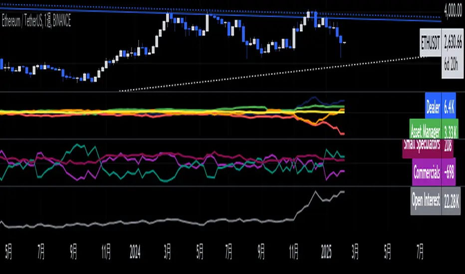
Ethereum COT [SAKANE]#Overview
Ethereum COT is an indicator that visualizes Ethereum futures market positions based on the Commitment of Traders (COT) report provided by the CFTC (Commodity Futures Trading Commission).
This indicator stands out from similar tools with the following features:
- **Flexible Data Switching**: Supports multiple COT report types, including "Financial," "Legacy," "OpenInterest," and "Force All."
- **Position Direction Selection**: Easily switch between long, short, and net positions. Net positions are automatically calculated.
- **Open Interest Integration**: View the overall trading volume in the market at a glance.
- **Comparison and Customization**: Toggle individual trader types (Dealer, Asset Manager, Commercials, etc.) on and off, with visually distinct color-coded graphs.
- **Force All Mode**: Simultaneously display data from different report types, enabling comprehensive market analysis.
These features make it a powerful tool for both beginners and advanced traders to deeply analyze the Ethereum futures market.
#Use Cases
1. **Analyzing Trader Sentiment**
- Compare net positions of various trader types (Dealer, Asset Manager, Commercials, etc.) to understand market sentiment.
2. **Identifying Trend Reversals**
- Detect early signs of trend reversals from sudden increases or decreases in long and short positions.
3. **Utilizing Open Interest**
- Monitor the overall trading volume represented by open interest to evaluate entry points or changes in volatility.
4. **Tracking Position Structures**
- Compare positions of leveraged funds and asset managers to analyze risk-on or risk-off environments.
#Key Features
1. **Report Type Selection**
- Financial (Financial Traders)
- Legacy (Legacy Report)
- Open Interest
- Force All (Display all data)
2. **Position Direction Selection**
- Long
- Short
- Net
3. **Visualization of Major Trader Types**
- Financial Traders: Dealer, Asset Manager, Leveraged Funds, Other Reportable
- Legacy: Commercials, Non-Commercials, Small Speculators
4. **Open Interest Visualization**
- Monitor the total open positions in the market.
5. **Flexible Customization**
- Toggle individual trader types on and off.
- Intuitive settings with tooltips for better usability.
#How to Use
1. Add the indicator to your chart and click the settings icon in the top-right corner.
2. Select the desired report type in the "Report Type" field.
3. Choose the position direction (Long/Short/Net) in the "Direction" field.
4. Toggle the visibility of trader types as needed.
#Notes
- Data is provided by the CFTC and is updated weekly. It is not real-time.
- Changes to the settings may take a few seconds to reflect.
PT Least Squares Moving AveragePT LSMA Multi-Period Indicator
The PT Least Squares Moving Average (LSMA) Multi-Period Indicator is a powerful tool designed for investors who want to track market trends across multiple time horizons in a single, convenient indicator. This indicator calculates the LSMA for four different periods— 25 bars, 50 bars, 450 bars, and 500 bars providing a comprehensive view of short-term and long-term market movements.
Key Features:
- Multi-Timeframe Trend Analysis: Tracks both short-term (25 & 50 bars) and long-term (450 & 500 bars) market trends, helping investors make informed decisions.
- Smoothing Capability: The LSMA reduces noise by fitting a linear regression line to past price data, offering a clearer trend direction compared to traditional moving averages.
- One-Indicator Solution: Combines multiple LSMA periods into a single chart, reducing clutter and enhancing visual clarity.
- Versatile Applications: Suitable for trend identification, market timing, and spotting potential reversals across different timeframes.
- Customizable Styling: Allows users to customize colors and line styles for each period to suit their preferences.
How to Use:
1. Short-Term Trends (25 & 50 bars):Ideal for identifying recent price movements and short-term trade opportunities.
2. Long-Term Trends (450 & 500 bars): Helps investors gauge broader market sentiment and position themselves accordingly for longer holding periods.
3. Trend Confirmation: When shorter LSMA periods cross above longer ones, it may signal bullish momentum, whereas the opposite may indicate bearish sentiment.
4. Support and Resistance: The LSMA lines can act as dynamic support and resistance levels during trending markets.
Best For:
- Long-term investors looking to align their positions with dominant market trends.
- Swing traders seeking confirmation from multiple time horizons.
- Portfolio managers tracking price momentum across various investment durations.
This LSMA Multi-Period Indicator equips investors with a well-rounded perspective on price movements, offering a strategic edge in navigating market cycles with confidence.
Created by Prince Thomas

Enhanced SPX and BTC Overlay with EMASPX-BTC Momentum Gauge and EMA Cross Indicator
Thorough Analysis:
• Combined Overlay (Green/Red Line):
o Function: Plots a wide line over the price chart, representing a composite of SPX and BTC dynamics adjusted by volume data.
o Color Coding:
Green: Indicates bullish conditions when the combined value exceeds its 10-period SMA and Bitcoin volume increases.
Red: Signals bearish conditions when the combined value drops below its 10-period SMA and Bitcoin volume decreases.
o Line Characteristics:
Width: Set at 8 for high visibility.
Transparency: 86% for both colors to overlay without obscuring candlesticks.
Scaling: Uses a factor of 0.02446 to amplify movements, making trend changes more noticeable.
• Continuous Bright Red and Green Lines:
o 20-period EMA of Current Ticker (Red):
Purpose: Acts as a medium-term trend indicator, smoothing price data to reflect the asset's general direction over time.
Color: Bright red for easy identification.
Transparency: 60% to keep it visible but not overpowering.
o 5-period EMA of BTC (Green):
Purpose: Provides insights into short-term Bitcoin momentum, capturing rapid changes in market sentiment.
Color: Bright green to distinguish from the red EMA.
Transparency: 30% for high visibility against price movements.
Detailed Analysis of the EMA Cross:
• Crossing Points:
o Bullish Crossover:
Occurs when the 5-period BTC EMA (green) moves above the 20-period EMA of the current ticker (red).
Suggests that Bitcoin's short-term momentum is gaining strength relative to the asset's medium-term trend, potentially signaling an upcoming uptrend or strengthening of an existing one.
o Bearish Crossover:
When the green line falls below the red, it indicates that Bitcoin's immediate momentum is weakening compared to the asset's medium-term trend, which might precede a downtrend or confirm one.
• Early Trade Signals:
o Entry/Exit Points:
These crossovers can guide traders in making timely decisions to enter or exit trades, especially when corroborated by the combined overlay's color.
o Confirmation:
EMA crossovers can confirm trends indicated by the combined overlay. For example, a bullish crossover with a green combined line could validate a buying opportunity.
o Volatility Insights:
The rapid shifts in Bitcoin's 5-period EMA highlight potential volatility spikes, offering an additional layer of market analysis, particularly useful in volatile markets.
• Strategic Use:
o Multi-Market Insight: The script integrates data from both traditional (SPX) and crypto (BTC) markets, allowing for a more comprehensive analysis of market conditions.
o Decision-Making: Provides traders with visual cues for market sentiment, trend direction, and potential reversals, enhancing strategic trading decisions.
o Trend Confirmation: The combination of EMA crossovers and the overlay's color changes offers a multi-faceted approach to trend confirmation or divergence.
In Summary:
• This script merges elements of traditional stock market analysis with cryptocurrency dynamics, utilizing color changes, line thickness, and EMA crossovers to visually communicate market conditions, offering traders a robust tool for analyzing and acting on market movements.

Volume EquilibriumThe intent behind this indicator is to provide comprehensive information relating to volume compared to multiple timeframes. This indicator allows one to see what the market 'theoretically' sees as 'fair-value' whilst also allowing one to gauge where the price of a stock is headed.
Volume Equilibrium
The main indicator finds the difference between buying volume and selling volume, under the basic presumption that more buying volume indicates greater bullish sentiment and vice versa.
Buying Volume = volume when close price is higher than open price.
Selling Volume = volume when close price is lower than open price.
Volume Balance = Cumulative Buying Volume − Cumulative Selling Volume
Volume Balance is then expressed as a percentage by dividing by total volume
This indicator is composed of three different lengths of the same indicator. Short, Mid, and Long term representations of Volume Equilibrium. The difference between the mid and long term are highlighted so to make it easy to see where volume is going relative to a longer time frame.
HOW TO USE:
At 0 ---> Equilibrium ---> Equal Buying/Selling Volume
Above 0 ---> More buying Volume
Below 0 ---> More selling Volume
Using theory, it is assumed that the price is at a 'fair-value' when the buying/selling volume is at 0. This is of course relative to the respective timeframe of your choosing. More weight given to larger timeframes.
Volume Histogram
It is a basic volume chart that represents the total volume though has highlighted bars so to indicate buying(green) and selling(red) volume. This allows one to see what the indicator is based off of.
Open-Close Oscillator(not needed)
Calculates the average open-close for a selected timeframe and then provides the current closing price relative to that average open-close. Very simply put, values below 0 indicate bearish and values above 0 generally indicate bullishness. This indicator is for a quick reference of price action relative to volume.
Another way to use this indicator, though unique, is to analyze the separate open-close lines themselves. Using the open-close bands, bullishness is defined as increasing closing prices and bearish as decreasing closing prices. So, in regard to this indicator, bear sessions can be indicated by the opening line being below the closing line and bull sessions as the opening line being above. Use the 'flip' of these lines to your advantage, they are very helpful at capturing long continuous sentiment.
This indicator is composed of great information though I still think it best to use many different indicators to help you with your trades.
NOTE: Be aware of what we are trying to analyze, Volume. This means that one should also look out for divergences to capture early indications of reversals. This indicator can be leveraged greatly.

EMA with VWAPThis indicator combines two popular technical analysis tools: the Exponential Moving Average (EMA) and the Volume Weighted Average Price (VWAP), into a single, powerful overlay on your chart. It allows you to analyze both trend direction using the EMA and institutional interest and fair value using the VWAP, all while saving valuable indicator slots on your TradingView layout.
Key Features:
- Exponential Moving Average (EMA):
- Calculates the EMA based on a user-defined Length and Source (e.g., close, open, hl2).
- Includes an optional Offset to shift the EMA line forward or backward on the chart.
- Offers a Smoothing Line feature, allowing you to further smooth the EMA using various moving average types (SMA, EMA, SMMA (RMA), WMA, VWMA) with a customizable Smoothing Length.
- EMA and Smoothing Line can be toggled on or off.
- EMA and Smoothing Line have independent offset capabilities.
Volume Weighted Average Price (VWAP):
-Calculates the VWAP, a crucial indicator that reflects the average price weighted by volume.
- Offers a wide range of Anchor Periods for resetting the VWAP calculation, including: Session, Week, Month, Quarter, Year, Decade, Century, Earnings, Dividends, and Splits.
- Includes an optional Offset to shift the VWAP line.
- Option to Hide VWAP on 1D or Above timeframes to focus on intraday analysis.
- Provides up to three customizable Standard Deviation Bands above and below the VWAP, visually representing volatility and potential support/resistance levels.
- Bands can be calculated using either "Standard Deviation" or "Percentage" methods.
- Bands can be turned on or off independently.
How to Use:
- EMA: Use the EMA to identify the overall trend direction. An upward-sloping EMA suggests an uptrend, while a downward-sloping EMA suggests a downtrend. The Smoothing Line can help confirm the EMA's trend.
- VWAP: The VWAP acts as a benchmark for the "fair" price of an asset during the selected anchor period. Prices above the VWAP may indicate bullish sentiment, while prices below may indicate bearish sentiment.
- Bands: The Standard Deviation Bands can help identify potential overbought and oversold conditions. Price reaching the upper bands might suggest overbought levels, while price reaching the lower bands might suggest oversold levels.
Customization:
- The indicator offers extensive customization through its settings:
- EMA Settings: Adjust the EMA length, source, offset, smoothing method, and smoothing length.
- VWAP Settings: Choose the VWAP anchor period, source, offset, and whether to hide it on daily or higher timeframes.
- VWAP Bands Settings: Control the visibility, multiplier, and calculation method for each of the three standard deviation bands.
Benefits:
- Consolidated Analysis: Combines two essential indicators into one, providing a comprehensive view of price action and volume.
- Saves Indicator Slots: Frees up valuable indicator slots on your TradingView chart.
- Highly Customizable: Offers a wide range of settings to tailor the indicator to your specific trading style and preferences.
- Visual Clarity: Clearly displays the EMA, VWAP, and optional bands on the chart, facilitating quick and easy analysis.
This combined EMA and VWAP indicator is a valuable tool for traders of all levels, offering a powerful and flexible way to analyze market trends and identify potential trading opportunities.
Bitcoin COT [SAKANE]#Overview
Bitcoin COT is an indicator that visualizes Bitcoin futures market positions based on the Commitment of Traders (COT) report provided by the CFTC (Commodity Futures Trading Commission).
This indicator stands out from similar tools with the following features:
- Flexible Data Switching: Supports multiple COT report types, including "Financial," "Legacy," "OpenInterest," and "Force All."
- Position Direction Selection: Easily switch between long, short, and net positions. Net positions are automatically calculated.
- Open Interest Integration: View the overall trading volume in the market at a glance.
- Comparison and Customization: Toggle individual trader types (Dealer, Asset Manager, Commercials, etc.) on and off, with visually distinct color-coded graphs.
- Force All Mode: Simultaneously display data from different report types, enabling comprehensive market analysis.
These features make it a powerful tool for both beginners and advanced traders to deeply analyze the Bitcoin futures market.
#Use Cases
1. Analyzing Trader Sentiment
- Compare net positions of various trader types (Dealer, Asset Manager, Commercials, etc.) to understand market sentiment.
2. Identifying Trend Reversals
- Detect early signs of trend reversals from sudden increases or decreases in long and short positions.
3. Utilizing Open Interest
- Monitor the overall trading volume represented by open interest to evaluate entry points or changes in volatility.
4. Tracking Position Structures
- Compare positions of leveraged funds and asset managers to analyze risk-on or risk-off environments.
#Key Features
1. Report Type Selection
- Financial (Financial Traders)
- Legacy (Legacy Report)
- Open Interest
- Force All (Display all data)
2. Position Direction Selection
- Long
- Short
- Net
3. Visualization of Major Trader Types
- Financial Traders: Dealer, Asset Manager, Leveraged Funds, Other Reportable
- Legacy: Commercials, Non-Commercials, Small Speculators
4. Open Interest Visualization
- Monitor the total open positions in the market.
5. Flexible Customization
- Toggle individual trader types on and off.
- Intuitive settings with tooltips for better usability.
#How to Use
1. Add the indicator to your chart and click the settings icon in the top-right corner.
2. Select the desired report type in the "Report Type" field.
3. Choose the position direction (Long/Short/Net) in the "Direction" field.
4. Toggle the visibility of trader types as needed.
#Notes
- Data is provided by the CFTC and is updated weekly. It is not real-time.
- Changes to the settings may take a few seconds to reflect.

Wick Trend Analysis with Supertrend and RSI -AYNETScientific Explanation
1. Wick Trend Analysis
Upper and Lower Wicks:
Calculated based on the difference between the high or low price and the candlestick body (open and close).
The trend of these wick lengths is derived using the Simple Moving Average (SMA) over the defined trend_length period.
Trend Direction:
Positive change (ta.change > 0) indicates an increasing trend.
Negative change (ta.change < 0) indicates a decreasing trend.
2. Supertrend Indicator
ATR Bands:
The Supertrend uses the Average True Range (ATR) to calculate dynamic upper and lower bands:
upper_band
=
hl2
+
(
supertrend_atr_multiplier
×
ATR
)
upper_band=hl2+(supertrend_atr_multiplier×ATR)
lower_band
=
hl2
−
(
supertrend_atr_multiplier
×
ATR
)
lower_band=hl2−(supertrend_atr_multiplier×ATR)
Trend Detection:
If the price is above the upper band, the Supertrend moves to the lower band.
If the price is below the lower band, the Supertrend moves to the upper band.
The Supertrend helps identify the prevailing market trend.
3. RSI (Relative Strength Index)
The RSI measures the momentum of price changes and ranges between 0 and 100:
Overbought Zone (Above 70): Indicates that the price may be overextended and due for a pullback.
Oversold Zone (Below 30): Indicates that the price may be undervalued and due for a reversal.
Visualization Features
Wick Trend Lines:
Upper wick trend (green) and lower wick trend (red) show the relative strength of price rejection on both sides.
Wick Trend Area:
The area between the upper and lower wick trends is filled dynamically:
Green: Upper wick trend is stronger.
Red: Lower wick trend is stronger.
Supertrend Line:
Displays the Supertrend as a blue line to highlight the market's directional bias.
RSI:
Plots the RSI line, with horizontal dotted lines marking the overbought (70) and oversold (30) levels.
Applications
Trend Confirmation:
Use the Supertrend and wick trends together to confirm the market's directional bias.
For example, a rising lower wick trend with a bullish Supertrend suggests strong bullish sentiment.
Momentum Analysis:
Combine the RSI with wick trends to assess the strength of price movements.
For example, if the RSI is oversold and the lower wick trend is increasing, it may signal a potential reversal.
Signal Generation:
Generate entry signals when all three indicators align:
Bullish Signal:
Lower wick trend increasing.
Supertrend bullish.
RSI rising from oversold.
Bearish Signal:
Upper wick trend increasing.
Supertrend bearish.
RSI falling from overbought.
Future Improvements
Alert System:
Add alerts for alignment of Supertrend, RSI, and wick trends:
pinescript
Kodu kopyala
alertcondition(upper_trend_direction == 1 and supertrend < close and rsi > 50, title="Bullish Signal", message="Bullish alignment detected.")
alertcondition(lower_trend_direction == 1 and supertrend > close and rsi < 50, title="Bearish Signal", message="Bearish alignment detected.")
Custom Thresholds:
Add thresholds for wick lengths and RSI levels to filter weak signals.
Multiple Timeframes:
Incorporate multi-timeframe analysis for more robust signal generation.
Conclusion
This script combines wick trends, Supertrend, and RSI to create a comprehensive framework for analyzing market sentiment and detecting potential trading opportunities. By visualizing trends, market bias, and momentum, traders can make more informed decisions and reduce reliance on single-indicator strategies.

Delivery Volume IndicatorDelivery Volume Indicator
The Delivery Volume Indicator is designed to provide insights into trading volume specifically delivered on a daily basis, scaled in lakhs (hundreds of thousands) for ease of interpretation. This tool can be especially useful for traders looking to monitor delivery-based volume changes and trends, as it helps to distinguish between bullish and bearish volume flows.
Key Features:
Daily Volume in Lakhs: The indicator pulls daily volume data and scales it to lakhs for more readable values.
Bullish/Bearish Color Coding: The indicator color-codes volume columns to reflect market sentiment. Columns are displayed in green when the price closes higher than it opens (bullish) and in red when the price closes lower than it opens (bearish).
Adjustable EMA: A customizable Exponential Moving Average (EMA) is applied to the scaled delivery volume. The EMA line, displayed in blue, helps smooth out volume trends and allows traders to adjust the period for personal strategy alignment.
How to Use:
Observe the delivery volume changes to track market sentiment over time. Increased bullish delivery volume could indicate accumulating interest, while increased bearish delivery volume might suggest distribution.
Utilize the EMA to identify longer-term trends in delivery volume, with shorter EMA periods for quick volume shifts and longer periods for gradual trend changes.
This indicator is ideal for traders seeking volume-based insights that align closely with price action.
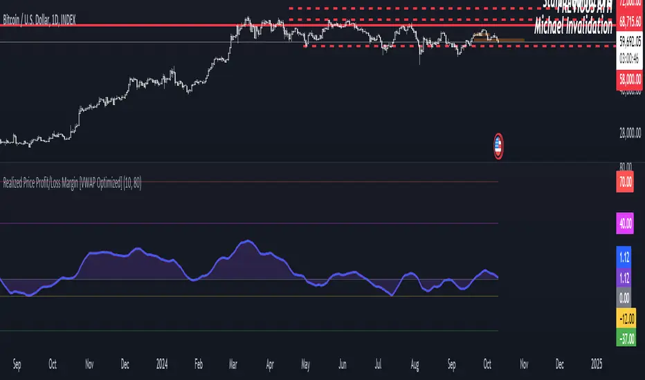
Realized Price Profit/Loss Margin [VWAP Optimized]Shaded Profit/Loss Margin Oscillator
The Shaded Profit/Loss Margin Oscillator is a powerful tool designed to measure Bitcoin’s Net Unrealized Profit/Loss (NUPL). This metric reflects the difference between Bitcoin’s current market price and its realized price, which approximates the price at which coins were last moved. By smoothing the NUPL using a moving average, the indicator provides a clean purple oscillator line that helps users easily gauge market sentiment. When the oscillator is above the zero line, the market is in profit, and when it is below zero, participants are generally in a state of unrealized loss. The shaded area between the oscillator and the zero line enhances visual clarity, making it easier to identify potential shifts in market behavior such as profit-taking or capitulation.
Unique Features and Added Value
What sets this indicator apart from traditional NUPL indicators is the use of a volume-weighted average price (VWAP) as a proxy for the realized price. Unlike the original on-chain NUPL metric, which relies on complex on-chain data, this indicator leverages VWAP to provide an approximation of realized price based solely on price and volume data available directly on TradingView. This method makes it highly accessible to traders who don’t have access to on-chain data platforms.
The use of VWAP not only simplifies the calculation but also provides additional value, as it incorporates volume into the realized price estimation. This volume-sensitive approach may offer a more responsive and dynamic reflection of realized prices compared to on-chain models, which can sometimes lag. In essence, this VWAP-based NUPL oscillator offers a unique edge in tracking profit/loss margins, particularly for traders who want a straightforward and efficient way to gauge sentiment without relying on external on-chain data sources. It brings the essence of NUPL into the world of technical analysis in an accessible and actionable way.
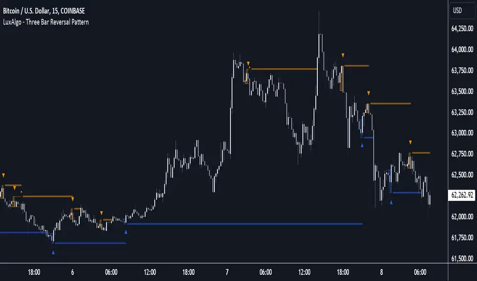
Three Bar Reversal Pattern [LuxAlgo]The Three Bar Reversal Pattern indicator identifies and highlights three bar reversal patterns on the user price chart.
The script also provides an option for incorporating various trend indicators used to filter out detected signals, allowing them to enhance their accuracy and help obtain a more comprehensive analysis.
🔶 USAGE
The script automates the detection of three-bar reversal patterns and provides a clear, visually identifiable signal for potential trend reversals.
When a reversal chart pattern is confirmed and price action aligns with the pattern, the pattern's boundaries are extended, forming levels, with the upper boundary often acting as a resistance and the lower boundary as a support.
The script allows users to filter patterns based on a specific trend direction detected by multiple trend indicators. Users can choose to view patterns that are either aligned with the detected trend or opposite to it.
Included trend indicators are: Moving Average Cloud, Supertrend, and Donchian Channels.
🔶 DETAILS
The three-bar reversal pattern is a technical analysis pattern that signals a potential reversal in the prevailing trend. The pattern consists of three consecutive bar formations:
First Bar and Second Bar: 2 consecutive of the same sentiment, representing the prevailing trend in the market.
Third Bar: Confirms the reversal by closing beyond the high or low of the first bar, signaling a potential change in market sentiment.
Various types of three-bar reversal patterns are documented. The script supports two main types:
Normal Pattern: Detects three-bar reversal patterns without requiring the third bar closing price to surpass the high (bullish pattern) or low (bearish pattern) of the first bar. It identifies basic formations signaling potential trend reversals.
Enhanced Pattern: Specifically identifies three-bar reversal patterns where the third bar closing price surpasses the high (bullish pattern) or low (bearish pattern) of the first bar. This type provides a more selective signal for stronger trend reversals.
🔶 SETTINGS
Pattern Type: Users can choose the type of 3-bar reversal patterns to detect: Normal, Enhanced, or All. "Normal" detects patterns that do not necessarily surpass the high/low of the first bar. "Enhanced" detects patterns where the third bar surpasses the high/low of the first bar. "All" detects both Normal and Enhanced patterns.
Derived Support and Resistance: Toggles the visibility of the support and resistance levels/zones.
🔹 Trend Filtering
Filtering: Allows users to filter patterns based on the trend indicators: Moving Average Cloud, Supertrend, and Donchian Channels. The "Aligned" option only detects patterns that align with the trend and conversely, the "Opposite" option detects patterns that go against the trend.
🔹 Trend Indicator Settings
Moving Average Cloud: Allows traders to choose the type of moving averages (SMA, EMA, HMA, etc.) and set the lengths for fast and slow-moving averages.
Supertrend: Options to set the ATR length and factor for Supertrend.
Donchian Channels: Option to set the length for the channel calculation.
🔶 RELATED SCRIPTS
Reversal-Candlestick-Structure .
Reversal-Signals .
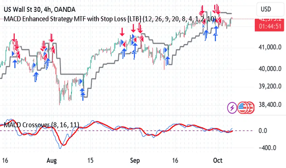
MACD Enhanced Strategy MTF with Stop Loss [LTB]Test strategy for MACD
This strategy, named "MACD Enhanced Strategy MTF with Stop Loss ," is a modified Moving Average Convergence Divergence (MACD) strategy with enhancements such as multi-timeframe (MTF) analysis, custom scoring, and a dynamic stop loss mechanism. Let’s break down how to effectively use it:
Key Elements of the Strategy
MACD Indicator with Modifications:
The strategy uses MACD, a well-known momentum indicator, with customizable parameters:
fastLength, slowLength, and signalLength represent the standard MACD settings.
Instead of relying solely on MACD crossovers, it introduces scoring parameters for histogram direction (histside), indicator direction (indiside), and signal cross (crossscore). This allows for a more nuanced decision-making process when determining buy and sell signals.
Multi-Timeframe Analysis (MTF):
The strategy compares the current timeframe's MACD score with that of a higher timeframe (HTF). It dynamically selects the higher timeframe based on the current timeframe. For example, if the current chart period is 1, it will select 5 as the higher timeframe.
This MTF approach aims to align trades with broader trends, filtering out false signals that could be present when analyzing only a single timeframe.
Scoring System:
A custom scoring system (count() function) is used to evaluate buy and sell signals. This includes calculations based on the direction and momentum of MACD (indi) and the histogram. The score is used to determine the strength of signals.
Positive scores indicate bullish sentiment, while negative scores indicate bearish sentiment.
This scoring mechanism aims to reduce the influence of noise and provide more reliable entries.
Entry Conditions:
Long Condition: When the Result value (a combination of MTF and current MACD analysis) changes and becomes positive, a long entry is triggered.
Short Condition: When the Result changes and becomes negative, a short entry is initiated.
Stop Loss Mechanism:
The countstop() function calculates dynamic stop loss values for both long and short trades. It is based on the Average True Range (ATR) multiplied by a factor (Mult), providing adaptive stop loss levels depending on market volatility.
The stop loss is plotted on the chart to show potential risk levels for open trades, with the line appearing only if shotsl is enabled.
How to Use the Strategy
To properly use the strategy, follow these steps:
Parameter Optimization:
Adjust the input parameters such as fastLength, slowLength, and signalLength to tune the MACD indicator to the specific asset you’re trading. The values provided are typical defaults, but optimizing these values based on backtesting can help improve performance.
Customize the scoring parameters (crossscore, indiside, histside) to balance how much weight you want to put on the direction, histogram, and cross events of the MACD indicator.
Select Appropriate Timeframes:
This strategy employs a multi-timeframe (MTF) approach, so it's important to understand how the higher timeframe (HTF) is selected based on the current timeframe. For instance, if you are trading on a 5-minute chart, the higher timeframe will be 15 minutes, which helps filter out lower timeframe noise.
Ensure you understand the relationship between the timeframe you’re using and the HTF it automatically selects. The strategy’s effectiveness can vary depending on how these timeframes align with the asset’s overall volatility.
Run Backtests:
Always backtest the strategy over historical data to determine its reliability for the asset and timeframes you’re interested in. Note that the MTF approach may require substantial data to capture how different timeframes interact.
Use the backtest results to adjust the scoring parameters or the Stop Loss Factor (Mult) for better risk management.
Stop Loss Usage:
The stop loss is calculated dynamically using ATR, which means that it adjusts with changing volatility. This can be useful to avoid being stopped out too often during periods of increased volatility.
The shotsl parameter can be set to true to visualize the stop loss line on the chart. This helps to monitor the protection level and make better decisions regarding holding or closing a trade manually.
Entry Signals and Trade Execution:
Look for changes in the Result value to determine entry points. For a long position, the Result needs to become positive, and for a short position, it must be negative.
Note that the strategy's entries are more conservative because it waits for the Result to confirm the direction using multiple factors, which helps filter out false breakouts.
Risk Management:
The adaptive stop loss mechanism reduces the risk by basing the stop level on market volatility. However, you must still consider additional risk management practices such as position sizing and profit targets.
Given the scoring mechanism, it might not enter trades frequently, which means using this strategy may result in fewer but potentially more accurate trades. It’s important to be patient and not force trades that don’t align with the calculated results.
Real-Time Monitoring:
Make sure to monitor trades actively. Since the strategy recalculates the score on each bar, real-time changes in the Result value could provide exit opportunities even if the stop loss isn't triggered.
Summary
The "MACD Enhanced Strategy MTF with Stop Loss " is a sophisticated version of the MACD strategy, enhanced with multi-timeframe analysis and adaptive stop loss. Properly using it involves optimizing MACD and scoring parameters, selecting suitable timeframes, and actively managing entries and exits based on a combination of scoring and volatility-based stop losses. Always conduct thorough backtesting before applying it in a live environment to ensure the strategy performs well on the asset you're trading.
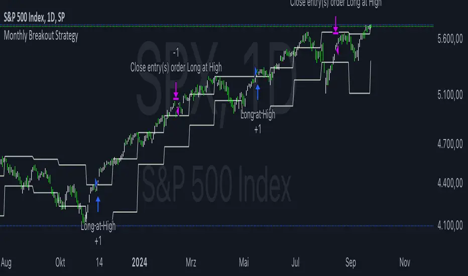
Monthly Breakout StrategyThis Monthly High/Low Breakout Strategy is designed to take long or short positions based on breakouts from the high or low of the previous month. Users can select whether they want to go long at a breakout above the previous month’s high, short at a breakdown below the previous month’s low, or use the reverse logic. Additionally, it includes a month filter, allowing trades to be executed only during user-specified months.
Breakout strategies, particularly those based on monthly highs and lows, aim to capitalize on price momentum. These systems rely on the assumption that once a significant price level is breached (such as the previous month's high or low), the market is likely to continue moving in the same direction due to increased volatility and trend-following behaviors by traders. Studies have demonstrated the potential effectiveness of breakout strategies in financial markets.
Scientific Evidence Supporting Breakout Strategies:
Momentum in Financial Markets:
Research on momentum-based strategies, which include breakout trading, shows that securities breaking key levels of support or resistance tend to continue their price movement in the direction of the breakout. Jegadeesh and Titman (1993) found that stocks with strong performance over a given period tend to continue performing well in subsequent periods, a principle also applied to breakout strategies.
Behavioral Finance:
The psychological factor of herd behavior is one of the driving forces behind breakout strategies. When prices break out of a key level (such as a monthly high), it triggers increased buying or selling pressure as traders join the trend. Barberis, Shleifer, and Vishny (1998) explained how cognitive biases, such as overconfidence and sentiment, can amplify price trends, which breakout strategies attempt to exploit.
Market Efficiency:
While markets are generally efficient, periods of inefficiency can occur, particularly around the breakouts of significant price levels. These inefficiencies often result in temporary price trends, which breakout strategies can exploit before the market corrects itself (Fama, 1970).
Risk Considerations:
Despite the potential for profit, the Monthly Breakout Strategy comes with several risks:
False Breakouts:
One of the most common risks in breakout strategies is the occurrence of false breakouts. These happen when the price temporarily moves above (or below) a key level but quickly reverses direction, causing losses for traders who entered positions too early. This is particularly risky in low-volatility environments.
Market Volatility:
Monthly breakout strategies rely on momentum, which may not be consistent across different market conditions. During periods of low volatility, price breakouts might lack the follow-through required for the strategy to succeed, leading to poor performance.
Whipsaw Risk:
The strategy is vulnerable to whipsaw markets, where prices oscillate around key levels without establishing a clear direction. This can result in frequent entry and exit signals that lead to losses, especially if trading costs are not managed properly.
Overfitting to Past Data:
If the month-selection filter is overly optimized based on historical data, the strategy may suffer from overfitting—performing well in backtests but poorly in real-time trading. This happens when strategies are tailored to past market conditions that may not repeat.
Conclusion:
While monthly breakout strategies can be effective in markets with strong momentum, they are subject to several risks, including false breakouts, volatility dependency, and whipsaw behavior. It is crucial to backtest this strategy thoroughly and ensure it aligns with your risk tolerance before implementing it in live trading.
References:
Jegadeesh, N., & Titman, S. (1993). Returns to Buying Winners and Selling Losers: Implications for Stock Market Efficiency. Journal of Finance, 48(1), 65-91.
Barberis, N., Shleifer, A., & Vishny, R. (1998). A Model of Investor Sentiment. Journal of Financial Economics, 49(3), 307-343.
Fama, E. F. (1970). Efficient Capital Markets: A Review of Theory and Empirical Work. Journal of Finance, 25(2), 383-417.
Fibonacci Pivot | SyedFibonacci pivots combine Fibonacci retracement levels with pivot points to provide potential support and resistance levels. This tool is based on the idea that price tends to retrace a predictable portion of a move, after which it often continues in the original direction.
Here’s a breakdown of Fibonacci pivots:
1. Pivot Point (PP)
The central level that acts as the main reference point for support and resistance levels. It’s calculated as the average of the high, low, and close of the previous period (typically a day).
Formula:
𝑃
𝑃
=
(
𝐻
𝑖
𝑔
ℎ
+
𝐿
𝑜
𝑤
+
𝐶
𝑙
𝑜
𝑠
𝑒
)
3
PP=
3
(High+Low+Close)
2. Fibonacci-Based Support and Resistance Levels
These levels are derived by multiplying the range (High - Low) of the previous period with key Fibonacci ratios (23.6%, 38.2%, 61.8%, etc.), then adding or subtracting this result from the Pivot Point.
The Fibonacci ratios used in Fibonacci pivots are typically:
38.2%: A strong retracement level.
61.8%: The golden ratio, a key Fibonacci level that often acts as major support or resistance.
100%: Full retracement from the previous period's high or low.
Fibonacci Support Levels (S1, S2, S3, etc.)
These levels indicate potential areas where the price might find support:
S1 = PP - (Range * 0.382)
S2 = PP - (Range * 0.618)
S3 = PP - (Range * 1)
Fibonacci Resistance Levels (R1, R2, R3, etc.)
These are the areas where price might face resistance:
R1 = PP + (Range * 0.382)
R2 = PP + (Range * 0.618)
R3 = PP + (Range * 1)
Interpretation
R1/R2/R3: Potential resistance levels where price might face selling pressure.
S1/S2/S3: Potential support levels where price might encounter buying interest.
Pivot Point (PP): Acts as the primary level of interest. If the price is above the PP, it suggests bullish sentiment; if below, bearish sentiment.
Example

Options Series - MTF 1 and 3 Minute
Objective:
The indicator is named "Options Series - MTF 1 and 3 Minute", suggesting it's designed to analyze options series with multiple time frames (MTF), particularly focusing on 1-minute and 3-minute intervals.
OHLC Values Of Candle:
The code fetches the Open, High, Low, and Close (OHLC) values of the current candle for the specified ticker and timeframes (current, 1 minute, and 3 minutes). Additionally, it calculates the 200-period Simple Moving Average (SMA) of the closing prices for each timeframe.
Bull vs. Bear Condition:
It defines conditions for Bullish and Bearish scenarios based on comparing the current close price with the previous 200-period SMA close price for both 1-minute and 3-minute timeframes. If the current close price is higher than the previous 200-period SMA close price, it's considered Bullish, and if it's lower, it's considered Bearish.
Final Color Condition and Plot:
It determines the color of the candlestick based on the Bullish or Bearish condition. If the conditions for a Bullish scenario are met, the candlestick color is set to green (GreenColorCandle). If the conditions for a Bearish scenario are met, the candlestick color is set to red (RedColorCandle). If neither condition is met (i.e., the candle is neither Bullish nor Bearish), the color remains gray.
The code then plots the 200-period SMA values for both 1-minute and 3-minute timeframes and colors them based on the candlestick color. It also colors the bars based on the candlestick color.
Insights:
This indicator focuses on comparing current close prices with the 200-period SMA close prices to determine market sentiment (Bullish or Bearish).
It utilizes multiple time frames (1 minute and 3 minutes) to provide a broader perspective on market movements.
The color-coded candlesticks and bars make it visually easy to identify Bullish and Bearish trends.
This indicator can be used as part trading based on the identified market sentiment.

Trend Fusion: ADX&EMA+Ichimoku (Custom)SAME AS THE ORIGINAL (WITHOUT BOTTOM PART)
Trend Fusion: ADX & EMA+Ichimoku is an innovative indicator designed to provide traders with comprehensive insights into market trends. Combining the power of the Average Directional Index (ADX) with Exponential Moving Averages (EMA) and the Ichimoku Cloud, this indicator offers a sophisticated approach to trend analysis.
This indicator stands out for its unique integration of multiple trend-following indicators, offering traders a holistic view of market dynamics. Unlike traditional trend indicators that focus solely on price movements, Trend Fusion incorporates the ADX, EMA, and Ichimoku Cloud to provide a more nuanced understanding of trend strength and direction. By combining these indicators, traders can make more informed decisions and enhance their trading strategies.
How it works:
Trend Fusion generates buy and sell signals based on the convergence of these indicators. A combination of strong ADX readings, EMA crossovers, and alignment with the Ichimoku Cloud confirms trend direction and provides entry and exit points for traders.
Average Directional Index (ADX): Measures the strength of the prevailing trend by analyzing price movements. A rising ADX indicates a strengthening trend, while a falling ADX suggests weakening momentum.
Exponential Moving Averages (EMA): Detects potential trend reversals through crossover signals. A bullish crossover (fast EMA crossing above slow EMA) suggests an uptrend, while a bearish crossover indicates a downtrend.
Ichimoku Cloud: Provides support and resistance levels along with trend direction. Price movements above the cloud indicate bullish sentiment, while movements below the cloud suggest bearish sentiment.
How to useColour codes:
Green Candles: Represent a strong uptrend, indicating robust buying momentum. The intensity of green color deepens with increasing trend strength.
Red Candles: Indicate a strong downtrend, signaling significant selling pressure in the market. The intensity of red color deepens with increasing trend strength.
Yellow Candles: Suggest a weak trend, characterized by indecision and lack of clear direction. The intensity of yellow color varies based on the strength of the trend, with lighter shades indicating weaker trends and darker shades suggesting slightly stronger trends.
Trend Strength: Monitor the ADX to gauge the strength of the prevailing trend. Higher ADX values indicate stronger trends, while lower values suggest weaker trends.
Trend Direction: Confirm trend direction using EMA crossovers and Ichimoku Cloud signals. Look for bullish crossovers and price movements above the cloud for uptrends, and bearish crossovers and movements below the cloud for downtrends.
Entry and Exit Signals: Enter trades when all components align, signaling a strong trend. Use EMA crossovers and cloud confirmations to identify potential entry points, and consider exiting trades when these signals reverse.
The ADX calculation and signal logic are based on the ADX script by PineCoders, with modifications to integrate it into this indicator.
The EMA crossover logic is adapted from the GDAX EMA Cross script by stefano98.
The Ichimoku Cloud calculation and plotting are adapted from the Ichimoku Cloud script by lonesometheblue.
Trading involves risk, and past performance is not indicative of future results. It is recommended to use this indicator alongside other technical analysis tools and risk management strategies.

[DarkTrader] Pivot Point HeatmapThe indicator calculates pivot points using price data from different timeframes such as 12M, 1M, 1W, 3D, and 1D. For each timeframe, it retrieves the high, low, open, and close prices of the previous bar. The pivot point is calculated as the average of the high, low, and close prices, which provides a central level where market sentiment may shift. This calculation is repeated for each timeframe, ensuring a multi-dimensional view of potential interest zones.
Importance of Pivot Points :
Pivot points are essential tools in technical analysis, providing traders with levels that act as potential support and resistance zones. These zones help identify price levels where reversals or breakouts are more likely to occur.
Visual Representation :
The core feature of this indicator is its ability to visualize pivot points as a heatmap on the chart. Instead of showing just the latest pivot points, it tracks the historical pivot swipe, providing a dynamic view of how price interacts with these key levels. Each pivot point is represented by a line, color-coded based on its position relative to other points, creating a gradient effect that highlights the most critical price areas.
Customization Options :
Traders can customize various aspects of the heatmap to suit their preferences. The indicator offers options to toggle pivot swipe history, enabling traders to either focus on the most recent price interactions or consider how price has behaved over time. The background color and pivot line colors are fully customizable, making it easy to match the heatmap with your chart's theme or emphasize certain price levels.
Detecting Sweeps and Price Interaction :
Another important feature is the detection of price interactions with pivot levels. If the current bar's high and low cross a pivot point, it signals that the pivot level has been "swept" by price action, potentially indicating a change in market sentiment. The indicator either extends the line if the pivot point remains relevant or deletes it if price has broken through. This dynamic adjustment helps traders stay updated on which pivot levels are still valid.

Cumulative Net Money FlowDescription:
Dive into the financial depth of the markets with the "Cumulative Net Money Flow" indicator, designed to provide a comprehensive view of the monetary dynamics in trading. This tool is invaluable for traders and investors seeking to quantify the actual money entering or exiting the market over a specified period.
Features:
Value-Weighted Calculations: This indicator multiplies the trading volume by the price, offering a money flow perspective rather than just counting shares or contracts.
Custom Timeframe Adaptability: Adjust the timeframe to match your trading strategy, whether you are day trading, swing trading, or looking for longer-term trends.
Cumulative Insight: Tracks and accumulates net money flow to highlight overall market sentiment, making it easier to spot trends in capital movement.
Color-Coded Visualization: Displays positive money flow in green and negative money flow in red, providing clear, visual cues about market conditions.
Utility: "Cumulative Net Money Flow" is particularly effective in revealing the strength behind market movements. By understanding whether the money flow is predominantly buying or selling, traders can better align their strategies with market sentiment. This indicator is suited for various asset classes, including stocks, cryptocurrencies, and forex.

Daily Open [Kintsugi Trading]Daily Open
The "Daily Open" indicator by Kintsugi Trading is designed to give traders clear and immediate access to daily open prices, enhancing their ability to spot key market levels and make informed trading decisions. The indicator dynamically changes the color of the plotted line based on the current price's relationship to the opening price of the regular market session. This visual aid helps traders quickly assess whether the current price is trading above or below the opening price of the session.
Key Features:
Daily Open Visualization: Automatically plots the daily open price on your chart, providing a clear reference point for daily price action.
Configurable Market Open Time: The indicator allows users to input the start time of the regular market session (default is set to 9:30 AM).
Color-Coded: The indicator dynamically adjusts the color of the daily open line and price labels based on whether the price is above or below the open, giving you quick visual cues about market sentiment.
Customization Options: Users can modify the line's appearance, including the color and style, to better fit their chart preferences.
Ideal For:
This indicator is particularly useful for day traders and those looking to closely monitor price action in relation to the market's opening level. It serves as a quick reference point for identifying potential bullish or bearish sentiment throughout the trading day.
Good luck with your trading!
