Trade Session If you are trading intraday. It is sometimes helpful to see
the boundaries of your time period. This script was created
for this. It highlights your trading session in the background.
You can specify this interval in the settings in hh:mm-hh:mm
session start and stop, respectively.
חפש סקריפטים עבור "session"

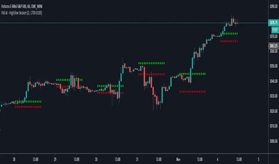
Fide AI - High/low SessionDraw the high and low of the specific session until the start the session again.
Ignore Extended Session CodeLooking at the extended session is awesome and can certainly give you an edge on trading the open of a market. If you're more of a technical trader, though, you run into the problem of the extended session data throwing your indicators off. To fix that, use the code below as a template for whatever indicators you use.


3-Session ORB (SGT) + 15m EMA200 Trend Dashboard (v6)3-Session ORB (SGT) + 15m EMA200 Trend Dashboard (v6)


Dual Session VWAPs by GK snipervwaps automatically
for london
new york session
easy
will remove automatically next day

ICT 7/8/9am lines NY session + 7.30/8.30/9.30 linesThis script show the 7, 8, 9 AM NY session lines, together with the 7.30, 8.30 and 9.30AM lines, like ICT teaches in the 2024 Mentorship, lesson 2.
Feel free to use it!

First FVG per Session - Big boss traders First FVG per Session like Asia first Persented FVG London and Ny

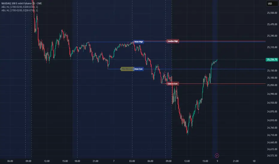
4H Session High/Low4H Asia Session Anchor Range Description: This indicator identifies and plots the price range of the specific 4-hour candle starting at 04:00 (local time). By utilizing Multi-Timeframe (MTF) logic, the high and low boundaries (wick-to-wick) remain fixed and accurate even when scaling down to lower timeframes like the 1-minute or 5-minute charts. The levels extend horizontally to the right, providing clear institutional support and resistance zones based on the early morning volatility.

Long Only - Double EMA + SessionOverview
This is a high-probability Long-Only trend-following strategy designed primarily for the 65-minute and 4-hour timeframes. It utilizes a dual-layered filter system to align trades with both macro and mid-term market momentum, ensuring entries only occur during healthy uptrends. The strategy is optimized for volatile, high-growth assets like TSLA and MSFT.
How It Works
The strategy relies on three primary pillars of technical analysis to confirm an "A+" setup:
Macro Trend Filter (200 EMA): We only look for long opportunities when the price is above the 200-period Exponential Moving Average. This keeps the strategy on the right side of the long-term trend and avoids "buying the dip" during major bear markets.
Momentum Filter (50 EMA): The 50 EMA acts as a local trend filter. By requiring price to be above both EMAs, we ensure the medium-term momentum is also bullish.
The Trigger (Stochastic RSI): We enter when the Stochastic RSI K-line crosses above the 20 level (Oversold). This identifies local "oversold" pullbacks within a larger uptrend.
Risk Management & Exit Plan
This strategy is built with professional-grade capital preservation in mind:
Trailing Stop-Loss: A 5% trailing stop follows the price as it moves in our favor. This protects unrealized profits and helps mitigate the drawdown during sudden reversals.
Dynamic Profit Target: The strategy exits automatically if the Stochastic RSI K-line reaches the 97 level, capturing gains at the peak of momentum.
Session Filter: To avoid the "noise" of pre-market and low-volume afternoon trading, the strategy is restricted to the Market Open (9:30 AM EST) window where institutional volume is highest.
Backtesting Notes
Realistic Simulation: This strategy includes a 0.05% commission and 2 ticks of slippage to reflect real-world execution costs.
Recommended Assets: Optimized for Nasdaq-100 components and high-volume growth stocks.
Timeframe: Best performance found on 65m or 4h intervals.

Fair Value Gaps (40+ Points) with NY Session AlertsFVG with alerts. This works for the NY session only.

Today's Session High/Low + Previous LevelsThis indicator combines multiple powerful tools into one clean overlay:
Today’s Session High & Low for Asia, London and New York, automatically drawn only for the current trading day.
Previous High & Low levels based on configurable timeframes (hour, day, week, month or year), including optional filtering and area zones.
EMA Trend Table showing EMA20, EMA50 and EMA200 alignment across multiple timeframes with clear bullish/bearish status.
Designed to help traders quickly identify key intraday levels, higher-timeframe liquidity zones and overall market trend at a glance.

Today's Session High/Low + Previous LevelsDescription
This indicator combines multiple powerful tools into one clean overlay:
Today’s Session High & Low for Asia, London and New York, automatically drawn only for the current trading day.
Previous High & Low levels based on configurable timeframes (hour, day, week, month or year), including optional filtering and area zones.
EMA Trend Table showing EMA20, EMA50 and EMA200 alignment across multiple timeframes with clear bullish/bearish status.
Designed to help traders quickly identify key intraday levels, higher-timeframe liquidity zones and overall market trend at a glance.

FxNeel SessionAll types of ICT session you can draw here. Like Asia, London, NY, New Close, CBDR, Asia Kill zone and also Silverbullet Time zone.

Pre-Market + Previous Session High/LowThis script plots the key intraday levels most daytraders watch:
Today’s Pre-Market High & Low
Previous Regular Session High & Low


NYSE CME Market Session Clock This indicator can only work on short-term timeframes, since the time before the opening and before the closing of the session is updated only with the appearance of a new candle.

Hourly ORB NY Session (5/15min) - FixedDrawing ORB each hour in NY session
First ORB is 9.30 to 11.00am
then every hour we have a 15 min ORB
11am
12pm
1pm
2pm
3pm
You dont need anything else than this! Simple and powerful

Bangladesh Time Session & Candlestick ConfirmationIt's shows the time when new york and london session colaub with candelstick confarmation.
Asian & London Session Highs/LowsThis will help you spot session highs/lows to help you get draws on liq

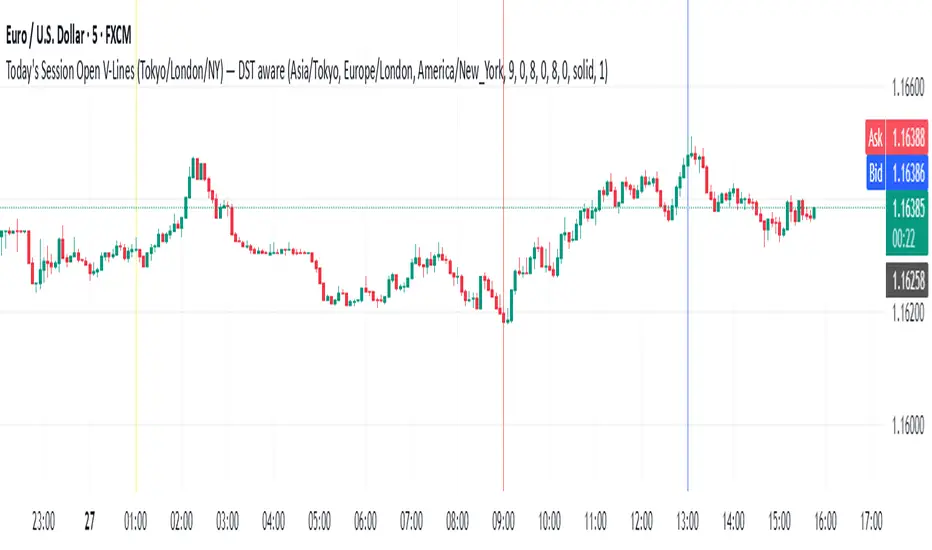
Todays Session Open LN,NYWhen are the Asian, London and New York open for each session simple stuff trading view made me right more stuff so i can publish this what to do c'est la vie