[Mad] Liquidation LevelsThe Liquidation Lines Technical Indicator is a trading tool designed to assist traders in identifying potential liquidation levels. This indicator generates virtual positions, known as "liquidation lines", which mark the points at which these positions would be liquidated under specified conditions.
Key Features:
Quantity of Lines: The indicator can create up to 125 liquidation lines, evenly distributed between long and short positions. This limit is derived from a maximum of 500 lines, divided by four to account for two types of leverage (long and short).
Customizable Liquidation Levels: Users are given the ability to set liquidation levels according to their individual trading strategies and the current market conditions.
Customizable Visuals: The color and thickness of the liquidation lines can be adjusted to suit personal preferences, providing a clear visual representation on the trading chart for ease of analysis.
Selectable Signal Sources: The indicator provides the flexibility to choose the signal source for creating the liquidation lines. Users can select from a range of popular technical analysis tools such as Bollinger Bands, MACD crosses, EMA crosses, or SMA crosses. This feature allows traders to customize the formation of liquidation lines based on their preferred technical indicators, adding to the comprehensiveness and versatility of the tool.
Two selectable Leverages: The indicator accommodates both long and short leverages, offering a comprehensive understanding of potential liquidation points for various trading scenarios.
Selectable Exchange Maintenance: The indicator allows users to select their specific cryptocurrency exchange. This feature ensures that the liquidation lines are accurately calculated according to the maintenance margin requirements of the chosen exchange, adding precision and customization to the trading analysis.
חפש סקריפטים עבור "technical"
Adaptive Gaussian Moving AverageThe Adaptive Gaussian Moving Average (AGMA) is a versatile technical indicator that combines the concept of a Gaussian Moving Average (GMA) with adaptive parameters based on market volatility. The indicator aims to provide a smoothed trend line that dynamically adjusts to different market conditions, offering a more responsive analysis of price movements.
Calculation:
The AGMA is calculated by applying a weighted moving average based on a Gaussian distribution. The length parameter determines the number of bars considered for the calculation. The adaptive parameter enables or disables the adaptive feature. When adaptive is true, the sigma value, which represents the standard deviation, is dynamically calculated using the standard deviation of the closing prices over the volatilityPeriod. When adaptive is false, a user-defined fixed value for sigma can be input.
Interpretation:
The AGMA generates a smoothed line that follows the trend of the price action. When the AGMA line is rising, it suggests an uptrend, while a declining line indicates a downtrend. The adaptive feature allows the indicator to adjust its sensitivity based on market volatility, making it more responsive during periods of high volatility and less sensitive during low volatility conditions.
Potential Uses in Strategies:
-- Trend Identification : Traders can use the AGMA to identify the direction of the prevailing trend. Buying opportunities may arise when the price is above the AGMA line during an uptrend, while selling opportunities may be considered when the price is below the AGMA line during a downtrend.
-- Trend Confirmation : The AGMA can be used in conjunction with other technical indicators or trend-following strategies to confirm the strength and sustainability of a trend. A strong and steady AGMA line can provide additional confidence in the prevailing trend.
-- Volatility-Based Strategies : Traders can utilize the adaptive feature of the AGMA to build volatility-based strategies. By adjusting the sigma value based on market volatility, the indicator can dynamically adapt to changing market conditions, potentially improving the accuracy of entry and exit signals.
Limitations:
-- Lagging Indicator : Like other moving averages, the AGMA is a lagging indicator that relies on historical price data. It may not provide timely signals during rapidly changing market conditions or sharp price reversals.
-- Whipsaw in Sideways Markets : During periods of low volatility or when the market is moving sideways, the AGMA may generate false signals or exhibit frequent crossovers around the price, leading to whipsaw trades.
-- Subjectivity of Parameters : The choice of length, adaptive parameters, and volatility period requires careful consideration and customization based on individual preferences and trading strategies. Traders need to adjust these parameters to suit the specific market and timeframe they are trading.
Overall, the Adaptive Gaussian Moving Average can be a valuable tool in trend identification and confirmation, especially when combined with other technical analysis techniques. However, traders should exercise caution, conduct thorough analysis, and consider the indicator's limitations when incorporating it into their trading strategies.

Nonlinear Regression, Zero-lag Moving Average [Loxx]Nonlinear Regression and Zero-lag Moving Average
Technical indicators are widely used in financial markets to analyze price data and make informed trading decisions. This indicator presents an implementation of two popular indicators: Nonlinear Regression and Zero-lag Moving Average (ZLMA). Let's explore the functioning of these indicators and discuss their significance in technical analysis.
Nonlinear Regression
The Nonlinear Regression indicator aims to fit a nonlinear curve to a given set of data points. It calculates the best-fit curve by minimizing the sum of squared errors between the actual data points and the predicted values on the curve. The curve is determined by solving a system of equations derived from the data points.
We define a function "nonLinearRegression" that takes two parameters: "src" (the input data series) and "per" (the period over which the regression is calculated). It calculates the coefficients of the nonlinear curve using the least squares method and returns the predicted value for the current period. The nonlinear regression curve provides insights into the overall trend and potential reversals in the price data.
Zero-lag Moving Average (ZLMA)
Moving averages are widely used to smoothen price data and identify trend directions. However, traditional moving averages introduce a lag due to the inclusion of past data. The Zero-lag Moving Average (ZLMA) overcomes this lag by dynamically adjusting the weights of past values, resulting in a more responsive moving average.
We create a function named "zlma" that calculates the ZLMA. It takes two parameters: "src" (the input data series) and "per" (the period over which the ZLMA is calculated). The ZLMA is computed by first calculating a weighted moving average (LWMA) using a linearly decreasing weight scheme. The LWMA is then used to calculate the ZLMA by applying the same weight scheme again. The ZLMA provides a smoother representation of the price data while reducing lag.
Combining Nonlinear Regression and ZLMA
The ZLMA is applied to the input data series using the function "zlma(src, zlmaper)". The ZLMA values are then passed as input to the "nonLinearRegression" function, along with the specified period for nonlinear regression. The output of the nonlinear regression is stored in the variable "out".
To enhance the visual representation of the indicator, colors are assigned based on the relationship between the nonlinear regression value and a signal value (sig) calculated from the previous period's nonlinear regression value. If the current "out" value is greater than the previous "sig" value, the color is set to green; otherwise, it is set to red.
The indicator also includes optional features such as coloring the bars based on the indicator's values and displaying signals for potential long and short positions. The signals are generated based on the crossover and crossunder of the "out" and "sig" values.
Wrapping Up
This indicator combines two important concepts: Nonlinear Regression and Zero-lag Moving Average indicators, which are valuable tools for technical analysis in financial markets. These indicators help traders identify trends, potential reversals, and generate trading signals. By combining the nonlinear regression curve with the zero-lag moving average, this indicator provides a comprehensive view of the price dynamics. Traders can customize the indicator's settings and use it in conjunction with other analysis techniques to make well-informed trading decisions.

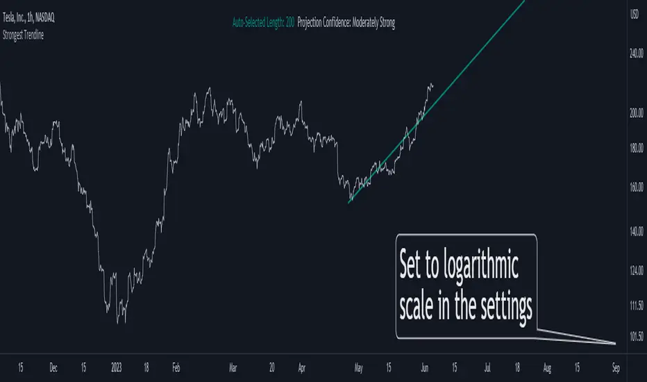
Strongest TrendlineUnleashing the Power of Trendlines with the "Strongest Trendline" Indicator.
Trendlines are an invaluable tool in technical analysis, providing traders with insights into price movements and market trends. The "Strongest Trendline" indicator offers a powerful approach to identifying robust trendlines based on various parameters and technical analysis metrics.
When using the "Strongest Trendline" indicator, it is recommended to utilize a logarithmic scale . This scale accurately represents percentage changes in price, allowing for a more comprehensive visualization of trends. Logarithmic scales highlight the proportional relationship between prices, ensuring that both large and small price movements are given due consideration.
One of the notable advantages of logarithmic scales is their ability to balance price movements on a chart. This prevents larger price changes from dominating the visual representation, providing a more balanced perspective on the overall trend. Logarithmic scales are particularly useful when analyzing assets with significant price fluctuations.
In some cases, traders may need to scroll back on the chart to view the trendlines generated by the "Strongest Trendline" indicator. By scrolling back, traders ensure they have a sufficient historical context to accurately assess the strength and reliability of the trendline. This comprehensive analysis allows for the identification of trendline patterns and correlations between historical price movements and current market conditions.
The "Strongest Trendline" indicator calculates trendlines based on historical data, requiring an adequate number of data points to identify the strongest trend. By scrolling back and considering historical patterns, traders can make more informed trading decisions and identify potential entry or exit points.
When using the "Strongest Trendline" indicator, a higher Pearson's R value signifies a stronger trendline. The closer the Pearson's R value is to 1, the more reliable and robust the trendline is considered to be.
In conclusion, the "Strongest Trendline" indicator offers traders a robust method for identifying trendlines with significant predictive power. By utilizing a logarithmic scale and considering historical data, traders can unleash the full potential of this indicator and gain valuable insights into price trends. Trendlines, when used in conjunction with other technical analysis tools, can help traders make more informed decisions in the dynamic world of financial markets.
Dual Dynamic Fibonacci Retracement — Long and Short Duration
Title : "The Dual-Dynamic Fibonacci Retracement Script: An Advanced Tool for Comprehensive Market Analysis"
As the author of the "Dual-Dynamic Fibonacci Retracement Script", I am delighted to introduce you to this cutting-edge tool for technical analysis. Unlike conventional Fibonacci scripts, this advanced model incorporates multiple unique features and adjustments that make it a powerful asset for any market analyst. Whether you're dealing with forex, commodities, equities or any other market, this script is versatile enough to enhance your trading strategy.
Uniqueness & Differentiation:
The "Dual-Dynamic Fibonacci Script" stands out by offering two distinct lookback periods. This feature is what separates it from other scripts available in the market. The first lookback period is longer, focusing on capturing broader market trends. The second lookback period is shorter, allowing for a more granular analysis of near-term market fluctuations. This dual perspective provides a more comprehensive view of the market, allowing you to see both the forest and the trees at the same time.
Fibonacci Levels:
While offering the standard Fibonacci retracement levels (0.236, 0.382, 0.5, 0.618, 0.786, and 1.0), the script also gives you the ability to plot 0.114 and 0.886 levels. These additional levels offer an extra layer of depth to your analysis, and can prove crucial in high-volatility markets where they often serve as significant support and resistance points.
Customizable Line Shifts and Extends:
This script provides options for customization of the shift and extension of the plotted lines. This means you can adjust the start and end points of the Fibonacci lines according to your personal trading style and strategy. This level of personalization is not typically available in other scripts, and it allows for a more tailored visual representation.
Flexible Trading Positioning:
Depending on whether the closing price is above or below the midpoint of the pivot high and pivot low, the Fibonacci retracement levels are adjusted accordingly. This ensures the script remains relevant and useful regardless of market conditions.
Clean Visualization:
To prevent clutter and maintain focus on the most relevant price action, the script removes old Fibonacci lines and plots new ones once a new pivot high or low is identified. This clean visualization helps keep your analysis focused and sharp.
How to Use the Script:
To get started, simply adjust the lookback periods according to your trading strategy. If you're a long-term investor or prefer swing trading, a longer lookback period might be appropriate. Conversely, if you're a day trader, a shorter lookback period might be more beneficial.
The "Shift" and "Extend" inputs allow you to control the positioning of the Fibonacci lines on your chart. Positive values shift the lines to the right, while negative values shift them to the left.
You also have the choice to plot the additional Fibonacci levels (0.114 and 0.886) via the "Plot 0.114 and 0.886 levels?" input. Similarly, the "Plot second set of levels?" input lets you decide whether to display the second set of Fibonacci levels derived from the shorter lookback period.
Like any technical analysis tool, this script is most effective when used in conjunction with other indicators and methods of analysis. It is designed to work well in trending markets, where Fibonacci retracements can often indicate potential reversal levels. However, it's always recommended to use a holistic approach to market analysis to maximize the likelihood of successful trades.
Note: the two lines drawn on the chart are there to help the user identify the levels from which the two respective Fib sequences are calculated.
~~~
Input Explanations:
Long Period Pivot High/Low Lookback and Short Period Pivot High/Low Lookback : These settings determine the length of the lookback periods for the long-term and short-term pivot points, respectively. A pivot point is a technical analysis indicator used to determine the overall trend of the market over different time frames. The pivot points are then used to calculate the Fibonacci levels. A longer lookback period will identify pivot points over a broader time frame, capturing major market trends, while a shorter lookback period will identify pivot points over a narrower time frame, capturing more immediate market movements.
Long Period Fibonacci Level Shift and Short Period Fibonacci Level Shift : These inputs control the shift of the Fibonacci levels based on the long and short lookback periods, respectively. If you want to shift the Fibonacci levels to the right, increase the value. If you want to shift the Fibonacci levels to the left, decrease the value. This allows you to adjust the Fibonacci levels to better align with your analysis.
Long Period Fibonacci Level Extend and Short Period Fibonacci Level Extend : These inputs control the extension of the Fibonacci levels based on the long and short lookback periods, respectively. If you want the Fibonacci levels to extend further to the right, increase the value. If you want the Fibonacci levels to extend less to the right, decrease the value. This feature provides the flexibility to adjust the length of the Fibonacci levels according to your personal trading preferences and strategy.
Plot 0.114 and 0.886 levels? : This setting gives you the ability to plot the additional 0.114 and 0.886 Fibonacci levels. These levels provide extra depth to your analysis, particularly in highly volatile markets where they can act as significant support and resistance levels.
Plot second set of levels? : This input allows you to decide whether to plot the second set of Fibonacci levels based on the short lookback period. Displaying this second set of levels can provide a more granular view of market movements and potential reversal points, enhancing your overall analysis.

Supply and DemandThis is a "Supply and Demand" script designed to help traders spot potential levels of supply (resistance) and demand (support) in the market by identifying pivot points from past price action.
Differences from Other Scripts:
Unlike many pivot point scripts, this one offers a greater degree of customization and flexibility, allowing users to determine how many ranges of pivot points they wish to plot (up to 10), as well as the number of the most recent ranges to display.
Furthermore, it allows users to restrict the plotting of pivot points to specific timeframes (15 minutes, 30 minutes, 1 hour, 4 hours, and daily) using a toggle input. This is useful for traders who wish to focus on these popular trading timeframes.
This script also uses the color.new function for a more transparent plotting, which is not commonly used in many scripts.
How to Use:
The script provides two user inputs:
"Number of Ranges to Plot (1-10)": This determines how many 10-bar ranges of pivot points the script will calculate and potentially plot.
"Number of Last Ranges to Show (1-?)": This determines how many of the most recent ranges will be displayed on the chart.
"Limit to specific timeframes?": This is a toggle switch. When turned on, the script only plots pivot points if the current timeframe is one of the following: 15 minutes, 30 minutes, 1 hour, 4 hours, or daily.
The pivot points are plotted as circles on the chart, with pivot highs in red and pivot lows in green. The transparency level of these plots can be adjusted in the script.
Market and Conditions:
This script is versatile and can be used in any market, including Forex, commodities, indices, or cryptocurrencies. It's best used in trending markets where supply and demand levels are more likely to be respected. However, like all technical analysis tools, it's not foolproof and should be used in conjunction with other indicators and analysis techniques to confirm signals and manage risk.
A technical analyst, or technician, uses chart patterns and indicators to predict future price movements. The "Supply and Demand" script in question can be an invaluable tool for a technical analyst for the following reasons:
Identifying Support and Resistance Levels : The pivot points plotted by this script can act as potential levels of support and resistance. When the price of an asset approaches these pivot points, it might bounce back (in case of support) or retreat (in case of resistance). These levels can be used to set stop-loss and take-profit points.
Timeframe Analysis : The ability to limit the plotting of pivot points to specific timeframes is useful for multiple timeframe analysis. For instance, a trader might use a longer timeframe to determine the overall trend and a shorter one to decide the optimal entry and exit points.
Customization : The user inputs provided by the script allow a technician to customize the ranges of pivot points according to their unique trading strategy. They can choose the number of ranges to plot and the number of the most recent ranges to display on the chart.
Confirmation of Other Indicators : If a pivot point coincides with a signal from another indicator (for instance, a moving average crossover or a relative strength index (RSI) divergence), it could provide further confirmation of that signal, increasing the chances of a successful trade.
Transparency in Plots : The use of the color.new function allows for more transparent plotting. This feature can prevent the chart from becoming too cluttered when multiple ranges of pivot points are plotted, making it easier for the analyst to interpret the data.
In summary, this script can be used by a technical analyst to pinpoint potential trading opportunities, validate signals from other indicators, and customize the display of pivot points to suit their individual trading style and strategy. Always remember, however, that no single indicator should be used in isolation, and effective risk management strategies should always be employed.
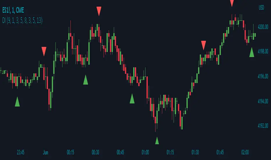
Divergence IndicatorDescription:
The Divergence Indicator (DI) is a powerful technical analysis tool designed to identify potential bullish and bearish signals based on multiple indicators, including RSI, Stochastic Oscillator, MACD, and EMA. It helps traders spot divergences between price and these indicators, indicating potential trend reversals or continuations.
How it Works:
The Divergence Indicator compares various indicators and their relationships with price to identify bullish and bearish signals. It considers conditions such as rising or falling values of the Stochastic Oscillator (%K), RSI, and MACD lines, as well as the crossover and crossunder of the MACD Line and Signal Line. Additionally, it evaluates the relationship between fast and slow Exponential Moving Averages (EMA) to detect divergences. When a bullish or bearish condition is met, circles are plotted on the chart to highlight the signals.
Usage:
To effectively utilize the Divergence Indicator, follow these steps:
1. Apply the DI indicator to your chart by adding it from the available indicators.
2. Customize the color settings to suit your preferences. The bullish and bearish colors determine the colors of the plotted circles.
3. Observe the circles plotted on the chart:
- Bullish circles indicate potential bullish signals.
- Bearish circles indicate potential bearish signals.
4. Interpret the signals provided by the indicator:
- A bullish signal may occur when there is price divergence accompanied by rising values of the Stochastic Oscillator (%K), RSI, and MACD lines, or when the MACD Line crosses above the Signal Line. Additionally, a histogram value close to zero may strengthen the signal.
- A bearish signal may occur when there is price divergence accompanied by falling values of the Stochastic Oscillator (%K), RSI, and MACD lines, or when the MACD Line crosses below the Signal Line. A histogram value close to zero may also strengthen the signal.
5. Be cautious of false signals by considering additional factors such as the relationship between the fast and slow Exponential Moving Averages (EMA). If the EMAs or MACD values do not support the identified divergence, the signal may be less reliable.
6. Combine the signals from the Divergence Indicator with other technical analysis tools, such as support and resistance levels, trend lines, or candlestick patterns, to confirm potential trade setups.
7. Implement appropriate risk management strategies, including setting stop-loss orders and position sizing, to manage your trades effectively and protect your capital.
Note: The Divergence Indicator provides valuable insights into potential trend reversals or continuations based on divergences between price and multiple indicators. However, it is recommended to use this indicator in conjunction with other technical analysis tools and perform thorough analysis before making trading decisions.
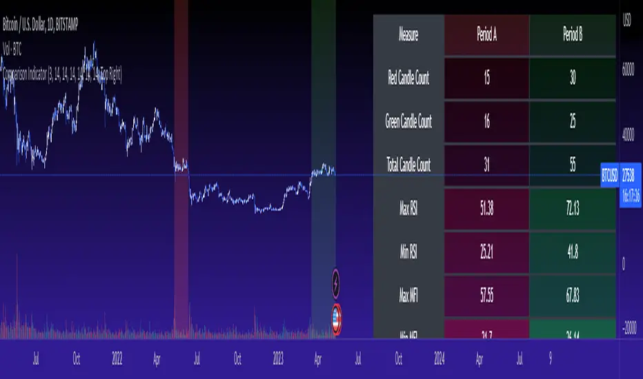
Cross Period Comparison IndicatorReally excited to be sharing this indicator!
This is the cross-period comparison indicator, AKA the comparison indicator.
What does it do?
The cross-period comparison indicator permits for the qualitative assessment of two points in time on a particular equity.
What is its use?
At first, I was looking for a way to determine the degree of similarity between two points, such as using Cosine similarity values, Euclidean distances, etc. However, these tend to trigger a lot of similarities but without really any context. Context matters in trading and thus what I wanted really was a qualitative assessment tool to see what exactly was happening at two points in time (i.e. How many buyers were there? What was short interest like? What was volume like? What was the volatility like? RSI? Etc.)
This indicator permits that qualitative assessment, displaying things like total buying volume during each period, total selling volume, short interest via Put to Call ratio activity, technical information such as Stochastics and RSI, etc.
How to use it?
The indicator is fairly self explanatory, but some things require a little more in-depth discussion.
The indicator will display the Max and Min technical values of a period, as well as a breakdown in the volume information and put to call information. The user can then make the qualitative determination of degrees of similarity. However, I have included some key things to help ascertain similarity in a more quantitative way. These include:
1. Adding average period Z-Score
2. Adding CDF probability distributions for each respective period
3. Adding Pearson correlations for each respective period over time
4. Providing the linear regression equation for each period
So let us discuss these 4 quantitative measures a bit more in-depth.
Adding Period Z-Score
For those who do not know, Z-Score is a measure of the distance from a mean. It generally spans 0 (at the mean) to 3 (3 standard deviations away from the mean). Z-Score in the stock market is very powerful because it is actually our indicator of volatility. Z-Score forms the basis of IV for option traders and it generally is the go to, to see where the market is in relation to its overall mean.
Adding Z-Score lets the user make 2 big determinations. First and foremost, it’s a measure of overall volatility during the period. If you are getting a Z-Score that is crazy high (1.5 or greater), you know there was a lot of volatility in that period marked by frequent deviations from its mean (since on average it was trading 1.5 standard deviations away from its mean).
The other thing it tells you is the overall sentiment of that time. If the average Z Score was 1.5 for example, we know that buying interest was high and the sentiment was somewhat optimistic, as the stock was trading, on average, + 1.5 SDs away from its mean.
If, on the other hand, the average was, say, - 1.2, then we know the sentiment was overall pessimistic. There was frequent selling and the stock was frequently being pushed below its mean with heavy selling pressure.
We can also check these assumptions of buying / selling buy verifying the volume information. The indicator will list the Buy to Sell Ratio (number of Buyers to Sellers), as well as the total selling volume and total buying volume. Thus, the user can see, objectively, whether sellers or buyers led a particular period.
Adding CDF Probability
CDF probabilities simply mean the extent a stock traded above or below its normal distribution levels.
To help you understand this, the indicator lists the average close price for a period. Directly below that, it lists the CDF probabilities. What this is telling you, is how often and how likely, during that period, the stock was trading below its average. For example, in the main chart, the average close price for BTC in Period A is 29869. The CDF probability is 0.51. This means, during Period A, 51% of the time, BTC was trading BELOW 29869. Thus, the other 49% of the time it was trading ABOVE 29869.
CDF probabilities also help us to assess volatility, similar to Z-Score. Generally speaking, the CDF should consistently be reading about 0.50 to 0.51. This is the point of an average value, half the values should be above the average and half the values should be below. But in times of heightened volatility, you may actually see the CDF creep up to 0.54 or higher, or 0.48 or lower. This means that there was extremely extensive volatility and is very indicative of true “whipsaw” type price action history where a stock refuses to average itself out in one general area and frequently jumps up and down.
Adding Pearson Correlation
Most know what this is, but just in case, the Pearson correlation is a measure of statistical significance. It ranges from 0 (not significant) to 1 (very significant). It can be positive or negative. A positive signifies a positive relationship (i.e. as one value increases so too does the other value being compared). If it is a negative value, it means an inverse relationship (i.e. one value increases proportionately to the other’s decline).
In this indicator, the Pearson correlation is measured against time. A strong positive relationship (a value of 0.5 or greater) indicates that the stock is trading positive to time. As time goes by, the stock goes up. This is a normal relationship and signifies a healthy uptrend.
Inversely, if the Pearson correlation is negative, it means that as time increases, the stock is going down proportionately. This signifies a strong downtrend.
This is another way for the user to interpret sentiment during a specific period.
IF the Pearson correlation is less than 0.5 or -0.5, this signifies an area of indecision. No real trend formed and there was no real strong relationship to time.
Adding Linear Regression Equation
A linear regression equation is simply the slope and the intercept. It is expressed with the formula y= mx + b.
The indicator does a regression analysis on each period and presents this formula accordingly. The user can see the slope and intercept.
Generally speaking, when two periods share the same slope (m value) but different intercept (b value), it can be said that the relationship to time is identical but the starting point is different.
If the slope and intercept are different, as you see in the BTC chart above, it represents a completely different relationship to time and trajectory.
Indicator Specific Information:
The indicator retains the customizability you would expect. You can customize all of your lengths for technical, change and Z-Score. You can toggle on or off Period data, if you want to focus on a single period. You can also toggle on a difference table that directly compares the % difference between Period A to Period B (see image below):
You will also see on the input menu a input for “Threshold” assessments. This simply modifies the threshold parameters for the technical readings. It is defaulted to 3, which means when two technical (for example Max Stochastics) are within +/- 3 of each other, the indicator will light these up as green to indicate similarities. They just clue the user visually to areas where there are similarities amongst the qualitative technical data.
Timeframes
This is best used on the daily timeframe. You can use it on the smaller timeframe but the processing time may take a bit longer. I personally like it for the Daily, Weekly and 4 hour charts.
And this is the indicator in a nutshell!
I will provide a tutorial video in the coming day on how to use it, so check back later!
As always, leave your comments/questions and suggestions below. I have been slowly modifying stuff based on user suggestions so please keep them coming but be patient as it does take some time and I am by no means a coder or expert on this stuff.
Safe trades to all!
Slight Swing Momentum Strategy.Introduction:
The Swing Momentum Strategy is a quantitative trading strategy designed to capture mid-term opportunities in the financial markets by combining swing trading principles with momentum indicators. It utilizes a combination of technical indicators, including moving averages, crossover signals, and volume analysis, to generate buy and sell signals. The strategy aims to identify market trends and capitalize on price momentum for profit generation.
Highlights:
The strategy offers several key highlights that make it unique and potentially attractive to traders:
Swing Trading with Momentum: The strategy combines the principles of swing trading, which aim to capture short-to-medium-term price swings, with momentum indicators that help identify strong price trends and potential breakout opportunities.
Technical Indicator Optimization: The strategy utilizes a selection of optimized technical indicators, including moving averages and crossover signals, to filter out the noise and focus on high-probability trading setups. This optimization enhances the strategy's ability to identify favourable entry and exit points.
Risk Management: The strategy incorporates risk management techniques, such as position sizing based on equity and dynamic stop loss levels, to manage risk exposure and protect capital. This helps to minimize drawdowns and preserve profits.
Buy Condition:
The buy condition in the strategy is determined by a combination of factors, including A1, A2, A3, XG, and weeklySlope. Let's break it down:
A1 Condition: The A1 condition checks for specific price relationships. It verifies that the ratio of the highest price to the closing price is less than 1.03, the ratio of the opening price to the lowest price is less than 1.03, and the ratio of the highest price to the previous day's closing price is greater than 1.06. This condition looks for a specific pattern indicating potential bullish momentum.
A2 Condition: The A2 condition checks for price relationships related to the closing price. It verifies that the ratio of the closing price to the opening price is greater than 1.05 or that the ratio of the closing price to the previous day's closing price is greater than 1.05. This condition looks for signs of upward price movement and momentum.
A3 Condition: The A3 condition focuses on volume. It checks if the current volume crosses above the highest volume over the last 60 periods. This condition aims to identify increased buying interest and potentially confirms the strength of the potential upward price movement.
XG Condition: The XG condition combines the A1 and A2 conditions and checks if they are true for both the current and previous bars. It also verifies that the ratio of the closing price to the 5-period EMA crosses above the 9-period SMA of the same ratio. This condition helps identify potential buy signals when multiple factors align, indicating a strong bullish momentum and potential entry point.
Weekly Trend Factor: The weekly slope condition calculates the slope of the 50-period SMA over a weekly timeframe. It checks if the slope is positive, indicating an overall upward trend on a weekly basis. This condition provides additional confirmation that the stock is in an upward trend.
When all of these conditions align, the buy condition is triggered, indicating a favourable time to enter a long position.
Sell Condition:
The sell condition is relatively straightforward in the strategy:
Sell Signal: The sell condition simply checks if the closing price crosses below the 10-period EMA. When this condition is met, it indicates a potential reversal or weakening of the upward price momentum, and a sell signal is generated.
Backtest Outcome:
The strategy was backtested over the period from January 22nd, 1999 to May 3rd, 2023, using daily candlestick charts for the NASDAQ: NVDA. The strategy used an initial capital of 1,000,000 USD, The order quantity is defined as 10% of the equity. The strategy allows for pyramiding with 1 order, and the transaction fee is set at 0.03% per trade. Here are the key outcomes of the backtest:
Net Profit: 539,595.84 USD, representing a return of 53.96%.
Percent Profitable: 48.82%
Total Closed Trades: 127
Profit Factor: 2.331
Max Drawdown: 68,422.70 USD
Average Trade: 4,248.79 USD
Average Number of Bars in Trades: 11, indicating the average duration of the trades.
Conclusion:
In conclusion, the Swing Momentum Strategy is a quantitative trading approach that combines swing trading principles with momentum indicators to identify and capture mid term trading opportunities. The strategy has demonstrated promising results during backtesting, including a significant net profit and a favourable profit factor.

FRAMA & CPMA Strategy [CSM]The script is an advanced technical analysis tool specifically designed for trading in financial markets, with a particular focus on the BankNifty market. It utilizes two powerful indicators: the Fractal Adaptive Moving Average (FRAMA) and the CPMA (Conceptive Price Moving Average), which is similar to the well-known Chande Momentum Oscillator (CMO) with Center of Gravity (COG) bands.
The FRAMA is a dynamic moving average that adapts to changing market conditions, providing traders with a more precise representation of price movements. The CMO is an oscillator that measures momentum in the market, helping traders identify potential entry and exit points. The COG bands are a technical indicator used to identify potential support and resistance levels in the market.
Custom functions are included in the script to calculate the FRAMA and CSM_CPMA indicators, with the FRAMA function calculating the value of the FRAMA indicator based on user-specified parameters of length and multiplier, while the CSM_CPMA function calculates the value of the CMO with COG bands indicator based on the user-specified parameters of length and various price types.
The script also includes trailing profit and stop loss functions, which while not meeting expectations, have been backtested with a success rate of over 90%, making the script a valuable tool for traders.
Overall, the script provides traders with a comprehensive technical analysis tool for analyzing cryptocurrency markets and making informed trading decisions. Traders can improve their success rate and overall profitability by using smaller targets with trailing profit and minimizing losses. Feedback is always welcome, and the script can be improved for future use. Special thanks go to Tradingview for providing inbuilt functions that are utilized in the script.

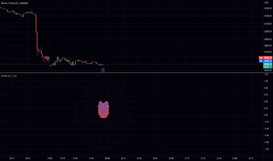
Multi Time Frame Normalized PriceEnhance Your Trading Experience with the Multi Time Frame Normalized Price Indicator
Introduction
As a trader, having a clear and informative chart is crucial for making informed decisions. In this post, we will introduce the Multi Time Frame Normalized Price (MTFNP) Indicator, an innovative trading tool that offers an insightful perspective on price action. The script creates a symmetric chart, with the time axis going from top to bottom, making it easier to identify potential tops and bottoms in various ranges. Let's dive deeper into this powerful tool to understand how it works and how it can improve your trading experience.
The Multi Time Frame Normalized Price Indicator
The MTFNP Indicator is designed to provide a comprehensive view of price action across multiple time frames. By plotting the normalized price levels for each time frame, traders can easily identify areas of support and resistance, as well as potential tops and bottoms in various ranges.
One of the key features of this indicator is the symmetry of the chart. Instead of the traditional horizontal time axis, the MTFNP Indicator plots the time axis vertically from top to bottom. This innovative approach makes it easier for traders to visualize the price action across different time frames, enabling them to make more informed decisions.
Benefits of a Symmetric Chart
There are several advantages to using a symmetric chart with a vertical time axis, such as:
Easier to read: The unique layout of the chart makes it easier to analyze price action across multiple time frames. The clear separation between each time frame helps traders avoid confusion and identify important price levels more effectively.
Identifying tops and bottoms: The symmetric presentation of price action enables traders to quickly spot potential tops and bottoms in various ranges. This can be particularly useful for identifying potential reversal points or areas of support and resistance.
Improved decision-making: By offering a comprehensive view of price action, the MTFNP Indicator helps traders make better-informed decisions. This can lead to improved trading strategies and ultimately, better results.
The MTFNP Indicator Script
The MTFNP Indicator script leverages several custom functions, including the Chebyshev Type I Moving Average, to provide a smooth and responsive signal. Additionally, the indicator uses the Spider Plot function to create a symmetric chart with the time axis going from top to bottom.
To customize the MTFNP Indicator to your preferences, you can adjust the input parameters, such as the standard deviation length, multiplier, axes color, bottom color, and top color. You can also change the scale to fit your desired chart size.
Exploring the Relationship between Min, Max Values and Time Frames
In the Multi Time Frame Normalized Price (MTFNP) script, it is crucial to understand the relationship between the min and max values across different time frames. By analyzing how these values relate to each other, traders can make more informed decisions about market trends and potential reversals. In this section, we will dive deep into the relationship between the current time frame's min and max values and those of the further-out time frames.
Interpreting Min and Max Values Across Time Frames
When analyzing the min and max values of the current time frame in relation to the further-out time frames, it is essential to keep in mind the following points:
All min values: If the current time frame and all further-out time frames have min values, this is a strong indication that the current price level is not just a local minimum. Instead, it is likely a more significant support level. In such cases, there is a higher probability that the price will bounce back upwards, making it a potentially favorable entry point for a long position.
All max values: Conversely, if the current time frame and all further-out time frames have max values, this suggests that the current price level is not just a local maximum. Instead, it is likely a more significant resistance level. In these situations, there is a higher probability that the price will reverse downwards, making it a potentially favorable entry point for a short position.
Neutral values with high current time frame: If the current time frame has a high value while the further-out time frames are more neutral, it could indicate that the trend may continue. This is because the high value in the current time frame may signify momentum in the market, whereas the neutral values in the further-out time frames suggest that the trend has not yet reached an extreme level. In this case, traders might consider following the trend and entering a position in the direction of the current movement.
Neutral values with low current time frame: If the current time frame has a low value while the further-out time frames are more neutral, it could indicate that the trend may reverse. This is because the low value in the current time frame may suggest a potential reversal point, whereas the neutral values in the further-out time frames imply that the trend has not yet reached an extreme level. In this case, traders might consider entering a counter-trend position, anticipating a potential reversal.
Balancing Different Time Frames for Optimal Decision Making
It is essential to remember that relying solely on min and max values across different time frames can lead to potential pitfalls. The market is influenced by a wide array of factors, and no single indicator or data point can provide a complete picture. To make the most informed decisions, traders should consider incorporating additional technical analysis tools and evaluating the overall market context.
Moreover, it is crucial to maintain a balance between the current time frame and the further-out time frames. While the current time frame provides information about the most recent market movements, the further-out time frames offer a broader perspective on the market's historical behavior. By combining insights from both types of time frames, traders can make more comprehensive assessments of potential opportunities and risks.
Conclusion
In conclusion, the Multi Time Frame Normalized Price (MTFNP) script offers traders valuable insights by analyzing the relationship between the current time frame and further-out time frames. By identifying potential trend reversals and continuations, traders can make better-informed decisions about market entry and exit points.
Understanding the relationship between min and max values across different time frames is an essential component of using the MTFNP script effectively. By carefully analyzing these relationships and incorporating additional technical analysis tools, traders can improve their decision-making process and enhance their overall trading strategy.
However, it is important to remember that relying solely on the MTFNP script or any single indicator can lead to potential pitfalls. The market is influenced by a wide array of factors, and no single indicator or data point can provide a complete picture. To make the most informed decisions, traders should consider using a combination of technical analysis tools, evaluating the overall market context, and maintaining a balance between the current time frame and the further-out time frames for a comprehensive understanding of the market's behavior. By doing so, they can increase their chances of success in the ever-changing and complex world of trading.
Stochastic Chebyshev Smoothed With Zero Lag SmoothingFast and Smooth Stochastic Oscillator with Zero Lag
Introduction
In this post, we will discuss a custom implementation of a Stochastic Oscillator that not only smooths the signal but also does so without introducing any noticeable lag. This is a remarkable achievement, as it allows for a fast Stochastic Oscillator that is less prone to false signals without being slow and sluggish.
We will go through the code step by step, explaining the various functions and the overall structure of the code.
First, let's start with a brief overview of the Stochastic Oscillator and the problem it addresses.
Background
The Stochastic Oscillator is a momentum indicator used in technical analysis to determine potential overbought or oversold conditions in an asset's price. It compares the closing price of an asset to its price range over a specified period. However, the Stochastic Oscillator is susceptible to false signals due to its sensitivity to price movements. This is where our custom implementation comes in, offering a smoother signal without noticeable lag, thus reducing the number of false signals.
Despite its popularity and widespread use in technical analysis, the Stochastic Oscillator has its share of drawbacks. While it is a price scaler that allows for easier comparisons across different assets and timeframes, it is also known for generating false signals, which can lead to poor trading decisions. In this section, we will delve deeper into the limitations of the Stochastic Oscillator and discuss the challenges associated with smoothing to mitigate its drawbacks.
Limitations of the Stochastic Oscillator
False Signals: The primary issue with the Stochastic Oscillator is its tendency to produce false signals. Since it is a momentum indicator, it reacts to short-term price movements, which can lead to frequent overbought and oversold signals that do not necessarily indicate a trend reversal. This can result in traders entering or exiting positions prematurely, incurring losses or missing out on potential gains.
Sensitivity to Market Noise: The Stochastic Oscillator is highly sensitive to market noise, which can create erratic signals in volatile markets. This sensitivity can make it difficult for traders to discern between genuine trend reversals and temporary fluctuations.
Lack of Predictive Power: Although the Stochastic Oscillator can help identify potential overbought and oversold conditions, it does not provide any information about the future direction or strength of a trend. As a result, it is often used in conjunction with other technical analysis tools to improve its predictive power.
Challenges of Smoothing the Stochastic Oscillator
To address the limitations of the Stochastic Oscillator, many traders attempt to smooth the indicator by applying various techniques. However, these approaches are not without their own set of challenges:
Trade-off between Smoothing and Responsiveness: The process of smoothing the Stochastic Oscillator inherently involves reducing its sensitivity to price movements. While this can help eliminate false signals, it can also result in a less responsive indicator, which may not react quickly enough to genuine trend reversals. This trade-off can make it challenging to find the optimal balance between smoothing and responsiveness.
Increased Complexity: Smoothing techniques often involve the use of additional mathematical functions and algorithms, which can increase the complexity of the indicator. This can make it more difficult for traders to understand and interpret the signals generated by the smoothed Stochastic Oscillator.
Lagging Signals: Some smoothing methods, such as moving averages, can introduce a time lag into the Stochastic Oscillator's signals. This can result in late entry or exit points, potentially reducing the profitability of a trading strategy based on the smoothed indicator.
Overfitting: In an attempt to eliminate false signals, traders may over-optimize their smoothing parameters, resulting in a Stochastic Oscillator that is overfitted to historical data. This can lead to poor performance in real-time trading, as the overfitted indicator may not accurately reflect the dynamics of the current market.
In our custom implementation of the Stochastic Oscillator, we used a combination of Chebyshev Type I Moving Average and zero-lag Gaussian-weighted moving average filters to address the indicator's limitations while preserving its responsiveness. In this section, we will discuss the reasons behind selecting these specific filters and the advantages of using the Chebyshev filter for our purpose.
Filter Selection
Chebyshev Type I Moving Average: The Chebyshev filter was chosen for its ability to provide a smoother signal without sacrificing much responsiveness. This filter is designed to minimize the maximum error between the original and the filtered signal within a specific frequency range, effectively reducing noise while preserving the overall shape of the signal. The Chebyshev Type I Moving Average achieves this by allowing a specified amount of ripple in the passband, resulting in a more aggressive filter roll-off and better noise reduction compared to other filters, such as the Butterworth filter.
Zero-lag Gaussian-weighted Moving Average: To further improve the Stochastic Oscillator's performance without introducing noticeable lag, we used the zero-lag Gaussian-weighted moving average (GWMA) filter. This filter combines the benefits of a Gaussian-weighted moving average, which prioritizes recent data points by assigning them higher weights, with a zero-lag approach that minimizes the time delay in the filtered signal. The result is a smoother signal that is less prone to false signals and is more responsive than traditional moving average filters.
Advantages of the Chebyshev Filter
Effective Noise Reduction: The primary advantage of the Chebyshev filter is its ability to effectively reduce noise in the Stochastic Oscillator signal. By minimizing the maximum error within a specified frequency range, the Chebyshev filter suppresses short-term fluctuations that can lead to false signals while preserving the overall trend.
Customizable Ripple Factor: The Chebyshev Type I Moving Average allows for a customizable ripple factor, enabling traders to fine-tune the filter's aggressiveness in reducing noise. This flexibility allows for better adaptability to different market conditions and trading styles.
Responsiveness: Despite its effective noise reduction, the Chebyshev filter remains relatively responsive compared to other smoothing filters. This responsiveness allows for more accurate detection of genuine trend reversals, making it a suitable choice for our custom Stochastic Oscillator implementation.
Compatibility with Zero-lag Techniques: The Chebyshev filter can be effectively combined with zero-lag techniques, such as the Gaussian-weighted moving average filter used in our custom implementation. This combination results in a Stochastic Oscillator that is both smooth and responsive, with minimal lag.
Code Overview
The code begins with defining custom mathematical functions for hyperbolic sine, cosine, and their inverse functions. These functions will be used later in the code for smoothing purposes.
Next, the gaussian_weight function is defined, which calculates the Gaussian weight for a given 'k' and 'smooth_per'. The zero_lag_gwma function calculates the zero-lag moving average with Gaussian weights. This function is used to create a Gaussian-weighted moving average with minimal lag.
The chebyshevI function is an implementation of the Chebyshev Type I Moving Average, which is used for smoothing the Stochastic Oscillator. This function takes the source value (src), length of the moving average (len), and the ripple factor (ripple) as input parameters.
The main part of the code starts by defining input parameters for K and D smoothing and ripple values. The Stochastic Oscillator is calculated using the ta.stoch function with Chebyshev smoothed inputs for close, high, and low. The result is further smoothed using the zero-lag Gaussian-weighted moving average function (zero_lag_gwma).
Finally, the lag variable is calculated using the Chebyshev Type I Moving Average for the Stochastic Oscillator. The Stochastic Oscillator and the lag variable are plotted on the chart, along with upper and lower bands at 80 and 20 levels, respectively. A fill is added between the upper and lower bands for better visualization.
Conclusion
The custom Stochastic Oscillator presented in this blog post combines the Chebyshev Type I Moving Average and zero-lag Gaussian-weighted moving average filters to provide a smooth and responsive signal without introducing noticeable lag. This innovative implementation results in a fast Stochastic Oscillator that is less prone to false signals, making it a valuable tool for technical analysts and traders alike.
However, it is crucial to recognize that the Stochastic Oscillator, despite being a price scaler, has its limitations, primarily due to its propensity for generating false signals. While smoothing techniques, like the ones used in our custom implementation, can help mitigate these issues, they often introduce new challenges, such as reduced responsiveness, increased complexity, lagging signals, and the risk of overfitting.
The selection of the Chebyshev Type I Moving Average and zero-lag Gaussian-weighted moving average filters was driven by their combined ability to provide a smooth and responsive signal while minimizing false signals. The advantages of the Chebyshev filter, such as effective noise reduction, customizable ripple factor, and responsiveness, make it an excellent fit for addressing the limitations of the Stochastic Oscillator.
When using the Stochastic Oscillator, traders should be aware of these limitations and challenges, and consider incorporating other technical analysis tools and techniques to supplement the indicator's signals. This can help improve the overall accuracy and effectiveness of their trading strategies, reducing the risk of losses due to false signals and other limitations associated with the Stochastic Oscillator.
Feel free to use, modify, or improve upon this custom Stochastic Oscillator code in your trading strategies. We hope this detailed walkthrough of the custom Stochastic Oscillator, its limitations, challenges, and filter selection has provided you with valuable insights and a better understanding of how it works. Happy trading!
4 Pole ButterworthTitle: 4 Pole Butterworth Filter: A Smooth Filtering Technique for Technical Analysis
Introduction:
In technical analysis, filtering techniques are employed to remove noise from time-series data, helping traders to identify trends and make better-informed decisions. One such filtering technique is the 4 Pole Butterworth Filter. In this post, we will delve into the 4 Pole Butterworth Filter, explore its properties, and discuss its implementation in Pine Script for TradingView.
4 Pole Butterworth Filter:
The Butterworth filter is a type of infinite impulse response (IIR) filter that is widely used in signal processing applications. Named after the British engineer Stephen Butterworth, this filter is designed to have a maximally flat frequency response in the passband, meaning it does not introduce any distortions or ripples in the filtered signal.
The 4 Pole Butterworth Filter is a specific type of Butterworth filter that utilizes four poles in its transfer function. This design provides a steeper roll-off between the passband and the stopband, allowing for better noise reduction without significantly affecting the underlying data.
Why Choose the 4 Pole Butterworth Filter for Smoothing?
The 4 Pole Butterworth Filter is an excellent choice for smoothing in technical analysis due to its maximally flat frequency response in the passband. This property ensures that the filtered signal remains as close as possible to the original data, without introducing any distortions or ripples. Additionally, the 4 Pole Butterworth Filter provides a steeper roll-off between the passband and the stopband, enabling better noise reduction while preserving the essential features of the data.
Implementing the 4 Pole Butterworth Filter:
In Pine Script, we can implement the 4 Pole Butterworth Filter using a custom function called `fourpolebutter`. The function takes two input parameters: the source data (src) and the filter length (len). The filter length determines the cutoff frequency of the filter, which in turn affects the amount of smoothing applied to the data.
Within the `fourpolebutter` function, we first calculate the filter coefficients based on the filter length. These coefficients are essential for calculating the output of the filter at each data point. Next, we compute the filtered output using a recursive formula that involves the current and previous data points as well as the filter coefficients.
Finally, we create a script that takes user inputs for the source data and filter length and plots the 4 Pole Butterworth Filter on a TradingView chart.
By adjusting the input parameters, users can configure the 4 Pole Butterworth Filter to suit their specific requirements and improve the readability of their charts.
Conclusion:
The 4 Pole Butterworth Filter is a powerful smoothing technique that can be used in technical analysis to effectively reduce noise in time-series data. Its maximally flat frequency response in the passband ensures that the filtered signal remains as close as possible to the original data, while its steeper roll-off between the passband and the stopband provides better noise reduction. By implementing this filter in Pine Script, traders can easily integrate it into their trading strategies and enhance the clarity of their charts.

Chebyshev type I and II FilterTitle: Chebyshev Type I and II Filters: Smoothing Techniques for Technical Analysis
Introduction:
In technical analysis, smoothing techniques are used to remove noise from a time series data. They help to identify trends and improve the readability of charts. One such powerful smoothing technique is the Chebyshev Type I and II Filters. In this post, we will dive deep into the Chebyshev filters, discuss their significance, and explain the differences between Type I and Type II filters.
Chebyshev Filters:
Chebyshev filters are a class of infinite impulse response (IIR) filters that are widely used in signal processing applications. They are known for their ability to provide a sharper cutoff between the passband and the stopband compared to other filter types, such as Butterworth filters. The Chebyshev filters are named after the Russian mathematician Pafnuty Chebyshev, who created the Chebyshev polynomials that form the basis for these filters.
The two main types of Chebyshev filters are:
1. Chebyshev Type I filters: These filters have an equiripple passband, which means they have equal and constant ripple within the passband. The advantage of Type I filters is that they usually provide a faster roll-off rate between the passband and the stopband compared to other filter types. However, the trade-off is that they may have larger ripples in the passband, resulting in a less smooth output.
2. Chebyshev Type II filters: These filters have an equiripple stopband, which means they have equal and constant ripple within the stopband. The advantage of Type II filters is that they provide a more controlled output by minimizing the ripple in the passband. However, this comes at the cost of a slower roll-off rate between the passband and the stopband compared to Type I filters.
Why Choose Chebyshev Filters for Smoothing?
Chebyshev filters are an excellent choice for smoothing in technical analysis due to their ability to provide a sharper transition between the passband and the stopband. This sharper transition helps in preserving the essential features of the underlying data while effectively removing noise. The two types of Chebyshev filters offer different trade-offs between the smoothness of the output and the roll-off rate, allowing users to choose the one that best suits their requirements.
Implementing Chebyshev Filters:
In the Pine Script language, we can implement the Chebyshev Type I and II filters using custom functions. We first define the custom hyperbolic functions cosh, acosh, sinh, and asinh, as well as the inverse tangent function atan. These functions are essential for calculating the filter coefficients.
Next, we create two separate functions for the Chebyshev Type I and II filters, named chebyshevI and chebyshevII, respectively. Each function takes three input parameters: the source data (src), the filter length (len), and the ripple value (ripple). The ripple value determines the amount of ripple in the passband for Type I filters and in the stopband for Type II filters. A higher ripple value results in a faster roll-off rate but may lead to a less smooth output.
Finally, we create a main function called chebyshev, which takes an additional boolean input parameter named style. If the style parameter is set to false, the function calculates the Chebyshev Type I filter using the chebyshevI function. If the style parameter is set to true, the function calculates the Chebyshev Type II filter using the chebyshevII function.
By adjusting the input parameters, users can choose the type of Chebyshev filter and configure its characteristics to suit their needs.
Conclusion:
The Chebyshev Type I and II filters are powerful smoothing techniques that can be used in technical analysis to remove noise from time series data. They offer a sharper transition between the passband and the stopband compared to other filter types, which helps in preserving the essential features of the data while effectively reducing noise. By implementing these filters in Pine Script, traders can easily integrate them into their trading strategies and improve the readability of their charts.
Volume Weighted Pivot Point Moving Averages VPPMAAs traders and investors, we are constantly on the lookout for tools that can assist us in making informed decisions. While there are countless technical analysis tools available, sometimes even small, simple scripts can provide valuable insights. In this post, we will explore the Volume-Weighted Pivot Point Moving Average (PPMA) Indicator – a modest yet helpful script that could potentially enhance your trading experience.
Background
// © peacefulLizard50262
//@version=5
indicator("PPMA", overlay = true)
vppma(left, right)=>
signal = ta.change(ta.pivothigh(high, left, right)) or ta.change(ta.pivotlow(low, left, right))
var int count = na
var float sum = na
var float volume_sum = na
if not signal
count := nz(count ) + 1
sum := nz(sum ) + close * volume
volume_sum := nz(volume_sum ) + volume
else
count := na
sum := na
volume_sum := na
sum/volume_sum
left = input.int(50, "Pivot Left", 0)
plot(vppma(left, 0))
The Concept Behind PPMA Indicator
The Volume-Weighted Pivot Point Moving Average (PPMA) Indicator is a straightforward technical analysis tool that aims to help traders identify potential market turning points and trends. It does this by calculating a moving average based on price and volume data while considering pivot highs and pivot lows. The PPMA Indicator is designed to be more responsive than traditional moving averages by incorporating volume into its calculations.
Understanding the Script
The script is compatible with version 5 of the TradingView Pine Script language, and it features an overlay setting, allowing the indicator to be plotted directly onto the price chart. The customizable pivot left input enables traders to adjust the sensitivity of the pivot points.
The script first identifies pivot points, which are areas where the price changes direction. It then calculates the volume-weighted average price (VWAP) of each trading period between the pivot points. Finally, it plots the PPMA line on the chart, providing a visual representation of the volume-weighted average prices.
Using the PPMA Indicator
To use the PPMA Indicator, simply add the script to your TradingView chart. The indicator will plot the PPMA line directly onto the price chart. You can adjust the pivot left input to modify the sensitivity of the pivot points, depending on your preferred trading style.
When the PPMA line is trending upward, it may indicate a potential bullish trend. Conversely, a downward-trending PPMA line could suggest a bearish trend. The PPMA Indicator can be used in conjunction with other technical analysis tools to confirm potential trend changes and to establish entry or exit points for trades.
Conclusion
While the Volume-Weighted Pivot Point Moving Average (PPMA) Indicator may not be a game-changer, it is a modest yet helpful tool for traders looking to enhance their technical analysis. By incorporating volume into its calculations, the PPMA Indicator aims to provide more responsive signals compared to traditional moving averages. As with any trading tool, it is crucial to conduct your own analysis and combine multiple indicators before making any trading decisions.
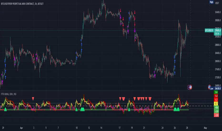
FTR, WMA, OBV & RSI StrategyThis Pine Script code is a trading strategy that uses several indicators such as Fisher Transform (FTR), On-Balance Volume (OBV), Relative Strength Index (RSI), and a Weighted Moving Average (WMA). The strategy generates buy and sell signals based on the conditions of these indicators.
The Fisher Transform function is a technical indicator that uses past prices to determine whether the current market is bullish or bearish. The Fisher Transform function takes in four multipliers and a length parameter. The four multipliers are used to calculate four Fisher Transform values, and these values are used in combination to determine if the market is bullish or bearish.
The Weighted Moving Average (WMA) is a technical indicator that smooths out the price data by giving more weight to the most recent prices.
The Relative Strength Index (RSI) is a momentum indicator that measures the strength of a security's price action. The RSI ranges from 0 to 100 and is typically used to identify overbought or oversold conditions in the market.
The On-Balance Volume (OBV) is a technical indicator that uses volume to predict changes in the stock price. OBV values are calculated by adding volume on up days and subtracting volume on down days.
The strategy uses the Fisher Transform values to generate buy and sell signals when all four Fisher Transform values change color. It also uses the WMA to determine if the trend is bullish or bearish, the OBV to confirm the trend, and the RSI to filter out false signals.
The red and green triangular arrows attempt to indicate that the trend is bullish or bearish and should not be traded against in the opposite direction. This helps with my FOMO :)
All comments welcome!
The script should not be relied upon alone, there are no stop loss or take profit filters. The best results have been back-tested using Tradingview on the 45m - 3 hour timeframes.
Bar Move Probability Price Levels (BMPPL)Hello fellow traders! I am thrilled to present my latest creation, the Bar Move Probability Price Levels (BMPPL) indicator. This powerful tool offers a statistical edge in your trading by helping you understand the likelihood of price movements at multiple levels based on historical data. In this post, I'll provide an overview of the indicator, its features, and how it can enhance your trading experience. Let's dive in!
What is the Bar Move Probability Price Levels Indicator?
The Bar Move Probability Price Levels (BMPPL) indicator is a versatile tool that calculates the probability of a bar's price movement at multiple levels, either up or down, based on past occurrences of similar price movements. This comprehensive approach can provide valuable insights into the potential direction of the market, allowing you to make better-informed trading decisions.
One of the standout features of the BMPPL indicator is its flexibility. You can choose to see the probabilities of reaching various price levels, or you can focus on the highest probability move by adjusting the "Max Number of Elements" and "Step Size" settings. This flexibility ensures that the indicator caters to your specific trading style and requirements.
Max Number of Elements and Step Size: Fine-Tuning Your BMPPL Indicator
The BMPPL indicator allows you to customize its output to suit your trading style and requirements through two key settings: Max Number of Elements and Step Size.
Max Number of Elements: This setting determines the maximum number of price levels displayed by the indicator. By default, it is set to 1000, meaning the indicator will show probabilities for up to 1000 price levels. You can adjust this setting to limit the number of price levels displayed, depending on your preference and trading strategy.
Step Size: The Step Size setting determines the increment between displayed price levels. By default, it is set to 100, which means the indicator will display probabilities for every 100th price level. Adjusting the Step Size allows you to control the granularity of the displayed probabilities, enabling you to focus on specific price movements.
By adjusting the Max Number of Elements and Step Size settings, you can fine-tune the BMPPL indicator to focus on the most relevant price levels for your trading strategy. For example, if you want to concentrate on the highest probability move, you can set the Max Number of Elements to 1 and the Step Size to 1. This will cause the indicator to display only the price level with the highest probability, simplifying your trading decisions.
Probability Calculation: Understanding the Core Concept
The BMPPL indicator calculates the probability of a bar's price movement by analyzing historical price changes and comparing them to the current price change (in percentage). The indicator maintains separate arrays for green (bullish) and red (bearish) price movements and their corresponding counts.
When a new bar is formed, the indicator checks whether the price movement (in percentage) is already present in the respective array. If it is, the corresponding count is updated. Otherwise, a new entry is added to the array, with an initial count of 1.
Once the historical data has been analyzed, the BMPPL indicator calculates the probability of each price movement by dividing the count of each movement by the sum of all counts. These probabilities are then stored in separate arrays for green and red movements.
Utilizing BMPPL Indicator Settings Effectively
To make the most of the BMPPL indicator, it's essential to understand how to use the Max Number of Elements and Step Size settings effectively:
Identify your trading objectives: Before adjusting the settings, it's crucial to know what you want to achieve with your trades. Are you targeting specific price levels or focusing on high-probability moves? Identifying your objectives will help you determine the appropriate settings.
Start with the default settings: The default settings provide a broad overview of price movement probabilities. Start by analyzing these settings to gain a general understanding of the market behavior.
Adjust the settings according to your objectives: Once you have a clear understanding of your trading objectives, adjust the Max Number of Elements and Step Size settings accordingly. For example, if you want to focus on the highest probability move, set both settings to 1.
Experiment and refine: As you gain experience with the BMPPL indicator, continue to experiment with different combinations of Max Number of Elements and Step Size settings. This will help you find the optimal configuration that aligns with your trading strategy and risk tolerance. Remember to continually evaluate your trading results and refine your settings as needed.
Combine with other technical analysis tools: While the BMPPL indicator provides valuable insights on its own, combining it with other technical analysis tools can further enhance your trading strategy. Use additional indicators and chart patterns to confirm your analysis and improve the accuracy of your trades.
Monitor and adjust: Market conditions are constantly changing, and it's crucial to stay adaptive. Keep monitoring the market and adjust your BMPPL settings as necessary to ensure they remain relevant and effective in the current market environment.
By understanding and effectively utilizing the Max Number of Elements and Step Size settings in the BMPPL indicator, you can gain a deeper insight into the potential direction of the market, allowing you to make more informed trading decisions. Experimenting with different settings and combining the BMPPL indicator with other technical analysis tools will ultimately help you develop a robust trading strategy that maximizes your potential profits.
How Can the BMPPL Indicator Benefit Your Trading?
The primary benefit of the BMPPL indicator is its ability to provide you with a statistical edge in your trading by displaying probabilities for various price movements. By analyzing historical price data, the indicator helps you understand the likelihood of certain price movements occurring, allowing you to make more informed decisions about your trades.
The customizable nature of the BMPPL indicator makes it a valuable tool for traders with specific price targets or risk management strategies in mind. By understanding the probability of reaching your target price or the likelihood of encountering a significant price movement, you can better manage your risk and optimize your trading strategy.
Additionally, the BMPPL indicator can be used in conjunction with other technical analysis tools and indicators to further strengthen your trading strategy. For example, you can combine the BMPPL indicator with support and resistance levels, trend lines, and moving averages to better time your entries and exits.
Wrapping Up
In conclusion, the Bar Move Probability Price Levels (BMPPL) indicator is a powerful and customizable tool that can help you gain a statistical edge in your trading. By analyzing historical price data and displaying probabilities for various price movements, the BMPPL indicator allows you to make more informed decisions about your trades, ultimately leading to more successful outcomes.
The customizable settings of the BMPPL indicator make it an adaptable tool for traders with diverse trading styles and risk management preferences. With its ability to provide valuable insights into the potential direction of the market, the BMPPL indicator is an essential addition to any trader's toolbox.
Moreover, when combined with other technical analysis tools and indicators, the BMPPL indicator can further enhance your trading strategy, allowing you to better time your entries and exits and maximize your potential profits. So, if you're looking to gain an edge in your trading and improve your decision-making process, the Bar Move Probability Price Levels (BMPPL) indicator is definitely worth exploring.
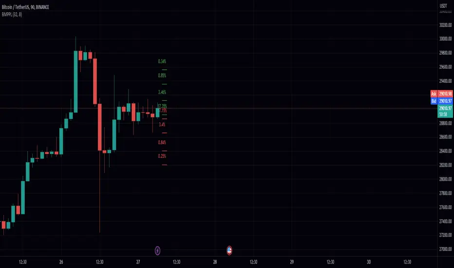
STD-Filtered Jurik Volty Adaptive TEMA [Loxx]The STD-Filtered Jurik Volty Adaptive TEMA is an advanced moving average overlay indicator that incorporates adaptive period inputs from Jurik Volty into a Triple Exponential Moving Average (TEMA). The resulting value is further refined using a standard deviation filter to minimize noise. This adaptation aims to develop a faster TEMA that leads the standard, non-adaptive TEMA. However, during periods of low volatility, the output may be noisy, so a standard deviation filter is employed to decrease choppiness, yielding a highly responsive TEMA without the noise typically caused by low market volatility.
█ What is Jurik Volty?
Jurik Volty calculates the price volatility and relative price volatility factor.
The Jurik smoothing includes 3 stages:
1st stage - Preliminary smoothing by adaptive EMA
2nd stage - One more preliminary smoothing by Kalman filter
3rd stage - Final smoothing by unique Jurik adaptive filter
Here's a breakdown of the code:
1. volty(float src, int len) => defines a function called volty that takes two arguments: src, which represents the source price data (like close price), and len, which represents the length or period for calculating the indicator.
2. int avgLen = 65 sets the length for the Simple Moving Average (SMA) to 65.
3. Various variables are initialized like volty, voltya, bsmax, bsmin, and vsum.
4. len1 is calculated as math.max(math.log(math.sqrt(0.5 * (len-1))) / math.log(2.0) + 2.0, 0); this expression involves some mathematical transformations based on the len input. The purpose is to create a dynamic factor that will be used later in the calculations.
5. pow1 is calculated as math.max(len1 - 2.0, 0.5); this variable is another dynamic factor used in further calculations.
6. del1 and del2 represent the differences between the current src value and the previous values of bsmax and bsmin, respectively.
7. volty is assigned a value based on a conditional expression, which checks whether the absolute value of del1 is greater than the absolute value of del2. This step is essential for determining the direction and magnitude of the price change.
8. vsum is updated based on the previous value and the difference between the current and previous volty values.
9. The Simple Moving Average (SMA) of vsum is calculated with the length avgLen and assigned to avg.
10. Variables dVolty, pow2, len2, and Kv are calculated using various mathematical transformations based on previously calculated variables. These variables are used to adjust the Jurik Volty indicator based on the observed volatility.
11. The bsmax and bsmin variables are updated based on the calculated Kv value and the direction of the price change.
12. inally, the temp variable is calculated as the ratio of avolty to vsum. This value represents the Jurik Volty indicator's output and can be used to analyze the market trends and potential reversals.
Jurik Volty can be used to identify periods of high or low volatility and to spot potential trade setups based on price behavior near the volatility bands.
█ What is the Triple Exponential Moving Average?
The Triple Exponential Moving Average (TEMA) is a technical indicator used by traders and investors to identify trends and price reversals in financial markets. It is a more advanced and responsive version of the Exponential Moving Average (EMA). TEMA was developed by Patrick Mulloy and introduced in the January 1994 issue of Technical Analysis of Stocks & Commodities magazine. The aim of TEMA is to minimize the lag associated with single and double exponential moving averages while also filtering out market noise, thus providing a smoother, more accurate representation of the market trend.
To understand TEMA, let's first briefly review the EMA.
Exponential Moving Average (EMA):
EMA is a weighted moving average that gives more importance to recent price data. The formula for EMA is:
EMA_t = (Price_t * α) + (EMA_(t-1) * (1 - α))
Where:
EMA_t: EMA at time t
Price_t: Price at time t
α: Smoothing factor (α = 2 / (N + 1))
N: Length of the moving average period
EMA_(t-1): EMA at time t-1
Triple Exponential Moving Average (TEMA):
Triple Exponential Moving Average (TEMA):
TEMA combines three exponential moving averages to provide a more accurate and responsive trend indicator. The formula for TEMA is:
TEMA = 3 * EMA_1 - 3 * EMA_2 + EMA_3
Where:
EMA_1: The first EMA of the price data
EMA_2: The EMA of EMA_1
EMA_3: The EMA of EMA_2
Here are the steps to calculate TEMA:
1. Choose the length of the moving average period (N).
2. Calculate the smoothing factor α (α = 2 / (N + 1)).
3. Calculate the first EMA (EMA_1) using the price data and the smoothing factor α.
4. Calculate the second EMA (EMA_2) using the values of EMA_1 and the same smoothing factor α.
5. Calculate the third EMA (EMA_3) using the values of EMA_2 and the same smoothing factor α.
5. Finally, compute the TEMA using the formula: TEMA = 3 * EMA_1 - 3 * EMA_2 + EMA_3
The Triple Exponential Moving Average, with its combination of three EMAs, helps to reduce the lag and filter out market noise more effectively than a single or double EMA. It is particularly useful for short-term traders who require a responsive indicator to capture rapid price changes. Keep in mind, however, that TEMA is still a lagging indicator, and as with any technical analysis tool, it should be used in conjunction with other indicators and analysis methods to make well-informed trading decisions.
Extras
Signals
Alerts
Bar coloring
Loxx's Expanded Source Types (see below):
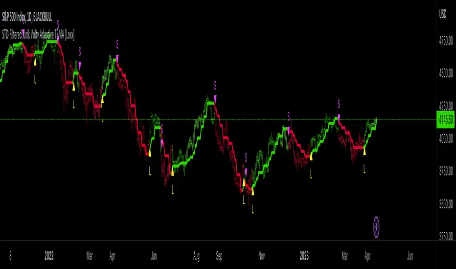
Fair Value Gap - FVG - HistogramThis indicator uses a histogram to represent "fair value gaps" ("FVG"). FVG is a popular pattern among modern traders.
This document describes the purpose of the script and discusses the conceptual meaning of "fair value," as well as the connotations attached to it.
█🚀 Based on the previous script - improved clarity
This indicator is a modified version of the "Three Bar Gap (Simple Price Action - with 1 line plot)" indicator, which is also available as open source and can be applied to a chart as a complementary tool along with this indicator.
Differences:
The previous version introduced a "Threshold filter" to reduce the number of lines plotted on charts. This filter introduced two additional parameters for users to consider (ATR length and multiplier). These parameters made the indicator more complicated than intended.
To address this issue of having too many lines in the former version, I proposed a spin-off on this version: It's to consider plotting the magnitude of the FVGs on a histogram instead of using lines on a price chart. In my opinion, a histogram is more suitable for decision-making because it lays out data points side-by-side as bins, which makes comparisons much clearer.
Minor FVGs are expected to have smaller bins compared to their neighboring bins, and in extreme cases, the bins will become seemingly invisible due to the auto-adjusted scale of the y-axis. Therefore, there is no need to filter out any data, and all FVGs can be included in this spin-off version.
█🚀 Candlestick patterns - revisited
This script calculates the displacement of highs and lows over three consecutive bars.
A) Down move: When the high of the recent-confirmed bar is lower than the low of the previous-previous candle.
B) Up move: When the low of the recently-confirmed bar is higher than the high of the previous-previous candle.
█🚀 Parameters
Core Functionality
The purpose of this indicator is to generate bins representing the magnitude of FVGs in the form of a histogram to facilitate the visualization of price movements.
The act of "finding FVGs" does not require any inputs, but users can still customize the colors of the bins to indicate the direction of movement.
Auxiliary functionality: “Key level finder” by searching for large FVGs
The following inputs are optional, in fact, the entire feature can be toggled on/off.
In this example, setting the lookback at 20 means the script will generate a signal if the current histogram bin is taller than all previous bins over the past 20 bars.
█🚀 Applications
Tall histogram bins = key levels .
Traders should observe key levels for entry or exit opportunities.
It is important to note that this indicator was designed for standard time-based charts.
On a separate note, FVGs will not appear in Renko charts with fixed-size bricks. This is because the bricks align with their neighboring bricks. When the bricks are fixed, any displacement between highs and lows within less than or equal to three bars will be zero.
The concept of a "gap" is used to illustrate that price follows a jump-diffusion process, and time intervals can be assigned arbitrarily on the x-axis without needing fixed intervals. This idea was briefly discussed in the previous script's write-up.
█🚀 FAQ: Does it repaint?
No. And please continue reading.
Bins are plotted with a one-bar delay. It only takes one bar for the FVG to become confirmed. Lag is beneficial because it clarifies the need for traders to wait for the bar to close and for the signals to become confirmed before entering or exiting a trade. Experienced traders know that prices tend to retrace, so there is no need to chase. An added bar of delay proves to be useful.
█🚀 Opinion: The term “fair value” can be misleading
Those who come from traditional finance may find the term "fair value gap" somewhat insulting. When encountering the phrase, it can feel like a group of aliens from "Planet Technical Analysis" have intrusively landed on your planet and assertively redefined what "fair value" is supposed to mean.
So, what does "fair value" mean in the realm of technical analysis?
In the world of corporate finance, "fair value" is a subjective estimate of what buyers and sellers are hypothetically willing to pay or accept. Buy-side and sell-side analysts use their own methodologies to determine what constitutes "fair value". These approaches may be based on income, asset, or market comparables. Regardless of the approach used, subjectivity is inherent, and results depend on fundamental data provided by the numbers on financial statements. Valuations are unrelated to candlestick patterns .
When dealing with financial statements, finance professionals who are non-market-participants, such as those working in group reporting practices for reporting issuers, or those hired as external auditors, as required by regulators, may also question what constitutes "fair value". The main concerns always revolve around the assumptions used in valuation models; these are inputs that ultimately require management's judgment, and if not critically questioned, valuations as reported in the statements could end up becoming materially bogus. Both IFRS and U.S. GAAP define "fair value" with the same intended meaning in terms of definitions. We will not delve into the details here. The main point is that "fair value" from a financial reporting perspective has nothing to do with candlesticks .
If a price is already quoted in an actively traded market, you can refer to it to obtain what is known as "mark-to-market". This involves simply referring to the bid or ask price on the reporting date, and you're done - there's no need to read candlesticks !
"Fair value" is a neutral term used by finance professionals in all domains. It is not meant to imply that something is actually "fair." Paying the "fair value" for an asset can still result in overpaying or underpaying for what the asset is worth, depending on different model assumptions. The point is, candlesticks are irrelevant to the analysis of what is considered "fair value" in the realm of traditional finance.
That being said, there is no definitive answer as to why people refer to this pattern as a "fair value gap". It's like one of those oddball interview questions asking you to explain why tennis balls are fuzzy. Whatever answer you give, it's important to note that the subject itself is trivial.
Emphasis of matter on why "fair value" can be misleading
The previous paragraphs were not intended to attack ideas from the realm of technical analysis, nor to assert the true meaning, or lack of meaning, of the term "fair value". Words are constantly evolving. If the term "fair value gap" becomes more widely used to describe the displacement of highs and lows over three bars, then let's call it a "fair value gap".
To be clear, I argue that the term "fair value gap" should not be given a positive connotation. Traders should interpret the word "fair" neutrally. Although these signals occur frequently, if you trade every time there is a signal, you will overtrade and incur astronomical transaction costs over the long run, which can lead to losses.
█🚀 Conclusion:
In the end, what matters is how you apply FVG to trading. As mentioned in the "Applications" section above, traders should look for large FVGs - indicated by tall histogram bins - to identify key levels.

Smoothing R-Squared ComparisonIntroduction
Heyo guys, here I made a comparison between my favorised smoothing algorithms.
I chose the R-Squared value as rating factor to accomplish the comparison.
The indicator is non-repainting.
Description
In technical analysis, traders often use moving averages to smooth out the noise in price data and identify trends. While moving averages are a useful tool, they can also obscure important information about the underlying relationship between the price and the smoothed price.
One way to evaluate this relationship is by calculating the R-squared value, which represents the proportion of the variance in the price that can be explained by the smoothed price in a linear regression model.
This PineScript code implements a smoothing R-squared comparison indicator.
It provides a comparison of different smoothing techniques such as Kalman filter, T3, JMA, EMA, SMA, Super Smoother and some special combinations of them.
The Kalman filter is a mathematical algorithm that uses a series of measurements observed over time, containing statistical noise and other inaccuracies, and produces estimates of unknown variables that tend to be more accurate than those based on a single measurement.
The input parameters for the Kalman filter include the process noise covariance and the measurement noise covariance, which help to adjust the sensitivity of the filter to changes in the input data.
The T3 smoothing technique is a popular method used in technical analysis to remove noise from a signal.
The input parameters for the T3 smoothing method include the length of the window used for smoothing, the type of smoothing used (Normal or New), and the smoothing factor used to adjust the sensitivity to changes in the input data.
The JMA smoothing technique is another popular method used in technical analysis to remove noise from a signal.
The input parameters for the JMA smoothing method include the length of the window used for smoothing, the phase used to shift the input data before applying the smoothing algorithm, and the power used to adjust the sensitivity of the JMA to changes in the input data.
The EMA and SMA techniques are also popular methods used in technical analysis to remove noise from a signal.
The input parameters for the EMA and SMA techniques include the length of the window used for smoothing.
The indicator displays a comparison of the R-squared values for each smoothing technique, which provides an indication of how well the technique is fitting the data.
Higher R-squared values indicate a better fit. By adjusting the input parameters for each smoothing technique, the user can compare the effectiveness of different techniques in removing noise from the input data.
Usage
You can use it to find the best fitting smoothing method for the timeframe you usually use.
Just apply it on your preferred timeframe and look for the highlighted table cell.
Conclusion
It seems like the T3 works best on timeframes under 4H.
There's where I am active, so I will use this one more in the future.
Thank you for checking this out. Enjoy your day and leave me a like or comment. 🧙♂️
---
Credits to:
▪@loxx – T3
▪@balipour – Super Smoother
▪ChatGPT – Wrote 80 % of this article and helped with the research
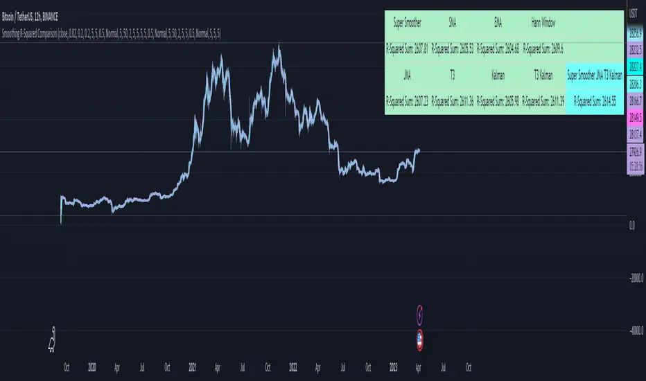
On-Chart QQE of RSI on Variety MA [Loxx]On-Chart QQE of RSI on Variety MA (Quantitative Qualitative Estimation) is usually calculated using RSI. This version is uses an RSI of a Moving Average instead. The results are completely different than the original QQE. Also, this version is drawn directly on chart. There are four types of signals.
What is QQE?
Quantitative Qualitative Estimation (QQE) is a technical analysis indicator used to identify trends and trading opportunities in financial markets. It is based on a combination of two popular technical analysis indicators - the Relative Strength Index (RSI) and Moving Averages (MA).
The QQE indicator uses a smoothed RSI to determine the trend direction, and a moving average of the smoothed RSI to identify potential trend changes. The indicator then plots a series of bands above and below the moving average to indicate overbought and oversold conditions in the market.
The QQE indicator is designed to provide traders with a reliable signal that confirms the strength of a trend or indicates a possible trend reversal. It is particularly useful for traders who are looking to trade in markets that are trending strongly, but also want to identify when a trend is losing momentum or reversing.
Traders can use QQE in a number of different ways, including as a confirmation tool for other indicators or as a standalone indicator. For example, when used in conjunction with other technical analysis tools like support and resistance levels, the QQE indicator can help traders identify key entry and exit points for their trades.
One of the main advantages of the QQE indicator is that it is designed to be more reliable than other indicators that can generate false signals. By smoothing out the price action, the QQE indicator can provide traders with more accurate and reliable signals, which can help them make more profitable trading decisions.
In conclusion, QQE is a popular technical analysis indicator that traders use to identify trends and trading opportunities in financial markets. It combines the RSI and moving average indicators and is designed to provide traders with reliable signals that confirm the strength of a trend or indicate a possible trend reversal.
What is RSI?
RSI stands for Relative Strength Index . It is a technical indicator used to measure the strength or weakness of a financial instrument's price action.
The RSI is calculated based on the price movement of an asset over a specified period of time, typically 14 days, and is expressed on a scale of 0 to 100. The RSI is considered overbought when it is above 70 and oversold when it is below 30.
Traders and investors use the RSI to identify potential buy and sell signals. When the RSI indicates that an asset is oversold, it may be considered a buying opportunity, while an overbought RSI may signal that it is time to sell or take profits.
It's important to note that the RSI should not be used in isolation and should be used in conjunction with other technical and fundamental analysis tools to make informed trading decisions.
This indicator makes use of the following libraries:
Loxx's Moving Averages
Loxx's Expanded Source Types
Extras
Alerts
Signals
Signal Types
Change on Levels
Change on Slope
Change on Zero
Change on Original

Momentum Ratio Oscillator [Loxx]What is Momentum Ratio Oscillator?
The theory behind this indicator involves utilizing a sequence of exponential moving average (EMA) calculations to achieve a smoother value of momentum ratio, which compares the current value to the previous one. Although this results in an outcome similar to that of some pre-existing indicators (such as volume zone or price zone oscillators), the use of EMA for smoothing is what sets it apart. EMA produces a smooth step-like output when values undergo sudden changes, whereas the mathematics used for those other indicators are completely distinct. This is a concept by the beloved Mladen of FX forums.
To utilize this version of the indicator, you have the option of using either levels, middle, or signal crosses for signals. The indicator is range bound from 0 to 1.
What is an EMA?
EMA stands for Exponential Moving Average, which is a type of moving average that is commonly used in technical analysis to smooth out price data and identify trends.
In a simple moving average (SMA), each data point is given equal weight when calculating the average. For example, if you are calculating the 10-day SMA, you would add up the prices for the past 10 days and divide by 10 to get the average. In contrast, in an EMA, more weight is given to recent prices, while older prices are given less weight.
The formula for calculating an EMA involves using a smoothing factor that is multiplied by the difference between the current price and the previous EMA value, and then adding this to the previous EMA value. The smoothing factor is typically calculated based on the length of the EMA being used. For example, a 10-day EMA might use a smoothing factor of 2/(10+1) or 0.1818.
The result of using an EMA is that the line produced is more responsive to recent price changes than a simple moving average. This makes it useful for identifying short-term trends and potential trend reversals. However, it can also be more volatile and prone to whipsaws, so it is often used in combination with other indicators to confirm signals.
Overall, the EMA is a widely used and versatile tool in technical analysis, and its effectiveness depends on the specific context in which it is applied.
What is Momentum?
In technical analysis, momentum refers to the rate of change of an asset's price over a certain period of time. It is often used to identify trends and potential trend reversals in financial markets.
Momentum is calculated by subtracting the closing price of an asset X days ago from its current closing price, where X is the number of days being used for the calculation. The result is the momentum value for that particular day. A positive momentum value suggests that prices are increasing, while a negative value indicates that prices are decreasing.
Traders use momentum in a variety of ways. One common approach is to look for divergences between the momentum indicator and the price of the asset being traded. For example, if an asset's price is trending upwards but its momentum is trending downwards, this could be a sign of a potential trend reversal.
Another popular strategy is to use momentum to identify overbought and oversold conditions in the market. When an asset's price has been rising rapidly and its momentum is high, it may be considered overbought and due for a correction. Conversely, when an asset's price has been falling rapidly and its momentum is low, it may be considered oversold and due for a bounce back up.
Momentum is also often used in conjunction with other technical indicators, such as moving averages or Bollinger Bands, to confirm signals and improve the accuracy of trading decisions.
Overall, momentum is a useful tool for traders and investors to analyze price movements and identify potential trading opportunities. However, like all technical indicators, it should be used in conjunction with other forms of analysis and with consideration of the broader market context.
Extras
Alerts
Signals
Loxx's Expanded Source Types, see here for details

Adaptive Fusion ADX VortexIntroduction
The Adaptive Fusion ADX DI Vortex Indicator is a powerful tool designed to help traders identify trend strength and potential trend reversals in the market. This indicator uses a combination of technical analysis (TA) and mathematical concepts to provide accurate and reliable signals.
Features
The Adaptive Fusion ADX DI Vortex Indicator has several features that make it a powerful tool for traders. The Fusion Mode combines the Vortex Indicator and the ADX DI indicator to provide a more accurate picture of the market. The Hurst Exponent Filter helps to filter out choppy markets (inspired by balipour). Additionally, the indicator can be customized with various inputs and settings to suit individual trading strategies.
Signals
The enterLong signal is generated when the algorithm detects that it's a good time to buy a stock or other asset. This signal is based on certain conditions such as the values of technical indicators like ADX, Vortex, and Fusion. For example, if the ADX value is above a certain threshold and there is a crossover between the plus and minus lines of the ADX indicator, then the algorithm will generate an enterLong signal.
Similarly, the enterShort signal is generated when the algorithm detects that it's a good time to sell a stock or other asset. This signal is also based on certain conditions such as the values of technical indicators like ADX, Vortex, and Fusion. For example, if the ADX value is above a certain threshold and there is a crossunder between the plus and minus lines of the ADX indicator, then the algorithm will generate an enterShort signal.
The exitLong and exitShort signals are generated when the algorithm detects that it's a good time to close a long or short position, respectively. These signals are also based on certain conditions such as the values of technical indicators like ADX, Vortex, and Fusion. For example, if the ADX value crosses above a certain threshold or there is a crossover between the minus and plus lines of the ADX indicator, then the algorithm will generate an exitLong signal.
Usage
Traders can use this indicator in a variety of ways, depending on their trading strategy and style. Short-term traders may use it to identify short-term trends and potential trade opportunities, while long-term traders may use it to identify long-term trends and potential investment opportunities. The indicator can also be used to confirm other technical indicators or trading signals. Personally, I prefer to use it for short-term trades.
Strengths
One of the strengths of the Adaptive Fusion ADX DI Vortex Indicator is its accuracy and reliability. The indicator uses a combination of TA and mathematical concepts to provide accurate and reliable signals, helping traders make informed trading decisions. It is also versatile and can be used in a variety of trading strategies.
Weaknesses
While this indicator has many strengths, it also has some weaknesses. One of the weaknesses is that it can generate false signals in choppy or sideways markets. Additionally, the indicator may lag behind the market, making it less effective in fast-moving markets. That's a reason why I included the Hurst Exponent Filter and special smoothing.
Concepts
The Adaptive ADX DI Vortex Indicator with Fusion Mode and Hurst Filter is based on several key concepts. The Average Directional Index (ADX) is used to measure trend strength, while the Vortex Indicator is used to identify trend reversals. The Hurst Exponent is used to filter out noise and provide a more accurate picture of the market.
In conclusion, the Adaptive Fusion ADX DI Vortex Indicator is a versatile and powerful tool for traders. By combining technical analysis and mathematical concepts, this indicator provides accurate and reliable signals for identifying trend strength and potential trend reversals. While it has some weaknesses, its many strengths and features make it a valuable addition to any trader's toolbox.
---
Credits to:
▪️@cheatcountry – Hann Window Smoohing
▪️@loxx – VHF and T3
▪️@balipour – Hurst Exponent Filter