Market Sell-Off GaugeOVERVIEW
The Market Sell‑Off Gauge identifies high‑conviction, risk‑off entry opportunities by detecting broad market sell‑off behavior and rising stablecoin dominance, then confirming risk‑off sentiment via NDX weakness, VIX spikes, and elevated volume. It uses fuzzy logic and sigmoid scaling to convert raw signals into a smooth, bounded metric.
FEATURES
Sell‑Off Detection - calculates percentage drops in the primary asset over a user‑defined lookback.
Stablecoin Dominance Surge - tracks combined USDT/USDC dominance rises as a proxy for on‑chain “flight to safety.”
Macro Confirmation
NDX Weakness (NASDAQ‑100)
VIX Spikes (CBOE Volatility Index)
Elevated Volume on declining bars
Fuzzy Logic & Scaling - component values feed into a fuzzy‑logic membership scor and are passed through a sigmoid compressor (–1 to +1). Weighted aggregation derives the final result of the gauge (or metric).
VISUALISATION
Continuous line plot - Smoothed metric (–1 to +1), colored cold‑to‑warm.
Entry circles - Highlighted when all conditions (fuzzy or crisp) are met after the time offset.
Time‑Offset marker - Vertical line/label showing the user‑specified “start” bar.
Component table - Displays real‑time % changes & volume multiples in the lower right of the indicator.
USAGE
Asset drop % - The threshold percent decline to register a sell‑off.
Stables rise % - The threshold percent increase in stablecoin dominance to qualify as a “flight to safety.”
NDX drop % - The threshold percent decline in the NASDAQ‑100 for macro confirmation.
VIX rise % - The threshold percent increase in VIX. Contributes to risk‑off validation.
Volume Multiplier - Defines how many times above SMA volume must rise to confirm conviction.
Lookback Period - Controls the number of bars over which % changes are measured.
Time Offset - Point in time beyond which bars to “fade” historical signals, enables focus on recent data only.
Fuzzy Logic Settings - Enables fuzzy scoring and set membership threshold & sensitivity.
Weights - allows for adjusting the relative importance of each component (Asset, Stables, NDX, VIX, Volume).
Sigmoid Steepness (k) - Controls curve steepness for compression (0.1 = very flat → 5.0 = very sharp S‑curve).
Chart & settings
Best applied on 4H or Daily BTCUSD (or similar) charts to capture meaningful sell‑off events.
Combine with broader trend filters (e.g., moving averages) for trend‑aligned entries.
Adjust Sigmoid Steepness and Membership Sensitivity to fine‑tune signal crispness vs. smoothness. Refer to tooltips.
Disclaimer
This indicator is intended for educational purposes only. Always perform your own due diligence before making financial decisions.
חפש סקריפטים עבור "vix"

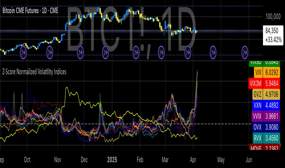
Z-Score Normalized Volatility IndicesVolatility is one of the most important measures in financial markets, reflecting the extent of variation in asset prices over time. It is commonly viewed as a risk indicator, with higher volatility signifying greater uncertainty and potential for price swings, which can affect investment decisions. Understanding volatility and its dynamics is crucial for risk management and forecasting in both traditional and alternative asset classes.
Z-Score Normalization in Volatility Analysis
The Z-score is a statistical tool that quantifies how many standard deviations a given data point is from the mean of the dataset. It is calculated as:
Z = \frac{X - \mu}{\sigma}
Where X is the value of the data point, \mu is the mean of the dataset, and \sigma is the standard deviation of the dataset. In the context of volatility indices, the Z-score allows for the normalization of these values, enabling their comparison regardless of the original scale. This is particularly useful when analyzing volatility across multiple assets or asset classes.
This script utilizes the Z-score to normalize various volatility indices:
1. VIX (CBOE Volatility Index): A widely used indicator that measures the implied volatility of S&P 500 options. It is considered a barometer of market fear and uncertainty (Whaley, 2000).
2. VIX3M: Represents the 3-month implied volatility of the S&P 500 options, providing insight into medium-term volatility expectations.
3. VIX9D: The implied volatility for a 9-day S&P 500 options contract, which reflects short-term volatility expectations.
4. VVIX: The volatility of the VIX itself, which measures the uncertainty in the expectations of future volatility.
5. VXN: The Nasdaq-100 volatility index, representing implied volatility in the Nasdaq-100 options.
6. RVX: The Russell 2000 volatility index, tracking the implied volatility of options on the Russell 2000 Index.
7. VXD: Volatility for the Dow Jones Industrial Average.
8. MOVE: The implied volatility index for U.S. Treasury bonds, offering insight into expectations for interest rate volatility.
9. BVIX: Volatility of Bitcoin options, a useful indicator for understanding the risk in the cryptocurrency market.
10. GVZ: Volatility index for gold futures, reflecting the risk perception of gold prices.
11. OVX: Measures implied volatility for crude oil futures.
Volatility Clustering and Z-Score
The concept of volatility clustering—where high volatility tends to be followed by more high volatility—is well documented in financial literature. This phenomenon is fundamental in volatility modeling and highlights the persistence of periods of heightened market uncertainty (Bollerslev, 1986).
Moreover, studies by Andersen et al. (2012) explore how implied volatility indices, like the VIX, serve as predictors for future realized volatility, underlining the relationship between expected volatility and actual market behavior. The Z-score normalization process helps in making volatility data comparable across different asset classes, enabling more effective decision-making in volatility-based strategies.
Applications in Trading and Risk Management
By using Z-score normalization, traders can more easily assess deviations from the mean in volatility, helping to identify periods when volatility is unusually high or low. This can be used to adjust risk exposure or to implement volatility-based trading strategies, such as mean reversion strategies. Research suggests that volatility mean-reversion is a reliable pattern that can be exploited for profit (Christensen & Prabhala, 1998).
References:
• Andersen, T. G., Bollerslev, T., Diebold, F. X., & Vega, C. (2012). Realized volatility and correlation dynamics: A long-run approach. Journal of Financial Economics, 104(3), 385-406.
• Bollerslev, T. (1986). Generalized autoregressive conditional heteroskedasticity. Journal of Econometrics, 31(3), 307-327.
• Christensen, B. J., & Prabhala, N. R. (1998). The relation between implied and realized volatility. Journal of Financial Economics, 50(2), 125-150.
• Whaley, R. E. (2000). Derivatives on market volatility and the VIX index. Journal of Derivatives, 8(1), 71-84.
Risk MeterRisk Meter Indicator for TradingView
The Risk Meter is a powerful market risk assessment tool designed to help traders evaluate the current risk environment using a simple, data-driven score. By analyzing four critical market factors—VIX (volatility index), market breadth, trailing volatility, and credit spreads—the indicator generates a risk score between 0 and 4. This score empowers traders to make informed decisions about hedging, exiting positions, or re-entering the market, with clear visual cues and alerts for intraday monitoring.
What It Does
Calculates a Risk Score: Assigns a score from 0 to 4, where each point reflects an active risk condition based on four market indicators.
Identifies Risk Levels:
A score of 3 or higher indicates a high-risk environment, suggesting traders consider hedging or reducing exposure.
A score of 2 or lower for at least two consecutive days signals a potential opportunity to re-enter the market.
Provides Visual Feedback: Uses color-coded Columns, threshold markers, and a component table for quick interpretation.
Supports Decision-Making: Offers a structured approach to managing risk and timing trades.
How It Works
The Risk Meter aggregates four key risk conditions, each contributing 1 point to the total score when triggered:
Elevated and Rising VIX (Risk 1)
Condition: The VIX is above 18 and higher than it was 20 days ago.
Purpose: Detects increasing market fear or uncertainty.
Market Breadth Dropping (Risk 2)
Condition: Either:
Fewer than 50% of S&P 500 stocks are above their 200-day moving average and fewer than 70% are above their 50-day moving average, or
The 3-day EMA of the 200-day breadth falls below 80% of its 20-day SMA.
Purpose: Identifies weakening participation across the market.
Trailing Volatility (Risk 3)
Condition: The 30-day annualized volatility of the equal-weight S&P 500 (RSP) exceeds 35%.
Purpose: Highlights periods of heightened price instability.
Credit Spreads (Risk 4)
Condition: The price ratio of high-yield bonds (HYG) to Treasuries (TLT or IEF) is lower than it was 20 days ago, indicating widening credit spreads.
Purpose: Signals potential stress in credit markets.
The total risk score is the sum of these conditions (0 to 4). Additionally, the indicator tracks consecutive days with a score of 2 or lower to generate re-entry signals.
How to Read It Intraday
The Risk Meter is built on daily data but can be monitored intraday for real-time insights. Here’s how traders can interpret it:
Risk Score Plot:
Displayed as a step line ranging from 0 to 4.
Colors:
Red: High risk (score ≥ 3) – caution advised.
Green: Re-entry signal – score ≤ 2 for at least two consecutive days (triggered when the count increments from 1 to 2).
Blue: Neutral or low risk (score < 3 without a re-entry signal).
Threshold Lines:
Dashed Gray Line at 3: Marks the high-risk threshold.
Dotted Gray Line at 2: Indicates the low-risk threshold for re-entry signals.
Risk Component Table:
Located in the top-right corner, it lists:
VIX, Breadth, Volatility, and Credit Spreads.
Status: Shows "" (warning, red) if the risk condition is met, or "✓" (safe, blue) if not.
Helps traders pinpoint which factors are driving the score.
Alerts:
High Risk Alert: Triggers when the score moves from < 3 to ≥ 3.
Re-entry Signal Alert: Triggers when the score ≤ 2 for two consecutive days.
Intraday Usage Tips
Check the indicator throughout the day for early signs of risk shifts, especially if the score is near a threshold (e.g., 2 or 3).
Combine with other intraday tools (e.g., price action, volume) since the Risk Meter updates daily but reflects broader market conditions.
How Traders Can Use It
High-Risk Signal (Score ≥ 3):
Consider hedging positions (e.g., with options) or reducing equity exposure to protect against potential downturns.
Re-entry Signal (Score ≤ 2 for 2+ Days):
Look to re-enter the market or increase exposure, as it suggests stabilizing conditions.
Daily Risk Management:
Use the score and table to assess overall market health and adjust strategies accordingly.
Alert-Driven Trading:
Set up alerts to stay notified of critical risk changes without constant monitoring.
Why Use the Risk Meter?
This indicator offers a systematic, multi-factor approach to risk assessment, blending volatility, breadth, and credit market data into an easy-to-read score. Whether you’re an intraday trader or a longer-term investor, the Risk Meter helps you stay proactive, avoid surprises, and time your trades with greater confidence.
Financial Risk Disclaimer for the Risk Meter Tool
Important Notice: The Risk Meter is a market risk assessment tool designed to provide insights into current market conditions based on historical data and predefined indicators. It is intended for informational and educational purposes only and should not be considered financial advice, a recommendation to buy or sell any securities, or a guarantee of future market performance.
Key Considerations
No Guarantee of Accuracy: While the Risk Meter utilizes reliable data sources and established financial metrics, the creators do not guarantee the accuracy, completeness, or timeliness of the information provided. Financial markets are complex and subject to rapid, unpredictable changes, and the tool’s output may not fully reflect all market dynamics.
Market Risks: Trading and investing in financial markets carry significant risks, including the potential loss of principal. Market volatility, economic shifts, and other factors can lead to unexpected outcomes. Past performance is not a reliable indicator of future results, and the Risk Meter’s assessments are based on historical data, not future predictions.
Not a Substitute for Professional Advice: The Risk Meter is not intended to replace personalized financial guidance. Users are strongly encouraged to consult a qualified financial advisor, perform their own research, and evaluate their personal financial situation, risk tolerance, and investment objectives before making any trading or investment decisions.
Limitation of Liability: The creators of the Risk Meter, including any affiliates, developers, or contributors, are not liable for any direct, indirect, incidental, or consequential losses or damages arising from the use of this tool. This includes, but is not limited to, financial losses, missed opportunities, or decisions based on the tool’s output.
User Responsibility: By using the Risk Meter, you accept full responsibility for your trading and investment decisions. You acknowledge that you use the tool at your own risk and that the creators bear no responsibility for any outcomes resulting from its use.
Final Note
The Risk Meter is a supplementary tool designed to enhance your understanding of market risk. It is not a comprehensive solution for investment management. Approach trading and investing with caution, ensuring your decisions align with your personal financial strategy.

Financial Conditions Composite Z-Score1. Inputs and Data Sources
The script pulls data for the following financial metrics using TradingView's request.security function:
CBOE:VIX (Volatility Index): A measure of market volatility.
MOVE Index: A measure of bond market volatility (or Treasury volatility).
BAMLH0A0HYM2 (High-Yield Spread): The spread between high-yield corporate bonds and Treasury yields.
BAMLC0A0CM (Credit Spread): The spread for investment-grade corporate bonds.
Each of these metrics represents a key aspect of financial conditions:
VIX: Equity market risk.
MOVE: Bond market risk.
High-Yield Spread and Credit Spread: Perception of risk in corporate debt.
2. Z-Score Calculation
A z-score standardizes each metric to show how far it deviates from its average over a specified period (lookback = 160, or 160 days):
Positive z-scores indicate the metric is higher than average.
Negative z-scores indicate the metric is lower than average.
The formula for the z-score:
Z-Score = Metric − Mean
Standard Deviation Z-Score = Standard Deviation Metric−Mean
3. Combined Z-Score
The script combines the four individual z-scores into a single Composite Z-Score, equally weighted across the metrics:
Combined Z-Score = (Z VIX + Z MOVE + Z High-Yield Spread + Z Credit Spread) / 4
This Combined Z-Score provides an overall measure of financial conditions:
Positive combined z-scores indicate tighter or riskier financial conditions.
Negative combined z-scores indicate looser or less risky financial conditions.
4. Visual Elements on the Chart
A. Colorful Lines: Individual Z-Scores
Each of the four metrics is plotted as a separate line:
Red: Z-score of the VIX.
Green: Z-score of the MOVE index.
Orange: Z-score of the high-yield spread.
Purple: Z-score of the credit spread.
These lines show how each metric contributes to the overall financial conditions. For example:
A rising red line means increasing equity market volatility (risk).
A rising green line means increasing bond market volatility (risk).
B. Blue Line: Combined Z-Score
The blue line represents the Combined Z-Score. It aggregates the individual z-scores into a single measure:
A rising blue line suggests financial conditions are tightening (greater risk across markets).
A falling blue line suggests financial conditions are loosening (lower risk across markets).
C. Red and Green Background: Z-Score Regions
Red Background: When the Combined Z-Score is positive (>0), it indicates riskier or tighter financial conditions.
Green Background: When the Combined Z-Score is negative (<0), it indicates less risky or looser financial conditions.
This background coloring helps visually distinguish periods of riskier financial conditions from less risky ones.
5. Purpose of the Visualization
This indicator provides a comprehensive view of financial conditions across multiple asset classes:
Traders can use it to gauge the level of systemic market stress.
Investors can use it to assess when risk is elevated (positive z-scores) or subdued (negative z-scores).
It helps in decision-making for strategies that depend on market volatility or risk appetite.
Summary of What You See:
Colorful Lines (Red, Green, Orange, Purple): Individual z-scores for each metric (VIX, MOVE, high-yield spread, credit spread).
Blue Line: The aggregated Combined Z-Score that summarizes financial conditions.
Red and Green Background:
Red: Tight or risky financial conditions (Combined Z-Score > 0).
Green: Loose or low-risk financial conditions (Combined Z-Score < 0).
This visualization provides a multi-dimensional view of financial conditions at a glance, helping to identify periods of high or low risk in the markets.

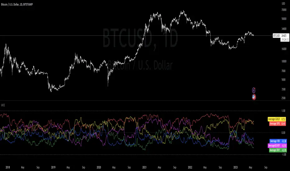
Ultimate Correlation CoefficientIt contains the Correlations for SP:SPX , TVC:DXY , CURRENCYCOM:GOLD , TVC:US10Y and TVC:VIX and is intended for INDEX:BTCUSD , but works fine for most other charts as well.
Don't worry about the colored mess, what you want is to export your chart ->
TradingView: How can I export chart data?
and then use the last line in the csv file to copy your values into a correlation table.
Order is:
SPX
DXY
GOLD
US10Y
VIX
Your last exported line should look like this:
2023-05-25T02:00:00+02:00 26329.56 26389.12 25873.34 26184.07 0 0.255895534 -0.177543633 0.011944815 0.613678565 0.387705043 0.696003298 0.566425278 0.877838156 0.721872645 0 -0.593674719 -0.839538073 -0.662553817 -0.873684242 -0.695764534 -0.682759656 -0.54393749 -0.858188808 -0.498548691 0 0.416552489 0.424444345 0.387084882 0.887054782 0.869918437 0.88455388 0.694720993 0.192263269 -0.138439783 0 -0.39773255 -0.679121698 -0.429927048 -0.780313396 -0.661460134 -0.346525721 -0.270364046 -0.877208139 -0.367313687 0 -0.615415111 -0.226501775 -0.094827955 -0.475553396 -0.408924242 -0.521943234 -0.426649404 -0.266035908 -0.424316191
The zeros are thought as a demarcation for ease of application :
2023-05-25T02:00:00+02:00 26329.56 26389.12 25873.34 26184.07 0 -> unused
// 15D 30D 60D 90D 120D 180D 360D 600D 1000D
0.255895534 -0.177543633 0.011944815 0.613678565 0.387705043 0.696003298 0.566425278 0.877838156 0.721872645 -> SPX
0
-0.593674719 -0.839538073 -0.662553817 -0.873684242 -0.695764534 -0.682759656 -0.54393749 -0.858188808 -0.498548691 -> DXY
0
0.416552489 0.424444345 0.387084882 0.887054782 0.869918437 0.88455388 0.694720993 0.192263269 -0.138439783 -> GOLD
0
-0.39773255 -0.679121698 -0.429927048 -0.780313396 -0.661460134 -0.346525721 -0.270364046 -0.877208139 -0.367313687 -> US10Y
0
-0.615415111 -0.226501775 -0.094827955 -0.475553396 -0.408924242 -0.521943234 -0.426649404 -0.266035908 -0.424316191 -> VIX
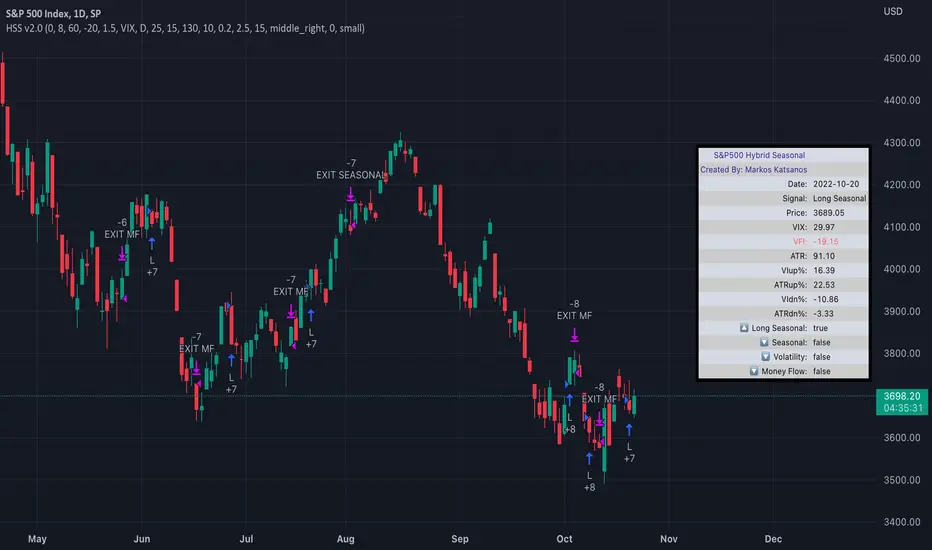
TASC 2022.04 S&P500 Hybrid Seasonal System█ OVERVIEW
TASC's April 2022 edition of Traders' Tips includes the "Sell In May? Stock Market Seasonality" article authored by Markos Katsanos. This is the code implementing the "Hybrid Seasonal System" from the article.
█ CONCEPTS
In his article, Markos Katsanos takes an updated look at the "Sell in May" adage by reviewing recent historical data for seasonal equity market tendencies. The author explores the development of a trading strategy (a set of buy and sell rules) based on this research.
He starts from the enhanced buy & hold system featured in his July 2021 TASC article, and adds additional technical conditions. These include volatility conditions ( VIX and ATR ) plus the "Volume Flow Indicator" (VFI), which is a custom money flow indicator that Katsanos introduced in his June 2004 TASC article. He provides an example of a trading system that others can test for themselves and modify as they see fit. The author notes that the system could likely be improved further by adding money management conditions (such as a stop-loss), or by adding more technical conditions not considered in the scope of this article.
█ CALCULATIONS
The entry and exit rules that constitute the trading system are defined below. The critical values of VIX, ATR and VFI (specified below) used in the calculations were determined by optimization for a daily chart of the SPY ETF . By default, the strategy only allows long entries. However, the script offers the possibility to initiate short entries upon exiting long trades through the "Long Only" toggle in the script's inputs.
Long Entry Rules
• Seasonal: The seasonal trade is initiated on the first business day October at the open.
• Volatility: In case of high volatility, that is if the VIX is above 60% or the 15-day ATR was above 90% over the past 25 days, the seasonal trade is deferred until later in the month or year, when the volatility subsides.
Exit/Short Entry Rules
• Seasonal: The exit/short signal is triggered on the first business day of August at the open.
• Volatility: The exit/short signal is triggered if VIX is above 120 % (i.e. 2 times the corresponding threshold parameter).
• Money flow (VFI): The exit/short signal is triggered if the VFI crosses under a critical value (-20) while its 10-day moving average is pointing down.
Join TradingView!
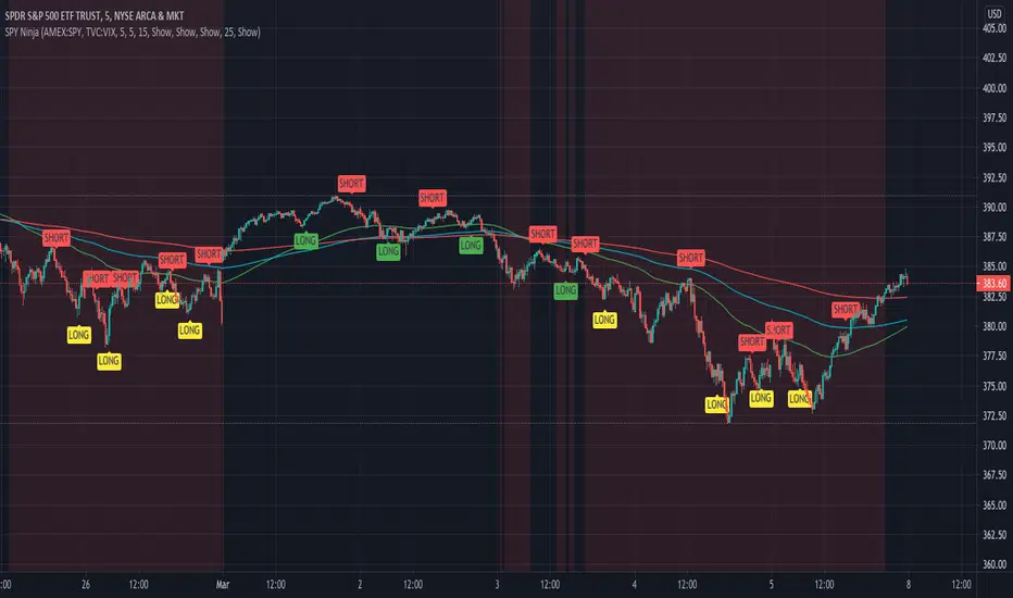
SPY Ninja
SPY Ninja correlates the true strength index exponential moving averages of SPY and VIX together. In doing so we can determine the start of trend shifts via SPY / VIX convergence in addition to crossover, with potential market entries and exits represented by the LONG and SELL signals.
SMMA 50,100, and 200 have been added to chart due to the historic SPY market reactivity to these moving averages. They often act as natural support and resistance levels with SPY, and when coinciding LONG and SHORT signals appear touching any of these levels, it adds an extra layer of confidence for traders' decisions. Also, by highlighting the areas on our SPY chart (red background areas) that represent a VIX threshold higher than 25, we can bring attention to areas with potentially higher volatility immediately so that traders know to proceed with caution.
SPY Ninja works harmoniously with the SPY Ninja Oscillator; Ninja provides the signals highlighting risky VIX areas of concern, while the Ninja Oscillator adds an additional 3 levels of potential confirmation for your trade decisions.
CM_Williams_Vix_Fix_V3_Ultimate_Filtered_AlertsNew Williams Vix Fix - Major Update - Filtered Entries - Additional Alerts - And Much More...
***01-05-2015 Major Updates Include:
***ALL Features Available To Turn On/Off On The INPUTS Tab!!!
FILTERED ENTRIES -- Plus AGGRESSIVE FILTERED ENTRIES - HIGHLIGHT BARS AND ALERTS
*Alerts Enabled for 4 Different Criteria
*Ability To Plot Alerts True/False Conditions on top of the WVF Histogram
*Ability To Turn Off the Histogram and just see True/False Alerts Conditions.
*Ability to Turn All Price Bars Gray, and Color the Price Bars to Match the WVF Colors Exactly, Including All 3 Entry Types.
*Added Inputs To Adjust the 3 Numerical Inputs That Define The PRICE ACTION FILTER! Explained in Video.
*Main Video is 34 Minutes…However, the New Features Are Extensive and I Go Thru All Features In Depth.
*I Recommend Using the VSTOP Indicator. I Go Through How To Customize It In Video.
Videos:
Video: The Evolution of the Williams Vix Fix - 12 Minutes.
vimeopro.com
Video: Williams Vix Fix V3 - Major Update - Additional Alerts and Filtered Entries - 34 Minutes.
***Video Covers In Detail How To Use The Multiple Alerts And Plot Styles Available.
vimeopro.com
Posts To Reference…
New Video on How to Create Alerts W/ Any Custom Indicator.
www.tradingview.com
Great Confirming Indicator for the Williams Vix Fix
CM_WILLIAMS_VIX_FIX FINDS MARKET BOTTOMS

Macro Momentum – 4-Theme, Vol Target, RebalanceMacro Momentum — 4-Theme, Vol Target, Rebalance
Purpose. A macro-aware strategy that blends four economic “themes”—Business Cycle, Trade/USD, Monetary Policy, and Risk Sentiment—into a single, smoothed Composite signal. It then:
gates entries/exits with hysteresis bands,
enforces optional regime filters (200-day bias), and
sizes the position via volatility targeting with caps for long/short exposure.
It’s designed to run on any chart (index, ETF, futures, single stocks) while reading external macro proxies on a chosen Signal Timeframe.
How it works (high level)
Build four theme signals from robust macro proxies:
Business Cycle: XLI/XLU and Copper/Gold momentum, confirmed by the chart’s price vs a long SMA (default 200D).
Trade / USD: DXY momentum (sign-flipped so a rising USD is bearish for risk assets).
Monetary Policy: 10Y–2Y curve slope momentum and 10Y yield trend (steepening & falling 10Y = risk-on; rising 10Y = risk-off).
Risk Sentiment: VIX momentum (bearish if higher) and HYG/IEF momentum (bullish if credit outperforms duration).
Normalize & de-noise.
Optional Winsorization (MAD or stdev) clamps outliers over a lookback window.
Optional Z-score → tanh mapping compresses to ~ for stable weighting.
Theme lines are SMA-smoothed; the final Composite is LSMA-smoothed (linreg).
Decide direction with hysteresis.
Enter/hold long when Composite ≥ Entry Band; enter/hold short when Composite ≤ −Entry Band.
Exit bands are tighter than entry bands to avoid whipsaws.
Apply regime & direction constraints.
Optional Long-only above 200MA (chart symbol) and/or Short-only below 200MA.
Global Direction control (Long / Short / Both) and Invert switch.
Size via volatility targeting.
Realized close-to-close vol is annualized (choose 9-5 or 24/7 market profile).
Target exposure = TargetVol / RealizedVol, capped by Max Long/Max Short multipliers.
Quantity is computed from equity; futures are rounded to whole contracts.
Rebalance cadence & execution.
Trades are placed on Weekly / Monthly / Quarterly rebalance bars or when the sign of exposure flips.
Optional ATR stop/TP for single-stock style risk management.
Inputs you’ll actually tweak
General
Signal Timeframe: Where macro is sampled (e.g., D/W).
Rebalance Frequency: Weekly / Monthly / Quarterly.
ROC & SMA lengths: Defaults for theme momentum and the 200D regime filter.
Normalization: Z-score (tanh) on/off.
Winsorization
Toggle, lookback, multiplier, MAD vs Stdev.
Risk / Sizing
Target Annualized Vol & Realized Vol Lookback.
Direction (Long/Short/Both) and Invert.
Max long/short exposure caps.
Advanced Thresholds
Theme/Composite smoothing lengths.
Entry/Exit bands (hysteresis).
Regime / Execution
Long-only above 200MA, Short-only below 200MA.
Stops/TP (optional)
ATR length and SL/TP multiples.
Theme Weights
Per-theme scalars so you can push/pull emphasis (e.g., overweight Policy during rate cycles).
Macro Proxies
Symbols for each theme (XLI, XLU, HG1!, GC1!, DXY, US10Y, US02Y, VIX, HYG, IEF). Swap to alternatives as needed (e.g., UUP for DXY).
Signals & logic (under the hood)
Business Cycle = ½ ROC(XLI/XLU) + ½ ROC(Copper/Gold), then confirmed by (price > 200SMA ? +1 : −1).
Trade / USD = −ROC(DXY).
Monetary Policy = 0.6·ROC(10Y–2Y) − 0.4·ROC(10Y).
Risk Sentiment = −0.6·ROC(VIX) + 0.4·ROC(HYG/IEF).
Each theme → (optional Winsor) → (robust z or scaled ROC) → tanh → SMA smoothing.
Composite = weighted average → LSMA smoothing → compare to bands → dir ∈ {−1,0,+1}.
Rebalance & flips. Orders fire on your chosen cadence or when the sign of exposure changes.
Position size. exposure = clamp(TargetVol / realizedVol, maxLong/Short) × dir.
Note: The script also exposes Gross Exposure (% equity) and Signed Exposure (× equity) as diagnostics. These can help you audit how vol-targeting and caps translate into sizing over time.
Visuals & alerts
Composite line + columns (color/intensity reflect direction & strength).
Entry/Exit bands with green/red fills for quick polarity reads.
Hidden plots for each Theme if you want to show them.
Optional rebalance labels (direction, gross & signed exposure, σ).
Background heatmap keyed to Composite.
Alerts
Enter/Inc LONG when Composite crosses up (and on rebalance bars).
Enter/Inc SHORT when Composite crosses down (and on rebalance bars).
Exit to FLAT when Composite returns toward neutral (and on rebalance bars).
Practical tips
Start higher timeframes. Daily signals with Monthly rebalance are a good baseline; weekly signals with quarterly rebalances are even cleaner.
Tune Entry/Exit bands before anything else. Wider bands = fewer trades and less noise.
Weights reflect regime. If policy dominates markets, raise Monetary Policy weight; if credit stress drives moves, raise Risk Sentiment.
Proxies are swappable. Use UUP for USD, or futures-continuous symbols that match your data plan.
Futures vs ETFs. Quantity auto-rounds for futures; ETFs accept fractional shares. Check contract multipliers when interpreting exposure.
Caveats
Macro proxies can repaint at the selected signal timeframe as higher-TF bars form; that’s intentional for macro sampling, but test live.
Vol targeting assumes reasonably stationary realized vol over the lookback; if markets regime-shift, revisit volLook and targetVol.
If you disable normalization/winsorization, themes can become spikier; expect more hysteresis band crossings.
What to change first (quick start)
Set Signal Timeframe = D, Rebalance = Monthly, Z-score on, Winsor on (MAD).
Entry/Exit bands: 0.25 / 0.12 (defaults), then nudge until trade count and turnover feel right.
TargetVol: try 10% for diversified indices; lower for single stocks, higher for vol-sell strategies.
Leave weights = 1.0 until you’ve inspected the four theme lines; then tilt deliberately.

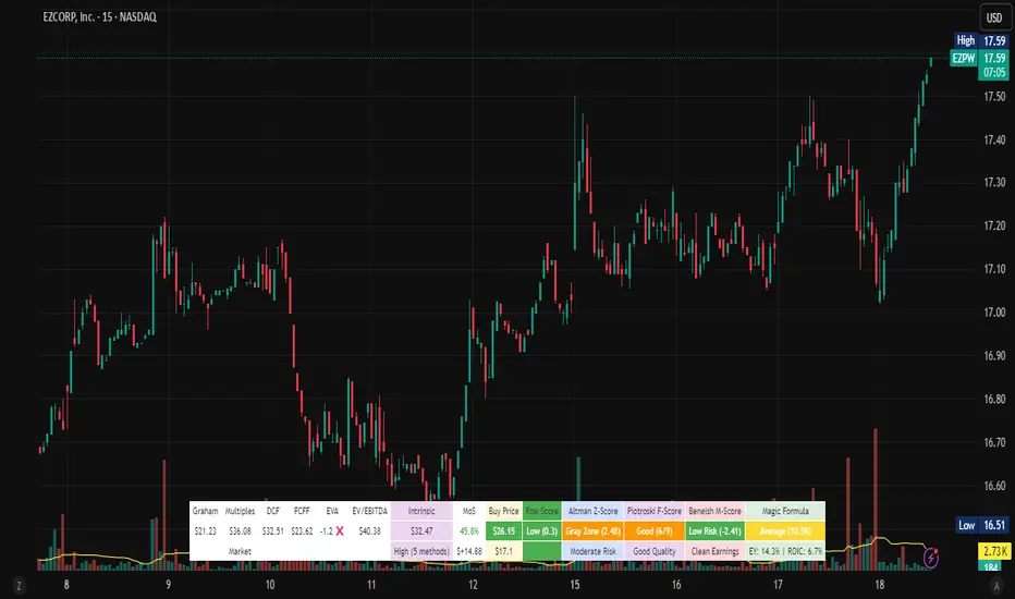
Stock Valuation Models - Professional Investment Analysis Tool📊 Overview
Stock Valuation Models is a comprehensive financial analysis indicator that combines multiple valuation methodologies to calculate intrinsic stock value. This professional-grade tool implements 7 different valuation methods , risk assessment framework, and financial health metrics to provide data-driven investment decisions.
🎯 Key Features
📈 Multiple Valuation Methods
Graham's Valuation - Conservative asset-based approach by Benjamin Graham
Multiples Valuation - Market-based P/E and P/B ratios from sector peers
Discounted Cash Flow (DCF) - Future cash flow projections with present value calculation
Dividend Discount Model - Gordon Growth Model for dividend-paying stocks
FCFF Model - Enterprise-level Free Cash Flow to Firm analysis
EVA Model - Economic Value Added measurement above cost of capital
Advanced Multiples - Enterprise Value ratios (EV/EBITDA, EV/Sales)
🏥 Financial Health Metrics
Altman Z-Score - Bankruptcy prediction and financial distress assessment
Piotroski F-Score - 9-point fundamental strength evaluation
Beneish M-Score - Earnings manipulation detection system
Magic Formula - Joel Greenblatt's combined quality and value scoring
⚖️ Risk Assessment Framework
Multi-Factor Risk Scoring - Fundamental, market, quality, and data quality risks
Risk-Adjusted Margin of Safety - Dynamic safety thresholds based on risk level
Position Sizing Guidance - Risk-appropriate investment allocation recommendations
🔍 Data Quality System
Real-Time Quality Tracking - Visual warnings for insufficient data
Fallback Methodology - Alternative calculations when primary data unavailable
Confidence Scoring - Method agreement and data quality assessment
⚙️ Settings & Parameters
Main Settings
Margin of Safety (%) - Minimum discount required before buying (Default: 15%)
Table Font Size - Choose between "Small" and "Normal" text size
Valuation Methods
Graham's Valuation - Best for mature, stable companies with strong fundamentals
Multiples Valuation - Compares to industry peers using dynamic sector ratios
Discounted Cash Flow - Ideal for growth companies with predictable cash flows
Dividend Discount Model - For consistent dividend-paying stocks (disabled by default)
FCFF Model - Enterprise approach for leveraged companies and M&A analysis
EVA Model - Measures value creation above cost of capital
Advanced Multiples - Wall Street standard EV ratios for professional analysis
Additional Metrics
Magic Formula - Combined quality and value scoring system
Altman Z-Score - Bankruptcy risk assessment (Safe >2.99, Distress <1.81)
Piotroski F-Score - Fundamental quality score (Excellent ≥8, Poor <4)
Beneish M-Score - Manipulation detector (High Risk >-2.22, Low Risk ≤-2.22)
🔧 How It Works
Dynamic Calculations
Sector-Based Ratios - Automatically detects company sector and applies appropriate valuation multiples
Economic Integration - Uses real-time risk-free rates, VIX volatility, and GDP growth data
Quality Weighting - Adjusts method weights based on company type (growth/mature/distressed) and market conditions
Negative Value Handling - Shows actual calculated values but excludes negative results from weighted average
Risk-Adjusted Analysis
VIX Integration - Higher market volatility increases required margin of safety
Sector Risk Premiums - Energy and Financial sectors get higher risk multipliers
Quality Adjustments - High Piotroski F-Score companies get lower risk ratings
Data Quality Impact - Insufficient data increases risk score and safety requirements
Visual Display
Horizontal Table Layout - Organized by method groups (Valuation → Results → Risk → Health)
Color-Coded Results - Green/Yellow/Red indicators for risk levels and recommendations
Warning Symbols - ⚠️ for data quality issues, ❌ for excluded negative values
Dollar Amounts - Both percentage and dollar-based margin of safety calculations
📈 Interpretation Guide
💎 Intrinsic Value Results
Weighted Average - Combines all enabled methods based on intelligent weighting
Confidence Level - High/Medium/Low based on method agreement and data quality
Method Count - Number of successful valuation calculations
🎯 Margin of Safety
Percentage - Current discount/premium to calculated intrinsic value
Dollar Amount - Absolute dollar difference per share
Buy Price - Risk-adjusted target purchase price
⚖️ Risk Assessment
Low Risk (Green) - Normal position sizing (3-5%)
Medium Risk (Yellow) - Reduced position sizing (1-3%)
High Risk (Red) - Minimal position sizing (<1%)
📊 Recommendations
STRONG BUY - Low risk + adequate margin + high confidence
BUY - Meets risk-adjusted margin requirements
HOLD - Positive margin but higher risk
SELL - Insufficient margin for risk level
🎓 Educational Tooltips
Every parameter includes detailed explanations accessible by hovering over the setting. Learn about:
When to use each valuation method
How different metrics are calculated
Interpretation thresholds and ratings
Risk factors and quality indicators
💡 Best Practices
🚀 For Growth Stocks
Enable DCF and Advanced Multiples
Focus on Piotroski F-Score for quality assessment
Use higher margin of safety due to volatility
💰 For Value Stocks
Enable Graham's and Multiples Valuation
Check Altman Z-Score for financial stability
Consider Magic Formula rating
📈 For Dividend Stocks
Enable Dividend Discount Model
Focus on sustainable dividend coverage
Check for consistent dividend history
⚠️ For Distressed Situations
Prioritize Graham's asset-based approach
Monitor Altman Z-Score closely
Use higher risk-adjusted margins
⚠️ Important Notes & Data Limitations
📅 Data Timing Considerations
Fundamental Data Lag - Company financial data (earnings, cash flows, balance sheet items) may be 1-3 months behind current market conditions
Quarterly Reporting Delays - Most recent available data reflects the company's situation as of the last filed quarterly/annual report
Market vs. Fundamentals Gap - Stock prices react instantly to news, while fundamental data updates occur periodically
Accuracy Impact - Recent business changes, market events, or company developments may not be reflected in current calculations
🔧 Technical Limitations
Data Dependencies - Requires fundamental data availability from TradingView
Quality Warnings - Pay attention to ⚠️ symbols indicating insufficient data
Risk Context - Always consider risk score in investment decisions
Market Conditions - Tool automatically adjusts for market volatility (VIX)
Sector Specificity - Ratios automatically adjust based on company's sector
💡 Best Practice Recommendations
Supplement with Current Analysis - Always combine with recent news, earnings calls, and management guidance
Monitor Data Quality - Check when the underlying financial data was last updated
Consider Market Context - Factor in recent market events that may affect company performance
Use as Starting Point - Treat calculations as baseline analysis requiring additional research
🔗 Methodology
Based on established academic research and professional practices:
Benjamin Graham - Security Analysis principles
Joel Greenblatt - Magic Formula methodology
Edward Altman - Z-Score bankruptcy prediction
Joseph Piotroski - Fundamental analysis scoring
Messod Beneish - Earnings manipulation detection
Modern Portfolio Theory - Risk-adjusted decision making
This indicator is designed for educational and analytical purposes. Always conduct additional research and consider consulting with financial professionals before making investment decisions.
Transformer Flux DashboardHere’s a practical guide to what your Transformer Flux Dashboard does and how to use it.
What it is
A compact, two-column trading dashboard + signal pack that blends trend, MACD, and OBV into one view (“Flux Score”) and adds session awareness (pre-sessions and main sessions in Eastern time). It’s designed for regular candles by default and avoids repaint by letting you confirm on bar close.
Core pieces it calculates
Moving Averages
Two MAs: Fast (HMA/EMA) and Slow (HMA/EMA).
You choose length, line width, color, and transparency.
Trend engine (Strict/Lenient)
Uses the relation between Fast/Slow MA and a debounced fast-MA slope filter (slope > ATR×buffer).
Strict: requires fast>slow and slow rising (or the inverse for down).
Lenient: fast>slow or slow rising (or the inverse).
A confirmation window (bars) must hold true before trend flips. That window can be auto-tuned by session (Asia/London/NY) or set globally.
OBV confirmation (optional)
OBV smoothed by SMA; needs to be rising/falling for N bars (also session-aware if you enable presets).
MACD
Standard MACD Fast/Slow/Signal; the dashboard shows Bull ▲, Bear ▼ or Flat based on line vs signal.
Flux Score (top row)
A composite, smoothed gauge from 0–100:
40% Trend, 30% MACD, 30% OBV → EMA(3) smoothed.
Labels: Bullish ≥ 70, Bearish ≤ 30, otherwise Neutral.
Summary line explains why (e.g., “MACD↑, OBV↑, Trend up”).
Sessions & zones (Eastern/NY time)
Recognizes Asia / London / New York main sessions and pre-sessions using your chart’s Eastern time.
Session label (top of chart): text is white; background auto-matches the current session color (or your manual color).
Zone backgrounds (optional): off by default; when on, default transparency ≈ 95% (very light), with separate colors for each session and pre-session. A toggle lets you draw pre-session on top or beneath main sessions.
Signals & markers
Two strength tiers: Strong (Trend + OBV + MACD aligned) and Weak (2 of the 3 agree).
To reduce clutter, markers only appear on direction shifts (from last visible direction to a new one), and you can enforce a minimum bar gap.
Marker style:
Default Icons with LabelUp/LabelDown (tiny).
Colors: strong long = bright white by default; others configurable.
Weak markers are slightly offset from price using ATR so they don’t overlap wicks.
Dashboard (2-column)
Left column = label, right column = value:
Flux Score: numeric + Bullish/Neutral/Bearish tag.
Summary: short reason of the score.
Trend: UP / DOWN / FLAT (cell tinted green/red/gray).
MACD: Bull ▲ / Bear ▼ / Flat (tinted).
Signal: last printed signal + bar age (fresh signals get a lighter tint).
MA: slow MA type/length and up/down arrow.
Sess: current session label (e.g., “Pre-London”, “New York”).
VIX / VXN (optional): shows current value.
Auto tint: based on calm/watch/elevated thresholds (you control levels and colors).
Manual tint: fixed BG color if you prefer consistency.
Params: “P”=trend bars, “O”=OBV bars, mode (Strict/Lenient), and “Candles”.
You can set a global Default Transparency for the dashboard cells.
Key settings to know
Confirm On Close: when on (default), trend/OBV/MACD states use the last confirmed bar; this avoids mid-bar flicker and reduces repaint risk.
Session presets: when enabled, the number of bars required for confirmations tightens/loosens per session (e.g., Asia uses more bars than NY).
Colors & Opacity:
MA lines have their own transparency (default 0 = fully opaque).
Dashboard cells use a single global transparency (default 40%).
Session zones default to very light (95%) and are off by default.
VIX/VXN cells can auto-color by regime or use a manual background.
Markers:
“Icons” vs “Ticks.” Default is Icons with tiny labels up/down.
“Shift only” display reduces noise; you can also set min bar spacing.
How to read it (quick workflow)
Flux Score row: a fast “risk-on/off” gauge.
≥70 with green Trend/MACD cells → higher-conviction long context.
≤30 with red Trend/MACD cells → higher-conviction short context.
Summary explains why the score is what it is.
Signal row: tells you the last official signal and how many bars ago it fired. Fresh signals tint lighter.
MA row: aligns your slow baseline; arrow helps spot slow-turns early.
Sess row + label: know which market is active; behavior and your confirmation bars adapt by session if presets are on.
VIX/VXN (if enabled): extra context for risk regime (values and color band).
Good practices & caveats
It’s confirmation-based to reduce false flips; you’ll get signals slightly later, by design.
All signals are informational; there’s no position management or stops in this build (we removed the stop visuals by request).
If you switch to exotic chart types or extreme resolutions, re-tune lengths and confirmation bars (and potentially disable session presets).
For scalping, consider reducing confirmation bars and OBV smoothing; for higher timeframes, increase them.
Quick customization ideas
Want faster flips? Lower confirmBars and obvBars, increase slope buffer a bit to retain quality.
Want fewer weak signals? Show only strong markers (toggle off weak via colors/visibility or increase min bar gap).
Prefer EMA stacking? Set both Fast/Slow to EMA.
Don’t care about OBV? Turn OBV confirm off; Trend + MACD will drive

Big Mo’s Glaskugel — Macro Drawdown Risk (v1.1.2)What it does / what you see
An at-a-glance drawdown-risk oscillator that blends several macro US signals.
• A smooth, color-blended line (green→orange→red) shows the scaled risk score (0–100).
• Subtle shading marks “re-steepen warning windows” (starts when the yield curve re-steepens after an inversion; ends on normalization/cool-down).
• A compact status table summarizes: overall risk level, Yield Curve (10y–3m), Credit Stress (Baa–10y), Economy (LEI), and Valuation (CAPE).
Data used & why
Yield Curve (10y–3m) — FRED:T10Y3M. Inversions and subsequent re-steepens often precede recessions/equity drawdowns.
Credit Stress — FRED:BAA10Y vs its 1-year average (deviation in bps). Widening credit spreads flag tightening financial conditions.
Economy (LEI) — ECONOMICS:USLEI. 6-month annualized growth below a cutoff highlights macro deterioration.
Valuation (CAPE) — SHILLER_PE_RATIO_MONTH. Elevated valuations can amplify downside risk.
VIX spikes — optional boost that recognizes sudden risk repricings.
Important disclaimer
This is not a reliable or predictive indicator in all regimes. No guarantees or warranties of any kind are provided. It is not financial advice. Signals can be early, late, or wrong.
That said, it leans on well-studied warning factors (yield-curve dynamics, credit spreads, LEI weakness, valuation extremes) that have flagged major market downturns in the past.
Key customization / tweaks
Weights for each component (Yield, Credit, LEI, VIX, CAPE).
Thresholds: yield inversion months, re-steepen lookback, credit-stress bps, LEI cutoff, CAPE level, VIX spike levels.
Re-steepen boost: enable/disable, base points, half-life decay.
Shading behavior: cool-down bars to “unwarn,” max warning duration, only shade when risk ≠ green.
Scaling & smoothing: dynamic rolling max, EMA length, yellow/red thresholds.
Status table: position, and a snapshot mode to view values at a chosen historical time.

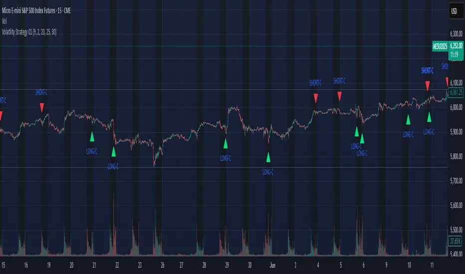
Volatility Strategy 01a quantitative volatility strategy (especially effective in trend direction on the 15min chart on the s&p-index)
the strategy is a rule-based setup, which dynamically adapts to the implied volatility structure (vx1!–vx2!)
context-dependent mean reversion strategy based on multiple timeframes in the vix index
a signal is provided under following conditions:
1. the vvix/vix spread has deviated significantly beyond one standard deviation
2. the vix is positioned above or below 3 moving averages on 3 minor timeframes
3. the trade direction is derived from the projected volatility regime, measured via vx1! and vx2! (cboe)
SHYY TFC SPX Sectors list This script provides a clean, configurable table displaying real-time data for the major SPX sectors, key indices, and market sentiment indicators such as VIX and the 10-year yield (US10Y).
It includes 16 columns with two rows:
* The top row shows the sector/asset symbol.
* The bottom row shows the most recent daily close price.
Each price cell is dynamically color-coded based on:
* Direction (green/red) during regular trading hours
* Separate colors during extended hours (pre-market or post-market)
* VIX values greater than 30 trigger a distinct background highlight
Users can fully control the position of the table on the chart via input settings. This flexibility allows traders to place the table in any screen corner or center without overlapping key price action.
The script is designed for:
* Monitoring broad market health at a glance
* Understanding sector performance in real-time
* Spotting risk-on/risk-off behavior (via SPY, QQQ, VIX, US10Y)
Unlike traditional watchlists, this table visually encodes directional movement and trading session context (regular vs. extended hours), making it highly actionable for intraday, swing, or macro-level analysis.
All data is pulled using `request.security()` on daily candles and uses pure Pine logic without external dependencies.
To use:
1. Add the indicator to your chart.
2. Adjust the table position via the input dropdown.
3. Read sector strength or weakness directly from the table.

ES OHLC BASED ON 9:301. RTH Price Levels
YC (Yesterday's Close): Previous day's RTH closing price at 4:00 PM ET
0DTE-O (Today's Open): Current day's RTH opening price at 9:30 AM ET
T-E-M (Today's Europe-Asia Midpoint): Midpoint of overnight session high/low
T-E-R (Today's Europe-Asia Resistance): Overnight session high
T-E-S (Today's Europe-Asia Support): Overnight session low
Y-T-M (Yesterday-Today Midpoint): Midpoint between YC and 0DTE-O
2. Previous Bar Percentage Levels
Displays 50% retracement level for all bars
Shows 70% level for bullish bars (close > open)
Shows 30% level for bearish bars (close < open)
Lines automatically update with each new bar
3. Custom Support/Resistance Lines
Up to 4 customizable horizontal levels (2 resistance, 2 support)
Useful for marking key psychological levels or pivot points
4. VIX-Based Options Strategy Suggestions
Real-time VIX value display
Time Zone Handling
The indicator is configured for Central Time (CT) as Pine Script's default:
RTH Open: 8:30 AM CT (9:30 AM ET)
RTH Close: 3:00 PM CT (4:00 PM ET)
Overnight session: 7:00 PM CT to 8:30 AM CT next day
Usage Notes
Chart Requirement: This indicator only works on 5-minute timeframe charts
Auto-refresh: All lines and labels automatically refresh at each new trading day's RTH open
24-hour Market: Designed for ES futures which trade nearly 24 hours
Visual Clarity: Different line styles and colors for easy identification
Ideal For
Day traders focusing on ES futures
0DTE options traders needing key reference levels
Traders using overnight gaps and previous day's levels
Those incorporating VIX-based strategies in their trading

Combo Gama Exposure + EMA + SMA 1.0Gamma Exposure (GEX) for the CBOE Volatility Index ( TVC:VIX ) is an estimate of how much option sellers need to hedge for every 1% change in the underlying asset's price. It's also known as Gamma Levels.
How is GEX calculated?
GEX is calculated based on a 1% move of the underlying security
It's calculated and updated throughout the day
It's based on market positioning and open interest
These regions are important because they show the regions where players can act more aggressively to defend their positions. When inserting the indicator on the chart, a popup will open requesting the GEX levels (Put wall, Vix Call Wall 0DTE, etc.)
In addition, 3 moving averages will be inserted into the chart. A 9-period exponential moving average, a 20-period arithmetic moving average, and a 200-period arithmetic moving average. These moving averages aim to indicate the possible trend of the asset, where pullbacks in these averages can signal a possible entry in favor of the trend.

Drawdown from 22-Day High (Daily Anchored)This Pine Script indicator, titled "Drawdown from 22-Day High (Daily Anchored)," is designed to plot various drawdown levels from the highest high over the past 22 days. This helps traders visualize the performance and potential risk of the security in terms of its recent high points.
Key Features:
Daily High Data:
Fetches daily high prices using the request.security function with a daily timeframe.
Highest High Calculation:
Calculates the highest high over the last 22 days using daily data. This represents the highest price the security has reached in this period.
Drawdown Levels:
Computes various drawdown levels from the highest high:
2% Drawdown
5% Drawdown
10% Drawdown
15% Drawdown
25% Drawdown
45% Drawdown
50% Drawdown
Dynamic Line Coloring:
The color of the 2% drawdown line changes dynamically based on the current closing price:
Green (#02ff0b) if the close is above the 2% drawdown level.
Red (#ff0000) if the close is below the 2% drawdown level.
Plotting Drawdown Levels:
Plots each drawdown level on the chart with specific colors and line widths for easy visual distinction:
2% Drawdown: Green or Red, depending on the closing price.
5% Drawdown: Orange.
10% Drawdown: Blue.
15% Drawdown: Maroon.
25% Drawdown: Purple.
45% Drawdown: Yellow.
50% Drawdown: Black.
Labels for Drawdown Levels:
Adds labels at the end of each drawdown line to indicate the percentage drawdown:
Labels display "2% WVF," "5% WVF," "10% WVF," "15% WVF," "25% WVF," "45% WVF," and "50% WVF" respectively.
The labels are positioned dynamically at the latest bar index to ensure they are always visible.
Explanation of Williams VIX Fix (WVF)
The Williams VIX Fix (WVF) is a volatility indicator designed to replicate the behavior of the VIX (Volatility Index) using price data instead of options prices. It helps traders identify market bottoms and volatility spikes.
Key Aspects of WVF:
Calculation:
The WVF measures the highest high over a specified period (typically 22 days) and compares it to the current closing price.
It is calculated as:
WVF
=
highest high over period
−
current close
highest high over period
×
100
This formula provides a percentage measure of how far the price has fallen from its recent high.
Interpretation:
High WVF Values: Indicate increased volatility and potential market bottoms, suggesting oversold conditions.
Low WVF Values: Suggest lower volatility and potentially overbought conditions.
Usage:
WVF can be used in conjunction with other indicators (e.g., moving averages, RSI) to confirm signals.
It is particularly useful for identifying periods of significant price declines and potential reversals.
In the script, the WVF concept is incorporated into the drawdown levels, providing a visual representation of how far the price has fallen from its 22-day high.
Example Use Cases:
Risk Management: Quickly identify significant drawdown levels to assess the risk of current positions.
Volatility Monitoring: Use the WVF-based drawdown levels to gauge market volatility.
Support Levels: Utilize drawdown levels as potential support levels where price might find buying interest.
This script offers traders and analysts an efficient way to visualize and track important drawdown levels from recent highs, helping in better risk management and decision-making. The dynamic color and label features enhance the readability and usability of the indicator.

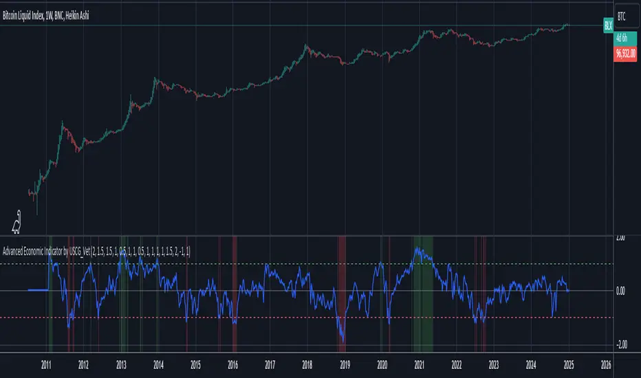
Advanced Economic Indicator by USCG_VetAdvanced Economic Indicator by USCG_Vet
tldr:
This comprehensive TradingView indicator combines multiple economic and financial metrics into a single, customizable composite index. By integrating key indicators such as the yield spread, commodity ratios, stock indices, and the Federal Reserve's QE/QT activities, it provides a holistic view of the economic landscape. Users can adjust the components and their weights to tailor the indicator to their analysis, aiding in forecasting economic conditions and market trends.
Detailed Description
Overview
The Advanced Economic Indicator is designed to provide traders and investors with a powerful tool to assess the overall economic environment. By aggregating a diverse set of economic indicators and financial market data into a single composite index, it helps identify potential turning points in the economy and financial markets.
Key Features:
Comprehensive Coverage: Includes 14 critical economic and financial indicators.
Customizable Components: Users can select which indicators to include.
Adjustable Weights: Assign weights to each component based on perceived significance.
Visual Signals: Clear plotting with threshold lines and background highlights.
Alerts: Set up alerts for when the composite index crosses user-defined thresholds.
Included Indicators
Yield Spread (10-Year Treasury Yield minus 3-Month Treasury Yield)
Copper/Gold Ratio
High Yield Spread (HYG/IEF Ratio)
Stock Market Performance (S&P 500 Index - SPX)
Bitcoin Performance (BLX)
Crude Oil Prices (CL1!)
Volatility Index (VIX)
U.S. Dollar Index (DXY)
Inflation Expectations (TIP ETF)
Consumer Confidence (XLY ETF)
Housing Market Index (XHB)
Manufacturing PMI (XLI ETF)
Unemployment Rate (Inverse SPY as Proxy)
Federal Reserve QE/QT Activities (Fed Balance Sheet - WALCL)
How to Use the Indicator
Configuring the Indicator:
Open Settings: Click on the gear icon (⚙️) next to the indicator's name.
Inputs Tab: You'll find a list of all components with checkboxes and weight inputs.
Including/Excluding Components
Checkboxes: Check or uncheck the box next to each component to include or exclude it from the composite index.
Default State: By default, all components are included.
Adjusting Component Weights:
Weight Inputs: Next to each component's checkbox is a weight input field.
Default Weights: Pre-assigned based on economic significance but fully adjustable.
Custom Weights: Enter your desired weight for each component to reflect your analysis.
Threshold Settings:
Bearish Threshold: Default is -1.0. Adjust to set the level below which the indicator signals potential economic downturns.
Bullish Threshold: Default is 1.0. Adjust to set the level above which the indicator signals potential economic upswings.
Setting the Timeframe:
Weekly Timeframe Recommended: Due to the inclusion of the Fed's balance sheet data (updated weekly), it's best to use this indicator on a weekly chart.
Changing Timeframe: Select 1W (weekly) from the timeframe options at the top of the chart.
Interpreting the Indicator:
Composite Index Line
Plot: The blue line represents the composite economic indicator.
Movement: Observe how the line moves relative to the threshold lines.
Threshold Lines
Zero Line (Gray Dotted): Indicates the neutral point.
Bearish Threshold (Red Dashed): Crossing below suggests potential economic weakness.
Bullish Threshold (Green Dashed): Crossing above suggests potential economic strength.
Background Highlights
Red Background: When the composite index is below the bearish threshold.
Green Background: When the composite index is above the bullish threshold.
No Color: When the composite index is between the thresholds.
Understanding the Components
1. Yield Spread
Description: The difference between the 10-year and 3-month U.S. Treasury yields.
Economic Significance: An inverted yield curve (negative spread) has historically preceded recessions.
2. Copper/Gold Ratio
Description: The price ratio of copper to gold.
Economic Significance: Copper is tied to industrial demand; gold is a safe-haven asset. The ratio indicates risk sentiment.
3. High Yield Spread (HYG/IEF Ratio)
Description: Ratio of high-yield corporate bonds (HYG) to intermediate-term Treasury bonds (IEF).
Economic Significance: Reflects investor appetite for risk; widening spreads can signal credit stress.
4. Stock Market Performance (SPX)
Description: S&P 500 Index levels.
Economic Significance: Broad measure of U.S. equity market performance.
5. Bitcoin Performance (BLX)
Description: Bitcoin Liquid Index price.
Economic Significance: Represents risk appetite in speculative assets.
6. Crude Oil Prices (CL1!)
Description: Front-month crude oil futures price.
Economic Significance: Influences inflation and consumer spending.
7. Volatility Index (VIX)
Description: Market's expectation of volatility (fear gauge).
Economic Significance: High VIX indicates market uncertainty; inverted in the indicator to align directionally.
8. U.S. Dollar Index (DXY)
Description: Value of the U.S. dollar relative to a basket of foreign currencies.
Economic Significance: Affects international trade and commodity prices; inverted in the indicator.
9. Inflation Expectations (TIP ETF)
Description: iShares TIPS Bond ETF prices.
Economic Significance: Reflects market expectations of inflation.
10. Consumer Confidence (XLY ETF)
Description: Consumer Discretionary Select Sector SPDR Fund prices.
Economic Significance: Proxy for consumer confidence and spending.
11. Housing Market Index (XHB)
Description: SPDR S&P Homebuilders ETF prices.
Economic Significance: Indicator of the housing market's health.
12. Manufacturing PMI (XLI ETF)
Description: Industrial Select Sector SPDR Fund prices.
Economic Significance: Proxy for manufacturing activity.
13. Unemployment Rate (Inverse SPY as Proxy)
Description: Inverse of the SPY ETF price.
Economic Significance: Represents unemployment trends; higher inverse SPY suggests higher unemployment.
14. Federal Reserve QE/QT Activities (Fed Balance Sheet - WALCL)
Description: Total assets held by the Federal Reserve.
Economic Significance: Indicates liquidity injections (QE) or withdrawals (QT); impacts interest rates and asset prices.
Customization and Advanced Usage
Adjusting Weights:
Purpose: Emphasize components you believe are more predictive or relevant.
Method: Increase or decrease the weight value next to each component.
Example: If you think the yield spread is particularly important, you might assign it a higher weight.
Disclaimer
This indicator is for educational and informational purposes only. It is not financial advice. Trading and investing involve risks, including possible loss of principal. Always conduct your own analysis and consult with a professional financial advisor before making investment decisions.
Enhanced Economic Composite with Dynamic WeightEnhanced Economic Composite with Dynamic Weight
Overview of the Indicator :
The "Enhanced Economic Composite with Dynamic Weight" is a comprehensive tool that combines multiple economic indicators, technical signals, and dynamic weighting to provide insights into market and economic health. It adjusts based on current volatility and recession risk, offering a detailed view of market conditions.
What This Indicator Does :
Tracks Economic Health: Uses key economic and market indicators to assess overall market conditions.
Dynamic Weighting: Adjusts the importance of components like stock indices, gold, and bonds based on volatility (VIX) and yield curve inversion.
Technical Signals: Identifies market momentum shifts through key crossovers like the Golden Cross, Death Cross, Silver Cross, and Hospice Cross.
Recession Shading: Marks known recessions for historical context.
Economic Factors Considered :
TIP (Treasury Inflation-Protected Securities): Reflects inflation expectations.
Gold: A safe-haven asset, increases in weight during volatility or rising momentum.
US Dollar Index (DXY): Measures USD strength, fixed weight of 10%, smoothed with EMA.
Commodities (DBC): Indicates global demand; weight increases with momentum or volatility.
Volatility Index (VIX): Reflects market risk, inversely related to market confidence.
Stock Indices (S&P 500, DJIA, NASDAQ, Russell 2000): Represent market performance, with weights reduced during high volatility or negative yield spread.
Yield Spread (10Y - 2Y Treasuries): Predicts recessions; negative spread reduces stock weighting.
Credit Spread (HYG - TLT): Indicates market risk through corporate vs. government bond yields.
How and Why Factors are Weighted:
Stock Indices get more weight in stable markets (low VIX, positive yield spread), while safe-haven assets like gold and bonds gain weight in volatile markets or during yield curve inversions. This dynamic adjustment ensures the composite reflects current market sentiment.
Technical Signals:
Golden Cross: 50 EMA crossing above 200 SMA, signaling bullish momentum.
Death Cross: 50 EMA below 200 SMA, indicating bearish momentum.
Silver Cross: 21 EMA crossing above 50 EMA, plotted only if below the 200-day SMA, signaling potential upside in downtrend conditions.
Hospice Cross: 50 EMA crosses below 21 EMA, plotted only if 21 EMA is below 200 SMA, a leading bearish signal.
Recession Shading:
Recession periods like the Great Recession, Early 2000s Recession, and COVID-19 Recession are shaded to provide historical context.
Benefits of Using This Indicator:
Comprehensive Analysis: Combines economic fundamentals and technical analysis for a full market view.
Dynamic Risk Adjustment: Weights shift between growth and safe-haven assets based on volatility and recession risk.
Early Signals: The Silver Cross and Hospice Cross provide early warnings of potential market shifts.
Recession Forecasting: Helps predict downturns through the yield curve and recession indicators.
Who Can Benefit:
Traders: Identify market momentum shifts early through crossovers.
Long-term Investors: Use recession warnings and dynamic adjustments to protect portfolios.
Analysts: A holistic tool for analyzing both economic trends and market movements.
This indicator helps users navigate varying market conditions by dynamically adjusting based on economic factors and providing early technical signals for market momentum shifts.

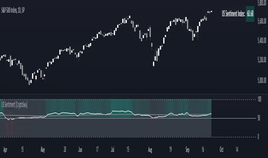
US Sentiment Index [CryptoSea]The US Sentiment Index is an advanced analytical tool designed for traders seeking to uncover patterns, correlations, and potential leading signals across key market tickers. This indicator surpasses traditional sentiment measures, providing a data-driven approach that offers deeper insights compared to conventional indices like the Fear and Greed Index.
Key Features
Multi-Ticker Analysis: Integrates data from a diverse set of market indicators, including gold, S&P 500, U.S. Dollar Index, Volatility Index, and more, to create a comprehensive view of market sentiment.
Customisable Sensitivity Settings: Allows users to adjust the moving average period to fine-tune the sensitivity of sentiment calculations, adapting the tool to various market conditions and trading strategies.
Detailed Sentiment Scaling: Utilises a 0-100 scale to quantify sentiment strength, with colour gradients that visually represent bearish, neutral, and bullish conditions, aiding in quick decision-making.
Below is an example where the sentiment index can give leading signals. We see a first sign of wekaness in the index as it drops below its moving average. Shortly after we see it dip below our median 50 level, another sign of weakeness. We see the SPX price action to take a hit following the sentiment index decrease.
Tickers Used and Their Impact on Sentiment
The impact of each ticker on sentiment can be bullish or bearish, depending on their behaviour:
Gold (USGD): Typically seen as a safe-haven asset, rising gold prices often indicate increased market fear or bearish sentiment. Conversely, falling gold prices can signal reduced fear and a shift towards bullish sentiment in riskier assets.
S&P 500 (SPX): A rising S&P 500 is usually a sign of bullish sentiment, reflecting confidence in economic growth and market stability. A decline, however, suggests bearish sentiment and a potential move towards risk aversion.
U.S. Dollar Index (DXY): A strengthening U.S. Dollar can be a sign of fear as investors seek safety in the dollar, which is bearish for risk assets. A weakening dollar, on the other hand, can signal bullish sentiment as capital flows into riskier assets.
Volatility Index (VIX): Known as the "fear gauge," a rising VIX indicates increased market fear and bearish sentiment. A falling VIX suggests a calm, bullish market environment.
Junk Bonds (JNK): Rising junk bond prices often reflect bullish sentiment as investors take on more risk for higher returns. Conversely, falling junk bond prices signal increased fear and bearish sentiment.
Long-Term Treasury Bonds (TLT): Higher prices for long-term treasuries usually indicate a flight to safety, reflecting bearish sentiment. Lower prices suggest a shift towards riskier assets, indicating bullish sentiment.
Financial Sector ETF (XLF): Strength in the financial sector is typically bullish, indicating confidence in economic conditions. Weakness in this sector can reflect bearish sentiment and concerns about financial stability.
Unemployment Rate (USUR): A rising unemployment rate is a bearish signal, indicating economic weakness. A declining unemployment rate is bullish, reflecting economic strength and job growth.
U.S. Interest Rates (USINTR, USIRYY): Higher interest rates can be bearish, as they increase borrowing costs and reduce spending. Lower rates are generally bullish, promoting economic growth and risk-taking.
How it Works
Sentiment Calculation: The US Sentiment Index combines data from multiple tickers, calculating sentiment by scaling the distance from their respective moving averages. Each asset's behaviour is interpreted within the context of market fear or greed, providing a refined sentiment reading that adjusts dynamically.
Market Strength Analysis: When the index is above 50 and also above its moving average, it indicates particularly strong or bullish market conditions, driven by greed. Conversely, when the index is below 50 and under its moving average, it signals bearish or weak market conditions, associated with fear.
Correlation and Pattern Detection: The indicator analyses correlations among the included assets to detect patterns that might signal potential market movements, giving traders a leading edge over simpler sentiment measures.
Adaptive Background Colouring: Utilises a colour gradient that dynamically adjusts based on sentiment values, highlighting extreme fear, neutral, and extreme greed levels directly on the chart.
Flexible Display Options: Offers settings to toggle the moving average plot and adjust its period, giving users the ability to tailor the indicator's sensitivity and display to their specific needs.
In this example below, we can see the Sentiment rise above the Moving Average (MA). Price action goes on to follow this, although there is an instance where it dips below the MA, it quickly rises back above again as a sign of strength.
Another way you can use this index is by simply using the MA, if its trending up, we know the macro sentiment is bullish.
Application
Data-Driven Insights: Offers traders a detailed, data-driven approach to sentiment analysis, incorporating a broad spectrum of market indicators to deliver actionable insights.
Pattern Recognition: Helps identify patterns and correlations that may lead to market reversals or continuations, providing a nuanced view that goes beyond simple sentiment gauges.
Enhanced Decision-Making: Equips traders with a robust tool to validate trading strategies and make informed decisions based on comprehensive sentiment analysis.
The US Sentiment Index by is an essential addition to the toolkit of any trader looking to navigate market complexities with precision and confidence. Its advanced features and data-driven approach offer unparalleled insights into market sentiment, setting it apart from conventional sentiment indicators.
Volatility Projection Levels (VPL)### Indicator Name: **Volatility Projection Levels (VPL)**
### Description:
The **Volatility Projection Levels (VPL)** indicator is a powerful tool designed to help traders anticipate key support and resistance levels for the E-mini S&P 500 (ES) by leveraging the CBOE Volatility Index (^VIX). This indicator utilizes historical volatility data to project potential price movements for the upcoming month, offering clear visual cues that enhance swing trading strategies.
### Key Features:
- **Volatility-Based Projections**: The VPL indicator uses the previous month’s closing value of the VIX, normalizing it for monthly analysis by dividing by the square root of 12. This calculated percentage is then applied to the E-mini S&P 500’s closing price from the last day of the previous month.
- **Upper and Lower Projection Levels**: The indicator calculates two essential levels:
- **Upper Projection Level**: The previous month’s closing price of the E-mini S&P 500 plus the calculated volatility percentage.
- **Lower Projection Level**: The previous month’s closing price of the E-mini S&P 500 minus the calculated volatility percentage.
- **Continuous Visualization**: The VPL indicator plots these projection levels on the chart throughout the entire month, providing traders with a consistent reference for potential support and resistance zones. This continuous visualization allows for better anticipation of market movements.
- **Previous Month's Close Reference**: Additionally, the indicator plots the previous month’s closing price as a reference point, offering further context for current price action.
### Use Cases:
- **Swing Trading**: The VPL indicator is ideal for swing traders looking to exploit predicted price ranges within a monthly timeframe.
- **Support & Resistance Identification**: It aids traders in identifying critical levels where the market may encounter support or resistance, thus informing entry and exit decisions.
- **Risk Management**: By forecasting potential price levels, traders can set more strategic stop-loss and take-profit levels, enhancing risk management.
### Summary:
The **Volatility Projection Levels (VPL)** indicator equips traders with a forward-looking tool that incorporates volatility data into market analysis. By projecting key price levels based on historical VIX data, the VPL indicator enhances decision-making, helping traders anticipate market movements and optimize their trading strategies.
Made by Serpenttrading

CNN Fear and Greed IndexThe “CNN Fear and Greed Index” indicator in this context is designed to gauge market sentiment based on a combination of several fundamental indicators. Here’s a breakdown of how this indicator works and what it represents:
Components of the Indicator:
1. Stock Price Momentum:
• Calculates the momentum of the S&P 500 index relative to its 125-day moving average. Momentum is essentially the rate of acceleration or deceleration of price movements over time.
2. Stock Price Strength:
• Measures the breadth of the market by comparing the number of stocks hitting 52-week highs versus lows. This provides insights into the overall strength or weakness of the market trend.
3. Stock Price Breadth:
• Evaluates the volume of shares trading on the rise versus the falling volume. Higher volume on rising days suggests positive market breadth, while higher volume on declining days indicates negative breadth.
4. Put and Call Options Ratio (Put/Call Ratio):
• This ratio indicates the sentiment of investors in the options market. A higher put/call ratio typically signals increased bearish sentiment (more puts relative to calls) and vice versa.
5. Market Volatility (VIX):
• Also known as the “fear gauge,” the VIX measures the expected volatility in the market over the next 30 days. Higher VIX values indicate higher expected volatility and often correlate with increased fear or uncertainty in the market.
6. Safe Haven Demand:
• Compares the returns of stocks (represented by S&P 500) versus safer investments like 10-year Treasury bonds. Higher returns on bonds relative to stocks suggest a flight to safety or risk aversion.
7. Junk Bond Demand:
• Measures the spread between yields on high-yield (junk) bonds and investment-grade bonds. Widening spreads may indicate increasing risk aversion as investors demand higher yields for riskier bonds.
Normalization and Weighting:
• Normalization: Each component is normalized to a scale of 0 to 100 using a function that adjusts the range based on historical highs and lows of the respective indicator.
• Weighting: The user can adjust the relative importance (weight) of each component using input parameters. This customization allows for different interpretations of market sentiment based on which factors are considered more influential.
Fear and Greed Index Calculation:
• The Fear and Greed Index is calculated as a weighted average of all normalized components. This index provides a single numerical value that summarizes the overall sentiment of the market based on the selected indicators.
Usage:
• Visualization: The indicator plots the Fear and Greed Index and its components on the chart. This allows traders and analysts to visually assess the sentiment trends over time.
• Analysis: Changes in the Fear and Greed Index can signal shifts in market sentiment. For example, a rising index may indicate increasing greed and potential overbought conditions, while a falling index may suggest increasing fear and potential oversold conditions.
• Customization: Traders can customize the indicator by adjusting the weights assigned to each component based on their trading strategies and market insights.
By integrating multiple fundamental indicators into a single index, the “CNN Fear and Greed Index” provides a comprehensive snapshot of market sentiment, helping traders make informed decisions about market entry, exit, and risk management strategies.
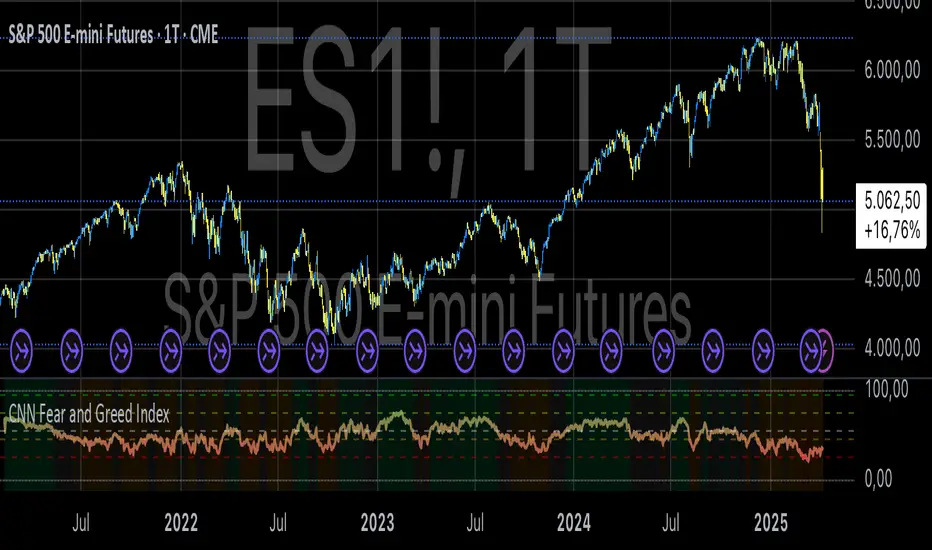
Normalized Market IndicatorsExplanation of the Code:
Data Retrieval: The script retrieves the closing prices of the S&P 500 (sp500) and VIX (vix).
Normalization: The script normalizes these values using a simple z-score normalization (subtracting the 50-period simple moving average and dividing by the 50-period standard deviation). This makes the scales of the two datasets more comparable.
Plotting with Secondary Axis: The normalized values of the S&P 500 and VIX are plotted on the same chart. They will share the same y-axis scale as the main chart (e.g. Netflix, GOLD, Forex).
Points to Note:
Normalization Method: The method of normalization (z-score in this case) is a choice and can be adjusted based on your needs. The idea is to bring the data to a comparable scale.
Timeframe and Symbol Codes: Ensure the timeframe and symbol codes are appropriate for your data source and trading strategy.
Overlaying on Price Chart: Since these values are normalized and plotted on a seperate chart, they won't directly correspond to the price levels of the main chart (e.g. Netflix, GOLD, Forex).