AI Chakra for Global Markets by Pooja🔮 AI Chakra for Global Markets — by Pooja
Invite-Only | Rule-Based Market Structure & Momentum Indicator
🔹 What this indicator actually does
AI Chakra is a rule-based indicator that generates Auto Buy / Auto Sell signals
only when predefined rules across trend, momentum, volatility and structure are satisfied together.
It is not a simple RSI, EMA or SMC indicator, and it is not a visual mash-up.
Each component has a fixed role, and no signal is allowed unless all required rules pass.
🟢 AUTO BUY / 🔴 AUTO SELL — How signals are generated
BUY signal is allowed ONLY when ALL rules below are true on candle close:
Trend Rule
Price above EMA trend structure
EMA alignment confirms bullish bias
Fair-Price Rule
Price above VWAP (no buy below VWAP)
Momentum Rule
RSI above its moving average
RSI–RSI-MA distance above minimum threshold
RSI-MA slope positive (flat momentum blocked)
Volatility Rule
ADX confirms market strength
ATR confirms sufficient price movement
Low-energy / sideways markets are ignored
Structure Rule
Market structure is valid (BOS or active CHoCH context)
No buy allowed against recent structure shift
Candle Confirmation Rule
Signal triggers only after candle close
No intrabar or repaint signals
If any single rule fails → NO BUY SIGNAL.
SELL signal follows the same rules in the opposite direction.
🧠 What “AI” means here (no hype, no prediction)
“AI” in this indicator does NOT mean machine learning or prediction.
It refers to:
Multi-rule decision logic
State-based signal control
Conditional signal rejection
Context-aware validation instead of single-condition triggers
👉 The indicator decides whether a signal is allowed or rejected, similar to a rule engine.
📉 Fake Breakout Protection (Core Purpose)
This indicator is specifically designed to avoid fake breakouts.
Fake signals are blocked using:
RSI distance + slope filter
ADX strength validation
ATR volatility requirement
VWAP position filter
Structure (BOS / CHoCH) alignment
Low-volume, sideways and weak momentum moves are intentionally ignored.
🧱 Market Structure (SMC) — How it is used
Break of Structure (BOS)
Detected using swing highs / lows
Confirms continuation of current trend
Used as structure validation, not as a trade trigger
Change of Character (CHoCH)
Detected when price breaks previous structure
Marks possible trend shift
Remains valid only for limited bars
⚠️ BOS / CHoCH do not generate trades alone.
They only allow or block signals from the main engine.
🔁 Partial Signals — Why they exist
Instead of only final Buy/Sell, the indicator shows Partial Signals:
CHoCH + RSI
EMA + VWAP + RSI
EMA + VWAP + Supertrend + RSI
Breakout structure (RSI intentionally excluded)
Partial signals:
Do not mean trade entry
Show which rules are already satisfied
Help traders track setup development
📍 Support & Resistance (Context Only)
Traditional Pivot Points
Multi-timeframe calculation (Daily / Weekly / Monthly)
Optional price labels
Pivot levels:
Never generate signals
Used only as support / resistance reference
📐 Trendline Module (Optional)
Trendlines drawn from swing points
ATR / Std-Dev / Regression-based slope
Extended forward for interaction zones
Trendlines are contextual, not breakout triggers.
⚙️ Trading Modes (Different rule handling)
Intraday Mode
Direction resets daily
Prevents repeated same-side signals in one session
Positional Mode
Direction stays active until opposite structure appears
No daily reset
Logic is different internally — not cosmetic.
🔔 Alerts
Auto Buy / Auto Sell alerts
Partial alerts available
Candle-close only
Non-repainting
Webhook compatible
🔒 Why Invite-Only
The script uses:
Stateful signal logic
Multi-rule validation
Structure-based filters
Partial-to-confirmed signal flow
Source is restricted to protect these mechanisms.
⚠️ Disclaimer
This indicator is for educational and analytical use only.
It does not provide financial advice or trade recommendations.
Risk management is the user’s responsibility.
תנודתיות

Bollinger Bands + MA 50/100/200📊 Bollinger Bands + MA 50 / 100 / 200 Indicator
This indicator combines Bollinger Bands with key Moving Averages (50, 100, 200) to help you spot trend direction, volatility, and potential reversal zones in one clean view.
🔹 Bollinger Bands
* Customizable length & MA type (SMA, EMA, RMA, WMA, VWMA)
* Visualizes market volatility
* Upper & lower bands help identify overbought / oversold conditions
🔹 Moving Averages
* MA 50 → Short-term trend
* MA 100 → Medium-term trend
* MA 200 → Long-term trend & major support/resistance
* Easy toggle on/off for clean charting
💡 How to use
* Price near upper band + strong MA trend → possible continuation
* Price near lower band → watch for bounce or breakdown
* MA alignment (50 > 100 > 200) → bullish trend
* MA cross & BB squeeze → potential breakout incoming
⚠️ Best used with price action & risk management
📌 Works on stocks, crypto, forex, indices

Order Flow Signals - Alphaomega18═══════════════════════════════════════════════════════════════════════════════
ORDER FLOW SIGNALS - TRADINGVIEW PUBLICATION (ENGLISH)
Created by Alphaomega18
═══════════════════════════════════════════════════════════════════════════════
📌 PUBLICATION TITLE
═══════════════════════════════════════════════════════════════════════════════
Order Flow Signals - Absorptions & CVD Divergences - Alphaomega18
📝 COMPLETE DESCRIPTION
═══════════════════════════════════════════════════════════════════════════════
🎯 DETECT INSTITUTIONAL MOVES IN REAL-TIME
Order Flow Signals is an advanced order flow analysis indicator that displays institutional absorption signals, hidden CVD divergences, and extreme buy/sell pressure directly on your chart.
Fully customizable with 9 configurable colors, adjustable label sizes, and extreme absorption detection (300%+), this indicator allows you to trade WITH institutions, not against them.
🔥 THE PROBLEM IT SOLVES
Have you ever:
✗ Taken a technically perfect setup but got stopped out?
✗ Seen price reject a support/resistance but go the other way?
✗ Entered counter-trend without knowing institutions were accumulating?
✗ Missed big moves due to lack of confirmation?
Order Flow Signals solves these problems by revealing what smart money is REALLY doing behind each candle.
📊 SIGNALS DISPLAYED ON CHART
🔷 ABSORPTIONS (💎 Diamonds)
Institutions absorb order flow when volume is high BUT price doesn't move in the expected direction.
💎 BULLISH ABSORPTION (Cyan)
→ Volume spike + bearish candle + positive delta
→ Institutions are BUYING despite selling pressure
→ Strong accumulation signal
💎 BEARISH ABSORPTION (Orange)
→ Volume spike + bullish candle + negative delta
→ Institutions are SELLING despite buying pressure
→ Strong distribution signal
🔥 EXTREME ABSORPTIONS (Fuchsia Fire)
→ Volume > 300% of average (customizable)
→ MASSIVE institutional activity
→ Ultra-rare and ultra-strong signals
→ Indicates major moves in preparation
🔺 DIVERGENCES (▲ Green Triangles)
Price makes lower lows BUT CVD makes higher lows
→ Hidden accumulation in progress
→ Bullish reversal signal likely
→ Confirms your BUY entries
🔻 DIVERGENCES (▼ Red Triangles)
Price makes higher highs BUT CVD makes lower highs
→ Hidden distribution in progress
→ Bearish reversal signal likely
→ Confirms your SELL entries
🚀 EXTREME BUY PRESSURE (Rockets)
Delta > 2x average
→ Massive aggressive buying
→ Strong bullish momentum
→ Continuation likely
💥 EXTREME SELL PRESSURE (Explosions)
Delta < -2x average
→ Massive aggressive selling
→ Strong bearish momentum
→ Capitulation or panic
📈 DELTA PER CANDLE DISPLAY (NEW)
Option to display numerical delta on each candle:
• ✅ GREEN when delta positive (+250, +180, etc.)
• ❌ RED when delta negative (-320, -150, etc.)
• Tiny size to avoid clutter
• Perfect for tracking flow in real-time
🎯 REAL USE CASES
📌 Example 1: Avoid the Classic Trap
Technical setup:
→ Price rejects VWAP Weekly (resistance)
→ FVG below attracting
→ Single Prints above
→ You think: "Perfect SELL setup!"
WITHOUT Order Flow Signals:
❌ You enter SELL
❌ Price goes up and stops you out
❌ Frustration and loss
WITH Order Flow Signals:
✅ You see 💎 CYAN DIAMOND (Bullish absorption)
✅ Institutions are BUYING despite rejection
✅ You DON'T ENTER SELL
✅ Trade saved, loss avoided!
📌 Example 2: Confirm a Breakout
Setup:
→ Price breaks major resistance
→ But is it a real breakout or fakeout?
Check Order Flow Signals:
→ 🚀 ROCKET appears (extreme buy pressure)
→ 💎 CYAN DIAMOND (bullish absorption)
→ Massive positive delta visible
Clear signal: It's a REAL breakout!
→ Enter BUY with confidence
→ Institutions pushing price
📌 Example 3: Detect Hidden Accumulation
Situation:
→ Price consolidating in range
→ Apparently neutral
→ No clear technical signal
Order Flow Signals reveals:
→ ▲ GREEN TRIANGLE (bullish divergence)
→ Price flat BUT CVD rising progressively
→ Institutional accumulation in progress
Action: Prepare LONG position
→ When price breaks, it will be violent!
⚙️ COMPLETE CUSTOMIZATION
🎨 COLORS (9 configurable colors)
• Bullish Absorption (default: cyan)
• Bearish Absorption (default: orange)
• EXTREME Absorption (default: fuchsia)
• Bullish Divergence (default: green)
• Bearish Divergence (default: red)
• Buy Pressure (default: lime)
• Sell Pressure (default: fuchsia)
• Positive Delta (default: green)
• Negative Delta (default: red)
Adapt the indicator to your chart style!
📏 LABEL SIZES
5 sizes available: Tiny / Small / Normal / Large / Huge
→ Perfect for all screen types
→ Large 4K screen? → Large or Huge
→ Small laptop? → Small or Normal
🔍 CUSTOMIZABLE DETECTION
• Normal Absorption Threshold: 1.5x (default)
• EXTREME Absorption Threshold: 3.0x (default)
• Divergence Periods: 14 (default)
• All thresholds adjustable to your style
👁️ ON/OFF DISPLAY
• Absorptions 💎 (On/Off)
• Divergences ▲▼ (On/Off)
• Extreme Pressure 🚀💥 (On/Off)
• Delta per Candle (On/Off)
Display only what you need!
🔔 COMPLETE ALERT SYSTEM
8 independently configurable alert types:
1. 🔵 Bullish Absorption
2. 🔴 Bearish Absorption
3. 🔥🔵 EXTREME Bullish Absorption
4. 🔥🔴 EXTREME Bearish Absorption
5. 📈 Bullish Divergence
6. 📉 Bearish Divergence
7. 🚀 Extreme Buy Pressure
8. 💥 Extreme Sell Pressure
Receive push, email or SMS notifications when institutions act!
💡 MARKETS AND TIMEFRAMES
✅ ALL markets compatible:
• Futures (ES, NQ, YM, RTY, MNQ, MES, etc.)
• Forex (EUR/USD, GBP/USD, USD/JPY, etc.)
• Crypto (BTC, ETH, altcoins)
• Stocks (Tesla, Apple, Nvidia, etc.)
• Indices (S&P 500, Nasdaq, Dow Jones)
• Commodities (Gold, Oil, etc.)
✅ All timeframes:
• Scalping: 1min, 5min
• Day Trading: 15min, 30min, 1H ⭐ (optimal!)
• Swing Trading: 4H, Daily
Note: More reliable signals with real volume data
→ TradingView Premium recommended for tick data
🏆 UNIQUE ADVANTAGES
✅ Automatic institutional absorption detection
✅ EXTREME absorptions (300%+) for ultra-strong signals
✅ Integrated CVD (Cumulative Volume Delta)
✅ Optional per-candle delta display (green/red)
✅ 9 customizable colors - adapt to your style
✅ 5 label sizes - perfect for all screens
✅ Clear visual signals directly on chart
✅ Detailed tooltips on each signal
✅ 8 independent configurable alerts
✅ Clean, optimized code, no repaint
✅ Compatible all markets and timeframes
📊 RECOMMENDED CONFIGURATION
For MNQ / ES / NQ (15min):
```
Detection:
├─ Normal Absorption Threshold: 1.5x
└─ EXTREME Absorption Threshold: 3.0x
Display:
├─ Absorptions: ✅ ON
├─ Divergences: ✅ ON
├─ Extreme Pressure: ✅ ON
└─ Delta per Candle: ❌ OFF (or ON if preferred)
Customization:
└─ Label Size: Normal (or Large for big screen)
Colors:
└─ Default (or customize!)
Alerts:
└─ All ✅ ON
```
For Scalping (1-5min):
```
└─ Label Size: Small
└─ Delta per Candle: ✅ ON (useful in scalping)
└─ Absorption Threshold: 2.0x (stricter)
```
🎓 SUPPORT AND TOOLTIPS
Each signal includes detailed tooltip on hover:
• Exact volume and multiplier (e.g. 2.3x)
• Precise delta
• Signal explanation
• Suggested action
Hover over 💎▲🚀 to understand each signal!
🔗 PERFECT COMPLEMENT
This indicator works perfectly with:
• Order Flow Dashboard (to see CVD and pressures)
• VWAP Multi-Timeframe
• Fair Value Gaps (FVG)
• Market Profile (POC/VPOC)
• Support/Resistance
Combine Order Flow signals with your technical analysis!
⚠️ DISCLAIMER
Technical indicators are decision support tools. No indicator guarantees profits. Always use:
• Appropriate risk management
• Stop loss on every trade
• Proper position sizing
• Demo account testing first
Order Flow Signals improves your analysis but doesn't replace a complete strategy.
📞 CONTACT AND SUPPORT
Created by Alphaomega18
For questions, bugs or suggestions:
Find my other indicators:
• Order Flow Dashboard (CVD and pressures)
• VWAP Multi-Timeframe Pro
• Fair Value Gap Detector
• Volume & Volatility Crisis Detector

CVD Oscillator - Alphaomega18ORDER FLOW DASHBOARD OSCILLATOR - TRADINGVIEW PUBLICATION (ENGLISH)
Created by Alphaomega18
═══════════════════════════════════════════════════════════════════════════════
📌 PUBLICATION TITLE
═══════════════════════════════════════════════════════════════════════════════
Order Flow Dashboard - CVD Oscillator & Pressures - Alphaomega18
📝 COMPLETE DESCRIPTION
═══════════════════════════════════════════════════════════════════════════════
🎯 TRACK INSTITUTIONAL FLOW IN REAL-TIME
Order Flow Dashboard Oscillator is an advanced indicator that displays CVD (Cumulative Volume Delta) as a percentage oscillator, combined with real-time buy/sell pressures.
Unlike traditional CVD indicators where raw CVD reaches millions and crushes other data, this oscillator displays CVD deviation from its average in %, allowing clear reading on the SAME scale as pressures.
🔥 THE PROBLEM SOLVED
Classic CVD indicator problem:
✗ Raw CVD climbs to 1,000,000+ → Unreadable
✗ Pressures stay small (0-500) → Invisible
✗ Impossible to see both simultaneously
✗ Cluttered and confusing chart
Solution with CVD Oscillator:
✅ CVD displayed as % deviation (oscillates around 0)
✅ Pressures normalized on same scale
✅ EVERYTHING visible simultaneously
✅ Clear and intuitive reading
📊 INDICATOR COMPONENTS
🔷 CVD OSCILLATOR (Thick white line)
Traditional CVD accumulates infinitely:
→ Raw CVD = 50,000 ... 100,000 ... 500,000 ... 1,000,000+
→ Hard to interpret
CVD Oscillator shows DEVIATION:
→ CVD Oscillator = +5% ... +12% ... -3% ... -8%
→ Easy to interpret!
**How it works:**
• Calculates distance between CVD and its moving average (20 periods default)
• Converts to percentage
• Oscillates around 0 (gray center line)
**Interpretation:**
• **Above 0** → CVD > Average = BULLISH trend
• **Below 0** → CVD < Average = BEARISH trend
• **+10% zone** (green dotted line) → Buyer strength
• **-10% zone** (red dotted line) → Seller strength
🔷 BUY/SELL PRESSURES (Green/Red zones)
**Buy Pressure (Green zone)**
→ Calculated on bullish candles
→ Proportional to candle size
→ Normalized for optimal visibility
**Sell Pressure (Red zone)**
→ Calculated on bearish candles
→ Proportional to candle size
→ Normalized for optimal visibility
**Extreme Pressures** (Background)
→ 🟢 Light green background = EXTREME buy pressure (delta > 2x average)
→ 🔴 Light red background = EXTREME sell pressure (delta < -2x average)
🔷 REAL-TIME DASHBOARD (Top right corner)
Displays 6 key metrics:
1. **CVD Osc**: Oscillator value in %
2. **CVD Raw**: Raw CVD value (reference)
3. **Trend**: 🟢 Bullish or 🔴 Bearish
4. **Delta**: Current candle delta
5. **Volume**: HIGH (spike) or Normal
6. **Pressure**: 🚀 BUY / 💥 SELL / Neutral
🎯 HOW TO USE IT
📌 CASE 1: HOLD TRADES LONGER
**Classic problem:**
→ You're in a LONG
→ Price pulls back slightly, you panic
→ You exit... then price resumes up
→ Frustration: "I was right but exited too early!"
**Solution with CVD Oscillator:**
Example LONG trade:
1. You enter LONG on breakout
2. You watch CVD Oscillator
3. **As long as it stays ABOVE 0** → Keep the trade
4. Institutions continue accumulating
5. Trend remains intact
Exit:
→ CVD Oscillator **crosses below 0**
→ Signal: Institutions now selling
→ You exit or take profits
**Result:**
✅ You maximize your gains
✅ You exit at right time (when flow changes)
✅ You don't panic on small corrections
📌 CASE 2: CONFIRM TREND STRENGTH
**Setup:**
→ Price in uptrend
→ But is it real trend or just noise?
**Check CVD Oscillator:**
STRONG trend:
→ CVD Oscillator **stays positive** (+5%, +8%, +12%)
→ Dominant buy pressures (green zones)
→ Few or no red backgrounds
WEAK trend:
→ CVD Oscillator **oscillates around 0** (+2%, -1%, +3%)
→ Mixed pressures (green and red alternate)
→ Lack of conviction
**Action:**
✅ Strong trend → Trade with confidence
⚠️ Weak trend → Be cautious or avoid
📌 CASE 3: DETECT TREND CHANGE
**CVD Oscillator Divergence:**
Price makes higher highs BUT:
→ CVD Oscillator makes lower highs
→ +15% ... +12% ... +8% (progressive decline)
→ Sell pressures increasing
Signal: Distribution in progress
→ Institutions selling into rally
→ Reversal likely
→ Prepare SHORT or exit LONG
📌 CASE 4: OPTIMAL ENTRY TIMING
**Situation:**
→ Price consolidating
→ You wait for signal to enter
**LONG entry signal:**
→ CVD Oscillator **crosses above 0**
→ Green background (extreme buy pressure) appears
→ Dashboard: 🚀 BUY
Action: Enter LONG immediately
**SHORT entry signal:**
→ CVD Oscillator **crosses below 0**
→ Red background (extreme sell pressure) appears
→ Dashboard: 💥 SELL
Action: Enter SHORT immediately
⚙️ CUSTOMIZABLE PARAMETERS
🔧 **CVD Moving Average Length** (default: 20)
→ Moving average period for oscillator
→ Shorter (10-15) = More reactive, more signals
→ Longer (30-50) = Smoother, fewer false signals
👁️ **Show CVD Oscillator** (On/Off)
→ Show/hide CVD Oscillator line
👁️ **Show Buy/Sell Pressure** (On/Off)
→ Show/hide pressure zones
👁️ **Show Info Dashboard** (On/Off)
→ Show/hide information table
📊 RECOMMENDED CONFIGURATIONS
**For Day Trading (15min-1H):**
```
CVD MA Length: 20
Show CVD Oscillator: ✅ ON
Show Buy/Sell Pressure: ✅ ON
Show Info Dashboard: ✅ ON
```
**For Scalping (1-5min):**
```
CVD MA Length: 10 (more reactive)
Show CVD Oscillator: ✅ ON
Show Buy/Sell Pressure: ✅ ON
Show Info Dashboard: ✅ ON
```
**For Swing Trading (4H-Daily):**
```
CVD MA Length: 30 (smoother)
Show CVD Oscillator: ✅ ON
Show Buy/Sell Pressure: ✅ ON
Show Info Dashboard: ✅ ON
```
💡 MARKETS AND TIMEFRAMES
✅ **ALL markets compatible:**
• Futures (ES, NQ, YM, RTY, MNQ, MES, etc.)
• Forex (EUR/USD, GBP/USD, USD/JPY, etc.)
• Crypto (BTC, ETH, altcoins)
• Stocks (Tesla, Apple, Nvidia, etc.)
• Indices (S&P 500, Nasdaq, Dow Jones)
✅ **All timeframes:**
• Scalping: 1min, 5min
• Day Trading: 15min, 30min, 1H ⭐ (optimal!)
• Swing Trading: 4H, Daily
Note: More reliable with real volume data
→ TradingView Premium recommended
🏆 UNIQUE ADVANTAGES
✅ **CVD Oscillator**: % deviation instead of raw value
✅ **Same scale**: CVD and pressures visible together
✅ **Intuitive reading**: Above/below 0
✅ **Normalized pressures**: Always visible
✅ **Real-time dashboard**: 6 key metrics
✅ **Strength zones**: +10% and -10% marked
✅ **Background alerts**: Visual extreme pressures
✅ **Optimized code**: Light and fast
✅ **No repaint**: Reliable signals
🔗 PERFECT COMPLEMENT
Use with **Order Flow Signals** for complete system:
• **Order Flow Signals** (overlay=true) → Signals on chart
→ 💎 Absorptions, ▲ Divergences, 🚀 Pressures
• **Order Flow Dashboard** (overlay=false) → CVD and metrics
→ CVD Oscillator, Pressures, Live dashboard
**Complete system = 360° order flow vision!**
🎓 QUICK INTERPRETATION
**CVD Oscillator:**
• +5% to +10% = Moderate bullish
• +10% and above = STRONG bullish
• -5% to -10% = Moderate bearish
• -10% and below = STRONG bearish
• Near 0 = Neutral / Consolidation
**Pressures:**
• Large green zones = Dominant buying
• Large red zones = Dominant selling
• Balanced = Indecision
**Dashboard:**
• 🟢 Bullish + 🚀 BUY = Strong LONG signal
• 🔴 Bearish + 💥 SELL = Strong SHORT signal
• Massive positive delta = Bullish momentum
• Massive negative delta = Bearish momentum
⚠️ DISCLAIMER
Technical indicators are decision support tools. No indicator guarantees profits. Always use:
• Appropriate risk management
• Stop loss on every trade
• Proper position sizing
• Demo account testing first
Order Flow Dashboard improves your analysis but doesn't replace a complete strategy.
🚀 INSTALLATION
1. Copy the Pine Script code
2. Open Pine Editor in TradingView
3. Paste the code
4. Click "Add to Chart"
5. Indicator displays in separate pane (below)
6. Configure parameters to your preferences
7. Combine with Order Flow Signals for complete system!
💡 USAGE TIPS
**Golden Rule for Holding Trades:**
→ LONG: Keep as long as CVD Osc > 0
→ SHORT: Keep as long as CVD Osc < 0
**Strength Signals:**
→ CVD Osc > +10% = Very bullish
→ CVD Osc < -10% = Very bearish
**Trend Change:**
→ CVD Osc crosses 0 = Potential change
→ + Extreme background = Strong confirmation
📞 CONTACT AND SUPPORT
Created by Alphaomega18
For questions, bugs or suggestions:
Find my other indicators:
• Order Flow Signals (signals on chart)
• VWAP Multi-Timeframe Pro
• Fair Value Gap Detector
• Volume & Volatility Crisis Detector

RSI ExtremesRSI Extremes — Exhaustion-Based Entry & Exit Framework
RSI Extremes is an analytical momentum-exhaustion framework designed to highlight statistically rare conditions where price action has stretched far enough to warrant heightened attention. Rather than attempting to predict direction or forecast outcomes, this tool focuses on identifying extreme pressure zones where risk dynamics materially change.
The indicator is intentionally minimal, rule-based, and transparent, making it suitable for studying market behavior across any asset class or timeframe.
Core Concept
Traditional RSI implementations rely on a single RSI line calculated from closing prices. RSI Extremes takes a more nuanced approach by separating downside exhaustion from upside exhaustion using different price references:
RSI (Low) is used to evaluate downside pressure
RSI (High) is used to evaluate upside pressure
This separation allows the indicator to react to true intrabar extremes instead of relying solely on closes, which can obscure meaningful stress during volatile moves.
Signal Logic
ENTER (Oversold Exhaustion)
An ENTER event is generated when:
RSI calculated on Low prices touches or falls below a user-defined lower threshold (default: 15)
This condition highlights moments where selling pressure has reached an extreme and downside momentum may be statistically overextended.
EXIT (Overbought Exhaustion)
An EXIT event is generated when:
RSI calculated on High prices touches or exceeds a user-defined upper threshold (default: 85)
This condition highlights moments where buying pressure has reached an extreme and upside momentum may be statistically overextended.
Real-Time + Bar-Close Safety
RSI Extremes is designed to function reliably in both live and historical environments:
Real-time detection allows signals to appear as conditions are met intrabar
Bar-close backup logic ensures signals are not missed if real-time conditions occur between updates
One alert per event prevents duplicate or spam signals
This structure makes the indicator suitable for observation, testing, and integration into broader analytical workflows.
Cooldown (Rest Period)
To reduce signal clustering in choppy or highly compressed conditions, RSI Extremes includes a configurable cooldown period after any signal. During this rest window, no new ENTER or EXIT events will fire.
This helps isolate meaningful extremes rather than repeated micro-signals.
Visual Components
RSI (Low) — highlights downside pressure
RSI (High) — highlights upside pressure
Ghost RSI (smoothed) — a visual-only reference to contextualize momentum flow
Neutral band (30–70) — provides orientation without acting as a signal source
The ghost line does not participate in signal logic and exists strictly to improve visual clarity.
How RSI Extremes Works with Rasta
RSI Extremes is designed to complement Rasta, not replace it.
Role Separation
Rasta focuses on structure and directional rhythm
RSI Extremes focuses on exhaustion and pressure extremes
When used together:
Rasta helps define context and trend behavior
RSI Extremes highlights where that behavior may be stretched
Practical Pairing Concept
A common analytical workflow is:
Use Rasta to understand market structure, regime, and directional flow
Use RSI Extremes to observe where price has reached statistically rare exhaustion levels within that structure
This pairing allows users to study timing versus context without relying on a single indicator to do everything.
Important Notes
RSI Extremes is an analytical and educational tool
It does not predict future price movement
It does not provide financial advice
Signals indicate conditions, not outcomes
Users are responsible for interpretation, risk management, and decision-making
Summary
RSI Extremes is a focused exhaustion-detection framework built to:
Highlight rare momentum conditions
Reduce noise through strict thresholds and cooldown logic
Operate cleanly in real-time and historical analysis
Integrate naturally with structure-based tools like Rasta
Its strength lies in clarity, restraint, and role discipline — identifying when markets are stretched, not what must happen next.

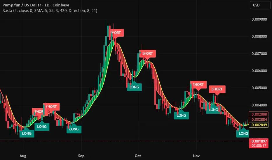
RastaRasta — Real-Time Directional State Framework
Rasta is a real-time, state-based momentum and structure indicator designed to help users visualize directional market bias and observe transitions between bullish and bearish regimes. The script combines an adaptive baseline (EMA) with a selectable smoothing layer to create a clean, readable structure that highlights how price momentum and trend context evolve over time.
This indicator is built to be responsive in real time while remaining readable on higher timeframes. It is intended for users who want a practical framework for studying market rhythm, structure, and directional bias—without relying on hindsight-based visuals.
Concept Overview
Rasta works by tracking two primary curves:
EMA Line (core baseline)
A fast baseline that responds to price movement according to the selected length and source.
Smoothed Line (structure layer)
A second line derived from the baseline using a user-selected smoothing method. This creates a stable “structure reference” that helps distinguish meaningful directional shifts from minor noise.
When the baseline crosses the structure line, the script interprets it as a directional state transition:
LONG state when momentum structure shifts upward
SHORT state when momentum structure shifts downward
These transitions are presented as labels and can be used to trigger alerts that notify the user when a state change occurs.
Key Features
1) Real-Time Directional State Transitions
Rasta evaluates transitions continuously and can generate state-change markers in real time. This makes it suitable for users who want a framework that can react during the bar, not only after a bar closes.
2) Per-Bar Lock for Clean Signaling
To prevent repeated triggering inside the same candle, Rasta uses a per-bar lock. This helps keep the visual output and alerting behavior clean and prevents rapid repeats when price oscillates around the crossover level.
3) One-Position State Logic
Rasta uses an internal state model so signals behave consistently:
A LONG state change occurs only when not already in that state
A SHORT state change occurs only when already in a LONG state (and vice versa depending on configuration)
This produces a stable “state machine” feel rather than noisy multi-trigger behavior.
4) Bar-Close Backup Events
In addition to real-time behavior, Rasta includes bar-close confirmation events so that state transitions can still be captured on confirmed closes. This is intended as a reliability layer for users who prefer bar-close confirmations or want a secondary confirmation pathway.
5) Optional EMA 8/21 Trend Context Filter
Rasta includes an optional EMA 8 / EMA 21 trend context filter:
When enabled, LONG transitions can be gated by a higher-level trend condition
Exits/transitions are not blocked by the filter (filter is focused on trend alignment rather than preventing regime changes)
This allows users to tune between:
More responsive behavior (filter off)
More trend-aligned behavior (filter on)
6) Adaptive Entry Behavior When Trend Context Flips
When the trend filter flips into alignment, Rasta can optionally allow an adaptive entry behavior if internal structure is already aligned. This is intended to reduce missed transitions when broader trend context changes after the internal structure has already shifted.
Visual System
Rasta includes several visual aids designed to make directional regime clarity obvious at a glance:
Lines
EMA (baseline)
Smoothed (structure)
Directional Fog (optional)
A colored fill between the lines helps highlight:
Positive structure alignment
Negative structure alignment
Opacity is adjustable for different chart styles.
DNA Rungs (optional)
Rasta can draw “rungs” that connect the EMA line and the smoothed line, creating a ladder-style visualization of structure spacing and momentum intensity over time. Users can:
Enable/disable rungs
Adjust rung width
Control the max number of rungs retained (performance management)
Choose rung color behavior (fixed vs directional)
Inputs and Tuning Notes
Rasta is intentionally configurable so you can tailor it to different markets and timeframes:
Core Settings
Length: Controls baseline responsiveness
Source: Baseline source (close by default)
Offset: Optional visual offset (does not change logic)
Smoothing Settings
Type: SMA / EMA / RMA / WMA / None
Length: Controls how stable the structure line becomes
General intuition:
Lower smoothing = faster, more reactive
Higher smoothing = cleaner, more selective transitions
EMA 8/21 Filter (optional)
Enable/disable
Fast/slow EMA lengths
Optional plotting for transparency
How to Use
Rasta is best used as a directional context tool—a framework for evaluating regime shifts, momentum structure, and trend alignment.
Common analytical workflows:
Apply Rasta to a chart and observe LONG/SHORT state transitions
Use the line relationship and fog as a visual confirmation of structure alignment
Optionally enable the EMA 8/21 filter for higher-level trend context
Use alerts if you want notifications when state changes occur
This indicator is designed to be applied to many assets and timeframes. Users should expect to tune parameters based on:
Volatility profile
Liquidity
Timeframe
Market regime
Alerts
Rasta supports alerts that notify you when a directional state change occurs.
Provided alert messages:
LONG
SHORT
These alerts indicate a state transition condition occurred. Users can route these alerts to external systems if they choose; however, Rasta itself is an analytical indicator and does not execute trades.
Recommended alert frequency (typical best practice):
“Once per bar” for real-time transitions
Users may choose bar-close alerting preferences depending on their workflow
Performance and Platform Notes
Rasta includes optional visual elements (fog and rungs). If you notice slowdowns on very low timeframes or long histories, reduce rung count or disable rungs.
The indicator is designed to avoid repeated triggers within a single bar via a per-bar lock, improving signal cleanliness.
Important Disclosures
Rasta is an analytical and educational framework intended to help users study market structure and directional bias. It is not financial advice and is not a signal service. No claims are made regarding profitability or future performance. Markets involve risk, and users are responsible for their own decisions, risk management, and execution.
PDH/PDL + ONH/ONL (Enhanced Labels)At the start of a new day's session, this indicator will plot the Previous Day's High and Low as well as the Overnight (afterhours) High and Low as horizontal dotted lines on the current day's session.
You can edit the colors of the lines and the text (the same)
You can edit the color of the labels as well as the transparency of the label color itself
The label for each line will be plotting with the chart, you can edit the number of bars that the label will appear to the live price action to keep from having to zoom to determine which line it represents.
the chart settings - session must be set to "extended trading hours" for this to appear on your chart

Average Trading Range info box (today and historical)One small informational box, in the upper right of your chart to provide trading range information.
Line one (historical) tells you the trading range over a configurable period of time as a $ amount and as a %.
The second line (today) tells you where these values are today and the final line tells you as a %, where the values are today as a percentage of the configurable first line (14 days etc).
The third line changes color when you are 75% of the way to the historical value and red when you are at over 100% of the historical value.
Big DC scripts

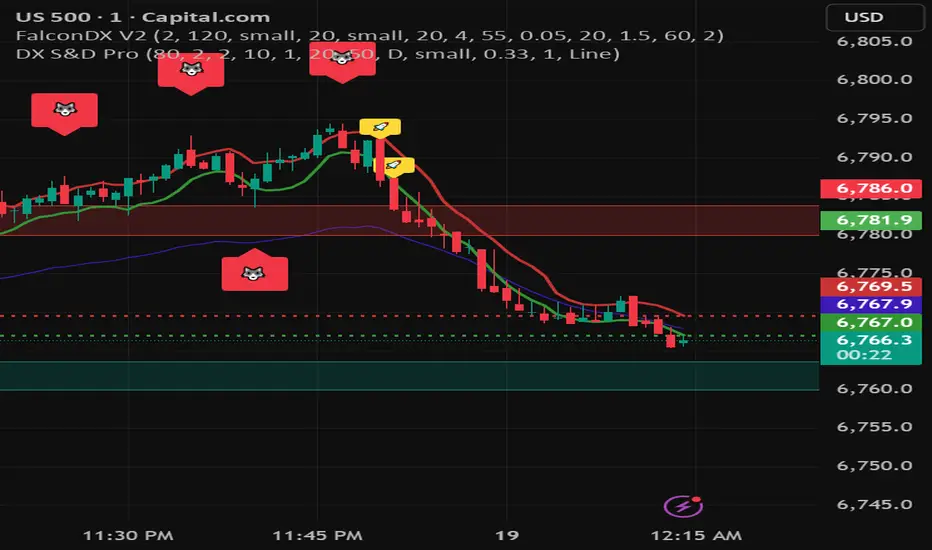
DX Supply and Demand Pro💎 DX Supply and Demand Pro: Adaptive Line and Zone Mastery
The DX Supply and Demand Pro indicator is an advanced, hybrid trading tool engineered for precision and context. It seamlessly integrates the proprietary Arbitor Line with dynamic, volume-weighted Supply and Demand Zones. This unique combination provides traders with a clear, adaptive view of both the current trend bias and critical structural price levels.
⚠️ Critical Trading Disclaimer 🛑
Trading is highly speculative and carries a substantial risk of loss. The use of this indicator does not guarantee profits, and you may lose more than your initial capital. Before using this tool in a live trading environment, you must test its performance thoroughly using paper trading or a simulated account.
Why Traders Need the DX S&D Pro 🎯
Proprietary Adaptive Intelligence: The Arbitor Line is a calculated price anchor derived from a complex, undisclosed combination of multiple market factors and proprietary equations. It automatically adjusts its sensitivity based on the chart's timeframe, effectively filtering out market noise to present an accurate, weighted average of the prevailing market bias.
Structural Clarity: It detects high-probability Supply and Demand Zones using pivot points, filtering them for strength based on volume, ATR (volatility), and High Volume Node (HVN) confirmation from a higher timeframe.
Actionable Confluence: The indicator combines dynamic trend bias (the Arbitor Line) with static structural levels (S&D Zones). This allows traders to identify high-conviction setups where the structural turning point is confirmed by the real-time bias of the Arbitor Line.
📚 How to Use DX Supply and Demand Pro
This indicator is best used as a confluence tool, where the Arbitor Line confirms the strength and direction of the setup identified by the Supply/Demand Zones.
Trading Confluence with the Arbitor Line:
Scenario: Buy Zone Rejection 🟢
Condition: Price touches a Demand Zone.
Confluence: The Arbitor Line is Above the zone.
Interpretation: Indicates a Bullish Bias is confirming the structural support. Focus on long entries.
Scenario: Sell Zone Rejection 🔴
Condition: Price touches a Supply Zone.
Confluence: The Arbitor Line is Below the zone.
Interpretation: Indicates a Bearish Bias is confirming the structural resistance. Focus on short entries.
Scenario: Momentum Break ⚡
Condition: Price Closes strongly beyond a zone.
Confluence: The Arbitor Line is Aligned with the Break.
Interpretation: Confirms market momentum and suggests the structural break is valid for directional continuation.
⚙️ Key Settings and Optimization Guide 🔧
Arbitor Line Settings (Trend Bias):
VWAP Weight: (Default: 0.33) — The weight applied to a key volume component within the proprietary Arbitor calculation.
Suggestion for High Volatility/Volume: Increase to 0.40 to emphasize volume's influence.
Suggestion for Clean Trends: Decrease to 0.25 to allow momentum components to dictate the line's position.
Supply & Demand Zone Settings (Structural Levels)
HVN Volume TF: (Default: D - Daily) — Crucial Context Setter. The higher timeframe used to look for High Volume Nodes (HVNs) to confirm zone strength.
For Scalping (1m-15m): Use 1H or 4H for validation.
For Day Trading (30m-1H): Use 4H or D. D is the recommended default.
For Swing Trading (4H-Daily): Use W (Weekly).
HVN Bonus %: (Default: 20) — The strength boost applied to a zone if it aligns with an HVN.
Max Supply/Demand Zones: (Default: 2) — Limits the number of active, displayed zones to keep the chart clean.
Retest Bonus %: (Default: 10) — Boosts a zone's strength score each time it is retested (up to max retests).
Time Decay Rate %: (Default: 1) — Reduces a zone's strength for every 10 bars it remains unbroken (stale zones weaken).
Flip Zone on Break: (Default: True) — Turns a broken Demand Zone into a Supply Zone (and vice versa), reflecting structural flip concepts.
💡 Suggestions for Power Users 🚀
Look for Flipped Zones: Pay attention to zones that have been broken and flipped (indicated by yellow text in the labels). Flipped zones that confirm the Arbitor direction often lead to high-momentum continuation moves.
Confirm HVN Strength: Always prioritize trading zones with a high strength score (e.g., 90% or higher), as this indicates maximum confluence of Volume, Volatility, and the HVN Bonus.
Adaptive Timeframes: Use the indicator on multiple timeframes to ensure the Arbitor bias aligns with your trade direction. If the Arbitor is bullish on both the 5-minute and the 1-hour chart, the conviction is exceptionally high.
Final Note: The DX S&D Pro combines the best of trend following with the best of structural trading. It's so good, we call it the Arbitor because it settles the arguments between buyers and sellers... until the next bar, of course! 😉
....................................................................................
💎 مؤشر DX Supply and Demand Pro: خط التكيّف وإتقان المناطق ✨
مؤشر DX Supply and Demand Pro هو أداة تداول هجينة ومتقدمة مصممة للدقة والسياق. إنه يدمج بسلاسة خط Arbitor الخاص بنا مع مناطق العرض والطلب الديناميكية المرجحة بالحجم. يوفر هذا المزيج الفريد للمتداولين رؤية واضحة ومتكيفة لكل من انحياز الاتجاه الحالي ومستويات الأسعار الهيكلية (Structural Price Levels) الحرجة.
⚠️ إخلاء مسؤولية حاسم بشأن التداول 🛑
التداول ينطوي على مخاطرة عالية للغاية ويحمل مخاطر خسارة كبيرة. استخدام هذا المؤشر لا يضمن الأرباح، وقد تخسر أكثر من رأس مالك الأولي. قبل استخدام هذه الأداة في بيئة تداول حقيقية، يجب عليك اختبار أدائها بشكل شامل باستخدام التداول الورقي (Paper Trading) أو حساب محاكاة.
لماذا يحتاج المتداولون إلى مؤشر DX S&D Pro 🎯
ذكاء تكيّفي خاص (Proprietary Adaptive Intelligence): خط Arbitor هو مرساة سعر محسوبة مشتقة من تركيبة معقدة وغير معلنة من عوامل سوق متعددة ومعادلات خاصة. يقوم بضبط حساسيته تلقائيًا بناءً على الإطار الزمني للرسم البياني، مما يزيل ضوضاء السوق بشكل فعال لتقديم متوسط مرجح ودقيق للانحياز السائد في السوق.
وضوح هيكلي (Structural Clarity): يكتشف مناطق العرض والطلب ذات الاحتمالية العالية باستخدام نقاط التحول (Pivot Points)، ويقوم بترشيحها وتحديد قوتها بناءً على الحجم، ATR (التقلب)، وتأكيد من عقدة الحجم العالية (HVN) من إطار زمني أعلى.
تضافر قابل للتطبيق (Actionable Confluence): يجمع المؤشر بين انحياز الاتجاه الديناميكي (خط Arbitor) ومستويات الهيكل الثابتة (مناطق العرض والطلب). يتيح ذلك للمتداولين تحديد إعدادات ذات قناعة عالية حيث يتم تأكيد نقطة التحول الهيكلية من خلال انحياز خط Arbitor في الوقت الفعلي.
📚 كيفية استخدام مؤشر DX Supply and Demand Pro
يُفضل استخدام هذا المؤشر كأداة تضافر، حيث يؤكد خط Arbitor قوة واتجاه الإعداد المحدد بواسطة مناطق العرض والطلب.
تضافر التداول مع خط Arbitor:
السيناريو: ارتداد منطقة الشراء 🟢
الحالة: يلامس السعر منطقة الطلب (Demand Zone).
التضافر: يقع خط Arbitor فوق المنطقة.
التفسير: يشير إلى أن انحياز صعودي (Bullish Bias) يؤكد الدعم الهيكلي. التركيز على صفقات الشراء (Long Entries).
السيناريو: ارتداد منطقة البيع 🔴
الحالة: يلامس السعر منطقة العرض (Supply Zone).
التضافر: يقع خط Arbitor أسفل المنطقة.
التفسير: يشير إلى أن انحياز هبوطي (Bearish Bias) يؤكد المقاومة الهيكلية. التركيز على صفقات البيع (Short Entries).
السيناريو: كسر الزخم ⚡
الحالة: يُغلق السعر بقوة خارج المنطقة.
التضافر: يتماشى خط Arbitor مع الكسر.
التفسير: يؤكد زخم السوق ويشير إلى أن الكسر الهيكلي صالح للاستمرار الاتجاهي.
⚙️ الإعدادات الرئيسية ودليل التحسين 🔧
إعدادات خط Arbitor (انحياز الاتجاه)
VWAP Weight (وزن VWAP): (افتراضي: 0.33) — الوزن المطبق على مكون حجم رئيسي ضمن حساب Arbitor الخاص بنا.
اقتراح للتقلب/الحجم العالي: زيادة إلى 0.40 للتأكيد على تأثير الحجم.
اقتراح للاتجاهات النظيفة: تقليل إلى 0.25 للسماح لمكونات الزخم بتحديد موقع الخط بشكل أقوى.
إعدادات مناطق العرض والطلب (المستويات الهيكلية)
HVN Volume TF (الإطار الزمني لحجم HVN): (افتراضي: D - يومي) — مُحدِد السياق الحاسم. الإطار الزمني الأعلى المستخدم للبحث عن عقد الحجم العالية (HVNs) لتأكيد قوة المنطقة.
للمضاربة اللحظية (1د-15د): استخدم 1س أو 4س للتحقق.
للتداول اليومي (30د-1س): استخدم 4س أو D. D هو الإعداد الافتراضي الموصى به.
للتداول المتأرجح (4س-يومي): استخدم W (أسبوعي).
HVN Bonus % (مكافأة HVN %): (افتراضي: 20) — تعزيز القوة المطبق على المنطقة إذا كانت تتماشى مع عقدة HVN.
Max Supply/Demand Zones (الحد الأقصى لمناطق العرض/الطلب): (افتراضي: 2) — يحد من عدد المناطق النشطة المعروضة للحفاظ على نظافة الرسم البياني.
Retest Bonus % (مكافأة إعادة الاختبار %): (افتراضي: 10) — يعزز درجة قوة المنطقة في كل مرة يتم فيها إعادة اختبارها (حتى الحد الأقصى لإعادة الاختبارات).
Time Decay Rate % (معدل الاضمحلال الزمني %): (افتراضي: 1) — يقلل من قوة المنطقة لكل 10 شمعات تبقى فيها دون كسر (المناطق القديمة تضعف).
Flip Zone on Break (قلب المنطقة عند الكسر): (افتراضي: True - صحيح) — يحول منطقة الطلب المكسورة إلى منطقة عرض (والعكس صحيح)، مما يعكس مفاهيم التحول الهيكلي.
💡 اقتراحات للمستخدمين المتقدمين 🚀
ابحث عن المناطق المقلوبة (Flipped Zones): انتبه بشكل خاص إلى المناطق التي تم كسرها وقلبها (يشار إليها بنص أصفر في التسميات). غالبًا ما تؤدي المناطق المقلوبة التي تؤكد اتجاه Arbitor إلى تحركات استمرارية ذات زخم عالٍ.
تأكيد قوة HVN: أعطِ الأولوية دائمًا لتداول المناطق ذات درجة القوة العالية (على سبيل المثال، 90% أو أعلى)، حيث يشير هذا إلى أقصى درجات التضافر بين الحجم والتقلب ومكافأة HVN.
الأطر الزمنية التكيفية: استخدم المؤشر على أطر زمنية متعددة للتأكد من توافق انحياز Arbitor مع اتجاه تداولك. إذا كان Arbitor صعوديًا على كل من الرسم البياني 5 دقائق والساعة الواحدة، تكون القناعة عالية بشكل استثنائي.
ملاحظة أخيرة: يجمع مؤشر DX S&D Pro أفضل ما في تتبع الاتجاه مع أفضل ما في التداول الهيكلي. إنه جيد جدًا، لدرجة أننا نطلق عليه اسم Arbitor لأنه يحسم الجدل بين المشترين والبائعين... حتى الشمعة التالية بالطبع! 😉
دعواتكم 🙏.
Omni-Trend Analytics + Live PnL DashboardOverview
The Omni-Trend Analytics suite is an all-in-one technical command center. It integrates the battle-tested UT Bot signal logic with a sophisticated real-time dashboard, session tracking, and multi-timeframe trend analysis.
📊 The "Nexus" Dashboard
The heart of this script is the 6-row dynamic dashboard, designed to give you "at-a-glance" confluence:
RSI & RSI-MA: Tracks the standard RSI alongside a custom RSI-based Moving Average to spot momentum shifts before they hit the price.
Selectable Trend Status: Unlike static indicators, you can toggle the "Trend" source between EMA 9, 20, or 200 in the settings to match your trading style (Scalping vs. Swing).
Distance to EMA: Shows exactly how "overextended" the price is from your selected trend line.
ATR Volatility (Color-Coded): Turns Green when volatility is expanding (ideal for trend following) and Red when the market is contracting (ideal for range-trading or caution).
Live PnL Tracking: Automatically calculates the profit or loss of the most recent UT Bot signal in real-time.
🛠️ Key Features & Settings
Precision Signals: Combines UT Bot Buy/Sell labels with RSI "!" reversal warnings for high-probability entries.
Institutional Moving Averages: Includes 5 SMAs (including the 610 SMA) and 3 EMAs (9, 20, 200) all set to a professional Thickness 2 for clarity.
Session Highlighting: Automatically shades the background for London and New York sessions to help you trade when liquidity is highest.
VWAP Integration: Includes a purple VWAP line to ensure you are trading at a "fair value" relative to volume.
🔔 Strategic Alert Suite
The script comes pre-loaded with 6 specialized alert conditions:
UT Bot Signal: Standard entry alerts.
RSI Cross RSI-MA: Early warning for momentum reversals.
High-Prob UT + VWAP: Signals that only trigger when aligned with institutional volume.
EMA 9/20 Momentum Cross: Classic trend-shift notification.
ATR Volatility Spike: Alerts you to 50% increases in market volatility.
PnL Target / Break-Even: Pings you when your live trade reaches a user-defined profit threshold.
💡 Trading Pro-Tip
The Convergence Strategy: Look for a UT Bot Buy signal that occurs during the London/NY Overlap while the ATR is Green (expanding) and the RSI is crossing over its RSI-MA. This "triple confluence" is the primary design intent of the Omni-Trend suite.

RastaRasta — Real-Time Directional State Framework
Rasta is a real-time, state-based momentum and structure indicator designed to help users visualize directional market bias and observe transitions between bullish and bearish regimes. The script combines an adaptive baseline (EMA) with a selectable smoothing layer to create a clean, readable structure that highlights how price momentum and trend context evolve over time.
This indicator is built to be responsive in real time while remaining readable on higher timeframes. It is intended for users who want a practical framework for studying market rhythm, structure, and directional bias—without relying on hindsight-based visuals.
Concept Overview
Rasta works by tracking two primary curves:
EMA Line (core baseline)
A fast baseline that responds to price movement according to the selected length and source.
Smoothed Line (structure layer)
A second line derived from the baseline using a user-selected smoothing method. This creates a stable “structure reference” that helps distinguish meaningful directional shifts from minor noise.
When the baseline crosses the structure line, the script interprets it as a directional state transition:
LONG state when momentum structure shifts upward
SHORT state when momentum structure shifts downward
These transitions are presented as labels and can be used to trigger alerts that notify the user when a state change occurs.
Key Features
1) Real-Time Directional State Transitions
Rasta evaluates transitions continuously and can generate state-change markers in real time. This makes it suitable for users who want a framework that can react during the bar, not only after a bar closes.
2) Per-Bar Lock for Clean Signaling
To prevent repeated triggering inside the same candle, Rasta uses a per-bar lock. This helps keep the visual output and alerting behavior clean and prevents rapid repeats when price oscillates around the crossover level.
3) One-Position State Logic
Rasta uses an internal state model so signals behave consistently:
A LONG state change occurs only when not already in that state
A SHORT state change occurs only when already in a LONG state (and vice versa depending on configuration)
This produces a stable “state machine” feel rather than noisy multi-trigger behavior.
4) Bar-Close Backup Events
In addition to real-time behavior, Rasta includes bar-close confirmation events so that state transitions can still be captured on confirmed closes. This is intended as a reliability layer for users who prefer bar-close confirmations or want a secondary confirmation pathway.
5) Optional EMA 8/21 Trend Context Filter
Rasta includes an optional EMA 8 / EMA 21 trend context filter:
When enabled, LONG transitions can be gated by a higher-level trend condition
Exits/transitions are not blocked by the filter (filter is focused on trend alignment rather than preventing regime changes)
This allows users to tune between:
More responsive behavior (filter off)
More trend-aligned behavior (filter on)
6) Adaptive Entry Behavior When Trend Context Flips
When the trend filter flips into alignment, Rasta can optionally allow an adaptive entry behavior if internal structure is already aligned. This is intended to reduce missed transitions when broader trend context changes after the internal structure has already shifted.
Visual System
Rasta includes several visual aids designed to make directional regime clarity obvious at a glance:
Lines
EMA (baseline)
Smoothed (structure)
Directional Fog (optional)
A colored fill between the lines helps highlight:
Positive structure alignment
Negative structure alignment
Opacity is adjustable for different chart styles.
DNA Rungs (optional)
Rasta can draw “rungs” that connect the EMA line and the smoothed line, creating a ladder-style visualization of structure spacing and momentum intensity over time. Users can:
Enable/disable rungs
Adjust rung width
Control the max number of rungs retained (performance management)
Choose rung color behavior (fixed vs directional)
Inputs and Tuning Notes
Rasta is intentionally configurable so you can tailor it to different markets and timeframes:
Core Settings
Length: Controls baseline responsiveness
Source: Baseline source (close by default)
Offset: Optional visual offset (does not change logic)
Smoothing Settings
Type: SMA / EMA / RMA / WMA / None
Length: Controls how stable the structure line becomes
General intuition:
Lower smoothing = faster, more reactive
Higher smoothing = cleaner, more selective transitions
EMA 8/21 Filter (optional)
Enable/disable
Fast/slow EMA lengths
Optional plotting for transparency
How to Use
Rasta is best used as a directional context tool—a framework for evaluating regime shifts, momentum structure, and trend alignment.
Common analytical workflows:
Apply Rasta to a chart and observe LONG/SHORT state transitions
Use the line relationship and fog as a visual confirmation of structure alignment
Optionally enable the EMA 8/21 filter for higher-level trend context
Use alerts if you want notifications when state changes occur
This indicator is designed to be applied to many assets and timeframes. Users should expect to tune parameters based on:
Volatility profile
Liquidity
Timeframe
Market regime
Alerts
Rasta supports alerts that notify you when a directional state change occurs.
Provided alert messages:
LONG
SHORT
These alerts indicate a state transition condition occurred. Users can route these alerts to external systems if they choose; however, Rasta itself is an analytical indicator and does not execute trades.
Recommended alert frequency (typical best practice):
“Once per bar” for real-time transitions
Users may choose bar-close alerting preferences depending on their workflow
Performance and Platform Notes
Rasta includes optional visual elements (fog and rungs). If you notice slowdowns on very low timeframes or long histories, reduce rung count or disable rungs.
The indicator is designed to avoid repeated triggers within a single bar via a per-bar lock, improving signal cleanliness.
Important Disclosures
Rasta is an analytical and educational framework intended to help users study market structure and directional bias. It is not financial advice and is not a signal service. No claims are made regarding profitability or future performance. Markets involve risk, and users are responsible for their own decisions, risk management, and execution.

DX Supply and Demand Pro💎 DX Supply and Demand Pro: Adaptive Line and Zone Mastery
The DX Supply and Demand Pro indicator is an advanced, hybrid trading tool engineered for precision and context. It seamlessly integrates the proprietary Arbitor Line with dynamic, volume-weighted Supply and Demand Zones. This unique combination provides traders with a clear, adaptive view of both the current trend bias and critical structural price levels.
⚠️ Critical Trading Disclaimer 🛑
Trading is highly speculative and carries a substantial risk of loss. The use of this indicator does not guarantee profits, and you may lose more than your initial capital. Before using this tool in a live trading environment, you must test its performance thoroughly using paper trading or a simulated account.
Why Traders Need the DX S&D Pro 🎯
Proprietary Adaptive Intelligence: The Arbitor Line is a calculated price anchor derived from a complex, undisclosed combination of multiple market factors and proprietary equations. It automatically adjusts its sensitivity based on the chart's timeframe, effectively filtering out market noise to present an accurate, weighted average of the prevailing market bias.
Structural Clarity: It detects high-probability Supply and Demand Zones using pivot points, filtering them for strength based on volume, ATR (volatility), and High Volume Node (HVN) confirmation from a higher timeframe.
Actionable Confluence: The indicator combines dynamic trend bias (the Arbitor Line) with static structural levels (S&D Zones). This allows traders to identify high-conviction setups where the structural turning point is confirmed by the real-time bias of the Arbitor Line.
Feedback & Accountability 🤝
This indicator is provided "as is" and its performance is based on the parameters set by the user. Any suggestions or comments from users regarding performance, bugs, or feature requests should be directed to the developer here or X @Falcondxeye. The developer assumes no liability for trading losses incurred using this tool.
📚 How to Use DX Supply and Demand Pro
This indicator is best used as a confluence tool, where the Arbitor Line confirms the strength and direction of the setup identified by the Supply/Demand Zones.
Trading Confluence with the Arbitor Line:
Scenario: Buy Zone Rejection 🟢
Condition: Price touches a Demand Zone.
Confluence: The Arbitor Line is Above the zone.
Interpretation: Indicates a Bullish Bias is confirming the structural support. Focus on long entries.
Scenario: Sell Zone Rejection 🔴
Condition: Price touches a Supply Zone.
Confluence: The Arbitor Line is Below the zone.
Interpretation: Indicates a Bearish Bias is confirming the structural resistance. Focus on short entries.
Scenario: Momentum Break ⚡
Condition: Price Closes strongly beyond a zone.
Confluence: The Arbitor Line is Aligned with the Break.
Interpretation: Confirms market momentum and suggests the structural break is valid for directional continuation.
⚙️ Key Settings and Optimization Guide 🔧
Arbitor Line Settings (Trend Bias):
VWAP Weight: (Default: 0.33) — The weight applied to a key volume component within the proprietary Arbitor calculation.
Suggestion for High Volatility/Volume: Increase to 0.40 to emphasize volume's influence.
Suggestion for Clean Trends: Decrease to 0.25 to allow momentum components to dictate the line's position.
Supply & Demand Zone Settings (Structural Levels)
HVN Volume TF: (Default: D - Daily) — Crucial Context Setter. The higher timeframe used to look for High Volume Nodes (HVNs) to confirm zone strength.
For Scalping (1m-15m): Use 1H or 4H for validation.
For Day Trading (30m-1H): Use 4H or D. D is the recommended default.
For Swing Trading (4H-Daily): Use W (Weekly).
HVN Bonus %: (Default: 20) — The strength boost applied to a zone if it aligns with an HVN.
Max Supply/Demand Zones: (Default: 2) — Limits the number of active, displayed zones to keep the chart clean.
Retest Bonus %: (Default: 10) — Boosts a zone's strength score each time it is retested (up to max retests).
Time Decay Rate %: (Default: 1) — Reduces a zone's strength for every 10 bars it remains unbroken (stale zones weaken).
Flip Zone on Break: (Default: True) — Turns a broken Demand Zone into a Supply Zone (and vice versa), reflecting structural flip concepts.
💡 Suggestions for Power Users 🚀
Look for Flipped Zones: Pay attention to zones that have been broken and flipped (indicated by yellow text in the labels). Flipped zones that confirm the Arbitor direction often lead to high-momentum continuation moves.
Confirm HVN Strength: Always prioritize trading zones with a high strength score (e.g., 90% or higher), as this indicates maximum confluence of Volume, Volatility, and the HVN Bonus.
Adaptive Timeframes: Use the indicator on multiple timeframes to ensure the Arbitor bias aligns with your trade direction. If the Arbitor is bullish on both the 5-minute and the 1-hour chart, the conviction is exceptionally high.
Final Note: The DX S&D Pro combines the best of trend following with the best of structural trading. It's so good, we call it the Arbitor because it settles the arguments between buyers and sellers... until the next bar, of course! 😉
....................................................................................
💎 مؤشر DX Supply and Demand Pro: خط التكيّف وإتقان المناطق ✨
مؤشر DX Supply and Demand Pro هو أداة تداول هجينة ومتقدمة مصممة للدقة والسياق. إنه يدمج بسلاسة خط Arbitor الخاص بنا مع مناطق العرض والطلب الديناميكية المرجحة بالحجم. يوفر هذا المزيج الفريد للمتداولين رؤية واضحة ومتكيفة لكل من انحياز الاتجاه الحالي ومستويات الأسعار الهيكلية (Structural Price Levels) الحرجة.
⚠️ إخلاء مسؤولية حاسم بشأن التداول 🛑
التداول ينطوي على مخاطرة عالية للغاية ويحمل مخاطر خسارة كبيرة. استخدام هذا المؤشر لا يضمن الأرباح، وقد تخسر أكثر من رأس مالك الأولي. قبل استخدام هذه الأداة في بيئة تداول حقيقية، يجب عليك اختبار أدائها بشكل شامل باستخدام التداول الورقي (Paper Trading) أو حساب محاكاة.
لماذا يحتاج المتداولون إلى مؤشر DX S&D Pro 🎯
ذكاء تكيّفي خاص (Proprietary Adaptive Intelligence): خط Arbitor هو مرساة سعر محسوبة مشتقة من تركيبة معقدة وغير معلنة من عوامل سوق متعددة ومعادلات خاصة. يقوم بضبط حساسيته تلقائيًا بناءً على الإطار الزمني للرسم البياني، مما يزيل ضوضاء السوق بشكل فعال لتقديم متوسط مرجح ودقيق للانحياز السائد في السوق.
وضوح هيكلي (Structural Clarity): يكتشف مناطق العرض والطلب ذات الاحتمالية العالية باستخدام نقاط التحول (Pivot Points)، ويقوم بترشيحها وتحديد قوتها بناءً على الحجم، ATR (التقلب)، وتأكيد من عقدة الحجم العالية (HVN) من إطار زمني أعلى.
تضافر قابل للتطبيق (Actionable Confluence): يجمع المؤشر بين انحياز الاتجاه الديناميكي (خط Arbitor) ومستويات الهيكل الثابتة (مناطق العرض والطلب). يتيح ذلك للمتداولين تحديد إعدادات ذات قناعة عالية حيث يتم تأكيد نقطة التحول الهيكلية من خلال انحياز خط Arbitor في الوقت الفعلي.
الملاحظات والمساءلة 🤝
يتم توفير هذا المؤشر "كما هو" ويستند أدائه إلى الاعدادات التي يحددها المستخدم. يجب توجيه أي اقتراحات أو تعليقات من المستخدمين بخصوص الأداء أو الأخطاء أو طلبات الميزات إلى المطور هنا أو على X @Falcondxeye. لا يتحمل المطور أي مسؤولية عن خسائر التداول المتكبدة باستخدام هذه الأداة.
📚 كيفية استخدام مؤشر DX Supply and Demand Pro
يُفضل استخدام هذا المؤشر كأداة تضافر، حيث يؤكد خط Arbitor قوة واتجاه الإعداد المحدد بواسطة مناطق العرض والطلب.
تضافر التداول مع خط Arbitor:
السيناريو: ارتداد منطقة الشراء 🟢
الحالة: يلامس السعر منطقة الطلب (Demand Zone).
التضافر: يقع خط Arbitor فوق المنطقة.
التفسير: يشير إلى أن انحياز صعودي (Bullish Bias) يؤكد الدعم الهيكلي. التركيز على صفقات الشراء (Long Entries).
السيناريو: ارتداد منطقة البيع 🔴
الحالة: يلامس السعر منطقة العرض (Supply Zone).
التضافر: يقع خط Arbitor أسفل المنطقة.
التفسير: يشير إلى أن انحياز هبوطي (Bearish Bias) يؤكد المقاومة الهيكلية. التركيز على صفقات البيع (Short Entries).
السيناريو: كسر الزخم ⚡
الحالة: يُغلق السعر بقوة خارج المنطقة.
التضافر: يتماشى خط Arbitor مع الكسر.
التفسير: يؤكد زخم السوق ويشير إلى أن الكسر الهيكلي صالح للاستمرار الاتجاهي.
⚙️ الإعدادات الرئيسية ودليل التحسين 🔧
إعدادات خط Arbitor (انحياز الاتجاه)
VWAP Weight (وزن VWAP): (افتراضي: 0.33) — الوزن المطبق على مكون حجم رئيسي ضمن حساب Arbitor الخاص بنا.
اقتراح للتقلب/الحجم العالي: زيادة إلى 0.40 للتأكيد على تأثير الحجم.
اقتراح للاتجاهات النظيفة: تقليل إلى 0.25 للسماح لمكونات الزخم بتحديد موقع الخط بشكل أقوى.
إعدادات مناطق العرض والطلب (المستويات الهيكلية)
HVN Volume TF (الإطار الزمني لحجم HVN): (افتراضي: D - يومي) — مُحدِد السياق الحاسم. الإطار الزمني الأعلى المستخدم للبحث عن عقد الحجم العالية (HVNs) لتأكيد قوة المنطقة.
للمضاربة اللحظية (1د-15د): استخدم 1س أو 4س للتحقق.
للتداول اليومي (30د-1س): استخدم 4س أو D. D هو الإعداد الافتراضي الموصى به.
للتداول المتأرجح (4س-يومي): استخدم W (أسبوعي).
HVN Bonus % (مكافأة HVN %): (افتراضي: 20) — تعزيز القوة المطبق على المنطقة إذا كانت تتماشى مع عقدة HVN.
Max Supply/Demand Zones (الحد الأقصى لمناطق العرض/الطلب): (افتراضي: 2) — يحد من عدد المناطق النشطة المعروضة للحفاظ على نظافة الرسم البياني.
Retest Bonus % (مكافأة إعادة الاختبار %): (افتراضي: 10) — يعزز درجة قوة المنطقة في كل مرة يتم فيها إعادة اختبارها (حتى الحد الأقصى لإعادة الاختبارات).
Time Decay Rate % (معدل الاضمحلال الزمني %): (افتراضي: 1) — يقلل من قوة المنطقة لكل 10 شمعات تبقى فيها دون كسر (المناطق القديمة تضعف).
Flip Zone on Break (قلب المنطقة عند الكسر): (افتراضي: True - صحيح) — يحول منطقة الطلب المكسورة إلى منطقة عرض (والعكس صحيح)، مما يعكس مفاهيم التحول الهيكلي.
💡 اقتراحات للمستخدمين المتقدمين 🚀
ابحث عن المناطق المقلوبة (Flipped Zones): انتبه بشكل خاص إلى المناطق التي تم كسرها وقلبها (يشار إليها بنص أصفر في التسميات). غالبًا ما تؤدي المناطق المقلوبة التي تؤكد اتجاه Arbitor إلى تحركات استمرارية ذات زخم عالٍ.
تأكيد قوة HVN: أعطِ الأولوية دائمًا لتداول المناطق ذات درجة القوة العالية (على سبيل المثال، 90% أو أعلى)، حيث يشير هذا إلى أقصى درجات التضافر بين الحجم والتقلب ومكافأة HVN.
الأطر الزمنية التكيفية: استخدم المؤشر على أطر زمنية متعددة للتأكد من توافق انحياز Arbitor مع اتجاه تداولك. إذا كان Arbitor صعوديًا على كل من الرسم البياني 5 دقائق والساعة الواحدة، تكون القناعة عالية بشكل استثنائي.
ملاحظة أخيرة: يجمع مؤشر DX S&D Pro أفضل ما في تتبع الاتجاه مع أفضل ما في التداول الهيكلي. إنه جيد جدًا، لدرجة أننا نطلق عليه اسم Arbitor لأنه يحسم الجدل بين المشترين والبائعين... حتى الشمعة التالية بالطبع! 😉
دعواتكم 🙏..

MarketMind PROM🜁rketMind PRO ────────────────────
Descriptive Market Context & Risk Awareness
M🜁rketMind PRO is a professional-grade market context system designed to help traders maintain situational clarity and explicit risk awareness — without signals, confidence scoring, or forward-looking interpretation.
Rather than telling traders what to trade or how confident to be, M🜁rketMind PRO focuses on describing what is happening in the market and where caution may be warranted.
This script is designed as a standalone descriptive tool. It does not provide execution guidance, trade signals, or predictive insight.
WHAT IT DOES ────────────────────
M🜁rketMind PRO evaluates current market conditions across multiple dimensions — including session context, regime state, momentum direction, volatility, liquidity, and structural behavior — and presents them in a clean, human-readable HUD.
The system emphasizes description over interpretation.
It highlights conditions that may elevate or reduce risk without assessing alignment strength, assigning confidence, or projecting outcomes.
The script provides visibility into:
Market context and session awareness
Basic regime states and transitions
Momentum direction (up, down, neutral)
Volatility, liquidity, and structural caution conditions
Environmental factors that may influence risk
The goal is to make risk visible — without telling traders what to do with it.
HOW TO USE IT ────────────────────
M🜁rketMind PRO is not a signal generator.
It is designed to be used alongside discretionary price action, rule-based entries, or systematic strategies, helping traders stay aware of context and potential risk while executing their own process.
Common questions it can help inform include:
What type of market environment is currently present?
Is momentum developing, stalling, or absent?
Are volatility or liquidity conditions elevated?
Does the environment appear clean or structurally fragile?
M🜁rketMind PRO describes conditions as they are.
Interpretation and decision-making remain entirely with the trader.
DESIGN PHILOSOPHY ────────────────────
M🜁rketMind PRO is intentionally descriptive.
It includes context and caution layers without interpretive or evaluative frameworks:
Market context, momentum, and risk visibility
Volatility, liquidity, and structural awareness
Session awareness without gating or execution logic
A single, consistent HUD perspective
No confidence scoring or conviction grading
No predictive or forward-looking language
Nothing is implied.
Nothing is projected.
This script shows what is happening and where risk may exist — nothing more.
WHO IT IS FOR ────────────────────
M🜁rketMind PRO is suited for traders who:
Prefer structured context over signals
Manage their own execution and risk decisions
Value awareness of environmental and structural conditions
Want clarity without interpretive bias
It is not designed for:
Buy or sell alerts
Execution guidance
Predictive or outcome-based analysis
IMPORTANT NOTES ────────────────────
M🜁rketMind PRO does not provide financial advice
No system can predict future price behavior
This tool is designed to inform awareness, not decisions
Used appropriately, M🜁rketMind PRO supports disciplined, context-aware trading

Price Contraction / Expansion1. Introduction
The Price Contraction / Expansion indicator highlights areas of market compression and volatility release by analyzing candle body size and volume behavior. It provides a fast, color-coded visualization to identify potential breakout zones, accumulation phases, or exhaustion movements.
This tool helps traders recognize when price action is tightening before a volatility expansion — a common precursor to strong directional moves.
2. Key Features
Dynamic body analysis: Compares each candle’s body size with a moving average to detect contraction (small bodies) and expansion (large bodies).
Volume confirmation: Measures whether volume is unusually high or low compared to its recent average, helping filter false breaks.
Color-coded system for clarity:
Yellow: Contraction with high volume (potential accumulation or strong activity).
Blue: Contraction with normal volume or expansion with low volume (neutral/reduced participation).
Green: Expansion in bullish candle (buyer dominance).
Red: Expansion in bearish candle (seller dominance).
Customizable parameters: Adjust body and volume averaging periods and thresholds to fit different market conditions or timeframes.
3. How to Use
Identify contraction zones: Look for blue or yellow bars to locate areas of price compression — these often precede breakouts or large movements.
Wait for expansion confirmation: A shift to green or red bars with increasing volume indicates that volatility is expanding and momentum is building.
Combine with context: Use this indicator alongside trend tools, liquidity zones, or moving averages to confirm directional bias and filter noise.
Adapt thresholds: In highly volatile markets, increase the “Threshold multiplier” to reduce false contraction signals.
This indicator is most effective for traders who focus on volatility behavior, market structure, and timing potential breakout opportunities.

Butterworth Cloud + Squeeze (Upper)The Butterworth Squeeze Cloud – Simple Guide
The Butterworth Cloud is a volatility + trend structure indicator that shows when the market is contracting (coiling) or expanding (breaking out) using a smoothed trend line and dynamic volatility bands.
It is designed to be easy to read visually while giving very advanced information about volatility behavior.
1. What the Butterworth Cloud Actually Measures
The indicator builds three things:
1. A smoothed trend line (Butterworth line)
This filters out noise better than a normal moving average.
When price is above it → bullish bias
When price is below it → bearish bias
When it is flat → ranging market
2. Volatility bands around the trend line
These form the “cloud.”
The cloud expands or contracts depending on volatility.
3. Color signals that show what volatility is doing
Cyan → Contracting (squeezing)
Market energy is tightening. Moves become more likely.
Magenta → Expanding (releasing)
Market is breaking out or trending.
Gray → Neutral
No strong compression or expansion.
This gives a visual map of volatility shifts, similar in concept to Bollinger squeezes, but much smoother and more reactive.
2. How to Read the Cloud at a Glance
A. Contracting Cloud (Cyan)
This signals volatility compression:
Market is coiling
Price is getting tighter around the trend line
Breakouts often follow contraction periods
The longer the cloud stays cyan, the larger the potential move afterward.
B. Expanding Cloud (Magenta)
This signals volatility expansion:
Trend activity increases
Strong directional move is underway
Expansion often begins right after a squeeze ends
Great for:
Trend continuation entries
Avoiding counter-trend trades into strength
C. Neutral Cloud (Gray)
Mixed or unstable volatility.
Often a transition zone, early chop, or slowdown.
3. How Traders Use the Butterworth Cloud
1. Spotting Squeeze → Breakout Cycles
This is the most common use.
Look for cyan contraction
Then wait for a switch to magenta
Combine with price breaking above/below structure
This setup often predicts high-momentum moves.
2. Confirming Trend Strength
Longs are higher probability when cloud is magenta & expanding upward
Shorts are higher probability when cloud is magenta & expanding downward
Avoid trading against expansion unless mean-reverting intentionally
3. Avoiding Chop
If the cloud flips:
cyan → magenta → cyan → magenta
within a short period, the market is choppy.
This helps you stand aside and avoid unnecessary losses.
4. Using the Bands for Targets
The Butterworth Cloud also includes:
Upper band
Lower band
Midline (the Butter line)
Common usage:
Long take profit at upper band
Short take profit at lower band
Mean reversion take profit at midline
Because the bands track volatility, these targets adapt to market conditions.
4. Why Use Butterworth Instead of Standard Indicators?
The Butterworth Cloud has several advantages:
1. Noise filtering
It reduces random spikes better than an EMA or SMA.
2. Cleaner squeeze detection
Unlike Bollinger Bands, it avoids overreacting to single candles.
3. Earlier expansion recognition
Especially in “EARLY” mode, it detects momentum bursts as soon as they start.
4. Works on any timeframe including seconds
Crypto scalpers especially benefit from this.
Cyan = Squeeze (volatility contracting) → market building pressure
Magenta = Expansion (volatility releasing) → breakout or trend
Use cyan → magenta transitions to detect new moves
Use bands for natural take-profits (upper for longs, lower for shorts, midline for reversions)
Works on all markets and timeframes
Very clean representation of volatility behavior
RSI + Volume reversal This indicator designed on RSI reversal concept...For a better understanding of the indicator, please watch the videos

Black OPS Pro Edition (White Knight) v1.0Black OPS Pro Edition (White Knight) v1.0
Black OPS Pro Edition (White Knight) v1.0 is a professional-grade educational trading tool designed for trend analysis, volatility measurement, and intrabar signal detection. It combines ATR-based volatility tracking, Bollinger Bands, EMA bounces, and stochastic filtering to provide clear visual cues on market movements.
Features:
ATR & Volatility Analysis: Tracks market volatility and directional movement.
Bollinger Bands: Upper, lower, and midline bands with smoothing to identify breakouts and pullbacks.
Trend Detection: Automatically identifies bullish, bearish, and neutral trends.
EMA Bounces: Detects price interactions with multiple EMA levels (1- 200).
Stochastic Filter: Confirms trend signals and helps reduce false alerts.
Visual Signals: Up 🚀 and down 💥 arrows for trend flips, plus EMA bounce indicators ⚔️ 🕵️.
Dashboard: Displays current volatility and trend strength.
Background Coloring: Highlights bullish and bearish periods.
Screen-Fixed Disclaimer: Table at the bottom-right with a permanent educational disclaimer.
User Customization:
Adjust ATR length, volatility lookback, Bollinger Band parameters, EMA settings, and other thresholds to fit your trading style.
Disclaimer:
For educational purposes only. This script does NOT provide financial advice or guarantee profits. Users are fully responsible for their own trading decisions and risk management. Always perform your own analysis before making trades.

Market Efficiency Ratio [Interakktive]The Market Efficiency Ratio decomposes price movement into two components: net progress vs wasted movement. This tool exposes the underlying math that most traders never see, helping you understand when price is moving efficiently versus chopping sideways.
Unlike simple trend indicators, this shows you WHY price movement matters — not just whether it's up or down, but how much of that movement was useful directional progress versus noisy oscillation.
█ WHAT IT DOES
• Calculates Efficiency Ratio (0–1 or 0–100) measuring directional progress
• Exposes Net Displacement (how far price actually moved)
• Exposes Path Length (total distance price traveled)
• Calculates Chop Cost (wasted movement)
• Visual zones for high/mid/low efficiency states
█ WHAT IT DOES NOT DO
• NO signals, NO entries/exits, NO buy/sell
• NO performance claims
• NO predictions — purely diagnostic
• This is a tool for understanding price behavior
█ HOW IT WORKS
The efficiency ratio answers one question: "Of all the movement price made, how much was useful progress?"
🔹 THE MATH
Over a lookback period of N bars:
Net Displacement = |Close - Close |
Path Length = Σ |Close - Close | for all bars
Efficiency Ratio = Net Displacement / Path Length
🔹 INTERPRETATION
• Efficiency = 1.0 (100%): Price moved in a straight line — every tick was progress
• Efficiency = 0.5 (50%): Half the movement was wasted in back-and-forth chop
• Efficiency = 0.0 (0%): Price ended exactly where it started — all movement was noise
🔹 CHOP COST
This is the "wasted movement" — how much price traveled without making progress:
Chop Cost = Path Length - Net Displacement
Chop % = Chop Cost / Path Length
High chop cost means lots of effort for little result — a warning sign for trend traders.
█ VISUAL GUIDE
Three efficiency zones:
• GREEN (≥70): High efficiency — strong directional movement
• YELLOW (30-70): Mixed efficiency — some progress, some chop
• RED (<30): Low efficiency — mostly noise, little progress
█ INPUTS
Lookback Length (default: 14)
Number of bars to calculate efficiency over. Higher values produce smoother readings but respond slower to changes.
Smoothing Length (default: 5)
EMA smoothing applied to the output. Reduces noise in the efficiency reading.
Apply Smoothing (default: true)
Toggle EMA smoothing on/off.
Scale Mode (default: 0–100)
Display as percentage (0-100) or decimal ratio (0-1).
Show Reference Bands (default: true)
Display the high/low efficiency threshold lines.
Low/High Efficiency Level (default: 30/70)
Thresholds for classifying efficiency zones.
Overlay Effect (default: None)
• None: No overlay
• Background Tint: Subtle chart background color in high/low zones
• Bar Highlight: Color bars during low efficiency periods
Show Data Window Values (default: true)
Export all raw values (Net Displacement, Path Length, Efficiency, Chop Cost, Chop %) to the data window for analysis.
█ USE CASES
This indicator helps traders understand:
• Why some trends are "clean" and others are "messy"
• When price is consolidating vs trending (without using volume)
• The relationship between movement and progress
• Why high-chop environments are difficult to trade
This is the foundational concept behind more advanced regime detection systems.
█ SUITABLE MARKETS
Works on: Stocks, Futures, Forex, Crypto
Timeframes: All timeframes
Note: This is a price-only indicator — no volume required
█ DISCLAIMER
This indicator is for informational and educational purposes only. It does not constitute financial advice. It does not generate trading signals. Past performance does not guarantee future results. Always conduct your own analysis.

AKILLI ANALIZ TERMINALI (V20-REVIZE)SMART ANALYSIS TERMINAL (V20-ULTIMATE)
This indicator is a professional-grade analysis terminal designed for both strategic daily analysis (Swing Trade) and real-time intraday trading (Scalp/Day Trade). It allows you to perform a complete technical X-ray of the market on a single dashboard.
CORE FEATURES:
- Dual-Mode Hybrid Engine: Choose between "NIGHT (ANALYSIS)" or "IN-DAY (AGGRESSIVE)" modes in settings. Mathematical periods and target levels update automatically.
- Smart Scoring System: Blends RSI, MACD, EMA, ADX, and Volume data to produce 5 distinct signals from "VERY POSITIVE" to "VERY NEGATIVE."
- Symmetrical Visual Panel: Left panel displays Live Signal, Pivot Balance, Money Flow, and Target/Support; right panel focuses on RSI, Trend, Momentum, and Volume confirmation.
- Money Flow Algorithm: Detects institutional accumulation (Entry) or distribution (Exit) by analyzing price-volume correlation.
USER GUIDE:
1. NIGHT MODE: Use for evening analysis to plan for the next day. Based on EMA 20/50 and standard MACD values.
2. IN-DAY MODE: Use during live sessions on 5m and 15m charts. Catch instant momentum shifts with EMA 9/21 and aggressive settings.

Professional 3SD Institutional Rejection
This indicator identifies institutional "liquidity grab" and "momentum exhaustion" zones using the statistical extremes of 3 Standard Deviations (3SD) on Bollinger Bands. Unlike standard strategies, it doesn't just look for band touches; it confirms price "wicking" outside the 3SD and closing back inside the 2SD band (rejection), while ensuring the Money Flow Index (MFI) shows signs of exhaustion. It is highly effective on 1H, 4H, and Daily timeframes for mean-reversion setups targeting the median line.

Standard Deviation Vidya Moving Average | QuantLapseStandard Deviation Vidya MA by QuantLapse
Overview
The Standard Deviation Vidya MA indicator by QuantLapse is an dynamic and unique trend-following tool that leverages Variable Index Dynamic Average (VIDYA) along with a statistical measure of standard deviation to assess trend strength, direction and volatility. By utilizing adaptive smoothing and volatility adjustment this indicator provides a more responsive and robust signal framework for traders.
______
Technical Composition, Calculation, Key Components & Features
📌 VIDYA (Variable Index Dynamic Average)
An adaptive moving average that automatically adjusts its sensitivity based on prevailing market volatility.
Employs a volatility-weighted smoothing constant derived from standard deviation ratios, allowing the average to respond faster during high-momentum phases and slow down during consolidation.
Reduces lag during trend expansion while suppressing noise in low-volatility environments.
Provides clearer trend structure and regime awareness compared to fixed-length moving averages.
Serves as a dynamic baseline for volatility envelopes and trend-state classification within the system.
📌 Volatility Adjustment – Standard Deviation
The system constructs a volatility-adaptive envelope around the VIDYA baseline using standard deviation, allowing band width to expand and contract dynamically with changing market conditions.
VIDYA’s smoothing factor is adjusted by comparing short-term and longer-term standard deviation, increasing responsiveness during volatility expansion and dampening noise during compression.
Upper and lower bands are calculated by applying a configurable standard deviation multiplier to the VIDYA value, creating a proportional volatility boundary rather than a fixed offset.
Price movement beyond these bands confirms volatility-supported momentum, while price contained within the bands signals consolidation or transitional phases.
📌 Trend Signal Calculation
A bullish trend state is triggered when price closes above the upper standard deviation band, indicating sustained upward momentum with volatility confirmation.
A bearish trend state is triggered when price closes below the lower band, confirming downside momentum under expanding volatility.
Once established, the trend state persists until an opposing volatility break occurs, reducing whipsaw and improving regime stability.
Trend direction is visually reinforced through dynamic color-coding of the VIDYA line and its envelope, providing immediate directional context at a glance.
______
How It Works in Trading
✅ Trend Strength Detection – Evaluates cumulative price movement over a defined window to assess directional conviction.
✅ Noise Reduction – Applies adaptive smoothing techniques to minimize whipsaws during choppy conditions.
✅ Dynamic Thresholding – Utilizes volatility-aware bands to define customizable trend continuation and invalidation levels.
✅ Color-Coded Visualization – Enhances chart readability by clearly distinguishing bullish, bearish, and neutral states.
______
Visual Representation
Trend Signals on Moving Average and Background Color:
🟢 Green/Teal Moving Average – Strong Uptrend
🔴 Red/Pink Candles – Strong Downtrend
✅ Long & Short Labels can be turned on or off for trade signal clarity.
📊 Display of entry & exit points based on entry and exit criteria's.
📊 Display of Indicators equity and buy and hold equity to compare performance.
______
Features and User Inputs
The Standard Deviation Vidya MA framework incorporates a flexible set of user-defined inputs designed to balance adaptability, clarity, and analytical control.
VIDYA Configuration – Customize the Variable Index Dynamic Average length and price source to control trend responsiveness based on volatility-adjusted smoothing.
Volatility & Deviation Controls – Adjust standard deviation lookback periods and multipliers to fine-tune adaptive upper and lower thresholds used for trend qualification.
Backtesting & Date Filters – Define a start date for historical evaluation and enable range filtering to analyze performance during specific market periods.
Display & Visualization Options – Toggle labels, equity curves, and visual overlays to tailor the chart presentation to personal trading preferences.
Color Customization – Fully configurable buy/sell colors for both trend signals and equity curves, allowing intuitive visual differentiation between bullish and bearish phases.
______
Practical Applications
The Standard Deviation VIDYA MA is designed for traders seeking an adaptive trend-following framework that dynamically responds to changing market volatility. By combining VIDYA’s volatility-sensitive smoothing with standard deviation–based thresholds, the indicator offers a robust approach to directional analysis across multiple market conditions.
Key applications include:
Adaptive Trend Identification – Detect sustained bullish and bearish trends using a volatility-adjusted moving average that automatically accelerates or slows based on market activity.
Volatility-Aware Entry & Exit Signals – Utilize standard deviation bands to define dynamic breakout and invalidation zones, helping reduce false signals during low-volatility consolidation phases.
Noise-Filtered Trend Participation – Avoid whipsaws by requiring price expansion beyond adaptive deviation thresholds before confirming trend direction.
Systematic Backtesting & Evaluation – Analyze historical trend performance using built-in equity curves and date filters to assess effectiveness across different market regimes.
Visual Trend Confirmation – Leverage color-coded VIDYA lines, deviation zones, and optional labels to clearly interpret trend state and momentum strength in real time.
This framework bridges volatility analysis with adaptive trend logic, providing a disciplined and data-driven method for trend participation while maintaining clarity and interpretability in live trading environments.
______
Conclusion
The Standard Deviation VIDYA MA by QuantLapse represents a modern evolution of adaptive trend analysis, blending volatility-weighted smoothing with statistically driven deviation thresholds. By integrating VIDYA’s responsiveness with standard deviation-based confirmation, the system delivers clearer trend structure, reduced noise, and more reliable directional context across varying market regimes.
This indicator is particularly well-suited for traders who value adaptability, clarity, and rule-based decision-making over static moving average techniques.
🔹 Who should use Standard Deviation VIDYA MA:
📊 Trend-Following Traders – Identify and stay aligned with sustained directional moves while avoiding premature reversals.
⚡ Momentum Traders – Capture volatility-supported expansions when price breaks beyond adaptive deviation bands.
🤖 Systematic & Algorithmic Traders – Ideal as a volatility-aware trend filter for rule-based entries, exits, and portfolio frameworks.
🔹 Disclaimer: Past performance does not guarantee future results. All trading involves risk, and no indicator or methodology can ensure profitability.
🔹 Strategic Advice: Always backtest thoroughly, optimize parameters responsibly, and align settings with your personal risk tolerance, timeframe, and market conditions before deploying the indicator in live trading.

ORB Fusion ML AdaptiveORB FUSION ML - ADAPTIVE OPENING RANGE BREAKOUT SYSTEM
INTRODUCTION
ORB Fusion ML is an advanced Opening Range Breakout (ORB) system that combines traditional ORB methodology with machine learning probability scoring and adaptive reversal trading. Unlike basic ORB indicators, this system features intelligent breakout filtering, failed breakout detection, and complete trade lifecycle management with real-time visual feedback.
This guide explains the theoretical concepts, system components, and educational examples of how the indicator operates.
WHAT IS OPENING RANGE BREAKOUT (ORB)?
Core Concept:
The Opening Range Breakout strategy is based on the observation that the first 15-60 minutes of trading often establish a range that serves as support/resistance for the remainder of the session. Breakouts beyond this range have historically indicated potential directional moves.
How It Works:
Range Formation: System identifies high and low during opening period (default 30 minutes)
Breakout Detection: Monitors price for confirmed breaks above/below range
Signal Generation: Generates signals based on breakout method and filters
Target Projection: Projects extension targets based on range size
Why ORB May Be Effective:
Opening period often represents institutional positioning
Range boundaries historically act as support/resistance
Breakouts may indicate strong directional bias
Failed breakouts may signal reversal opportunities
Note: Historical patterns do not guarantee future occurrences.
SYSTEM COMPONENTS
1. OPENING RANGE DETECTION
Primary ORB:
Default: First 30 minutes of regular trading hours (9:30-10:00 AM ET)
Configurable: 5, 15, 30, or 60-minute ranges
Precision: Optional lower timeframe (LTF) data for exact high/low detection
LTF Precision Mode:
When enabled, system uses 1-minute data to identify precise range boundaries, even on higher timeframe charts. This may improve accuracy of breakout detection.
Session ORBs (Optional):
Asian Session: Typically 00:00-01:00 UTC
London Session: Typically 08:00-09:00 UTC
NY Session: Typically 13:30-14:30 UTC
These provide additional reference levels for 24-hour markets.
2. INITIAL BALANCE (IB)
The Initial Balance concept extends ORB methodology:
Components:
A-Period: First 30 minutes (9:30-10:00)
B-Period: Second 30 minutes (10:00-10:30)
IB Range: Combined high/low of both periods
IB Extensions:
System projects multiples of IB range (0.5×, 1.0×, 1.5×, 2.0×) as potential targets and key reference levels.
Historical Context:
IB methodology was popularized by traders observing that the first hour often establishes the day's trading range. Extensions beyond IB may indicate trend day development.
3. BREAKOUT CONFIRMATION METHODS
The system offers three confirmation methods:
A. Close Beyond Range (Default):
Bullish: Close > ORB High
Bearish: Close < ORB Low
Most balanced approach - requires bar to close beyond level.
B. Wick Beyond Range:
Bullish: High > ORB High
Bearish: Low < ORB Low
Most sensitive - any touch triggers. May generate more signals but higher false breakout rate.
C. Body Beyond Range:
Bullish: Min(Open, Close) > ORB High
Bearish: Max(Open, Close) < ORB Low
Most conservative - entire candle body must be beyond range.
Volume Confirmation:
Optional requirement that breakout occurs on above-average volume (default 1.5× 20-bar average). May filter weak breakouts lacking institutional participation.
4. MACHINE LEARNING PROBABILITY SCORING
The system's key differentiator is ML-based breakout filtering using logistic regression.
How It Works:
Feature Extraction:
When breakout candidate detected, system calculates:
ORB Range / ATR (range size normalization)
Volume Ratio (current vs. average)
VWAP Distance × Direction (alignment)
Gap Size × Direction (overnight gap influence)
Bar Impulse (momentum strength)
Probability Calculation:
pContinue = Probability breakout continues
pFail = Probability breakout fails and reverses
Calculated via logistic regression:
P = 1 / (1 + e^(-z))
where z = β₀ + β₁×Feature₁ + β₂×Feature₂ + ...
Coefficient Examples (User Configurable):
pContinue Model:
Intercept: -0.20 (slight bearish bias)
ORB Range/ATR: +0.80 (larger ranges favored)
Volume Ratio: +0.60 (higher volume increases probability)
VWAP Alignment: +0.50 (aligned with VWAP helps)
pFail Model:
Intercept: -0.30 (assumes most breakouts valid)
Volume Ratio: -0.50 (low volume increases failure risk)
VWAP Alignment: -0.90 (breaking away from VWAP risky)
ML Gating:
When enabled, breakout only signaled if:
pContinue ≥ Minimum Threshold (default 55%)
pFail ≤ Maximum Threshold (default 35%)
This filtering aims to reduce false breakouts by requiring favorable probability scores.
Model Training:
Users should backtest and optimize coefficients for their specific instrument and timeframe. Default values are educational starting points, not guaranteed optimal parameters.
Educational Note: ML models assume past feature relationships continue into the future. Market conditions may change in ways not captured by historical data.
5. FAILED BREAKOUT DETECTION & REVERSAL TRADING
A unique feature is automatic detection of failed breakouts and generation of counter-trend reversal setups.
Detection Logic:
Failure Conditions:
For Bullish Breakout that fails:
- Initially broke above ORB High
- After N bars (default 3), price closes back inside range
- Must close below (ORB High - Buffer)
- Buffer = ATR × 0.1 (default)
For Bearish Breakout that fails:
- Initially broke below ORB Low
- After N bars, price closes back inside range
- Must close above (ORB Low + Buffer)
Automatic Reversal Entry:
When failure detected, system automatically:
Generates reversal entry at current close
Sets stop loss beyond recent extreme + small buffer
Projects 3 targets based on ORB range multiples
Target Calculations:
For failed bullish breakout (now SHORT):
Entry = Close (when failure confirmed)
Stop = Recent High + (ATR × 0.10)
T1 = ORB High - (ORB Range × 0.5) // 50% retracement
T2 = ORB High - (ORB Range × 1.0) // Full retracement
T3 = ORB High - (ORB Range × 1.5) // Beyond opposite boundary
Trade Lifecycle Management:
The system tracks reversal trades in real-time through multiple states:
State 0: No trade
State 1: Breakout active (monitoring for failure)
State 2: Breakout failed (not used currently)
State 3: Reversal entry taken
State 4: Target 1 hit
State 5: Target 2 hit
State 6: Target 3 hit
State 7: Stopped out
State 8: Complete
Real-Time Tracking:
MFE (Maximum Favorable Excursion): Best price achieved
MAE (Maximum Adverse Excursion): Worst price against position
Dynamic Lines & Labels: Visual updates as trade progresses
Color Coding: Green for hit targets, gray for stopped trades
Visual Feedback:
Entry line (solid when active, dotted when stopped)
Stop loss line (red dashed)
Target lines (green when hit, gray when stopped)
Labels update in real-time with status
This complete lifecycle tracking provides educational insight into trade development and risk/reward realization.
Educational Context: Failed breakouts are a recognized pattern in technical analysis. The theory is that trapped traders may need to exit, creating momentum in the opposite direction. However, not all failed breakouts result in profitable reversals.
6. EXTENSION TARGETS
System projects Fibonacci-based extension levels beyond ORB boundaries.
Bullish Extensions (Above ORB High):
1.272× (ORB High + ORB Range × 0.272)
1.5× (ORB High + ORB Range × 0.5)
1.618× (ORB High + ORB Range × 0.618)
2.0× (ORB High + ORB Range × 1.0)
2.618× (ORB High + ORB Range × 1.618)
3.0× (ORB High + ORB Range × 2.0)
Bearish Extensions (Below ORB Low):
Same multipliers applied below ORB Low
Visual Representation:
Dotted lines until reached
Solid lines after price touches level
Color coding (green for bullish, red for bearish)
These serve as potential profit targets and key reference levels.
7. DAY TYPE CLASSIFICATION
System attempts to classify trading day based on price movement relative to Initial Balance.
Classification Logic:
IB Extension = (Current Price - IB Boundary) / IB Range
Day Types:
Trend Day: Extension ≥ 1.5× IB Range
- Strong directional movement
- Price extends significantly beyond IB
Normal Day: Extension between 0.5× and 1.5×
- Moderate movement
- Some extension but not extreme
Rotation Day: Price stays within IB
- Range-bound conditions
- Limited directional conviction
Historical Context:
Day type classification comes from market profile analysis, suggesting different trading approaches for different conditions. However, classification is backward-looking and may change throughout the session.
8. VWAP INTEGRATION
Volume-Weighted Average Price included as institutional reference level.
Calculation:
VWAP = Σ(Typical Price × Volume) / Σ(Volume)
Typical Price = (High + Low + Close) / 3
Standard Deviation Bands:
Band 1: VWAP ± 1.0 σ
Band 2: VWAP ± 2.0 σ
Usage:
Alignment with VWAP may indicate institutional support
Distance from VWAP factored into ML probability scoring
Bands suggest potential overbought/oversold extremes
Note: VWAP is widely used by institutional traders as a benchmark, but this does not guarantee its predictive value.
9. GAP ANALYSIS
Tracks overnight gaps and fill statistics.
Gap Detection:
Gap Size = Open - Previous Close
Classification:
Gap Up: Gap > ATR × 0.1
Gap Down: Gap < -ATR × 0.1
No Gap: Otherwise
Gap Fill Tracking:
Monitors if price returns to previous close
Calculates fill rate over time
Displays previous close as reference level
Historical Context:
Market folklore suggests "gaps get filled," though statistical evidence varies by market and timeframe.
10. MOMENTUM CANDLE VISUALIZATION
Optional colored boxes around candles showing position relative to ORB.
Color Coding:
Blue: Inside ORB range
Green: Above ORB High (bullish momentum)
Red: Below ORB Low (bearish momentum)
Bright Green: Breakout bar
Orange: Failed breakout bar
Gray: Stopped out bar
Lime: Target hit bar
Provides quick visual context of price location and key events.
DISPLAY MODES
Three complexity levels to suit different user preferences:
SIMPLE MODE
Minimal display focusing on essentials:
✓ Primary ORB levels (High, Low, Mid)
✓ Basic breakout signals
✓ Essential dashboard metrics
✗ No session ORBs
✗ No IB analysis
✗ No extensions
Best for: Clean charts, beginners, focus on core ORB only
STANDARD MODE
Balanced feature set:
✓ Primary ORB levels
✓ Initial Balance with extensions
✓ Session ORBs (Asian, London, NY)
✓ VWAP with bands
✓ Breakout and reversal signals
✓ Gap analysis
✗ Detailed statistics
Best for: Most traders, good balance of information and clarity
ADVANCED MODE
Full feature set:
✓ All Standard features
✓ ORB extensions (1.272×, 1.5×, 1.618×, 2.0×, etc.)
✓ Complete statistics dashboard
✓ Detailed performance metrics
✓ All visual enhancements
Best for: Experienced users, research, full analysis
DASHBOARD INTERPRETATION
Main Dashboard Sections:
ORB Status:
Status: Complete / Building / Waiting
Range: Actual range size in price units
Trade State:
State: Current trade status (see 8 states above)
Vol: Volume confirmation (Confirmed / Low)
Targets (when reversal active):
T1, T2, T3: Hit / Pending / Stopped
Color: Green = hit, Gray = pending or stopped
ML Section (when enabled):
ML: ON Pass / ON Reject / OFF
pC/pF: Probability scores as percentages
Setup:
Action: LONG / SHORT / REVERSAL / FADE / WAIT
Grade: A+ to D based on confidence
Status: ACTIVE / STOPPED / T1 HIT / etc.
Conf: Confidence percentage
Context:
Bias: Overall market direction assessment
VWAP: Above / Below / At VWAP
Gap: Gap type and fill status
Statistics (Advanced Mode):
Bull WR: Bullish breakout win rate
Bear WR: Bearish breakout win rate
Rev WR: Reversal trade win rate
Rev Count: Total reversals taken
Narrative Dashboard:
Plain-language interpretation:
Phase: Building ORB / Trading Phase / Pre-market
Status: Current market state in plain English
ML: Probability scores
Setup: Trade recommendation with grade
All metrics based on historical simulation, not live trading results.
USAGE GUIDELINES - EDUCATIONAL EXAMPLES
Getting Started:
Step 1: Chart Setup
Add indicator to chart
Select appropriate timeframe (1-5 min recommended for ORB trading)
Choose display mode (start with Standard)
Step 2: Opening Range Formation
During first 30 minutes (9:30-10:00 ET default)
Watch ORB High/Low levels form
Note range size relative to ATR
Step 3: Breakout Monitoring
After ORB complete, watch for breakout candidates
Check ML scores if enabled
Verify volume confirmation
Step 4: Signal Evaluation
Consider confidence grade
Review trade state and targets
Evaluate risk/reward ratio
Interpreting ML Scores:
Example 1: High Probability Breakout
Breakout: Bullish
pContinue: 72%
pFail: 18%
ML Status: Pass
Grade: A
Interpretation:
- High continuation probability
- Low failure probability
- Passes ML filter
- May warrant consideration
Example 2: Rejected Breakout
Breakout: Bearish
pContinue: 48%
pFail: 52%
ML Status: Reject
Grade: D
Interpretation:
- Low continuation probability
- High failure probability
- ML filter blocks signal
- Small 'X' marker shows rejection
Note: ML scores are mathematical outputs based on historical data. They do not guarantee outcomes.
Reversal Trade Example:
Scenario:
9:45 AM: Bullish breakout above ORB High
9:46 AM: Price extends to +0.8× ORB range
9:48 AM: Price reverses, closes back below ORB High
9:49 AM: Failure confirmed (3 bars inside range)
System Response:
- Marks failed breakout with 'FAIL' label
- Generates SHORT reversal entry
- Sets stop above recent high
- Projects 3 targets
- Trade State → 3 (Reversal Active)
- Entry line and targets display
Potential Outcomes:
- Stop hit → State 7 (Stopped), lines gray out
- T1 hit → State 4, T1 line turns green
- T2 hit → State 5, T2 line turns green
- T3 hit → State 6, T3 line turns green
All tracked in real-time with visual updates.
Risk Management Considerations:
Position Sizing Example:
Account: $25,000
Risk per trade: 1% = $250
Stop distance: 1.5 ATR = $150 per share
Position size: $250 / $150 = 1.67 shares (round to 1)
Stop Loss Guidelines:
Breakout trades: ORB midpoint or opposite boundary
Reversal trades: System-provided stop (recent extreme + buffer)
Never widen system stops
Target Management:
Consider scaling out at T1, T2, T3
Trail stops after T1 reached
Full exit if stopped
These are educational examples, not recommendations. Users must develop their own risk management based on personal tolerance and account size.
OPTIMIZATION SUGGESTIONS
For Stock Indices (ES, NQ):
Suggested Settings:
ORB Timeframe: 30 minutes
Confirmation: Close
Volume Filter: ON (1.5×)
ML Filter: ON
Display Mode: Standard
Rationale:
30-min ORB standard for equity indices
Close confirmation balances speed and reliability
Volume important for institutional participation
ML helps filter noise
Historical Observation:
Indices often respect ORB levels during regular hours.
For Individual Stocks:
Suggested Settings:
ORB Timeframe: 5-15 minutes
Confirmation: Close or Body
Volume Filter: ON (1.8-2.0×)
RTH Only: ON
Failed Breakouts: ON
Rationale:
Shorter ORB may be appropriate for volatile stocks
Volume critical to filter low-liquidity moves
RTH avoids pre-market noise
Failed breakouts common in stocks
For Forex:
Suggested Settings:
ORB Timeframe: 60 minutes
Session ORBs: ON (Asian, London)
Volume Filter: OFF or low threshold
24-hour mode: ON
Rationale:
Forex trades 24 hours, need session awareness
Volume data less reliable in forex
Longer ORB for slower forex movement
For Crypto:
Suggested Settings:
ORB Timeframe: 30-60 minutes
Confirmation: Body (more conservative)
Volume Filter: ON (2.0×+)
Display Mode: Advanced
Rationale:
High volatility requires conservative confirmation
Volume crucial to distinguish real moves from noise
24-hour market benefits from multiple session ORBs
ML COEFFICIENT TUNING
Users can optimize ML model coefficients through backtesting.
Approach:
Data Collection: Review rejected breakouts - were they correct to reject?
Pattern Analysis: Which features correlate with success/failure?
Coefficient Adjustment: Increase weights for predictive features
Threshold Tuning: Adjust minimum pContinue and maximum pFail
Validation: Test on out-of-sample data
Example Optimization:
If finding:
High-volume breakouts consistently succeed
Low-volume breakouts often fail
Action:
Increase pCont w(Volume Ratio) from 0.60 to 0.80
Increase pFail w(Volume Ratio) magnitude (more negative)
If finding:
VWAP alignment highly predictive
Gap direction not helpful
Action:
Increase pCont w(VWAP Distance×Dir) from 0.50 to 0.70
Decrease pCont w(Gap×Dir) toward 0.0
Important: Optimization should be done on historical data and validated on out-of-sample periods. Overfitting to past data does not guarantee future performance.
STATISTICS & PERFORMANCE TRACKING
System maintains comprehensive statistics:
Breakout Statistics:
Total Days: Number of trading days analyzed
Bull Breakouts: Total bullish breakouts
Bull Wins: Breakouts that reached 2.0× extension
Bull Win Rate: Percentage that succeeded
Bear Breakouts: Total bearish breakouts
Bear Wins: Breakouts that reached 2.0× extension
Bear Win Rate: Percentage that succeeded
Reversal Statistics:
Reversals Taken: Total failed breakouts traded
T1 Hit: Number reaching first target
T2 Hit: Number reaching second target
T3 Hit: Number reaching third target
Stopped: Number stopped out
Reversal Win Rate: Percentage reaching at least T1
Day Type Statistics:
Trend Days: Days with 1.5×+ IB extension
Normal Days: Days with 0.5-1.5× extension
Rotation Days: Days staying within IB
Extension Statistics:
Average Extension: Mean extension level reached
Max Extension: Largest extension observed
Gap Statistics:
Total Gaps: Number of significant gaps
Gaps Filled: Number that filled during session
Gap Fill Rate: Percentage filled
Note: All statistics based on indicator's internal simulation logic, not actual trading results. Past statistics do not predict future outcomes.
ALERTS
Customizable alert system for key events:
Available Alerts:
Breakout Alert:
Trigger: Initial breakout above/below ORB
Message: Direction, price, volume status, ML scores, grade
Frequency: Once per bar
Failed Breakout Alert:
Trigger: Breakout failure detected
Message: Reversal setup with entry, stop, and 3 targets
Frequency: Once per bar
Extension Alert:
Trigger: Price reaches extension level
Message: Extension multiple and price level
Frequency: Once per bar per level
IB Break Alert:
Trigger: Price breaks Initial Balance
Message: Potential trend day warning
Frequency: Once per bar
Reversal Stopped Alert:
Trigger: Reversal trade hits stop loss
Message: Stop level and original entry
Frequency: Once per bar
Target Hit Alert:
Trigger: T1, T2, or T3 reached
Message: Which target and price level
Frequency: Once per bar
Users can enable/disable alerts individually based on preferences.
VISUAL CUSTOMIZATION
Extensive visual options:
Color Schemes:
All colors fully customizable:
ORB High, Low, Mid colors
Extension colors (bull/bear)
IB colors
VWAP colors
Momentum box colors
Session ORB colors
Display Options:
Line widths (1-5 pixels)
Box transparencies (50-95%)
Fill transparencies (80-98%)
Momentum box transparency
Label Behavior:
Label Modes:
All: Always show all labels
Adaptive: Fade labels far from price
Minimal: Only show labels very close to price
Label Proximity:
Adjustable threshold (1.0-5.0× ATR)
Labels beyond threshold fade or hide
Reduces clutter on wide-range charts
Gradient Fills:
Optional gradient zones between levels:
ORB High to Mid (bullish gradient)
ORB Mid to Low (bearish gradient)
Creates visual "heatmap" of tension
FREQUENTLY ASKED QUESTIONS
Q: What timeframe should I use?
A: ORB methodology is typically applied to intraday charts. Suggestions:
1-5 min: Active trading, multiple setups per day
5-15 min: Balanced view, clearer signals
15-30 min: Higher timeframe confirmation
The indicator works on any timeframe, but ORB is traditionally an intraday concept.
Q: Do I need the ML filter enabled?
A: This is a user choice:
ML Enabled:
Fewer signals
Potentially higher quality (filters low-probability)
Requires coefficient optimization
More complex
ML Disabled:
More signals
Simpler operation
Traditional ORB approach
May include lower-quality breakouts
Consider paper trading both approaches to determine preference.
Q: How should I interpret pContinue and pFail?
A: These are probability estimates from the logistic regression model:
pContinue 70% / pFail 25%: Model suggests favorable continuation odds
pContinue 45% / pFail 55%: Model suggests breakout likely to fail
pContinue 60% / pFail 35%: Borderline, depends on thresholds
Remember: These are mathematical outputs based on historical feature relationships. They are not certainties.
Q: Should I always take reversal trades?
A: Reversal trades are optional setups. Considerations:
Potential Advantages:
Trapped traders may need to exit
Clear stop loss levels
Defined targets
Potential Risks:
Counter-trend trading
Original breakout may resume
Requires quick reaction
Users should evaluate reversal setups like any other trade based on personal strategy and risk tolerance.
Q: What if ORB range is very small?
A: Small ranges may indicate:
Low volatility session opening
Potential for expansion later
Less reliable breakout levels
Considerations:
Larger ranges often more significant
Small ranges may need wider stops relative to range
ORB Range/ATR ratio helps normalize
The ML model includes this via the ORB Range/ATR feature.
Q: Can I use this on stocks, forex, crypto?
A: System is adaptable:
Stocks: Designed primarily for stock indices and equities. Use RTH mode.
Forex: Enable session ORBs. Volume filter less relevant. Adjust for 24-hour nature.
Crypto: Very volatile. Consider conservative confirmation method (Body). Higher volume thresholds.
Each market has unique characteristics. Extensive testing recommended.
Q: How do I optimize ML coefficients?
A: Systematic approach:
Collect data on 50-100+ breakouts
Note which succeeded/failed
Analyze feature values for each
Identify correlations
Adjust coefficients to emphasize predictive features
Validate on different time period
Iterate
Alternatively, use regression analysis on historical breakout data if you have programming skills.
Q: What does "Stopped Out" mean for reversals?
A: Reversal trade hit its stop loss:
Price moved against reversal position
Original breakout may have resumed
Trade closed at loss
Lines and labels gray out
Trade State → 7
This is part of normal trading - not all reversals succeed.
Q: Can I change ORB timeframe intraday?
A: ORB timeframe setting affects the next day's ORB. Current day's ORB remains fixed. To see different ORB sizes, you would need to change setting and wait for next session.
Q: Why do rejected breakouts show an 'X'?
A: When "Mark Rejected Breakout Candidates" enabled:
Small 'X' appears when ML filter rejects a breakout
Shows where system prevented a signal
Useful for model calibration
Helps evaluate if ML making good decisions
You can disable this marker if it creates clutter.
ADVANCED CONCEPTS
1. Adaptive vs. Static ORB:
Traditional ORB uses fixed time windows. This system adds adaptability through:
ML probability scoring (adapts to current conditions)
Multiple session ORBs (adapts to global markets)
Failed breakout detection (adapts when setup fails)
Real-time trade management (adapts as trade develops)
This creates a more dynamic approach than simple static levels.
2. Confluence Scoring:
System internally calculates confluence (agreement of factors):
Breakout direction
Volume confirmation
VWAP alignment
ML probability scores
Gap direction
Momentum strength
Higher confluence typically results in higher grade (A+, A, B+, etc.).
3. Trade State Machine:
The 8-state system provides complete trade lifecycle:
State 0: Waiting → No setup
State 1: Breakout → Monitoring for failure
State 2: Failed → (transition state)
State 3: Reversal Active → In counter-trend position
State 4: T1 Hit → First target reached
State 5: T2 Hit → Second target reached
State 6: T3 Hit → Third target reached (full success)
State 7: Stopped → Hit stop loss
State 8: Complete → Trade resolved
Each state has specific visual properties and logic.
4. Real-Time Performance Attribution:
MFE/MAE tracking provides insight:
Maximum Favorable Excursion (MFE):
Best price achieved during trade
Shows potential if optimal exit used
Educational metric for exit strategy analysis
Maximum Adverse Excursion (MAE):
Worst price against position
Shows drawdown during trade
Helps evaluate stop placement
These appear in Narrative Dashboard during active reversals.
THEORETICAL FOUNDATIONS
Why Opening Range Matters:
Several theories support ORB methodology:
1. Information Incorporation:
Opening period represents initial consensus on overnight news and pre-market sentiment. Range boundaries may reflect this information.
2. Order Flow:
Institutional traders often execute during opening period, establishing supply/demand zones.
3. Behavioral Finance:
Traders psychologically anchor to opening range levels. Self-fulfilling prophecy may strengthen these levels.
4. Market Microstructure:
Opening auction establishes price discovery. Breaks beyond may indicate new information or momentum.
Academic Note: While ORB is widely used, academic evidence on its effectiveness varies. Like all technical analysis, it should be evaluated empirically for each specific application.
Machine Learning in Trading:
This system uses supervised learning (logistic regression):
Advantages:
Interpretable (can see feature weights)
Fast calculation
Probabilistic output
Well-understood mathematically
Limitations:
Assumes linear relationships
Requires feature engineering
Needs periodic retraining
Not adaptive to regime changes automatically
More sophisticated ML (neural networks, ensemble methods) could potentially improve performance but at cost of interpretability and speed.
Failed Breakouts & Market Psychology:
Failed breakout trading exploits several concepts:
1. Stop Hunting:
Large players may push price to trigger stops, then reverse.
2. False Breakouts:
Insufficient conviction leads to failed breakout and quick reversal.
3. Trapped Traders:
Those who entered breakout now forced to exit, creating momentum opposite direction.
4. Mean Reversion:
After failed directional attempt, price may revert to range or beyond.
These are theoretical frameworks, not guaranteed patterns.
BEST PRACTICES - EDUCATIONAL SUGGESTIONS
1. Paper Trade Extensively:
Before live trading:
Test on historical data
Forward test in real-time (paper)
Evaluate statistics over 50+ occurrences
Understand system behavior in different conditions
2. Start with Simple Mode:
Initial learning:
Use Simple or Standard mode
Focus on primary ORB only
Master basic breakout interpretation
Add features incrementally
3. Optimize ML Coefficients:
If using ML filter:
Backtest on your specific instrument
Note which features predictive
Adjust coefficients systematically
Validate on out-of-sample data
Re-optimize periodically
4. Respect Risk Management:
Always:
Define maximum risk per trade (1-2% recommended)
Use system-provided stops
Size positions appropriately
Never override stops wider
Keep statistics of your actual trading
b]5. Understand Context:
Consider:
Is it a trending or ranging market?
What's the day type developing?
Is volume confirming moves?
Are you aligned with VWAP?
What's the overall market condition?
Context may inform which setups to emphasize.
6. Journal Results:
Track:
Which setup types work best for you
Your execution quality
Emotional responses to different scenarios
Missed opportunities and why
Losses and lessons
Systematic journaling improves over time.
FINAL EDUCATIONAL SUMMARY
ORB Fusion ML combines traditional Opening Range Breakout methodology with modern
enhancements:
✓ ML Probability Scoring: Filters breakouts using logistic regression
✓ Failed Breakout Detection: Automatic reversal trade generation
✓ Complete Trade Management: Real-time tracking with visual updates
✓ Multi-Session Support: Asian, London, NY ORBs for global markets
✓ Institutional Reference: VWAP and Initial Balance integration
✓ Comprehensive Statistics: Track performance across breakout types
✓ Full Customization: Three display modes, extensive visual options
✓ Educational Transparency: Dashboard shows all relevant metrics
This is an educational tool demonstrating advanced ORB concepts.
Critical Reminders:
The system:
✓ Identifies potential ORB breakout and reversal setups
✓ Provides ML-based probability estimates
✓ Tracks trades through complete lifecycle
✓ Offers comprehensive performance statistics
Users must understand:
✓ No system guarantees profitable results
✓ Past performance does not predict future results
✓ All indicators require proper risk management
✓ Paper trading essential before live trading
✓ Market conditions change unpredictably
✓ This is educational software, not financial advice
Success requires: Proper education, disciplined risk management, realistic expectations, personal responsibility for all trading decisions, and understanding that indicators are tools, not crystal balls.
For Educational Use Only - ORB Fusion ML Development Staff
⚠️ FINAL DISCLAIMER
This indicator and documentation are provided strictly for educational and informational purposes.
NOT FINANCIAL ADVICE: Nothing in this guide constitutes financial advice, investment advice, trading advice, or any recommendation to buy or sell any security or engage in any trading strategy.
NO GUARANTEES: No representation is made that any account will or is likely to achieve profits or losses similar to those shown. The statistics, probabilities, and examples are from historical backtesting and do not represent actual trading results.
SUBSTANTIAL RISK: Trading involves substantial risk of loss and is not suitable for every investor. The high degree of leverage can work against you as well as for you.
YOUR RESPONSIBILITY: You are solely responsible for your own trading decisions. You should conduct your own research, perform your own analysis, paper trade extensively, and consult with qualified financial advisors before making any trading decisions.
NO LIABILITY: The developers, contributors, and distributors of this indicator disclaim all liability for any losses or damages, direct or indirect, that may result from use of this indicator or reliance on any information provided.
PAPER TRADE FIRST: Users are strongly encouraged to thoroughly test this indicator in a paper trading environment before risking any real capital.
By using this indicator, you acknowledge that you have read this disclaimer, understand the substantial risks involved in trading, and agree that you are solely responsible for your own trading decisions and their outcomes.
Educational Software Only | Trade at Your Own Risk | Not Financial Advice
Taking you to school. — Dskyz, Trade with insight. Trade with anticipation.

GME Warrant Tracker [theUltimator5]The GME Warrant Tracker was designed to be used for GME warrants tracking. The theory behind this indicator is that warrants are priced similarly to options and generally follow the same Greeks. With that assumption, we can break down the price of the warrants by using known Greeks to estimate either the theoretical price, or even estimate Implied Volatility (IV).
The base settings for this indicator plot the calculated IV, the theoretical price (there are multiple methods of calculation which I will discuss later) and the current warrant price.
You can toggle on or off all of these plots to display only what you want to track.
For example, you can simply track the difference between the theoretical price and the current price to see if warrants are trading at a premium or a discount vs what the indicator calculates it to be.
Calculating implied volatility is extremely difficult and must be approximated.
The theoretical warrant price produced by this indicator depends primarily on the volatility input (σ) used in the Black–Scholes pricing model.
This script supports five distinct methods for approximating σ, each extracting different information from the market.
1) Close-to-Close Historical Volatility
Close-to-Close computes the standard deviation of daily close-to-close returns and uses a lookback window scaled to time-to-expiry. As the expiration approaches, the lookback window tightens, giving a more responsive volatility approximation relative to time-to-expiry.
This option produces conservative approximations for volatility, and may lag actual volatility intraday.
2) Parkinson High-Low Volatility
Parkinson High-Low volatility uses daily high and low prices to calculate intraday trading range for a more responsive estimation to volatility. It ignores opening and close gaps, so overnight volatility is not accounted for.
This option produces higher theoretical volatility during choppy price action and can over estimate actual volatility.
3) Garman–Klass Volatility
Garman–Klass volatility is a way to estimate how much price is fluctuating by using the open, high, low, and close for each period. Because it draws on multiple intraperiod price points (not just the range or close-to-close moves), it typically produces a tighter, more informative volatility estimate than simpler approaches. It’s often most helpful when gaps occur and when the open and close carry meaningful information about the session’s trading.
4)Yang–Zhang Volatility
The Yang–Zhang volatility estimator is designed to account for both opening jumps and price drift. It estimates volatility by combining overnight (close-to-open) variance, intraday (open-to-close) variance, and a weighted Rogers–Satchell component using OHLC data, often yielding a more robust measure than simpler close-to-close style estimators.
5) Option price
By default, the indicator uses the call option strike dated closest to the warrant expiration date. Since the Greeks for both the warrants and the
options are assumed to be equivalent with a minor difference in theta (time-to-expiry), the theoretical price of the warrants closely matches the trade price of the call strike chosen.
There is a table that can be enabled (off by default because it is large and fills entire screen on mobile) which shows all the configuration settings and Greeks.
You can also manually adjust the "dilution" factor for the warrants, which shifts the number of active warrants and moves the count into the shares outstanding for the underlying (GME). The reason for this is that as warrants get exercised, the total quantity of warrants in circulation decreases and the the total quantity of shares outstanding increases.
Since this indicator was built around the single warrant, ticker NYSE: GME/W, it is only meant to be used with NYSE:GME. Any other ticker will not work properly with this indicator.
