Market Internals Candles AIOThis indicator provides top down review of all major market internals for NYSE (currently).
ADD - stocks price advancing or declining against prior days range
VOLD - stocks volume in advancing or declining
TRIN - momentum in the market, somewhat of a "macd" for the broad market
TICK - miniscule price fluctuations by tick measurements, up ticks vs down ticks
Each internal has been converted to a % based format in order to have them all on the same scale, otherwise this indicator couldn't exist and be useful.
Customization allows for toggling metrics information that displays ratio data, can also add % measurement in when not using price scale values.
User can also enjoy simplicity of adding built in SMAs and adjusting lengths for individual internals.
Color management is built in also, with transparency support and toggling internals off will automatically hide SMAs and metrics data.
Usage of the internals is nuanced but in general a trend assessment could be derived from this display for credit selling or directional bias, my other indicator MIT would be better for scalping utilizing the TICK histogram.
When ADD and VOLD are reading over 50% that's a strong buy trend, -50% would be a strong selling trend.
Use TRIN to see when there's a potential for overbought or oversold given price and volume broad market readings, TRIN isn't to be trusted in isolation and other information should be considered.
TICK is most useful for fading in a balanced market, or joining a trend with a TICK pullback (buy negative %s when up trending, or sell positive %s when down trending).
I hope you find this comprehensive display useful in your trading journey and don't forget to check out some of my other market internals indicators.
Breadth

Tick Weighted Average Price %BTick Weighted Average Price %B
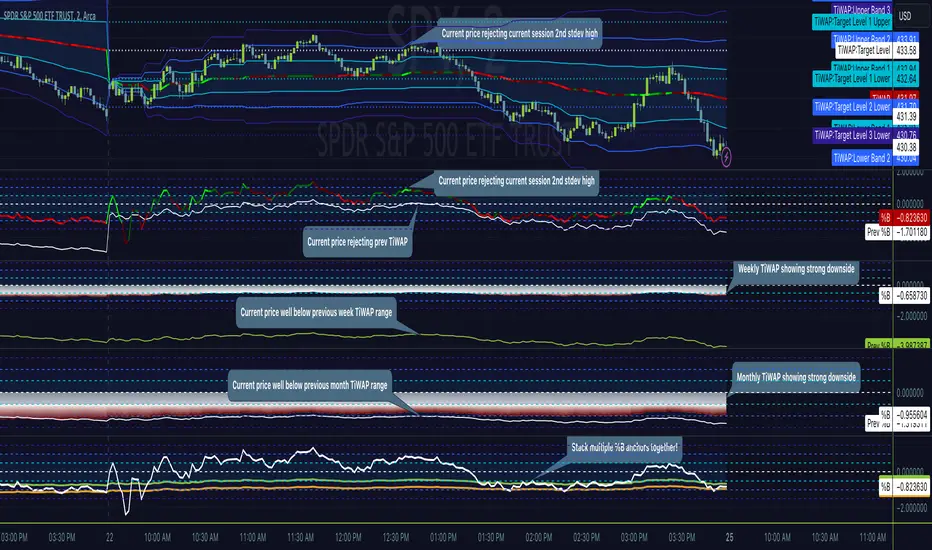
"TiWAP %B" is an indicator that tracks the NYSE TICK by default and plots price location in relation to the tick weighted average price based only off of extreme TICK movement. NASDAQ TICK is also supported and future updates may add others if they provide value, or if requested.
This utilizes same calculation as TiWAP indicator already published, but removes the need to have it overlaying price to keep things tidy :)
What makes this different?
Quite simply there isn't another indicator that plots weighted average price based on TICK movement as done here, this is showing the correlation between the entire markets volatile price movement and the charted security. It provides a sense of established fair value given the entire NYSE/NASDAQ, given the automated nature of the markets there's a strong correlation between highly liquid ETFs/Indexes and the whole market.
How to use
As price is affected by NYSE the study will reveal location of price as it relates to TiWAP, use location to find reversals from rejections or bounces of standard deviations.
As price is affected by market volatility look to see the weighted price adjust to actual price and combine with other trading strategies to take advantage of the data. Rejections and bounces near standard deviations as well as the weighted average price line can provide excellent trade setups, or they could be utilized in advanced options strategies such as straddles, strangles, iron condors, etc.
Anchor points can be utilized to track how the market is adjusting broad value for the week, month, quarter, etc. The higher timeframe based anchor points will need higher periods for the chart or a max bars lookback error may occur.
Sensitivity should be adjusted as changes in TICK occur, this is commonly correlated with NYSE adjustments but the tooltip provides some guidance on value selection based on current conventional wisdom.
Show Target Level Relation
Turn on "Show Target Level Relation" to observe how current price is moving in relation to previous TiWAP range. For example if %B is configured for session, enabling this feature will reveal price rejecting and reclaim aspects of previous session %B range, works on any anchorage selected so long as resolution permits.
Fill %B As Cloud
By special request, this will render %B as a sentiment cloud which will aid in quick review of price to TiWAP relation being in buy side or sell side ranges, use this to easily spot exhaustion or continuation.
Markets
TICK tracks the entire market and as such whatever the entire market is doing will most likely apply to any individual security charted so give this a shot with anything you trade and let me know your results :)
Usage Conditions
Currently I'm finding the most success with this weighted average price on various intra-day timeframes, but anchored on weekly or higher and utilizing other timeframes may net some interesting swing trading opportunities.
Special thanks to MrChach for the original idea as well as discussions and debugging sessions :)
TICK Strength Background ShadeThis indicator shades the background of each candle based on the strength off the current TICK.US chart. User can define the strength levels, which are by default set to 1-299 (lightest), 300-599, and 600+ (darkest). Best used on lower timeframe charts to help identify whether or not to remain in a trend, or if a trend is possibly reversing when you start to see the opposite color begin to appear following a trend.

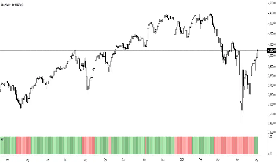
Breadth - % Above * MA█ OVERVIEW
'Breadth - % Above * MA' is a script developed to measure market breadth, providing traders with a deeper understanding of the overall health of a chosen stock market or specific sector. By calculating the percentage of stocks performing above their Simple Moving Average (SMA), it offers an efficient and precise method to gauge market trends.
█ MARKET BREADTH
Market breadth is a powerful tool in technical analysis. It examines the number of securities on an upward trajectory versus those on a downward one. This indicator serves as a measure of market sentiment and assists in identifying the strength and sustainability of market trends.
█ PERCENTAGE ABOVE MOVING AVERAGE
The script's primary function is to show the percentage of stocks trading above a selected SMA. This provides valuable insight into the market's condition. For instance, a high percentage of stocks above their 200-day moving average may suggest a strong bull market. Conversely, a low percentage could indicate a bearish market. However, these are mere observations and should be supplemented with additional analysis for informed trading decisions.
█ KEY FEATURES
The script offers extensive customization. Users can choose from various stock market groups and SMA periods. The options for data smoothing and chart visualization enhance the versatility of the script.
The script also offers a choice of different candlestick styles for visualizing price movements. An added feature colors the inside bars in Heikin-Ashi (HA) format black, providing additional clarity.
█ ACKNOWLEDGEMENTS
The script incorporates code from the 'Line Break' script by kitoboynaya. We gratefully acknowledge their contribution.
█ CODE
The script is published as a protected code due to the usage of a certain style/formula. While the idea of knowledge sharing is encouraged, certain aspects of the script remain confidential.

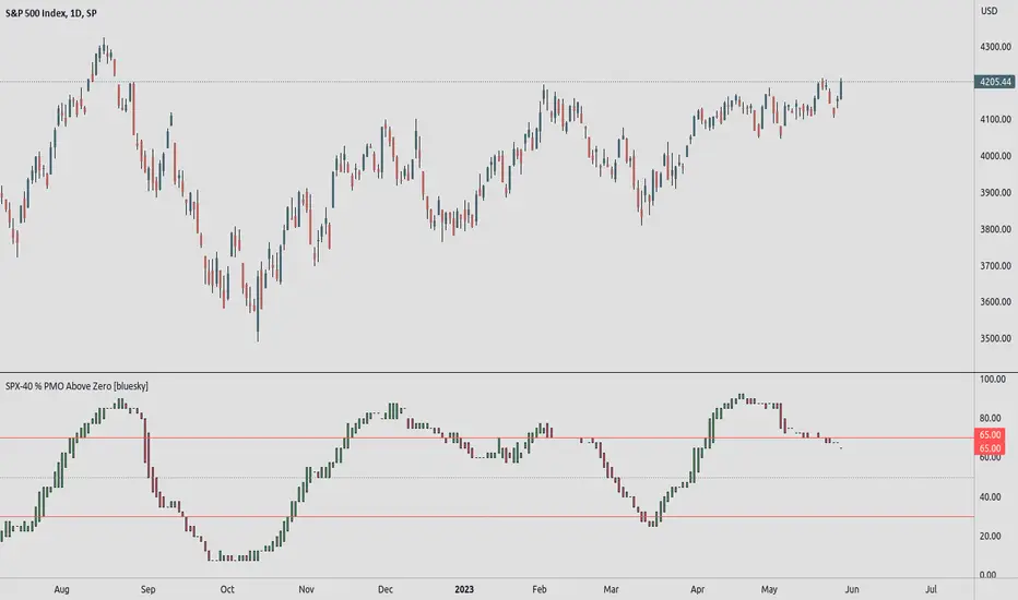
SPX-40 % PMO Above Zero [bluesky]█ OVERVIEW
The "SPX-40 % PMO Above Zero" script analyzes market breadth based on the percentage of stocks within the SPX-40 subset with a Positive Momentum Oscillator (PMO) value greater than or equal to zero. It provides insights into the strength and breadth of positive momentum signals, aiding traders in making informed decisions.
█ CONCEPTS
This script evaluates the percentage of stocks within the SPX-40 subset that have a PMO value above zero. By calculating this percentage, the script identifies periods of broad positive momentum and potential trading opportunities.
█ CALCULATION
The script calculates the percentage of stocks with a PMO value above zero within the SPX-40 subset. It uses the PMO values of individual stocks to assess market breadth and determine the strength of positive momentum signals.
█ HOW TO USE IT
- Timeframe: Optimize the script for different timeframes to analyze market breadth effectively.
- Market Breadth Analysis: The script displays the percentage of SPX-40 stocks with a PMO value above zero, indicating the strength of positive momentum signals across the subset.
- Trend Identification: Monitor changes in the percentage of stocks above zero to identify shifts in market breadth and trends.
- Risk Management: Consider the breadth of positive momentum signals when setting stop-loss levels or evaluating overall market conditions.
█ ADDITIONAL OPTIONS
- This script offers additional options to enhance analysis and customization, including the usage of two exponential moving averages (fast and slow) for additional insights into momentum trends.
- Background colors for EMA crossovers can be visualized using customizable options, aiding in trend identification.
- The Heikin Ashi candles option can be enabled for a different perspective on price movements.
█ FLEXIBILITY AND ADAPTABILITY
It's important to note that the default selection of 40 stocks within the SPX-40 subset may need adjustment over time as market dynamics change. Traders have the flexibility to modify the list of stocks to reflect the current market conditions and ensure the script's relevance and accuracy. Please review and update the list periodically to maintain the effectiveness of the analysis.
█ DISCLAIMER
Trading involves risks, and past performance is not indicative of future results. The "SPX-40 % PMO Above Zero" script is a tool designed to assist traders in analyzing market breadth and positive momentum signals. It should be used in conjunction with sound risk management practices and a comprehensive trading strategy. Traders are encouraged to perform their due diligence, exercise caution, and adapt the script to their individual trading preferences and requirements.
Please note that this script does not make any claims of guaranteed profitability or provide investment advice. Always consult with a qualified financial professional before making any investment decisions.
SPX-Sectors % PMO Above Zero [bluesky]█ OVERVIEW
The "Subsector-11 % PMO Above Zero" script analyzes market breadth based on the percentage of 11 user-adjustable subsector ETFs of the S&P 500 with a Positive Momentum Oscillator (PMO) value greater than or equal to zero. It provides insights into the strength and breadth of positive momentum signals within specific subsectors, aiding traders in making informed decisions.
█ CONCEPTS
This script utilizes the PMO values of the 11 user-adjustable subsector ETFs of the S&P 500 to assess market breadth. By calculating the percentage of subsector ETFs with a PMO value above zero, it identifies periods of broad positive momentum and potential trading opportunities within those specific sectors.
█ PMO (Positive Momentum Oscillator)
Developed by Carl Swenlin, the PMO is an oscillator based on a Rate of Change (ROC) calculation that is smoothed twice with exponential moving averages using a custom smoothing process. The PMO is normalized, allowing it to be used as a relative strength tool. Traders can rank subsector ETFs based on their PMO values as an expression of relative strength.
█ CALCULATION
The script calculates the percentage of subsector ETFs with a PMO value above zero based on the provided PMO values of the 11 user-adjustable subsector ETFs. It uses custom smoothing functions similar to Exponential Moving Averages (EMAs) to derive the PMO values.
█ HOW TO USE IT
- Timeframe: Optimize the script for different timeframes to analyze market breadth effectively within specific subsectors.
- Subsector Analysis: The script displays the percentage of subsector ETFs within the 11 user-adjustable subsectors of the S&P 500 with a PMO value above zero, indicating the strength of positive momentum signals within those subsectors.
- Trend Identification: Monitor changes in the percentage of subsector ETFs above zero to identify shifts in market breadth and trends.
- Risk Management: Consider the breadth of positive momentum signals within specific subsectors when setting stop-loss levels or evaluating overall market conditions.
█ ADDITIONAL OPTIONS
This script offers additional options to enhance analysis and customization:
- Candle Style: Choose from different candle styles such as Heikin Ashi, Three Line Break, Candles, or Line for chart visualization.
- PMO Settings: Adjust the lengths of the PMO calculation and signal length according to your trading preferences.
- Moving Average Settings: Incorporate the usage of fast and slow exponential moving averages (EMAs) for additional insights into momentum trends.
█ FLEXIBILITY AND ADAPTABILITY
The script allows traders to adjust the subsector ETF names according to their specific requirements. Please review and update the list of subsector ETFs periodically to reflect the desired sectors for analysis and ensure the script's relevance and accuracy.
█ DISCLAIMER
Trading involves risks, and past performance is not indicative of future results. The "Subsector-11 % PMO Above Zero" script is a tool designed to assist traders in analyzing market breadth and positive momentum signals within specific subsectors. It should be used in conjunction with sound risk management practices and a comprehensive trading strategy. Traders are encouraged to perform their due diligence, exercise caution, and adapt the script to their individual trading preferences and requirements.
Please note that this script does not make any claims of guaranteed profitability or provide investment advice. Always consult with a qualified financial professional before making any investment decisions.

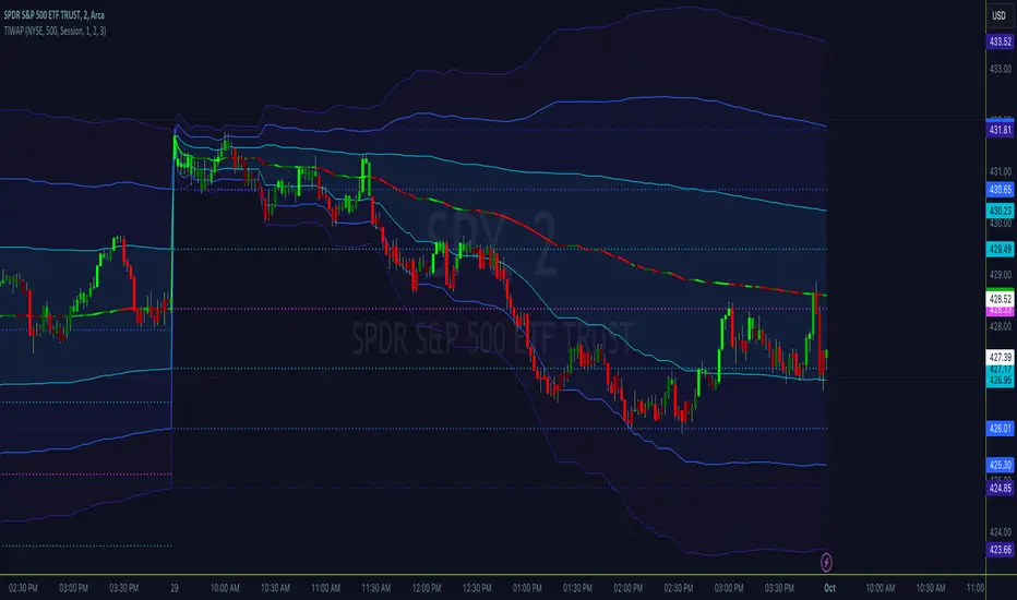
Tick Weighted Average PriceTick Weighted Average Price
"TiWAP" is an indicator that tracks the NYSE TICK by default and plots weighted average price on the charted security based only off of extreme TICK movement. NASDAQ TICK is also supported and future updates may add others if they provide value, or if requested.
What makes this different?
Quite simply there isn't another indicator that plots weighted average price based on TICK movement as done here, this is showing the correlation between the entire markets volatile price movement and the charted security. It provides a sense of established fair value given the entire NYSE/NASDAQ, given the automated nature of the markets there's a strong correlation between highly liquid ETFs/Indexes and the whole market.
How to use
Using this is similar to volume or time weighted average price, there is the average price line that is only adjusted when TICK movement breaches configured thresholds via sensitivity. Standard deviation bands are calculated and can be enabled up to 3rd deviation as per standard configuration, the further deviations being broken can serve as valuable signals for reversals.
As price is affected by market volatility look to see the weighted price adjust to actual price and combine with other trading strategies to take advantage of the data. Rejections and bounces near standard deviations as well as the weighted average price line can provide excellent trade setups, or they could be utilized in advanced options strategies such as straddles, strangles, iron condors, etc.
Anchor points can be utilized to track how the market is adjusting broad value for the week, month, quarter, etc. The higher timeframe based anchor points will need higher periods for the chart or a max bars lookback error may occur.
Sensitivity should be adjusted as changes in TICK occur, this is commonly correlated with NYSE adjustments but the tooltip provides some guidance on value selection based on current conventional wisdom.
Markets
TICK tracks the entire market and as such whatever the entire market is doing will most likely apply to any individual security charted so give this a shot with anything you trade and let me know your results :)
Usage Conditions
Currently I'm finding the most success with this weighted average price on various intra-day timeframes, but anchored on weekly or higher and utilizing other timeframes may net some interesting swing trading opportunities.
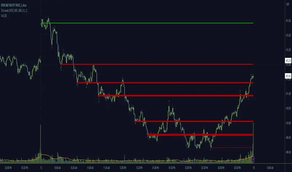
Tick LevelsTick Levels
This indicator is designed to be a companion to "MIT" .
It tracks the NYSE TICK by default and plots key levels on the charted security based off of extreme TICK movement. NASDAQ TICK is also supported and future updates may add others if they provide value, or if requested.
What makes this different?
Quite simply there isn't another indicator that plots levels based on TICK as done here, the signal and proximity sensing features added give context to which levels may provide the best entries, trims and exits for day traders.
How to use
Ensure adjustments are set for TICK, it changes over time but currently I've found the defaults to be best suited for me - your results may vary.
Watch price around the tick levels plotted on the chart to combine with other trading strategies. Use the proximity tolerance setting to ensure multiple TICK movements within the region as other movements are combined to lessen any possible noise, or disable this feature if each individual line is desired, though be warned extremely volatile days may produce noise.
Currently, the tick levels are reset on first new bar on regular sessions, but perhaps a future update will allow past sessions lines to stay with setting adjustment.
Diamonds above or below candles signify extreme highs and lows of TICK respectively, and triangles above or below candles signify extreme closures of TICK - if you're using this indicator in combination with "MIT" it may be redundant and you can disable the signals should you so choose.
Markets
TICK tracks the entire market and as such whatever the entire market is doing will most likely apply to any individual security charted so give this a shot with anything you trade and let me know your results :)
Usage Conditions
Currently I'm finding the most success with these levels on various intra-day timeframes, the more fine grained the more levels you can expect potentially but at key areas.
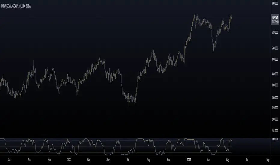
Mervaleta BreadthFellow Merval investors/traders , I'm sharing this script with you that allows you to calculate a breadth indicator using the components of the Merval Index (IMV) from Argentina.
This breadth indicator shows the percentage of stocks that are above a moving average. In this case, you can choose between an EMA or SMA, and you can select the period of the moving average.
The components that make up the index and were used for this script are as follows:
AGRO
ALUA
BBAR
BMA
BYMA
CEPU
COME
CRES
CVH
EDN
GGAL
HARG
LOMA
MIRG
PAMP
SUPV
TECO2
TGNO4
TGSU2
TRAN
TXAR
VALO
YPFD
For all of them, their dollar value in CCL was used, calculated with GGAL.
Enjoy :)
Market Condition DetectorThis script allows to change the background color of the main chart to green or red depending on the following factors:
Based on the QQQ graph whatever ticker you are watching
- Price > EMA20 Da
- Net New Highs > 0
- 10EMA Da > 20 EMA Da
When you are trading Break-Out, EP or other similar trades you will need the market at your back to improve both the winrate and the risk reward ratio.
This is a very useful tool if you struggle with the FOMO biais. It will help you detect the trend at a glance.
Remember that the top best trader are waiting for their trade to work and only after getting some traction, and only then will they take the next trade.
I also proceeded to find a formula that make the indicator be the smoother possible with the less possible amount of noise.
/!\ This indicator is intended for use on daily charts . /!\

US Markets Net highs/lows main chart overlayThis script allows users to change the background color of the main chart to green or red depending on patterns of net highs or lows for the Nasdaq, NYSE, or AMEX. Healthy markets typically show persistent trends of net highs, and the green background highlight helps to identify that condition. Similarly, poor market conditions are associated with trends in net lows which can be identified with a red highlight. The script identifies trends in net highs or lows by looking for three or more consecutive days of either condition.
This script is helpful when analyzing the general market, and it is also helpful when studying individual stocks to see how general market breadth conditions affect individual stock price movements.
You can select which individual US market composite or combination of composites are used in the calculations.
This indicator is intended for use on daily charts.
Acknowledgment
Thank you to @JohnMuchow for coding my formulas.

Crypto McClellan Oscillator (SLN Fix)This is an adaption of the Mcclellan Oscillator for crypto. Instead of tracking the S&P500 it tracks a selection of cryptos to make sure the indicator follows this sector instead.
Full credit goes to the creator of this indicator: Fadior. It has since been fixed by SLN.
The following description explains the standard McClellan Oscillator. Full credit to Investopedia , my fav source of financial explanations.
The same principles applies to its use in the crypto sector, but please be cautious of the last point, the limitations. Since crypto is more volatile, that could amplify choppy behavior.
This is not financial advice, please be extremely cautious. This indicator is only suitable as a confirmation signal and needs support of other signals to be profitable.
This indicator usually produces the best signals on slightly above daily time frame. I personally like 2 or 3 day, but you have to find the settings suitable for your trading style.
What Is the McClellan Oscillator?
The McClellan Oscillator is a market breadth indicator that is based on the difference between the number of advancing and declining issues on a stock exchange, such as the New York Stock Exchange (NYSE) or NASDAQ.
The indicator is used to show strong shifts in sentiment in the indexes, called breadth thrusts. It also helps in analyzing the strength of an index trend via divergence or confirmation.
The McClellan Oscillator formula can be applied to any stock exchange or group of stocks.
A reading above zero helps confirm a rise in the index, while readings below zero confirm a decline in the index.
When the index is rising but the oscillator is falling, that warns that the index could start declining too. When the index is falling and the oscillator is rising, that indicates the index could start rising soon. This is called divergence.
A significant change, such as moving 100 points or more, from a negative reading to a positive reading is called a breadth thrust. It may indicate a strong reversal from downtrend to uptrend is underway on the stock exchange.
How to Calculate the McClellan Oscillator
To get the calculation started, track Advances - Declines on a stock exchange for 19 and 39 days. Calculate a simple average for these, not exponential moving average (EMA).
Use these simple values as the Prior Day EMA values in the 19- and 39-day EMA formulas.
Calculate the 19- and 39-day EMAs.
Calculate the McClellan Oscillator value.
Now that the value has been calculated, on the next calculation use this value for the Prior Day EMA. Start calculating EMAs for the formula instead of simple averages.
If using the adjusted formula, the steps are the same, except use ANA instead of using Advances - Declines.
What Does the McClellan Oscillator Tell You?
The McClellan Oscillator is an indicator based on market breadth which technical analysts can use in conjunction with other technical tools to determine the overall state of the stock market and assess the strength of its current trend.
Since the indicator is based on all the stocks in an exchange, it is compared to the price movements of indexes that reflect that exchange, or compared to major indexes such as the S&P 500.
Positive and negative values indicate whether more stocks, on average, are advancing or declining. The indicator is positive when the 19-day EMA is above the 39-day EMA, and negative when the 19-day EMA is below the 39-day EMA.
A positive and rising indicator suggests that stocks on the exchange are being accumulated. A negative and falling indicator signals that stocks are being sold. Typically such action confirms the current trend in the index.
Crossovers from positive to negative, or vice versa, may signal the trend has changed in the index or exchange being tracked. When the indicator makes a large move, typically of 100 points or more, from negative to positive territory, that is called a breadth thrust.
It means a large number of stocks moved up after a bearish move. Since the stock market tends to rise over time, this a positive signal and may indicate that a bottom in the index is in and prices are heading higher overall.
When index prices and the indicator are moving in different directions, then the current index trend may lack strength. Bullish divergence occurs when the oscillator is rising while the index is falling. This indicates the index could head higher soon since more stocks are starting to advance.
Bearish divergence is when the index is rising and the indicator is falling. This means fewer stocks are keeping the advance going and prices may start to head lower.
Limitations of Using the McClellan Oscillator
The indicator tends to produce lots of signals. Breadth thrusts, divergence, and crossovers all occur with some frequency, but not all these signals will result in the price/index moving in the expected direction.
The indicator is prone to producing false signals and therefore should be used in conjunction with price action analysis and other technical indicators.
The indicator can also be quite choppy, moving between positive and negative territory rapidly. Such action indicates a choppy market, but this isn't evident until the indicator has made this whipsaw move a few times.
Good luck and a big thanks to Fadior!

[TTI] Whaley Breadth Thrust––––History & Credit
The Whaley Breadth Trust is a powerful signal that has a great success rate. It was invented by Wayne Whaley in 2009. Since 1970 to 2009, the signal has occured only 12 times!
–––––What it does
The indicator uses 3 conditions.
Condition 1: The Advancing and Declining NYSE stocks
Condition 2: The Up and Down volume
Condition 3:The absolute price increase in the SP500
It calculates different ratios and determine bullish or bearish setting based on this.
When only conditions 1 and 2 are present, we call this a Light Thrust. When all 3 conditions have occured then we call this Full Thrust.
–––––How to use it
Consider very bullish signal when you see this.
The light thrust occured on 12JAN23 on the SPX.
The signal occured in the following years: 1974, 1982, 1987, 2002, 2008

TICK Divergence + Heikin Ashi [Pt]This indicator identifies divergence between NYSE TICK and price, displays TICK in line, bar, or Heikin Ashi format, calculates various types of moving average lines and shows moving average crossovers.
What is TICK
NYSE TICK, also known as the TICK index, is a technical analysis indicator that shows the number of stocks on the New York Stock Exchange (NYSE) that are trading on an uptick or a downtick in a particular period of time. The TICK index is calculated by subtracting the number of stocks trading on a downtick from the number of stocks trading on an uptick. A reading of +1000 on the TICK index, for example, would indicate that there are 1000 more stocks trading on an uptick than on a downtick. The TICK index is often used as a measure of market sentiment, as it can provide insight into whether there is more buying or selling pressure in the market at a given time. A high TICK index reading may suggest that there is strong buying pressure, while a low TICK index reading may indicate that there is more selling pressure in the market.
The TICK index is usually very volatile, so this indicator is best suited for lower timeframes, such as 1 to 5 min charts.
Features
1) Shows bullish, bearish, hidden bullish and hidden bearish divergences
2) Three display modes for TICK data: Line, Bar, Heikin-Ashi
3) Plot various moving average lines and crossovers. Overall background
4) Configurable significant zones. Background colors will change based on closing TICK value.
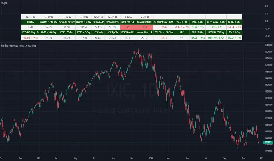
(CM|DB) Caruso Market DashboardThe Caruso Market Dashboard (CM|DB) provides a snapshot of key US market data, market internals (breadth), and economic statistics. It displays real-time prices of seven major markets along with daily updates of the put/call ratio and multiple breadth measurements. Lastly, it displays the Federal Reserve’s balance sheet and 4-week change of assets held to help investors keep abreast of important FED changes in policy.
Presented for both the Nasdaq and NYSE composites and updated at the end of each trading day, the market breadth section shows:
· the number of net 52-week highs and lows
· the actual number of new 52-week highs and 52-week lows.
· The percentage of volume traded on up stocks vs. total volume
· The percentage of stocks advancing vs. all stocks
· Percentage of stocks above their 5-day average
· Percentage of stocks above their 50-day average
· Percentage of stocks above their 200-day average
In addition to presenting all of this valuable information in a table, users can hide the table and plot each market and economic data point. This is very helpful when viewing trends as well as overbought and oversold levels for these data points.
Market Breadth - Secondary IndicatorMarket Breath is the equilibrium between number of stocks in advance to those in a decline, in other words a method to determine the current market environment. In a positive phase bullish setups will have improved probabilities and presence, whereas in a bearish phase the opposite would be true.
The primary indicator is the main tool used to identify whether the market is favorable for bullish- or bearish setups. The secondary indicator is complementary, with the purpose to calculate the intensity of each phase. In other words, overbought or oversold conditons.
The calculations are made based on the MMFI (% of stocks above 50 DMA).
- Red Column: Value below 21 would be considered oversold, where 10 < would be extreme / capitulation.
- Green Column: Value above 72 would be considered overbought, however in a stable bullish phase would on the contrary indicate positive acceleration.
There are also prints of dots that are created around / end of these extremes, which can indicate a reversal attempt. This will be printed when there is a countertrend move in the MMFI, VIX and SPY from an extreme value.
- Red Dots: Countertrend (down expansion) from a bullish phase.
- Green Dots: Countertrend (up expansion) from a bearish phase.
- Black Dots: Countertrend (up expansion) from an extreme / deep bearish phase.
How To Use
Use the primary indicator to note whether the market is more favorable for bullish- or bearish setups. Then look at the secondary breadth indicator and note whether there are extreme numbers and take that into account with a discretionary perspective. Example In case the market is in a bearish phase, have extended to the downside for several weeks and the primary breadth indicator is bearish. But he secondary show oversold levels with reversal prints, one should consider to be more careful on short side to risk of mean reversion. In simple terms these can be used to determine whether the current market is appropriate for selected setups.
Market Breadth - Primary IndicatorMarket Breath is the equilibrium between number of stocks in advance to those in a decline, in other words a method to determine the current market environment. In a positive phase bullish setups will have improved probabilities and presence, whereas in a bearish phase the opposite would be true.
The primary indicator measure the trend in SPY and correlation between different EMA's.
- Green Columns: Positive Breadth
- Red Columns: Negative Breadth
This indicator can be combined with the secondary breadth indicator to further note excessive movement and risk of mean reversion.
Crypto Market Breadth [QuantVue]15 top crypto tickers of your choosing. Just input your 15 favorite crypto markets in the settings.
Showing breadth of market as a percentage change to gauge buyers/sellers strength.
You can check this on the last day of the week and compare each daily bar to see if buyers are increasing/decreasing or sellers increasing/decreasing bars.
A reading above +2 is bullish , below -2 is bearish momentum, between +2 and -2 neutral.
Works best on daily charts .
Hope you enjoy!
*this will also work with stock tickers!

TICK/BreadthThis indicator will show you both the $TICK values for the day showing you the advance and decline of stocks in the NYSE throughout the day, as well as showing you the Breadth ratio for the NYSE and the NASDAQ.
There is a maximum and minimum line showing the maximum and minimum throughout the day.
There is also a marker placed on this max/min line for when the TICK candle closes above or below zero.

4C NYSE Market Breadth RatioThe NYSE Market Breadth Ratio is considered by some to be the “king” of market internals. It lets you know instantly how strong current buying or selling pressure is in the broad market, to eliminate guessing or opinion.
This indicator plots the Market Breadth Ratio values for the NYSE and the NASD exchanges in real time.
It also plots the NYSE Market Breadth Ratio in a histogram plot for visual reference.
The indicator dynamically changes colors between green and red depending on whether breadth is currently positive or negative.
This indicator divides the 'Up-Volume' ("UVOL") by 'Down-Volume' ("DVOL"), for each exchange.
It can be added to any chart, but is incredibly useful when added to other sources of market internals like the NYSE Advancers/Decliners Difference (ticker ADD) or with the NYSE UVOL / DVOL Difference (ticker VOLD ).
Credit goes to author=@auron9000 as the bulk of this code was from their Breadth Ratio Bubbles indicator.
---> The changes made to their indicator include: bug fixes where the values werent properly updating; fixed indicator to be a separate plot (not chart overlay), and added the histogram plot.

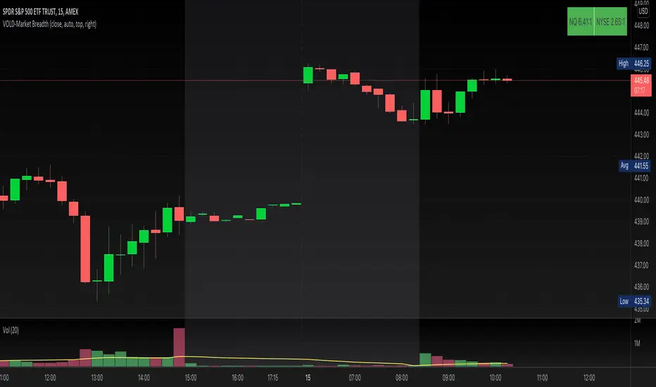
VOLD-MarketBreadth-RatioThis script provides NASDAQ and NYSE Up Volume (volume in rising stocks) and Down Volume (volume in falling stocks) ratio. Up Volume is higher than Down Volume, then you would see green label with ratio e.g 3.5:1. This means Up Volume is 3.5 times higher than Down Volume - Positive Market Breadth. If Down Volume is higher than Up Volume, then you would see red label with ratio e.g -4.5:1. This means Down Volume is 4.5 times higher than Up Volume.
For example, ratio is 1:1, then it is considered Market Breadth is Neutral.
PS: Currently TradingView provides only NASDAQ Composite Market volume data. I have requested them to provide Primary NASDAQ volume data. If they respond with new ticket for primary NQ data, I will update the script and publish the updated version. So if you have got similar table on ToS, you would see minor difference in NQ ratio.
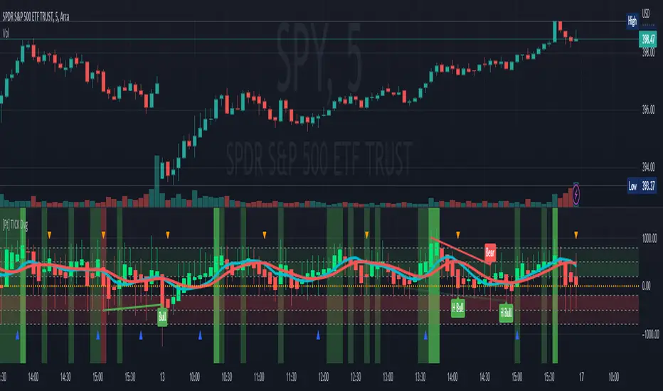
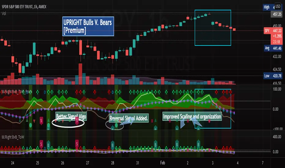
[UPRIGHT] Bulls-V-Bears Tug-of-War SquidGame [Premium] (cc)Hello Traders,
Today I'm updating the Bull V. Bears with a Premium version. (Note: the other version is shown below the Premium on the chart above)
……"The game is Tug of War, the side that pulls the rope from the middle to their side wins. Let the game begin."……
How it works:
This indicator is not a typical one.
1) It shows visually when Bull volume or Bear volume is ‘pulling the rope to their side’.
2) It uses several different formulas to get an accurate read on the level of volume , but still keeps peaks and troughs within 100 for easy reading.
3) Update: It was originally meant to be used strictly with other indicators, but it can now be used as a standalone indicator.
__________________________________
Legend:
1) The top line signals give the major signals –
a. Red cross = Bearish volume strength and continuation.
b. Green cross = Bullish volume strength and continuation.
i. + Green Dot inside enhances signal.
ii. + Red Dot inside weakens signal.
c. Blue circle = Can indicate the beginning of a reversal to the upside or downside.
d. Pink circle = Can indicate the beginning of a reversal to the downside.
2) The Bottom signals are triggered when one circle-rope crosses over the other, these signals give confirmation to the top line signals – Red bearish / Green bullish .
3) As shown on the chart, the Reversal setup usually consists of a blue circle, followed by a red or green cross, then confirmation from the bottom signal.
4) Without the signals: green obviously is Bullish especially above the threshold set --Red bearish . The regular rope gives trend indication.
I've added tooltips to make it easy to understand, feel free to leave a comment if you still have a question!
__________________________________
Features:
-Tooltips (hover over - Info) for understanding.
-Works well on all timeframes; even 5min, I made a tooltip for recommended lengths.
-Customizable Signals; with the ability to turn on and off.
-Reversal signals: Pink and Blue circles can indicate reversals coming.
-Works well as a leading standalone indicator.
-Adjustable top signal row.
-Background Highlights.
-Alerts
-Rules added (hover over).
__________________________________
Premium :
-Better signal algo (will likely be updated again soon)
-Reversal Signal added (Large Circle)
-Improved Scaling and Organization - Now easier to see large moves/signals on Multiple timeframes.
Chart should look like:
Cheers,
Mike
(UPRIGHT Trading)
Dollar Weighted Cumulative SPY Sectors VolumeThis plots the combined volume of the subsectors of the SPY using (open+close)/2, both per bar (narrow candles) and cumulative (wide faded candles).
This aims to use dollar volume and weights each sector individually in dollar amounts. NOT with the weighting used in the SPY index. This indicator is NOT equally weighted., it is weighted according to each subsector's own dollar volume.
Green lines means there is more money flowing into the subsectors combined than out. This is a breadth indicator.
Green and red crosses indicate divergence.
Green crosses are shown when the SPY is outperforming this indicator.
Red crosses are shown when this indicator is outperforming the SPY.
Perhaps the best use of this indicator is to stop you from being aggressive when the whole market isn't moving with you.
Enjoy! Feel free to ask any questions.
