The Maker StrategyDESCRIPTION
The Maker Strategy is a trend-following system built around exponential moving averages (EMAs). By analyzing the alignment of multiple EMAs, the strategy identifies strong bullish or bearish momentum and generates precise entry signals. This method is designed to capture sustained trends while filtering out sideways or noisy market conditions.
USER INPUTS :
• EMA 1 Length (Default: 30)
• EMA 2 Length (Default: 35)
• EMA 3 Length (Default: 40)
• EMA 4 Length (Default: 45)
• EMA 5 Length (Default: 50)
• EMA 6 Length (Default: 60)
LONG CONDITION :
A long signal is triggered when all EMAs are perfectly aligned in ascending order:
EMA1 > EMA2 > EMA3 > EMA4 > EMA5 > EMA6
SHORT CONDITION :
A short signal is triggered when all EMAs are perfectly aligned in descending order:
EMA1 < EMA2 < EMA3 < EMA4 < EMA5 < EMA6
WHY IT IS UNIQUE:
Unlike traditional EMA crossover systems that rely on just 2 or 3 moving averages, The Maker Strategy uses 6 EMAs in sequence. This ensures that trades are only taken when there is clear and strong market momentum. The approach minimizes false signals in ranging markets and focuses on capturing trends with higher probability setups.
HOW USER CAN BENEFIT FROM IT :
• Clear entry alerts for both long and short positions.
• Visual confirmation through candle coloring and EMA band fills.
• Works on multiple timeframes and instruments (stocks, forex, crypto, indices).
• Helps traders stay on the right side of the trend while avoiding whipsaws.
• A simple yet effective tool for those who want a disciplined, rules-based strategy.
Forecasting

Adaptive Log Trend ChannelOne-line Summary / 一句话简介
EN: Adaptive log-scale trend channel using Pearson-optimized regression and deviation bands.
中文:基于皮尔逊优化回归的自适应对数趋势通道,带标准差波动带。
Full Description / 完整介绍
What it does / 功能
EN: This indicator fits a log-linear regression to price and builds a trend channel with ±k·σ deviation bands. It automatically selects the period with the highest Pearson correlation (R), ensuring the channel best matches the dominant market trend.
中文:该指标通过价格的对数线性回归拟合趋势,并在中线上下绘制 ±k·σ 偏差通道。它会自动选择皮尔逊相关系数 (R) 最高的周期,从而保证通道与主要趋势最贴合。
Why it’s useful / 适用价值
EN:
Naturally fits assets with multiplicative growth (crypto, tech stocks).
Adapts dynamically to different market regimes.
Provides CAGR estimates on Daily/Weekly charts for trend strength evaluation.
中文:
自然适用于呈现乘法增长的资产(如加密货币与科技股)。
可动态适应不同的市场阶段。
在日线/周线图上提供 趋势年化收益率 (CAGR),帮助评估趋势强度。
How it works / 工作原理
EN:
Computes log(price) → regression slope & intercept.
Draws a midline (log regression projection).
Upper & lower bands = ±k·σ in log space.
Info panel shows: Auto-Selected Period, Trend Strength (or Pearson’s R), and CAGR.
中文:
对价格取对数 → 计算回归斜率与截距。
绘制 中线(对数回归投影)。
上下轨 = 对数空间中的 ±k·σ。
信息面板显示:自动选择周期、趋势强度(或皮尔逊 R 值)、以及 CAGR 年化收益率。
Key Settings / 主要参数
EN:
Long-Term Mode: Uses extended periods (300–1200).
Deviation Multiplier (k): Controls channel width (default 2.0).
Styles: Colors, line type, and extension.
Panel Options: Toggle auto-period, Pearson’s R, and CAGR.
中文:
长期模式:采用更长周期 (300–1200)。
偏差倍数 (k):控制通道宽度(默认 2.0)。
样式:可设置颜色、线型、延长方式。
信息面板:可开关自动周期、皮尔逊 R、CAGR。
Notes / 注意事项
EN:
CAGR is only available on Daily/Weekly timeframes.
Regression-based tools may repaint as new bars form; treat it as context, not signals.
中文:
CAGR 仅在日线与周线周期可用。
回归类指标在新K线形成时可能重绘,仅用于趋势参考而非交易信号。

🕊️ Shemitah + Jubilee Cycle OverlayShemitah + Jubilee Cycle Overlay
This indicator overlays significant biblical cycle events—Shemitah and Jubilee years—onto your chart, providing a unique perspective on historical and potential future market cycles. The Shemitah cycle occurs every 7 years, while the Jubilee cycle spans 49 years, both starting from a user-defined year (defaulting to 1917). Key features include:
Highlight Shemitah Years: Shades the chart background in orange during Shemitah years, with customizable color and transparency.
Mark Jubilee Years: Draws bold blue vertical lines on the chart for Jubilee years, with optional labels.
Event Markers: Places vertical lines and labels (e.g., "Shemitah" or "Jubilee") on a specified month and day (defaulting to September 10th) for each cycle event.
Countdown Display: Shows the next upcoming Shemitah and Jubilee years on the chart for easy reference.
Customizable Inputs: Adjust the start year, cycle lengths, event date, colors, and visibility of highlights and labels to suit your analysis.
Ideal for traders and analysts exploring long-term economic or market patterns influenced by these traditional cycles, this overlay combines historical context with visual clarity. Use it on daily or higher timeframes for best results. The best markets to overlay this indicator on include major stock indices (e.g., S&P 500, Dow Jones), precious metals (e.g., Gold, Silver), cryptocurrencies (e.g., Bitcoin, Ethereum), and debt markets (e.g., U.S. Treasury Bonds, Corporate Bond ETFs), as these markets often reflect macroeconomic shifts, debt cycles, and speculative behavior that may correlate with Shemitah and Jubilee cycles.
Rationale for Including Debt Markets
U.S. Treasury Bonds:
Treasury securities (e.g., 10-year or 30-year bonds) are sensitive to interest rate changes and government debt levels. The Shemitah cycle (every 7 years) has been historically linked to debt-related economic adjustments, while the Jubilee cycle (every 49 years) aligns with broader debt forgiveness or restructuring concepts, making bonds a prime candidate.
Corporate Bond ETFs (e.g., LQD, HYG):
Corporate bond ETFs represent corporate debt and are influenced by credit cycles and economic resets. The indicator could highlight periods of potential default risk or yield shifts tied to Shemitah or Jubilee years.
Relevance to Biblical Context:
The Jubilee year, as described in the Bible (Leviticus 25), involves the release of debts and return of land, directly tying it to debt markets. The Shemitah year also includes a release of debts every seven years, making debt instruments a natural fit for this indicator’s thematic analysis.

OG OHLC MarkerDraws, OHLC for Previous day and Today with options to add alerts when any PD Array is swept
Shashwat Khurana's Pivot + Mean Reversion + RSI (Signals Only)Show BUY labels below bars when a bullish reversal is detected.
Show SELL labels above bars when a bearish reversal is detected.
Uses pivot levels, mean reversion, big candle, RSI, and volume filters.

Moon Phase & Celestial Events TrackerMoon Phase & Celestial Events Tracker
Overview
A comprehensive astronomical and celestial event indicator that tracks and projects major cosmic events from 2011 to 2040. This indicator overlays important astronomical phenomena directly on your charts, allowing traders and researchers to analyze potential correlations between celestial events and market movements.
Key Features
Eclipse Tracking 🌑
Blood Moons (Total Lunar Eclipses) including 2014-2015 tetrad
Partial Lunar Eclipses with distinctive yellow markers
Solar Eclipses: Total, Annular, Partial, and Hybrid types with unique symbols
Optional eclipse season background highlighting
Moon Cycles 🌕
Supermoons at perigee (closest Earth approach)
Regular moon phases: New, First Quarter, Full, Last Quarter
Adjustable phase marking with day-offset capability
Mercury Retrograde ☿
Start and end dates clearly marked
Optional period highlighting for entire retrograde duration
Complete cycle tracking through 2040
Seasonal Transitions ✨
Spring Equinox, Summer Solstice, Autumn Equinox, Winter Solstice
Precise astronomical season changes
Future Projections 📊
Event forecasting up to 5 years ahead
Customizable projection range (30-1825 days)
Selective projection by event type
Adjustable visual styles and transparency
Interpretation Guide
Blood Moons
Total lunar eclipses where Earth's atmosphere creates the red appearance. In financial astrology, these are often watched as potential reversal or volatility periods, though correlations vary significantly.
Eclipse Seasons
Twice-yearly windows when Sun-Earth-Moon alignment allows eclipses. Some market practitioners note increased volatility during these periods, though empirical evidence remains debated.
Mercury Retrograde
The apparent backward motion of Mercury occurs 3-4 times yearly. In trading folklore, it's associated with communication issues, technical problems, and false signals. Many practitioners suggest extra caution with new positions during these periods.
Supermoons
Full or new moons at closest Earth approach. Some traders track these for potential short-term highs/lows, particularly in commodities and currencies, though effects are subtle if present.
Seasonal Markers
Astronomical season changes have been incorporated into various market timing systems, with some analysts noting clustering of trend changes around these dates.
Use Cases
Historical pattern analysis
Event-based research
Educational astronomy tracking
Market cycle studies
Long-term planning and observation
Technical Details ⚙️
Data Coverage: 2011-2040 (30 years of precise astronomical events)
Compatibility: All timeframes with smart filtering (Weekly/Monthly show only major events)
Performance: Lightweight with efficient calculations and minimal chart impact
Data Source: Based on NASA ephemeris data for precise event timing
Customization Options 🎨
Individual colors for each event type
Transparency controls for projections
Event visibility toggles
Optional date labels on events
Alert Options 🔔
Set custom alerts for any tracked event including all eclipse types, moon phases, Mercury retrograde start/end, and seasonal transitions.
⚠️ Important Note
This indicator displays astronomical events for research and educational purposes. Any perceived correlations with market movements should be thoroughly backtested. Financial astrology interpretations are included for historical context only and should not be considered trading advice. Always use proper risk management and multiple forms of analysis in trading decisions.
Best Suited For
Market researchers and analysts
Students of market cycles
Those interested in astronomical timing
Educational and observational purposes
Long-term pattern analysis

ASPO - Adaptive Statistical Position OscillatorASPO - Advanced Statistical Price Position Oscillator - Time-Weighted
Based on a time-weighted statistical model, this indicator quantifies price deviation from its recent mean. It uses a Z-Score to normalize price position and calculates the statistical probability of its occurrence, helping traders identify over-extended market conditions and mean-reversion opportunities with greater sensitivity.
- Time-Weighted Model: Reacts more quickly to recent price changes by using a Weighted Moving Average (WMA) and a weighted standard deviation.
- Statistical Foundation: Utilizes Z-Score standardization and a probability calculation to provide an objective measure of risk and price extremity.
- Dynamic Adaptation: Automatically adjusts its calculation period and sensitivity based on market volatility, making it versatile across different market conditions.
- Intelligent Visuals: Dynamic line thickness and gradient color-coding intuitively display the intensity of price deviations.
- Multi-Dimensional Analysis: Combines the main line's position (Z-Score), a momentum histogram, and real-time probability for a comprehensive view.
1. Time-Weighted Statistical Model (Z-Score Calculation)
- Weighted Mean (μ_w): Instead of a simple average, the indicator uses a Weighted Moving Average (ta.wma) to calculate the price mean, giving more weight to recent data points.
- Weighted Standard Deviation (σ_w): A custom weighted_std function calculates the standard deviation, also prioritizing recent prices. This ensures that the measure of dispersion is more responsive to the latest market behavior.
- Z-Score: The core of the indicator is the Z-Score, calculated as Z = (Price - μ_w) / σ_w. This value represents how many weighted standard deviations the current price is from its weighted mean. A higher absolute Z-Score indicates a more statistically significant price deviation.
2. Probability Calculation
- The indicator uses an approximation of the Normal Cumulative Distribution Function (normal_cdf_approx) to calculate the probability of a Z-Score occurring.
- The final price_probability is a two-tailed probability, calculated as 2 * (1 - CDF(|Z-Score|)). This value quantifies the statistical rarity of the current price deviation. For example, a probability of 0.05 (or 5%) means that a deviation of this magnitude or greater is expected to occur only 5% of the time, signaling a potential market extreme.
3. Dynamic Parameter Adjustment
- Volatility Measurement: The system measures market volatility using the standard deviation of price changes (ta.stdev(ta.change(src))) over a specific lookback period.
- Volatility Percentile: It then calculates the percentile rank (ta.percentrank) of the current volatility relative to its history. This contextualizes whether the market is in a high-volatility or low-volatility state.
- Adaptive Adjustment:
- If volatility is high (e.g., >75th percentile), the indicator can shorten its distribution_period and increase its position_sensitivity. This makes it more responsive to fast-moving markets.
- If volatility is low (e.g., <25th percentile), it can lengthen the period and decrease sensitivity, making it more stable in calmer markets. This adaptive mechanism helps maintain the indicator's relevance across different market regimes.
4. Momentum and Cycle Analysis (Histogram)
- The indicator does not use a Hilbert Transform. Instead, it analyzes momentum cycles by calculating a histogram: Histogram = (Z-Score - EMA(Z-Score)) * Sensitivity.
- This histogram represents the rate of change of the Z-Score. A positive and rising histogram indicates accelerating upward deviation, while a negative and falling histogram indicates accelerating downward deviation. Divergences between the price and the histogram can signal a potential exhaustion of the current deviation trend, often preceding a reversal.
- Reversal Signals: Look for the main line in extreme zones (e.g., Z-Score > 2 or < -2), probability below a threshold (e.g., 5%), and divergence or contraction in the momentum histogram.
- Trend Filtering: The main line's direction indicates the trend of price deviation, while the histogram confirms its momentum.
- Risk Management: Enter a high-alert state when probability drops below 5%; consider risk control when |Z-Score| > 2.
- Gray, thin line: Price is within a normal statistical range (~1 sigma, ~68% probability).
- Orange/Yellow, thick line: Price is moderately deviated (1 to 2 sigma).
- Cyan/Purple, thick line: Price is extremely deviated (>2 sigma, typically <5% probability).
- Distribution Period: 50 (for weighted calculation)
- Position Sensitivity: 2.5
- Volatility Lookback: 10
- Probability Threshold: 0.03
Suitable for all financial markets and timeframes, especially in markets that exhibit mean-reverting tendencies.
This indicator is a technical analysis tool and does not constitute investment advice. Always use in conjunction with other analysis methods and a strict risk management strategy.
Copyright (c) 2025 | Pine Script v6 Compatible
---
高级统计价格位置振荡器 (ASPO) - 时间加权版
基于时间加权统计学模型,该指标量化了当前价格与其近期均值的偏离程度。它使用Z分数对价格位置进行标准化,并计算其出现的统计概率,帮助交易者更灵敏地识别市场过度延伸和均值回归的机会。
- 时间加权模型:通过使用加权移动平均(WMA)和加权标准差,对近期价格变化反应更迅速。
- 统计学基础:利用Z分数标准化和概率计算,为风险和价格极端性提供了客观的衡量标准。
- 动态自适应:根据市场波动率自动调整其计算周期和敏感度,使其在不同市场条件下都具有通用性。
- 智能视觉:动态线条粗细和渐变颜色编码,直观地展示价格偏离的强度。
- 多维分析:结合了主线位置(Z分数)、动能柱和实时概率,提供了全面的市场视角。
1. 时间加权统计模型 (Z分数计算)
- 加权均值 (μ_w):指标使用加权移动平均 (ta.wma) 而非简单平均来计算价格均值,赋予近期数据点更高的权重。
- 加权标准差 (σ_w):通过一个自定义的 weighted_std 函数计算标准差,同样优先考虑近期价格。这确保了离散度的衡量对最新的市场行为更敏感。
- Z分数:指标的核心是Z分数,计算公式为 Z = (价格 - μ_w) / σ_w。该值表示当前价格偏离其加权均值的加权标准差倍数。Z分数的绝对值越高,表示价格偏离在统计上越显著。
2. 概率计算
- 指标使用正态累积分布函数 (normal_cdf_approx) 的近似值来计算特定Z分数出现的概率。
- 最终的 price_probability 是一个双尾概率,计算公式为 2 * (1 - CDF(|Z分数|))。该值量化了当前价格偏离的统计稀有性。例如,0.05(或5%)的概率意味着这种幅度或更大的偏离预计只在5%的时间内发生,这预示着一个潜在的市场极端。
3. 动态参数调整
- 波动率测量:系统通过计算特定回溯期内价格变化的标准差 (ta.stdev(ta.change(src))) 来测量市场波动率。
- 波动率百分位:然后,它计算当前波动率相对于其历史的百分位排名 (ta.percentrank)。这将当前市场背景定义为高波动率或低波动率状态。
- 自适应调整:
- 如果波动率高(例如,>75百分位),指标可以缩短其 distribution_period(分布周期)并增加其 position_sensitivity(位置敏感度),使其对快速变化的市场反应更灵敏。
- 如果波动率低(例如,<25百分位),它可以延长周期并降低敏感度,使其在较平静的市场中更稳定。这种自适应机制有助于保持指标在不同市场制度下的有效性。
4. 动能与周期分析 (动能柱)
- 该指标不使用希尔伯特变换。相反,它通过计算一个动能柱来分析动量周期:动能柱 = (Z分数 - Z分数的EMA) * 敏感度。
- 该动能柱代表Z分数的变化率。一个正向且不断增长的动能柱表示向上的偏离正在加速,而一个负向且不断下降的动能柱表示向下的偏离正在加速。价格与动能柱之间的背离可以预示当前偏离趋势的衰竭,通常发生在反转之前。
- 反转信号:寻找主线进入极端区域(如Z分数 > 2 或 < -2)、概率低于阈值(如5%)以及动能柱出现背离或收缩。
- 趋势过滤:主线的方向指示价格偏离的趋势,而动能柱确认其动量。
- 风险管理:当概率降至5%以下时进入高度警惕状态;当|Z分数| > 2时考虑风险控制。
- 灰色细线:价格处于正常统计范围内(约1个标准差,约68%概率)。
- 橙色/黄色粗线:价格中度偏离(1到2个标准差)。
- 青色/紫色粗线:价格极端偏离(>2个标准差,通常概率<5%)。
- 分布周期:50(用于加权计算)
- 位置敏感度:2.5
- 波动率回溯期:10
- 概率阈值:0.03
适用于所有金融市场和时间框架,尤其是在表现出均值回归特性的市场中。
本指标为技术分析辅助工具,不构成任何投资建议。请务必结合其他分析方法和严格的风险管理策略使用。
版权所有 (c) 2025 | Pine Script v6 兼容

Measured Move Volume XIndicator Description
The "Measured Move Volume X" indicator, developed for TradingView using Pine Script version 6, projects potential price targets based on the measured move concept, where the magnitude of a prior price leg (Leg A) is used to forecast a subsequent move. It overlays translucent boxes on the chart to visualize bullish (green) or bearish (red) price projections, extending them to the right for a user-specified number of bars. The indicator integrates volume analysis (relative to a simple moving average), RSI for momentum, and VWAP for price-volume weighting, combining these into a confidence score to filter entry signals, displayed as triangles on breakouts. Horizontal key level lines (large, medium, small) are drawn at significant price points derived from the measured moves, with customizable thresholds, colors, and styles. Exhaustion hints, shown as orange labels near box extremes, indicate potential reversal points. Anomalous candles, marked with diamond shapes, are identified based on volume spikes and body-to-range ratios. Optional higher timeframe candle coloring enhances context. The indicator is fully customizable through input groups for lookback periods, transparency, and signal weights, making it adaptable to various assets and timeframes.
Adjustment Tips for Optimization
To optimize the "Measured Move Volume X" indicator for specific assets or timeframes, adjust the following input parameters:
Leg A Lookback (default: 14 bars): Increase to 20-30 for volatile markets (e.g., cryptocurrencies) to capture larger price swings; decrease to 5-10 for intraday charts (e.g., stocks) for faster signals.
Extend Box to the Right (default: 30 bars): Extend to 50+ for daily or weekly charts to project further targets; shorten to 10-20 for lower timeframes to reduce clutter.
Volume SMA Length (default: 20) and Relative Volume Threshold (default: 1.5): Lower the threshold to 1.2-1.3 for low-volume assets (e.g., commodities) to detect subtler spikes; raise to 2.0+ for high-volume equities to filter noise. Match SMA length to RSI length for consistency.
RSI Parameters (default: length 14, overbought 70, oversold 30): Set overbought to 80 and oversold to 20 in trending markets to reduce premature exit signals; shorten length to 7-10 for scalping.
Key Level Thresholds (default: large 10%, medium 5%, small 5%): Increase thresholds (e.g., large to 15%) for volatile assets to focus on significant moves; disable medium or small lines to declutter charts.
Confidence Score Weights (default: volume 0.5, VWAP 0.3, RSI 0.2): Increase volume weight (e.g., 0.7) for volume-driven markets like futures; emphasize RSI (e.g., 0.4) for momentum-focused strategies.
Anomaly Detection (default: volume multiplier 1.5, small body ratio 0.2, large body ratio 0.75): Adjust the volume multiplier higher for stricter anomaly detection in noisy markets; fine-tune body-to-range ratios based on asset-specific candle patterns.
Use TradingView’s replay feature to test adjustments on historical data, ensuring settings suit the chosen market and timeframe.
Tips for Using the Indicator
Interpreting Signals: Green upward triangles indicate bullish breakout entries when price exceeds the prior high with a confidence score ≥40; red downward triangles signal bearish breakouts. Use these to identify potential entry points aligned with the projected box targets.
Box Projections: Bullish boxes project upward targets (top of box) equal to the prior leg’s height added to the breakout price; bearish boxes project downward. Monitor price action near box edges for target completion or reversal.
Exhaustion Hints: Orange labels near box tops (bullish) or bottoms (bearish) suggest potential exhaustion when price deviates within the set percentage (default: 5%) and RSI or volume conditions are met. Use these as cues to watch for reversals.
Key Level Lines: Large, medium, and small lines mark significant price levels from box tops/bottoms. Use these as potential support/resistance zones, especially when drawn with high volume (colored differently).
Anomaly Candles: Orange diamonds highlight candles with unusual volume/body characteristics, indicating potential reversals or pauses. Combine with box levels for context.
Higher Timeframe Coloring: Enable to color bars based on higher timeframe candle closures (e.g., 1, 2, 5, or 15 minutes) for added trend context.
Customization: Toggle "Only Show Bullish Moves" to focus on bullish setups. Adjust transparency and line styles for visual clarity. Test settings to balance signal frequency and chart readability.
Inputs: Organized into groups (e.g., "Measured Move Settings") using input.int, input.float, input.color, and input.bool for user customization, with tooltips for clarity.
Calculations: Computes relative volume (ta.sma(volume, volLookback)), VWAP (ta.vwap(hlc3)), RSI (ta.rsi(close, rsiLength)), and prior leg extremes (ta.highest/lowest) using prior bar data ( ) to prevent repainting.
Boxes and Lines: Creates boxes (box.new) for bullish/bearish projections and lines (line.new) for key levels. The f_addLine function manages line arrays (array.new_line), capping at maxLinesCount to avoid clutter.
Confidence Score: Combines volume, VWAP distance, and RSI into a weighted score (confScore), filtering entries (≥40). Rounded for display.
Exhaustion Hints: Functions like f_plotBullExitHint assess price deviation, RSI, and volume decrease, using label.new for dynamic orange labels.
Entry Signals and Plots: plotshape displays triangles for breakouts; plot and hline show VWAP and RSI levels; request.security handles higher timeframe coloring.
Anomaly Detection: Identifies candles with small-body high-volume or large-body average-volume patterns via ratios, plotted as diamonds.

DZ/SZ - HFM by MamaRight-Empty Wick Zones (MTF) draws Supply/Demand zones from the remaining wick of adjacent opposite-color candles (Classic & Non-classic rules). Zones extend right only through empty space and stop at the first touching candle. Multi-TF scan (H1/H4/1D/1W/1M) with TF-colored boxes and labels showing Demand/Supply + H/L.
Demand (red → green, adjacent):
Classic: if the red candle’s lower wick is longer than the green’s → zone = (the “excess” red wick).
Non-classic: if the red’s lower wick is shorter or equal → zone = (use the longer green wick).
Supply (green → red, adjacent):
Classic: if the green candle’s upper wick is longer than the red’s → zone = (the “excess” green wick).
Non-classic: if the green’s upper wick is shorter or equal → zone = (use the longer red wick).
After a zone is created, the box extends right and terminates at the very first bar whose price range (body or wick) overlaps the zone → ensures the plotted area is genuinely right-empty.
What you see
Zone boxes with distinct colors per timeframe (e.g., H1/H4/1D/1W/1M).
Optional labels on each box: H4 Demand / H1 Supply, plus H/L prices of the zone.
Labels can sit at the left edge or follow the right edge of the box.
Inputs
Toggles: Demand Classic / Demand Non-classic / Supply Classic / Supply Non-classic.
Timeframes to scan: H1, H4, 1D, 1W, 1M.
Min zone thickness (price): minimum height of a zone (in price units).
Initial right extension (bars): initial box length; the script auto-cuts at the first touch.
Show labels / place labels at the right edge.
How to use (suggestion)
Use higher TF (e.g., 1D) for bias and lower TFs (H1/H4) for execution zones.
Keep only the rule set (Classic/Non-classic) that matches your playbook.
Treat zones as areas of interest—wait for your own confirmations (e.g., swing rejection, wick re-entry, structure shift, volume cues) and manage risk accordingly.
Notes
Because zones are sourced from higher TFs via request.security, the drawing can update intrabar; a zone is final once the source TF bar closes.
Min zone thickness uses price units (e.g., on XAUUSD, 1.00 ≈ $1).
This tool is an analytical aid, not financial advice or an entry/exit signal.
อินดิเคเตอร์ DZ/SZ - HFM by Mama ใช้หา Demand/Supply zone จาก “ไส้ที่เหลือ” ของ คู่แท่งสีตรงข้ามที่ติดกัน แล้ววาดเป็นกล่อง ยืดไปทางขวาเฉพาะช่วงที่ว่าง และ หยุดตรงแท่งแรกที่เข้ามาแตะโซน รองรับหลาย Timeframe (H1/H4/1D/1W/1M) พร้อมสีแยก TF และป้ายกำกับ Demand/Supply + H/L ของโซน
รายละเอียดการทำงาน (ไทย)
แนวคิดหลัก
Demand: เลือกคู่ แดง→เขียว ที่ “ติดกัน”
Classic: ถ้า ไส้ล่าง ของแท่งแดงยาวกว่าแท่งเขียว → โซน =
Non-classic: ถ้า ไส้ล่าง ของแท่งแดงสั้นกว่าหรือเท่าเขียว → โซน =
Supply: เลือกคู่ เขียว→แดง ที่ “ติดกัน”
Classic: ถ้า ไส้บน ของแท่งเขียวยาวกว่าแท่งแดง → โซน =
Non-classic: ถ้า ไส้บน ของแท่งเขียวสั้นกว่าหรือเท่าแดง → โซน =
เมื่อสร้างโซนแล้ว กล่องจะ ยืดทางขวา ไปเรื่อย ๆ และ หยุดทันทีเมื่อมีแท่งแรกที่ช่วงราคา (ไส้หรือตัวแท่ง) ทับซ้อนกับโซน ⇒ ได้ “พื้นที่ขวาว่าง” ตามโจทย์
สิ่งที่แสดงบนกราฟ
กล่องโซนสีตาม Timeframe (เช่น H1=ฟ้า, H4=เขียว, 1D=ส้ม, 1W=ม่วง, 1M=เทา)
Label ที่มุมกล่อง: H4 Demand / H1 Supply + ราคาของ High/Low ของโซน
(เลือกวาง ซ้าย หรือ ขอบขวา ของกล่องได้ในตั้งค่า)
ตัวเลือกสำคัญใน Settings
เปิด/ปิด: Demand Classic / Demand Non-classic / Supply Classic / Supply Non-classic
เลือก TF ที่จะสแกน: H1, H4, 1D, 1W, 1M
Min zone thickness (price): กำหนด “ความหนา” ขั้นต่ำของโซน (หน่วยเป็นราคา เช่น XAUUSD = ดอลลาร์)
Initial right extension (bars): ความยาวยืดเริ่มต้น (อินดี้จะตัดให้สั้นลงเองเมื่อมีแท่งมาแตะ)
แสดง Label บนโซน และ วาง Label ที่ขอบขวากล่อง
วิธีใช้แนะนำ
เลือก TF ที่ต้องการ (เช่น ให้ H1/H4 เป็นโซนเทรดละเอียด และ 1D ใช้กรองทิศ)
เปิดเฉพาะโหมด (Classic/Non-classic) ที่ตรงกับแนวคิดการเทรดของคุณ
ใช้โซนเป็นบริเวณ “สนใจ” แล้วรอพฤติกรรมราคา/สัญญาณยืนยันเสริม (เช่น สวิงกลับ, rejection wick, โวลลุ่ม, หรือโครงสร้างจบคลื่น)
หมายเหตุสำคัญ
อินดี้ใช้ข้อมูลข้าม TF; สัญญาณจาก TF สูง อาจเปลี่ยนระหว่างแท่งยังไม่ปิด (ลักษณะ intrabar update) โซนจะ “นิ่ง” เมื่อแท่งของ TF ต้นทาง ปิดแล้ว
หน่วยของ Min zone thickness เป็น หน่วยราคา ไม่ใช่ pips (XAUUSD: 1.00 = $1)
อินดี้ไม่ได้ให้สัญญาณเข้า–ออกอัตโนมัติ ควรใช้ร่วมกับแผนเทรดและการจัดการความเสี่ยง


Short Sellingell signal when RSI < 40, MACD crosses zero or signal line downward in negative zone, close below 50 EMA, candle bearish.
Strong sell signal confirmed on 5-minute higher timeframe with same conditions.
Square off half/full signals as defined.
Target lines drawn bold based on previous swing lows and extended as described.
Blue candle color when RSI below 30.
One sell and one full square off per cycle, blocking repeated sells until full square off.

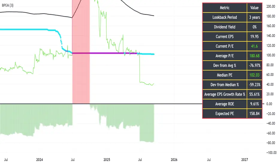
BLITZ PE ANAYLYZERFollowing script is designed specifically to meet the requirement of accessing the PE ratio, comparing it to it's historical averages, median and expected values that are possible.
Following is the method to use the indicator:
1) User must select the look back years which is by default set to 3 years as per the text book reference from the book "The Intelligent Investor" by Sir Benjamin Graham
2) The red or green histogram represents the deviation of the current PE to the average PE. If the histograms are green in color, it represent buy opportunity because the current PE is lower than that of the average PE values, the % deviation of the current PE from the average value is mentioned in the black color table and a negative value represents under evaluations as compared to the historical PE ratio
3) The black color line is the SMA of the PE ratio.
4) Another plots exists for plotting the current PE which is red or green depending upon its deviation from the average PE values & another plot exists for median PE ratio which is light blue when healthy and purple when not healthy.
5) Using the inflation data and the EPS growth of the company the black table also displays the expected value of the PE ratio for the stock.
Value Investing IndicatorThis is based on PeterNagy Indicator. I just update it from v.4 to v.6 and modify. Open for tweak


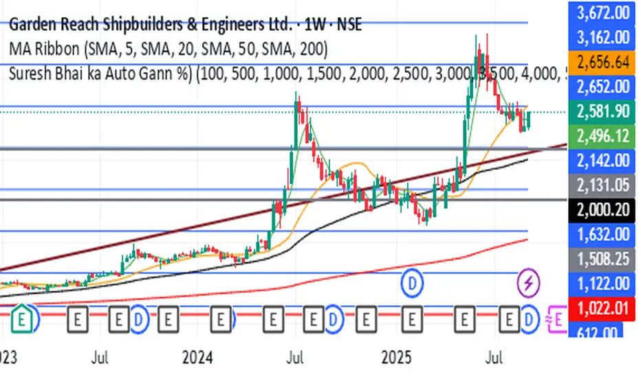
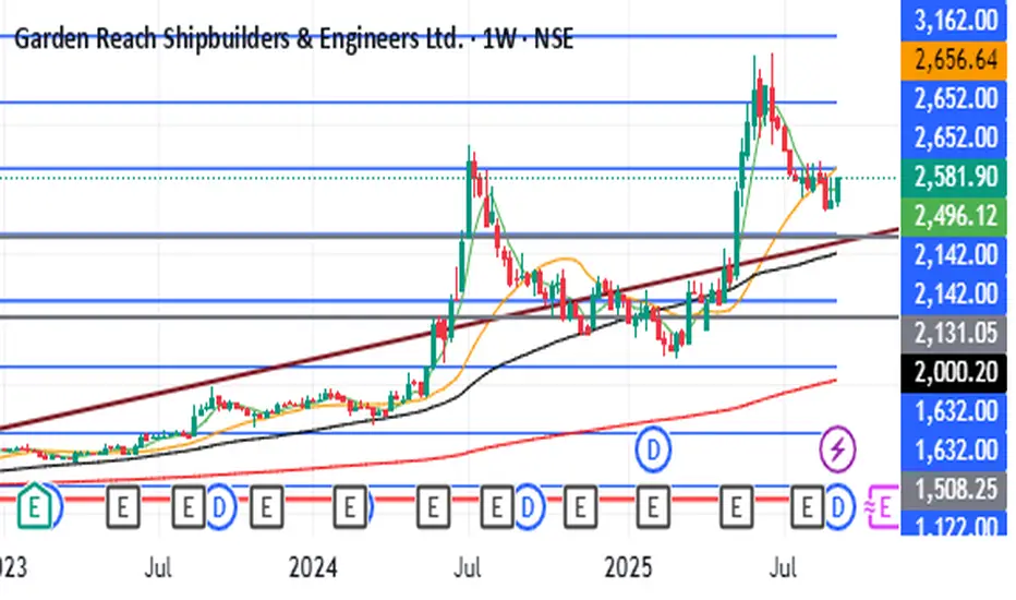
Gann Percentage SureshCalculates the Gann percentages from covid lows to find the future Supports and resistance Levels
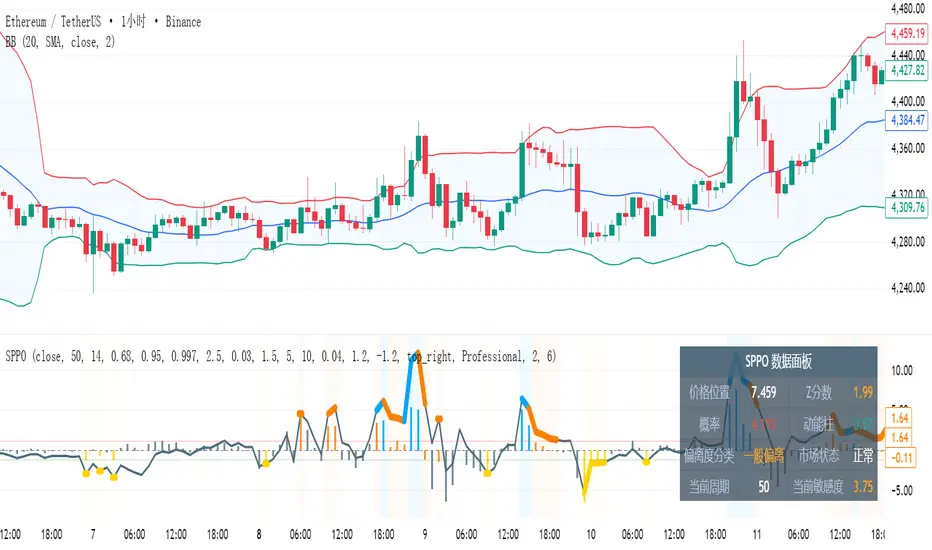
SPPO - Statistical Price Position OscillatorSPPO - Statistical Price Position Oscillator - Time-Weighted
Based on a time-weighted statistical model, this indicator quantifies price deviation from its recent mean. It uses a Z-Score to normalize price position and calculates the statistical probability of its occurrence, helping traders identify over-extended market conditions and mean-reversion opportunities with greater sensitivity.
- Time-Weighted Model: Reacts more quickly to recent price changes by using a Weighted Moving Average (WMA) and a weighted standard deviation.
- Statistical Foundation: Utilizes Z-Score standardization and a probability calculation to provide an objective measure of risk and price extremity.
- Dynamic Adaptation: Automatically adjusts its calculation period and sensitivity based on market volatility, making it versatile across different market conditions.
- Intelligent Visuals: Dynamic line thickness and gradient color-coding intuitively display the intensity of price deviations.
- Multi-Dimensional Analysis: Combines the main line's position (Z-Score), a momentum histogram, and real-time probability for a comprehensive view.
1. Time-Weighted Statistical Model (Z-Score Calculation)
- Weighted Mean (μ_w): Instead of a simple average, the indicator uses a Weighted Moving Average (ta.wma) to calculate the price mean, giving more weight to recent data points.
- Weighted Standard Deviation (σ_w): A custom weighted_std function calculates the standard deviation, also prioritizing recent prices. This ensures that the measure of dispersion is more responsive to the latest market behavior.
- Z-Score: The core of the indicator is the Z-Score, calculated as Z = (Price - μ_w) / σ_w. This value represents how many weighted standard deviations the current price is from its weighted mean. A higher absolute Z-Score indicates a more statistically significant price deviation.
2. Probability Calculation
- The indicator uses an approximation of the Normal Cumulative Distribution Function (normal_cdf_approx) to calculate the probability of a Z-Score occurring.
- The final price_probability is a two-tailed probability, calculated as 2 * (1 - CDF(|Z-Score|)). This value quantifies the statistical rarity of the current price deviation. For example, a probability of 0.05 (or 5%) means that a deviation of this magnitude or greater is expected to occur only 5% of the time, signaling a potential market extreme.
3. Dynamic Parameter Adjustment
- Volatility Measurement: The system measures market volatility using the standard deviation of price changes (ta.stdev(ta.change(src))) over a specific lookback period.
- Volatility Percentile: It then calculates the percentile rank (ta.percentrank) of the current volatility relative to its history. This contextualizes whether the market is in a high-volatility or low-volatility state.
- Adaptive Adjustment:
- If volatility is high (e.g., >75th percentile), the indicator can shorten its distribution_period and increase its position_sensitivity. This makes it more responsive to fast-moving markets.
- If volatility is low (e.g., <25th percentile), it can lengthen the period and decrease sensitivity, making it more stable in calmer markets. This adaptive mechanism helps maintain the indicator's relevance across different market regimes.
4. Momentum and Cycle Analysis (Histogram)
- The indicator does not use a Hilbert Transform. Instead, it analyzes momentum cycles by calculating a histogram: Histogram = (Z-Score - EMA(Z-Score)) * Sensitivity.
- This histogram represents the rate of change of the Z-Score. A positive and rising histogram indicates accelerating upward deviation, while a negative and falling histogram indicates accelerating downward deviation. Divergences between the price and the histogram can signal a potential exhaustion of the current deviation trend, often preceding a reversal.
- Reversal Signals: Look for the main line in extreme zones (e.g., Z-Score > 2 or < -2), probability below a threshold (e.g., 5%), and divergence or contraction in the momentum histogram.
- Trend Filtering: The main line's direction indicates the trend of price deviation, while the histogram confirms its momentum.
- Risk Management: Enter a high-alert state when probability drops below 5%; consider risk control when |Z-Score| > 2.
- Gray, thin line: Price is within a normal statistical range (~1 sigma, ~68% probability).
- Orange/Yellow, thick line: Price is moderately deviated (1 to 2 sigma).
- Cyan/Purple, thick line: Price is extremely deviated (>2 sigma, typically <5% probability).
- Distribution Period: 50 (for weighted calculation)
- Position Sensitivity: 2.5
- Volatility Lookback: 10
- Probability Threshold: 0.03
Suitable for all financial markets and timeframes, especially in markets that exhibit mean-reverting tendencies.
This indicator is a technical analysis tool and does not constitute investment advice. Always use in conjunction with other analysis methods and a strict risk management strategy.
Copyright (c) 2025 | Pine Script v6 Compatible
---
统计价格位置振荡器 (SPPO) - 时间加权版
基于时间加权统计学模型,该指标量化了当前价格与其近期均值的偏离程度。它使用Z分数对价格位置进行标准化,并计算其出现的统计概率,帮助交易者更灵敏地识别市场过度延伸和均值回归的机会。
- 时间加权模型:通过使用加权移动平均(WMA)和加权标准差,对近期价格变化反应更迅速。
- 统计学基础:利用Z分数标准化和概率计算,为风险和价格极端性提供了客观的衡量标准。
- 动态自适应:根据市场波动率自动调整其计算周期和敏感度,使其在不同市场条件下都具有通用性。
- 智能视觉:动态线条粗细和渐变颜色编码,直观地展示价格偏离的强度。
- 多维分析:结合了主线位置(Z分数)、动能柱和实时概率,提供了全面的市场视角。
1. 时间加权统计模型 (Z分数计算)
- 加权均值 (μ_w):指标使用加权移动平均 (ta.wma) 而非简单平均来计算价格均值,赋予近期数据点更高的权重。
- 加权标准差 (σ_w):通过一个自定义的 weighted_std 函数计算标准差,同样优先考虑近期价格。这确保了离散度的衡量对最新的市场行为更敏感。
- Z分数:指标的核心是Z分数,计算公式为 Z = (价格 - μ_w) / σ_w。该值表示当前价格偏离其加权均值的加权标准差倍数。Z分数的绝对值越高,表示价格偏离在统计上越显著。
2. 概率计算
- 指标使用正态累积分布函数 (normal_cdf_approx) 的近似值来计算特定Z分数出现的概率。
- 最终的 price_probability 是一个双尾概率,计算公式为 2 * (1 - CDF(|Z分数|))。该值量化了当前价格偏离的统计稀有性。例如,0.05(或5%)的概率意味着这种幅度或更大的偏离预计只在5%的时间内发生,这预示着一个潜在的市场极端。
3. 动态参数调整
- 波动率测量:系统通过计算特定回溯期内价格变化的标准差 (ta.stdev(ta.change(src))) 来测量市场波动率。
- 波动率百分位:然后,它计算当前波动率相对于其历史的百分位排名 (ta.percentrank)。这将当前市场背景定义为高波动率或低波动率状态。
- 自适应调整:
- 如果波动率高(例如,>75百分位),指标可以缩短其 distribution_period(分布周期)并增加其 position_sensitivity(位置敏感度),使其对快速变化的市场反应更灵敏。
- 如果波动率低(例如,<25百分位),它可以延长周期并降低敏感度,使其在较平静的市场中更稳定。这种自适应机制有助于保持指标在不同市场制度下的有效性。
4. 动能与周期分析 (动能柱)
- 该指标不使用希尔伯特变换。相反,它通过计算一个动能柱来分析动量周期:动能柱 = (Z分数 - Z分数的EMA) * 敏感度。
- 该动能柱代表Z分数的变化率。一个正向且不断增长的动能柱表示向上的偏离正在加速,而一个负向且不断下降的动能柱表示向下的偏离正在加速。价格与动能柱之间的背离可以预示当前偏离趋势的衰竭,通常发生在反转之前。
- 反转信号:寻找主线进入极端区域(如Z分数 > 2 或 < -2)、概率低于阈值(如5%)以及动能柱出现背离或收缩。
- 趋势过滤:主线的方向指示价格偏离的趋势,而动能柱确认其动量。
- 风险管理:当概率降至5%以下时进入高度警惕状态;当|Z分数| > 2时考虑风险控制。
- 灰色细线:价格处于正常统计范围内(约1个标准差,约68%概率)。
- 橙色/黄色粗线:价格中度偏离(1到2个标准差)。
- 青色/紫色粗线:价格极端偏离(>2个标准差,通常概率<5%)。
- 分布周期:50(用于加权计算)
- 位置敏感度:2.5
- 波动率回溯期:10
- 概率阈值:0.03
适用于所有金融市场和时间框架,尤其是在表现出均值回归特性的市场中。
本指标为技术分析辅助工具,不构成任何投资建议。请务必结合其他分析方法和严格的风险管理策略使用。
版权所有 (c) 2025 | Pine Script v6 兼容
[DEM] Other Asset Predicting Indicator Other Asset Predicting Indicator is a cross-asset signal generator that uses technical signals from one market to predict price movements in the current chart's asset, based on the correlation between the two instruments. The indicator allows users to select from a comprehensive list of assets including major indices, sector ETFs, cryptocurrencies, forex pairs, country ETFs, and commodities, then applies one of four technical signal methods (Supertrend, Parabolic SAR, EMA Cross, or MACD Crossover) to generate buy and sell signals from the selected reference asset. A key feature is the built-in correlation analysis that calculates a rolling correlation coefficient between the current asset and the reference asset, displayed in a color-coded table where green indicates positive correlation (above 0.5) and red shows negative correlation (below 0.5). The indicator includes an option to invert signals for negatively correlated assets, making it particularly useful for identifying intermarket relationships and leveraging leading indicators from related markets to anticipate price movements in the current instrument.
[DEM] Doji Candlestick Identifier Doji Candlestick Identifier is designed to automatically detect and highlight doji candlestick patterns on the price chart by identifying bars where the opening and closing prices are nearly identical, indicating market indecision. The indicator uses statistical analysis to determine what constitutes a "near identical" open-close relationship by calculating the standard deviation of close-open differences over a specified lookback period (default 200 bars) and setting tolerance bands at one-tenth of this deviation above and below zero. When a candlestick's open-close difference falls within these narrow tolerance bands, the indicator places a small gray triangle below the bar to mark the doji pattern, helping traders quickly identify potential reversal or continuation points where buying and selling pressure are balanced.

SPPO - Statistical Price Position OscillatorSPPO - Statistical Price Position Oscillator
=== INDICATOR OVERVIEW ===
The Statistical Price Position Oscillator (SPPO) is an innovative technical analysis tool built on rigorous statistical principles. Unlike traditional oscillators that rely on fixed periods or subjective thresholds, SPPO uses dynamic statistical modeling to assess where current prices stand within their historical distribution.
=== KEY FEATURES ===
• Statistical Foundation: Based on normal distribution theory and Z-Score standardization
• Dynamic Parameter Adjustment: Automatically adapts to market volatility conditions
• Probability Quantification: Provides objective probability assessments for price levels
• Multi-Layer Visual System: Six layers of information encoding (line position, color intensity, line width, background, histogram, data panel)
• Professional Color Schemes: Multiple themes optimized for different trading environments
• Real-time Risk Assessment: Quantifies the statistical significance of current price positions
=== CORE COMPONENTS ===
1. SPPO Main Line
- Represents the standardized price position (Z-Score × Sensitivity)
- Dynamic line width: Normal (2px) for |Z| ≤ 1.0, Bold (6px) for extreme deviations
- Color coding: Neutral (gray) for normal range, Orange/Yellow for moderate deviation, Blue/Purple for extreme deviation
2. SPPO Histogram (Momentum Bars)
- Measures the momentum of statistical deviation, not price momentum
- Calculated as: (Current Z-Score - EMA of Z-Score) × Sensitivity
- Helps identify momentum divergences and trend continuation/reversal signals
3. Intelligent Data Panel
- Real-time display of key statistical metrics
- Shows: Price Position, Z-Score, Probability, Momentum, Deviation Classification, Market Regime
- Dynamic parameter display for transparency
4. Adaptive Background System
- Visual representation of market regimes
- Color intensity based on statistical significance
- Helps quickly identify extreme market conditions
=== PARAMETER SETTINGS ===
Core Parameters:
• Distribution Period (30-120, default 50): Statistical calculation window based on Central Limit Theorem
• Range Evaluation Period (10-100, default 14): Price range assessment window
• Position Sensitivity (0.5-4.0, default 2.5): Indicator responsiveness factor
• Probability Threshold (0.01-0.2, default 0.03): Signal trigger threshold
Confidence Intervals:
• 1σ Confidence (60%-75%, default 68%): Normal range boundary
• 2σ Confidence (90%-98%, default 95%): Significant deviation boundary
• 3σ Confidence (99.5%-99.9%, default 99.7%): Extreme deviation boundary
Dynamic Adjustment:
• Enable Dynamic Adjustment: Automatically optimizes parameters based on market volatility
• Volatility Lookback (10-50, default 10): Period for volatility assessment
• Dynamic Sensitivity Multiplier (0.5-3.0, default 1.5): Volatility-based sensitivity adjustment
=== MATHEMATICAL FOUNDATION ===
SPPO is built on several key mathematical concepts:
1. Z-Score Standardization: Z = (X - μ) / σ
Where X = current price, μ = mean, σ = standard deviation
2. Normal Distribution Theory: Assumes prices follow normal distribution within rolling windows
3. Probability Density Function: PDF(z) = e^(-z²/2) / √(2π)
4. Cumulative Distribution Function: Approximates tail probabilities for extreme events
5. Dynamic Parameter Optimization: Adjusts calculation parameters based on market volatility percentiles
=== TRADING APPLICATIONS ===
1. Mean Reversion Strategy
- Entry: SPPO > +8 or < -8 with probability < 5%
- Confirmation: Momentum histogram showing divergence
- Exit: SPPO returns to ±3 range
2. Trend Confirmation
- Trend continuation: SPPO and histogram aligned
- Trend exhaustion: Extreme SPPO with weakening histogram
- Breakout validation: SPPO breaking confidence intervals with volume
3. Risk Management
- Position sizing based on probability inverse
- Stop-loss when SPPO extends beyond ±12
- Take-profit at statistical mean reversion levels
=== MARKET REGIME CLASSIFICATION ===
• Normal Range (|SPPO| < 3): Trend-following strategies preferred
• Moderate Deviation (3 < |SPPO| < 8): Cautious mean reversion with partial positions
• Extreme Deviation (|SPPO| > 8): Aggressive mean reversion with strict risk management
=== TIMEFRAME RECOMMENDATIONS ===
• Short-term Trading (30-50 period): Intraday scalping, high sensitivity
• Medium-term Analysis (50-80 period): Swing trading, balanced sensitivity
• Long-term Trends (80-120 period): Position trading, statistical stability focus
=== UNIQUE ADVANTAGES ===
1. Objective Signal Generation: Every signal backed by statistical probability
2. Self-Adaptive System: Automatically adjusts to changing market conditions
3. Multi-Dimensional Information: Six layers of visual information in single indicator
4. Universal Application: Works across all markets and timeframes
5. Risk Quantification: Provides probability-based risk assessment
6. Professional Visualization: Institutional-grade color schemes and data presentation
=== TECHNICAL SPECIFICATIONS ===
• Pine Script Version: v6 compatible
• Maximum Bars Back: 500 (optimized for performance)
• Calculation Efficiency: Incremental updates with caching
• Memory Management: Dynamic array sizing with intelligent cleanup
• Rendering Optimization: Conditional rendering to reduce resource consumption
=== ALERT CONDITIONS ===
• Extreme Probability Alert: Triggered when probability < extreme threshold
• Buy Signal Alert: Statistical mean reversion buy conditions met
• Sell Signal Alert: Statistical mean reversion sell conditions met
• High Volatility Alert: Market enters high volatility regime (>90th percentile)
=== COMPATIBILITY ===
• Asset Classes: Stocks, Forex, Commodities, Cryptocurrencies, Indices
• Timeframes: All standard timeframes (1m to 1M)
• Market Sessions: 24/7 markets and traditional market hours
• Data Requirements: Minimum 120 bars for optimal statistical accuracy
=== PERFORMANCE OPTIMIZATION ===
• Efficient Algorithms: Uses Pine Script built-in functions for optimal speed
• Memory Management: Limited historical data caching to prevent overflow
• Rendering Optimization: Layered rendering system reduces redraw overhead
• Precision Balance: Optimized balance between calculation accuracy and performance
=== RISK DISCLAIMER ===
SPPO is a statistical analysis tool designed to assist in market analysis. While based on rigorous mathematical principles, it should not be used as the sole basis for trading decisions. Always combine SPPO analysis with:
• Fundamental analysis
• Risk management practices
• Market context awareness
• Position sizing discipline
Past performance does not guarantee future results. Trading involves substantial risk of loss.
=== SUPPORT AND DOCUMENTATION ===
For detailed technical documentation, implementation examples, and advanced strategies, please refer to the comprehensive SPPO Technical Documentation included with this indicator.
=== VERSION INFORMATION ===
Current Version: 2.0
Last Updated: 2024
Compatibility: Pine Script v6
Author:
=== CONCLUSION ===
SPPO represents a significant advancement in technical analysis, bringing institutional-grade statistical modeling to retail traders. Its combination of mathematical rigor, adaptive intelligence, and professional visualization makes it an invaluable tool for traders seeking objective, probability-based market analysis.
The indicator's unique approach to quantifying price position within statistical distributions provides traders with unprecedented insight into market extremes and mean reversion opportunities, while its self-adaptive nature ensures consistent performance across varying market conditions.

ICT Largest Midnight–00:30 FVG (NY, 1 per day) — FIXEDmarks out the first and largest fvg on the 1 min chart from midnight open until 12:30 am est

ATR Future Movement Range Projection
The "ATR Future Movement Range Projection" is a custom TradingView Pine Script indicator designed to forecast potential price ranges for a stock (or any asset) over short-term (1-month) and medium-term (3-month) horizons. It leverages the Average True Range (ATR) as a measure of volatility to estimate how far the price might move, while incorporating recent momentum bias based on the proportion of bullish (green) vs. bearish (red) candles. This creates asymmetric projections: in bullish periods, the upside range is larger than the downside, and vice versa.
The indicator is overlaid on the chart, plotting horizontal lines for the projected high and low prices for both timeframes. Additionally, it displays a small table in the top-right corner summarizing the projected prices and the percentage change required from the current close to reach them. This makes it useful for traders assessing potential targets, risk-reward ratios, or option strategies, as it combines volatility forecasting with directional sentiment.
Key features:
- **Volatility Basis**: Uses weekly ATR to derive a stable daily volatility estimate, avoiding noise from shorter timeframes.
- **Momentum Adjustment**: Analyzes recent candle colors to tilt projections toward the prevailing trend (e.g., more upside if more green candles).
- **Time Horizons**: Fixed at 1 month (21 trading days) and 3 months (63 trading days), assuming ~21 trading days per month (excluding weekends/holidays).
- **User Adjustable**: The ATR length/lookback (default 50) can be tweaked via inputs.
- **Visuals**: Green/lime lines for highs, red/orange for lows; a semi-transparent table for quick reference.
- **Limitations**: This is a probabilistic projection based on historical volatility and momentum—it doesn't predict direction with certainty and assumes volatility persists. It ignores external factors like news, earnings, or market regimes. Best used on daily charts for stocks/ETFs.
The indicator doesn't generate buy/sell signals but helps visualize "expected" ranges, similar to how implied volatility informs option pricing.
### How It Works Step-by-Step
The script executes on each bar update (typically daily timeframe) and follows this logic:
1. **Input Configuration**:
- ATR Length (Lookback): Default 50 bars. This controls both the ATR calculation period and the candle count window. You can adjust it in the indicator settings.
2. **Calculate Weekly ATR**:
- Fetches the ATR from the weekly timeframe using `request.security` with a length of 50 weeks.
- ATR measures average price range (high-low, adjusted for gaps), representing volatility.
3. **Derive Daily ATR**:
- Divides the weekly ATR by 5 (approximating 5 trading days per week) to get an equivalent daily volatility estimate.
- Example: If weekly ATR is $5, daily ATR ≈ $1.
4. **Define Projection Periods**:
- 1 Month: 21 trading days.
- 3 Months: 63 trading days (21 × 3).
- These are hardcoded but based on standard trading calendar assumptions.
5. **Compute Base Projections**:
- Base projection = Daily ATR × Days in period.
- This gives the total expected movement (range) without direction: e.g., for 3 months, $1 daily ATR × 63 = $63 total range.
6. **Analyze Candle Momentum (Win Rate)**:
- Counts green candles (close > open) and red candles (close < open) over the last 50 bars (ignores dojis where close == open).
- Total colored candles = green + red.
- Win rate = green / total colored (as a fraction, e.g., 0.7 for 70%). Defaults to 0.5 if no colored candles.
- This acts as a simple momentum proxy: higher win rate implies bullish bias.
7. **Adjust Projections Asymmetrically**:
- Upside projection = Base projection × Win rate.
- Downside projection = Base projection × (1 - Win rate).
- This skews the range: e.g., 70% win rate means 70% of the total range allocated to upside, 30% to downside.
8. **Calculate Projected Prices**:
- High = Current close + Upside projection.
- Low = Current close - Downside projection.
- Done separately for 1M and 3M.
9. **Plot Lines**:
- 3M High: Solid green line.
- 3M Low: Solid red line.
- 1M High: Dashed lime line.
- 1M Low: Dashed orange line.
- Lines extend horizontally from the current bar onward.
10. **Display Table**:
- A 3-column table (Projection, Price, % Change) in the top-right.
- Rows for 1M High/Low and 3M High/Low, color-coded.
- % Change = ((Projected price - Close) / Close) × 100.
- Updates dynamically with new data.
The entire process repeats on each new bar, so projections evolve as volatility and momentum change.
### Examples
Here are two hypothetical examples using the indicator on a daily chart. Assume it's applied to a stock like AAPL, but with made-up data for illustration. (In TradingView, you'd add the script to see real outputs.)
#### Example 1: Bullish Scenario (High Win Rate)
- Current Close: $150.
- Weekly ATR (50 periods): $10 → Daily ATR: $10 / 5 = $2.
- Last 50 Candles: 35 green, 15 red → Total colored: 50 → Win Rate: 35/50 = 0.7 (70%).
- Base Projections:
- 1M: $2 × 21 = $42.
- 3M: $2 × 63 = $126.
- Adjusted Projections:
- 1M Upside: $42 × 0.7 = $29.4 → High: $150 + $29.4 = $179.4 (+19.6%).
- 1M Downside: $42 × 0.3 = $12.6 → Low: $150 - $12.6 = $137.4 (-8.4%).
- 3M Upside: $126 × 0.7 = $88.2 → High: $150 + $88.2 = $238.2 (+58.8%).
- 3M Downside: $126 × 0.3 = $37.8 → Low: $150 - $37.8 = $112.2 (-25.2%).
- On the Chart: Green/lime lines skewed higher; table shows bullish % changes (e.g., +58.8% for 3M high).
- Interpretation: Suggests stronger potential upside due to recent bullish momentum; useful for call options or long positions.
#### Example 2: Bearish Scenario (Low Win Rate)
- Current Close: $50.
- Weekly ATR (50 periods): $3 → Daily ATR: $3 / 5 = $0.6.
- Last 50 Candles: 20 green, 30 red → Total colored: 50 → Win Rate: 20/50 = 0.4 (40%).
- Base Projections:
- 1M: $0.6 × 21 = $12.6.
- 3M: $0.6 × 63 = $37.8.
- Adjusted Projections:
- 1M Upside: $12.6 × 0.4 = $5.04 → High: $50 + $5.04 = $55.04 (+10.1%).
- 1M Downside: $12.6 × 0.6 = $7.56 → Low: $50 - $7.56 = $42.44 (-15.1%).
- 3M Upside: $37.8 × 0.4 = $15.12 → High: $50 + $15.12 = $65.12 (+30.2%).
- 3M Downside: $37.8 × 0.6 = $22.68 → Low: $50 - $22.68 = $27.32 (-45.4%).
- On the Chart: Red/orange lines skewed lower; table highlights larger downside % (e.g., -45.4% for 3M low).
- Interpretation: Indicates bearish risk; might prompt protective puts or short strategies.
#### Example 3: Neutral Scenario (Balanced Win Rate)
- Current Close: $100.
- Weekly ATR: $5 → Daily ATR: $1.
- Last 50 Candles: 25 green, 25 red → Win Rate: 0.5 (50%).
- Projections become symmetric:
- 1M: Base $21 → Upside/Downside $10.5 each → High $110.5 (+10.5%), Low $89.5 (-10.5%).
- 3M: Base $63 → Upside/Downside $31.5 each → High $131.5 (+31.5%), Low $68.5 (-31.5%).
- Interpretation: Pure volatility-based range, no directional bias—ideal for straddle options or range trading.
In real use, test on historical data: e.g., if past projections captured actual moves ~68% of the time (1 standard deviation for ATR), it validates the volatility assumption. Adjust the lookback for different assets (shorter for volatile cryptos, longer for stable blue-chips).
