Order Block Scanner - Institutional ActivityIntroducing the Order Block Scanner: Unleash the Power of Institutional Insight!
Unlock a whole new realm of trading opportunities with the Order Block Scanner, your ultimate weapon in the dynamic world of financial markets. This cutting-edge indicator is meticulously designed to empower you with invaluable insights into potential Institutional and Hedge Funds activity like never before. Prepare to harness the intelligence that drives the giants of the industry and propel your trading success to new heights.
Institutional trading has long been veiled in secrecy, an exclusive realm accessible only to the chosen few. But with the Order Block Scanner, the doors to this realm swing open, inviting you to step inside and seize the advantage. Our revolutionary technology employs advanced algorithms to scan and analyze market data, pinpointing the telltale signs of institutional activity that can make or break your trades.
Imagine having the power to identify key levels where Institutional and Hedge Funds are initiating significant trades. With the Order Block Scanner, these hidden order blocks are unveiled, allowing you to ride the coattails of the market giants. This game-changing tool decodes their strategies, offering you a window into their actions and allowing you to align your trading decisions accordingly.
Forget the guesswork and uncertainty that plague so many traders. The Order Block Scanner empowers you with precision and clarity, helping you make informed decisions based on real-time data. Identify when the big players enter or exit the market, recognize their accumulation or distribution patterns, and position yourself for maximum profit potential.
Step into the realm of trading mastery and unleash your potential with the Order Block Scanner. Elevate your trading game, tap into the world of institutional trading, and take your profits to soaring heights. Don't let opportunity pass you by – invest in the Order Block Scanner today and embark on a thrilling journey toward trading success like never before.
The algorithm operates on data from Options and Darkpool markets, which is first exported to Quandl DB and then imported to TradingView using an API. The indicator also identifies patterns based on volume, volatility, and market movements, increasing the number of identified institutional activities on the markets.
Institutional

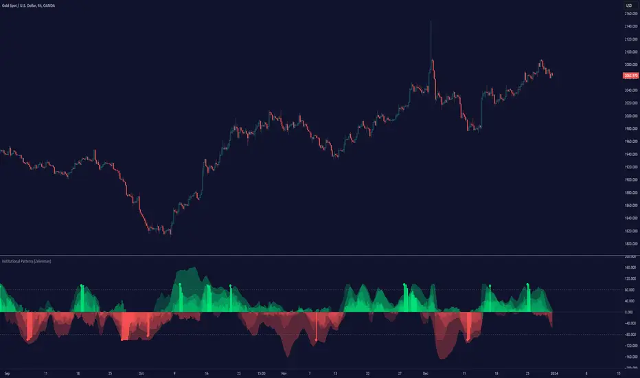
Institutional Patterns (Zeiierman)█ Overview
Institutional Patterns (Zeiierman) reveals how large participants quietly shape market structure. It transforms price, volume, and momentum into a unified view of institutional activity, helping traders see beyond surface volatility to understand where meaningful capital is entering or exiting the market.
The indicator operates through two primary layers:
Pre-Institutional Activity, which highlights early accumulation or distribution before trends emerge, and Institutional Activity , which visualizes active participation once those trends are underway. Each layer combines flow signals from momentum, trend, and volume domains into an adaptive map of market behavior. The result is a fluid representation of how professional money interacts with price, showing when participation is strengthening, fading, or shifting direction.
⚪ Why This One Is Unique
Traditional “smart money” indicators focus on one aspect of market behavior. Institutional Patterns blends multiple adaptive models into a single, self-adjusting framework that evaluates participation strength and direction dynamically.
Its internal flow engine rebalances several momentum and volume dimensions based on changing volatility and structure. This allows it to remain stable in trending environments while still sensitive to early signs of accumulation or exhaustion. Traders gain a clear sense of whether the underlying flow supports or contradicts visible price action.
█ Main Features
⚪ Smart Money Flow
Smart Money Flow provides a multi-dimensional view of how institutional participation evolves beneath price action. It combines several adaptive models that represent different aspects of market behavior—momentum, volatility balance, trend inertia, and volume displacement—into a single synchronized flow structure.
When the flows move together, it shows unified institutional behavior; when they diverge, it signals redistribution, exhaustion, or hidden accumulation. The flow visualization reacts dynamically to volatility shifts, helping traders detect the strength or fragility behind visible price trends.
⚪ Institutional Activity Layer
The Institutional Activity Layer transforms the collective signals of Smart Money Flow into a coherent measure of institutional intent. It visualizes where capital is entering or exiting positions in real time.
Each activity pulse represents the depth of institutional engagement, filtered through adaptive volatility scaling. Green regions highlight expansion phases when capital is building into strength, while red regions indicate contraction or controlled distribution.
This layer bridges the gap between short-term trader behavior and long-term professional positioning, providing a clear and adaptable view of where meaningful market participation truly resides.
⚪ Key Terms
Accumulation vs. Distribution
These terms describe what large participants are doing, not necessarily whether price is going up or down at that moment:
Accumulation: Institutions are building long exposure—quietly buying over time, often during a sideways or suppressed market phase, before a larger uptrend.
Distribution: Institutions are building short exposure or unloading longs—selling gradually into strength, often during or near the end of an uptrend.
In a Uptrend Context
During an uptrend, institutions often accumulate early and distribute later.
Accumulation occurs when large players are building long positions during consolidation or pullbacks, preparing for the next upward leg.
Distribution takes place when they begin offloading those long positions into strength, gradually selling to retail demand near or after market peaks.
In a Downtrend Context
Even in a downtrend, both processes can still occur.
When large players are adding short positions at higher levels, this represents distribution, as they are distributing supply into the market as the price attempts to rally.
When institutions begin covering shorts or quietly building new long exposure for a future recovery, that marks accumulation, reflecting strategic buying while price remains weak and undervalued.
█ How to Use
⚪ Trend Following
The simplest way to use the indicator is to look for alignment across the Smart Money Flow components.
When most of the flows align in green, it signals strong buying pressure and confirms that institutional participation supports the uptrend. This is the ideal environment for trend-following trades in the direction of strength.
When most flows align in red, it indicates dominant selling pressure and active distribution, suggesting short opportunities aligned with the prevailing downtrend.
⚪ Pullbacks
Pullbacks can be identified when the Leading Flow begins to diverge from the primary Smart Money Flow.
If the main flow remains bullish (green) but the leading flow temporarily turns bearish (red), it often marks a short-term retracement within an uptrend. This phase can offer re-entry opportunities for long positions once the flows realign.
In a downtrend, the opposite applies. If the main flow remains bearish (red) and the leading flow turns bullish (green), it signals a temporary countertrend bounce that may provide short re-entry points after the correction fades.
⚪ Breakouts
Breakouts are best confirmed by the Institutional Activity Layer.
A bullish breakout occurs when institutional activity spikes above a breakout level with clear green intensity, confirming active capital expansion and strong follow-through potential.
Conversely, a bearish breakout is confirmed when institutional activity rises below a breakdown level with strong red intensity, signaling renewed distribution and a potential continuation of the downtrend.
⚪ Reversals
Institutional activity can also reveal potential reversal zones.
If red or pink activity appears after an extended downtrend or near a lower trading range, it may indicate accumulation and an upcoming bullish reversal.
If green or aqua activity forms after a prolonged uptrend or near upper resistance levels, it may signal distribution and the beginning of a bearish reversal.
Note: These signals can be the first sign of a potential reversal, but they still need confirmation before taking action.
⚪ Squeeze Detections
Squeeze conditions occur when volume flow begins to diverge from the primary trend, showing early signs of trapped positioning.
If volume flow turns bullish while price and trend flow remain bearish, it suggests buyers are stepping in early. If the price then accelerates downward, longs get trapped and start closing positions, triggering a long liquidation that further fuels the drop.
If volume flow turns bearish while price and trend flow remain bullish, it signals early selling pressure. If the price then pushes higher, shorts begin exiting to limit losses, causing a short squeeze that amplifies the upward move.
█ How It Works
⚪ Flow Integration Framework
The indicator combines several flow components into a single activity field using advanced normalization and smoothing logic. Each flow—trend, momentum, oscillator, and volume bias—contributes a weighted directional influence. These are blended into a balanced structure that represents the strength and direction of institutional behavior across time.
Calculation: Employs multi-domain normalization and weighted signal blending to synchronize phase, reduce noise, and maintain a coherent directional bias across all flow sources.
⚪ Institutional Activity Core
At the core of the system is a volatility-adaptive activity model that interprets both price displacement and volume footprint asymmetry. It measures how trade flow diverges from recent equilibrium and translates that divergence into a refined intensity signal. The model reacts dynamically to imbalances between buying and selling pressure (delta), revealing whether institutional flow is accumulating into strength or distributing into weakness.
Calculation: Utilizes a dynamic volatility envelope combined with delta-weighted response mapping to translate footprint imbalances into a smooth, self-adjusting participation curve.
⚪ Pre-Institutional Detection Engine
The early detection engine isolates latent footprint formations and delta transitions that occur before price movement becomes visible. It examines structural variance, order-flow dispersion, and volatility compression to pinpoint areas where large participants begin to build or unwind positions.
Calculation: Applies entropy-weighted variance mapping and flow compression analysis to reveal pre-breakout regions of capital absorption or release.
-----------------
Disclaimer
The content provided in my scripts, indicators, ideas, algorithms, and systems is for educational and informational purposes only. It does not constitute financial advice, investment recommendations, or a solicitation to buy or sell any financial instruments. I will not accept liability for any loss or damage, including without limitation any loss of profit, which may arise directly or indirectly from the use of or reliance on such information.
All investments involve risk, and the past performance of a security, industry, sector, market, financial product, trading strategy, backtest, or individual's trading does not guarantee future results or returns. Investors are fully responsible for any investment decisions they make. Such decisions should be based solely on an evaluation of their financial circumstances, investment objectives, risk tolerance, and liquidity needs.
סקריפט בתשלום
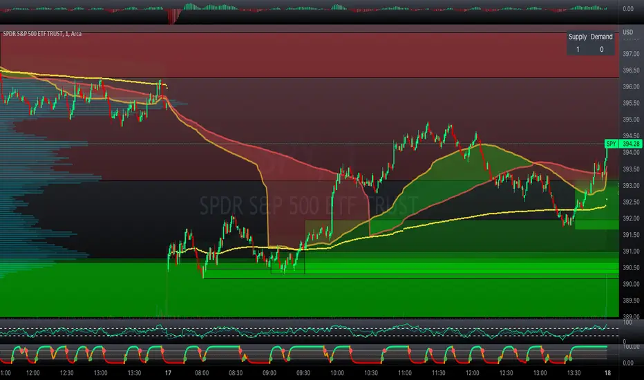
Professional Zones - Institutional Demand and Supply Imbalances
Intro to Supply and Demand Zone Technical Analysis
Supply and demand is an increasingly common strategy among day and swing traders in equity, forex, and the futures markets. The goal of analyzing supply and demand zones is to pre-determine where price action may pivot before that pivot happens, thus giving us an edge over the market. There are many unique charting/trading strategies that fit under the supply and demand umbrella, however we are going to focus primarily on Institutional Zones of Demand and Supply Imbalances, as this is what our TradingView indicator actively displays.
What are Institutional Zones of Demand and Supply Imbalances?
First, let’s break down the phrase above. The first word is ‘institutional’, which is a key aspect in our trading. As a retail trader, you must understand that retail traders (individual traders like you and I) have very little control and very little effect on price action in the major markets. The price action that we see everyday is caused by large institutions and hedge funds buying and selling equities in massive quantities.
This chart displays the price action for ES, which is the S&P500 E-mini futures .
At the time this guide was created, that chart for ES displays the low of this year (2022). You can see major highs and major lows, as well as steep drops and momentous runs.
Price action like this appears random to the naked eye, however it is all controlled by major institutions. These institutions place large buy and sell orders for markets such as the S&P 500 Index which causes these moves.
Our Institutional Demand and Supply Analysis attempts to discover the price zones where institutions have placed their buy/sell orders. Their buy orders create “demand zones”. And their sell orders create “supply zones”. Knowing where these zones exist allows us to anticipate price trend reversals so we can profitably participate in them alongside the major institutions when these key moves take place.
We are looking for areas in the chart where institutions have created major imbalances (more buy orders than sell orders or vice versa) which creates demand and supply zones that impact price action and trend reversals in predictable ways.
What Causes These Supply and Demand Zones?
Understanding that institutions control the price of the markets is crucial for understanding how these zones of supply and demand imbalances are formed, and it can be derived from historical price action.
There are two types of price action, balanced and imbalanced. Balanced price action is flat, consolidatory price action where the overall direction is sideways. Imbalanced price action is an exaggerated move in price either up or down. Now here is the key: institutional supply and demand imbalances are formed when price action goes from balanced to imbalanced. Below is an example of balanced price action .
There are clearly areas of institutional buy and sell orders that are causing price action to oscillate between the areas of demand and supply. The longer price action consolidates and moves sideways, the larger the volume profile will be in this range. In other words, more institutional orders will build up as price remains relatively the same for a longer period of time.
Here is how a demand zone is formed :
Due to bullish CPI news, price action went from balanced to imbalanced by exploding to the upside. This bullish price action filled all of the sell orders and broke past the previous area of supply. Because price moved up so fast, the buy orders did not get a chance to fill, essentially leaving an area with a high concentration of buy orders remaining. Hence, a new demand zone is formed which is shown here .
Our state-of-the-art indicator automatically scans for these historical shifts in price action (balanced to imbalanced) via our supply and demand zone detection formula, and displays them on your chart instantly. Remember the first image sent of blank price action? Here it is below:
The image below shows the exact same chart of ES, however, our advanced Professional Zones - Institutional Demand and Supply Imbalances indicator has been applied to the chart.
Just like that, price action has been transformed from unexplainable chaos to an orderly sequence of demand bounces and supply rejections.
Yes, all of these zones may be charted manually if one were to acquire the knowledge required to chart them by hand, and spend numerous hours going back in time to find all these zones. Additionally, these charts would then have to be constantly monitored and updated, which would require hours of work each day. This powerful indicator automates all of that work to give you more precious time to analyze and trade these zone-driven pivots in the markets.
How To Measure the Strength of Supply and Demand Zones?
The longer the consolidation takes place, the larger the demand/ supply zone will be. This strength is measured by the time frame of the origin of the zone.
Each zone may be formed on a different time frame, the biggest being the 1 Month time frame, and the smallest being the 30 Minute. Each supply and demand zone is automatically labeled based on the time frame from which the zone originated.
The weakest zones are derived from the 30 minute time frame. This means the zone only took two 30 minute candles to form, which is not a lot of time for institutions to place large orders. This means that the bounces and rejections off of these zones will usually be smaller, and usually won’t last more than a few days.
Larger zones such as 1 Day, 1 Week, and 1 Month often cause large swings in the market lasting weeks, months and even years. So pay attention not just to where the demand and supply zones currently appear, but also to the strength of that zone. You can see below that the demand zone that the market bottomed in and reversed out of in 2022 was in fact, a very strong weekly zone.
What is the Significance of Supply and Demand Zone Breaks?
These zones are order-based. This means that a supply zone level doesn’t turn into demand when price action breaks above it, and demand doesn’t turn into supply when price action breaks below it. It is unlike standard trend-based support and resistance levels. If price action breaks below demand by even $0. 01 , all of the buy orders have been filled and the demand must be deleted from the chart (and vice versa for a supply zone ).
While it is possible to play these zone breaks as continuation plays off of current momentous price action, it is unpredictable how far price will go up or down after breaking supply or demand during that leg.
However, in my years of supply and demand experience, I have noticed that if demand breaks, the market will eventually come down to the next viable demand zone . This is because without a pivot caused by an institutional-created demand or supply imbalance, there is often not enough participation to cause a sustainable trend reversal for a long period of time. Below is an example of this:
Above is the 4 Hour chart of TSLA bouncing up off of a demand zone . We call this a bounce in “no man's land”, as there is no major demand bounce to support this reversal to the upside. So in theory, price action should return lower to the next major historical zone of demand before it has a chance of pulling off a solid reversal. Here is what happened:
As you can see above, TSLA did indeed end up heading back down into the next major demand zone before getting a sustainable reversal to the upside. So you may play these supply and demand zone breaks as continuation trades, either long or short, with a price target at the next major zone. Just make sure to use proper risk management and position sizing, as timing the trigger of a price target can be difficult.
How Might I Place a Trade Using the Indicator?
Now that the basics of institutional supply and demand zones have been discussed, there will come a time that this strategy must be actively applied to personal trading with a goal of becoming profitable. Here is a step-by-step process to place a trade using supply and demand paired with an example of a day trade from the 1 minute time frame.
Step 1: Find a highly institutionally traded stock that is currently in supply or demand as shown by our indicator. For example, AAPL:
Step 2: Look for an above-average (exaggerated) volume spike. Because we are in one of the green zones at the bottom of the chart, we know that we are in demand where large institutional buy orders reside. We need to wait for some of these orders to actually fill before we take our trade. This is known as volume confirmation. The color of the volume usually does not matter in this situation.
Step 3: Now that we have a volume spike which is confirmation of large orders being filled, we need more confirmation that the institutional orders are not only a buy, but large enough to actually reverse the current trend.
This is ultimately a judgment call. A few green candles may be good enough to dictate a reversal, or a trend break. It comes down to personal preference and how aggressive you would like to be. Keep in mind, the longer you wait, the more confirmation your trade has, but also, the longer you wait, the greater the risk of missing the new trend. In this example, we will use a trend line to confirm our trend reversal.
Step 4: Enter the trade. Now that you have proper demand confirmation, you may place your trade. Be sure to determine your stop loss, price target, position size, and all other risk management factors along the way.
In this example, AAPL ran all the way up to supply before rejecting; making for a perfect demand to supply call trade. Also, more short trade entries could have been taken based off of the multiple supply rejections AAPL had.
The Bottom Line
There are many ways one may go about trading the stock market. However in my years of trading and teaching, there has never been a strategy that has not only changed my career, but improved the trading careers of my students, more dramatically than Institutional Zones of Demand and Supply Imbalances.
Though charting new zones and deleting broken ones everyday was time consuming and repetitive, the results of trading these zones made it well-worth the hours of charting. However, after months of development and fine-tuning, the painful charting process has been automated by this powerful indicator, completely replacing the tedious charting work for myself and my students.
While numerous other indicators include the name “Supply and Demand Zones”, we believe that no supply and demand indicator remotely this advanced and accurate available on TradingView. I am very blessed to finally bring this revolutionary tool to the market.
Introduction to the Aurora Demand and Supply Indicator for TradingView and its Functionality
This page is dedicated to providing a thorough walk-through of our Professional Zones - Institutional Demand and Supply Imbalances indicator. The settings functionality, customizability, and purpose will be discussed to give you an in-depth understanding of the indicator. Understanding the purpose of the different functions and settings is crucial to utilizing this powerful tool at its full potential.
First Look Upon Indicator Addition
After purchasing the indicator, your chart may initially appear cluttered, zoomed out, and hard to read. But do not worry, it just means the indicator settings must be fine-tuned to optimize your experience. Tt may appear overwhelming. However this page will discuss each major customizable setting and the functionality behind it to streamline your TradingView set up.
Filter Options Settings Category
This is the first customizable feature that appears when accessing the settings of the indicator. What Filter Zone Ranges does is allow you to filter the range at which zones appear both above and below the current asset price. With this setting unchecked, every single demand and supply zone within the 5k candle limit (or 20k limit if you have a premium TradingView account) will appear on your chart. This causes chart clutter which limits the visibility of price action.
If you have this setting activated, you can choose exactly the range of zones visible to you. This range is percent based and is measured both above and below the current market price. For example, if you activate Filter Zone Ranges and set the Filter Percentage at 7%, only zones within the range of 7% above, and 7% below the current asset price will be shown.
Demand/ Supply Zone Options Settings Category
The next two categories contain the majority of the customizability for supply and demand zones. The first option in both the Demand/ Supply Zone Options is Create Demand/Supply Zones. This toggle is very straight forward, you may choose whether or not to display all demand zones, or all supply zones.
The next two options are Demand/ Supply Zone Border and Demand/ Supply Zone Fill. Again, these are straight forward. The border setting allows you to edit both the color and opacity of the zones’ border lines. The fill setting allows you to edit the color and opacity of the interior of the supply/demand boxes.
Following the first pair of visual settings, you will see Demand/ Supply Zone Box Offset. This allows you to toggle how much the indicator offsets each zone from its origin point. In other words, move it to the left or right from the point in time at which the zone was created. The 0 offset is the base setting which is actually a slight offset to the right of the origin point to ensure that the candlesticks remain unobstructed visually.
After the offset options, you will find Demand/ Supply Zone ERC Multiple. This is a key setting which inputs the value our formula utilizes to scan the areas of institutional supply and demand imbalances. Unless you are extremely experienced with supply and demand analysis or you are running backtesting, it is highly recommended this value is left at ‘2’ for both the demand and supply options.
The next two options you will see in your indicator settings are Extend Demand/ Supply Zone and Demand/ Supply Zone Size. This feature allows you to customize exactly how far your zones will extend from the point of origin into the future.
The three options on the drop down menu are Extend, Fixed, and Dynamic. Each of these options extend your zones in a different fashion. It is important to note that the value inputted in the size option is the amount of units the zones will extend to the right for both Fixed and Dynamic options. The larger this input is, the further out the zones will extend into the future, and vice versa.
The final setting in the Demand/ Supply Zone Options category is Broken Zones to Keep and Broken Demand/ Supply Zone Fill. The Broken Zones to Keep input allows you to see recent supply or demand zones that have been broken and deleted from your chart. This may be useful for a trader in a few different ways. The Broken Demand/ Supply Zone Fill setting allows you to customize the number of broken zones displayed as well as their color and opacity. The most prominent example of this option’s utility is for traders that do not observe price action during the entirety of the market open.
If an individual left their charts for a few hours and missed a demand break, it may give the illusion that there was never a demand there and price action has been in “no-man's land” all day. However if that individual inputted ‘1’ in the Broken Zones to Keep setting, they would be able to see that a demand has broken. This may be useful as the trader may have an altered sentiment after knowing that a zone did in fact break.
Note: the value inputted is the amount of previously broken zones that will appear on your chart. For example, if the value ‘3’ is inputted, the three most recently broken zones will appear on your chart.
Time Frame Options Settings Category
Time Frame Options Settings allows you to toggle which supply and demand zones appear on your chart by time frame. For example, if you are analyzing a chart on a larger time frame such as the daily or weekly, the small 30 minute and 45 minute zones will often clutter your chart. By deselecting the weaker and smaller time frame zones, it will clean your chart up, allowing you to only see the zones that assist your analysis.
However the first two options in the category are unique.The first is Show Forming Zones. This option is extremely useful if you are watching price action play out live, when seeing the possibility of a supply or demand zone forming may be of benefit during your day trading. By toggling this setting ON, you will see all possible supply and demand zones forming in real time. However, this could cause clutter if multiple zones are forming at once in which case, toggling it off may be more beneficial.
The second option in the Timeframe Options category is the Show Zones Inside toggle, which controls the table at the top right of your screen (you may get rid of this table by deselecting tables in display settings).
This setting simply is a “yes” or “no” as to whether or not the table located at the top right of your screen will display the number of zones price action is currently sitting in. This setting is useful as zones may sometimes pile up on top of one another, making it hard to know exactly how many zones price action is currently sitting in.
Gap Options Settings Category
Just below the Timeframe Options category, is the Gap Options category. Gaps appear when two daily candles highs and lows do not overlap. These are often created when a catalyst is released into the market overnight causing a large move, resulting in a “gap” up or down the next morning.
A Gap often forms due to a strong move to the upside, and the indicator highlights this gap with a gray box. Gaps are important to many traders as there is often a large lack of liquidity inside the gap area, which often acts as a magnet that attracts future price action to fill it. If toggled on, the indicator displays the gap among the supply and demand zones seamlessly. The rest of the settings for this category are options to customize the color, opacity, size, and offset. These have the same effect as the options in the Demand/ Supply Zone Options category.
Text Options Settings Category
The final category in the indicator input settings is Text Options. This category allows you to toggle zone labeling on or off, and to specify how you would like the zone labels to appear. It’s strongly recommended that zone labeling is left ON because knowing the time frame a supply or demand zone originated from is a massive indicator of its strength. Top right alignment causes labeling such as “3H” to appear at the top right of each zone.
Indicator Data Limitations
There are a few limitations of TradingView which impact the Professional Zones - Institutional Supply and Demand Imbalances indicator. The first is the data TradingView provides to its users. With a basic TradingView account, a user only has access to 5,000 candles of data. So if a user is on the 1 minute time frame, that user can only see 5,000 candles before that current point. This is important because our advanced indicator scans historical price action that has formed supply and demand zones and displays it on your chart. This means that if a user is on a 1 minute time frame chart, they will only be able to see zones formed within the last 5,000 candles. Older supply and demand zones can not be displayed. However if a user has the Premium TradingView subscription, they can access up to 20,000 candles, which greatly increases the potential zones the user may see on the smaller time frames.
To counter this, we strongly recommend checking the larger time frames before starting your trading day, as there could be an old zone lurking behind the scenes. Once you spot it on the 30 minute time frame, for example, you may easily take note of the demand zone and its location.
The Bottom Line
This indicator has been intricately and powerfully designed to not only display institutional supply and demand imbalances more accurately and efficiently than any other TradingView indicator, but it has also been designed to give the user full control. Full control means the user has the ability to customize the appearance and inputs, as well as toggle specific objects visible to the trader.
We have meticulously designed the Professional Zones - Institutional Supply and Demand Imbalances indicator to be extremely valuable as a stand-alone strategy, as well as versatile enough to incorporate multiple other trading strategies on top of supply and demand .
However, in order for this indicator to be utilized by you at its full potential, it is important that you understand all of its features, capabilities and configuration options before you dive into trading.
Bodies X Wix Version of Smart Money Tools by makuchaku & eFeThis is the same Script as Super Fair Value Gaps / FVG /BoS / by makuchaku & eFe. Mine Should Default to Large Text instead of small. The Super Order Blocks I believe was meant to for you to find one of the many Smart Money tools such as turn on the Fair Value gap but leave the others off, or Turn on where the Break of Structure and leave the others off. The reason I believe this is because the default values for each of the structures were default colored (green for positive and red for negative) for all.
Mine has a different Color for every possible structure. As long as you can read with the larger text that I added, then you can create your own boxes positive for break of structure, rejection block, order blocks and fair value gaps for any time frame. The reason I did that is because There's only certain things I believe I will need to mark for myself in each time frame, and then from there You can stretch iyour own box out further in time because if price touches a fair value gap for example, the fair value gap should conyinue in time until at least 2 candles have filed the Fair valu gap going both directions. That's truly when the fair value gap should is mitigated and will from off the chart. However, If I knew How to add the code for that, I would.
Additionally, I have the Max Boxes per chart, so you should have the ability to see every OB, FVG,RJB, & BoS on the chart
I tried my hardest to create a colored border that was different from the box. But the way the original was coded was almost impossible to do. Because they defined each of the structures (FVG, OB, BoS, RJB) outer levels, when the outer levels connect via math in the code, then it joins all the outside lines for a rectangle. When creating a box, the coloe will always be the same as the border unfortunately. (Unless I replan this from the beginning)
I also Changed the default labels for reach structure from a hard to read gray to a white that pops out.
Also, chart indicators are a little large as well. Such as the cross, sideways cross, The green Triangle, and the white Diamond. You'll get used to it or you can change it as well.
Creating videos for students, you need something they can see.
So, I just wanted to ensure everything was a little more unique and easily usable when showing this to my students when I send them private videos for our weekly lessons. I'm trying to learn how to use the IPFS for THAT, (which i see has invaded PineScript) Hope this indicator helps.
If you're to borrow this, Just make sure you keep the authors in the name makuchaku & efe

Trading Guidance institutional ZoneThis is the institutional zone indicator. it used in 5 Minute Timmeframe.

BTC Coinbase Premium TrendBTC Coinbase (institutional trader) vs. Binance (retail trader) Premium
Positive values: Coinbase trading at a premium (institutions more bullish than retail)
Negative values: Coinbase trading at a discount (institutions more bearish than retail)
Daily and Weekly Sweep - LiquidityDaily and Weekly Sweep – Liquidity
Description:
The script is designed to illustrate the sweeps of the high and low of the previous day and week. The larger the ratio of shares traded to the percentage price change, the more deep and liquid the market is presumed to be, therefore the market maker always seeks liquidity. Liquidity rests above previous highs and below previous lows as many traders see these as obvious points to place their stops. These are areas on the chart where many orders are placed together and serve as tipping points for market makers. The script focuses on the previous day and week. We can assume these are potential areas for mitigation.
How to use:
The indicator plots the highs and lows of the previous day and week. On default, it also shows the high and low price for the first 8 hours of the opening day of the week. Users can customise this in settings. The weekly open is also plotted. The background changes colour once a daily/weekly high or low has been breached and stops at the extreme point of price. These areas may provide points of interest in the future.
A good understanding of supply and demand, order blocks, market structure, and how to identify fresh levels is expected to utilise it's full potential.
Alert function added for:
- Daily Sweep
- Weekly Sweep
Indicator in use:

Institutional Behavior AnalyticsJapanese below / 日本語説明は下記
■Summary
This indicator provides analysis on institutional investors/traders’ behavior by discovering and interpreting patterns of CFTC positions and price action in order to help users follow market directions that maker makers create and make decisions.
■What can we do with this indicator?
●Display institutional investors/traders’ position(CFTC COT position)
●Analyze institutional investors/traders’ behavior
Analyze institutional investors’ behavior from CFTC position data and price action and patternize the movement where strong buying/selling pressures are indicated
●Notify institutional investors’ behavioral changes with signals and alerts
In case strong buying/selling pressures detected, signals will be displayed along with the factors by which the behavioral changes identified. Alerts can be set with the same condition as signals.
■Why is it important to analyze institutional investors/traders behavior?
Financial markets are created by institutional investors/traders aka market makers. Analyzing their behavior and knowing where they are heading are chances for retail traders for trend trading.
■Functions
There is three core functions in this indicator.
1. CFTC COT Positions
2. Institutional Behavior Analysis
3. Alert
■Function Details:
1. CFTC COT Positions
1-1. CFTC COT Position
This indicator shows COT(Commitment of Traders) positions provided by CFTC with selection of legacy format and new format.
Users also can select position type from Futures only and Futures and Options.
Data source is quandle.com
The indicator shows the data of the assets listed below based on the code and the ticker code of which users open charts.
This is upgrade functions of CFTC Positions by COT Report(Legacy and New Format) Indicator which I previously released by adding more assets and new functions; (1)manual CFTC code entry, (2)display of changes from previous week and (3) Auto-identification of peak position level (see below)
CFTC Positions by COT Report(Legacy and New Format)
Indices:
Dow Jones Industrial Average / CFTC code:12460P / when DJI/US30 open
S&P 500 STOCK INDEX / CFTC code:13874P / when SPX / SPX500USD /US500 open
NASDAQ-100 STOCK INDEX / CFTC code:20974P / when NDX/US100 open
E-MINI Russel2000 INDEX / CFTC code:239742 / when RUT/US2000 open
NIKKEI STOCK AVERAGE / CFTC code:240741 / when NI225 / JP225USD open
Currencies:
EURO / CFTC code:099741 / when EURUSD open
Japanese Yen / CFTC code:097741 / when USDJPY open
British Pound / CFTC code:096742 / when GBPUSD or EURGBP open
Australian Dollars / CFTC code:232741 / when AUDUSD open
New Zealand Dollars / CFTC code:112741 / when NZDUSD open
Canadian Dollars / CFTC code:090741 / when USDCAD open
Swiss Franc / CFTC code:092741 / when USDCHF open
Commodities:
USOIL / CFTC code:067411 / when USOIL open
Brent oil / CFTC code:06765T / when UKOIL open
GOLD / CFTC code:088691 / when GOLD or XAUUSD open
Silver / CFTC code:084691 / when SILVER or XAGUSD open
Platinum / CFTC code:076651 / when PLATINUM or XPTUSD open
Palladium / CFTC code:075651 / when PALLADIUM or XPDUSD open
Copper(Grade#1) / CFTC code:085692 / HG1! or HG2! Open
Natural Gas(Henry Hub) / CFTC code:023391 / when NATURALGAS open)
Corn / CFTC code:002602 / ZC1! Or ZC2! Open
Cryptos:
Bitcoin / CFTC code:133741 / when BTCUSD open
Ether / CFTC code:146021 / when ETHUSD open
Data to be displayed:
Legacy format:
1. Open Interest
2. Non Commercial Long
3. Non Commercial Short
4. Non Commercial Net Positions (calculated by 2 and 3)
5. Non Commercial Spreads
6. Commercial Long
7. Commercial Short
8. Commercial Net Positions(calculated by 6 and 7)
9. Total Long
10. Total Short
11. Non Reportable Positions Long
12. Non Reportable Positions Short
13. Non Reportable Net Positions(calculated by 11 and 12)
New format:
1. Open Interest
2. Producer/Merchant/Processor/User Longs
3. Producer/Merchant/Processor/User Shorts
4. Producer/Merchant/Processor/User Net Positions(calculated by 2 and 3)
5. Swap Dealer Longs
6. Swap Dealer Shorts
7. Swap Dealer Net Positions(calculated by 5 and 6)
8. Swap Dealer Spreads
9. Money Manager Longs
10. Money Manager Shorts
11. Money Manager Net Positions(calculated by 9 and 10)
12. Money Manager Spreads
13. Other Reportable Longs
14. Other Reportable Shorts
15. Other Reportable Net Positions(calculated by 13 and 14)
16. Other Reportable Spreads
17. Total Reportable Longs
18. Total Reportable Shorts
19. Non Reportable Longs
20. Non Reportable Shorts
21. Non Reportable Net Positions(calculated by 19 and 20)
Sample chart
Colors and chart type are configurable.
❶.Non commercial long(green)/short(purple)/net(blue) position
❷.All data in legacy format
❸. All net positions in new format
1-2 Manual CFTC code entry
Besides the assets above, users now can enter CFTC code manually when they want to specify CFTC code regardless of charts they are opening and see other assets' COT position data.
1-3 Changes from previous week
Changes from previous week are displayed as text for Open interest, Non Commercial Long/Short/Net positions.
1-4 Auto-identification of peak position level in past N week
By specifying number of weeks(=N), the indicator automatically identify highest position level in the past N weeks for Non-commercial long and short positions.
By knowing this, users can prepare for trend reversal possibilities.
Sample chart
2. Institutional Behavior Analysis
This indicator detects institutional behavior changes based on changes of positions and price action and then categorizes them into patterns where strong buying/selling pressures of institutional investors are indicated.
Once the patterns identified, those will be displayed as signals and also it plots the factors in text by which the patterns are identified in order to support users’ decision making.
Sample chart
What makes indicator suggest institutional investors’ strong buy/sell will be remarked in the bottom right corner.
Please be noted that this function works on weekly timeframe only as institutional investors positions are updated on weekly basis by CFTC.
3. Alert
Alerts can be set with the same condition as signals so that users do not miss indicated strong buying/selling pressure of institutional investors.
■What timeframe/trading style is this indicator for?
As CFTC position updated on weekly basis, weekly, daily and 4H timeframes are most appropriate hence swing trading and day trading is best fitting trading style.
Scalping? Possible but why would we aim such small movement, knowing the directions that institutional investors are going to which could lead to big trends.
---------------------------------------------------
■サマリー
機関投資家の建玉とプライスアクションに基づいて機関投資家の行動分析を提供するインジケーターです。
機関投資家の強い買い圧力、売り圧力が示唆されるケースをその構成要素と共にパターン分類。
マーケットメーカーの作り出す相場の方向性に追従しやすくなるように、ユーザーの意思決定を支援します。
■このインジケーターでできること
●CFTC建玉の分析
CFTC(アメリカ商品先物取引委員会)が公開するCOT(Commitment of Traders)レポートに基づき機関投資家や商業筋の建玉データを分析することができます。
●機関投資家の行動分析
建玉データと値動きから機関投資家の行動を分析することが可能です。
インジケーターは建玉データとプライスアクションを基に機関投資家の強い買い圧力、売り圧力が示唆されるケースをその構成要素と共にパターン分類します。
●機関投資家の行動変化をシグナルとアラートで通知
機関投資家の強い買い圧力、売り圧力が検知された場合、その構成要素と共にシグナルを表示します。またシグナル表示のタイミングでアラート設定することも可能です。
■なぜ機関投資家の建玉や行動を分析することが重要なのか?
相場はマーケットメーカーと呼ばれる機関投資家によって作られています。
彼らのポジション状況や行動を分析し、彼らがどの方向に進んでいるのかを知ることは、個人投資家にとってトレンドフォローでトレードする機会、特に大きなトレンドに乗る機会を見出すことに繋がります。
機能
このインジケーターには主に3つの機能が搭載されています。
1. CFTC建玉データの表示
2. 機関投資家の行動分析
3. アラート
1. CFTC建玉データの表示
1-1. CFTC建玉データの表示
COTレポートが提供するCFTC建玉をサブウィンドウに表示することができます。
データレイアウトについては、レガシーフォーマットと新フォーマットの二つのレポートフォーマットを選択可能です。
またポジション種類として先物のみを表示するか、先物とオプションを含んだポジションを表示するかの選択も可能です。
インジケーターが表示する対象の資産と該当のCFTCコード、どのティッカーコードのチャートで表示されるかは以下の通りです。(データソースはquandle.com)
この機能は以前リリースしたCFTC Positions by COT Report(Legacy and New Format) Indicatorのアップグレードバージョン機能です。
対象データが追加されている他、新機能として(1)マニュアルでのCFTCコード指定、(2)前週比の表示、(3)過去のピークポジションのレベルライン自動描画が追加されています。
(詳細は下記)
CFTC Positions by COT Report(Legacy and New Format)
株価インデックス:
ダウ工業平均 / CFTC code:12460P / DJI/US30 を開いたとき
S&P500 / CFTC code:13874P / SPX / SPX500USD /US500
ナスダック100指数 / CFTC code:20974P / NDX/US100
E-MINI ラッセル2000指数 / CFTC code:239742 / RUT/US2000
日経平均 / CFTC code:240741 / NI225 / JP225USD
通貨:
ユーロ / CFTC code:099741 / EURUSDを開いた時
円 / CFTC code:097741 / USDJPY
ポンド / CFTC code:096742 / GBPUSD または EURGBP
豪ドル / CFTC code:232741 / AUDUSD
ニュージーランドドル / CFTC code:112741 / NZDUSD
カナダドル / CFTC code:090741 / USDCAD
スイスフラン / CFTC code:092741 / USDCHF
コモディティ:
WTI原油 / CFTC code:067411 / USOIL
北海ブレント原油 / CFTC code:06765T / UKOIL
ゴールド / CFTC code:088691 / GOLD または XAUUSD
シルバー / CFTC code:084691 / SILVER または XAGUSD
プラチナ / CFTC code:076651 / PLATINUM または XPTUSD
パラジウム / CFTC code:075651 / PALLADIUM または XPDUSD
銅(Grade#1) / CFTC code:085692 / HG1! または HG2!
天然ガス(Henry Hub) / CFTC code:023391 / NATURALGAS
コーン / CFTC code:002602 / ZC1! または ZC2!
暗号資産:
ビットコイン / CFTC code:133741 / BTCUSD
イーサ / CFTC code:146021 / ETHUSD
表示されるデータ:
レガシーフォーマット(一般的によく見るのはこのフォーマットです。)
1. Open Interest
2. Non Commercial Long
3. Non Commercial Short
4. Non Commercial Net Positions (calculated by 2 and 3)
5. Non Commercial Spreads
6. Commercial Long
7. Commercial Short
8. Commercial Net Positions (calculated by 6 and 7)
9. Total Long
10. Total Short
11. Non Reportable Positions Long
12. Non Reportable Positions Short
13. Non Reportable Net Positions(calculated by 11 and 12)
新フォーマット:
1. Open Interest
2. Producer/Merchant/Processor/User Longs
3. Producer/Merchant/Processor/User Shorts
4. Producer/Merchant/Processor/User Net Positions(calculated by 2 and 3)
5. Swap Dealer Longs
6. Swap Dealer Shorts
7. Swap Dealer Net Positions(calculated by 5 and 6)
8. Swap Dealer Spreads
9. Money Manager Longs
10. Money Manager Shorts
11. Money Manager Net Positions(calculated by 9 and 10)
12. Money Manager Spreads
13. Other Reportable Longs
14. Other Reportable Shorts
15. Other Reportable Net Positions(calculated by 13 and 14)
16. Other Reportable Spreads
17. Total Reportable Longs
18. Total Reportable Shorts
19. Non Reportable Longs
20. Non Reportable Shorts
21. Non Reportable Net Positions(calculated by 19 and 20)
サンプルチャート:
色とグラフ/線種は変更可能です。
❶.Non commercial(いわゆる投機筋)のポジション: ロング(緑)/ショート(紫)/ネット(青)
❷.レガシーフォーマットの全データ出力
❸. 新フォーマットで提供される全てのネットポジション
1-2 CFTCコードのマニュアル入力
上記のアセットに加え、任意のCFTCコードを指定して建玉データを表示することができます。
現在開いているチャートに関係なく、特定のアセットの建玉を確認したい時、他のアセットの建玉との相関を見るときに活用できます。
1-3 前週比の表示
Open Interest, Non Commercial(投機筋)のLong/Short/Netについて、前週比を表示します。
1-4. 過去N週間における建玉のピークを自動表示
過去N週間(Nはパラメータ設定)におけるNon Commercial(投機筋)のロング·ショートポジションのピークを自動で表示します。
過去の建玉のピークを知ることで、建玉が再びそのラインに接近した時のトレンド転換の可能性に備えることが可能です。
サンプルチャート
2. 機関投資家の行動分析
この機能では建玉の変化とプライスアクションから機関投資家の行動変化を検知し、機関投資家の強い買い、売りの存在が示唆されるケースをパターン分類します。
パターンが特定されたタイミングでシグナル表示するとともに、パターンを構成する要素(何を以て機関投資家の強い買い/売りの存在を判断したか)をテキストで表示することでユーザーの意思決定を支援します。
サンプルチャート
インジケーターが機関投資家の強い買い·売りの存在が示唆されると判断した要素がサブウィンドウの右下に記載されます。
この機能は週足でのみ有効です。
3. アラート
上記2のシグナルが表示されるタイミングでアラートを設定することができます。
機関投資家の強い買い·売りを検知したタイミングを逃さないよう活用してください。
■このインジケーターが適しているタイムフレーム
CFTCのポジションが週次で更新されることから、長めの時間軸である週足、日足から4時間足くらいまでが適しています。
トレードスタイルとしては、機関投資家が作る大きなトレンドに追尾するスイングトレードが最も適していると考えますが、デイトレードにも使えます。

Key Levels (Time Frames - Weekly,Monthly,Quarterly,Yearly)This indicator plots the 4h, Daily, Weekly, Monthly, Quarterly, Yearly Open High, Low and Mids.
You can watch how these institutional trading levels work as support and resistance.
Most Important you can add alerts to these levels with a few clicks.
Just add/remove unnecessary levels for scaling problems.
For any error/suggestion/improvement just let me know.
[astropark] Kill ZonesDear Followers,
today I'm glad to present you an indicator which highlights for you the most important market Kill Zones .
This indicator will color background of the time sessions when Asia, London and New York sessions are going to be most active .
This way you can understand easier what istitutions and big hedge funds made during the session.
You can change colors and transparency in the indicator options, default colors are yellow for Asia, blue for London and red for New York sessions.
You can enable the indicator to show background also during the weekend (disabled by default).
This indicator works on all markets, I suggest not to use it above 1h timeframe, 5m-15m is great.
This is a premium indicator , so send me a private message in order to get access to this script.

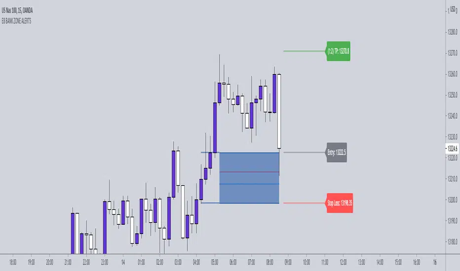
E8-BANK ZONES 4.0 THE E8- BANK ZONES will highlight the most accurate zones the market has to offer.
SETTINGS:
Remove uncheck CHARS - this feature simply places a star on high momentum candles to help identify strong momentum bullish and bearish candles.
INPUT:
You have the ability to choose which zones to display. Our recommendation is to activate continuation zones when price is trending and reversal zones when price is at key level/ strong support and resistance areas.
CONTINUATION ZONES
REVERSAL ZONES
FLIP ZONES
Institutional PivotsToday I propose a novel idea of plotting pivots, this can be also considered as Value areas/Noise areas.
*What is it?
Its a simple concept of gauging price action with respect to its most time spent in a particular range, this is usually denoted as Value area in the Market profile concept, where that "most" word is represented by 70% of the price action.
*What's different from the Market Profile?
Market profile is dependent on real time price movement to complete to see the value area or noise area to plot a static area, there is always a possibility of it shifting as price may move outside of it, and hence its called "developing value area", till of course session is closed and plot is finalized.
While that method is solid indication of "actual price profile" development, it lacks when it comes to offering traders a more stable view to enable them to make decisions. And therefor, when traders trade MP they are usually limited by the number of trades they can take.
This is the main reason as to why traders prefer to use other methods like Pivots/ORB/Range-breakouts over pure MP charts, even though latter reduces the possibility of wrong estimations of "support/resistance working/holding".
*Why the name Institutional Pivots?
In my research I've found that these Pivots/Value area/Noise area ranges are often the areas watched by the big players who trade breakouts or mean reversion strategies, so while that name may sound dubiously clickbaity, it is indeed intended to represent an observation. I know how that sounds, but you can choose to ignore it if you do not agree or see good results after using it. After all, its free to use for everyone.
*Nomenclature/colors and settings?
Noise area/Value area/Central Pivot area - Designated with Yellow labels, in which NU represents the Upper level and ND represents the Lower level
Targets - Target calculation mechanism is based on " today's price action" and today's Open, D1 and D2 represent down targets for the day and U1 and U2 represent upper targets. Please note that this is independent of the "Noise area/Value area/Central Pivot area", so overlap of levels is possible. AND if overlap happens, that's an indication of more strength at S/R line/area for the price.
One more thing to note here is that if there is formation of the new low or new high in the day, those levels will change as their calculation gets influenced by the same. This is NOT a repaint issue, this is SHIFT/FORMATION OF THE NEW levels and it's an "intended" behavior.
Open and POpen - Open represents open of the time-frame selected and POpen represents previous open of the time-frame.
Lable's starting with "H" are indicating higher Timeframe levels, levels which are same as above.
ATR based targets - When you enable this in settings, you will get target calculation based on ATR (self explanatory)
Full ATR mode - When you enable this option, you will get both Noise area as well as targets based on ATR, please don't forgot to turn off the ATR based targets when you enable this, as they conflict with each other.
I've not kept lines, area plots or even price levels as I feel it's just noise and takes away from the indicators main focus, please don't ask to add them, I'll not.
This is meant as purely educational idea, if you use this to trade, it is at your discretion and responsibility will be yours alone.
Past performance is not assurance of the future performance.
More example chart/s

Earthquake Effect by DGTInstitutional investors have a profound impact on financial instruments prices because of the large volume, and their trading activities can greatly impact the price of financial instruments. They sometimes may split trades over time in order to not make a material impact and of course not to decrease liquidity to the point where there may be no one to take the other side of the trade.
Institutional investors (Smart Money) may create an Elephant Effect on the prices of financial instruments, and this study aims to display by emphasizing high volume changes
In the memory of the North Anatolian Earthquake that struck on August 17, 1999, that we remember with pain today, and similarities of plotting outcomes to seismograph plotting I preferred to name this study as Earthquake Effect (SEISMOGRAPH)
Disclaimer:
Trading success is all about following your trading strategy and the indicators should fit within your trading strategy, and not to be traded upon solely
The script is for informational and educational purposes only. Use of the script does not constitute professional and/or financial advice. You alone have the sole responsibility of evaluating the script output and risks associated with the use of the script. In exchange for using the script, you agree not to hold dgtrd TradingView user liable for any possible claim for damages arising from any decision you make based on use of the script
🐳 Whales 🆚 Little Fish 🐟THIS INDICATOR DETERMINES WHAT THE STRONG HANDS AND WEAK HANDS ARE DOING, BASED ON THE FAMOUS INDICATOR "KONCORDE", OBTAINED FROM THE PERCENTARY VARIATION OF THE INDICATOR IVP (POSITIVE VOLUME INDEX) AND IVN (VOLUME INDEX). ANYONE READING THE AVAILABLE DOCUMENTATION ON THESE TWO SMALL MATHEMATICAL JEWELRY WILL DISCOVER THAT THE ATTRIBUTED VOLUMES NEGOTIATED TO STRONG HANDS (IVN) OR WEAK HANDS (IVP).
NOTE: USE THIS INDICATOR ONLY IN INSTRUMENTS WITH REAL VOLUME.

Ultimate BiasThis indicator is meant to be used by our private trading group.
It allows you to plot complex Market Bias criteria, and it generates a context for the market state and fires Entry/Exit signals.
It includes customized alerts to ease its use in algo trading.

Ultimate TRI MAsThis is a helper tool to get deeper into TRI's Moving Average Studies.
The indicator allows for:
Show/Hide all MAs
Show/Hide each one of the MAs
Label the MAs for quicker identification
Select Bias Mode: Institutional or Brian's
Draw a Cloud based on Bias Mode
Highlight Crosses based on Bias Mode
Color the Background based on Bias Mode
Show/Hide the Cloud, the Crosses and the Background
Hope you find it useful!
Institutional BiasShows what we at TRI call the institutional bias, i.e. a bull bias when 9 ema is above 18 ema and a bear bias when the 9 ema is below the 18 ema.
Plots the 9 and 18 ema, and fills the background green when the institutional bias is bullish and red when it is bearish.

Commitment of Traders (COT) NonCom with Average (by Lowphat)Commitment of Traders Non Commercial with Trailing Average
