MY_CME eod OI vs CFTC eow OIDaily e-o-d Open Interest as published by CME.
As CFTC COT Open Interest relates to last Tuesday, here you can have an idea how things evolved day-by-day since then.
As CME total OI is not accessibl as data, here I sum OI of the next 9 outstanding contracts, which gives a fair idea of the trend in OI
חפש סקריפטים עבור "daily"

MTF EMA Combo with Background ColorDaily/Weekly EMA combo for longer term trend direction, with combo background color for varying trend direction.


Daily Average True Range OverlayPlots the upper and lower average true range away from the previous days close on all time frames.

Daily Deviations (Lazy Edition)
Plots the standard deviation resistance/support lines.
Uses Previous days close and the VIX as the volatility factor.
credit to u/UberBotMan and u/Living_Granger for the idea and formulas

Daily Deviations (Self Input Version)
Plots the standard deviation resistance/support levels.
Input the previous settlement price and the implied volatility.
credit to u/UberBotMan and u/Living_Granger for the idea and formulas
(preview example is using settlement of 2420 and IV of 11)

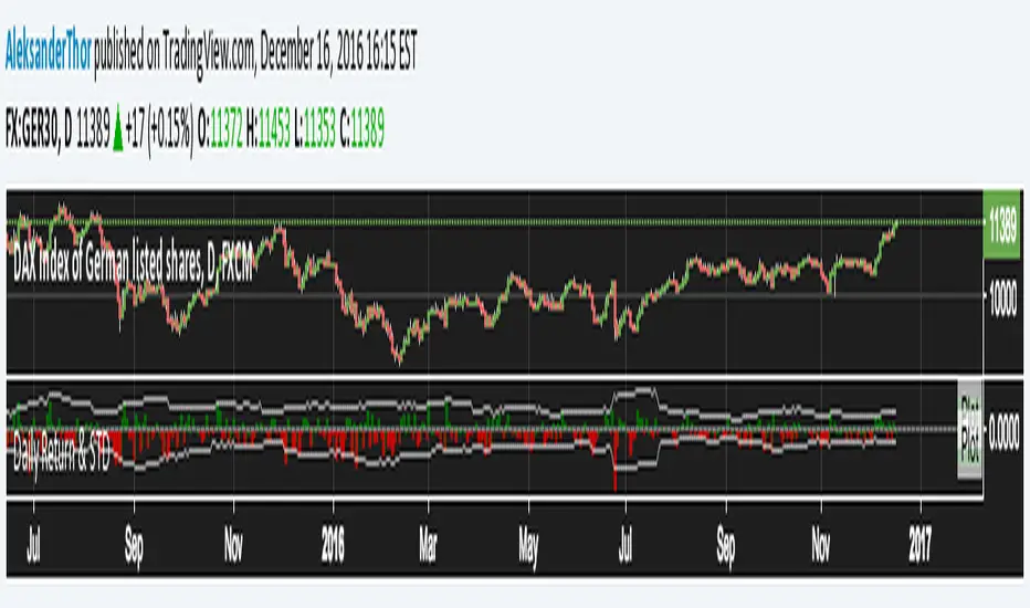
Daily Returns & STDWhat happened last time when xx increased by xx%? - Start collecting some stats!
You can choose the ticker and the timeframe you're interested in
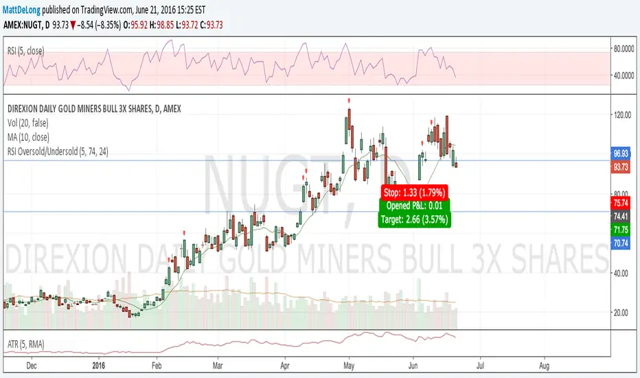
RSI Oversold/UndersoldThe study script will place GREEN BUY arrows BELOW oversold conditions and RED SHORT arrows ABOVE overbought conditions. You can configure the period
Most RSI(14) indicators use a 14-period, I prefer a 5-period. The period, overbought and oversold periods are settings that can easily be changed by adding this study to your chart and clicking the "gear" icon next to the study inside your chart.

Daily SMAThis pine script on intraday chart is exactly the same SMA as built-in MovingAverage on a 1Day chart (with the same lengths)


bitcoin Multi-Timeframe Trend Analysis Toolbitcoin Multi-Timeframe Trend Analysis Tool: A Comprehensive Guide for Market Cycle Identification
Introduction
The Multi-Timeframe Trend Analysis Tool is a sophisticated technical indicator designed to help traders identify critical market phases across different time horizons. This tool synthesizes multiple established technical analysis concepts into a unified framework, specifically optimized for high-volatility markets such as cryptocurrencies and alternative coins (altcoins). By integrating trend-following, momentum, and mean-reversion principles, it provides visual cues for strategic entry and exit points throughout market cycles.
Core Philosophy and Integration Rationale
The indicator's design philosophy centers on the principle that different market phases require different analytical approaches. Rather than relying on a single indicator, which often produces false signals during complex market conditions, this tool combines multiple technical components that complement each other's strengths and compensate for individual weaknesses.
The integration follows a logical hierarchy:
Trend Identification through multiple EMA periods establishes the market's primary direction
Momentum Confirmation via multiple MACD configurations validates trend strength and potential reversals
Multi-timeframe Alignment ensures signals are significant across both short-term and long-term perspectives
This layered approach reduces the likelihood of whipsaws and increases the statistical significance of generated signals.
Component Synergy and Operational Mechanics
1. EMA System: The Trend Foundation
The tool employs six Exponential Moving Averages organized into two groups:
Long-term EMA Group (200, 300, 700 periods):
The 200-period EMA serves as the primary trend baseline
The 300-period EMA provides confirmation of the longer-term direction
The 700-period EMA represents the "macro trend" and helps identify major cycle shifts
Medium-term EMA Group (18, 36, 63 periods):
These shorter EMAs capture intermediate trend dynamics
The relationship between these EMAs helps identify acceleration or deceleration in trend momentum
The EMA system works by comparing relationships between different period lengths. For instance, when shorter EMAs are positioned below longer EMAs, it confirms a bearish trend structure, while the opposite configuration suggests bullish momentum.
2. Multi-Period MACD System: Momentum and Divergence Detection
The tool implements three separate MACD configurations, each serving a distinct purpose:
Bottom MACD (168/364/6 periods):
Designed to capture long-term momentum shifts at potential market bottoms
The extended periods (168 and 364) filter out short-term noise while highlighting significant trend changes
Particularly effective at identifying oversold conditions during prolonged downtrends
Top MACD (108/234/9 periods):
Optimized for detecting momentum deterioration at potential market tops
The period selection is based on historical analysis of bull market cycles
Helps identify when bullish momentum is weakening before price action clearly reverses
Local Top MACD (9/36/9 periods):
Functions as an early warning system for short-term corrections
Particularly useful for swing traders and risk management
Can help identify profit-taking opportunities during ongoing trends
The three MACDs operate independently but collectively provide a comprehensive view of momentum across different time horizons. When multiple MACDs simultaneously show confirming signals, the reliability of the indication increases significantly.
3. Signal Generation Logic: Conditional Framework
Signals are generated only when multiple conditions align across different components:
Accumulation Zone Conditions:
Requires both trend alignment (200 EMA below 300 EMA) AND either:
Price trading at a significant discount to the 200 EMA (suggesting oversold conditions), OR
The 200 EMA itself declining sharply (confirming bearish momentum exhaustion)
This dual requirement prevents false accumulation signals during healthy downtrends
Strong Buy Zone Conditions:
Includes all accumulation zone requirements PLUS:
Sharp decline in the 36-period EMA (suggesting panic or capitulation)
Accelerated decline in the 200 EMA (confirming bearish exhaustion)
This represents a higher-conviction signal with multiple confirming factors
Potential Bull Market Top Conditions:
Requires the 700 EMA to be rising sharply (confirming extended bullish trend) AND
Top MACD showing bearish divergence (momentum weakening) AND
Short-term EMA alignment still bullish (indicating the top is forming amid strength)
This combination helps distinguish between minor corrections and major trend reversals
Local Top Warning Conditions:
Triggered when the 700 EMA shows accelerated gains (potential euphoria phase) AND
The Local Top MACD shows bearish momentum divergence
Serves as a risk management tool rather than a direct reversal signal
Practical Application and Usage Guidelines
For Long-Term Investors:
Monitor for "Accumulation Zone" signals during market downturns
Consider initiating or adding to positions during "Strong Buy Zone" signals
Use these signals for dollar-cost averaging strategies rather than timing exact bottoms
Hold through intermediate fluctuations unless "Potential Bull Market Top" signals appear
For Trend Traders:
Use EMA alignments to confirm trend direction before entering positions
Employ "Local Top Warnings" to secure profits on portions of positions
Watch for alignment between medium-term EMA direction and MACD signals for entry timing
Consider "Potential Bull Market Top" signals as reasons to reduce exposure or implement hedging strategies
For Risk Managers:
Use "Local Top Warnings" to tighten stop-losses or reduce position sizes
Monitor the relationship between price and the 200 EMA for overall market health assessment
Track multiple timeframes to distinguish between normal volatility and potential trend changes
Originality and Distinctive Features
This tool represents a novel synthesis of existing technical concepts rather than a completely new indicator. Its originality stems from:
Purpose-Specific MACD Configurations: Unlike standard MACD implementations, each of the three MACDs is optimized for a specific market condition, with period lengths derived from empirical analysis of market cycles.
Multi-Layered Confirmation Framework: Signals require alignment across trend, momentum, and rate-of-change dimensions, reducing false positives common in single-indicator systems.
Progressive Signal Hierarchy: The tool distinguishes between initial warning signals ("Local Top Warnings") and higher-conviction reversal signals ("Potential Bull Market Tops"), allowing for graduated responses.
Combination of Absolute and Relative Conditions: The logic incorporates both absolute price relationships (price vs. EMA levels) and rate-of-change metrics (EMA acceleration/deceleration), capturing both state and momentum information.
Limitations and Considerations
Lagging Nature: Like all trend-following indicators, this tool reacts to established conditions rather than predicting future movements. Early trend phases may not generate signals.
Parameter Sensitivity: The default parameters are optimized for daily cryptocurrency charts. Performance may vary across different asset classes or timeframes.
Complementary Analysis Required: This tool should be used alongside fundamental analysis, volume confirmation, and market structure considerations.
No Guarantee of Performance: Past success in identifying market phases does not ensure future accuracy. All trading involves risk, and no indicator provides certainty.
Conclusion
The Multi-Timeframe Trend Analysis Tool provides a structured approach to identifying significant market phases by integrating trend, momentum, and mean-reversion concepts across multiple time horizons. Its value lies not in predicting exact turning points but in identifying zones of increasing probability for trend changes, allowing traders to adjust their strategies accordingly. When used as part of a comprehensive trading plan with proper risk management, it can help traders navigate complex market environments with greater clarity and discipline.
The tool is particularly suited to the extended trends and pronounced cycles characteristic of cryptocurrency markets, though its principles apply across various financial instruments. As with all technical tools, its effectiveness increases with user understanding of both its mechanisms and its limitations.

Bitcoin Macro Trend IndicatorBitcoin Macro Trend Indicator: A Multi-Timeframe Confirmation System for Strategic Positioning
Introduction
The Bitcoin Macro Trend Indicator is a comprehensive technical analysis tool designed for cryptocurrency traders and investors seeking to navigate Bitcoin's volatile cycles. It integrates multiple exponential moving averages (EMAs) and MACD variations into a unified system that identifies long-term accumulation zones, bull market tops, and strategic re-entry points. This document outlines the logical foundation of this integration, explains the synergistic operation of its components, and provides practical guidance for its application.
Rationale for Multi-Indicator Integration
Bitcoin's market behavior exhibits distinct cyclical patterns characterized by extended accumulation periods, parabolic advances, and sharp corrections. Single indicators often generate false signals during volatile conditions. This system employs a layered confirmation approach where:
Ultra-long-term EMAs establish the primary trend context
Medium-term EMA crossovers identify trend transitions
Multiple MACD configurations detect momentum shifts across different time horizons
This multi-timeframe methodology reduces noise and increases signal reliability by requiring convergence across independent but complementary technical elements.
Component Synergy and Operational Mechanism
1. EMA Framework: The Trend Foundation
700-period EMA: Serves as the primary trend baseline. Prices below this line suggest long-term undervaluation (accumulation territory), while sustained positions above indicate established bull markets.
18/63-period EMA Pair: Functions as the core trend transition system. The golden cross (18 above 63) confirms bullish momentum, while the death cross signals potential trend exhaustion.
12/52-period EMA Pair: Specialized for identifying renewed momentum after corrections within ongoing trends, reducing premature re-entry during false recoveries.
12-period EMA (Auxiliary): Provides early warning of short-term trend deterioration that may precede larger corrections.
2. MACD Ensemble: Momentum Verification
Bottom MACD (168/364/6): With exceptionally slow parameters, this configuration filters out short-term noise to identify genuine long-term momentum shifts characteristic of market bottoms.
Top MACD (63/133/1): Optimized for detecting momentum divergence at potential market tops, where traditional MACD settings often lag.
Local Top Warning MACD (30/65/4): Balanced to capture intermediate-term momentum deterioration that frequently precedes significant pullbacks.
Early Bull MACD (9/19/6): Sensitive to initial momentum surges following accumulation periods, providing early confirmation of trend initiation.
3. Signal Hierarchy and Progressive Confirmation
The indicator employs a cascading confirmation logic:
Stage 1 (Accumulation): Requires both long-term MACD improvement AND price position below the 700-period EMA. Strong accumulation signals add Early Bull MACD confirmation.
Stage 2 (Warning): Local top warnings activate only when multiple conditions align: medium-term trend remains bullish, ultra-long-term trend confirms strength, AND specialized MACDs show momentum deterioration.
Stage 3 (Re-entry): Requires both EMA crossover confirmation AND momentum recovery in the warning MACD, reducing false continuation signals.
Stage 4 (Top Confirmation): The most stringent criteria, demanding convergence across long-term, medium-term, and momentum indicators before signaling major trend reversal.
Practical Application and Interpretation
Signal Classification System
Accumulation Zones (Green): Areas where long-term indicators suggest undervaluation. These represent strategic buying opportunities for patient investors.
Strong Accumulation Signals (Dark Green): Enhanced accumulation zones with additional momentum confirmation, suggesting higher-probability entry points.
Local Top Warnings (Orange/Red): Progressive warnings of increasing risk, with red zones indicating conditions historically associated with more severe corrections.
Re-entry Opportunities (Blue): Post-correction zones where momentum recovery aligns with trend resumption signals.
Bull Market Termination (Purple): Signals suggesting completion of major advance cycles, prompting defensive positioning.
Top Confirmation (Dark Red): High-confidence reversal signals with multi-timeframe confirmation.
Usage Guidelines
Timeframe Recommendation: Designed primarily for daily and weekly charts where macroeconomic trends are most evident.
Position Sizing: Accumulation signals support gradual position building, while warning signals suggest reducing exposure rather than immediate liquidation.
Corroboration: Although self-contained, the indicator performs best when combined with volume analysis and fundamental considerations.
Historical Validation: Users should review signal performance across multiple market cycles to understand characteristic behaviors.
Limitations and Considerations
No technical indicator predicts market movements with absolute certainty. This tool provides probabilistic assessments based on historical patterns.
Extraordinary market events or fundamental shifts may override technical signals.
The indicator's parameters, while optimized for Bitcoin's historical behavior, may require adjustment for unprecedented market conditions.
Signals should be interpreted in context of overall market structure and trader/investor time horizon.
Originality and Differentiation
This system represents a novel synthesis of established technical concepts through:
Parameter Optimization: Specific EMA and MACD periods calibrated to Bitcoin's characteristic volatility and cycle duration.
Conditional Layering: Unlike single-criterion systems, signals require convergence across independent technical dimensions.
Progressive Warning System: Multi-stage alerts that distinguish between routine corrections and potential trend reversals.
Macro-Micro Integration: Simultaneous analysis of ultra-long-term trends and short-term momentum shifts.
Empirical Foundation
The indicator's design incorporates observations from Bitcoin's market behavior since 2010, particularly:
The tendency for major bottoms to form during extended periods below long-term moving averages
Characteristic momentum patterns preceding significant tops
The predictive value of specific EMA relationships during different market phases
Historical performance of multi-timeframe confirmation versus single indicators
Conclusion
The Bitcoin Macro Trend Indicator provides a structured framework for identifying high-probability turning points in Bitcoin's market cycles. By integrating multiple technical perspectives into a confirmation hierarchy, it reduces reaction to market noise while maintaining sensitivity to genuine trend changes. Users should employ this tool as part of a comprehensive trading plan that includes risk management protocols and consideration of external market factors. The system's greatest utility emerges when understood not as a predictive oracle but as a systematic method for identifying favorable risk-reward scenarios based on multi-timeframe technical convergence.

Professional Clean BTC ChartInstitutional Price Structure is a clean, price-focused charting tool designed to provide traders with a clear and distraction-free view of market structure, trend context, and key reference levels.
The indicator replaces default candles with neutral grayscale price bars to reduce visual noise and improve readability during high-volatility conditions. Trend direction is defined using a fast and slow exponential moving average, offering immediate context without lag-heavy complexity.
A session-based VWAP is included as a core institutional benchmark, allowing traders to quickly assess mean reversion, premium/discount zones, and intraday bias. Daily high and low levels are plotted automatically to highlight key liquidity boundaries and reaction zones commonly respected by professional participants.
This tool is intentionally minimalist—free of oscillators and signals—to support discretionary decision-making, execution precision, and price-action-based strategies across intraday and swing timeframes.

Fear Greed RangesFear Greed Ranges Indicator: A Practical Guide to Market Sentiment Analysis
Introduction: Understanding Market Psychology
The "Fear Greed Ranges" indicator is a specialized technical analysis tool designed to visualize market sentiment through the lens of the Relative Strength Index (RSI). Unlike traditional RSI displays that show only a line graph, this indicator transforms raw RSI data into intuitive, color-coded zones that immediately signal whether markets are driven by fear, greed, or balanced sentiment. By providing this visual context, it helps traders identify potential turning points and manage risk more effectively.
Rational Integration: Why RSI Forms the Core
The indicator's foundation rests on the well-established RSI oscillator, chosen for several compelling reasons. First, RSI has stood the test of time since its development by J. Welles Wilder Jr. in 1978, with decades of empirical validation across various asset classes. Second, its mathematical construction—comparing the magnitude of recent gains to recent losses—directly measures momentum, which often precedes price reversals at extremes. Third, RSI's bounded nature (0-100 range) makes it ideal for creating clearly defined zones without subjective interpretation.
The integration transforms this numerical oscillator into a spatial visualization system. Rather than simply reading RSI values, traders can immediately perceive market conditions through color psychology: red triggers caution, green suggests opportunity, and yellow indicates neutrality. This multi-sensory approach reduces cognitive load during fast-moving markets and helps overcome confirmation bias that might occur when interpreting raw numbers.
Component Synergy: How the System Works Together
The indicator comprises three interconnected layers that create a unified analytical framework:
Core Calculation Layer: The traditional RSI calculation processes price data using the specified period length (default 14 periods). This generates the fundamental sentiment metric that drives all subsequent visualizations. The RSI calculation serves as the "brain" of the indicator, continuously analyzing market momentum.
Sentiment Classification Layer: This layer applies threshold logic to categorize each RSI reading into one of three emotional states. Readings above 70 are classified as "Greed" (market potentially overbought), below 30 as "Fear" (market potentially oversold), and between 30-70 as "Neutral" (balanced market conditions). These thresholds are based on the conventional RSI interpretation framework that has been widely adopted in technical analysis.
Visual Translation Layer: The most innovative aspect transforms numerical classifications into immediate visual cues. The colored ribbon area creates a "sentiment atmosphere" around price action, while the background tint provides subtle contextual framing. Horizontal reference lines at 30, 50, and 70 offer precise anchoring points, and the floating label provides real-time status updates. These elements work in concert: the ribbon shows sentiment intensity, the background provides persistent context, and the reference lines offer precise measurement points.
Practical Application: How to Use the Indicator Effectively
For optimal results, traders should incorporate this tool into a comprehensive analysis framework:
Initial Setup: Apply the indicator to any financial chart (stocks, forex, cryptocurrencies, etc.) using the default 14-period setting for general purposes. For shorter timeframes, consider reducing the period to 10; for longer-term analysis, increase to 20-25 periods.
Signal Interpretation:
When the ribbon turns red and the background tints crimson, exercise caution with new long positions and consider profit-taking on existing holdings.
Green zones may indicate accumulation opportunities, particularly if accompanied by bullish divergence (price making lower lows while RSI makes higher lows).
Yellow areas suggest normal market fluctuation where trend-following strategies may be more appropriate than reversal anticipation.
Confirmation Protocol: Always wait for additional confirmation before acting on extreme readings. For greed zone signals, look for bearish candlestick patterns, resistance at key price levels, or decreasing volume. For fear zone signals, watch for bullish reversal patterns, support levels holding, or increasing volume on down moves.
Timeframe Harmony: Analyze multiple timeframes simultaneously. A greed signal on a daily chart carries more weight than one on a 15-minute chart. Look for alignment across timeframes for higher-probability setups.
Alert Utilization: Enable the built-in alert system to receive notifications when sentiment zones change, ensuring you never miss potential opportunities or risk scenarios.
Original Contribution: What Sets This Indicator Apart
While RSI indicators are ubiquitous, the "Fear Greed Ranges" implementation offers several distinctive advantages:
Cognitive Efficiency: By converting numerical data into immediate visual perception, the indicator reduces the mental processing required to assess market conditions. Traders can glance at a chart and instantly understand the sentiment landscape without calculating or interpreting raw values.
Contextual Persistence: The colored background maintains a subtle but constant reminder of the prevailing sentiment, preventing the common pitfall of overlooking extreme conditions that might develop gradually.
Dual-Layer Communication: The system operates on both conscious (reference lines, labels) and subconscious (color psychology) levels, engaging multiple cognitive pathways for more reliable signal recognition.
Integrated Risk Framework: By explicitly naming emotional extremes ("Fear" and "Greed"), the indicator constantly reminds traders of the psychological forces driving markets, encouraging more disciplined decision-making.
Important Considerations and Limitations
No technical indicator guarantees future performance, and this tool should form only one component of a comprehensive trading strategy. Several critical factors require attention:
Market Context Matters: During strong trending markets, RSI can remain in extreme zones for extended periods without immediate reversal. In such conditions, the indicator signals strength rather than imminent reversal.
Volatility Adjustments: Highly volatile instruments may generate frequent zone changes that could lead to overtrading if not filtered appropriately.
Complementary Tools: This indicator works best when combined with price action analysis, volume studies, support/resistance levels, and fundamental factors where applicable.
Personal Adaptation: Traders should backtest the indicator on their preferred markets and timeframes to understand its characteristics before live implementation, potentially adjusting the RSI period or zone thresholds to match specific instrument behaviors.
The "Fear Greed Ranges" indicator serves as a visual translator of market psychology, converting mathematical momentum readings into intuitive emotional landscapes. By making RSI interpretation more immediate and accessible, it helps traders maintain objectivity during emotionally charged market conditions and supports more disciplined execution of their trading strategies. Remember that successful trading involves risk management, continuous learning, and adapting tools to your individual approach—this indicator provides one lens through which to view the markets, not a complete trading system in itself.

ZLT - Date and Time MarkerPine Script v5 indicator called “DateTime Marker” that overlays on the chart and marks bars whose timestamp matches a user-defined schedule. When a bar “matches,” it can draw:
a vertical line through the bar,
a label with a time/date string, and
a triangle marker below the bar (always plotted on matches).
What you can configure
Marker Type (the matching rule)
You choose one of five modes:
Every Minute
Inputs: everyNMinutes (default 15), minuteOffset (default 0)
Match condition: minute % everyNMinutes == minuteOffset
Example with defaults: marks bars at :00, :15, :30, :45 each hour.
Hourly
Inputs: everyNHours (default 4), hourlyMinute (default 0)
Match condition: hour % everyNHours == 0 AND minute == hourlyMinute
Example with defaults: marks bars at 00:00, 04:00, 08:00, 12:00, 16:00, 20:00 (at minute 00).
Daily Time
Inputs: dailyHour (default 10), dailyMinute (default 0)
Match condition: hour == dailyHour AND minute == dailyMinute
Example with defaults: marks 10:00 every day.
Weekly Day & Time
Inputs: weekDay (default Tuesday), weeklyHour (default 16), weeklyMinute (default 0)
It converts the weekday name to Pine’s dayofweek number via getDayNumber().
Match condition: dayofweek == targetDay AND hour == weeklyHour AND minute == weeklyMinute
Example with defaults: marks Tuesday 16:00.
Monthly Date & Time
Inputs: monthlyDay (default 2), monthlyHour (default 23), monthlyMinute (default 0)
Match condition: dayofmonth == monthlyDay AND hour == monthlyHour AND minute == monthlyMinute
Example with defaults: marks the 2nd day of each month at 23:00.
Visual settings
showLine: whether to draw the vertical line.
lineStyle: Solid/Dashed/Dotted (mapped to Pine line styles by getLineStyle()).
lineColor, lineWidth: styling for the line (width is rounded to an integer because Pine line width is integer).
showLabel: whether to draw a label.
labelColor: background color of the label (text is forced white).
What happens when a bar matches
When isMatch becomes true on a bar:
Vertical line: line.new() at that bar’s bar_index, from low to high, extended extend.both (so it spans the full chart vertically).
Label: label.new() at the bar’s high, with mode-specific text:
Minute/Hourly/Daily: "HH:mm"
Weekly: "Tuesday HH:mm" (or whatever day selected)
Monthly: "Day 2 - HH:mm" (or chosen day)
Triangle marker: plotshape() draws a triangle up below the bar on every match (this happens regardless of showLine / showLabel).
Important practical implications
This uses the bar’s exchange/chart time (TradingView’s time, hour, minute, etc.), so results depend on the symbol/session and chart timezone settings.
On timeframes coarser than 1 minute, “Every Minute” still checks only the bar’s timestamp minute value; it won’t mark intra-bar minutes that don’t exist as separate bars.
Because it can create many objects (lines/labels), it sets max_labels_count=500. Lines are not capped here, so very dense marking can still clutter the chart.
If you tell me your intended use (e.g., “mark NY open,” “mark every 15m candle close,” “mark macro events weekly”), I can point out whether the current matching logic fits that precisely or needs adjustments (sessions, timezones, avoiding duplicates, limiting lines, etc.).

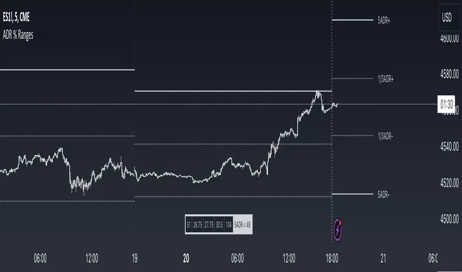
ADR % RangesThis indicator is designed to visually represent percentage lines from the open of the day. The % amount is determined by X amount of the last days to create an average...or Average Daily Range (ADR).
1. ADR Percentage Lines: The core function of the script is to apply lines to the chart that represent specific percentage changes from the daily open. It first calculates the average over X amount of days and then displays two lines that are 1/3rd of that average. One line goes above the other line goes below. The other two lines are the full "range" of the average. These lines can act as boundaries or targets to know how an asset has moved recently. *Past performance is not indicative of current or future results.
The calculation for ADR is:
Step 1. Calculate Today's Range = DailyHigh - DailyLow
Step 2. Store this average after the day has completed
Step 3. Sum all day's ranges
Step 4. Divide by total number of days
Step 5. Draw on chart
2. Customizable Inputs: Users have the flexibility to customize the script through various inputs. This includes the option to display lines only for the current trading day (`todayonly`), and to select which lines are displayed. The user can also opt to show a table the displays the total range of previous days and the average range of those previous days.
3. No Secondary Timeframe: The ADR is computed based on whatever timeframe the chart is and does not reference secondary periods. Therefore the script cannot be used on charts greater than daily.
This script is can be used by all traders for any market. The trader might have to adjust the "X" number of days back to compute a historical average. Maybe they only want to know the average over the past week (5 days) or maybe the past month (20 days).
Humble Student OB/OS Trifecta indicatorAfter reading Cam Hui's blog post about his "Trifecta" bottom spotting model I thought I'd try my hand at scripting it as an indicator. The results are pretty close to what he describes. Though the data TradingView feeds me doesn't seem to be identical to what he's using on StockCharts.com the results are close enough that I will call the effort a success worth publishing.

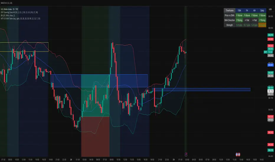
MTF 20 SMA Table - DXY**MTF 20 SMA Table - Multi-Timeframe Trend Analysis Dashboard**
**Overview:**
This indicator provides a comprehensive multi-timeframe analysis dashboard that displays the relationship between price and the 20-period Simple Moving Average (SMA) across four key timeframes: 15-minute, 1-hour, 4-hour, and Daily. It's designed to help traders quickly identify trend alignment and potential trading opportunities across multiple timeframes at a glance. It's definitely not perfect but has helped me speed up my backtesting efforts as it's worked well for me eliminating flipping back and forth between timeframes excpet when I have confluence on the table, then I check the HTF.
**How It Works:**
The indicator creates a table overlay on your chart showing three critical metrics for each timeframe:
1. **Price vs SMA (Row 1):** Shows whether price is currently above (bullish) or below (bearish) the 20 SMA
- Green = Price Above SMA
- Red = Price Below SMA
2. **SMA Direction (Row 2):** Indicates the trend direction of the SMA itself over a lookback period
- Green (↗ Rising) = Uptrend
- Red (↘ Falling) = Downtrend
- Gray (→ Flat) = Ranging/Consolidation
3. **Strength (Row 3):** Displays the distance between current price and the SMA in pips
- Purple background = Strong move (>50 pips away)
- Orange background = Moderate move (20-50 pips)
- Gray background = Weak/consolidating (<20 pips)
- Text color: Green for positive distance, Red for negative
**Key Features:**
- **Customizable Table Position:** Place the table anywhere on your chart (9 position options)
- **Adjustable SMA Lengths:** Modify the SMA period for each timeframe independently (default: 20)
- **Direction Lookback Settings:** Fine-tune how far back the indicator looks to determine SMA direction for each timeframe
- **Flat Threshold:** Set the pip threshold for determining when an SMA is "flat" vs trending (default: 5 pips)
- **DXY Optimized:** Calculations are calibrated for the US Dollar Index (1 pip = 0.01)
**Best Use Cases:**
1. **Trend Alignment:** Identify when multiple timeframes align in the same direction for higher probability trades
2. **Divergence Spotting:** Detect when lower timeframes diverge from higher timeframes (potential reversals)
3. **Entry Timing:** Use lower timeframe signals while higher timeframes confirm overall trend
4. **Strength Assessment:** Gauge how extended price is from the mean (SMA) to avoid overextended entries
**Settings Guide:**
- **SMA Settings Group:** Adjust the SMA period for each timeframe (15M, 1H, 4H, Daily)
- **SMA Direction Group:** Control lookback periods to determine trend direction
- 15M: Default 5 candles
- 1H: Default 10 candles
- 4H: Default 15 candles
- Daily: Default 20 candles
- **Flat Threshold:** Set sensitivity for "flat" detection (lower = more sensitive to ranging markets)
**Trading Strategy Examples:**
1. **Trend Following:** Look for all timeframes showing the same direction (all green or all red)
2. **Pullback Trading:** When Daily/4H are green but 15M/1H show red, wait for lower timeframes to flip green for entry
3. **Ranging Markets:** When multiple SMAs show "flat", consider range-bound strategies
**Important Notes:**
- This is a reference tool only, not a standalone trading system
- Always use proper risk management and combine with other analysis methods
- Best suited for trending instruments like indices and major forex pairs
- Calculations are optimized for DXY but can be used on other instruments (pip calculations may need adjustment)
**Credits:**
Feel free to modify and improve this code! Suggestions for enhancements are welcome in the comments.
---
**Installation Instructions:**
1. Add the indicator to your TradingView chart
2. Adjust the table position via settings to avoid overlap with price action
3. Customize SMA lengths and lookback periods to match your trading style
4. Monitor the table for timeframe alignment and trend confirmation
---
This indicator is published as open source for the community to learn from and improve upon. Happy trading! 📈