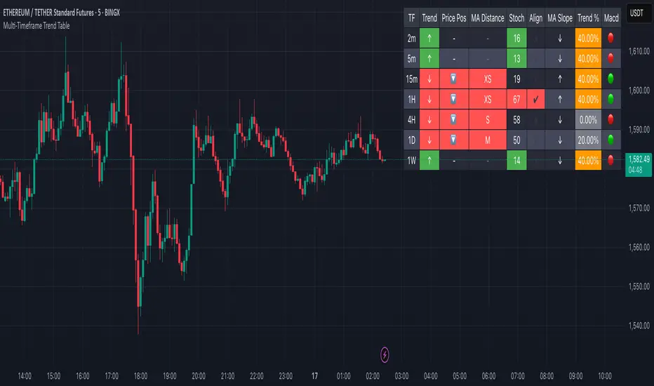
Multi-Timeframe Trend Table📊 Multi-Timeframe Trend Table
Overview
This powerful trend-tracking tool gives you a real-time snapshot of market trends across multiple timeframes — all in one compact and color-coded table. Designed for traders who want fast, clean, and multi-timeframe awareness at a glance.
⸻
✅ Features
• 7 Key Timeframes Monitored:
2min · 5min · 15min · 1h · 4h · 1d · 1w
• Trend Detection Based on EMAs
Uses a fast (default 20) and slow (default 200) EMA to determine if a timeframe is trending:
• 🟢 Uptrend: Fast EMA is above slow EMA
• 🔴 Downtrend: Slow EMA is above fast EMA
• 🟠 Sideways: EMAs are close (configurable threshold)
• Raw EMA Distance
See the actual difference between fast and slow EMAs for each timeframe — great for gauging trend strength.
• EMA Slope Analysis
A unique “Slope” column tells you the current behavior of EMAs:
• 📈 Pointing Up
• 📉 Pointing Down
• 🔄 Crossing Up/Down
• ➡️ Lateral
• Instant Alerts
Alerts fire the moment a trend flips on any timeframe, keeping you ahead of market shifts.
• Optional Chart EMAs
Toggle on/off the fast and slow EMAs on your active chart for extra clarity.
⸻
🧠 Use Case Examples
• Confirm trades with alignment across multiple timeframes
• Spot early trend reversals with crossing behavior
• Add a higher-timeframe filter to your scalping system
• Monitor key EMAs without changing your chart timeframe
⸻
⚙️ Configuration
• EMA lengths and sideways threshold are fully adjustable
• Enable/disable chart overlays for EMAs
• Table dynamically updates in real time
⸻
💡 Pro Tip: Use this indicator alongside your entry strategy to only trade in the direction of the dominant trends.
⸻
חפש סקריפטים עבור "trend"
ACCURATE TREND LEVELS - TABLE PSv6.1Accurate Trend Level Indicator
Description:
The "Accurate Trend Level" indicator is a powerful tool designed to identify market trends and potential reversals with precision. Built on the concept (foundation) of Swing Highs and Swing Lows, this indicator easily detects uptrends and downtrends, providing traders with clear signals for trend continuation or reversal. Whether you are a swing trader or a trend follower, this indicator offers customization options to suit your trading style.
Key Features:
Trend Identification: Accurately identifies uptrends and downtrends based on Swing High and Swing Low points. This indicator provides signals for Up after Down and Down after Up.
Percentage Adjustment: Includes a customizable percentage factor that reduces false signals and helps identify accurate and strong trends.
Trend Table: Displays essential data in a table, such as:
Last and running Trend Position (Uptrend/Downtrend)
Date and Time of the last and running trend change
Reversal Level (price level for the next potential trend change)
Max. Run-up feature is also provided, which shows how much the market has moved according to the trend.
How It Works:
The indicator analyzes price action using Swing Highs and Lows to determine the current trend direction. A user-defined percentage threshold filters out minor fluctuations, ensuring only significant trends are highlighted. The table provides a quick snapshot of the latest trend data, while reversal levels help traders anticipate the next move.

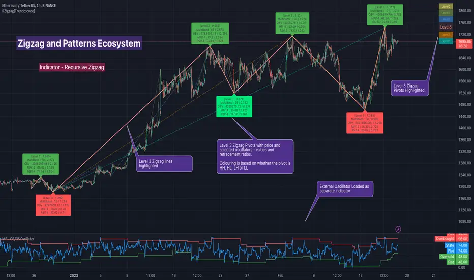
Dual Zigzag [Trendoscope®]🎲 Dual Zigzag indicator is built on recursive zigzag algorithm. It is very similar to other zigzag indicators published by us and other authors. However, the key point here is, the indicator draws zigzag on both price and any other plot based indicator on separate layouts.
Before we get into the indicator, here are some brief descriptions of the underlying concepts and key terminologies
🎯 Zigzag
Zigzag indicator breaks down price or any input series into a series of Pivot Highs and Pivot Lows alternating between each other. Zigzags though shows pivot high and lows, should not be used for buying at low and selling at high. The main application of zigzag indicator is for the visualisation of market structure and this can be used as basic building block for any pattern recognition algorithms.
🎯 Recursive Zigzag Algorithm
Recursive zigzag algorithm builds zigzag on multiple levels and each level of zigzag is based on the previous level pivots. The level zero zigzag is built on price. However, for level 1, instead of price level 0 zigzag pivots are used. Similarly for level 2, level 1 zigzag pivots are used as base.
🎲 Components Dual Zigzag Indicator
Here are the components of Dual zigzag indicator
Built in Oscillator - Indicator has built in oscillator options for plotting RSI (Relative Strength Index), MFI (Money Flow Index), cci (Commodity Channel Index) , CMO (Chande Momentum Oscillator), COG (Center of Gravity), and ROC (Rate of Change). Apart from the given built in oscillators, users can also use a custom external output as base. The oscillators are not printed on the price pane. But, printed on a separate indicator overlay.
Zigzag On Oscillator - Recursive zigzag is calculated and printed on the oscillator series. Each pivot high and pivot low also prints a label having the retracement ratios, and price levels at those points. Zigzag on the oscillator is also printed on the indicator overlay pane.
Zigzag on Price - Recursive zigzag calculated based on price and printed on the price pane. This is made possible by using force_overlay option present in the drawing objects. At each zigzag pivot levels, the label having price retracement ratios, and oscillator values are printed.
It is called dual zigzag because, the indicator calculates the zigzag on both price and oscillator series of values and prints them separately on different panes on the chart.
🎲 Indicator Settings
Settings include
Theme display settings to get the right colour combination to match the background.
Zigzag settings to be used for zigzag calculation and display
Oscillator settings to chose the oscillator to be used as base for 2nd zigzag
🎲 Applications
Useful in spotting divergences with both indicator and price having their own zigzag to highlight pivots
Spotting patterns in indicators/oscillators and correlate them with the patterns on price
🎲 Using External Input
If users want to use an external indicator such as OBV instead of the built in oscillators, then can do so by using the custom option.
Here is how this can be done.
Step1. Add both Dual Zigzag and the intended indicator (in this case OBV) on the chart. Notice that both OBV and Dual zigzag appear on different panes.
Step2. Edit the indicator settings of Dual zigzag and set custom indicator by selecting "custom" as oscillator name and then by setting the custom external indicator name and input.
Step 3. You would notice that the zigzag in Dual Zigzag indictor pane is already showing the zigzag pivots based on the OBV indicator and the price pivots display obv values at the pivot points. We can leave this as is.
Step 4. As an additional step, you can also merge the OBV pane and the Dual zigzag indicator pane into one by going into OBV settings and moving the indicator to above pane. Merge the scales so that there is no two scales on the same pane and the entire scale appear on the right.
At the end, you should see two panes - one with price and other with OBV and both having their zigzag plotted.

HTF Candles Overlay [Trendoscope®]🎲 HTF Candles Overlay is a simple indicator where you can overlay higher timeframe candles on current timeframe chart.
Most of the code is encapsulated in the library HTFCandlesLib . After publishing the library as open source, many people requested to convert that into an indicator. Based on this, we decided to publish this small code for the use of community.
🎯 Usage
The indicator is simple, it helps users visualise higher timeframe candles. We majorly use this for debugging or validating our implementations based on higher timeframe. Instead of switching back and forth to different timeframes, it helps us visualise higher timeframe candles on the same chart when we are validating the implementation that involves higher timeframe calculations.
🎯 Components
The indicator provides two types of displays
Candles - overlay candles built through lines and labels
Plot - close price of higher timeframe plotted on chart
🎯 Candles
The behaviour of the candles are similar to that of hollow candles. The color of the body and the border+wick demonstrates the movement of the candle.
Body color is lime if the HTF close is higher than HTF open. Body color is orange if the HTF close is lower than the HTF open.
Wick and border color is lime if HTF close price is higher than previous HTF close price. And they are orange if HTF close price is lower than the previous HTF close price
In most cases body color will be same as the wick color. In case of stocks and indices, it may happen that the open price is too far away from previous close price due to gaps. This can lead to close price being relatively in different direction when compared to open and previous close.
Wicks are not at the centre of the candle. Instead wicks are drawn on the current chart timeframe position where the current timeframe has reached the highest or lowest point within the given HTF candle
Candles also list OHLC price of HTF candle along with HTF bar index and the range of LTF bar index that the candle spawns
Here are some pictorial representations that can help understand better.
Here are the examples of candles with gaps where body and wick/border are in different directions (colours)
🎯 Indicator Settings
Simple settings allow users to select the timeframe, whether to display candles and plots and their specific colors.
🎯 Possible inconsistencies
The overlay can show inconsistent data in certain situations. Here are some of the scenarios where the indicator may not show consistent display of the data.
When the HTF data from request.security does not match that of combined LTF data . In such cases, HTF candles may not form inline with the current timeframe candles. This happens when there is a data issue of different OHLC data available in tradingview.
When using weekly candle as either chart timeframe or higher timeframe - end of week may not coincide with end of month or other timeframes. This can cause some inconsistencies in the visuals of the indicator.
When open and close time of either LTF or HTF falls under different day due to time zone used. - time is always the time on which the candle close. So, when we use time zone that causes the exchange day to open and close on different days, that can cause some inconsistencies in the candles being drawn.

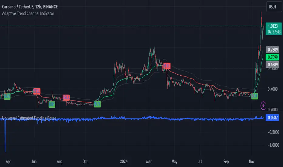
Adaptive Trend Channel IndicatorThe Adaptive Trend Channel Indicator is a trend-following tool designed to help traders identify buy and sell opportunities by analyzing price action in relation to a dynamic basis line with a customizable buffer zone. This indicator leverages an adaptive moving average to create a responsive trend line, providing insight into market direction and trend strength.
How It Works:
Dynamic Basis Calculation: Using a modified Kaufman’s Adaptive Moving Average (KAMA), the indicator calculates a basis line that adapts to price volatility. The basis line turns green during bullish trends and red during bearish trends, helping to visualize market sentiment.
Buffer Zone for Entry Signals: A buffer zone is calculated around the basis line to filter out false signals in low-volatility or sideways markets. Buy and sell signals are generated only when the price moves beyond this buffer zone, enhancing signal accuracy and reducing noise.
Non-Consecutive Signal Logic: To avoid over-trading, the indicator is programmed to prevent consecutive buy or sell signals in the same direction. This ensures that a new buy signal is only issued after a sell signal, and vice versa, for improved control in trending conditions.
Real-Time Alerts: The indicator issues real-time "Buy" and "Sell" alerts as soon as conditions are met, without waiting for the candle to close. This feature is particularly beneficial for intraday and scalping strategies, where timely entries are crucial.
How to Use:
Buy Signal: A buy signal appears when the basis line is green, and the price moves above the upper buffer zone, indicating a potential uptrend.
Sell Signal: A sell signal appears when the basis line is red, and the price falls below the lower buffer zone, signaling a potential downtrend.
The buffer zone’s sensitivity can be adjusted to adapt the indicator to different trading environments and personal risk tolerance.
Disclaimer: This indicator is designed to support your trading decisions and is best used in combination with other technical analysis tools. It is not intended as standalone financial advice.
UDC - Local TrendsUDC - Local Trends Indicator
Overview:
The UDC - Local Trends Indicator combines multiple moving averages to provide a clear visualization of both local and high timeframe (HTF) trends. This indicator helps traders make informed decisions by highlighting key moving averages and trend zones, making it easier to determine whether the current trend is likely to continue or reverse.
Features:
Local Trend Zone: Displays the range between the 13 and 34 EMAs, with an average line in the middle. This zone is plotted close to the price candles, offering a clear visual guide for the immediate trend on the timeframe you’re viewing.
Usage: Observe the strength of the local trend within this zone. Breaks from this zone may indicate potential moves toward the 200 moving averages, providing early signals for trend continuation or potential reversals.
Current Trend Indicators:
Tracks the broader trend using the 200 EMA and 200 SMA on the active timeframe. Choose a timeframe where these trend lines hold significance and use them alongside support and resistance for precise entries and exits.
Cross-Timeframe Trend Reference:
On all sub-daily timeframes, the daily 200 moving average is overlaid, ensuring this essential trend line is visible even on shorter timeframes, like 4H, where reclaims or rejections of the daily 200 can signal strong trading setups.
The weekly 50 moving average, a critical HTF trend line, is also displayed consistently, guiding higher timeframe swing trade setups.
Trading Strategy:
Local Timeframe Trading:
Monitor the 200 moving averages in your active timeframe to identify bounces or breakdowns. If the local trend zone (13-34 EMA range) is lost, expect a possible pullback to the 200 moving averages, offering a chance for re-entry or confirmation of trend reversal.
High Timeframe Trading (HTF):
For swing trades, observe the daily 200 and weekly 50 moving averages. Reclaiming these lines often triggers long setups, while losing them may signal further downside until they’re regained.
This indicator offers a powerful combination of localized trend tracking and high timeframe support, enabling traders to align their entries with both immediate and overarching market

Oscillator Scatterplot Analysis [Trendoscope®]In this indicator, we demonstrate how to plot oscillator behavior of oversold-overbought against price movements in the form of scatterplots and perform analysis. Scatterplots are drawn on a graph containing x and y-axis, where x represent one measure whereas y represents another. We use the library Graph to collect the data and plot it as scatterplot.
Pictorial explanation of components is defined in the chart below.
🎲 This indicator performs following tasks
Calculate and plot oscillator
Identify oversold and overbought areas based on various methods
Measure the price and bar movement from overbought to oversold and vice versa and plot them on the chart.
In our example,
The x-axis represents price movement. The plots found on the right side of the graph has positive price movements, whereas the plots found on the left side of the graph has negative price movements.
The y-axis represents the number of bars it took for reaching overbought to oversold and/or oversold to overbought. Positive bars mean we are measuring oversold to overbought, whereas negative bars are a measure of overbought to oversold.
🎲 Graph is divided into 4 equal quadrants
Quadrant 1 is the top right portion of the graph. Plots in this quadrant represent the instances where positive price movement is observed when the oscillator moved from oversold to overbought
Quadrant 2 is the top left portion of the graph. Plots in this quadrant represent the instances where negative price movement is observed when the oscillator moved from oversold to overbought.
Quadrant 3 is the bottom left portion of the chart. Plots in this quadrant represent the instances where negative price movement is observed when the oscillator moved from overbought to oversold.
Quadrant 4 is the bottom right portion of the chart. Plots in this quadrant represent the instances where positive price movement is observed when the oscillator moved from overbought to oversold.
🎲 Indicator components in Detail
Let's dive deep into the indicator.
🎯 Oscillator Selection
Select the Oscillator and define the overbought oversold conditions through input settings
Indicator - Oscillator base used for performing analysis
Length - Loopback length on which the oscillator is calculated
OB/OS Method - We use Bollinger Bands, Keltener Channel and Donchian channel to calculate dynamic overbought and oversold levels instead of static 80-10. This is also useful as other type of indicators may not be within 0-100 range.
Length and Multiplier are used for the bands for calculating Overbought/Oversold boundaries.
🎯 Define Graph Properties
Select different graph properties from the input settings that will instruct how to display the scatterplot.
Type - this can be either scatterplot or heatmap. Scatterplot will display plots with specific transparency to indicate the data, whereas heatmap will display background with different transparencies.
Plot Color - this is the color in which the scatterplot or heatmap is drawn
Plot Size - applicable mainly for scatterplot. Since the character we use for scatterplot is very tiny, the large at present looks optimal. But, based on the user's screen size, we may need to select different sizes so that it will render properly.
Rows and Columns - Number of rows and columns allocated per quadrant. This means, the total size of the chart is 2X rows and 2X columns. Data sets are divided into buckets based on the number of available rows and columns. Hence, changing this can change the appearance of the overall chart, even though they are representing the same data. Also, please note that tables can have max 10000 cells. If we increase the rows and columns by too much, we may get runtime errors.
Outliers - this is used to exclude the extreme data. 20% outlier means, the chart will ignore bottom 20% and top 20% when defining the chart boundaries. However, the extreme data is still added to the boundaries.

EMA Trend Arrows Indicator### EMA Trend Arrows Indicator
**Description:**
The "EMA Trend Arrows Indicator" is designed to help traders identify bullish and bearish trends based on the Exponential Moving Average (EMA). This indicator plots arrows and lines on the chart, signaling potential trend changes, making it easier for users to spot entry and exit points in their trades.
**Indicator Features:**
1. **EMA Calculation:**
- The indicator calculates the Exponential Moving Average (EMA) over a user-defined period (`Length`).
- The default length is set to 50 periods but can be adjusted to suit different trading strategies.
2. **Trend Detection:**
- The indicator detects bullish trends when the EMA is falling for a specified duration (`Trend Duration`) and then starts rising.
- Conversely, it detects bearish trends when the EMA is rising for a specified duration and then starts falling.
- The default trend duration is set to 20 periods.
3. **Visual Signals:**
- **Bullish Signal:** When a bullish trend is detected, the indicator plots a blue upward arrow (▲) above the bar where the trend change is identified.
- **Bearish Signal:** When a bearish trend is detected, the indicator plots a red downward arrow (▼) below the bar where the trend change is identified.
- Additionally, lines are drawn to indicate the strength and duration of the trends. Blue lines represent bullish trends, while red lines represent bearish trends.
4. **Average True Range (ATR):**
- The indicator utilizes the Average True Range (ATR) to determine the placement of the lines and arrows, ensuring they are appropriately scaled to the price movements.
5. **EMA Plotting:**
- The EMA line is plotted on the chart in a grey color, allowing users to visualize the moving average alongside the trend signals.
6. **Chart Clarity:**
- To maintain a clear and uncluttered chart, the indicator automatically deletes past trend direction signals once a new trend is detected. This ensures that only the most relevant and current trend signals are displayed.
**User Inputs:**
- `Length`: Defines the period for EMA calculation. Default is 50.
- `Trend Duration`: Sets the duration to consider for trend changes. Default is 20.
- `Bullish`: Sets the color for bullish signals. Default is blue (#2962ff).
- `Bearish`: Sets the color for bearish signals. Default is red (#f23645).
- `MA`: Sets the color for the EMA line. Default is grey (#787b86).
**How to Use:**
- Add the "EMA Trend Arrows Indicator" to your chart.
- Configure the `Length` and `Trend Duration` based on your trading strategy.
- Observe the chart for blue upward arrows indicating potential buy signals and red downward arrows indicating potential sell signals.
- Use the plotted EMA line to gauge the overall market trend and make more informed trading decisions.
**Benefits:**
- Simplifies trend detection by providing clear visual signals.
- Helps traders identify potential entry and exit points.
- Customizable settings to fit various trading strategies.
- Maintains a clean chart by automatically removing outdated trend direction signals.
**Example:**
When applied to a daily chart, the indicator can help identify major trend reversals, providing traders with timely buy and sell signals. For instance, a blue arrow appearing after a period of EMA decline signals a potential buying opportunity as the trend shifts to bullish.
Add this indicator to your TradingView chart today to enhance your trend analysis and improve your trading performance.
Best regards Chervolino

Super Trend and RSI Strategy### Super Trend and RSI Strategy: A Brief Overview
The Super Trend and RSI (Relative Strength Index) strategy is a popular trading approach that combines the trend-following capabilities of the Super Trend indicator with the momentum analysis of the RSI. This hybrid strategy aims to provide traders with reliable entry and exit signals by confirming trends and identifying potential reversals.
#### Super Trend Indicator
The Super Trend indicator is a trend-following tool that signals the current market direction. It is calculated using the Average True Range (ATR) to identify volatility and price movement. The indicator plots lines above or below the price, signaling bullish (green) or bearish (red) trends:
- **Buy Signal**: When the price crosses above the Super Trend line and the line turns green.
- **Sell Signal**: When the price crosses below the Super Trend line and the line turns red.
#### Relative Strength Index (RSI)
The RSI is a momentum oscillator that measures the speed and change of price movements on a scale from 0 to 100. It helps identify overbought or oversold conditions:
- **Overbought Condition**: RSI value above 70, suggesting the asset may be overvalued and a correction could be imminent.
- **Oversold Condition**: RSI value below 30, suggesting the asset may be undervalued and a rebound could be imminent.
#### Strategy Implementation
1. **Trend Confirmation with Super Trend**:
- Enter a long position (buy) when the Super Trend turns green and the price closes above it.
- Enter a short position (sell) when the Super Trend turns red and the price closes below it.
2. **Momentum Confirmation with RSI**:
- For long positions, ensure the RSI is not in the overbought zone (preferably below 70).
- For short positions, ensure the RSI is not in the oversold zone (preferably above 30).
3. **Entry Signals**:
- **Buy Signal**: Super Trend turns green, price closes above the Super Trend line, and RSI is below 70.
- **Sell Signal**: Super Trend turns red, price closes below the Super Trend line, and RSI is above 30.
4. **Exit Signals**:
- Close long positions when the Super Trend turns red or the RSI enters the overbought zone.
- Close short positions when the Super Trend turns green or the RSI enters the oversold zone.
#### Advantages and Considerations
- **Advantages**:
- Combines trend-following and momentum analysis for more robust signals.
- Helps filter out false signals by requiring confirmation from both indicators.
- **Considerations**:
- Like all trading strategies, it is not foolproof and can generate false signals.
- Best used in conjunction with other analysis techniques and proper risk management.
- Performance can vary across different market conditions and timeframes.
The Super Trend and RSI strategy is a versatile tool that can enhance trading decisions by providing clearer entry and exit points, helping traders capture significant market moves while avoiding potential pitfalls of relying on a single indicator.

RMB - Trend AnalysisRMB - Trend Analysis Indicator
Overview:
The "RMB - Trend Analysis" indicator is a powerful tool designed for traders who need a quick and clear visual representation of the trend direction across multiple timeframes. This indicator simplifies the process of trend analysis by displaying trend direction symbols on the chart, allowing traders to make informed decisions. This indicator is usable for all instruments.
Key Features:
Multi-Timeframe Analysis: Provides trend direction for weekly, daily, 4-hour, 2-hour, 1-hour, 30-minute, and 15-minute timeframes.
Trend Direction Symbols: Utilizes intuitive arrow symbols to indicate the trend direction. An upward arrow (↑) signifies an uptrend, while a downward arrow (↓) indicates a downtrend.
Color-Coded Trends: Arrows are color-coded for enhanced visibility and quick interpretation. Green arrows represent uptrends, and red arrows denote downtrends.
Dynamic Updates: The indicator updates the trend symbols in real-time as new price data becomes available, ensuring traders are always informed of the latest trend changes.
Customizable and User-Friendly: Designed with user experience in mind, the indicator is easy to add to any chart and integrates seamlessly with TradingView's interface.
Usage:
This indicator is particularly useful for traders who employ multi-timeframe analysis in their trading strategy. By providing a snapshot of trend directions across different timeframes, it helps in identifying potential entry and exit points, confirming trend continuations, or spotting trend reversals. Whether you are a day trader, swing trader, or long-term investor, the "RMB - Trend Analysis" indicator can be a valuable addition to your trading toolkit.
How it Works:
The indicator calculates the trend direction based on a Simple Moving Average (SMA) over 14 periods. It then displays this information as arrow symbols on the chart, with each symbol corresponding to a specific timeframe. The position and color of these arrows provide an at-a-glance view of the current trend status across various timeframes, aiding in comprehensive market analysis.

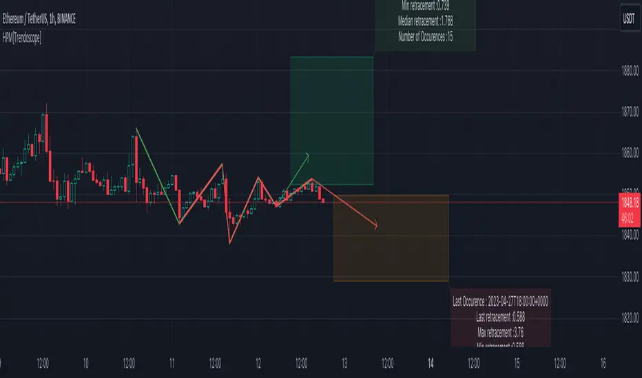
Historical Pattern Matcher [Trendoscope]Do you believe in patterns and think price movements are more likely to follow historical patterns? If yes, this is an indicator for you.
🎲 Concept
The patterns in this script are not a named or known pattern. But, it can be any pattern that happen to repeat again and again over a period of time.
The indicator collects the following information over a period of time.
Collects all possible patterns for specified number of pivots based on relation between each pivot prices. (Default 6)
Keeps track of all the possible patterns for the given pivots and number of occurrences of such patterns over a period of time.
Collects the movement of next pivot (in terms of retracement ratio) after the pattern has formed for each occurrence.
Keeps track of the last occurrence of each pattern collected
And the indicator presents on chart following information
Current Pattern drawing based on last confirmed pivot.
Current Pattern drawing based on current unconfirmed pivot in the opposite direction.
Projection range based on historical retracement ratio for both patterns
Detailed info on last occurrence and overall occurrences.
Last occurrence of both confirmed and unconfirmed pivot patterns.
Please note that, if the patterns have not been repeated over a period, then it will not be shown on the screen. Hence, it is perfectly normal to not see any projection. This can happen when the current pattern has not been repeated any time before.
🎲 Details
When you load the indicator on the chart, you may see the following patterns and projections.
You may also notice, in the pattern details, information about the last occurrence of the pattern. If you scroll on your chart to the left to the given data and time, you can observe how the past occurrence of the pattern has formed and the price movement past that point.
For example, last occurrence of pattern based on confirmed pivot happened on 02-Jun-2023 00:00 UTC time
And last occurrence of pattern based on unconfirmed pivot happened on 27-Apr-2023 22:00 UTC time
🎲 Settings
Settings are minimal, and here is the meaning of them.
Most important setting here is the number of pivots forming the pattern.
🎲 Caution
The indicator is designed to present the projection based on historical occurrences of similar price pattern. This does not necessarily mean the patterns are supposed to be bullish or bearish. But, it will certainly give users an idea of what happened when similar price action presented historically.
Note to developers This script makes use of new pine script feature - maps
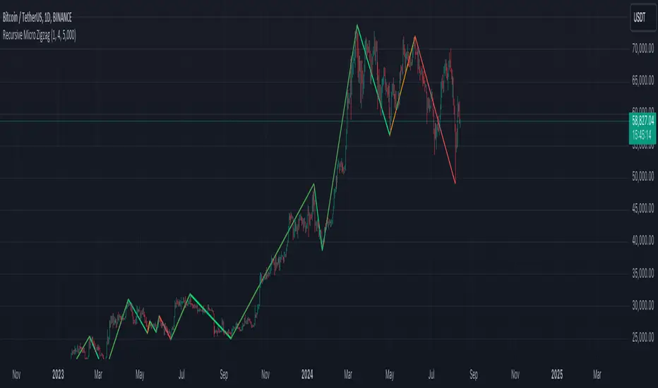
Recursive Micro Zigzag🎲 Overview
Zigzag is basic building block for any pattern recognition algorithm. This indicator is a research-oriented tool that combines the concepts of Micro Zigzag and Recursive Zigzag to facilitate a comprehensive analysis of price patterns. This indicator focuses on deriving zigzag on multiple levels in more efficient and enhanced manner in order to support enhanced pattern recognition.
The Recursive Micro Zigzag Indicator utilises the Micro Zigzag as the foundation and applies the Recursive Zigzag technique to derive higher-level zigzags. By integrating these techniques, this indicator enables researchers to analyse price patterns at multiple levels and gain a deeper understanding of market behaviour.
🎲 Concept:
Micro Zigzag Base : The indicator utilises the Micro Zigzag concept to capture detailed price movements within each candle. It allows for the visualisation of the sequential price action within the candle, aiding in pattern recognition at a micro level.
Basic implementation of micro zigzag can be found in this link - Micro-Zigzag
Recursive Zigzag Expansion : Building upon the Micro Zigzag base, the indicator applies the Recursive Zigzag concept to derive higher-level zigzags. Through recursive analysis of the Micro Zigzag's pivots, the indicator uncovers intricate patterns and trends that may not be evident in single-level zigzags.
Earlier implementations of recursive zigzag can be found here:
Recursive Zigzag
Recursive Zigzag - Trendoscope
And the libraries
rZigzag
ZigzagMethods
The major differences in this implementation are
Micro Zigzag Base - Earlier implementation made use of standard zigzag as base whereas this implementation uses Micro Zigzag as base
Not cap on Pivot depth - Earlier implementation was limited by the depth of level 0 zigzag. In this implementation, we are trying to build the recursive algorithm progressively so that there is no cap on the depth of level 0 zigzag. But, if we go for higher levels, there is chance of program timing out due to pine limitations.
These algorithms are useful in automatically spotting patterns on the chart including Harmonic Patterns, Chart Patterns, Elliot Waves and many more.
Custom Trend Indicator with Reversal ArrowsThe Custom Trend Indicator with Reversal Arrows is a user-friendly script designed to help traders identify trends and trend reversals on the TradingView platform. This indicator analyzes price action and generates trend lines based on user-defined rules for uptrends, downtrends, and no-trend conditions. Additionally, it highlights trend reversal points with arrows for easy identification.
Features:
Customizable Line Offset Multiplier: Allows users to set the distance between the trend line and the candlesticks. This makes the trend lines more visually discernible.
Trend Identification:
Uptrend: The indicator plots a green line when the current high, low, and close are greater than the previous high, low, and close, respectively.
Downtrend: The indicator plots a red line when the current high, low, and close are less than the previous high, low, and close, respectively.
No Trend: The indicator plots a black line when neither an uptrend nor a downtrend is identified.
Trend Reversal Arrows: The script displays green arrows pointing upwards for bullish trend reversals and red arrows pointing downwards for bearish trend reversals.
To use this indicator, simply copy and paste the provided Pine Script into the Pine editor on TradingView, and add the indicator to your chart. This powerful and customizable tool will enhance your ability to identify trends and capitalize on trend reversals in your trading strategy.
Please note that this indicator is intended for educational purposes only and should not be considered as financial advice. Always perform your own due diligence and consult with a financial professional before making any trading decisions.

Recursive Reversal Chart Patterns [Trendoscope]Caution: This algorithm is very heavy and bound to cause timeouts. If that happens, there are few settings you can change to reduce the load. (Will explain them in the description below)
🎲 Recursive Reversal Chart Patterns Indicator
Welcome to another exploration of Zigzag and Pattern ecosystem components. Previously we derived Pitchfork and Recursive Zigzag indicators. This indicator is designed to scan and highlight few popular "Reversal Chart Patterns". Similar to other indicators in the ecosystem, this too is built on recursive zigzags.
Double Taps
Triple Taps
Cup and Handles
Head and Shoulders
Indicator however names the patterns separately for bullish and bearish formations. So, the actual names you see on the screen are
Double Top
Double Bottom
Triple Top
Triple Bottom
Cup and Handle
Inverted Cup and Handle
Head and Shoulders
Inverse Head and Shoulders
Here is a snapshot on how each category of patterns look on the chart.
🎲 Architecture
Many of you may be cursing me for publishing too many libraries. But, these are all preparations for something big. Like other indicators in the Zigzag and Patterns Ecosystem, this too uses a bunch of libraries.
🎯Major direct dependencies
ZigzagTypes
ZigzagMethods
ReversalChartPatternLibrary
🎯Indirect dependencies
DrawingTypes
DrawingMethods
🎯Minor dependencies
Utils
TradeTracker
🎲 Indicator Settings
🎯Generic and Zigzag Settings.
Note: In case of timeout, please decrease the value of depth parameter
🎯Pattern Selection
Having all the patterns selected on chart may also cause timeouts and will make the chart look messy. It is better to limit one or two patterns on the chart to have clear picture.
🎯Scanner Settings
🎯Indicators.
These are options to use indicators as secondary confirmation to calculate divergence. If selected, the patterns are shown only if the divergence data is inline. Option also available to plugin external indicator. These calculations are not straightforward and not easy to measure by manual inspection. This feature at present is purely experimental.
Have a go and let me know how you feel :)

Session Filter [Trendoscope]🎲 Session Filter: A Customisable Trading Indicator for Defining Preferred Trade Sessions
Session Filter is a simple trading indicator that enables traders to define their preferred trading sessions and optimise their approach based on individual preferences. By providing a range of flexible customisation options, Session Filter can help traders reduce risk, increase accuracy, by helping them to adhere to their trading sessions. Features include
🎯 Customisable Trading Sessions
One of the key features of Session Filter is the ability to select from four different trading sessions. These sessions are designed to be flexible, making it easy to tailor your approach to specific markets, assets, and trading styles. By selecting the sessions that are most relevant to your strategy, you can reduce the risk of making trades during less favourable market conditions.
For example, if you prefer to trade during the Asian session, you can set the session times to "Asian Session" in input settings. This will highlight the specific times when the Asian markets are open, allowing you to focus your trading activity during these periods. By doing so, you can avoid trading during times when the market is less active or more volatile.
🎯 Customisable Timezone and Days of the Week:
In addition to customisable trading sessions, Session Filter also allows users to select a timezone and specific days of the week. This ensures that the displayed trading zones and signals are aligned with your local time, and that you can tailor your approach to your preferred schedule. This is particularly useful for traders who have other commitments, or who prefer to focus on specific markets or assets on certain days.
For example, if you are based in New York and prefer to trade during the European session, you can select the "European Session" option in Session Filter and adjust the timezone to reflect your local time. You can also select specific days of the week when you prefer to trade during the European session, such as Tuesday through Thursday. This allows you to optimize your approach based on your personal preferences and schedule.
🎯 Easy Visual Interpretation:
Session Filter uses green and red overlays on the chart to indicate the trading zones, making it easy for users to visually identify their trading sessions
For example, when a green overlay is displayed on the chart, this indicates that the market is within the selected trading session and that it may be a good time to start trade. Conversely, when a red overlay is displayed, this indicates that the market is outside of the selected trading session and that it may be a good time close all trading. By providing this visual feedback, Session Filter helps traders stay focused and disciplined, and avoid making impulsive trading decisions.
🎯Force Exit Signal for Risk Management:
Session Filter also offers the ability to generate a force exit signal when not in any of the selected sessions. This can be used in conjunction with alerts to exit all trades outsize session zone.
For example, if you are using Session Filter to trade during the European session, but the market is particularly volatile during a specific day, the force exit signal will be generated to indicate that it may be a good time to exit your trade. This helps you avoid potential losses and stay disciplined during periods of market turbulence.
🎯External Signal Plots:
In addition to the chart overlays, Session Filter also plots signals on the data window that can be used as external inputs in other indicators and strategies. This feature allows traders to incorporate the signals generated by Session Filter into their existing trading systems and this can be used as additional filters on an existing strategy or methodology.
🎯Alerts using Alert Conditions
Alerts are provided for start and end of session so that users can make use of it to set auto turn on or off their bots.
Settings are pretty simple and are explained here.

Recursive Zigzag [Trendoscope]Here is an another outcome of Object Oriented Zigzag and Pattern Ecosystem of Libraries.
We already have another implementation of recursive zigzag which makes use of earlier library rzigzag . Here in this example, we make use of similar logic but leverage the new type and method based Zigzag system libraries to derive the indicator.
🎲 Design Overview
Similar to Recursive Auto Pitchfork, here too the indicator code is around 50 lines. Whereas most of the heavy lifting is done by the libraries.
🎲 Base Libraries
Base libraries are those which does not have any dependency. They form basic structures which are later used in other libraries. These libraries need to be crafted carefully so that minimal updates are done later on. Any updates on these libraries will impact all the dependent libraries and scripts.
🎯 Drawing
DrawingTypes - Defines basic drawing types Point, Line, Label, Box, Linefill and related property types.
DrawingMethods - All the methods or functionality surrounding Basic types are defined here.
🎲 Layer 1 Libraries
These are the libraries which has direct dependency on base libraries.
🎯 Zigzag
ZigzagTypes - Types required for defining Zigzag and Divergence
ZigzagMethods - Methods associated with Zigzag Type definitions.
🎲Indicator
Indicator draws zigzags based on given length. And then recursively derives next level zigzags based on previous levels. As per the utility, indicator is useful in several ways
Visualising price structure based on zigzag pivots - which in turn can help visualise patterns.
Ability to add any oscillator makes it easy to spot divergences with choice of indicators.
Programmers can use the derived values to build complex algorithms such as automatic pattern recognition.
🎯 Settings
Settings are explained via tooltips. These are very much straight forward and directly related to zigzag, oscillators and divergence.
Recursive Auto-Pitchfork [Trendoscope]"Say Hi" to object oriented programming with Pinescript using types and methods. This is the beginning of new era of Pinescript where we are moving from isolated scripts containing indicator and strategies to whole ecosystem of Object Oriented Programming with libraries of highly reusable components. Those who are familiar with programming would have already realised how big these improvements are and what it brings to the table.
With this script, I am not just providing an indicator for traders but also an introduction for programmers on how to design and build object oriented components in Pinescript using types and methods. Big thanks to Tradingview and Pine development team for making this happen. We look forward for many such gifts in the future :)
🎲 Architecture
As mentioned before, we are not just building an indicator here. But, an ecosystem of components. Using Types and Methods we can visualise libraries as Classes. Thus, we can build an ecosystem of libraries in layered approach to enhance effective code reusability.
Generic architecture can be visualised as below
Coming to the specific case of Auto Pitchfork indicator, the indicator code is less than 50 lines for logic and around 100 lines of inputs. But, most of the heavy-lifting is done by the libraries underneath. Here is a snapshot of related libraries and how they are connected.
All libraries are divided into two portions.
Types - Contains only type definitions
Methods - Contains only method definitions related to the types defined in the Types library
Together, these libraries can be visualised as Class. Methods are defined in such a way all exported methods are related to Types and no other functions or features are defined. If we need further functionality which does not depend on the types, we need to do this via some other library and use them here. Similarly, we should not define any methods related to these types in other libraries.
Reason for splitting the libraries to types and methods is to enable updating methods without disturbing types. Since libraries create interdependencies due to versioning, it is best if we do less updates on the type definitions. Splitting the two enables adding more features while keeping the type definition version intact.
🎲 Base Libraries
Base libraries are those which does not have any dependency. They form basic structures which are later used in other libraries. These libraries need to be crafted carefully so that minimal updates are done later on. Any updates on these libraries will impact all the dependent libraries and scripts.
🎯 Drawing
DrawingTypes - Defines basic drawing types Point, Line, Label, Box, Linefill and related property types.
DrawingMethods - All the methods or functionality surrounding Basic types are defined here.
🎲 Layer 1 Libraries
These are the libraries which has direct dependency on base libraries.
🎯 Zigzag
ZigzagTypes - Types required for defining Zigzag and Divergence
ZigzagMethods - Methods associated with Zigzag Type definitions.
🎯Pitchfork
PitchforkTypes - Basic and Drawing Types for Pitchfork objects
PitchforkMethods - Methods associated with Pitchfork type definitions
🎲 Indicator and Settings
Indicator draws pitchfork based on recursive zigzag configurations. Recursive zigzag is derived with following logic:
Base level zigzag is calculated with regular zigzag algorithm with given length and depth
Next level zigzag is calculated based on base zigzag. And we recursively calculate higher level zigzags until we are left with 4 or less pivots or when no further reduction is possible
On every level of zigzag, we then check the last 3 pivots and draw pitchfork based on the retracement ratio.
Indicator settings are summarised in the tooltips and are as below.
Finally, big thanks to my partner @CryptoArch_ for bringing up the topic of pitchfork for our next development.
RSI Impact Heat Map [Trendoscope]Here is a simple tool to measure and display outcome of certain RSI event over heat map.
🎲 Process
🎯Event
Event can be either Crossover or Crossunder of RSI on certain value.
🎯Measuring Impact
Impact of the event after N number of bars is measured in terms of highest and lowest displacement from the last close price. Impact can be collected as either number of times of ATR or percentage of price. Impact for each trigger is recorded separately and stored in array of custom type.
🎯Plotting Heat Map
Heat map is displayed using pine tables. Users can select heat map size - which can vary from 10 to 90. Selecting optimal size is important in order to get right interpretation of data. Having higher number of cells can give more granular data. But, chart may not fit into the window. Having lower size means, stats are combined together to get less granular data which may not give right picture of the results. Default value for size is 50 - meaning data is displayed in 51X51 cells.
Range of the heat map is adjusted automatically based on min and max value of the displacement. In order to filter out or merge extreme values, range is calculated based on certain percentile of the values. This will avoid displaying lots of empty cells which can obscure the actual impact.
🎲 Settings
Settings allow users to define their event, impact duration and reference, and few display related properties. The description of these parameters are as below:
🎲 Use Cases
In this script, we have taken RSI as an example to measure impact. But, we can do this for any event. This can be price crossing over/under upper/lower bollinger bands, moving average crossovers or even complex entry or exit conditions. Overall, we can use this to plot and evaluate our trade criteria.
🎲 Interpretation
Q1 - If more coloured dots appear on the top right corner of the table, then the event is considered to trigger high volatility and high risk environment.
Q2 - If more coloured dots appear on the top left corner, then the events are considered to trigger bearish environment.
Q3 - If more coloured dots appear on the bottom left corner of the chart, then the events are considered insignificant as they neither generate higher displacement in positive or negative side. You can further alter outlier percentage to reduce the bracket and hence have higher distribution move towards
Q4 - If more coloured dots appear on the bottom right corner, then the events are considered to trigger bullish environment.
Will also look forward to implement this as library so that any conditions or events can be plugged into it.

Harmonic Patterns Based SupertrendExtending the earlier implemented concept of Harmonic-Patterns-Based-Trend-Follower , in this script, lets make it work as supertrend so that it is more easier to operate.
🎲 Process
🎯 Derive Zigzag and scan harmonic patterns for last 5 confirmed pivots
🎯 If a pattern is found, bullish and bearish zones are calculated based on parameter Base
🎯 These bullish and bearish zones act as supertrend based on current trade in progress.
🎯 When in bullish mode, bearish zone will only go up irrespective of new pattern forming new low. Similarly when in bearish mode, bullish zones will only come down - this is done to imitate the standard supertrend behaviour.
🎲 Note
Patterns are not created on latest pivot as last pivot will be unconfirmed and moving. Due to this, patterns appear after certain delay - patterns will not be real time. But, this is expected and does not impact the overall process.
Here are few chart captures to demonstrate how it works.
🎲 Settings
Settings are explained in the screenshot below.

Channel Based Zigzag [HeWhoMustNotBeNamed]🎲 Concept
Zigzag is built based on the price and number of offset bars. But, in this experiment, we build zigzag based on different bands such as Bollinger Band, Keltner Channel and Donchian Channel. The process is simple:
🎯 Derive bands based on input parameters
🎯 High of a bar is considered as pivot high only if the high price is above or equal to upper band.
🎯 Similarly low of a bar is considered as pivot low only if low price is below or equal to lower band.
🎯 Adding the pivot high/low follows same logic as that of regular zigzag where pivot high is always followed by pivot low and vice versa.
🎯 If the new pivot added is of same direction as that of last pivot, then both pivots are compared with each other and only the extreme one is kept. (Highest in case of pivot high and lowest in case of pivot low)
🎯 If a bar has both pivot high and pivot low - pivot with same direction as previous pivot is added to the list first before adding the pivot with opposite direction.
🎲 Use Cases
Can be used for pattern recognition algorithms instead of standard zigzag. This will help derive patterns which are relative to bands and channels.
Example: John Bollinger explains how to manually scan double tap using Bollinger Bands in this video: www.youtube.com This modified zigzag base can be used to achieve the same using algorithmic means.
🎲 Settings
Few simple configurations which will let you select the band properties. Notice that there is no zigzag length here. All the calculations depend on the bands.
With bands display, indicator looks something like this
Note that pivots do not always represent highest/lowest prices. They represent highest/lowest price relative to bands.
As mentioned many times, application of zigzag is not for buying at lower price and selling at higher price. It is mainly used for pattern recognition either manually or via algorithms. Lets build new Harmonic, Chart patterns, Trend Lines using the new zigzag?

Next Pivot Projection [Trendoscope]Still experimental. Extending further on the divergence backtest results - in this script we try to project next 2 pivots (including one unconfirmed pivot)
🎲 Previous experiments
1. Divergence-Backtester
2. Divergence-Backtester-V2
🎲 Additions
Apart from collecting the stats on number of occurrences of HH, HL, LH, LL - this script also keeps track of average ratio for each levels and average bars.
Based on these data, we try to calculate the next pivot projections including possible bar and price.
Cloud covering the candles indicate historical levels of average HH, HL, LH, LL projections.
Hover on projection labels to find more details in tooltips.
🎲 Overall method in a nutshell
🎲 Going bit deeper
🎯 Unconfirmed Pivot and its projection - Last pivot of the zigzag is always unconfirmed. Meaning, it can potentially repaint based on further price movements. But, projection of the unconfirmed pivot will not change as it will be based on previous two pivots - both of which are confirmed.
🎯 Next Pivot Projection - Next pivot is projected based on last two pivots - which include last unconfirmed pivot. Hence, these projections can potentially repaint based on the last pivot repaint.
🎯 Historical projections displayed as cloud - Historical projection values are displayed as cloud around pivots.
A cloud above represents area from average lower high range to average higher high range. Cloud color is green if average ratio of pivot high is more than 1. Red Otherwise.
A cloud below represents area from average higher low range to average lower low range. Cloud color is red if average ratio of pivot high is more than 1. Green otherwise

ALMA TrendlineThis is a simple indicator to make ALMA Trendline to be used as STOP LOSS guidance in trending market. The trendline will change color from GREEN to RED and vice versa once price crossing down or crossing up the trendline.

Crypto Volume/Strength ComparatorHello Traders,
Here is an attempt to perform comparative analysis between top cryptos based on strength (oscillator) and volume. Methodology used here is similar to Magic Number formula described in the post : Enhanced Magic Formula for fundamental analysis . But, instead of using fundamentals, we are making use of few technicals to derive similar outcome. Usage of the available stats will not be same as Magic number since we are using technicals.
⬜ Process
▶ Get crypto exchange based on prefix of instrument being used.
▶ For the given exchange, get data for all the tickers available in input fields.
▶ Calculate Oscillator, Momentum based on price for each tickers.
▶ Calculate Oscillator, Momentum based on volume for each tickers.
▶ Calculate Volatility for each tickers.
▶ Rank Price-Oscillator, Price-Momentum, Volume-Oscillator, Volume-Momentum, Volatility for each tickers.
▶ Calculate combined rank by adding up individual ranks.
▶ Calculate movement of rankings from bar to bar
▶ Sort tickers based on rank and populate them on table. Display direction of rankings.
⬜ Components
Display components are as follows:
⬜ Settings
Settings are pretty simple and straightforward
⬜ Calculations
▶ Oscillators : High values of oscillators are considered as ideal as the process is intended towards finding trend.
▶ Momentum : Momentum is calculated on the basis of Squeeze Momentum Indicator by @LazyBear.
▶ Volatility : Volatility is calculated on the basis of Williams Vix Fix by @ChrisMoody. Here too since we are in trend following mode, lower vix fix is considered ideal.
⬜ Few Notes
Tickers will show data only if selected exchange has them. Some tickers are not available in all exchanges. In that case, it will show NAN. This is kind of unavoidable as we need to have fixed size arrays for any calculations.
Indicator works only on crypto tickers which has valid exchange.
Tickers move through the rankings in real time. Background of all stats are based on gradient from green to red.
Tickers on top may not always have better long opportunity or tickers at bottom may not always be optimal for shorting. We need to consider how long the instrument may stay in the position or how fast it is moving in opposite direction. Hence, directions of the ranking movement are also shown on the table.
