🔥 QUANT MOMENTUM SKORQUANT MOMENTUM SCORE – Description (EN)
Summary: This indicator fuses Price ROC, RSI, MACD, Trend Strength (ADX+EMA) and Volume into a single 0-100 “Momentum Score.” Guide bands (50/60/70/80) and ready-to-use alert conditions are included.
How it works
Price Momentum (ROC): Rate of change normalized to 0-100.
RSI Momentum: RSI treated as a momentum proxy and mapped to 0-100.
MACD Momentum: MACD histogram normalized to capture acceleration.
Trend Strength: ADX is direction-aware (DI+ vs DI–) and blended with EMA state (above/below) to form a combined trend score.
Volume Momentum: Volume relative to its moving average (ratio-based).
Weighting: All five components are weighted, auto-normalized, and summed into the final 0-100 score.
Visuals & Alerts: Score line with 50/60/70/80 guides; threshold-cross alerts for High/Strong/Ultra-Strong regimes.
Inputs, weights and thresholds are configurable; total weights are normalized automatically.
How to use
Timeframes: Works on any timeframe—lower TFs react faster; higher TFs reduce noise.
Reading the score:
<50: Weak momentum
50-60: Transition
60-70: Moderate-Strong (potential acceleration)
≥70: Strong, ≥80: Ultra Strong
Practical tip: Use it as a filter, not a stand-alone signal. Combine score breakouts with market structure/trend context (e.g., pullback-then-re-acceleration) to improve selectivity.
Disclaimer: This is not financial advice; past performance does not guarantee future results.
ווליום

5x Relative Volume vs 30-Day AverageRelative Volume.
If today's volume is more than average of last 30 days volume by 5x.

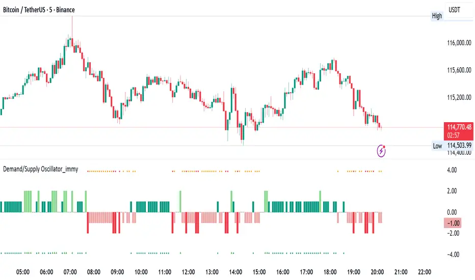
Demand/Supply Oscillator_immyDemand/Supply Oscillator, probably the only D/S oscillator on TV which doesn't draw the lines on the chart but to show you the actual reasons behind the price moves.
Concept Overview
A demand/supply oscillator would aim to look for the hidden spots/order which institutes place in small quantities to not to upset the trend and suddenly place one big order to liquidate the retailers and make a final big move.
The lite color candles in histogram shows the hidden demand/supply which is the reason behind the sudden price pullback, even for short period of time.
Measure demand and supply based on volume, price movement, or candle structure
Identify price waves or impulses (e.g., using fractals, zigzag, or swing high/low logic)
Detect hidden demand/supply (e.g., low volume pullbacks or absorption zones)
Plotted on histogram boxes to visualize strength and direction of each wave
What “Hidden Demand” Means?
Hidden demand refers to buying pressure that isn’t immediately obvious from price action — in other words, buyers are active “behind the scenes” even though the price doesn’t yet show strong upward movement.
What Hidden supply Means?
refers to selling pressure that isn’t obvious yet on the price chart. It means smart money (big players) are quietly selling or distributing positions, even though the price might not be dropping sharply yet.
It usually appears when:
The price is pulling back slightly (down candle),
But volume or an oscillator (like RSI, MACD, or OBV) shows bullish strength (e.g., higher low or positive divergence).
That suggests smart money is accumulating (buying quietly) while the public may think it’s just a normal dip.
💹 Price Reaction — Up or Down?
If there is hidden demand, it’s generally a bullish signal → meaning price is likely to go up afterward.
However, on that exact candle, the price may still be down or neutral, because:
Hidden demand is “hidden” — buyers are absorbing supply quietly.
The move up usually comes after the hidden demand signal, not necessarily on the same candle.
📊 Example
Suppose:
Price makes a slightly lower low,
But RSI makes a higher low → this is bullish (hidden) divergence, or “hidden demand.”
➡️ Interpretation:
Smart buyers are stepping in → next few candles likely move up.
The current candle might still be red or show a small body — that’s okay. The key is the shift in underlying strength.
🧭 Quick Summary
Term Meaning Candle Effect Expected Move After
Hidden Demand Buyers active below surface Candle may still go down or stay flat
Hidden Supply Sellers active behind the scenes Price likely to rise soon
🛠️ Key Components
Best results with Price/Action e.g. Use swing high/low or zigzag to segment price into waves.
Optionally apply fractal logic for more refined wave detection
Combine with other indicators (e.g., RSI, OBV) for confirmation
Include zone strength metrics (e.g., “Power Number” as seen in some indicators)
Demand/Supply Calculation
Demand: Strong bullish candles, increasing volume, breakout zones
Supply: Strong bearish candles, volume spikes on down moves
Hidden Demand/Supply: Pullbacks with low volume or absorption candles
Histogram Visualization
Use plot() or plotshape() to draw histogram bars
Color-code bars: e.g., green for demand, red for supply, lite colors for hidden zones
Add alerts for wave transitions or hidden zone detection
How It Works
Demand/Supply: Detected when price moves strongly with volume spikes.
Hidden Zones: Detected when price moves but volume is low (potential absorption).
Histogram Values:
+2: Strong Demand
+1: Hidden Demand
-1: Hidden Supply
-2: Strong Supply
0: Neutral
Feature Demand (Visible) Hidden Demand
Visibility Clearly seen on price charts Subtle, often masked in consolidation
Participants Retail + Institutional Primarily Institutional
Price Behavior Sharp rallies from zone Sideways movement, low volatility
Tools to Identify Candlestick patterns, support zones Volume profile, order flow, price clusters
Risk/Reward Moderate (widely known) High (less crowded, early entry potential)
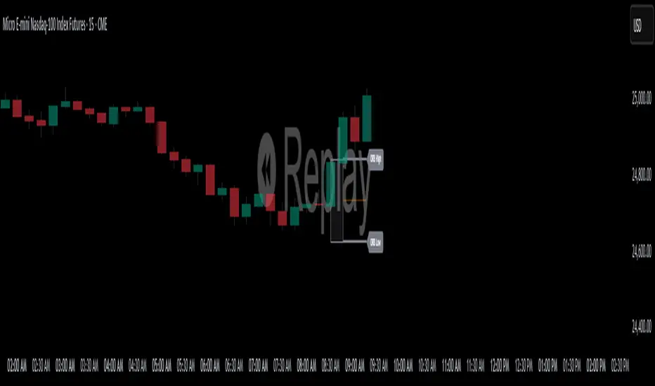
ORB High/LowOpening Range High/Low (ORB) Indicator
This indicator plots the Opening Range High and Low (ORB) for a user-defined time window on your chart. It helps traders identify the initial price range after market open, which is commonly used for breakout and trend strategies.
Key Features:
Custom OR Window: Set your own start and end time for the Opening Range. Default is 08:30–08:45 CST.
ORB High/Low Lines: Automatically plots the high and low of the opening range.
Sticky Labels: “ORB High” and “ORB Low” labels follow the lines across the chart for easy visibility.
Shaded Box: Highlights the opening range area with customizable color and opacity.
Custom Colors: Separate colors for lines, shading, and labels, allowing for full chart customization.
Stop Time: Optionally stop plotting OR lines after a specific time.
Daily Reset: Automatically resets at the start of a new day, preventing carryover from the previous session.
Usage:
Identify breakout levels: watch for price to break above ORB High or below ORB Low.
Gauge early market volatility and momentum.
Combine with other technical tools for trend confirmation or intraday strategies.
Ideal For: Intraday and day traders who rely on the first 15 minutes of the trading session to identify key levels and potential breakout points.
eFkolos Tech IndicatorMachine learning-enhanced SuperTrend indicator that uses k-means clustering to adaptively optimize SuperTrend parameters based on historical performance. Let me break down what makes this unique:
Key Innovation
Instead of using a single fixed SuperTrend factor, this indicator:
Calculates multiple SuperTrends simultaneously (with factors from 1 to 5 by default, stepped at 0.5)
Tracks performance of each variant using exponential smoothing
Clusters them into 3 groups (Best/Average/Worst) using k-means algorithm
Adapts by selecting the average factor from your chosen cluster
Clever Technical Aspects
Performance Metric: Uses a smart approach where performance = EMA of (price_change × signal_direction), giving positive values when the SuperTrend correctly predicts direction.
K-means Implementation: Properly initializes centroids using quartiles and iterates until convergence - this is solid unsupervised learning.
Adaptive MA Layer: The perf_ama that adapts faster when the performance index is high (more confidence) and slower when low.
Memory Management: Uses UDTs (User Defined Types) efficiently with arrays to handle multiple SuperTrend instances.
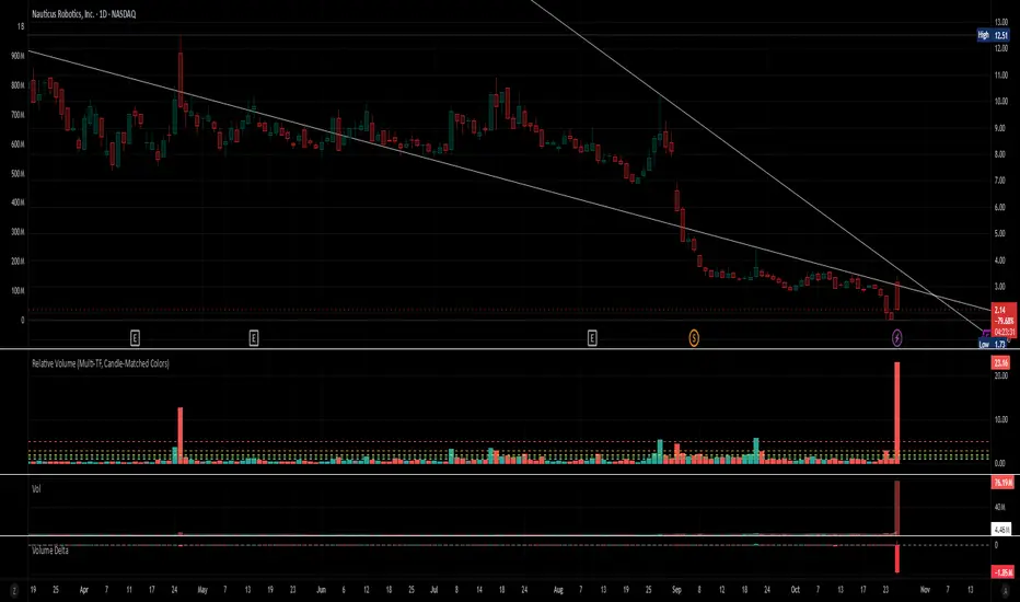
Relative Volume (Multi-TF, D, W, M)Relative Volume (Multi-TF, Candle-Matched Colors)
This indicator measures Relative Volume (RVOL) — the ratio of current volume to average historical volume — across any higher timeframe (Daily, Weekly, or Monthly) and displays it as color-coded columns that match the candle colors of the chart you’re viewing.
RVOL reveals how active today’s market participation is compared to its typical rhythm.
RVOL = 1.0 → normal volume
>1.5 → rising interest
>2.0–3.0 → strong institutional participation
>5.0 → climax or exhaustion levels
Features
Works on any chart timeframe while computing RVOL from your chosen higher timeframe (e.g., show Daily RVOL while trading on a 5-minute chart).
Column colors automatically match your chart’s candle colors (green/red/neutral).
Adjustable lookback period (len) and selectable source timeframe (D, W, or M).
Pre-drawn horizontal guide levels at 1.0, 1.2, 1.5, 2, 3, and 5 for quick interpretation.
Compatible with all chart types, including Heikin Ashi or custom color schemes.
Typical Use
Swing trading:
Look for quiet bases where RVOL stays 0.4–0.9, then expansion ≥2 on breakout days.
Confirm follow-through when green days keep RVOL ≥1.2–1.5 and red pullbacks stay below 1.0.
Day trading:
Watch intraday RVOL (on 1–5m charts) for bursts ≥2 that sustain for several bars — this signals crowd engagement and valid momentum.
Interpretation Summary
RVOL Value Meaning Typical Action
0.4–0.9 Quiet base / low interest Watch for setup
1.0 Normal activity Neutral
1.2–1.5 Valid participation Early confirmation
2–3 Strong expansion Momentum / breakout
≥5 Climax / exhaustion Take profits or avoid new entries
Author’s note:
RVOL isn’t directional; it tells how many players are active, not who’s winning. Combine it with structure (levels, VWAP, or trend) to see when the market crowd truly commits.
Market Order BubblesMarket Order Bubbles is a streamlined, volume-driven overlay indicator designed to spotlight sudden spikes in trading activity, highlighting potential shifts in market momentum.
By detecting deviations in volume from its recent average, it plots intuitive bubble markers to reveal aggressive order flows—ideal for traders seeking early warnings of exhaustion or reversal setups in fast-moving markets.
What makes this indicator different
This indicator draws inspiration from established volume analysis tools but stands out with a refined, lightweight approach. Unlike more complex models that layer multiple filters or emulate cumulative metrics, it leverages a weighted moving average (WMA) of volume paired with statistical deviation for a direct, responsive measure of "surge intensity."
This results in cleaner signals with less noise, making it particularly suited for intraday scalpers or swing traders who value simplicity without sacrificing depth. The focus on excess volume relative to a dynamic baseline ensures bubbles only emerge during truly anomalous activity, setting it apart from generic volume oscillators or basic footprint indicators that often flood charts with irrelevant data.
Core Mechanics
At its heart, the indicator computes a smoothed volume baseline using a WMA over a user-defined period, then applies a volatility-adjusted threshold derived from the standard deviation of that same period. A "surge" triggers when actual volume exceeds this baseline plus the threshold, with the excess amount determining bubble size. Price direction (bullish or bearish close) classifies the surge as buying or selling pressure:
Buy Surges (plotted as blue bubbles above the bar): Indicate potential overextension in upward moves.
Sell Surges (plotted as red bubbles below the bar): Flag possible downside fatigue.
Bubble opacity and size scale with surge magnitude—fainter, smaller bubbles for mild excesses; bolder, larger ones for extreme outliers—providing a visual gradient of intensity at a glance.
How to use this tool:
Use this tool as a contrarian edge to anticipate potential pullbacks or reversals, rather than chasing the trend. Large clusters of buy bubbles during a rally could signal "capitulation" from late entrants or forced covers, priming the market for a downside move. Conversely, sell bubbles in a downward move can mark bottoming exhaustion, cueing possible upside bounces.
For best results:
Confluence: Pair with price action, momentum indicators, or other orderflow tools.
Timeframe Flexibility: Excels on low timeframe for day trading; scale up to hourly for swings.
Treat bubbles as filters, not standalone signals—always confirm with broader context.
In essence bubbles don't predict direction but can illuminate when the crowd's aggression might soon flip.
Bubble Sizing and Interpretation
Bubbles are tiered by surge strength for quick assessment:
Small Bubbles: Minor excess — a little more pressure on volume.
Medium Bubbles: Notable excess — moderate alert.
Large Bubbles: Major excess — high-impact event.
Customizing Settings
The indicator keeps things minimal with just two changeable inputs, highlighting quick tweaks without overwhelming options.
WMA Length (default: 100): Controls the lookback for the volume baseline. Increase for smoother, less reactive signals (fewer but more reliable bubbles in volatile assets). Decrease for heightened sensitivity (more frequent alerts in choppy sessions).
Threshold Multiplier (default: 1.5): Scales the deviation buffer. Higher values tighten criteria, reducing bubble frequency for more conservative filtering; lower values loosen it, capturing subtler surges but risking more noise.
These adjustments let traders dial in the indicator to their style.

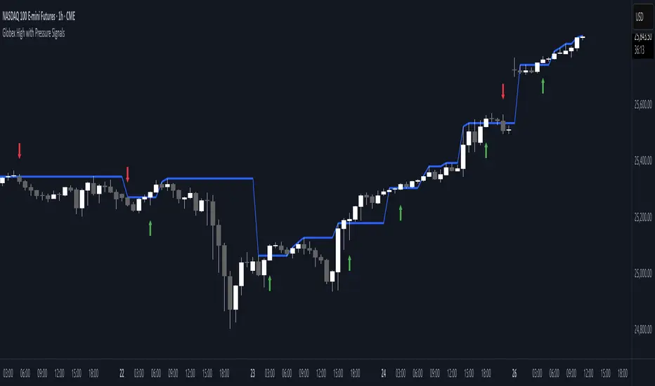
Globex High with Pressure SignalsThis custom indicator is designed for futures traders, particularly those focusing on equity index contracts like ES or NQ. It highlights the Globex High, a key overnight session level, and overlays buy/sell signals based on calculated price action crossovers by intrabar momentum analysis. By combining session-specific reference levels with real-time pressure detection, it can help to identify potential entry points during regular trading hours.
Volume Profile Area [BigBeluga]🔵 OVERVIEW
The Volume Profile Area is an advanced profiling tool that calculates and visualizes the value area within a chosen period’s volume distribution. It first builds a main profile of the entire range, then constructs a secondary profile inside the defined value area, allowing traders to examine market balance and key trading zones in greater detail.
🔵 CONCEPTS
Volume Profile – Distributes traded volume across price levels to highlight areas of market activity.
Value Area (VA) – The price range containing a chosen percentage of total volume (commonly 50–70%).
Point of Control (PoC) – The price level with the highest traded volume, often acting as a magnet for price.
Nested Profiles – A profile inside the VA adds a second layer of precision, showing where liquidity clusters within the “fair value” zone.
🔵 FEATURES
Main Profile – Full distribution of volume over the selected lookback period.
Secondary Profile – Built only inside the VA of the main profile, highlighting intrabalance structure.
Customizable PoC Selection – Choose between showing the PoC of the
Main Profile ,
the Area Profile ,
their Average ,
or None .
Dynamic Value Area Levels – Automatically plots VAL (Value Area Low) and VAH (Value Area High) with labels.
Overlay Toggles – Show/hide range extremes, VA lines, or PoCs for a cleaner chart view.
Visual Profiles – Main profile shaded in darker blue; the VA profile inside is lighter for clear separation.
Automatic Scaling – Profiles adapt to period highs/lows and auto-adjust bins for consistent resolution.
Volume Labels – PoCs can display traded volume, giving numeric confirmation of liquidity concentration.
🔵 HOW TO USE
Set the Period to define how many bars to include in the main profile.
Adjust the Value Area % to control how much volume defines the VA (e.g., 50% by default).
Pick your PoC option: Main , Area , or Average , depending on focus.
Use VAH/VAL lines as support/resistance levels where most trading occurred.
Compare reactions at Main vs VA PoC levels to spot potential breakouts or mean reversions.
🔵 CONCLUSION
The Volume Profile Area extends traditional profiling by nesting a secondary VA profile inside the main distribution. This dual-layer approach reveals not just where the market was active overall, but where liquidity concentrated within the “fair value” zone—powerful for refining entries, exits, and risk placement across intraday and swing horizons.

Liquidity Levels - PMH/PWH/PDH/HODWhat is it?
An indicator that tracks the main liquidity levels on TradingView, displaying the highs and lows of reference for month, week, previous day and current day.
What's it for?
It identifies price zones where there are many pending orders (liquidity). Traders use it to:
Find support and resistance points
Identify areas where price could bounce or break through
Receive alerts when price touches or breaks these levels
Which levels does it show?
LevelDescriptionColorLinePMH/PMLPrevious month's high and lowPurpleSolidPWH/PWLPrevious week's high and lowBlueSolidPDH/PDLPrevious day's high and lowOrangeSolidHOD/LODCurrent day's high and lowGrayDotted
How to use it?
Apply the indicator to your chart
Customize colors and enable/disable the levels you prefer
Set alerts to receive notifications when price touches or breaks levels
Use the levels to make trading decisions (entry, exit, stop loss)
Perfect for: Scalping, Day Trading, Swing Trading on any asset (forex, crypto, stocks)

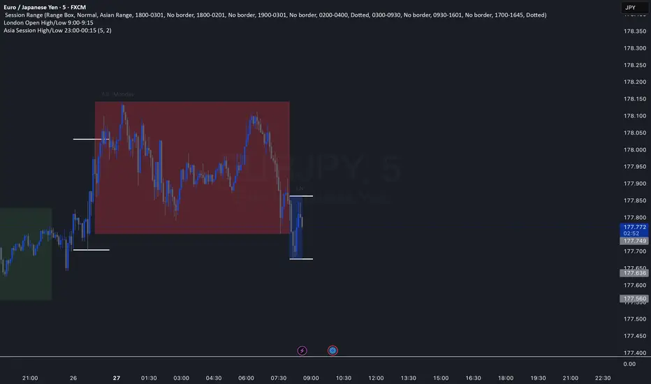
Asia Session High/Low 23:00-00:15This indicator shows highs and lows 1 hour before Asia session and the first 15min of Asia session.
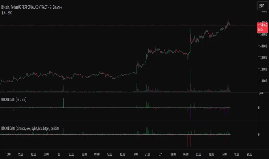
BTC OI Delta (binance, okx, bybit, htx, bitget, deribit)📊 BTC Open Interest (OI) Delta (Binance, OKX, Bybit, HTX, Bitget, Deribit)
📝 Overview
This Pine Script indicator tracks and visualizes the changes (delta) in Bitcoin (BTC) open interest (OI) for perpetual futures across multiple major crypto exchanges: Binance, OKX, Bybit, Bitget, HTX, and Deribit. It calculates the total net delta by summing the OI delta from each exchange and displays positive (OI increase) and negative (OI decrease) deltas as separate column charts. Users can choose which exchanges to include or exclude and utilize the spike highlight feature to differentiate delta intensity with color based on user-defined thresholds.
⚡ Key Features
🌐 Multi-exchange OI delta tracking
Fetches and calculates BTC perpetual futures OI delta individually from Binance, OKX, Bybit, Bitget, HTX, and Deribit.
📈 Total net delta calculation
Sums the OI delta from all selected exchanges to represent overall market open interest changes.
🎨 Visualization
Column plots: Displays net OI increases (positive delta) and decreases (negative delta) as separate column charts for intuitive trend analysis.
Spike highlights: Changes in OI delta are color-coded according to user-defined thresholds to make significant moves easily identifiable.
⚙️ User settings
Users can select which exchanges to display, enable/disable spike highlights, and set thresholds for “strong” and “very strong” OI delta changes.
🛠 Input Settings
Show Zero Line (bool, default: true): Show a zero baseline on the chart.
Highlight Spikes (bool, default: true): Enable color highlighting based on OI delta intensity.
Strong Threshold (int, default: 1000): Delta value considered a “strong” change (in BTC).
Very Strong Threshold (int, default: 2000): Delta value considered a “very strong” change (in BTC).
Show Binance (bool, default: true): Include Binance OI delta.
Show OKX (bool, default: true): Include OKX OI delta.
Show Bybit (bool, default: true): Include Bybit OI delta.
Show Bitget (bool, default: true): Include Bitget OI delta.
Show HTX (bool, default: true): Include HTX OI delta.
Show Deribit (bool, default: true): Include Deribit OI delta.
🔢 Calculation Method
🧮 Individual OI request
Uses request.security() to fetch OI data from each exchange.
➕ Delta calculation
Current bar OI minus previous bar OI (oi - oi ).
❌ Handling na values
If OI data is missing (exchange disabled or no data), the delta is treated as 0 to avoid sum errors.
🔗 Total net delta
Sums all selected exchange deltas as totalCombinedDelta.
↔️ Separate net increase/decrease
Positive (netIncreaseCombined) and negative (netDecreaseCombined) parts of total delta are split.
🎨 Color determination
getNetDeltaHighlightedColor function dynamically sets column colors based on highlightSpike and threshold settings.
🎨 Color Scheme
Highlight disabled:
Positive delta: teal shades
Negative delta: red shades
Highlight enabled:
Positive delta (normal): dark teal (#026628)
Positive delta (strong): bright teal (#00ff95)
Positive delta (very strong): yellow (#eeff00)
Negative delta (normal): dark red (#6b0d0d)
Negative delta (strong): bright red (#ff1044)
Negative delta (very strong): pink (#ff00ea)
📊 Usage
💹 Market sentiment analysis
Total net OI delta increase → capital inflow and position building
Total net OI delta decrease → capital outflow and position liquidation
⚖️ Position interpretation
BTC rising + positive OI delta → increasing long positions
BTC falling + negative OI delta → decreasing long positions
BTC falling + positive OI delta → increasing short positions
BTC rising + negative OI delta → decreasing short positions
📈 Trend confirmation
Sustained positive delta → bullish signal
Sustained negative delta → bearish signal
🌪 Volatility prediction
“Strong” or “very strong” spikes may indicate increased price volatility.
🏦 Exchange-specific impact
Enable/disable exchanges to analyze how each exchange’s OI changes affect the overall market.
VolumeAnlaysis### Volume Analysis (VA) Indicator
**Overview**
The Volume Analysis (VA) indicator is a dynamic overlay tool designed for traders seeking to identify high-volume breakouts, retests, and multi-timeframe volume-driven price cycles. By combining volume spikes with price action and support/resistance boxes, it highlights potential trend continuations, reversals, and cycle shifts. Ideal for intraday and swing trading on stocks, forex, or crypto, it uses a Fibonacci-inspired 1.618 multiplier to detect significant volume surges, then maps them to visual boxes and key levels for actionable insights.
This indicator draws from volume profile concepts but focuses on **breakout confirmation** and **cycle momentum**, helping you spot when "smart money" volume aligns with price extremes. It's particularly useful in volatile markets where volume precedes price moves.
**How It Works**
1. **Volume Break Detection**:
- Identifies a "Volume Break" when the current bar's volume exceeds 1.618x the highest volume from the prior 5 bars. This signals unusual activity, often preceding breakouts.
- A "Volume Retest" triggers exactly 3 bars after a break if volume has been falling steadily over those 3 bars—indicating a pullback for re-accumulation/distribution.
2. **Visual Annotations**:
- **Labels**: Green/red/yellow labels mark Volume Breaks and Retests, positioned above/below the bar based on candle direction for clarity.
- **Demand/Supply Boxes**:
- Blue semi-transparent boxes form around Retest bars, extending rightward to act as dynamic support/resistance.
- Green (bullish) or red (bearish) boxes draw from Volume Breaks, based on the original candle's open/close, highlighting potential zones for continuation.
- Limited to 5 boxes max to avoid chart clutter; older boxes fade as new ones form.
3. **Box Interaction Signals**:
- When price enters a box:
- **Reversal Hints**: Maroon (bearish rejection) or lime (bullish rejection) labels on closes against the trend with opening price momentum.
- **Breakout Arrows**: Up/down arrows on crossovers/crossunders of box tops/bottoms from Retest boxes.
- Scans all active boxes for interactions, prioritizing recent volume events.
4. **Multi-Timeframe Volume Cycles**:
- Aggregates the "Volume Break Max" level (a proxy for key price extremes tied to volume spikes) across timeframes: 1min, 5min, 10min, 30min, and 65min (using `request.security`).
- Computes **MaxVolBreak** (highest extreme) and **MinVolBreak** (lowest extreme) for trend-following levels.
- Tracks **Percent Volume Greater/Less Than Close**: Sums volumes from TFs where price is below/above these levels, creating a momentum ratio.
- **CrossClose**: Plots the prior close where this ratio crosses (gray line), signaling cycle shifts—bullish below MinVolBreak, bearish above MaxVolBreak.
- **Fills**: Red fill above CrossClose/MaxVolBreak (bearish cycle); green below CrossClose/MinVolBreak (bullish cycle).
5. **Plots**:
- Black lines for MaxVolBreak (⏫) and MinVolBreak (⏬).
- Gray 🔄 for CrossClose.
- Colors dynamically adjust (green/red) based on close relative to levels.
**Key Features**
- **Trend vs. Reversal Modes**: Toggle alerts for trend-following breaks (crosses of Max/MinVolBreak) or reversal signals (crosses of CrossClose).
- **Multi-TF Fusion**: Optionally include the chart's native timeframe in Max/Min calculations for finer tuning.
- **Box Management**: Auto-prunes to 5 boxes; focuses on retest/break alignments for "inside bar" logic.
- **Momentum Filters**: Uses rising/falling opens and crossovers for label precision, reducing noise.
- **Customizable**: Simple inputs for alert visibility and timeframe inclusion.
**Settings**
| Input | Default | Description |
|-------|---------|-------------|
| Show Volume Reversal Breaks | False | Enables alerts/labels for CrossClose crosses (cycle reversals). |
| Show Trend Following Breaks | True | Enables alerts for Max/MinVolBreak crosses (trend signals). |
| Use Current Time | False | Includes chart's native TF in multi-TF Max/Min calculations. |
**Alerts**
- **Reversal Alerts** (if enabled): "Volume Reverse Bullish/Bearish Break of " on close crosses of CrossClose.
- **Trend Alerts** (if enabled): "Trend Volume Bullish/Bearish Signal" on close crosses of Max/MinVolBreak; plus notes if prior low/high aligns with levels.
- All alerts include ticker and level value for easy scanning. Use `alert.freq_once_per_bar` to avoid spam.
**Trading Ideas**
- **Bullish Entry**: Green box formation + price holding MinVolBreak + upward arrow on retest box. Target next resistance.
- **Bearish Entry**: Red box + close above MaxVolBreak + red fill activation. Stop below recent low.
- **Cycle Trading**: Watch CrossClose crosses for regime shifts—fade extremes in overextended cycles.
- **Best Timeframes**: 5-30min for intraday; combine with daily for swings. Works best on liquid assets with reliable volume data.
**Limitations & Notes**
- Relies on accurate volume data (e.g., stocks/forex); less effective on low-volume or synthetic instruments.
- Boxes extend rightward but don't auto-delete—monitor for clutter on long histories (max_bars_back=500).
- Some logic (e.g., exact 3-bar retest) is rigid; backtest for your market.
- Open-source under MPL 2.0—fork and tweak as needed!
For questions or enhancements, drop a comment below. Happy trading! 🚀

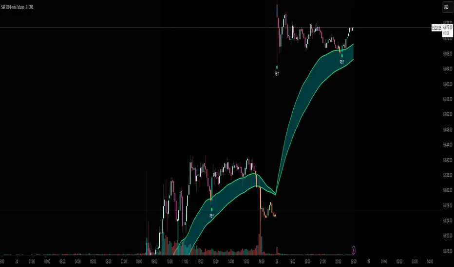
Flux AI PullBack System (Hybrid Pro)Flux AI PullBack System (Hybrid Pro)
//Session-Aware | Adaptive Confluence | Grace Confirm Logic//
Overview:
The Flux AI PullBack System (Hybrid Pro v5) is an adaptive, session-aware pullback indicator designed to identify high-probability continuation setups within trending markets. It automatically adjusts between “Classic” and “Enhanced” logic modes based on volatility, volume, and ATR slope, allowing it to perform seamlessly across different market sessions (Asian, London, and New York).
Core Features:
Hybrid Auto Mode — Dynamically switches between Classic (fast-moving) and Enhanced (strict) modes.
Session-Aware Context — Optimized for intraday trading in ES, NQ, and SPY.
Grace Confirmation Logic — Validates pullbacks with a follow-through condition to reduce noise.
Adaptive EMA Zone (38/62) — Highlights pullback areas with dynamic aqua fill and transparency linked to trend strength.
Noise Suppression Filter — Prevents false pullbacks during EMA crossovers or unstable transitions.
Weighted Confluence Model — Combines trend, ATR, volume, and swing structure for confirmation strength.
Pine v6 Compliant Alerts — Constant-string safe, ready for webhooks and automation.
Visual Elements:
Aqua EMA Zone: Displays the “breathing” pullback band (tightens during volatility spikes).
PB↑ / PB↓ Markers: Confirmed pullbacks with subtle transparency and fixed label size.
Bar Highlights: Yellow for pullbacks; ice-blue for confirmed continuation.
Use Cases
Perfect for:
Intraday trend traders
0DTE SPX / ES scalpers
Futures traders (NQ, MNQ, MES)
Algorithmic strategy builders using webhooks
Recommended Timeframes:
1–15 minute charts (scalping / intraday)
Higher timeframes for swing confirmations.
Attribution:
This open-source script was inspired by Chris Moody’s “CM Slingshot System” and JustUncleL’s Pullback Tools, but it was built from scratch using AI-assisted code refinement (ChatGPT).
All logic and enhancements are original, not derived from proprietary software.
License: MIT (Open Source)
© 2025 Ken Anderson — You may modify, use, or redistribute with credit.
Keywords:
Pullback, Reversal, AI Trading, EMA Zone, Session Aware, Futures Trading, SPX, ES, NQ, ATR Filter, Volume Confirmation, Flux System, Pine Script v6, Non-Repainting, Adaptive Trading Indicator.

Momentum Breakout Filter + ATR ZonesMomentum Breakout Filter + ATR Zones - User Guide
What This Indicator Does
This indicator helps you with your MACD + volume momentum strategy by:
Filtering out fake breakouts - Shows ⚠️ warnings when breakouts lack confirmation
Showing clear entry signals - 🚀 LONG and 🔻 SHORT labels when all conditions align
Automatic stop loss & profit targets - Based on ATR (Average True Range)
Visual trend confirmation - Background color + EMA alignment
Signal Types
🚀 LONG Entry Signal (Green Label)
Appears when ALL conditions met:
✅ MACD crosses above signal line
✅ Volume > 1.5× average
✅ Price > EMA 9 > EMA 21 > EMA 200 (bullish trend)
✅ Price closes above recent 20-bar high
🔻 SHORT Entry Signal (Red Label)
Appears when ALL conditions met:
✅ MACD crosses below signal line
✅ Volume > 1.5× average
✅ Price < EMA 9 < EMA 21 < EMA 200 (bearish trend)
✅ Price closes below recent 20-bar low
⚠️ FAKE Breakout Warning (Orange Label)
Appears when price breaks high/low BUT lacks confirmation:
❌ Low volume (below 1.5× average), OR
❌ Wick break only (didn't close through level), OR
❌ MACD not aligned with direction
Hover over the warning label to see what's missing!
ATR Stop Loss & Targets
When you get a signal, colored lines automatically appear:
Long Position
Red solid line = Stop Loss (Entry - 1.5×ATR)
Green dashed lines = Profit Targets:
Target 1: Entry + 2×ATR
Target 2: Entry + 3×ATR
Target 3: Entry + 4×ATR
Short Position
Red solid line = Stop Loss (Entry + 1.5×ATR)
Green dashed lines = Profit Targets:
Target 1: Entry - 2×ATR
Target 2: Entry - 3×ATR
Target 3: Entry - 4×ATR
The lines move with each bar until you exit the position.
Chart Elements
Moving Averages
Blue line = EMA 9 (fast)
Orange line = EMA 21 (medium)
White line = EMA 200 (trend filter)
Volume
Yellow bars = High volume (above threshold)
Gray bars = Normal volume
Background Color
Light green = Bullish trend (all EMAs aligned up)
Light red = Bearish trend (all EMAs aligned down)
No color = Neutral/mixed
MACD (Bottom Pane)
Green/Red columns = MACD Histogram
Blue line = MACD Line
Orange line = Signal Line
Info Dashboard (Bottom Right)
ItemWhat It ShowsVolumeCurrent volume vs average (✓ HIGH or ✗ Low)MACDDirection (BULLISH or BEARISH)TrendEMA alignment (BULL, BEAR, or NEUTRAL)ATRCurrent ATR value in dollarsPositionCurrent position (LONG, SHORT, or NONE)R:RRisk-to-Reward ratio (shows when in position)
How To Use It
Basic Workflow
Wait for setup
Watch for MACD to approach signal line
Volume should be building
Price should be near EMA structure
Get confirmation
Wait for 🚀 LONG or 🔻 SHORT label
Check dashboard shows "✓ HIGH" volume
Verify trend is aligned (green or red background)
Enter the trade
Enter when signal appears
Note your stop loss (red line)
Note your targets (green dashed lines)
Manage the trade
Exit at first target for partial profit
Move stop to breakeven
Trail remaining position
What To Avoid
❌ Don't trade when you see:
⚠️ FAKE labels (wait for confirmation)
Neutral background (no clear trend)
"✗ Low" volume in dashboard
MACD and Trend not aligned
Settings You Can Adjust
Volume Sensitivity
High Volume Threshold: Default 1.5×
Increase to 2.0× for cleaner signals (fewer trades)
Decrease to 1.2× for more signals (more trades)
Fake Breakout Filters
You can toggle these ON/OFF:
Volume Confirmation: Requires high volume
Close Through: Requires candle close, not just wick
MACD Alignment: Requires MACD direction match
Tip: Turn all three ON for highest quality signals
ATR Stop/Target Multipliers
Default settings (conservative):
Stop Loss: 1.5×ATR
Target 1: 2×ATR (1.33:1 R:R)
Target 2: 3×ATR (2:1 R:R)
Target 3: 4×ATR (2.67:1 R:R)
Aggressive traders might use:
Stop Loss: 1.0×ATR
Target 1: 2×ATR (2:1 R:R)
Target 2: 4×ATR (4:1 R:R)
Conservative traders might use:
Stop Loss: 2.0×ATR
Target 1: 3×ATR (1.5:1 R:R)
Target 2: 5×ATR (2.5:1 R:R)
Example Trade Scenarios
Scenario 1: Perfect Long Setup ✅
Stock consolidating near EMA 21
MACD curling up toward signal line
Volume bar turns yellow (high volume)
🚀 LONG label appears
Red stop line and green target lines appear
Result: High probability trade
Scenario 2: Fake Breakout Avoided ✅
Price breaks above resistance
Volume is normal (gray bar)
⚠️ FAKE label appears (hover shows "Low volume")
No entry signal
Price falls back below breakout level
Result: Avoided losing trade
Scenario 3: Premature Entry ❌
MACD crosses up
Volume is high
BUT trend is NEUTRAL (no background color)
No signal appears (trend filter blocks it)
Result: Avoided choppy/sideways market
Quick Reference
Entry Checklist
🚀 or 🔻 label on chart
Dashboard shows "✓ HIGH" volume
Dashboard shows aligned MACD + Trend
Colored background (green or red)
ATR lines visible
No ⚠️ FAKE warning
Exit Strategy
Target 1 (2×ATR): Take 50% profit, move stop to breakeven
Target 2 (3×ATR): Take 25% profit, trail stop
Target 3 (4×ATR): Take remaining profit or trail aggressively
Stop Loss: Exit entire position if hit
Alerts
Set up these alerts:
Long Entry: Fires when 🚀 LONG signal appears
Short Entry: Fires when 🔻 SHORT signal appears
Fake Breakout Warning: Fires when ⚠️ appears (optional)
Tips for Success
Use on 5-minute charts for day trading momentum plays
Only trade high volume stocks ($5-20 range works best)
Wait for full confirmation - don't jump early
Respect the stop loss - it's calculated based on volatility
Scale out at targets - don't hold for home runs
Avoid trading first 15 minutes - let market settle
Best during 10am-11am and 2pm-3pm - peak momentum times
Common Questions
Q: Why didn't I get a signal even though MACD crossed?
A: All conditions must be met - check dashboard for what's missing (likely volume or trend alignment)
Q: Can I use this on any timeframe?
A: Yes, but it's designed for 5-15 minute charts. On daily charts, adjust ATR multipliers higher.
Q: The stop loss seems too tight, can I widen it?
A: Yes, increase "Stop Loss (×ATR)" from 1.5 to 2.0 or 2.5 in settings.
Q: I keep seeing FAKE warnings but price keeps going - what gives?
A: The filter is conservative. You can disable some filters in settings, but expect more false signals.
Q: Can I use this for swing trading?
A: Yes, but use larger timeframes (1H or 4H) and adjust ATR multipliers up (3× for stops, 6-9× for targets).

Volume Surge by MashrabThe "Volume Surge" indicator is like a simple market health checkup. It looks at how much of an asset (like a stock or crypto) is being traded right now and compares it to the recent past. Think of it as a way to quickly see if interest in that asset is suddenly spiking, fading, or staying the same.
The indicator shows this information in an easy-to-read table right on your chart.
How it works:
The indicator keeps track of two main things for you:
Current Volume: The total trading volume over the last "N" days (or whatever time period you choose).
Previous Volume: The total trading volume over the period right before that
Then, it gives you a summary:
The "Ratio" tells you how many times bigger or smaller the current volume is.
The "Percent Change" shows the percentage jump in volume.
How to use it:
This indicator helps you see when something interesting might be happening. Here are a few ways traders use it:
Confirm Breakouts: If a stock breaks above a key price level and the indicator shows a huge volume surge, it’s a stronger signal that the move is real and not a false alarm.
Spot Reversals: If a stock has been trending up but the volume starts to drop off, it could mean the trend is losing steam. A sudden, massive volume surge on a down day might indicate panic selling, which can sometimes happen right before the price turns around.
Check Trend Strength: A healthy trend usually has increasing volume going in the same direction. For example, if a stock is in an uptrend, you want to see lots of volume on the days it goes up.
This indicator isn't a crystal ball, but it's a great tool for understanding the "who" and "how much" behind a price move. It helps you see when a price change is backed by a lot of market activity, which often makes the move more trustworthy.

FluxVector Liquidity Universal Trendline FluxVector Liquidity Trendline FFTL
Summary in one paragraph
FFTL is a single adaptive trendline for stocks ETFs FX crypto and indices on one minute to daily. It fires only when price action pressure and volatility curvature align. It is original because it fuses a directional liquidity pulse from candle geometry and normalized volume with realized volatility curvature and an impact efficiency term to modulate a Kalman like state without ATR VWAP or moving averages. Add it to a clean chart and use the colored line plus alerts. Shapes can move while a bar is open and settle on close. For conservative alerts select on bar close.
Scope and intent
• Markets. Major FX pairs index futures large cap equities liquid crypto top ETFs
• Timeframes. One minute to daily
• Default demo used in the publication. SPY on 30min
• Purpose. Reduce false flips and chop by gating the line reaction to noise and by using a one bar projection
• Limits. This is a strategy. Orders are simulated on standard candles only
Originality and usefulness
• Unique fusion. Directional Liquidity Pulse plus Volatility Curvature plus Impact Efficiency drives an adaptive gain for a one dimensional state
• Failure mode addressed. One or two shock candles that break ordinary trendlines and saw chop in flat regimes
• Testability. All windows and gains are inputs
• Portable yardstick. Returns use natural log units and range is bar high minus low
• Protected scripts. Not used. Method disclosed plainly here
Method overview in plain language
Base measures
• Return basis. Natural log of close over prior close. Average absolute return over a window is a unit of motion
Components
• Directional Liquidity Pulse DLP. Measures signed participation from body and wick imbalance scaled by normalized volume and variance stabilized
• Volatility Curvature. Second difference of realized volatility from returns highlights expansion or compression
• Impact Efficiency. Price change per unit range and volume boosts gain during efficient moves
• Energy score. Z scores of the above form a single energy that controls the state gain
• One bar projection. Current slope extended by one bar for anticipatory checks
Fusion rule
Weighted sum inside the energy score then logistic mapping to a gain between k min and k max. The state updates toward price plus a small flow push.
Signal rule
• Long suggestion and order when close is below trend and the one bar projection is above the trend
• Short suggestion and flip when close is above trend and the one bar projection is below the trend
• WAIT is implicit when neither condition holds
• In position states end on the opposite condition
What you will see on the chart
• Colored trendline teal for rising red for falling gray for flat
• Optional projection line one bar ahead
• Optional background can be enabled in code
• Alerts on price cross and on slope flips
Inputs with guidance
Setup
• Price source. Close by default
Logic
• Flow window. Typical range 20 to 80. Higher smooths the pulse and reduces flips
• Vol window. Typical range 30 to 120. Higher calms curvature
• Energy window. Typical range 20 to 80. Higher slows regime changes
• Min gain and Max gain. Raise max to react faster. Raise min to keep momentum in chop
UI
• Show 1 bar projection. Colors for up down flat
Properties visible in this publication
• Initial capital 25000
• Base currency USD
• Commission percent 0.03
• Slippage 5
• Default order size method percent of equity value 3%
• Pyramiding 0
• Process orders on close off
• Calc on every tick off
• Recalculate after order is filled off
Realism and responsible publication
• No performance claims
• Intrabar reminder. Shapes can move while a bar forms and settle on close
• Strategy uses standard candles only
Honest limitations and failure modes
• Sudden gaps and thin liquidity can still produce fast flips
• Very quiet regimes reduce contrast. Use larger windows and lower max gain
• Session time uses the exchange time of the chart if you enable any windows later
• Past results never guarantee future outcomes
Open source reuse and credits
• None

TFT VIP TRADE (V2)This indicator helps traders quickly evaluate candle strength and momentum in real time.
It compares each 5-minute candle’s body and volume to the last 10 candles, then scores market strength using three powerful filters:
• Body/Range ratio – measures how decisive the candle is.
• RVOL (Relative Volume) – shows if today’s volume is unusually high.
• ATR/Close (%) – checks if the stock has enough volatility to move.

Enhanced Level Breakout Strategy ProEnhanced Level Breakout Strategy Pro — Executive Summary
Level-driven breakout engine with single-position governance, three staged targets, and live USD/INR currency awareness. It operationalizes last session levels and swing structure to generate actionable entries only when price confirms and volume validates.
What it does
Surfaces breakouts of previous day and previous week high/low/open/close.
Confirms with optional volume expansion.
Enters one position at a time. Manages SL + TP1/TP2/TP3 and auto-expires after time.
Tracks outcomes and KPIs, including a rolling 30-day dashboard.
Auto-detects INR vs USD charts and handles live USD/INR conversion for capital displays.
How trades are found
Levels
Uses completed prior Daily and Weekly OHLC as reference rails.
Breakout up: close > prior high/open/close.
Breakout down: close < prior low/open/close.
Volume filter (optional)
Current volume > 20-SMA(volume) × threshold.
Swing context (visual only)
Marks most recent 3–4-bar swing high/low to show nearby structure.
Entry logic
Long if any daily/weekly upside breakout confirms on the closed bar and volume filter passes.
Short if any downside breakout confirms with the same gating.
Single-trade mode by default. You can allow new trades before completion if required.
Risk model and exits
Stop-loss
Long: min(low , low )
Short: max(high , high )
Targets
TP1 = 1.5R, TP2 = 2R, TP3 = 3R.
Hitting TP3 implies TP2 and TP1 are counted as achieved.
Time exit
Force close after 50 bars if no TP/SL.
Labels/lines
Entry, SL, TP1/2/3 plotted only while the trade is active.
Capital and currency enablement
Initial Capital and Risk % per trade drive the on-chart capital panel.
Auto-detects chart currency (INR for NSE/BSE tickers, else USD).
Live USD/INR pull with fallback to manual rate.
Shows position size (float units), investment amount, and risk amount in the selected display currency.
On-chart UX
Level rails
Daily levels on the left (custom color).
Weekly levels on the right (custom color).
Swing tags: SH / SL at the latest swing points.
Signal markers: Entry labels on the confirmation bar.
Two tables
Performance (top-right): trades, win rate, average P/L, TP1/2/3 hit counts and accuracies, 30-day counts and average TP profits, SL stats, configuration flags.
Capital (bottom-left): capital, risk/trade, position size, investment, stop distance, R:R set, conversion rate and source.
KPIs tracked
All-time: total trades, win rate, average P/L, TP1/TP2/TP3 accuracy and average profit, SL accuracy.
Last 30 days: number of trades hitting TP1/TP2/TP3 or SL, plus average TP1/TP2/TP3 profit across those hits.
Configuration levers
Currency: Auto / INR / USD, live or manual USD/INR rate.
Components: toggle daily/weekly levels and entry generation.
Swing: lookback 2–10, show/hide.
Risk: initial capital, risk % per trade.
Filters: volume on/off and threshold.
Display: TP/SL lines, labels, transparent tables, one-trade policy, wait-for-completion.
Styling: independent colors and thickness for daily/weekly/swing levels.
Governance and constraints
One active position unless you opt out.
Entries trigger on bar close to avoid repaint.
Level references are always previous completed sessions.
Arrays capped to manage memory; stats keep recent history efficiently.
Operating procedure
Select timeframe. Add to chart.
Set capital and risk %. Confirm currency mode.
Optional: enable volume filter and set threshold.
Monitor left/right level rails. Trade fires on confirmed breaches.
Manage optional discretion using swing markers and stop distance readout.
Review top-right KPIs for continuous improvement. Iterate thresholds as needed.
Tips
Use higher timeframes for fewer but higher-quality signals.
Keep volume filter on during trend days to avoid weak breaks.
For INR equities, prefer AUTO currency with Live conversion enabled for cleaner dashboards.
If you scale manually, keep single-trade mode enabled to avoid overlapping signals.

Yellow candle MMAThrough this candle we can infer the strength of the previous supply and demand zone or the current zone it is in.

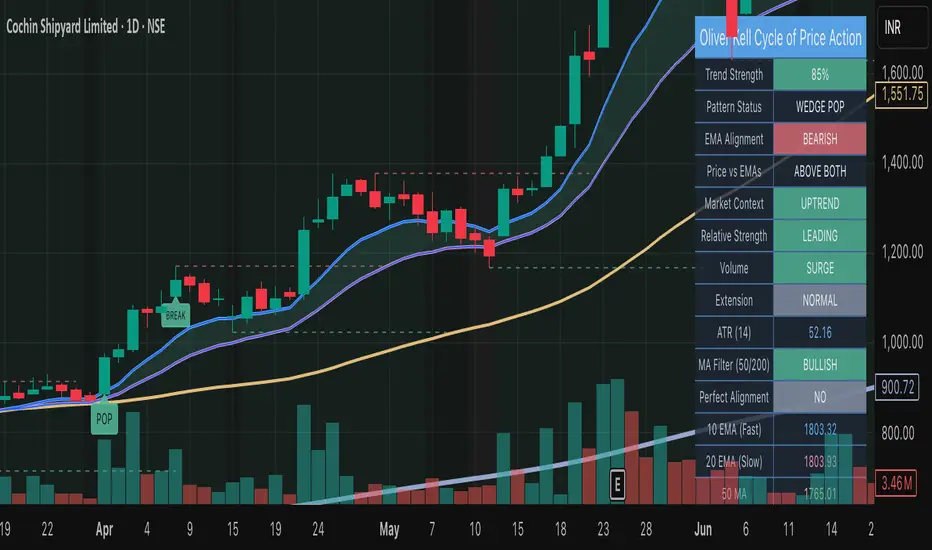
Oliver Kell Cycle of Price Action• Overview
Oliver Kell Cycle of Price Action codifies Oliver Kell’s growth-trading workflow: 10/20 EMA rhythm, CAN SLIM trend filters, and the “money pattern” wedge pop.
Identifies where institutional money typically accumulates by tracking velocity vs. EMAs, dry-up volume, and stacked moving averages.
Adapts visually to light/dark charts with an institutional palette, compact labels, and a top-right dashboard summarizing state and telemetry.
Core Methodology
10/20 EMA stack drives directional bias, while 50/200 SMAs enforce CAN SLIM trend alignment and perfect-stack detection.
Extension engine flags capitulation and exhaustion as % distance from the 10 EMA paired with volume climaxes.
Base detector monitors multi-week contractions near the EMAs, tracking tightening range and optional volume dry-ups before breakout.
Market context (optional) requires the chosen benchmark to trend above its 21/50 EMAs and the instrument’s relative strength line to rise.
Primary Signals
Wedge Pop: tight pullback or extension reset beneath the EMAs that snaps back above both with confirming volume.
Base & Break: qualifying base with sufficient duration and (optionally) dry-up volume that clears the pivot on volume expansion.
EMA Crossback: low-risk pullback to the 10/20 EMA stack after trend confirmation, highlighting secondary entries.
Extension Markers: ▲/▼ icons annotate exhaustion and reversal extremes, including distance readouts in tooltips.
Controls & Customization
Sensitivity group lets you mandate extension-first wedges and dry-up confirmation or relax them to surface more opportunities.
Volume analysis inputs manage surge, dry-up multipliers, and participation ratio; adjust to suit the symbol’s liquidity profile.
Context toggles enable short-side patterns, benchmark symbol selection, and relative strength smoothing for broader compatibility.
Institutional styling panel offers theme presets and color controls so the script blends with professional chart layouts.
Alert Framework
Built-in alerts fire for every entry (wedge pop/drop, EMA crossbacks, base break) and for key exit governance (20 EMA violation, vertical extension) plus new exhaustion/reversal extremes.
Matching alertcondition() hooks expose these events in TradingView’s picker; configure one-click alerts with custom messages.
Usage Notes
Default settings target daily growth equities; for intraday or crypto, relax the base length and volume filters or disable market context.
Combine with broader CAN SLIM screening (earnings/industry strength) and always verify signals on the weekly timeframe.
Use the dashboard to confirm market context, relative strength, and MA alignment before acting on highlighted patterns.
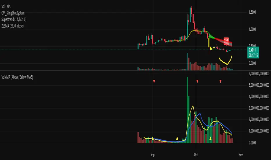
Volume + MA5 & MA10This Volume + MA5 & MA10 (Technical Volume Trend Analysis)
The Volume + MA5 & MA10 indicator provides a precise view of market participation and volume momentum by combining raw volume data with two moving averages (MA5 and MA10). It’s designed for traders who rely on volume-based confirmation to validate price movements, breakouts, and trend reversals.
🔍 Overview
This indicator displays volume bars alongside two smooth volume averages — MA5 (short-term) and MA10 (medium-term) — making it easier to detect shifts in market activity.
When the short-term average crosses above or below the long-term average, it signals a potential change in trading intensity or market sentiment.
⚙️ Key Features
Dual Volume Moving Averages (MA5 & MA10) for short- and medium-term analysis.
Dynamic Bar Coloring based on whether current volume exceeds MA5 or MA10.
Crossover Detection with visual markers for MA5/MA10 intersections.
Alert Conditions to notify you of significant volume trend shifts.
Fully customizable appearance and smoothing options.
📊 How to Interpret
MA5 > MA10 → Increasing short-term volume activity (strengthening momentum).
MA5 < MA10 → Decreasing short-term volume (weakening participation).
Rising volume with price → Confirms trend strength.
Falling volume with rising/falling price → Suggests potential reversal or reduced conviction.
💡 Applications
Confirm breakouts and trend continuations.
Identify momentum divergences between price and volume.
Filter out low-volume or weak-trend setups.
Combine with RSI, MACD, or moving averages for enhanced signal validation.
✅ Advantages
Simple yet powerful structure for clean visual analysis.
Works across all timeframes and markets (crypto, stocks, forex, indices).
No repainting — reliable for both live and historical backtesting.
Use Volume + MA5 & MA10 to strengthen your technical analysis and gain a deeper understanding of how market participation drives price trends.