Source CorrelationIn this small indicator I make it possible for the user to set two different input sources. Then, the indicator displays the correlation of these two input sources. It's a very small script, but I think it could be helpful to somebody to find uncorrelated indicators for his trading strategy. To use uncorrelated indicators is in general recommended.
Enjoy this small, but powerful tool. 🧙♂️
Analysis

[TTI] NDR 63-Day QQQ-QQEW ROC% SpreadWelcome to the NDR 63-Day QQQ-QQEW ROC% Spread script! This script is a powerful tool that calculates and visualizes the 63-day Rate of Change (ROC%) spread between the QQQ and QQEW tickers. This script is based on the research conducted by Ned Davis Research (NDR), a renowned name in the field of investment strategy.
⚙️ Key Features:
👉Rate of Change Calculation: The script calculates the 63-day Rate of Change (ROC%) for both QQQ and QQEW tickers. The ROC% is a momentum oscillator that measures the percentage price change over a given time period.
👉Spread Calculation: The script calculates the spread between the ROC% of QQQ and QQEW. This spread can be used to identify potential trading opportunities.
👉Visual Representation: The script plots the spread on the chart, providing a visual representation of the ROC% spread. This can help traders to easily identify trends and patterns.
👉Warning Lines: The script includes warning lines at +600 and -600 levels. These lines can be used as potential thresholds for trading decisions.
Usage:
To use this script, simply add it to your TradingView chart. The script will automatically calculate the ROC% for QQQ and QQEW and plot the spread on the chart. You can use this information to inform your trading decisions.
🚨 Disclaimer:
This script is provided for educational purposes only and is not intended as investment advice. Trading involves risk and is not suitable for all investors. Please consult with a financial advisor before making any investment decisions.
🎖️ Credits:
This script is based on the research conducted by Ned Davis Research (NDR). All credit for the underlying methodology and concept goes to NDR.

Rainbow IndicatorName of the indicator: Rainbow indicator
A brief description of the indicator:
Using this indicator, you can see the "margin of safety" for opening a position in shares of fundamentally strong companies with an acceptable P/E level, as well as the price range for closing a position.
The background to the creation of the indicator:
I got the idea to create this indicator thanks to the concept of the "margin of safety", which was invented by the father of value investing - Benjamin Graham. According to his idea, it is reasonable to buy shares of a company only when the price offered by the market is lower than the "intrinsic value" calculated on the basis of financial statements. The value of this difference is the "margin of safety”. At the same time, the indicator does not copy Graham's idea but develops it relying on my own methodology.
So, according to Graham, the "margin of safety" is a good discount to the intrinsic value of the company. That is, if a company's stock is trading at prices that are well below the company's intrinsic value (on a per-share basis), it's a good opportunity to consider buying it. In this case, you will have a certain margin of safety in case the company is in financial distress and its stock price goes down. Accordingly, the greater the discount, the better.
When it comes to the intrinsic value of a company, there are many approaches to determining it - from calculating the Price-to-book value financial ratio to the discounted cash flow method. As for my approach, I am not trying to find the cherished intrinsic value, but I am trying to understand how fundamentally strong the company is in front of me, and in how many years the investment in it will pay off. To determine fundamental strength, I use the appropriate Fundamental Strength Indicator . To estimate the payback period, I use the P/E ratio (*). If I am satisfied with both of these indicators, I move on to the Rainbow Indicator.
(*) If you want to learn more about the P/E ratio, I suggest reading my two articles on TradingView:
Price / Earnings: Interpretation #1
Price/Earnings: amazing interpretation #2
Indicator calculation methodology:
The Rainbow indicator starts with a simple moving average of one year (this is the thick red line in the center). Hereinafter a year will mean the last 252 trading days.
Applying a moving average of this length - is a good way to smooth out sharp price fluctuations which can happen during a year as much as possible, keeping the trend direction as much as possible. Thus, the moving average becomes for me the center of fluctuations of the imaginary pendulum of the market price.
Then the deviations are calculated from the center of fluctuations. To do this, a certain amount of earnings per share is subtracted from and added to the moving average. This is the diluted EPS of the last year.
Deviations with a "-" sign form the Lower Rainbow of four colors:
- The blue spectrum of the lower rainbow begins with a deflection of -4 EPS and ends with a deflection of -8 EPS.
- Green spectrum of the lower rainbow begins with a deflection of -8 EPS and ends with a deflection of -16 EPS.
- The orange spectrum of the lower rainbow begins with a deflection of -16 EPS and ends with a deflection of -32 EPS.
- Red spectrum of the lower rainbow begins with a deflection of -32 EPS and goes to infinity.
The Lower Rainbow is used to determine the price ranges that can be considered for buying stocks. It is in the spectra of the Lower Rainbow that the very "margin of safety" according to my methodology is located. The Lower Rainbow has the boundaries between the spectra as a solid line . And only the red spectrum of the Lower Rainbow has only one boundary.
Deviations with a "+" sign form the Upper Rainbow of four similar colors:
- The red spectrum of the upper rainbow begins with a deflection of 0 EPS and ends with a deflection of +4 EPS.
- The orange spectrum of the upper rainbow begins with a deflection of +4 EPS and ends with a deflection of +8 EPS.
- Green spectrum top rainbow begins with a deflection of +8 EPS and ends with a deflection of +16 EPS.
- The blue spectrum of the upper rainbow begins with a deflection of +16 EPS and goes to infinity.
The Upper Rainbow is used to determine the price ranges that can be considered for selling stocks already purchased. The top rainbow has boundaries between the spectra in the form of crosses . And only the blue spectrum of the upper rainbow has only one boundary.
The presence of the Empty Area (the size of 4 EPS) above the Lower Rainbow creates some asymmetry between the two rainbows - the Lower Rainbow looks wider than the Upper Rainbow. This asymmetry is deliberate because the market tends to fall much faster and deeper than it grows . Therefore, a wider Lower Rainbow is conducive to buying stocks at a good discount during a period of massive "sell-offs.
The situation, when the Lower Rainbow is below the center of fluctuations (the thick red line) and the Upper Rainbow, is above the center of fluctuations is called an Obverse . It is only possible to buy a stock in an Obverse situation .
The situation when the Lower Rainbow is above the center of fluctuations and the Upper Rainbow is below the center of fluctuations is called Reverse . In this situation, the stock cannot be considered for purchase , according to my approach.
Selling a previously purchased stock is possible in both situations: Reverse and Obverse. After loading the indicator, you can see a hint next to the closing price - Reverse or Obverse now.
Due to the fact that the size of the deviation from the center of fluctuation depends on the size of the diluted EPS, several important conclusions can be made:
- The Obverse situation is characteristic of companies that show a profit over the last year.
- The Reverse situation is typical for companies that show a loss over the last year.
- An increase in the width of both rainbows in the Obverse situation tells us about an increase in profits for the company.
- A decrease in the width of both rainbows in the Obverse situation tells us about a decrease in the company's profits.
- An increase in the width of both rainbows in the Reverse situation tells us about an increase in the company's losses.
- A decrease in the width of both rainbows in the Reverse situation tells us about a decrease in the company's losses.
- The higher the profit level of the company, the greater your "margin of safety" should be. This will provide the necessary margin of safety in case you go into a cycle of declining financial results. The appropriate width of the Lower Rainbow will just create this "margin".
- Increased profits in the company (after buying its stock) will allow you to stay in position longer by widening the Upper Rainbow.
- A decrease in profits in the company (after buying its stock) will allow you to close your position more quickly by narrowing the Upper Rainbow.
Conditions for opening and closing positions:
So, the Lower Rainbow has four differently colored spectra: blue, green, orange, and red. Each one highlights the desired range of prices acceptable for buying in an Obverse situation. The blue spectrum is upper with respect to the green spectrum, and the green spectrum is lower with respect to the blue spectrum, etc.
- If the current price is in the Blue Spectrum of the Lower Rainbow, that is a reason to consider that company for buying the first portion (*) of the stock.
- If the current price has fallen below (into the Green Spectrum of the Lower Rainbow), that is a reason to consider this company to buy a second portion of the stock.
- If the current price has fallen below (into the Orange Spectrum of the Lower Rainbow), it is a reason to consider this company to buy a third portion of the stock.
- If the current price has fallen below (into the Red Spectrum of the Lower Rainbow), that is a reason to consider that company to buy a fourth portion of the stock.
(*) The logic of the Rainbow Indicator implies that no more than 4 portions of one company's stock can be purchased. One portion refers to the number of shares you can consider buying at the current price (depending on your account size and personal diversification ratio - see information below).
The Upper Rainbow also has four differently colored spectra: blue, green, orange, and red. Each of them highlights the appropriate range of prices acceptable for closing an open position.
- If the current price is in the red spectrum of the Upper Rainbow, I close one portion of an open position bought in the red spectrum of the Lower Rainbow.
- If the current price is in the orange spectrum of the Upper Rainbow, I close one portion of an open position bought in the orange spectrum of the Lower Rainbow.
- If the current price is in the green spectrum of the Upper Rainbow, I close one portion of an open position bought in the green spectrum of the Lower Rainbow.
- If the current price is in the blue spectrum of the Upper Rainbow, I close one portion of an open position bought in the blue spectrum of the Lower Rainbow.
This position-closing logic applies to both the Obverse and Reverse situations. In both cases, the position is closed in portions in four steps. However, there are 3 exceptions to this rule when it is possible to close an entire position in whole rather than in parts:
- If there is a Reverse situation and the current price is above the thick red line.
- If I decide to invest in another company and I do not have enough available cash to purchase the necessary number of portions.
- If I find out about events that pose a real threat to the further existence of the company (for example, a bankruptcy filing), I can close the position earlier, without waiting for the price to hit the corresponding Upper Rainbow spectrum.
So, the basic scenario of opening and closing a position assumes the gradual purchase of shares in 4 stages and their gradual sale in 4 stages. However, there is a situation where one of the stages is skipped in the case of buying shares and in the case of selling them. For example, because the Fundamental Strength Indicator and the P/E ratio became acceptable for me only at a certain stage (spectrum) or the moment was missed for a transaction due to technical reasons. In such cases, I buy or sell more than one portion of a stock in the spectrum I am in. The number of additional portions will depend on the number of missed spectra. For example, if I have no position in the stock of the company in question, all conditions for buying the stock have been met, and the current price is in the orange spectrum of the Lower Rainbow, I can buy three portions of the stock at once (for the blue, green, and orange spectrum). I will sell these three portions in the corresponding Upper Rainbow spectra (orange, green, and blue). However, if for some reason the orange spectrum of the Upper Rainbow was missed, and the current price is in the green spectrum - I will sell two portions of the three (in the green spectrum). I will sell the last, third portion only when the price reaches the blue spectrum of the Upper Rainbow.
The Rainbow Indicator also helps calculate the number of shares that can be considered for purchase at the current price position in the Lower Rainbow spectra. To do this, you need to go to the indicator settings.
+ Cash in - Cash out +/- Closed profit/loss + Dividends - Fees - Taxes
Here I indicate the amount of funds deposited to my account, withdrawn from it, profit/loss on closed positions, dividends credited to the account, and taxes deducted from the account.
Diversification coefficient
The diversification coefficient determines how diversified I want my portfolio to be. For example, a diversification coefficient of 20 means that I plan to buy 20 share portions of different companies, but no more than 4 portions per company (based on the number of Lower Rainbow spectra).
The cost of purchased shares of this company (fees excluded)
Here I specify the amount of already purchased shares of the company in question in the currency of my portfolio. For example, if at this point in time, I have purchased 1000 shares at $300 per share, and my portfolio is expressed in $, I enter - $300,000.
The cost of all purchased shares in the portfolio (fees excluded)
Here I enter the amount of all purchased shares for all companies in the currency of my portfolio (without commissions spent on the purchase). This is necessary to determine the amount of available funds available to purchase shares.
After entering all the necessary data, I go to the checkbox, by checking it I confirm that the company in question has been studied with the Fundamental Strength Indicator and the P/E ratio, and their values are satisfactory to me. No calculation is performed without the checkbox checked. This is done intentionally because the application of the Rainbow Indicator for stock acquisition purposes is possible only after studying the Fundamental Strength of the company and an acceptable P/E value.
Next, I click "Ok" and get the calculation in the form of a table on the left.
Free cash in the portfolio
This is the amount of free cash available to purchase stocks. Please note that the price of the stock and the funds in your portfolio must be denominated in the same currency. On TradingView, you can choose which currency to display the stock price in.
Cash amount for one portion
The amount of cash needed to buy one portion of a stock. Depends on the diversification ratio entered.
Potential portions amount
Number of portions, available for purchase at the current price. Can be a fractional number.
Cash amount to buy
The amount of cash needed to buy portions available for purchase at the current price.
Shares amount to buy
Number of shares in portions available for purchase at the current price.
The table also contains additional information in the form of the current value of the company's market capitalization and P/E ratio.
Mandatory requirements for using the indicator:
- works only on a daily timeframe;
- the indicator is only applicable to shares of public companies;
- quarterly income statements for the last year are required;
- an acceptable for you P/E ratio is required to consider the company's stock for purchase;
- the Rainbow Indicator only applies in tandem with the Fundamental Strength Indicator. To consider a company's stock for purchase, you need confirmation that the company is fundamentally strong.
What is the value of the Rainbow Indicator?
- clearly demonstrates a company's profit and loss dynamics;
- shows the price ranges that can be used to open and close a position;
- takes into account the principle of gradual increase and decrease of a position;
- allows calculating the number of shares to be purchased;
- shows the current value of the P/E ratio;
- shows the current capitalization of the company.
Example:
As an example, consider the situation with NVIDIA Corporation stock (ticker - NVDA).
September 02, 2022:
Fundamental Strength Indicator - 11.46 (fundamentally strong company).
P/E - 39.58 (acceptable to me).
Current Price - $136.47 (is in the Orange Spectrum of the Lower Rainbow).
Situation - Obverse.
The basic conditions for buying this company's stock are met. The Rainbow Indicator settings are filled out as follows:
The table to the left of the Rainbow Indicator shows how many shares are possible to buy in the Orange Spectrum of Lower Rainbow at the current price = 10 shares. This corresponds to 2.73 portions.
To give you an example, I buy 10 shares of NVDA at $136.47 per share.
October 14, 2022:
NVDA's stock price has moved into the red spectrum of the Lower Rainbow.
The Fundamental Strength Indicator is 10.81 (fundamentally strong company).
P/E is 35.80 (an acceptable level for me).
Current Price - $112.27 (is in the Red Spectrum of the Lower Rainbow).
Situation - Obverse.
The basic conditions for buying this company's stock are still met. The Rainbow Indicator settings are populated as follows:
The table to the left of the Rainbow Indicator shows how many shares are possible to buy in the Lower Rainbow Red Spectrum at the current price (5 shares). This corresponds to 1.12 portions.
To give you an example, I buy 5 shares of NVDA at $112.27 per share. A total of 3.85 portions were purchased, which is the maximum possible number of portions at the current price level. The remainder in the form of 0.15 portions can be purchased only at a price level below $75 per share.
January 23, 2023:
The price of NVDA stock passes through the red spectrum of the Upper Rainbow and stops in the orange spectrum. As an example, I sell 5 shares bought in the red spectrum of the Lower Rainbow, for example at $180 per share (+60%). And also a third of the shares bought in the orange spectrum, 3 shares out of 10, for example at $190 a share (+39%). That leaves me with 7 shares.
January 27, 2023:
NVDA's stock price has continued to rise and has moved into the green spectrum of the Upper Rainbow. This is a reason to close some of the remaining 7 shares. I divide the 7 shares by 2 and round up to a whole number - that's 4 shares. For my example, I sell 4 shares at $199 a share (+46%). Now I am left with 3 shares of stock.
February 02, 2023:
The price of NVDA stock moves into the blue spectrum of the Upper Rainbow, and I close the remaining 3 shares, for example, at $216 per share (+58%). The entire position in NVDA stock is closed.
As you can see, the Fundamental Strength Indicator and the P/E ratio were not used in the process of closing the position. Decisions were made only on the basis of the Rainbow Indicator.
As another example, let's look at the situation with the shares of Papa Johns International, Inc. (ticker PZZA).
November 01, 2017:
Fundamental Strength Indicator - 13.22 points (fundamentally strong company).
P/E - 21.64 (acceptable to me).
Current Price - $62.26 (is in the blue spectrum of the Lower Rainbow).
Situation - Obverse.
The basic conditions for buying shares of this company are met. The settings of the Rainbow Indicator are filled as follows:
The table to the left of the Rainbow Indicator shows how many shares are possible to buy in the Lower Rainbow Blue Spectrum at the current price - 8 shares. This corresponds to 1 portion.
To give you an example, I buy 8 shares of PZZA at a price of $62.26.
August 8, 2018:
PZZA's share price has moved into the green spectrum of the Lower Rainbow.
The Fundamental Strength Indicator is a 9.83 (fundamentally strong company).
P/E is 16.07 (an acceptable level for me).
Current Price - $38.94 (is in the green spectrum of the Lower Rainbow).
Situation - Obverse.
The basic conditions for buying shares of this company are still met. The Rainbow Indicator settings are populated as follows:
The table to the left of the Rainbow Indicator shows how many shares are possible to buy in the Lower Rainbow Green Spectrum at the current price - 12 shares. This corresponds to 0.93 portions.
To give you an example, I buy 12 shares of PZZA at a price of $38.94. A total of 1.93 portions were purchased.
October 31, 2018:
PZZA's stock price moves into the Upper Rainbow red spectrum and is $54.54 per share. Since I did not have any portions purchased in the Lower Rainbow red spectrum, there is no closing part of the position.
February 01, 2019:
After a significant decline, PZZA's stock price moves into the orange spectrum of the Lower Rainbow at $38.51 per share. However, I am not taking any action because the company's Fundamental Strength on this day is 5.02 (a fundamentally mediocre company).
March 27, 2019:
PZZA's stock price passes the green and blue spectrum of the Upper Rainbow. This allowed to close the previously purchased 12 shares, for example, at $50 a share (+28%) and 8 shares at $50.38 a share (-19%).
Closing the entire position at once was facilitated by a significant narrowing in both rainbows. As we now know, this indicates a decline in earnings at the company.
Risk disclaimer:
When working with the Rainbow Indicator, keep in mind that the release of the Income statement (from which diluted EPS is derived) occurs some time after the end of the fiscal quarter. This means that the new relevant data for the calculation will only appear after the publication of the new statement. In this regard, there may be a significant change in the Rainbow Indicator after the publication of the new statement. The magnitude of this change will depend on both the content of the new statement and the number of days between the end of the financial quarter and the publication date of the statement. Prior to the publication date of the new statement, the latest actual data will be used for the calculations. Also, once again, please note that the Rainbow Indicator can only be used in tandem with the Fundamental Strength Indicator and the P/E ratio. Without these additional filters, the Rainbow Indicator loses its intended meaning.
The Rainbow Indicator allows you to determine the price ranges for opening and closing a position gradually, based on available data and the methodology I created. You can also use it to calculate the number of shares you can consider buying taking into account the position you already have. However, this Indicator and/or its description and examples cannot be used as the sole reason for buying or selling stocks or for any other action or inaction related to stocks.

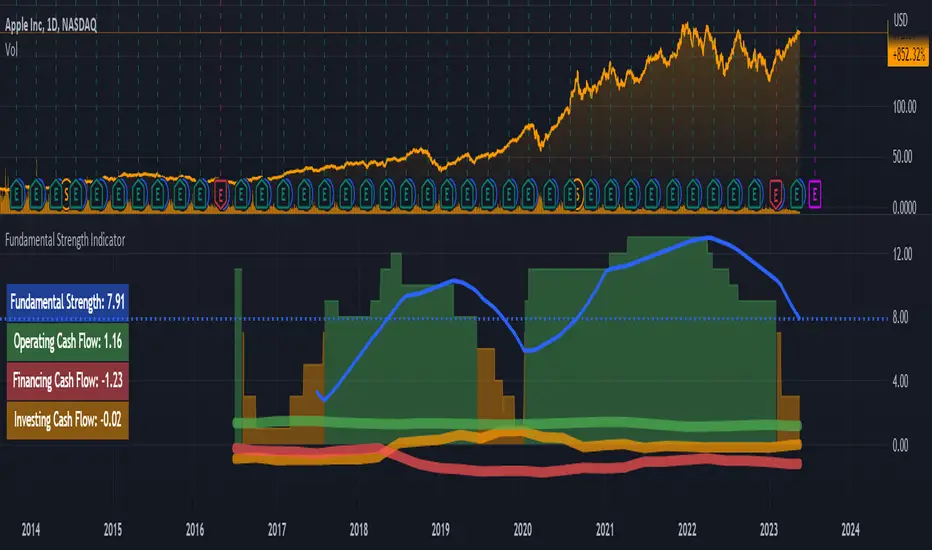
Fundamental Strength IndicatorName of the indicator: Fundamental Strength Indicator
A brief description of the indicator:
Using this indicator, you can evaluate a company in terms of the strength of its financial performance and see how that score has changed over time.
The background to the creation of the indicator:
The main idea that inspired me to create this indicator is: " Even if you buy just 1 share of a company, treat it like buying the whole business ". However, when I need to evaluate the business of thousands of public companies traded on exchanges, there is an objective difficulty: it is very time-consuming. To solve this problem, I had to create a scoring system of the fundamental analysis of the company, embodied in this indicator.
What the indicator looks like:
- First, it is a Histogram with bars of three colors: green, orange, and red. The width of the histogram depends on the depth of data from the company statements. The more historical data, the wider the histogram over time.
The green color of the bars means that the company has been showing excellent financial results by the sum of the factors in that time period. According to my terminology, the company has a " strong foundation " during this period. Green corresponds to values between 8 and 15 (where 15 is the maximum possible positive value on the sum of the factors).
The orange color of the bars means that according to the sum of factors during this period the company demonstrated mediocre financial results, i.e. it has a " mediocre foundation ". Orange color corresponds to values from 1 to 7.
The red color of the bars means that according to the sum of factors in this period of time, the company demonstrated weak financial results, i.e. it has a " weak foundation ". The red color corresponds to values from -15 to 0 (where -15 is the maximum possible negative value on the sum of factors).
- Second, this is the Blue Line , which is the moving average of the Histogram bars over the last year (*). Averaging over the year is necessary in order to obtain a weighted estimate that is not subject to medium-term fluctuations. It is by the last value of the blue line that the actual Fundamental Strength of the company is determined.
(*) The last year means the last 252 trading days, including the current trading day.
- Third, these are operating, investing, and financing Cash Flows expressed in Diluted net income. These flows look like thick green, orange, and red lines, respectively.
- Fourth, this is the Table on the left, which shows the latest actual value of the Fundamental Strength and Cash Flows.
Indicator settings:
In the indicator settings, I can disable the visibility of the Histogram, Blue Line, Cash Flows (each separately), and Table. It helps to study each of the parameters separately. It is also possible to change the color, transparency, and thickness of lines.
Mandatory requirements for using the indicator:
- works only on a daily timeframe;
- only applies to shares of public companies;
- company financial statements for the last 4 quarters and more are required;
- it is necessary to have the data from the Balance sheet, Income statement, and Cash flow statement, required for the calculation.
If at least one component required for calculating the Fundamental Strength is missing, the message " no data to calculate the Fundamental Strength correctly " is displayed. In the same case, but for the operating cash flow, the message " no data to calculate the Operating Cash Flow correctly " is shown, and similarly for other flows.
What is the value of the Fundamental Strength Indicator:
- allows for a quantitative assessment of a company's financial performance in points (from -15 to 15 points);
- allows you to visually track how the company's financial performance has changed (positively/negatively) over time;
- allows to visually trace the movement of main cash flows over time;
- speeds up the process of selecting companies for your shortlist (if you are focused on financial results when selecting companies);
- allows you to protect yourself from investing in companies with weak and mediocre fundamentals.
Indicator calculation methodology:
Guided by the "Treat stock investments as buying the whole business" approach, you can imagine what kind of business an investor is interested in owning and simultaneously determine the input parameters for calculating the indicator.
(!) Here it is important to emphasize that the idea of a benchmark business for investment is a subjective notion, so be sure to check whether it coincides with your own opinion.
For me, a benchmark business is:
- A business that operates efficiently without diminishing the return on shareholders' investment. To assess the efficiency and profitability of a business, I use the following financial ratios (*): Diluted EPS and Return on Equity (ROE). The first two parameters for calculating the indicator are there.
- A business that scales sales and optimizes its costs. From this point of view, the following financial ratios are suitable: Gross margin, Operating expense ratio, and Total revenue. Plus three other metrics.
- A business that turns goods/services into cash quickly and does not fall behind on payments to suppliers. The following financial ratios will fit here: Days payable, Days sales outstanding, and Inventory to revenue ratio. These are three more metrics.
- A business that does not resort to significant accounts payable and shows financial strength. Here I use the following financial ratios: Current ratio, Interest coverage, and Debt to revenue ratio. These are the last three parameters.
(*) If you want to learn more about these financial ratios, I suggest reading my two articles on TradingView:
Financial ratios: digesting them together
What can financial ratios tell us?
Next, each of the parameters is assigned a certain number of points based on its last value or the position of that value relative to the annual maximum and minimum.
For example, if the Current ratio:
- greater than or equal to 2 (+1 point);
- less than or equal to 1 (-1 point);
- more than 1 but less than 2 (0 points).
Or for example, if Diluted EPS:
- near or above the annual high (+2 points);
- near the annual minimum and below (-2 points);
- between the annual maximum and minimum (0 points).
And so on with each of the parameters.
As a result, the maximum number of points a company can score is 15 points. The minimum number of points a company can score is -15 points. These levels are marked with horizontal dotted lines: the green line is for the maximum value, and the red line is for the minimum.
I track the number of points for each day of a company's life on a three-color Histogram. The resulting average value for the last year is on the Blue Line. For me, it is the last value of the Blue Line that determines - this is the actual Fundamental Strength of the company.
The business valuation model I created is more suitable for companies that produce goods or services, and where tangible assets play a significant role in the business. For example, when analyzing companies in the financial sector, you may see the message "no data to calculate the Fundamental Strength correctly". Many of them may simply be missing data that is used as input for the calculation: Inventory to revenue ratio, Days sales outstanding, etc.
Examples:
Below I will evaluate various companies using the Fundamental Strength Indicator.
Tesla, Inc.
The indicator shows that since 2020, Tesla Inc. has been steadily increasing its Fundamental Strength (from 3.27 in Q1 2020 to 12.79 in Q1 2023). This is noticeable both by the color change of the Histogram from orange to green and by the rising Blue Line. If you look in detail at what has been happening with the financials during this time, it's clear what meaningful work the company has done. Revenues have almost quadrupled. Earnings per share have increased 134 times. At the same time, total debt to revenue fell almost 10 times.
Keurig Dr Pepper Inc.
The company, formed in 2018 by the merger of Keurig Green Mountain and Dr Pepper Snapple Group, has failed to deliver outstanding financial results, causing its Fundamental Strength to fall from 4.63 in Q1 2018 to -0.53 in Q1 2023. During this period, the drop in diluted earnings per share was accompanied by higher debt and deteriorating liquidity.
Costco Wholesale Corporation
Wholesaler Costco has been surprisingly stable in its financial performance and with steady growth in both earnings and revenue. This is the reason why the Histogram bars are exceptionally green throughout the calculation of the indicator. The Fundamental Strength has not changed in three years and is high at 11 points.
As an additional filter, for example, when comparing two companies where all other conditions are equal - I use the dynamics of Cash Flows expressed in Diluted net income (*). These are the thick green, orange, and red lines over the Histogram.
Why do I use income as a unit of measure of Cash Flows? Because it is a good way to make the scale of indicator values the same for companies from different countries, with different currencies. It also allows you to use a single value scale for both Cash Flows and Fundamental Strength.
(*) If you want to learn more about Cash Flows, I suggest reading my two articles on TradingView:
Cash flow statement or Three great rivers
Cash flow vibrations
So, an additional filter shows the dynamics of Cash Flows over time.
To interpret the dynamics of Cash Flows, I pay attention to the following patterns:
- How the cash flows are positioned in relation to each other;
- In which zone each of the cash flows is located - in the positive or negative;
- What is the trend of each of the cash flows;
- How volatile each of the cash flows is.
As an example, let's look at several companies in order to interpret the dynamics of their Cash Flows.
John B. Sanfilippo & Son, Inc.
This is the most ideal situation for me: operating cash flow (green line) is above the other cash flows, investment cash flow (orange line) is near zero and practically unchanged, and financial cash flow (red line) is consistently below zero. This picture shows that the company lives off its operating cash flow, does not increase its debt, does not spend a substantial amount of money on expensive purchases, and retains (does not sell off) assets.
Parker Hannifin Corporation
With stable operating cash flow (green line), the company implements investment programs by raising additional funding. This is noticeable due to an increase in financial cash flow (red line) and a simultaneous decrease in investment cash flow (orange line) with a significant deepening into negative areas. Apparently, there is not enough operating cash flow to realize the planned investments. One has to wonder how sustainable a company can be if it invests in its development using borrowed funds without a subsequent increase in operating cash flow.
Schlumberger N. V.
The chaotic intertwining of cash flows outside of the Fundamental Strength range (-15 to 15) is indicative of the company's rich life, but to me, it is an indicator of high riskiness of its actions. And as we can see, Fundamental Strength has only begun to strengthen in the last year, when the external appearance of cash flow has normalized.
Risk disclaimer:
When working with the Fundamental Strength Indicator and the additional filter in the form of Cash Flows, you should understand that the publication of the Balance sheet, Income statement, and Cash flow statement takes place sometime after the end of the financial quarter. This means that new relevant data for the calculation will only appear after the publication of the new statements. In this regard, there may be a significant change in the values of the Indicator after the publication of new statements. The magnitude of this change will depend both on the content of the new statements and on the number of days between the end of the financial quarter and the publication date of the statements. Until the date of publication of the new statements, the latest relevant data will be used for calculations.
I would like to draw your attention to the fact that the calculation of Fundamental Strength and Cash Flows requires the availability of data for all parameters of the valuation model . It uses data that is exclusively available on TradingView (there is no reconciliation with other sources). If at least one parameter is missing, I switch to another company's analysis to continue using the indicator.
Thus, the Fundamental Strength Indicator and an additional filter in the form of Cash Flows make it possible to evaluate the financial results of the company based on the available data and the methodology I created. A simple visualization in the form of a three-color Histogram, a Blue line, and three thick Cash Flow lines significantly reduces the time for selecting fundamentally strong companies that fit the criteria of the selected model. However, this Indicator and/or its description and/or examples cannot be used as the sole reason for buying or selling stocks or for any other action or inaction related to stocks.
Crypto Correlation MatrixA crypto correlation matrix or table is a tool that displays the correlation between different cryptocurrencies and other financial assets. The matrix provides an overview of the degree to which various cryptocurrencies move in tandem or independently of each other. Each cell represents the correlation between the row and column assets respectively.
The correlation matrix can be useful for traders and investors in several ways:
First, it allows them to identify trends and patterns in the behavior of different cryptocurrencies. By looking at the correlations between different assets, traders can gain insight into the intra-relationships of the crypto market and make more informed trading decisions. For example, if two cryptocurrencies have a high positive correlation, meaning that they tend to move in the same direction, a trader may want to diversify their portfolio by choosing to invest in only one of the two assets.
Additionally, the correlation matrix can help traders and investors to manage risk. By analyzing the correlations between different assets, traders can identify opportunities to hedge their positions or limit their exposure to particular risks. For example, if a trader holds a portfolio of cryptocurrencies that are highly correlated with each other, they may be at greater risk of losses if the market moves against them. By diversifying their portfolio with assets that are less correlated with each other, they can reduce their overall risk.
Some of the unique properties for this specific script are the correlation strength levels in conjunction with the color gradient of cells, intended for clearer readability.
Features:
Supports up to 64 different crypto assets.
Dark/Light mode.
Correlation strength levels and cell coloring.
Adjustable positioning on the chart.
Alerts at the close of a bar. (Daily timeframe or higher recommended)

Artharjan Daily Weekly Price Trend IndicatorHi,
Artharjan Daily Weekly Price Trend Indicator is created to identify whether the current market price is with respect to previous Daily High and Low as well as Previous Weekly High and Low
If the price is above previous Day High a Green Square is plotted above the Candle, if the Price is inside the Previous Day Range then a Gray Square is Plotted above the Candle, and if the Price is below the previous day low then a Red Square is plotted above the candle.
Similarly If the price is above previous Week's High a Green Circle is plotted below the Candle, if the Price is inside the Previous Week's Range then a Gray Circle is Plotted below the Candle, and if the Price is below the previous Week's low then a Red Circle is plotted below the candle.
The idea here is to identify the trend, trend changes (Reversals) and initiate either a long or short positing purely based on price action.
For illustration purpose, If suppose you have entered the trade when you see a Green Square above and a Green Circle Below, hold on to the trade as long as the Green circle below does not turn into a Red Circle. It means the Weekly trend is Bullish and Daily trend may change more frequently, but you may hold on to your position unless and until the weekly Trend changes.
Also if may help to Book your profits in a timely manner, lets say you are in a long trade and you keep seeing Green Square at the top of the candle, the moment you see a Gray or a red Square at the top you may exit your long position. Obviously trader needs to use his brains to enter a position at right location on the chart and ride that position using this indicator.
I hope everyone would find this simple indicator very useful.
Regards
Rahul Desai
@Artharjan

Financial Radar Chart by zdmreRadar chart is often used when you want to display data across several unique dimensions. Although there are exceptions, these dimensions are usually quantitative, and typically range from zero to a maximum value. Each dimension’s range is normalized to one another, so that when we draw our spider chart, the length of a line from zero to a dimension’s maximum value will be the similar for every dimension.
This Charts are useful for seeing which variables are scoring high or low within a dataset, making them ideal for displaying performance.
How is the score formed?
Debt Paying Ability
if Debt_to_Equity < %10 : 100
elif < 20% : 90
elif < 30% : 80
elif < 40% : 70
elif < 50% : 60
elif < 60% : 50
elif < 70% : 40
elif < 80% : 30
elif < 90% : 20
elif < 100% : 10
else: 0
ROIC
if Return_on_Invested_Capital > %50 : 100
elif > 40% : 90
elif > 30% : 80
elif > 20% : 70
elif > 10% : 50
elif > 5% : 20
else: 0
ROE
if Return_on_Equity > %50 : 100
elif > 40% : 90
elif > 30% : 80
elif > 20% : 70
elif > 10% : 50
elif > 5% : 20
else: 0
Operating Ability
if Operating_Margin > %50 : 100
elif > 30% : 90
elif > 20% : 80
elif > 15% : 60
elif > 10% : 40
elif > 0 : 20
else: 0
EV/EBITDA
if Enterprise_Value_to_EBITDA < 3 : 100
elif < 5 : 80
elif < 7 : 70
elif < 8 : 60
elif < 10 : 40
elif < 12 : 20
else: 0
FREE CASH Ability
if Price_to_Free_Cash_Flow < 5 : 100
elif < 7 : 90
elif < 10 : 80
elif < 16 : 60
elif < 18 : 50
elif < 20 : 40
elif < 22 : 30
elif < 30 : 20
elif < 40 : 15
elif < 50 : 10
elif < 60 : 5
else: 0
GROWTH Ability
if Revenue_One_Year_Growth > %20 : 100
elif > 16% : 90
elif > 14% : 80
elif > 12% : 70
elif > 10% : 50
elif > 7% : 40
elif > 4% : 30
elif > 2% : 20
elif > 0 : 10
else: 0

Joel Greenblatt Magic FormulaJoel Greenblatt Magic Formula. I always wanted to make this.
The Indicator shows 3 values.
ROC,EY,SUM.
ROC= Return On Capital.
EY=Earnings Yield
SUM= Addition of Two.
Formula:
ROC=EBIT / (Net Working Capital + Net Fixed Assets).
EY = EBIT / Enterprise value
Enterprise Value=(Market value of equity + Net Interest-bearing debt)
To implement the strategy, investors start by identifying a universe of stocks, typically large-cap or mid-cap companies that trade on a major stock exchange. Next, they rank the stocks based on their ROC and EY. The companies with the best combination of these two metrics are considered the best investments (based on this ranking).
For example, a stock that ranks 10th on EY and 99th on ROIC gets a value of 109. The two ranks are simply added together and all stocks are ranked on the sum of the two ranks. The stocks with the lowest values are best.
All credits to "The Little Book That Beats The Market" by Joel Greenblatt
The Magic Formula strategy is a stock selection method popularized by Joel Greenblatt’s book The Little Book That Beats the Market.
It involves ranking companies based on Two factors:
A high return on capital and A high Earnings Yield.
The companies with the best combination of these two metrics are considered the best investments. The strategy aims to find undervalued companies with strong financials that have the potential for high returns over the long term.

COT-index rangeA graph showing the commercials (part of COT-data) positioning in relation to its own range, X periods back. I usually choose the look-back period to equal approximately one year. This will be around 52 on a weekly chart and 250 on a daily chart.
In my opinion a high data-point for the commercials is bullish and vice versa. But instead of only looking att absolute values I now look more at how the commercials are positioned compared to the previous 12 och 6 months.
Example:
a) if COT-index range = 0.8, then the commercials are in the 80th percentile for this specific look-back period, i.e. the commercials has only been more bullish 20% of the time and more bearish 80% of the time.
b) a) if COT-index range = 0.5, then the commercials are in the 50th percentile for this specific look-back period, i.e. the commercials has been more bullish 50% of the time and more bearish 50% of the time.
c) if COT-index range = 0.2, then the commercials are in the 20th percentile for this specific look-back period, i.e. the commercials has been more bullish 80% of the time and more bearish 20% of the time.
In other words, a high reading is bullish and a low reading is bearish.
TimeFiesta by Billy Rock
Introducing TimeFiesta, a unique and fun digital clock timer for TradingView charts, created by Billy Rock. TimeFiesta is designed to help traders, especially scalpers, stay on top of multiple time frame closes with ease.
Features of TimeFiesta:
Customizable display of timer for Current Time Frame, 15 Minutes, 1 Hour, and 4 Hours.
Options to turn ON/OFF each time frame display as per the user's preference.
Adjustable digital clock text size: Small, Medium, and Large.
Multiple location options for the digital clock timer: Top Center, Top Right, and Bottom Right.
TimeFiesta is the perfect companion for those who need to keep an eye on multiple time frames while trading. Its sleek design and user-friendly interface make it a must- have tool for traders of all levels. With TimeFiesta, you'll never miss a crucial time frame close again!
Give credit where it's due: TimeFiesta is created by the talented Billy Rock. Be sure to try this fantastic tool and enhance your trading experience!

Days in rangeThis script is a little widget that I made to do some homework on the VIX.
As you can see in the chart I was analyzing the 2008 market crash and the stats that followed it after until the market started to recover.
You can see that theory in my "Ideas" tab.
This is an interactive set of lines that you can use to count the the bars inside and outside of your chosen range, and the percentage outside that range.
You should initially enter the price range of your product in the menu and set some arbitrary dates that you can easily see on your chart.
Drag and drop the lines around to suit what price and the dates you are analyzing.
The table will display the bar count inside and outside of the range, the total bars, and the percentage outside that range.
I personally used this as a tool to study the overall average of the product, compared with the behavior during major market events.
It is currently my opinion that post 2020 analysis needs to take into account the behavior of any given product prior to 2020 when the
VIX was in its comfort zone. Not to say that a price valuation hasn't been set, but that the movement to that price was outside of "Normal Market Conditions,"
and the time factor to return to that value might be skewed. Other factors would need to be considered at that point pertaining to your specific product or corelating indicator.
I could see this tool being useful to Forex and commodities traders. But that isn't my field so that that for what it is. I do think it would perform best on something that is more
pegged to a price range. I personally would use it on product's, like the VIX, that I use as an indicator product. That is what it was designed for.
But I suppose it could be used for Mean price and time related analysis, maybe with a Vwap, SMA or other breakout style indicators.
Volume analysis might be pretty sporty. Possibly time patterns... the possibilities could be endless. Or... limited.
I am publishing this for my trade group so that it can be tinkered with to find other helpful ways to use it.
If anyone finds something interesting with other indicators, please drop a comment below and I could consider creating a script to integrate with this tool.

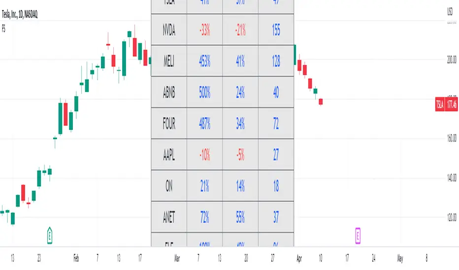
Fundamental ScreenerThis indicator is designed to compare the year-over-year earnings and sales growth, as well as the P/E ratio of up to 10 stocks simultaneously .
This provides valuable insights into the fundamental performance of multiple stocks at the same time, allowing traders to quickly identify which stocks are outperforming or underperforming their peers.
The earnings and sales growth figures are calculated on a year-over-year basis , comparing the most recent quarter to the same quarter 1 year ago.
The P/E ratio is a valuation metric that measures a company's stock price relative to its trailing twelve months earnings per share.
By comparing these three key metrics across multiple stocks, traders can quickly identify which stock in a group has superior fundamentals.
Customization
Chose to compare 5 or 10 symbols
Table position, color, and size
ValueViewTitle: ValueView
Description:
ValueView is a script designed to cater to the needs of value investors. Its primary purpose is to provide a comprehensive overview of the financial performance of a stock, making it easier for investors to assess the intrinsic value and potential investment opportunities.
The script displays a concise summary of essential fundamental values and metrics in the form of a customizable table, directly integrated into the chart. This allows investors to evaluate the stock's performance for a variable number of fiscal years, as defined by the user. The input flexibility enables users to focus on the timeframes that are most relevant to their analysis.
ValueView works on timeframes greater than or equal to "DAY", ensuring that the data presented is reliable and relevant for long-term value investing strategies. With this feature, investors can focus on the bigger picture and avoid getting distracted by short-term fluctuations.
With ValueView, investors can choose to select or deselect specific metrics according to their investment strategy and preferences. This feature ensures that users are presented with the information they find most valuable, allowing them to make more informed decisions based on their unique perspective.
Key Features:
Quick overview of the financial performance of a stock for value investors
Customizable table displaying essential fundamental values and metrics
User-defined number of fiscal years for analysis
Select and deselect metrics to tailor the output to individual preferences
ValueView offers a convenient, time-saving solution for value investors looking to gain a deep understanding of a stock's financial performance. With its customizable features and easy-to-use interface, this script simplifies the process of identifying promising investments and making informed decisions.

Hikkake Hunter 2.0This script serves as a successor to a previous script I wrote for identifying Hikkakes nearly two years ago.
The old version has been preserved here:
█ OVERVIEW
This script is a rework of an old script that identified the Hikkake candlestick pattern. While this pattern is not usually considered a part of the standard candlestick patterns set, I found a lot of value when finding a solution to identifying it. A Hikkake pattern is a 3-candle pattern where a middle candle is nested in between the range of the prior candle, and a candle that follows has a higher high and a higher low (bearish setup) or a lower high and a lower low (bullish setup). What makes this pattern unique is the "confirmation" status of the pattern; within 3 candles of this pattern's appearance, there must be a candle that closes above the high (bullish setup) or below the low (bearish setup) of the second candle. Additional flexibility has been added which allows the user to specify the number of candles (up to 5) that the pattern may have to confirm after its appearance.
█ CONCEPTS
This script will cover concepts mainly focusing on candlestick analysis, price analysis (with higher timeframes), and statistical analysis. I believe there is also educational value presented with the use of user-defined-types (UDTs) in accomplishing these concepts that I hope others will find useful.
Candlestick Analysis - Identification and confirmation of the patterns in the deprecated script were clunky and inefficient. While the previous script required the use of 6 candles to perform the confirmations of patterns (restricted solely to identifying patterns that confirmed in 3 candles or less), this script only requires 3 candles to identify and process patterns by utilizing a UDT representing a 'pattern object'. An object representing a pattern will be created when it has been identified, and fields within that object will be set for processing by the functions it is passed to. Pattern objects are held by a var array (values within the array persist between bars) and will be removed from this array once they have been confirmed or non-confirmed.
This is a significant deviation from the previous script's methods, as it prevents unnecessary re-evaluations of the confirmation status of patterns (i.e. Hikkakes confirmed on the first candle will no longer need to be checked for confirmations on the second or third; a pitfall of the deprecated version which required multiple booleans tracking prior confirmation statuses). This deviation is also what provides the flexibility in changing the number of candles that can pass before a pattern is deemed non-confirmed.
As multiple patterns can be confirmed simultaneously, this script uses another UDT representing a linked-list reduction of the pattern object used to process it. This liked-list object will then be used for Price Analysis.
Price Analysis - This script employs the use of a UDT which contains all the returns of confirmed patterns. The user specifies how many candles ahead of the confirmed pattern to calculate its return, as well as where this calculation begins. There are two settings: FROM APPEARANCE and FROM CONFIRMATION (default). Price differences are calculated from the open of the candle immediately following the candle which had confirmed the pattern to the close of the candle X candles ahead (default 10). ( SEE FEATURES )
Because of how Pine functions, this calculation necessitates a lookback on prior candles to identify when a pattern had been confirmed. This is accomplished with the following pseudo-code:
if not na(confirmed linked-list )
for all confirmed in list
GET MATRIX PLACEMENT
offset = FROM CONFIRMATION ? 0 : # of candles to confirm
openAtFind = open
percent return = ((close - openAtFind) / openAtFind) * 100
ADD percent return TO UDT IN MATRIX
All return UDTs are held in a matrix which breaks up these patterns into specific groups covered in the next section.
Higher Timeframes - This script makes a request.security call to a higher timeframe in order to identify a price range which breaks up these patterns into groups based on the 'partition' they had appeared in. The default values for this partitioning will break up the chart into three sections: upper, middle, and lower. The upper section represents the highest 20% of the yearly trading range that an asset has experienced. The lower section represents the trading range within a third (33%) of the yearly low. And the middle section represents the yearly high-low range between these two partitions.
The matrix containing all return UDTs will have these returns split up based on the number of candles required to confirm the pattern as well as the partition the pattern had appeared in. The underlying rationale is that patterns may perform better or worse at different parts of an asset's trading range.
Statistical Analysis - Once a pattern has been confirmed, the matrix containing all return UDTs will be queried to check if a 'returnArray' object has been created for that specific pattern. If not, one will be initialized and a confirmed linked-list object will be created that contains information pertinent to the matrix position of this object.
This matrix contains the returns of both the Bullish and Bearish Hikkake patterns, separated by the number of candles needed to confirm them, and by the partitions they had appeared in. For the standard 3 candles to confirm, this means the matrix will contain 18 elements (dependent on the number of candles allowed for confirmations; its size will range from 12 to 30).
When the required number of candles for Price Analysis passes, a percent return is calculated and added to the returnArray contained in the matrix at the location derived from the confirmed linked-list object's values. The return is added, and all values in the returnArray are updated using Pine's built in array.___ functions. This returnArray object contains the array of all returns, its size, its average, the median, the standard deviation of returns, and a separate 3-integer array which holds values that correspond to the types of returns experienced by this pattern (negative, neutral, and positive)*.
After a pattern has been confirmed, this script will place the partition and all of the aforementioned stats values (plus a 95% confidence interval of expected returns) related to that pattern onto the tooltip of the label that identifies it. This allows users to scroll over the label of a confirmed pattern to gauge its prior performance under specific conditions. The percent return of the specific pattern identified will later be placed onto the label tooltip as well. ( SEE LIMITATIONS )
The stats portion of this script also plays a significant role in how patterns are presented when using the Adaptive Coloring mode described in FEATURES .
*These values are incremented based on user-input related to what constitutes a 'negative' or 'positive' return. Default values would place any return by a pattern between -3% and 3% in the 'neutral' category, and values exceeding either end will be placed in the 'negative' or 'positive' categories.
█ FEATURES
This script contains numerous inputs for modifying its behavior and how patterns are presented/processed, separated into 5 groups.
Confirmation Setting - The most important input for this script's functioning. This input is a 'confirm=true' input and must be set by the user before the script is applied to the chart. It sets the number of candles that a pattern has to confirm once it has been identified.
Alert Settings - This group of booleans sets which types of alerts will fire during the scripts execution on the chart. If enabled, the four alerts will trigger when: a pattern has been identified, a pattern has been confirmed, a pattern has been non-confirmed, and show the return for that confirmed pattern in an alert. Because this script uses the 'alert' function and not 'alertcondition', these must be enabled before 'any alert() function call' is set in TradingView's 'alerts' settings.
Partition Settings - This group of inputs are responsible for creating (and viewing) the partitions that breaks the returns of the patterns identified up into their respective groups. The user may set the resolution to grab the range from, the length back of this resolution the partitions get their values from, the thresholds which breaks the partitions up into their groups, and modify the visibility (if they're shown, the colors, opacity) of these partitions.
Stats Settings - These inputs will drastically alter how patterns are presented and the resulting information derived from them after their appearance. Because of this section's importance, some of these inputs will be described in more detail.
P/L Sample Length - Defines the number of candles after the starting point to grab values from in the % return calculation for that pattern.
P/L Starting Point - Defines the starting point where the P/L calculation will take place. 'FROM APPEARANCE' will set the starting point at the candle immediately following the pattern's appearance. 'FROM CONFIRMATION' will place the starting point immediately following the candle which had confirmed the pattern. ( SEE LIMITATIONS )
Min Returns Needed - Sets how many times a specific pattern must appear (both by number of candles needed to confirm and by partition) before the statistics for that pattern are displayed onto the tooltip (and for gradient coloration in Adaptive Coloring mode).
Enable Adaptive Coloring - Changes the coloration of the patterns based on the bullish/bearishness of the specified Gradient Reference value of that pattern compared to the Return Tolerance values OR the minimum and maximum values of that specified Gradient Reference value contained in the matrix of all returns. This creates a color from a gradient using the user-specified colors and alters how many of the patterns may appear if prior performance is taken into account.
Gradient Reference - Defines which stats measure of returns will be used in the gradient color generation. The two settings are 'AVG' and 'MEDIAN'.
Hard Limit - This boolean sets whether the Return Tolerance values will not be replaced by values that exceed them from the matrix of returns in color gradient generation. This changes the scale of the gradient where any Gradient Reference values of patterns that exceed these tolerances will be colored the full bullish or bearish gradient colors, and anything in between them will be given a color from the gradient.
Visibility Settings - This last section includes all settings associated with the overall visibility of patterns found with this script. This includes the position of the labels and their colors (+ pattern colors without Adaptive Coloring being enabled), and showing patterns that were non-confirmed.
Most of these inputs in the script have these kinds of descriptions to what they do provided by their tooltips.
█ HOW TO USE
I attempted to make this script much easier to use in terms of analyzing the patterns and displaying the information to the user. The previous script would have the user go to the 'data window' side bar on TradingView to view the returns of a pattern after they had specified which pattern to analyze through the settings, needlessly convoluted. This aim at simplicity was achieved through the use of UDTs and specific code-design.
To use, simply apply the indicator to a chart, set the number of candles (between 2 and 5) for confirming this specific pattern and adjust the many settings described above at your leisure.
█ LIMITATIONS
Disclaimer - This is a tool created with the hopes of helping identify a specific pattern and provide an informative view about the performance of that pattern. Previous performance is not indicative of future results. None of this constitutes any form of financial advice, *use at your own risk*.
Statistical Analysis - This script assumes that all patterns will yield a NORMAL DISTRIBUTION regarding their returns which may not be reflective of reality. I personally have limited experience within the field of statistics apart from a few high school/college courses and make no guarantees that the calculation of the 95% confidence interval is correct. Please review the source code to verify for yourself that this interval calculation is correct (Function Name: f_DisplayStatsOnLabel).
P/L Starting Point - Because of when the object related to the confirmation status of a pattern is created (specifically the linked-list object) setting the 'P/L Starting Point' to 'FROM APPEARANCE' will yield the results of that P/L calculation at the same time as 'FROM CONFIRMATION'.
█ EXAMPLES
Default Settings:
Partition Background (default):
Partition Background (Resolution D : Length 30):
Adaptive Coloration:
Show Non-Confirmed:

Stock Dissect DashboardI developed this script, to help me in my analysis process of Stocks.
In it I have combined several things that I look at when evaluating a company.
First, there is the Macro part, where I have added the most important (at least for me) macro indicators, such as inflation, interest rates, initial jobless claims etc.
Under the last is the latest reported value, next we have the previous, and next to them is the change.
Underneath it is the technical part.
I have added the 1-Week, 1-Month, 3-Month, and 1-Year returns. This way I can easily see the performance of the stock over time.
We have a market regime indicator, which tells us whether the stock is Trending, Mean-Reverting, or Neutral.
Also, I've added the RSI and 50 and 200 Day Moving Averages for additional analysis
At the bottom, I've included some of the fundamentals that I look at in my analysis process. We have the PE and PB ratio, as well as the debt-to-equity and profit margins.
I hope you guys like it and saves you as much time and energy as it did for me.
Happy trading!

Artharjan - ATR DashboardArtharjan - ATR Dashboard indicator is designed to plot a dashboard of Average True Range for past 10 candles on the chart. It calculates and shows what percentage of the closing price the ATR is for the selected timeframe.
It also plots the volume of past 10 days and shows whether the volume has gone up (Green Color) or fallen (Red Color)
For daily timeframe since there are 22 active trading days per month a default 11 period is selected for the Daily timeframe however users may change according to their preference.
If the timeframe is in seconds - 75 period is used to calculate ATR
If the timeframe is in Intraday - 25 period is used to calculate ATR
If the timeframe is in Daily - 11 period is used to calculate ATR
If the timeframe is in Weekly - 4 period is used to calculate ATR
If the timeframe is in Monthly - 3 period is used to calculate ATR
The Default ATR period is 14. User has a choice to select the ATR period based on the timeframe or use Standard 14 period for all timeframes.
There is also a provision created to add a Buffer % to the ATR that is calculated. With this Buffer the Options Selling Prices (For Short Strangle Strategy) are calculated. If the Buffer is set to 0 then no Buffer is added to the ATR.
Strike Switch is provided to change the way the Call and Put Options Strike Prices are calculated.
There are two options provided to calculate short strike prices for Out of Money Call and Out of Money Put.
1] Strikes calculation based on H/L of previous candle
2] Strikes calculation based on the midpoint of previous candle (High + Low) /2
Short strikes for the OTM Call Option and OTM Put Options are calculated by adding the Buffered ATR either to the Previous Day High and subtracting Buffered ATR from Previous Day Low OR by adding the Buffered ATR either to the mid point of Previous Day and subtracting Buffered ATR from mid point of previous Day. If Buffer % is set to zero then no Buffer is added to the ATR.
Traders can decide whether they wish to enter the trade if the ATR is let's say at least 1.25% or higher of the Candles closing price that will ensure decent options premium to be collected by Options Writers.
The Dashboard plots following details for 10 period
1] Closing Price (LTP)
2] % Change of Closing Price
3] ATR for the selected Period
4] % Change in ATR
5] ATR as a Percentage of LTP
6] Buffered ATR
7] CE Strike
8] PE Strike
9] Volume (IN THOUSANDS)
Hope traders will find this dashboard very useful.
Regards
Rahul Desai
@Artharjan

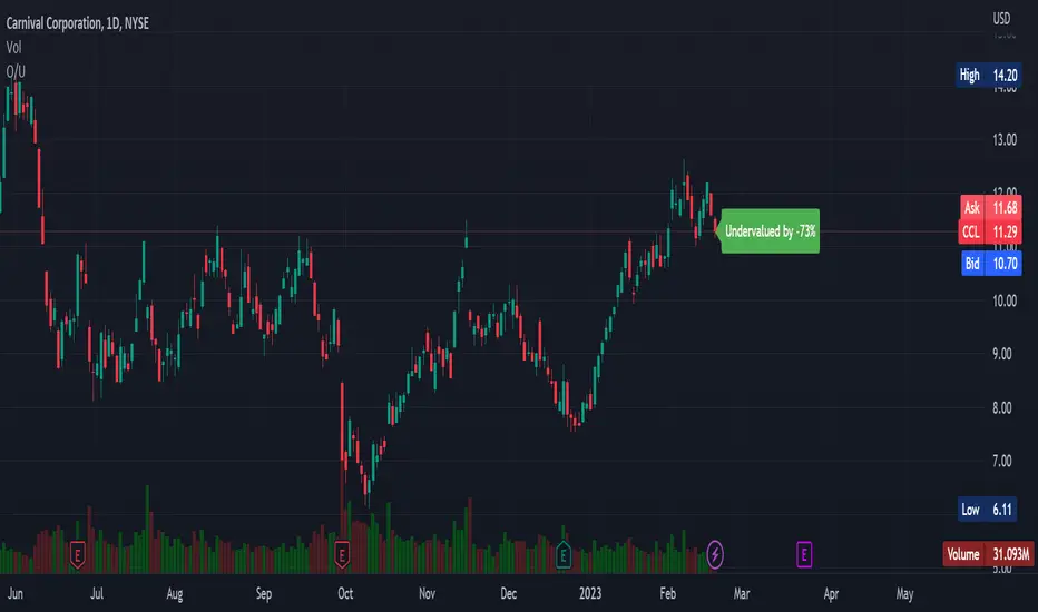
Overvalued/Undervalued OverlayThis indicator will tell you whether the security you are looking at is overvalued or undervalued using a company's total assets and their market cap. In theory, a company's total assets is everything that they own, which then should technically be how much the company is worth. Therefore, if the company's market cap is higher than their total assets, the indicator will read "Overvalued by X%". However, if the company's market cap is lower than their total assets, the indicator will read "Undervalued by X%". If you have any questions, feel free to let me know. Keep in mind that this indicator should be only used for long-term investing.
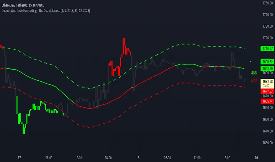
Quantitative Price Forecasting - The Quant ScienceThis script is a quantitative price forecasting indicator that forecasts price changes for a given asset.
The model aims to forecast future prices by analyzing past data within a selected time period. Mathematical probability is used to calculate whether starting from time X can lead to reaching prices Y1 and Y2. In this context, X represents the current selected time period, Y1 represents the selected percentage decrease, and Y2 represents the selected percentage increase. The probabilities are estimated using the simple average.
The simple average is displayed on the chart, showing in red the periods where the price is below the average and in green the periods where the price is above the average.
This powerful tool not only provides forecasts of future prices but also calculates the distribution of variations around the average. It then takes this information and creates an estimate of the average price variation around the simple average.
Using a mean-reverting logic, buying and selling opportunities are highlighted.
We recommend turning off the display of bars on your chart for a better experience when using this indicator.
Unlock the full potential of your trading strategy with our powerful indicator. By analyzing past price data, it provides accurate forecasts and calculates the probability of reaching specific price targets. Its mean-reverting logic highlights buying and selling opportunities, while the simple moving average displayed on the chart shows periods where the price is above or below the average. Additionally, it estimates the average variation of price around the simple average, giving you valuable insights into price movements. Don't miss out on this valuable tool that can take your trading to the next level
Range Identifier*Re-upload as previous attempt was removed.
An attempt to create a half decent identifier of when the markets are ranging and in a state of choppiness and mean reversion - as opposed to in trending trade conditions.
It's super simple logic just working on some basic price action and market structure operating on higher time frames.
It uses the Donchian Channels but with hlc3 data as opposed to high/lows - and identifies periods in which the baseline is static, or when the channel upper & lower are contracting.
This combination identifies non trending price action with decreasing volatility, which tends to indicate a lot of upcoming chop and ranging/sideways action; especially when intraday trading and applied on the daily timeframe.
The filter increasing results in a decrease of areas identified as choppy by extending the required period of a sideways static basis, I've found values of 2 or 3 to be a nice sweetspot!
Overall should be pretty intuitive to use, when the background changes just consider altering your trading and investing approach. This was created as I've not really seen anything on here that functions quite the same.
I decided to not include the Donchian upper/lower/basis as I found that can often lead to decision bias and being influenced by where these lines are situated causing you to guess on future direction.
It's obviously never going to be perfect, but a nice and unbiased way to quickly check where we may be in a cycle; let me know if there are any issues/questions and please enjoy!

TwV Market Signals ScreenerMarket Signals Screener
This indicator allows traders to have a view of multiple pairs and timeframes Long/Short signals and specific information of parameters, based on the TwV Market Signals also developed by me and that can be found on my profile.
Full Screener Panel
This panel allows the trader to monitor multiple pairs at a single screen, giving an immediate vision of possible entries and exits (Long/Short). Moreover, allows traders to have handy all information of the TwV Market Signals Indicator that might be analyzed further for each pair. It has the following characteristics:
It can be placed anywhere on the screen through the main menu of the indicator.
It can be combined with the same indicator multiple times, as per screener is limited to show 40 pairs, you can select the number of panels being added to adjust position one next to each other.
It strengthens colors when a pair has changed its signals in order to the trader to know immediate changes and then do the follow up
The screener shows the pairs, which can be changed within the menus.
The screener shows the Long and Short Signals in its las column but previously, it shows the most critical parameters in the strategies (Market Signals Indicator) that determined the possible Long/Short position. Therefore, the EMAs, STOCH, SQZ, ADX, and TTM, are summarized in the screener for each pair.
For analyzing a specific pair, refer to the the Twv Market Signals Indicator, which is other indicator that might be on my TradingView Profile and that was used as base for the screener.
How to use this indicator and work with the strategies of the TwV Market Signals Indicator
The use of EMAs 10,20 and 50 draw the medium to long term trends, therefore avoiding signals against the trend. Furthermore, the EMAs will advise possible change in trends, especially considering the 10 and 20 cross, considering that crossing the 10,20 and 50, might confirm the change in med to long term trend change of the price. This is completely visual in the chart as it tints green for positive trend and yellow to red for negative trend.
The 200 SMA is included as it also gives better confirmation to the trend, the basics tell that when the EMAs mentioned above are below the 200 SMA then the likelihood for entries in long positions are not the best and vice versa for short.
Therefore, the trader shall filter Long and Short Signals accordingly as this EMAs are not used to send Long and Short signals considering that they confirm the trend in a slow pace and not reactively to the price volatility.
There are two strategies built-in within the indicator:
Strategy 1 – Longer time trades and high volatility handling
The Long and Short Signals are based on 14 and EMAs (by default). This two Mas are used to send signals based on their crossovers as they are way more reactive to the price movement.
Trader shall consider that EMAs are used for higher timeframes, therefore the indicator has the possibility to adjust the EMAs and use SMAs or WMAs instead for one or the two parameters (14 and 21).
WMAs react faster to the price volatility so the trader shall adjust this according to the timeframe being used. (Lower timeframes suggested).
This strategy is used for trades that might keep running for longer periods of times.
For reference on what the SMAs, EMAs and WMAs are, please see below sections in the description.
Strategy 2 - Shorter time trades and unhandled high volatility
The Long and Short Signals are bases on HMA. HMAs (Hull Moving Averages) track the price movement and volatility way faster that SMAs, EMAs and WMAs, therefore as the HMA follow the price quicker, it is intended for short time trades even in higher timeframes.
Scalping is not suggested using this strategy as HMA do not handle high volatility even on higher timeframes.
One of the biggest differences from the first strategy is that there is no more than a single HMA length to work with, which is 24 as default.
HMAs calculation is different to other MAs, therefore combining various HMAs lengths looking for crossovers become trend identification a lot less precise. HMAs are not intended to be used with different length crossovers.
Exit points = The use of Stochastic and VRVP
Stochastic RSI
It is well known that when Stochastic RSI resets when overbought or oversold therefore traders have within a summary box the possibility to check whether the K & D lines in the Stochastic RSI hace crossed over bullish or bearish.
Although the crossover is not mandatory for a change trend, the crossover might be used by the trader to exit a position considering that the price might move on the opposite direction.
Traders shall look at the summary box, where bullish and bearish crossovers are shown, so they evaluate their position exit.
Visible Range Volume Profile
The use of the VRVP is to find support and resistance on the price movements. Although high and lows are used as possible supports and resistances, VRVP shows an area of confluence on the order book, where volume of positions are accumulated and that might act as support or resistance depending on the price direction.
Traders can visually activate the VRVP to see the Point of Control (POC) directly on the chart as a line (similar as how a support or resistance would be drawn). Moreover, traders have the ability to see within the summary box, whether to see if the price is above or below the POC, so they clearly know if it is acting as support or resistance.
Price Direction
Trade the market trend is well known to be used to identify possible price direction. It is important not to confuse the longer time trend drawn by the EMAs with the TTM Trend bar color. The TTM trend colors bars according to the price direction, helping traders not to confuse when a red bar appears on an uptrend or green bars on a down trend.
This coloring helps traders not to exit trades based on bar coloring, which might psychologically affect when scalping or short-term trading specially.
Originally, the TTM trend is used considering the ADX in and indicator called TTM Squeeze, where the strength of the movement is measured, therefore although candle colors help with the price direction, ADX provides the trader the ability to see whether the direction is losing momentum and then catch the best possible exit before the direction change.
Terminology basics
Trend indicators
Exponential Moving Average (EMAs): The base indicator is composed of moving averages of 10, 20 and 55 exponential periods, to determine a possible bullish or bearish trend (EMA Crossing)
Simple Moving Average (SMA): The base indicator is composed of a moving average of 200 simple periods, which in conjunction with the EMAs can lead to estimate potential upward or downwards moves, as well as possible resistances. (SMA Positioning)
Weighted moving average (WMA): It is a technical indicator that traders use to generate trade direction and make a long or short position. It assigns greater weighting to recent data points and less weighting on past data points. (WMA Crossing)
Strength and S/R indicators
VPVR (Volume Profile Visible Range): It allows to determine the Point of Control (POC) which is the node with the highest volume profile. This can be used as an important retest point or to calculate potential support and resistance. The POC level is represented with a red dotted line in the graph.
The VPVR is a simplified version of the “TwV Multi-timeframe Dynamic VRVP” that you can find for free use in my profile. This version calculates the main’s timeframe POC and also has the possibility to be fixed range if the trader enables it from the menu. (Dynamic range by default).
ADX (Average Directional Index): The ADX helps the indicator to estimate the strength of the movement, always considering the DI+ and DI- to not go against the trend strength. This is represented as summary text in a table.
/
Exit indicator
Stochastic RSI: It is an indicator used in technical analysis that ranges between zero and a hundred and is created by applying the Stochastic oscillator formula to a set of relative strength index (RSI) values rather than to standard price data. Using RSI values within the Stochastic formula gives traders an idea of whether the current RSI value is overbought or oversold (Exit zones)
/
How to use Summary
1. Receive the Long or Short Signals using strategy 1 or 2, depending on the selected in the main menu of the indicator.
2. Evaluate the trend based on the 10,20, 50 and 200 MAs. Filter the Long and Short signals accordingly.
3. Monitor constantly the TTM Trend and the ADX for the direction and strength of the position entered and review if the momentum is being lost, considering step 4 or other possible reasons that might lead to exiting the position.
4. Once entered to a position evaluate constantly the Stochastic RSI bearish or bullish crossover or POC value on screen or summary box to exit the position.
5. Consider that for doing the evaluation individually, you shall use the TwV Market Signals.
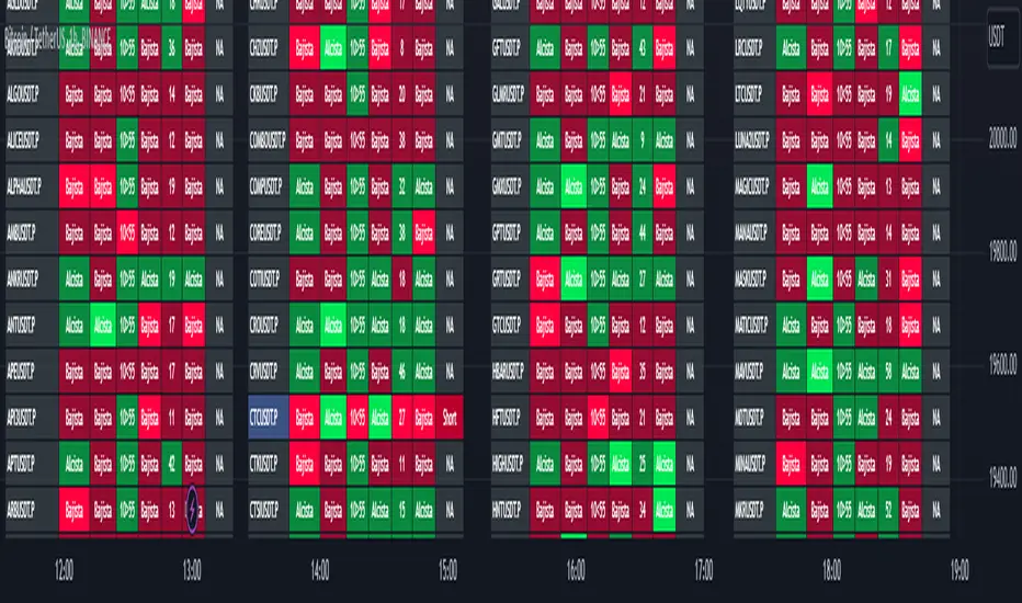
Stablecoins DominanceStablecoins Dominance
The purpose of the script is to show Stablecoin's strength in the crypto markets.
5 Largest Stablecoins divided by Total Market Cap
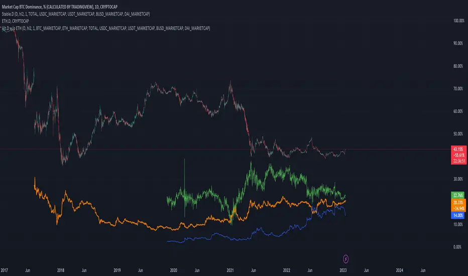
Altcoin Dominance Excluding EthereumAltcoin Dominance Excluding Ethereum
The purpose of the script is to show Altcoin's strength without Ethereum.
Pretty much shows Altcoin's Dominance in comparison to Market Cap once we exclude Ethereum.

ETH Dominance Excluding StablecoinsETH Dominance Excluding Stablecoins.
The purpose of the script is to show Ethereum's strength relative to other cryptocurrencies.
Pretty much shows ETH Dominance in comparison to Market Cap once we exclude the 5 largest stablecoins.
