Directional Movement Index + Fisher Price Action With LabelsDIRECTIONAL MOVEMENT INDEX + FISHER PRICE ACTION WITH LABELS
Directional Movement Index shows buy and sell pressure.
Fisher transform shows price action trending bullish or bearish.
Caution dots notify you of conflicting trends.
***HOW TO USE***
The top lines are the fisher transform showing you the price action trend.
The bottom lines filled with color shows the DMI directional movement index.
The yellow dots at the bottom tell you if these two indicators are currently giving conflicting signals.
DMI
If the green line is above the red line and the background is colored green, there is more market buying than selling.
If the red line is above the green line and the background is colored red, there is more market selling than buying.
FISHER TRANSFORM
If the lines are painted green, the price action is trending up.
If the lines are painted red, the price action is trending down.
CAUTION DOTS
If a yellow dot shows up at the bottom of the chart, it is notifying you that the DMI and Fisher Transform are currently giving opposite signals…. so use caution.
***BULLISH/BEARISH LABEL***
There is also a label on the right side that tells you whether there is more buying or selling. This table updates in real time and changes colors so you can get an easy, quick interpretation of the current buy/sell pressure without having to look at the indicator data so you can make faster decisions on whether to enter or exit a trade.
Green means more market buying than selling.
Red means more market selling than buying.
Blue means an equal amount of market buying and selling.
If buying pressure is bullish but below the 20 level, a second label will show up in purple letting you know there is weak buying pressure so use caution.
If selling pressure is bearish but below the 20 level, a second label will show up in purple letting you know there is weak selling pressure so use caution.
There is a third label showing the current trend of the fisher transform. Green means bullish price action. Red means bearish price action.
The fourth label is orange and only shows up when the DMI and Fisher Transform are currently giving opposite signals, so make sure you use caution during those times.
***MARKETS***
This indicator can be used as a signal on all markets, including stocks, crypto, futures and forex.
***TIMEFRAMES***
This directional movement index + fisher transform indicator can be used on all timeframes.
***TIPS***
Try using numerous indicators of ours on your chart so you can instantly see the bullish or bearish trend of multiple indicators in real time without having to analyze the data. Some of our favorites are our Auto Fibonacci, Volume Profile, Momentum, Auto Support And Resistance and Money Flow Index in combination with this Directional Movement Index + Fisher Transform. They all have real time Bullish and Bearish labels as well so you can immediately understand each indicator's trend.
מדד תנועה כיווני (DMI)

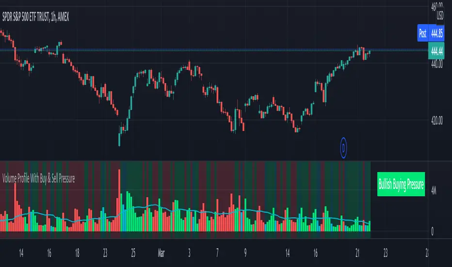
Volume Profile With Buy & Sell Pressure LabelVOLUME PROFILE WITH BUY AND SELL PRESSURE LABEL
This volume profile indicator shows volume traded for each bar and is colored according to the difference in buy and sell pressure(DMI).
***HOW TO USE***
If the bar and background is colored green, there is more market buying than selling on that bar.
If the bar and background is colored red, there is more market selling than buying on that bar.
If the bar and background is colored blue, there is an equal amount of market buying and selling on that bar.
***BUY/SELL LABEL***
There is also a label on the right side that tells you whether there is more buying or selling on the current bar. This table updates in real time and changes colors so you can get an easy, quick interpretation of the current buy/sell pressure without having to look at the volume bars so you can make faster decisions on whether to enter or exit a trade. The table changes colors in sync with the volume bars and background. Green means more market buying than selling. Red means more market selling than buying. Blue means an equal amount of market buying and selling.
***MARKETS***
This indicator can be used as a signal on all markets, including stocks, crypto, futures and forex.
***TIMEFRAMES***
This volume profile indicator can be used on all timeframes.
***TIPS***
Try using numerous indicators of ours on your chart so you can instantly see the bullish or bearish trend of multiple indicators in real time without having to analyze the data. Some of our favorites are our Auto Fibonacci, DMI, Momentum, Auto Support And Resistance and Money Flow Index in combination with this Volume Profile. They all have real time Bullish and Bearish labels as well so you can immediately understand each indicator's trend.
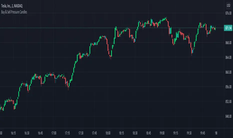
Candles Colored Green/Red According To Buy & Sell PressureCANDLES COLORED GREEN OR RED ACCORDING TO BUY & SELL PRESSURE
This indicator paints each candle green, red or blue depending on whether the buy/sell pressure for that candle is bullish, bearish or neutral.
***TURN OFF NORMAL CANDLE COLORS***
For this script to show properly on the chart, make sure you go to chart settings(gear icon in top right corner) and in the symbol tab, uncheck body, borders and wick.
***HOW TO USE***
When the directional movement index indicator shows more buying pressure than selling pressure, the candle will appear lime green. This indicates bullish buying pressure.
When the directional movement index indicator shows more selling pressure than buying pressure, the candle will appear red. This indicates bearish selling pressure.
When the directional movement index indicator shows the same amount of buy and sell pressure, the candle will appear blue. This indicates neutral buy/sell pressure.
Use the color changes to see if there is more buying or selling to pinpoint reversals and understand current market buying. Wait to enter or exit positions until the candles turn the opposite color.
***MARKETS***
This indicator can be used as a signal on all markets, including stocks, crypto, futures and forex.
***TIMEFRAMES***
This DMI color coded candlestick indicator can be used on all timeframes.
***TIPS***
Try using numerous indicators of ours on your chart so you can instantly see the bullish or bearish trend of multiple indicators in real time without having to analyze the data. Some of our favorites are our Auto Fibonacci, Directional Movement Index, Color Coded Buy & Sell Pressure Volume Profile, Auto Support And Resistance and Money Flow Index in combination with this Buy & Sell pressure Candle indicator.
Relative Strength Index - MayurRSI backtesting long only portfolio builder.
only for investing at cheap valuations

DMI PRO [JoseMetal]============
ENGLISH
============
- Description:
This study is a combination of all DMI components (DI+, DI- and ADX) into a simple line.
Other aspects of the indicator such as ADX levels are well known: 0-25 for weak or no trend, 25-50 for strong trend, 50-75 for very strong trend and 75-100 for extremely strong trend.
- Visual:
The ADX line takes a color depending on the trend, GREEN (BULLISH) for DI+ > DI- or RED for DI- > DI+ (BEARISH).
A signal line has been added to generate crossovers (which are marked with an arrow).
An increasing (getting stronger) ADX color is lighter when a decreasing (weaker) ADX is darker.
Also, green/red dots are shown in the top of the indicator when the ADX turns from decreasing ADX to increasing ADX, color depends on the trend (again, GREEN for BULLISH and RED for BEARISH).
- Usage:
There are some different ways to use this indicator which are similar to the DMI itself, you can just take crossovers to enter LONG or SHORT depending on the COLOR of the ADX (which shows the trend). You can enter/exit trades directly with this method when the crossover/cross under occurs respectively.
Other way (more risky) is to use the dots which may be trend continuation signals, so you can increase your position or enter a trade if you spot a nice trend (ADX higher than the minimum level).
You can also use this indicator as a trend filter for your strategy.
- Customization:
ADX levels, DMI and ADX periods, smoothing, colors... almost everything is configurable, i'll add even more if requested.
- Recommendations:
Any recommendation applied to the DMI is valid here like only entering trades if ADX is higher than 25 to ensure that you're in a trend and not in a range, 15-20 is more risky, but you can get more profits if you enter bottom/tops obviously.
============
ESPAÑOL
============
- Descripción:
Éste estudio es una combinación de todos los componentes del DMI (DI+, DI- y ADX) en una simple línea.
Otros aspectos del indicador como los niveles ADX son bien conocidos: 0-25 para tendencia débil o nula, 25-50 para tendencia fuerte, 50-75 para tendencia muy fuerte y 75-100 para tendencia extremadamente fuerte.
- Visual:
La línea ADX toma un color dependiendo de la tendencia, VERDE (ALCISTA) para DI+ > DI- o ROJO para DI- > DI+ (BAJISTA).
Se ha añadido una línea de señal para generar cruces (que se marcan con una flecha).
El color de un ADX creciente (cada vez más fuerte) es más claro cuando un ADX decreciente (más débil) es más oscuro.
Además, se muestran puntos verdes/rojos en la parte superior del indicador cuando el ADX pasa de ser decreciente a ser creciente, el color depende de la tendencia (de nuevo, VERDE para ALCISTA y ROJO para BAJISTA).
- Uso:
Hay varias formas de usar éste indicador que son similares al DMI mismo, puedes simplemente usar los cruces para entrar LONG o SHORT dependiendo del COLOR del ADX (que muestra la tendencia). Puedes entrar/salir de las operaciones directamente con este método cuando se produce el cruce al alza/cruce a la baja respectivamente.
Otra forma (más arriesgada) es utilizar los puntos que pueden ser señales de continuación de la tendencia, por lo que puede aumentar su posición o entrar en una operación si detecta una buena tendencia (ADX más alto que el nivel mínimo).
También puedes utilizar este indicador como un filtro de tendencia para tu estrategia.
- Personalización:
Niveles de ADX, períodos de DMI y ADX, suavizado, colores... casi todo es configurable, añadiré aún más personalización si lo pedís.
- Recomendaciones:
Cualquier recomendación aplicada al DMI es válida para éste indicador, como por ejemplo, sólo entrar en operaciones si el ADX es superior a 25 para asegurarte de que estás en una tendencia y no en un rango, 15-20 es más arriesgado pero puedes obtener más beneficios ya que podrías estar entrando en dips / tops.

ADeXtIt is an extended ADX and Direction Movement Index indicator with the following changes:
It shows a histogram instead of the DMI lines. If the histogram is green, the DMI+ is above DMI-, otherwise it is red.
You can specify a multiplier for the histogram values to check if values are above threshold. This way you can use the same threshold line as ADX to detect directional strength.
You can remove outliers from ATR calculations
You can use different MAs and sources for DMI and ATR calculations to make ADX more adjustable to different markets
It uses my ADExt library, so you can easily transfer your study to a strategy script.

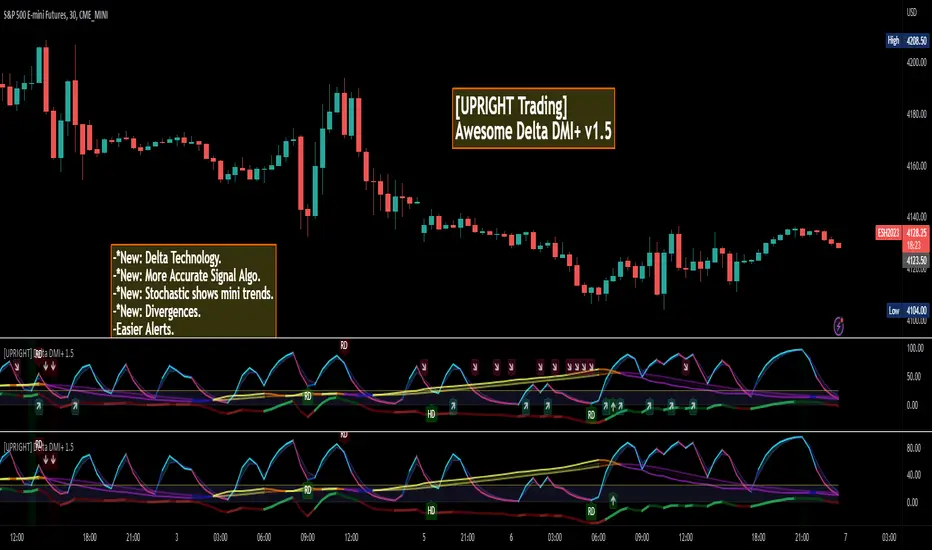
[UPRIGHT] Awesome DMI+Hello Traders,
Today I'm releasing a spin on an 'oldie but goodie'; the Directional Movement Index (DMI).
DMI is a combination of 3 different indicators developed by the famous J. Welles Wilder. DMI has 3 different plots: the ADX, +DI, and -DI. The first is the ADX (Average Directional Index), which Wilder created in 1978 to show the strength of a trend by comparing the current price with the previous price range. The other two are the +DI (positive directional indicator) and the -DI show up as two separate lines, +DI is the difference between the highest price of the current day and the highest price of the day before, and -DI does the same calculation with the current and previous day's lows.
How does it work?
When the ADX line is above 25 (as a general rule, some traders use a different threshold, +/- 5), the trend is strong. When the +DI line is above the -DI line, the asset (stock) is moving in an uptrend, and the opposite means the asset is in a downtrend.
How is this different?
Uses multiple calculations to produce signals for an indicator than normally doesn't have any.
Multiple ADX's, +DI's, and -DI's for better accuracy and clearer direction changes.
Ability to use 2 different background highlight signals and several buy/sell signals.
Fully customizable (as always), ability to turn on or off any signals, change any of the colors to suit your needs.
Added pre-filled Alerts.
The ribbons created by the fill make it easier to see the change in direction of each plot.
The chart should look like:
Cheers,
Mike
(UPRIGHT TRADING)
Blobbinger BandsBBANDS with:
- DI+/DI- coloring outer bands. If top BBand is green DI+ is on top; if top BBand is red DI- is on top.
- ADX Coloring - coloring of BBand background is relative to ADX performance. Blue = High, Red = Low, Black = Very Low, White = Extremely Low
- Basis Line Coloring - colored using Bollinger Band Width Percentile. Blue = Squeezing BBands, Red = Blasted Open BBands
- Histogram Lines - Denotes ADX Extremely Low

ETH Bottom FinderThis indicator is a 3 step process for confirming a short term bottom on ETH. Using the setting that are preset, there is are 1, 2 hour and 4 hour alerts. Going top down, if the 4H alert fires and a 1 or 2 hour signal is plotted, the long signal is confirmed. This will only plot on these timeframes and the "ETH 2H Bottom" and "ETH 4H Bottom" will only plot and signal for the ETHUSD ticker. The HigherTimeKLimit is for limiting the 2H slowstoch(21,3) k value for the 1H signal. Used on different pairs, I set it customized with target/stop loss percentages as follows:
upper K STB T:SL
CRV 11 2 3:4.5
LINK 13 2 4:2.2
ATOM 15 1 4:2.8
AVAX 11 1 5:5
AXS 9 2 3:4
STORJ 11 1 4:2.8
XTZ 11 2 no
VET 13 2 4:2.8
UNI 17 2 no
SOL 13 2 4:2.8
ONE 16 2 5:2
FTM 20 1 7:2
ADA 10 2 3:2.2
MATIC 11 1 5:2
HBAR 2H 17 1 5:5
ATOM 2H 1 5:5
LTC
ETH 17 2 no
The STB 1 or 2 refer to showatomstb or showonestb (just a name).

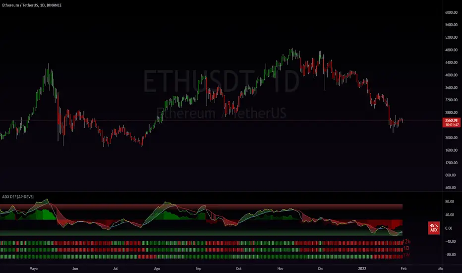
ADX DEF [APIDEVS]------------------------------------ ENGLISH -------------------------------------------------
In this version of the ADX we integrate several additional features to optimize its operation, for its construction we use the DI+ and DI- indicators and transform them into a histogram, this to mark the intensity of the steering force. We also incorporate another strength indicator called True Strengh Index or in Spanish real strength index (TSI) is a momentum oscillator that is used to identify trends and reversals. The indicator can be useful in determining overbought and oversold conditions, indicating possible trend direction changes via center line or signal line crossovers, and warning of trend weakness via divergence
With this incorporation we replace the traditional ADX with a new directional strength indicator which, in addition to marking the strength, allows to establish the reversal points, adding the possibility of showing divergences and observing the weakness of the movement in advance.
We also incorporate our ADX Multi Time-frames which we place at the bottom of the indicator to show the strength of the market in a multi-time frame. finally we add an informative panel where the value of the ADX is shown.
------------------------------------ ESPAÑOL -------------------------------------------------
En esta versión del ADX integramos varias características adicionales para optimizar su funcionamiento, para su construcción utilizamos los indicadores DI+ y DI- y los transformamos en histograma, esto para marcar la intensidad de la fuerza de la dirección. También incorporamos otro indicador de fuerza llamado True Strengh Index o en español índice de fuerza real (TSI) es un oscilador de impulso que se utiliza para identificar tendencias y reversiones. El indicador puede ser útil para determinar las condiciones de sobrecompra y sobreventa , indicando los posibles cambios de dirección de la tendencia a través de cruces de la línea central o de la línea de señal, y advirtiendo de la debilidad de la tendencia a través de la divergencia
Con esta incorporación remplazamos el tradicional ADX por un nuevo indicador de fuerza direccional el cual además de marcar la fuerza permite establecer los puntos de reversión, agregando la posibilidad de mostrar divergencias y observar la debilidad del movimiento con anticipación.
También incorporamos nuestro ADX Multi Time-frames el cual colocamos en la parte baja del indicador para mostrar la fuerza del mercado de modo multitemporal. finalmente añadimos un panel informativo donde se muestra el valor del ADX .
Ex's DMI DivergenceThis indicator I am posting open for everyone to see and use.
This is a modified DMI indicator, It has a DMI+ and DMI- and a 3rd line that is the average divergance/convergance of the two.
This indicator is used to recognize periods of consolidation, directional strength and retracements/reversal
There are some key things to watch for:
-When the Div/Conv line is yellow it means that the DMI+/- average distance is moving closer together(converging)
-When the Div/Conv line is aqua it means that the DMI+/- average distance is moving further apart(diverging)
-One DMI must be below the top threshold and other DMI must be below at least the Top threshold(or bottom if you prefer) to be considered valid
Signs of condolidation/possible reversal/weak strength:
-When the DMI+/- are crossing at any location stay mindful of entries
-If both DMI's are above the threshold there is no clear direction
-When the DMI Div/Conv is yellow it means trend is slowing down and aqua means it is picking up

ADX+BB %B+AO+EMA Strategy [PineMyths] #2Indicator List
ADX (14,14)
Bollinger Bands %B (20,close,2)
Awesome Oscillator
EMA(5), EMA(21), EMA(50), EMA(200)
Strategy Rules and Conditions
LONG Side
EMA(5) > EMA(21)
EMA(50) > EMA(200)
BB %B > 0.75
ADX > 15
Awesome Oscillator > 2
SHORT Side
EMA(5) < EMA(21)
EMA(50) < EMA(200)
BB %B < 0.25
ADX > 15
Awesome Oscillator < -2
Stop: Fixed %2
Take Profit: Fixed %1

ADX DINGUE v5This is the updated script for PinceScrip V5
3x DMI and ADX indicator into 1.
You can turn on and off all 3x DMI and all 3x ADX and or customize their settings manually.
I also added my 3 line system, which is a homemade calculation from the DMI lines (P+N), and instead turns them into a single line.
There are also several options for histogram, ADX line, crosses, colors, overextended ...
---------------------
In closing, no indicator can give perfect signals, you need to use them in conjunction with other information to make better decisions.
I hope you like my indicators and that they help your trading.
If you have any questions please ask.
Thank you.

The MACDMI T/SLThis is a combined MACD and DMI strategy script with multiple options for targets and stoploss.
Stoploss and targets sizes are ATR based calculations.
Each of these contains a sets an initial ATR based that will close the entire position if hit. From there, differences between them are as follows:
Trailing stop - immediately begins trailing stoploss from your entry. Entire position is closed when hit.
Single Target - closes entire position once target is hit
T1 + Trail - closes half of the position when first target is hit and then begins trailing stop on the remaining position.
T1 + Trail/T2 + Trail - closes a third of the position at T1 and begins trailing a stop on the rest. Will close another third at T2, continue the trailing stop, and close the final third when the stop is hit.
DMI (Multi timeframe) DI Strategy [KL]Directional Movement Index Strategy
Entry conditions:
- (a) when DI+ > DI- on timeframe #1, and
- (b) Confirmation: when DI+ > DI- on timeframe #2
In the shown example, timeframe1 was same as the chart (1H) and timeframe2 was 1D.
Stop Loss: ATR based trailing stop
About DMI
Can refer to Investopedia for general understanding.
Applications of DMI in this strategy:
- Assumes uptrend when DI+ is above DI- (when green DI+ lines above red DI-), vice versa for downtrend. This is checked in two different timeframes that can be set by user in settings.
- DX is ignored, it doesn't give a direction of the trend. But if DX was applied, it would be a good indicator for quantifying the strength of uptrend/downtrend. This measurement would typically be read along a threshold (i.e. if below 20, then market is likely consolidating). All of these have been commented out (ignored by pinescript's interpreter via //) in the codes, as said; we are not using DX for sake of simplicity.
Visualizations
To make the chart look cleaner, DMI plots have been simplified to just down/up arrows placed at bottom of the chart.
Referring to the example chart:
- Green arrows : when DI+ > DI- for both timeframes, implies uptrend
- Red arrows: other way around (DI+ < DI-), implies downtrend

ADX Heatmap & Di's + Fib Referencial by [JohnnySnow]For quicker and easier interpretation, ADX line is displayed in a heatmap style. The more absolute difference between both DIs, the more intense the color.
Because some people use 20 ADX reference and others use 25 ADX reference to confirm the trend, I just add both as reference lines in a 'golden box'
Additionally, reference lines were added with default values set to Fib levels
Imbalance, ADR Daily Target & ADR > 3X1 x ADR Movement Calculated on the Asian Session - Times can be altered to suit your parameters
Daily Target is set High from low of Asian Range and Low from High of Asian Range
0-3X ADR Calculated and Displayed from a point you select for the following days targets - can be set Bearish or Bullish and ADR parameters can be altered
Imbalance Finder - Can be switched on or off to show imbalance on current time frame - default is off

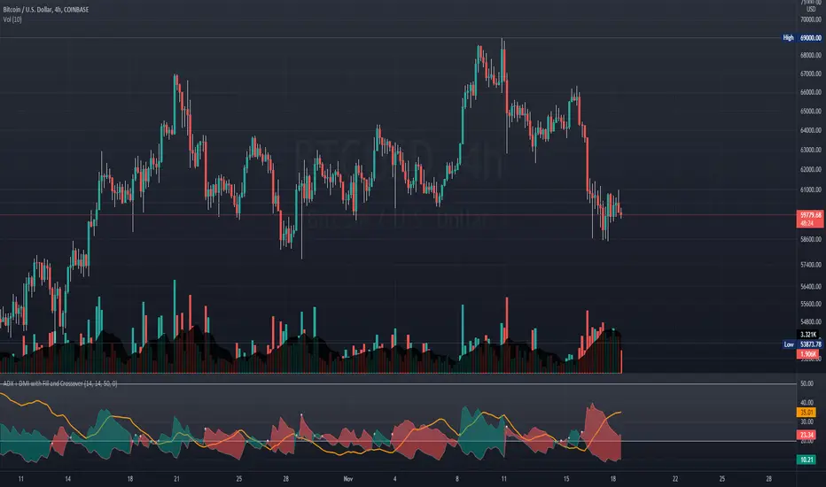
ADX + DMI with Fill and CrossoverBetter visuals for the ADX/DMI technical indicator.
I filled the DI+ and DI- with color to easily track the trend. Also, I added shapes (+) / (x) once the DI+ and DI- crossover each other.
You can also set two horizontal lines so you can easily track where the ADX value is at.
TASC 2021.12 Directional Movement w/Hann█ OVERVIEW
Presented here is code for the "Directional Movement w/Hann" indicator originally conceived by John Ehlers. The code is also published in the December 2021 issue of Trader's Tips by Technical Analysis of Stocks & Commodities (TASC) magazine.
Ehlers continues here his exploration of the application of Hann windowing to conventional trading indicators.
█ FEATURES
The rolling length can be modified in the script's inputs, as well as the width of the line.
█ NOTES
Calculations
The calculation starts with the classic definition of PlusDM and MinusDM. These directional movements are summed in an exponential moving average (EMA). Then, this EMA is further smoothed in a finite impulse response (FIR) filter using Hann window coefficients over the calculation period.
Background
The DMI and ADX indicators were designed by J. Welles Wilder and presented in his "New Concepts in Technical Trading Systems" book published in 1978.
Join TradingView!

DMI & ST DEV zone intersection [LM]Hello Traders,
This indicator uses two indicators st dev extremes and DMI extremes and visualize intersection of both indicators extreme zones using crosses. It means where cross is rendered intersection of extremes has occurred.
The standard deviation uses the same calculation as my Standard deviation zones Support & Resistance indicator, DMI indicator measures both the strength and direction of a price movement. I am using both indicators to find the intersection of extreme zones between them.
ST DEV settings:
source
tops setting
bottom setting
DMI settings:
length settings
extreme zone setting
Enjoy,
Lukas

ADXI + DMI Performance - TradingEDThis case study is based on a previous ADX + DM study, but with three different counts to compare different trends. The use of this indicator is restricted to private use, and it can be used only by invitation. Different functionalities have been added to the original code, such as alerts and signals that seek to make trading much easier to interpret by any type of trading operator of any experience level, from beginner to intermediate and advanced .
Key components of the original indicator:
• The DIRECTIONAL MOVEMENT INDEX (DMI) is a technical indicator that measures both the strength and direction of a price movement and is intended to reduce false signals.
• The DMI uses two standard indicators, one negative ( -DI ) and one positive ( +DI ), in conjunction with a third, the AVERAGE DIRECTIONAL INDEX ( ADX ), which is non-directional but shows momentum.
• The larger the spread between the two primary lines, the stronger the price trend. If +DI is way above -DI the price trend is strongly up. If -DI is way above +DI then the price trend is strongly down.
• ADX measures the strength of the trend, either up or down; a reading above 20 indicates a strong trend.
ADX is plotted as a single line with values ranging from a low of zero to a high of 100. ADX is non-directional; it registers trend strength whether price is trending up or down. The indicator is usually plotted in the same window as the two DMI lines, from which ADX is derived. When +DI is above -DI, there is more upward pressure than downward pressure in the price. Conversely, if -DI is above +DI, then there is more downward pressure on the price. This indicator may help traders assess the trend direction. Crossovers between the lines are also sometimes used as trade signals to buy or sell, theay are the main trade signals. A long trade is taken when the +DI crosses above the -DI and an uptrend could be underway. Meanwhile, a sell signal occurs when the +DI instead crosses below the -DI.
Main functions of this modified indicator:
1) You can select the type of MOVING AVERAGE, among many available options ( SMA , EMA , DEMA , HMA , etc.)
2) The SOURCE for the counts can be determined by the trader (close, open, etc).
3) The MEASURE can be based on a CANDLES count if you are trading OHLC Charts from 1D onwards, or if your trading is intraday, you can also select counts by MINUTES, HOURS or DAYS, depending on your trading style.
4) LENGTH, by default it will be loaded as in the STRATEGY, but considering the previous point, you can modify it according to your convenience.
5) You have the option to hide or show a LABEL at the top of the chart, with respect to the signals: BULLISH green, BEARISH red.
Main performance functions of this modified indicator:
I) In the case of the PERFORMANCE that appears at the right of the chart, you have the option to adjust the WIDTH of each box.
II) The TEXT of the PERFORMANCE is not modifiable, but you can customize the default color. *
III) The BACKGROUND of the PERFORMANCE, you can customize the default color. *
IV) You have the option to hide or show a PERFORMANCE that appears at the right of the chart.
Main functions to customize the style of this indicator:
a) You can select the color for ADX and for DMI, with the colors that best suit you.
b) The CROSSOVER/CROSSUNDER signal between DI+ and DI- can also be customized. *
c) For any type of SIGNAL, it is painted as a VERTICAL LINE in the graph, you can change the color that comes by default. *
d) In the case of the LABELS that appear at the top, the text is not modifiable, but you can customize both the type of label and change the default color. *
e) You can select the colors for the BACKGROUND of the indicator according to the trend, whether it is BEARISH or BULLISH, with the colors that best suit you. *
* By default, they are marked as red for downtrends and green for uptrends.

BTC Dominance TrendThis simple script applies the DMI/ADX (trend) indicator to the Bitcoin Dominance Index (BTC.D) to check whether BTC is increasing its dominance or not on that day. It is meant to be applied to altcoins on medium intervals. I put it together to test the following hypothesis: On days when BTC dominance is on the rise, altcoins are harder to take off, because Bitcoin is draining the lifeblood out of them, so caution is needed when opening trades.
Olive background means BTC dominance is rising on that day, purple that it is decreasing. White background means it is not moving significantly in any direction.
You can change the resolution (i.e. apply the DMI/ADX to a different BTC.D interval), just make sure to lower the threshold as well. I hope you find a good use for it! Beware if you try to incorporate it in your strategy, it uses higher timeframe data and hence is prone to repainting.

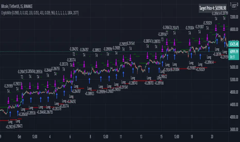
CryptoNite - Machine Learning Strategy (15Min Timeframe)Greeting Traders! I am back with another ML strategy. :D I kept my word with combining my machine learning algorithms from Python and integrating them into Tradingview. Thanks to Tradingview's new release of Pinescript v5 it is now possible. This strategy respects the Sortino Ratio and was created using 2 years of data for 50 different cryptocurrencies. That is a total of 100 years of data and 44,849 trades to create this strategy. Now let me tell you, my computer and I are exhausted. We both been at it non-stop for about two months everyday. I refine the strategy, and the computer runs 24/7 for a few days to spit out the best results into the terminal. It's been a good run so my computer will finally get some sleep tonight.
So let's talk a little about the features of the strategy. In the settings window, you'll see the Stoploss, Take Profit Parameters, and Date Range. You can change the Date Range, but I recommend to leave the SL/TP parameters how they are because the machine learning algo chose those input. If you wish to change them you are always welcome to do so but backtest results will change. For the Take Profit parameters you'll see on the left side you something labeled time duration(displayed in minutes) and on the right side you'll see take profit values. Let's talk a little bit how they work.
TP_values = {
"0": 0.102,
"133": 0.051,
"431": 0.039,
"963": 0
}
In python, the table looks like this but it is quite easy to understand in Tradingview.
From 0-133 minutes, the strategy is looking to the reach target point 1 at 10.2% profit.
From 133-431 minutes, the strategy is looking to the reach target point 2 at 5.1% profit.
From 431-963 minutes, the strategy is looking to the reach target point 3 at 3.9% profit.
From 963+ minutes, the strategy is looking to break even at 0% profit on target point 4.
Through each target point a sell trigger is active. It will look for the best time to sell even if TP has not been reached.
This helps the trade not stay open too long.
The last thing I need to mention is the textbox displayed on the right side of your chart. This textbox displays the current Take Profit value in dollar amount. So when you're in a trade you'll know what TP target has to be reached when the open trade is active. Throughout time, the target price changes depending how long the trade has been open. If you have any questions feel free to comment down below, and enjoy this strategy!