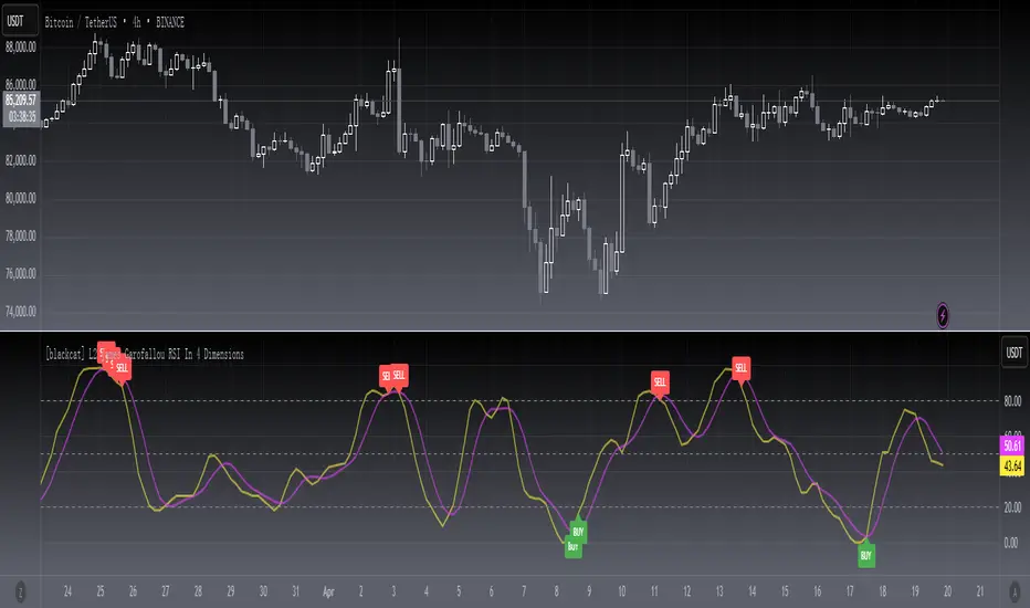
[blackcat] L2 James Garofallou RSI In 4 DimLevel 2
Background
Traders’ Tips of September 2020, the focus is James Garofallou’s article in the September issue, “Tracking Relative Strength In Four Dimensions”.
Function
In “Tracking Relative Strength In Four Dimensions” in this issue, author James Garofallou introduces us to a new method of measuring the relative strength of a security. This new technique creates a much broader reference than would be obtained by using a single security or index and combines several dimensions, as the author calls them, into a single rank value. This study compares a security to another in four dimensions, as explained in the article. James Garofallou presents a metric for a security’s strength relative to 11 major market sectors and over several time periods. All this is squeezed into a single value. The first step is the RS2. It normalizes the security to a market index, then calculates four moving averages and encodes their relations in a returned number. I just modified it by using most BTC-correlated instruments to reflect how BTC response to their performance.
Remarks
This is a Level 2 free and open source indicator.
Feedbacks are appreciated.
חפש סקריפטים עבור "BTC"
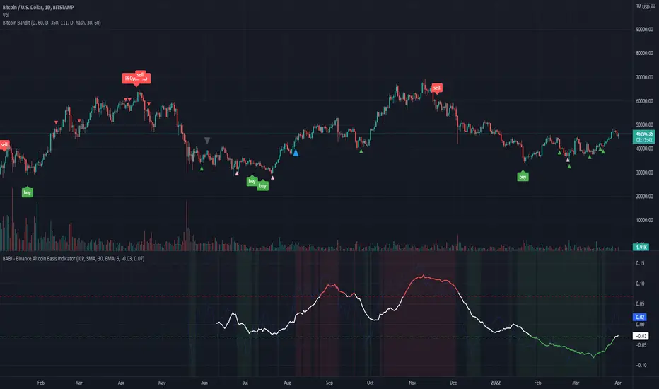
BABI - Binance Altcoin Basis Indicator
This indicator works by taking the basis between various altcoin perpetual futures contracts and spot market indexes on Binance, and then smooths out the data with a basic moving average.
The result is a useful oscillator that shows potential "buy" and "sell" areas.
Simply put, a spot premium is usually bullish and a derivatives premium is usually bearish.
Other versions of this indicator only worked for BTC and ETH, so I have extended its functionality to include popular altcoin trading pairs.
USDT Trading pairs included in this version:
•BTC
•ETH
•LTC
•ICP
•SOL
•LUNA
•GRT
•ATOM
•ADA
•XRP
•ETC
•AVAX
Default setting is BTC. To choose a different oscillator, go to settings and pick your desired crypto.
Thanks for looking. I think you could create a pretty basic trading strategy based on this indicator by simply placing buy and sell orders once the oscillator rises or falls below certain thresholds.
**Credit to @chestbrook on Twitter and Pinnacle_Investor on TradingView
Binance Basis Oscillator ()
Auto Support & Resistance From Option Strike Price + PercentagesAUTO SUPPORT AND RESISTANCE FROM OPTIONS STRIKE PRICES WITH PERCENTAGE GAPS
This is an auto support and resistance level indicator that uses options strike prices or psychological numbers as the relevant levels. Set your starting level or strike price and input the options strike price gaps for that ticker and 15 lines in either direction will automatically populate on the chart. It also has a table in the bottom right corner that tells you how far the current price is from the next closest support and resistance levels.
Everything is easily customizable in the indicator input settings including turning the lines on/off, turning the percentage gaps table on/off, setting the options strike price gaps, setting the starting level, setting the position of the percentage gaps table, changing support and resistance line colors all at once and updating the linewidth of all of the support and resistance lines at once.
***HOW TO USE***
First, go into the indicator settings and set the starting level to use. If you are trading SPY and it is near 450, then set your starting level at 450. If you are trading SQQQ and it is near 38, set your starting level to 38. If you are trading crypto, set your levels to the nearest psychological or round number such as 40,000 for BTC or 2,500 for ETH or 16.50 for LINK.
Second, set your options strike price gaps. If you are trading SPY, this will be 2.5. If you are trading SQQQ this number would be 1. If you are trading crypto, try using psychological price levels instead of strike prices, such as 500, 1000 or 5000 for BTC and 100, 250 or 500 for ETH. For small priced cryptos, use decimals such as .25, .50, etc.
Once these inputs are filled in, 15 levels in each direction will automatically populate on the chart for you.
If price is above a level, it will paint green. If price is below a level it will paint red. These colors represent support and resistance visually for you on the chart and will change dynamically as price moves above or below these levels. These colors can be customized in the indicator input settings to change all lines by only updating one color.
There is a table of percentage gap updates that will tell you in real time how far away the price is from the nearest support and resistance lines so you always know your risk to reward ratios. Each label will also be colored the same as the corresponding support or resistance line as a visual aid.
***MARKETS***
This indicator can be used as a signal on all markets, including stocks, crypto, futures and forex.
***TIMEFRAMES***
This support and resistance indicator can be used on all timeframes.
***TIPS***
Try using numerous indicators of ours on your chart so you can instantly see the bullish or bearish trend of multiple indicators in real time without having to analyze the data. Some of our favorites are our Auto Fibonacci, Directional Movement Index, Volume Profile, Momentum and Money Flow Index in combination with this auto support and resistance indicator. They all have real time Bullish and Bearish labels as well so you can immediately understand each indicator's trend.

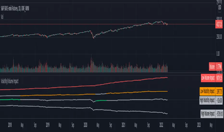
Volatility/Volume ImpactWe often hear statements such as follow the big volume to project possible price movements. Or low volatility is good for trend. How much of it is statistically right for different markets. I wrote this small script to study the impact of Volatility and Volume on price movements.
Concept is as below:
Compare volume with a reference median value. You can also use moving average or other types for this comparison.
If volume is higher than median, increment positive value impact with change in close price. If volume is less than median, then increment negative value impact with change in close price.
With this we derive pvd and nvd which are measure of price change when volume is higher and lower respectively. pvd measures the price change when volume is higher than median whereas nvd measures price change when volume is lower than median.
Calculate correlation of pvd and nvd with close price to see what is impacting the price by higher extent.
Colors are applied to plots which have higher correlation to price movement. For example, if pvd has higher correlation to price movement, then pvd is coloured green whereas nvd is coloured silver. Similarly if nvd has higher correlation to price then nvd is coloured in red whereas pvd is coloured in silver.
Similar calculation also applied for volatility.
With this, you can observe how price change is correlated to high/low volume and volatility.
Let us see some examples on different markets.
Example 1: AMEX:SPY
From the chart snapshot below, it looks evident that SPY always thrive when there is low volatility and LOW VOLUME!!
Example 2: NASDAQ:TSLA
The picture will be different if you look at individual stocks. For Tesla, the price movement is more correlated to high volume (unlike SPY where low volume days define the trend)
Example 3: KUCOIN:BTCUSDT
Unlike stocks and indices, high volatility defined the trend for BTC for long time. It thrived when volatility is more. We can see that high volume is still major influencer in BTC price movements.
Settings are very simple and self explanatory.
Hint: You can also move the indicator to chart overlay for better visualisation of comparison with close price.
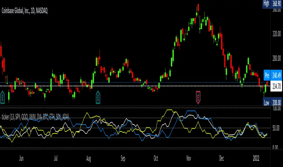
tickerTracker MFI OscillatorDid you ever want to have a neat indicator window in line with your chart showing a different ticker? tickerTracker is a Money Flow Index (MFI) oscillator. The Money Flow Index (MFI) is a technical oscillator that uses price and volume for identifying overbought or oversold conditions in an asset. More or less, everything is connected in the market. The tickerTracker lets you see what is happening with another ticker that you have connected a correlation between them. For my example here, I'm using COIN in the main chart with the tickerTracker displaying BTC, QQQ and COIN Money Flow Index (MFI) in its window. As the end user, you can customize the colors, the length input and the ticker. Like any other indicator, the shorter length input, the more quickly responsive and the longer the length input, the smoother curve print.
Default Values:
MFI Length = 13
Chart ticker = white
SPY = white
QQQ = blue
IWM = yellow
DIA = orange
BTC/USD = yellow
ETH/USD = green
SOL/USD = purple
ADA/USD = red
Do your own due diligence, your risk is 100% your responsibility. This is for educational and entertainment purposes only. You win some or you learn some. Consider being charitable with some of your profit to help humankind. Good luck and happy trading friends...
*3x lucky 7s of trading*
7pt Trading compass:
Price action, entry/exit
Volume average/direction
Trend, patterns, momentum
Newsworthy current events
Revenue
Earnings
Balance sheet
7 Common mistakes:
+5% portfolio trades, capital risk management
Beware of analyst's motives
Emotions & Opinions
FOMO : bad timing, the market is ruthless, be shrewd
Lack of planning & discipline
Forgetting restraint
Obdurate repetitive errors, no adaptation
7 Important tools:
Trading View app!, Brokerage UI
Accurate indicators & settings
Wide screen monitor/s
Trading log (pencil & graph paper)
Big, organized desk
Reading books, playing chess
Sorted watch-list
Checkout my indicators:
Fibonacci VIP - volume
Fibonacci MA7 - price
pi RSI - trend momentum
TTC - trend channel
AlertiT - notification
tickerTracker - MFI Oscillator
www.tradingview.com
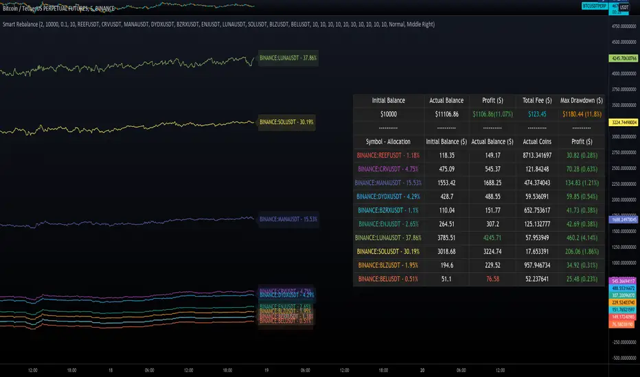
Smart RebalanceThis script is based on the portfolio rebalancing strategy. It's designed to work with cryptocurrencies, but it can work with any market.
How portfolio rebalance works?
Let's assume your initial capital is $1000, and you want to distribute it into 4 coins. This script takes the USDT as the stable coin for the initial money, so in case you want other currency, the pairs must be with that fiat as the quote.
Following our example, you would take BTC, ETH, BNB, and FTT. After selecting the coins, it's time to choose how much allocation is on each. Let's put 25% on each. This way, $250 of our capital on each coin.
After selecting the coins and their allocation, you choose the price change ratio for rebalancing. Let's use 1%. Next, you start to watch the markets. The first thing that happens, following our example, is the BTCUSDT price moving 1% up.
That amount hit the ratio of 1% for the rebalance. Hence, you sell 1% of BTC for USDT and redistribute to the other coins, buying 0.25% of each currency to rebalance the portfolio.
Next, ETHUSDT goes 1% down, time to rebalance again. This time, you need to take 0.33% of each other coin and buy ETH, so this way, it's all divided as the chosen allocation.
Why use rebalancing?
Looks easy, right? It is, but very time demanding. Demands even more if you raise the number of coins you want to distribute. Having a system to do that automatically is a must to work efficiently. Rebalancing spreads the risk among multiple currencies. This way, you earn small when it goes up, but you lose small when it goes down.
What this script helps with portfolio rebalance?
This indicator will not buy/sell for you but will help you choose the best markets for your rebalancing. Which coin will work best in that period? Do I need to have more than 8 coins? How much must be my ratio? Those questions you can answer using this indicator.
What this script has?
Start and End dates
The script will work for a certain period. All calculations will be done in that period.
Coin Ratio %
The amount of price movement of each asset that will be used to calculate the rebalancing
Initial Capital and Broker Fee
The amount of capital to be used on the rebalancing and the broker fee you want to use the strategy. The cost will be applied on every trade, buying or selling the coins.
Assets, allocations, and colors
It's possible to select from 2 to 10 assets to be used on the portfolio. Each purchase must have the allocation %. Suppose the sum of the allocations is different from 100%. In that case, a warning message will appear on the chart instead of the statistics.
Panel and tooltips
There is a panel with a summary of the results
Set allocations automatically
There is an option to make the indicator use the daily asset volume from the day before to determine the allocation percentage of each asset. This option is better if you are unsure how much allocation you want to use on each coin.
Use this indicator as a backtest for your rebalancing strategy. The selected market on the chart will not affect the calculation on this indicator, but the time frame will. The higher the time frame, the higher the coin ratio % must be.
About the code
The code is written to use arrays to store the values of each asset, making the calculations on each candle inside the time range. The for-loops are used to reduce the code length and make it easy to change the analysis of all assets. Finally, the script has some comments on the code.
HASHRATE and MINER REVENUEThis script uses daily data points from Quandl which measure Bitcoin mining hashrate, and miner revenue, and averages the two. The two data sets are fairly zigzaggy, so to smooth the data I am use a John Ehlers' filter to reduce the noise. Why did I combine the two? Both have correlation to BTC price action, and by combining hashrate and revenue, I believe it produces a stronger and more accurate signal. At times when the background is green (also displayed with a green square at the bottom), conditions are good in Bitcoinland with miner revenue/hashrate going up. No color in the background and no dot, means the combined miner revenue and hashrate indicator is dropping, but nothing to get worried about. Seeing red dots on the bottom along with a red background signals a rapidly dropping rate of hashrate/miner revenue, and with a fairly strong correlation to the Bitcoin price. Not every red zone foretells a drop in the Bitcoin price, but a significant number of them do. I wrote this script as an early warning system for when to move out of Bitcoin. Use at your own risk. Feel free to modify this code to suit your personal needs. Please only use on BTC /USD pairs with 1D bars. Since there is only one data point per day published by Quandl, it will not give accurate data for shorter timeframes. Enjoy.

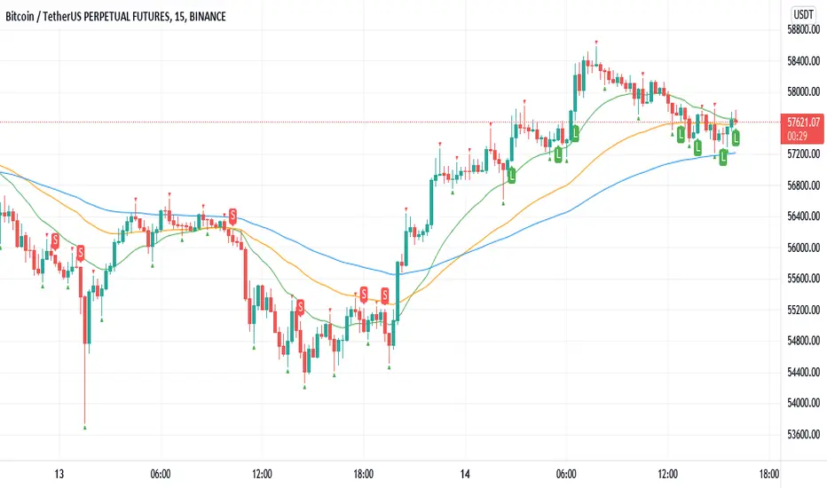
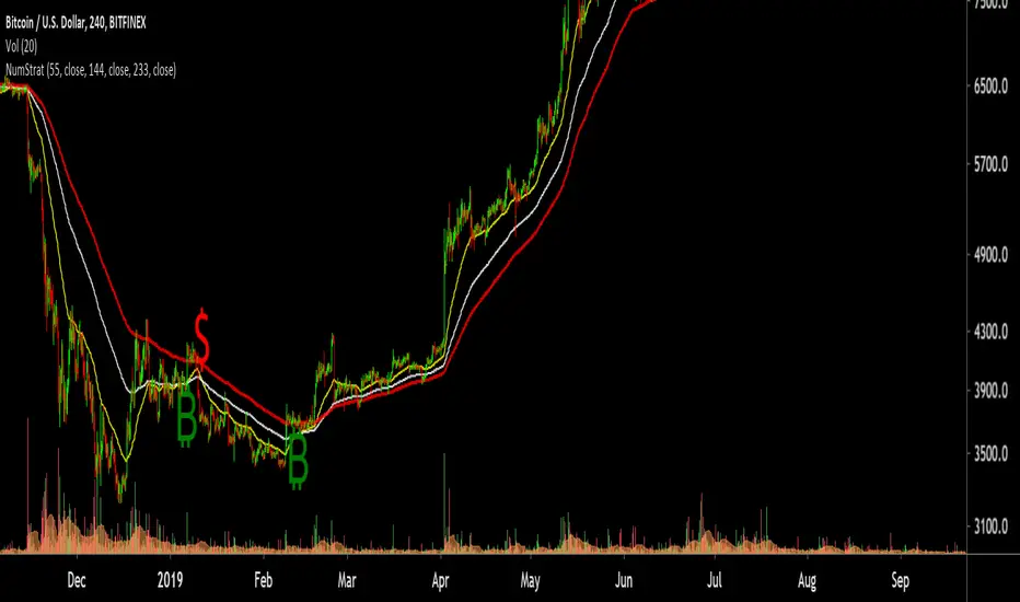
Williams Fractals BUY/SELL signals indicatorThis indicator made with using Williams Fractals, 20 50 100 Moving Averages and Relative Strength Index. You can easily find entry points by using Long (L), Short (S) signals.
This is a 15min scalping strategy for BTC:USDT Perpetual pair. For use different pairs or TFs you may need to change settings.
How to use
****************
When flashing Long (L) or Short (S) signal you should wait until the candle closing for the confirmation.
After that candle closed with the signal, you can enter a trade in next candle opening.
Your SL should be 3.1% from etnry and TP should be 0.5% from entry for best results. (You can use Long Position / Short Position tool in Prediction and Measurement Tools in drawing pannel to calculate this. This settings only for BTC:USDT Perp 15 min TF. For other TFs or Pairs settings may vary. You can easily change these settings and backtest your own.)
After entering a trade you can be ignored next signals until close the trade.
To learn more about this strategy, please try the "Williams Fractals Strategy" I coded. Thank you!
Tickers PanelCONCEPT
It's a very straight forward panel with tickers for both BTC and ETH (you can switch in the settings).
The background colouring changes based on how individual markets are trading compared to a market average.
It shows green if a market is trading above the average price and it shows grey if it's trading below the average.
This makes it easy to spot which markets are cheap/expensive.
This is jus a random idea, but the source code is open so that you can make your own changes if you like.
FEATURES
Tickers for six different markets.
By default it shows BTC prices, but you can also choose for it to show ETH prices.
Sometimes it gets blocked by price.
So there's an option to put it at the bottom of the screen.
There's more possible, just look at the source code.
I use a widescreen so for me the size of the boxes is perfect, but if you're on different resolution it might look weird.
Also if you split your screen in half for example it probably won't perfectly fit anymore.
In the settings you can easily change the colours, width, height, border thickness, ...
So yeah, just a fun panel with some crypto tickers.
Have a look at the source code it's pretty easy to understand, have fun playing around with it.
The indicator is free so just add it to your favourites and you can start using it (you might have to refresh Tradingview before it works).
Cheers.

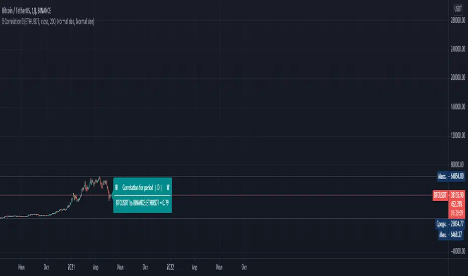
СorrelationThis script determines the degree of relationship between two characters. If the value is close to 1, it means that the correlation of the two symbols is very similar. That is, their graphs move in the same way as possible.
If the value is 0, it means that there is no correlation for these symbols. If the value is close to -1, it means that the charts are moving in opposite directions.
To compare two symbols, for example Bitcoin and Ether, you must open the chart of one of the symbols and add the second symbol in the script settings. The timeframe will automatically correspond to the one selected on your chart.
Example: You have an open BTC / USDT chart - 1 hour, then the second symbol that you add (for example, ETH / USDT) will also correspond to 1 hour
------------------------------------------------------------------------------------------------------------------------------------------------------------------------------------------------------------------------------------------------------------------------------------------------
Данный скрипт определяет степень взаимосвязи двух символов. Если значение близко к 1 , то это означает что корреляция двух символов очень похожа. То есть их графики двигаются максимально одинаково.
Если значение равняется 0 , то это означает что корреляция у этих символов отсутсвует . Если значение близко к -1 , это означает что графики символов двигаются в противоположных направлениях.
Чтобы сравнить два символа, к примеру Биткоин и Эфир, вы должны открыть график одного из символов и в настройках скрипта добавить второй символ. Таймфрейм автоматически будет соответствовать тому, что выбран у вас на графике.
Например: У Вас открыт график BTC /USDT - 1 час , то второй символ который выдобавите (например ETH/USDT) он тоже будет соотвествовать 1 часу
FAJ Dogepack Combines EMA + RSI indicator
Dieses Script ist eine einfache Kombination aus RSI und EMA.
Es erlaubt euch zu erkennen in welche Richtung der Trend in dem aktuellen
TimeFrame geht und wie stark dieser aktuell ist.
Außerdem zeigt es euch ob gerade eher die Bullen oder die Bären den Markt
dominieren. Mit Hilfe des Indikators lassen sich Top und Bottom des aktuellen
Time Frames erkennen.
Ich Empfehle nur eine Nutzung bei BTC um Wellen besser zu erkennen.
Erinnert euch daran, das ist nur eine Beta und gibt immer noch viele Fehlsignale aus, also testet es für euch selber in verschiedenen TimeFrames.
This script is a simple combination of RSI and EMA.
It allows you to see in which direction the trend is going in the current
time frame and how strong it is currently. It also shows you whether the
bulls or the bears are dominating the market. With the help of the indicator,
the top and bottom of the current time frame can be recognized.
recommended only use in BTC to better detect waves.
remember that it is in beta and still sends many false signals so you have to test it well in several time periods.
First Week Trend [MX]I created this indicator based on one of my ways of analyzing the BTC trend in particular, I noticed that the break of the first weekly candle usually indicates the trend for the rest of the month.
This indicator has a bug in which if you change the timeframe of the indicator it will show erroneous values
If you use the candlestick chart, you will need to pull the visual order of this indicator to the top to overlay the colors of the standard candles, or simply hide the standard candles
the trend colors are bugged in timeframes other than the weekly
special thanks to @xdecow who helped me with the code
////////////////////////////////////////////////////////////////////////
Eu criei esse indicador baseado em uma das minhas formas de analisar a tendência do BTC em específico, eu notei que o rompimento do primeiro candle do semanal costuma indicar a tendência para o resto do mês.
Esse script tem um bug em que se mudar o timeframe do indicador ele irá mostrar valores errados
Se você usa o gráfico de candlesticks, você precisará puxar para o topo a ordem visual desse indicador para sobrepor as cores do candles padrões, ou simplesmente ocultar os candles padrões
as cores da tendencia estão bugados em outros timeframes diferentes do semanal
agradecimentos especiais ao @xdecow que me ajudou no código

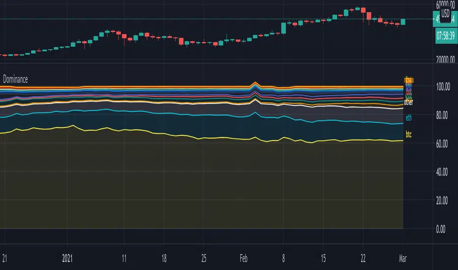
DominanceHi!
A script where you can play with 'Dominance" to make things more clear.
Initially we'll get this,
all available % dominance of BTC/Alts,...:
We can set an EMA on it to smooth things out:
We can filter so we keep want we want to see:
Finally, we can adjust the ratio's, which makes comparisons easier
Do mind, when you do this, don't look at the numbers!
They are changed, only to make it visually easier to see what goes up and down
Also, when doing this it may happen that lines flow in each other
Either way, you can get something like this:
You can see when BTC gets the inflow from ALTS, and USDT, you'll see that BNB recently is getting bigger, more inflow of USDT for some time now, etc...
Have fun!
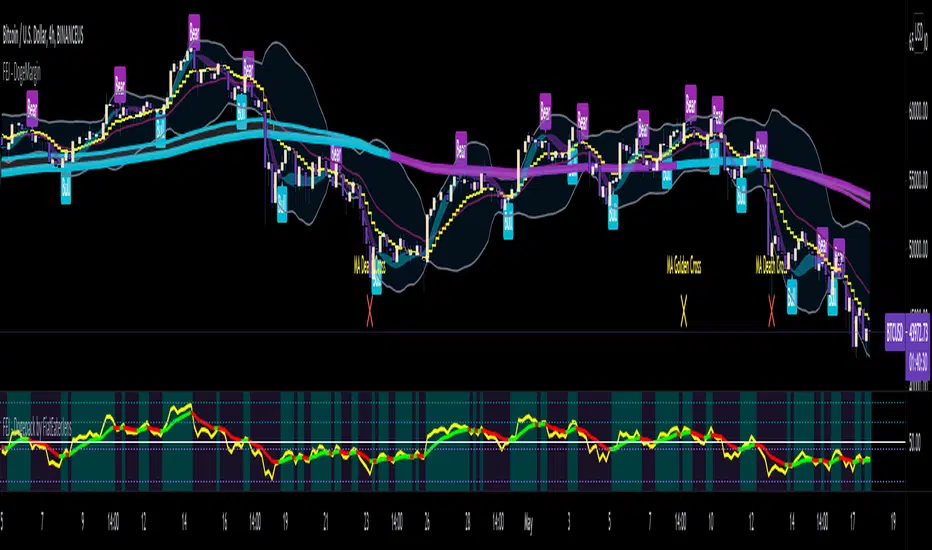
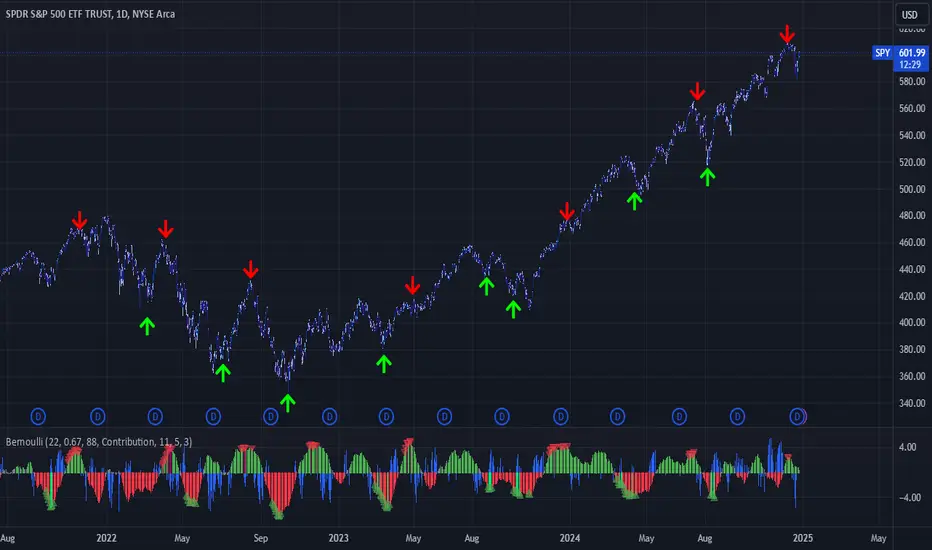
Bernoulli Process - Binary Entropy FunctionThis indicator is the Bernoulli Process or Wikipedia - Binary Entropy Function . Within Information Theory, Entropy is the measure of available information, here we use a binary variable 0 or 1 (P) and (1-P) (Bernoulli Function/Distribution), and combined with the Shannon Entropy measurement. As you can see below, it produces some wonderful charts and signals, using price, volume, or both summed together. The chart below shows you a couple of options and some critical details on the indicator. The best part about this is the simplicity, all of this information in a couple of lines of code.
Using the indicator:
The longer the Entropy measurement the more information you are capturing, so the analogy is, the shorter the signal, the less information you have available to utilize. You'll run into your Nyquist frequencies below a length of 5. I've found values between 9 and 22 work well to gather enough measurements. You also have an averaging summation that measures the weight or importance of the information over the summation period. This is also used for highlighting when you have an information signal above the 5% level (2 sigma) and then can be adjusted using the Percent Rank Variable. Finally, you can plot the individual signals (Price or Volume) to get another set of measurements to utilize. As can be seen in the chart below, the volume moves before price (but hopefully you already knew that)
At its core, this is taking the Binary Entropy measurement (using a Bernoulli distribution) for price and volume. I've subtracted the volume from the price so that you can use it like a MACD, also for shorter time frames (7, 9, 11) you can get divergences on the histogram. These divergences are primarily due to the weekly nature of the markets (5 days, 10 days is two weeks,...so 9 is measuring the last day of the past two weeks...so 11 is measuring the current day and the past two weeks).
Here are a couple of other examples, assuming you just love BTC, Stocks, or FOREX. I fashioned up a strategy to show the potential of the indicator.
BTC-Strategy
Stock-Strategy (#loveyouNFLX)
FOREX - (for everyone hopped up on 40X leverage)
EulerMethod: CryptoCapEN
Shows the cryptocurrency market capitalization balance for the period
Initial data
Bitcoin Capitalization - CRYPTOCAP: BTC
Altcoin Capitalization - CRYPTOCAP: TOTAL2
Money circulates from fiat to bitcoin, from bitcoin to altcoins, from altcoins to fiat
This indicator applies the RSI algorithm to changes in capitalization
The divergence of indices shows an imbalance
Balance level: 0, Maximum: +100, Minimum: -100
(!) Artifacts of indicator readings may occur due to incorrect input data
RU
Показывает баланс капитализации крипторынка за период
Исходные данные
Капитализация Биткоина — CRYPTOCAP:BTC
Капитализация Альткоинов — CRYPTOCAP:TOTAL2
Деньги циркулируют из фиата в биткоин, из биткоина в альткоины, из альткоинов в фиат
В этом индикаторе применяется алгоритм RSI к изменениям капитализации
Расхождения индексов показывают дисбаланс
Балансовый уровень: 0, Максимум: +100, Минимум: -100
(!) Могут возникать артефакты показаний индикатора из-за неправильных исходных данных

Buy the dip in Bull Market by BensonBuy the dip in Bull Market by Benson
This indicators is used for showing buying timing in bull market, buy BTC when the index is below 0.
牛市作多指標 By Benson
在指標下穿零軸時買入 BTC

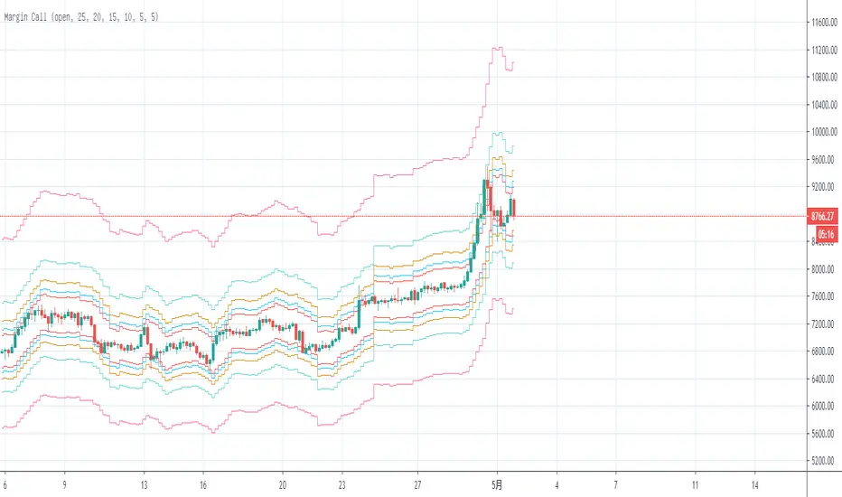
Margin Call MovingAverageThe first edition;
This is a tool to calculate BTC long “Margin Call” price line, you can intuitively adjust the leverage multiple to calculate the current “Margin Call” price line position, you can also adjust the average price to see the average“Margin Call” price;
这是一个计算BTC“爆仓”多头价格线的工具,可以直观地调整杠杆倍数来计算当前“爆仓”价格线位置,也可以调整平均价格来查看平均“爆仓”价格
Number StrategyA simple strategy based on fib ratios and numbers
Best time frames for highest accuracy ( Requires Tradingview Pro )
34 mins for quick scalps
89 mins for weekly Swings
254 mins for monthly swings
-Ability to set alerts for btc and $ singals
-Modify Ema values, Set colour
-Trend following strategy, Needs an active trend for best results
-sideways/choppy action results in bad signals
How to trade:
-----------------
Long if Btc signal appears , preferred if price is trading above the 233 EMA .
You can use the 233 EMA for activating trades during price retest
Short if $ signal appears , preferred if price is trading Below the 233 EMA .
You can use the 233 EMA for activating trades during price retest
VWAPVWMAATRAdapted ATR that i am using in BTC 15M charts. It is an usual ATR-Stop smoothed by a VWAP and a VWMA.
This crazy config i am using only for BTC, but i found others configs with others assets, like brlusd contracts.
You can turn off the barcolor function and change the lenght of the VWAP and VWMA.

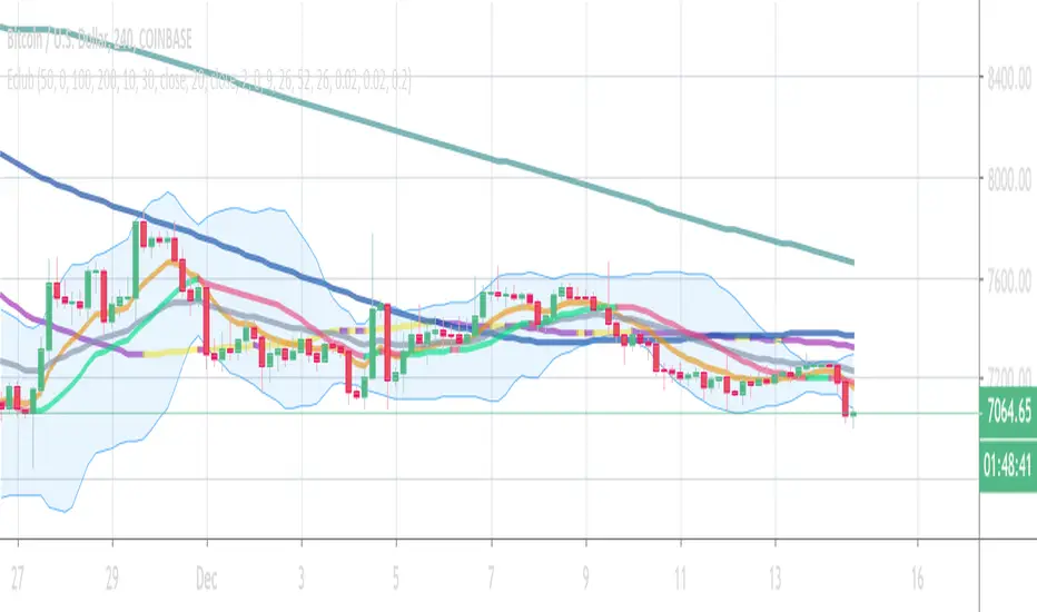
Eclub Multi IndicatorThis multi Indicator includes:
3 Moving Averages
2 Exponential Moving Averages
Bollinger Band
Ichimoku
Parabolic SAR
You can change the colors if you want. Go to setting to enable Ichimoku or SAR or disable others.
The color tolerance is by default zero which results in a very sensitive color change. You can change it to decrease the sensitivity. The value should be the last decimal of the price or the last two decimals of price etc.
If you like this indicator donate some BTC to the following address:
BTC address:
18NSD2xdJyYWoC4CSr4xg1hMk2q5cBbr8T
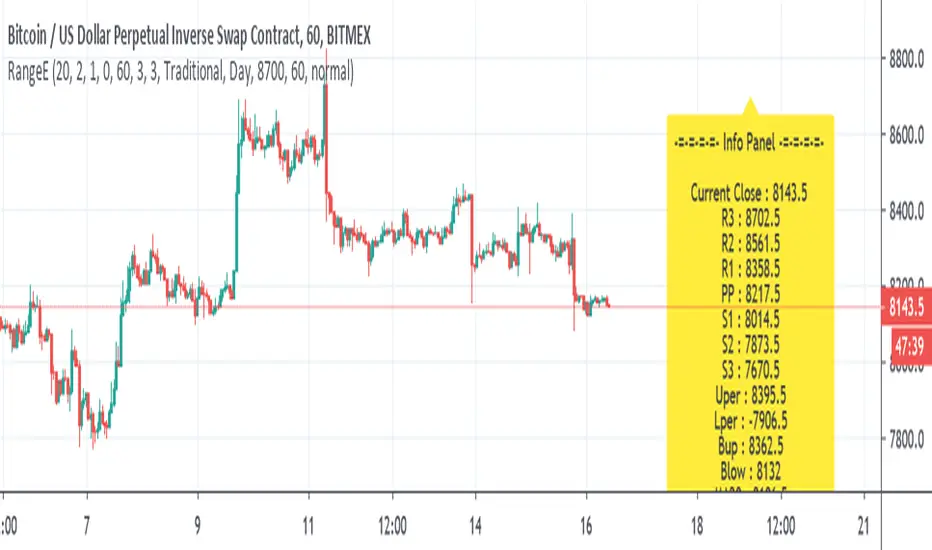
Range EstimateAs a trader I need to know what are the best ranges to get in or out
So this tool try to help a little bit .
First we have Pivot points (all forms with fib ,traditional etc)
next is percentage channel (uper=upper % from close and Lper=lower % from close) , in btc I use 3% up or low for 1 hour candles as it give me good range of lower and upper bound . This you need to change for different TF or different assets
next we have Bollinger upper and lower (Bup= Bollinger upper and Blow=Bollinger lower) it has also MTF function
last we MA =,20,50,100,200
in total the aim of this indicator is to give fast glance on the numbers that important to you as trader fast with a clean graph so you can add your indicator to it to see better how they work
The info panel you can change the font size, you can change distance by offset
and the position on the graph , you need to adjust with position -in this case since it btc I put number of 8700
let say it ETH then I put a number 5% above the close number
if it XRP = then the same trick , lets say 0.3 etc
Bitcoin Network Value to Transactions [aamonkey]Cryptoassets have been quite turbulent in the past few weeks.
At times like this, it is especially important to look at the fundamental foundations of cryptoassets.
This indicator is based on the Network Value to Transactions , or NVT .
Definition:
NVT = Network Value / Daily Transaction Volume
Because this indicator is pulling the Daily Transaction Volume for BTC it can only be used for BTC and the daily timeframe.

A Simple Bitcoin Stock to Flow ModelThis is just a bit of fun. Stock to flow is a hot topic so I thought I'd mess around. Here is a model that is very closely based on the one available here: digitalik.net . I take no credit for the actual model.
It can be tuned with parameters a and b, but this is the best fit imo.
The model is a bit pointless as Tradingview doesn't let us run scripts on future candles, so no predictions.
The blue line is the actual model and the pink line is a 200 MA.
Run this script on the DAILY chart please ;)
Here's a close up of current action. Interesting maybe ;)
