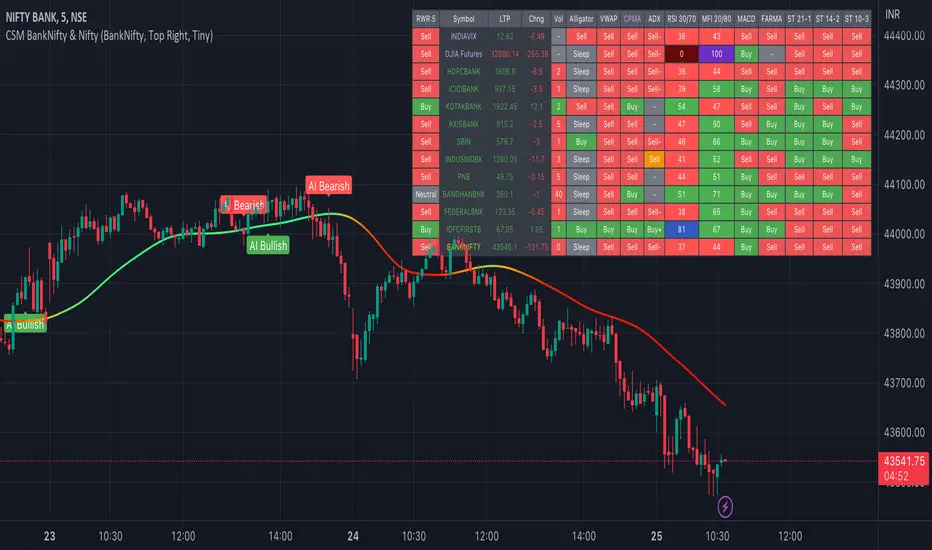
AI Big Players Move Pattern with Buy/Sell Signals.Big Players Move Pattern with Buy/Sell Signals
Description:
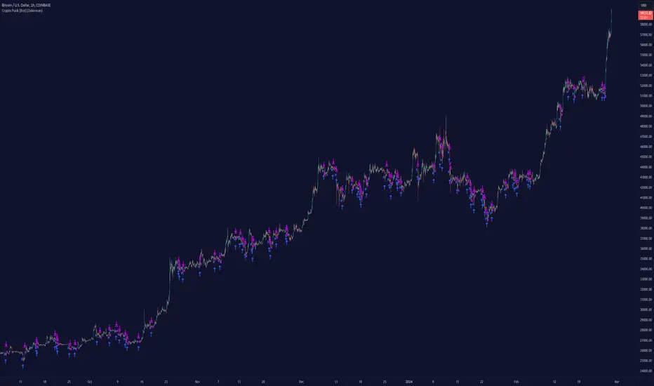
The "Big Players Move Pattern with Buy/Sell Signals" indicator is a powerful tool designed to help traders identify potential market movements driven by institutional investors, also known as big players or smart money. This indicator leverages key patterns such as volume spikes, support and resistance breakouts, and accumulation/distribution trends to generate actionable buy and sell signals.
Key Features:
Volume Spike Detection:
Volume Spike Length: The indicator calculates the moving average of volume over a user-defined period (default: 20 periods).
Volume Spike Multiplier: A volume spike is detected when the current volume exceeds the moving average volume by a specified multiplier (default: 2.0).
Visual Cue: Volume spikes are plotted on the chart with an orange triangle, indicating potential big player activity.
Support and Resistance Breakouts:
Support/Resistance Length: The indicator identifies key support and resistance levels based on the highest highs and lowest lows over a user-defined period (default: 50 periods).
Breakout Detection: The indicator detects and highlights breakouts above resistance levels and breakdowns below support levels.
Visual Cues: Breakouts are plotted with green upward labels, while breakdowns are plotted with red downward labels.
Accumulation/Distribution Line:
Trend Analysis: The accumulation/distribution line is calculated to provide insights into whether a stock is being accumulated (bought) or distributed (sold) by big players.
Visual Cue: The line is plotted on the chart, helping traders understand underlying market trends.
Buy and Sell Signals:
Buy Signal: Generated when a volume spike coincides with a price crossover above the support level.
Sell Signal: Generated when a volume spike coincides with a price crossover below the resistance level.
Visual Cues: Buy signals are plotted with green labels, and sell signals are plotted with red labels.
Alerts:
Custom Alerts: The indicator includes customizable alerts for volume spikes, buy signals, and sell signals, ensuring that traders never miss a significant market movement.
Benefits:
Early Detection: By identifying the activities of big players, traders can position themselves early to capitalize on significant price movements.
Visual Clarity: Clear visual indicators and signals help traders make informed decisions quickly and accurately.
Customization: Adjustable parameters allow traders to tailor the indicator to their specific trading strategies and timeframes.
Use Cases:
Day Trading: Ideal for identifying intraday movements and capitalizing on short-term opportunities.
Swing Trading: Effective for capturing medium-term trends driven by institutional activities.
Position Trading: Useful for understanding long-term accumulation and distribution patterns by big players.
Enhance your trading strategy with the "Big Players Move Pattern with Buy/Sell Signals" indicator and gain a competitive edge by tracking the movements of institutional investors.
אינדיקטור Pine Script®